In the world of trading, technical analysis often gets the spotlight—candlesticks, moving averages, and indicators. But beneath every price movement lies a deeper current: macroeconomic forces. These forces shape the environment in which all trades happen.
Great traders don’t just react to price—they understand the context behind it. That context is found in macro charts: the financial “weather maps” of markets. These charts reveal whether capital is flowing toward risk or safety, whether inflation is heating up or cooling down, and whether liquidity is expanding or shrinking.
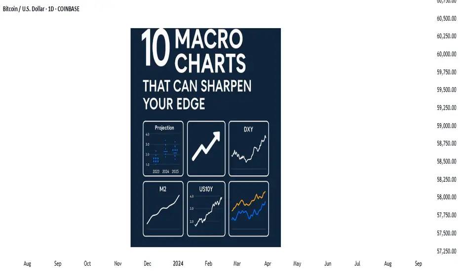
In this post, we’ll explore 10 macro charts that can elevate your edge, backed by proven examples of how they’ve helped traders stay on the right side of the market. These aren't just charts—they’re market truths in visual form.
1️⃣ DXY – U.S. Dollar Index
Why it matters:
The U.S. dollar affects everything: commodities, stocks, global trade, and especially forex. The DXY measures its strength against major currencies.
📉 Chart Reference:
In 2022, DXY surged past 110 due to aggressive Fed rate hikes. This crushed EURUSD, pressured gold, and triggered a global risk-off move. Traders who tracked DXY rode USD strength across the board.
💡 Use it to: Confirm trends in FX and commodities. Strong DXY = bearish pressure on gold and risk assets.
2️⃣ US10Y – 10-Year Treasury Yield
Why it matters:
This is the benchmark for interest rates and inflation expectations. It guides borrowing costs, equity valuations, and safe-haven flows.
📉 Chart Reference:
In 2023, the 10Y spiked from 3.5% to nearly 5%, leading to weakness in growth stocks and boosting USD/JPY. Bond traders saw it first—equities followed.
💡 Use it to: Anticipate moves in growth vs. value stocks, and confirm macro themes like inflation or deflation.
3️⃣ Fed Dot Plot
Why it matters:
This is the Fed’s forward guidance in visual form. Each dot shows where a policymaker expects interest rates to be in the future.
📉 Chart Reference:
In Dec 2021, the dot plot signaled a faster pace of hikes than the market expected. Those who caught the shift front-ran the USD rally and equity correction in early 2022.
💡 Use it to: Predict future rate policy and align your macro bias with the Fed's path.
4️⃣ M2 Money Supply (US)
Why it matters:
This chart tracks the amount of money in the system. More liquidity = fuel for risk. Less = tightening conditions.
📉 Chart Reference:
After COVID hit, M2 exploded, leading to a major bull run in stocks and crypto. When M2 began contracting in 2022, asset prices peaked and reversed.
💡 Use it to: Gauge macro liquidity conditions. Expansion is bullish; contraction is dangerous.
5️⃣ Copper/Gold Ratio
Why it matters:
Copper is a growth metal; gold is a fear hedge. Their ratio acts as a risk-on/risk-off indicator.
📉 Chart Reference:
In 2021, the copper/gold ratio surged—signaling growth and optimism. This preceded strong gains in cyclical equities and commodity currencies like AUD and CAD.
💡 Use it to: Confirm risk sentiment and lead equity or FX trends.
6️⃣ VIX – Volatility Index
Why it matters:
VIX tracks expected volatility in the S&P 500. It's often called the "fear index."
📉Chart Reference :
In March 2020, VIX spiked to nearly 90 as COVID panic set in. This extreme fear was followed by one of the greatest buying opportunities of the decade.
💡 Use it to: Time entries and exits. High VIX = fear = possible reversal. Low VIX = complacency = caution.
7️⃣ Real Yields (10Y TIPS - CPI)
Why it matters:
Shows the inflation-adjusted return on bonds. Real yields affect gold, tech, and risk appetite.
📉Chart Reference :
In 2022, real yields went from deeply negative to positive—crushing gold and high-growth stocks.
💡 Use it to: Confirm direction in gold, NASDAQ, and broad macro trends.
8️⃣ Oil Prices (WTI or Brent)
Why it matters:
Oil is both a growth and inflation input. Rising prices mean higher costs and often precede policy tightening.
📉Chart Reference :
Oil’s rally in early 2022 foreshadowed CPI spikes and led central banks to turn hawkish. Traders who tracked it saw inflation risks building early.
💡 Use it to: Forecast inflation, assess energy-related equities, and understand global demand.
9️⃣ Global PMIs (Purchasing Managers’ Indexes)
Why it matters:
Leading indicator of economic health. PMIs above 50 = expansion. Below 50 = contraction.
📉 Chart Reference:
In 2023, China’s PMI consistently printed below 50—signaling manufacturing weakness and global demand concerns. This helped traders avoid overexposure to emerging markets.
💡 Use it to: Gauge growth momentum globally and regionally.
🔟 SPX vs. Equal-Weighted SPX (Breadth Divergence)
Why it matters:
Shows whether the S&P 500 rally is broad-based or just driven by a few megacaps.
📉Chart Reference :
In early 2024, the index made new highs—but the equal-weighted version lagged badly. That divergence warned traders of a fragile rally.
💡 Use it to: Detect weakness beneath the surface and avoid false confidence in rallies.
🧠 Nerdy Tip: Macro Is the Invisible Hand
These charts don’t give you trade entries—but they give you conviction, timing, and perspective.
When you combine macro context with technical setups, you trade in sync with the market’s deeper rhythm.
So before you place your next trade, ask yourself:
What are yields doing?
Is liquidity expanding or drying up?
Is risk appetite rising or falling?
put together by : currencynerd as Pako Phutietsile
Great traders don’t just react to price—they understand the context behind it. That context is found in macro charts: the financial “weather maps” of markets. These charts reveal whether capital is flowing toward risk or safety, whether inflation is heating up or cooling down, and whether liquidity is expanding or shrinking.
In this post, we’ll explore 10 macro charts that can elevate your edge, backed by proven examples of how they’ve helped traders stay on the right side of the market. These aren't just charts—they’re market truths in visual form.
1️⃣ DXY – U.S. Dollar Index
Why it matters:
The U.S. dollar affects everything: commodities, stocks, global trade, and especially forex. The DXY measures its strength against major currencies.
📉 Chart Reference:
In 2022, DXY surged past 110 due to aggressive Fed rate hikes. This crushed EURUSD, pressured gold, and triggered a global risk-off move. Traders who tracked DXY rode USD strength across the board.
💡 Use it to: Confirm trends in FX and commodities. Strong DXY = bearish pressure on gold and risk assets.
2️⃣ US10Y – 10-Year Treasury Yield
Why it matters:
This is the benchmark for interest rates and inflation expectations. It guides borrowing costs, equity valuations, and safe-haven flows.
📉 Chart Reference:
In 2023, the 10Y spiked from 3.5% to nearly 5%, leading to weakness in growth stocks and boosting USD/JPY. Bond traders saw it first—equities followed.
💡 Use it to: Anticipate moves in growth vs. value stocks, and confirm macro themes like inflation or deflation.
3️⃣ Fed Dot Plot
Why it matters:
This is the Fed’s forward guidance in visual form. Each dot shows where a policymaker expects interest rates to be in the future.
📉 Chart Reference:
In Dec 2021, the dot plot signaled a faster pace of hikes than the market expected. Those who caught the shift front-ran the USD rally and equity correction in early 2022.
💡 Use it to: Predict future rate policy and align your macro bias with the Fed's path.
4️⃣ M2 Money Supply (US)
Why it matters:
This chart tracks the amount of money in the system. More liquidity = fuel for risk. Less = tightening conditions.
📉 Chart Reference:
After COVID hit, M2 exploded, leading to a major bull run in stocks and crypto. When M2 began contracting in 2022, asset prices peaked and reversed.
💡 Use it to: Gauge macro liquidity conditions. Expansion is bullish; contraction is dangerous.
5️⃣ Copper/Gold Ratio
Why it matters:
Copper is a growth metal; gold is a fear hedge. Their ratio acts as a risk-on/risk-off indicator.
📉 Chart Reference:
In 2021, the copper/gold ratio surged—signaling growth and optimism. This preceded strong gains in cyclical equities and commodity currencies like AUD and CAD.
💡 Use it to: Confirm risk sentiment and lead equity or FX trends.
6️⃣ VIX – Volatility Index
Why it matters:
VIX tracks expected volatility in the S&P 500. It's often called the "fear index."
📉Chart Reference :
In March 2020, VIX spiked to nearly 90 as COVID panic set in. This extreme fear was followed by one of the greatest buying opportunities of the decade.
💡 Use it to: Time entries and exits. High VIX = fear = possible reversal. Low VIX = complacency = caution.
7️⃣ Real Yields (10Y TIPS - CPI)
Why it matters:
Shows the inflation-adjusted return on bonds. Real yields affect gold, tech, and risk appetite.
📉Chart Reference :
In 2022, real yields went from deeply negative to positive—crushing gold and high-growth stocks.
💡 Use it to: Confirm direction in gold, NASDAQ, and broad macro trends.
8️⃣ Oil Prices (WTI or Brent)
Why it matters:
Oil is both a growth and inflation input. Rising prices mean higher costs and often precede policy tightening.
📉Chart Reference :
Oil’s rally in early 2022 foreshadowed CPI spikes and led central banks to turn hawkish. Traders who tracked it saw inflation risks building early.
💡 Use it to: Forecast inflation, assess energy-related equities, and understand global demand.
9️⃣ Global PMIs (Purchasing Managers’ Indexes)
Why it matters:
Leading indicator of economic health. PMIs above 50 = expansion. Below 50 = contraction.
📉 Chart Reference:
In 2023, China’s PMI consistently printed below 50—signaling manufacturing weakness and global demand concerns. This helped traders avoid overexposure to emerging markets.
💡 Use it to: Gauge growth momentum globally and regionally.
🔟 SPX vs. Equal-Weighted SPX (Breadth Divergence)
Why it matters:
Shows whether the S&P 500 rally is broad-based or just driven by a few megacaps.
📉Chart Reference :
In early 2024, the index made new highs—but the equal-weighted version lagged badly. That divergence warned traders of a fragile rally.
💡 Use it to: Detect weakness beneath the surface and avoid false confidence in rallies.
🧠 Nerdy Tip: Macro Is the Invisible Hand
These charts don’t give you trade entries—but they give you conviction, timing, and perspective.
When you combine macro context with technical setups, you trade in sync with the market’s deeper rhythm.
So before you place your next trade, ask yourself:
What are yields doing?
Is liquidity expanding or drying up?
Is risk appetite rising or falling?
put together by : currencynerd as Pako Phutietsile
Related publications
Disclaimer
The information and publications are not meant to be, and do not constitute, financial, investment, trading, or other types of advice or recommendations supplied or endorsed by TradingView. Read more in the Terms of Use.
Related publications
Disclaimer
The information and publications are not meant to be, and do not constitute, financial, investment, trading, or other types of advice or recommendations supplied or endorsed by TradingView. Read more in the Terms of Use.