### **Chart Description & Analysis**
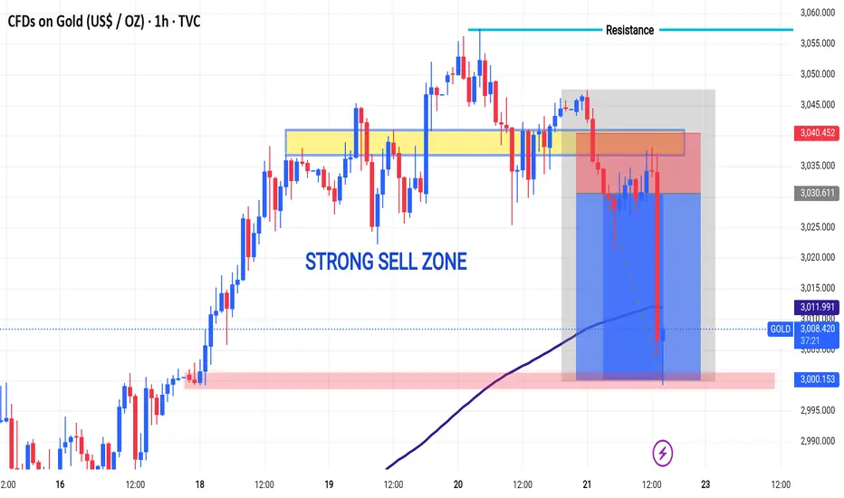
The chart represents **CFDs on Gold (US$/OZ) on a 1-hour timeframe**. It shows price movements, key resistance and support levels, and a highlighted sell zone.
### **Key Observations**
1. **Strong Sell Zone**
- The chart highlights a **yellow zone** as a key resistance level where sellers have shown dominance.
- The price attempted to break above this area multiple times but failed, leading to a strong downward move.
2. **Resistance Level**
- A blue line marks the **resistance zone** at around **3,040 - 3,050**.
- The price action failed to sustain above this level, confirming it as a resistance.
3. **Significant Drop**
- A large red candlestick indicates **strong selling pressure**.
- The price dropped sharply from the resistance area, falling below **3,010**, breaking an important support level.
4. **Moving Average Support**
- A blue curved line represents a **moving average**, possibly acting as dynamic support.
- The price is approaching a previously tested support zone (red-shaded area).
5. **Current Price Action**
- The latest price is **3,005.135**, down **1.29% (-39.275 points)**.
- A potential next support level is seen around **3,000**.
### **Conclusion**
This chart suggests that the market reacted to the strong sell zone and failed to break resistance. The strong bearish move indicates further downside potential, with **3,000 as the next key support level**. If this support holds, a pullback could occur; otherwise, a deeper decline may follow.
Would you like me to refine the analysis or add specific trading insights?
Trade closed: target reached
Target complete successful 3000 TELEGRAM CHANNEL CLICK HERE
👇👇
t.me/addlist/j3ts8pztHtY3NWQ0
VIP SIGNALS SERVICE 👇👇⬇️
t.me/addlist/j3ts8pztHtY3NWQ0
Recommend best broker exness Partner link 👇
one.exnesstrack.org/a/kyponqqh5i
👇👇
t.me/addlist/j3ts8pztHtY3NWQ0
VIP SIGNALS SERVICE 👇👇⬇️
t.me/addlist/j3ts8pztHtY3NWQ0
Recommend best broker exness Partner link 👇
one.exnesstrack.org/a/kyponqqh5i
Disclaimer
The information and publications are not meant to be, and do not constitute, financial, investment, trading, or other types of advice or recommendations supplied or endorsed by TradingView. Read more in the Terms of Use.
TELEGRAM CHANNEL CLICK HERE
👇👇
t.me/addlist/j3ts8pztHtY3NWQ0
VIP SIGNALS SERVICE 👇👇⬇️
t.me/addlist/j3ts8pztHtY3NWQ0
Recommend best broker exness Partner link 👇
one.exnesstrack.org/a/kyponqqh5i
👇👇
t.me/addlist/j3ts8pztHtY3NWQ0
VIP SIGNALS SERVICE 👇👇⬇️
t.me/addlist/j3ts8pztHtY3NWQ0
Recommend best broker exness Partner link 👇
one.exnesstrack.org/a/kyponqqh5i
Disclaimer
The information and publications are not meant to be, and do not constitute, financial, investment, trading, or other types of advice or recommendations supplied or endorsed by TradingView. Read more in the Terms of Use.
