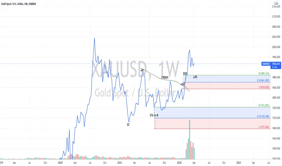
The chart you see is marked based on the Wyckoffian alternative reaccumulation schematics. A reaccumulation is a state during an uptrend featuring a consolidation of the market so as to absorb supply enough to push the price to another higher high. It usually takes Weeks to Months and to Years, depending on how much target expected after it ends. The chart shows that supply has successfully been absorbed and unless price goes down a little to mitigate the wick which took out liquidity ( test the "Spring" ) there's nothing holding it back from breaking the previous high and continuing higher. To corroborate this fact also is the massive longs added to the Non-commercial sector of the COT on Gold.
Check back in the future to see how this analysis played out. And leave like if you do like it.
Check back in the future to see how this analysis played out. And leave like if you do like it.
Related publications
Disclaimer
The information and publications are not meant to be, and do not constitute, financial, investment, trading, or other types of advice or recommendations supplied or endorsed by TradingView. Read more in the Terms of Use.
Related publications
Disclaimer
The information and publications are not meant to be, and do not constitute, financial, investment, trading, or other types of advice or recommendations supplied or endorsed by TradingView. Read more in the Terms of Use.