Example of how to draw a trend line using the StochRSI indicator
Hello, traders.
If you "Follow", you can always get new information quickly.
Have a nice day today.
-------------------------------------
We use the StochRSI indicator to draw a trend line.
We draw a trend line by connecting the peaks of the StochRSI indicator, i.e. the K line, when they are created in the overbought area or when they are created in the overbought area.
That is, when the K line of the StochRSI indicator forms a peak in the overbought area, the trend line is drawn by connecting the Open values of the falling candles.
If the candle corresponding to the peak of the StochRSI indicator is a rising candle, move to the right and use the Open value of the first falling candle.
When drawing the first trend line, draw it from the latest candle.
Since the third trend line indicates a new trend, do not draw anything after the third trend line.
The currently drawn trend line corresponds to the high-point trend line.
-
Therefore, you should also draw the low-point trend line.
The low-point trend line is drawn by connecting the K line of the StochRSI indicator when the top is formed in the oversold zone.
The low-point trend line uses the low value of the candle when the K line of the StochRSI indicator forms the top in the oversold zone.
That is, it doesn't matter whether the candle is a bearish candle or a bullish candle.
The drawing method is the same as when drawing the high-point trend line, drawing from the latest candle.
The top of the best K line of the StochRSI indicator was not formed within the oversold zone.
(The top is indicated by the section marked with a circle.)
Since the trend line was not formed, the principle is not to draw it.
If you want to draw it and see it, it is better to display it differently from the existing trend line so that it is intuitively different from the existing trend line.
-
The chart below is a chart that displays the trend line drawn separately above as a whole.
It is also good to distinguish which trend line it is by changing the color of the high-point trend line and the low-point trend line.
The chart below is a chart that distinguishes the high-point trend line in blue (#5b9cf6) and the low-point trend line in light green (#00ff00).
The low-point trend line is a line drawn when the trend has changed, so it does not have much meaning, but it still provides good information for calculating the volatility period.
-
To calculate the volatility period, support and resistance points drawn on the 1M, 1W, and 1D charts are required.
However, since I am currently explaining how to draw a trend line, it is only drawn on the 1M chart.
-
I use the indicators used in my chart to indicate support and resistance points.
That is, I use the DOM(60), DOM(-60), HA-Low, HA-High, and OBV indicators to indicate support and resistance points.
Since the DOM(-60) and HA-Low indicators are not displayed on the 1M chart, I have shown the 1W chart as an example.
The indicators displayed up to the current candle correspond to the main support and resistance points.
Although it is not displayed up to the current candle, the point where the horizontal line is long is drawn as the sub-support and resistance point.
It is recommended to mark them separately to distinguish the main support and resistance point and the sub-support and resistance point.
The trend line drawn in this way and the support and resistance points are correlated on the 1D chart and the volatility period is calculated.
(For example, it was drawn on the 1M chart.)
The sections marked as circles are the points that serve as the basis for calculating the volatility period.
That is,
- The point where multiple trend lines intersect
- The point where the trend line and the support and resistance points intersect
Select the point that satisfies the above cases at the same time to display the volatility period.
When the point of calculating the volatility period is ambiguous, move to the left and select the first candle.
This is because it is meaningless to display it after the volatility period has passed.
If possible, the more points that are satisfied at the same time, the stronger the volatility period.
If the K-line peak of the StochRSI indicator is formed outside the overbought or oversold zone, it is better to exclude it when calculating the volatility period.
-
The chart below is a chart drawn on a 1D chart by summarizing the above contents.
The reason why there are so many lines is because of this reason.
For those who are not familiar with my charts, I have been simplifying the charts as much as possible these days.
However, when explaining, I have shown all the indicators to help you understand the explanation.
-
Thank you for reading to the end.
I hope you have a successful trade.
--------------------------------------------------
HA-MS

StochRSI indicator and support and resistance levels
Hello, traders.
If you "follow" me, you can always get the latest information quickly.
Have a nice day today.
-------------------------------------
The StochRSI indicator on the left chart is slightly different from the StochRSI indicator on the right.
The StochRSI indicator on the left chart is the StochRSI indicator provided by default in TradingView, and the StochRSI indicator on the right chart is an indicator with a modified formula.
The StochRSI indicator is a leading indicator that is reflected almost in real time.
Therefore, it reacts sensitively to price changes.
Although it is advantageous because it reacts sensitively, it also increases the possibility of being caught in a fake, so I thought that a slight delay(?) was necessary, and so I created the StochRSI indicator on the left chart.
If you look at the relationship between the K and D of the StochRSI indicators on the two charts, you can see that there is a big difference.
In the end, you can predict the movement by checking whether the movement of the K line has escaped the overbought or oversold section.
However, I think that you will receive information that can determine the sustainability of the trend depending on the positional relationship between K and D.
Therefore, it is important to distinguish the inflection points that occur in the StochRSI indicator.
This is because these inflection points provide important information for drawing trend lines.
Therefore, the StochRSI indicator on the left chart, which better expresses the inflection point, is being used to draw the trend line.
(Unfortunately, this indicator was not registered on TradingView because I did not explain it well.)
-
As a new candle was created, the StochRSI indicator on the left chart is showing an inflection point on the K line.
The StochRSI indicator on the right chart is showing a transition to a state where K < D.
We will have to check whether the inflection point was created only when today's candle closes, but I think that the fact that it is showing this pattern means that there is a high possibility of a change in the future trend.
Since the next volatility period is expected to start around July 2nd (July 1st-3rd), I think it has started to show meaningful movements.
-
It is true that you want to buy at the lowest price possible and sell at the highest price.
However, because of this greed, one mistake can lead to a loss that can overturn nine victories, so you should always be careful.
Therefore, if possible, it is better to check for support and respond.
In that sense, I think it is worth referring to the relationship between K and D of the StochRSI indicator on the left chart.
This is because the actual downtrend is likely to start when K < D.
-
In order to check for support, you definitely need support and resistance points drawn on the 1M, 1W, and 1D charts.
Ignoring this and checking for support at the drawn support and resistance points can result in not being able to apply the chart you drew to actual trading.
Therefore, you should draw support and resistance points first before starting a trade.
Otherwise, if you draw support and resistance points after starting a trade, you are more likely to set support and resistance points that reflect your subjective thoughts, so as I mentioned earlier, you are more likely to lose faith in the chart you drew.
If this phenomenon continues, it will eventually lead to leaving the investment market.
-
It is important to determine whether there is support by checking the correlation between the StochRSI indicator and other indicators at the support and resistance points drawn on the 1M, 1W, and 1D charts.
Even if the inflection point of the StochRSI indicator or other indicators occurs at a point other than the support and resistance points you drew, you should consider it as something that occurred beyond your ability to handle.
In other words, you should observe the price movement but not actually trade.
As I mentioned earlier, if you start to violate this, you will become less and less able to trust the chart you drew.
-
Accordingly, the basic trading strategy I suggest is to buy near the HA-Low indicator and sell near the HA-High indicator.
However, since the HA-Low and HA-High indicators are expressed as average values, they may move in the opposite direction to the basic trading strategy.
In other words, if the HA-Low indicator is resisted and falls, there is a possibility of a stepwise downward trend, and if the HA-High indicator is supported and rises, there is a possibility of a stepwise upward trend.
Therefore, the basic trading strategy mentioned above can be considered a trading strategy in the box section.
In the case of deviating from this box section, it is highly likely to occur before and after the volatility period indicated by the relationship between the trend line using the StochRSI indicator mentioned above and the support and resistance points drawn on the 1M, 1W, and 1D charts.
Therefore, special care is required when conducting new transactions during the volatility period.
This is because there is a high possibility of being caught in a fake when trading during the volatility period.
-
The DOM(60) and DOM(-60) indicators are good indicators to look at together with the HA-Low and HA-High indicators.
The DOM indicator is an indicator that comprehensively evaluates the DMI, OBV, and MOMENTUM indicators.
Therefore, the DOM(60) indicator is likely to be at the end of the high point range, and the DOM(060) indicator is likely to be at the end of the low point range.
In the explanation of the HA-Low and HA-High indicators,
- I said that if the HA-Low indicator receives resistance and falls, there is a possibility that a stepwise downtrend will begin,
- and if the HA-High indicator receives support and rises, there is a possibility that a stepwise uptrend will begin.
In order for an actual stepwise downtrend to begin, the price must fall below DOM(-60), and in order for a stepwise uptrend to begin, it must rise above DOM(60).
In other words, the DOM(-60) ~ HA-Low section and the HA-High ~ DOM(60) section can be seen as support and resistance sections.
-
If these correlations start to appear, I think you will be able to create a trading strategy that fits your investment style without being swayed by price volatility and proceed with trading.
The reason for analyzing charts is to trade.
Therefore, the shorter the time for chart analysis, the better, and you should increase the start of creating a trading strategy.
-
Thank you for reading to the end.
I hope you have a successful trade.
--------------------------------------------------

About the chart that shows a sideways movement...
Hello, traders.
If you "follow", you can always get new information quickly.
Have a nice day today.
-------------------------------------
When you study charts, you will realize how difficult it is to move sideways.
Therefore, depending on how long the sideways movement was before the big wave, the size of the wave is also predicted.
However, in the charts showing sideways movement, the price range and wave size are often known after the wave appears.
This shows that the location of the sideways movement and the size of the sideways wave are important.
-
Looking at the chart above, we can say that it is showing a sideways movement.
However, since the price is located at the lowest price range, it is better to exclude this chart.
The reason is that if it is showing a sideways movement at the lowest price range, it is likely that the trading volume has decreased significantly due to being excluded from the market.
This is because it is likely to take a long time to turn into an upward trend in this state.
-
Looking at the chart above, the price is showing a sideways movement while maintaining a certain interval after rising.
The sideways movement is about 31%, so it may be ambiguous to say that it is actually sideways.
However, if the price moves sideways while maintaining a certain interval after rising, it means that someone is trying to maintain the price.
Therefore, when it shows a movement that breaks through the sideways section, it should be considered that there is a possibility that a large wave will occur.
The wave can be either upward or downward.
Therefore, it is necessary to be careful not to jump into a purchase with the idea that it will definitely rise in the future just because it moves sideways.
A box section is set at both ends of the sideways section.
Therefore, it is recommended to proceed with a purchase in installments when it shows support after entering this box section.
In other words, it is important to check the support in the 1.5-1.9669 section or the 25641-2.6013 section.
You can see that the HA-Low indicator and the HA-High indicator are converging.
Therefore, if this convergence is broken, it is expected that a trend will be formed.
-
Like this, you should measure the price position of the sideways movement and the width of the sideways movement well and think in advance about whether to proceed with the transaction when it deviates from that range.
Otherwise, if you start trading after the wave has already started, you may end up giving up the transaction because you cannot overcome the wave.
Since it is not known when the movement will start once the sideways movement starts, individual investors easily get tired.
Therefore, when the coin (token) you want to trade shows a sideways movement, it is recommended to increase the number of coins (tokens) corresponding to the profit while conducting short-term trading (day trading).
If you do this, you will naturally be able to see how the sideways waves change, and you will be able to hold out until a big wave starts.
I think there are quite a few people who are not familiar with day trading and say they will buy at once when the wave starts.
If you can hold out well against the wave, you will get good results, but there is a possibility that the trade will fail 7-8 times out of 10, so if possible, it is good to get used to the feeling by day trading coins (tokens) that show this sideways pattern.
-
Thank you for reading to the end.
I hope you have a successful trade.
--------------------------------------------------

Differences Between Trading Stock Market and Coin Market
Hello, traders.
If you "Follow", you can always get new information quickly.
Have a nice day today.
-------------------------------------
Please read with a light heart.
-
Trading stock market and coin market seem similar, but they are very different.
In stock market, you have to buy and sell 1 share at a time, but in coin market, you can buy and sell in decimals.
This difference makes a big difference in buying and selling.
In the stock market, you should buy when the price is rising from a low price if possible.
The reason is that since you buy in units of 1 week, you have to invest more money when you sell and then buy to buy 1 week.
I think the same goes for the coin market, but since you can buy in decimal units, you have the advantage of being able to buy at a higher price than when you buy in the stock market.
For example, if you sell and then buy again at the same price, the number of coins (tokens) will decrease, but there will be no cases where you can't buy at all.
Therefore, the coin market is an investment market where you can trade at virtually any price range.
-
In terms of profit realization, the stock market can only be traded in a way that earns cash profits.
The reason is that, as I mentioned earlier, since you have to trade in units of 1 week, there are restrictions on trading.
However, in the coin market, in addition to the method of earning cash profits, you can also increase the number of coins (tokens) corresponding to the profits.
The biggest advantage of increasing the number of coins (tokens) corresponding to profit is that you can get a large profit in the long term, and the burden of the average purchase price when conducting a transaction is reduced.
When the price rises by purchase price, if you sell the purchase amount (+ including the transaction fee), the coins (tokens) corresponding to profit will remain.
Since these coins (tokens) have an average purchase price of 0, they always correspond to profit even if there is volatility.
In addition, even if the price falls and you buy again, the average purchase price is set low, so it plays a good role in finding the right time to buy and starting a transaction.
Of course, when the number of coins (tokens) corresponding to profit is small, it does not have a big effect on the average purchase price, but as the number increases, you will realize its true value.
You can also get some cash when you increase the number of coins (tokens) corresponding to profit.
When selling, if you add up the purchase price + transaction fee X 2~3, you can also get some cash profit.
If you get cash profit, the number of coins (tokens) remaining will decrease, so you can adjust it well according to the situation.
When the profit is large, increase the cash profit slightly, and when you think the profit is small, decrease the cash profit.
-
Therefore, when you first move from the stock market to the coin market and start trading, you will experience that the trading is not going well for some reason.
In the stock market, there are some restrictions on the rise and fall, but in the coin market, there are no restrictions, so it is not easy to respond.
However, as I mentioned earlier, the biggest problem is the difference in the transaction unit.
When trading in the stock market, you need to check various announcements and issues in addition to the chart and determine how this information affects the stock or theme you want to trade.
This is because trading is not conducted 24 hours a day, 365 days a year like the coin market.
This is because if an announcement or issue occurs during a non-trading period, the stock market may rise or fall significantly when trading begins.
-
When using my chart on a stock chart, the basic trading strategy is to buy near the HA-Low indicator and sell near the HA-High indicator.
However, if you want to buy more, you can buy more when the M-Signal of the 1D chart > M-Signal of the 1W chart, and it shows support near the M-Signal indicator of the 1W chart.
In the stock chart, it is recommended to trade when the M-Signal indicators of the 1D, 1W, and 1M charts are aligned.
The reason is that, as I mentioned earlier, trading must be done in 1-week units, so the timing of the purchase is important.
In the coin chart, you can actually trade when it shows support at the support and resistance points.
However, since trading is possible 24 hours a day, 365 days a year, even if it shows support at the support and resistance points, psychological anxiety due to volatility increases, so it is recommended to proceed with trading according to the basic trading strategy.
The creation of the HA-Low indicator means that it has risen from the low range, and the creation of the HA-High indicator means that it has fallen from the high range.
Therefore, if it shows support near the HA-Low indicator, it is likely to rise, and if it shows resistance near the HA-High indicator, it is likely to fall.
However, on the contrary, if it is supported and rises at the HA-High indicator, it is likely to show a stepwise rise, and if it is resisted and falls at the HA-Low indicator, it is likely to show a stepwise fall.
In order to confirm this movement, you need to invest a lot of time and check the situation in real time.
-
Thank you for reading to the end.
I hope you have a successful transaction.
--------------------------------------------------

An example of a new way to interpret the OBV indicator
Hello, traders.
If you "follow", you can always get new information quickly.
Have a nice day today.
-------------------------------------
I think the reason why there are difficulties in using auxiliary indicators and why they say not to use indicators is because they do not properly reflect the price flow.
Therefore, I think many people use indicators added to the price part because they reflect the price flow.
However, I think auxiliary indicators are not used that much.
Among them, indicators related to trading volume are ambiguous to use and interpret.
To compensate for this, the OBV indicator has been modified and added.
-
The ambiguous part in interpreting the OBV indicator is that the price flow is not reflected.
Therefore, even if it performs its role well as an auxiliary indicator, it can be difficult to interpret.
To compensate for this, the High Line and Low Line of the OBV auxiliary indicator have been made to be displayed in the price section.
That is, High Line = OBV High, Low Line = OBV Low
-
Then, let's interpret the OBV at the current price position.
The OBV of the auxiliary indicator is currently located near the OBV EMA.
That is, the current OBV is located within the Low Line ~ High Line section.
However, if you look at the OBV High and OBV Low indicators displayed in the price section, you can see that it has fallen below the OBV Low indicator.
In other words, you can see that the price has fallen below the Low Line of the OBV indicator.
You can see that the OBV position of the auxiliary indicator and the OBV position displayed in the price section are different.
Therefore, in order to normally interpret the OBV of the auxiliary indicator, the price must have risen above the OBV Low indicator in the price section.
If not, you should consider that the interpretation of the OBV of the auxiliary indicator may be incorrect information.
In other words, if it fails to rise above the OBV Low indicator, you should interpret it as a high possibility of eventually falling and think about a countermeasure for that.
Since time frame charts below the 1D chart show too fast volatility, it is recommended to use it on a 1D chart or larger if possible.
-
It is not good to analyze a chart with just one indicator.
Therefore, you should comprehensively evaluate by adding different indicators or indicators that you understand.
The indicators that I use are mainly StochRSI indicator, OBV indicator, and MACD indicator.
I use these indicators to create and use M-Signal indicator, StochRSI(20, 50, 80) indicator, and OBV(High, Low) indicator.
DOM(60, -60) indicator is an indicator that comprehensively evaluates DMI, OBV, and Momentum indicators to display high and low points.
And, there are HA-Low, HA-High indicators, which are my basic trading strategy indicators that I created for trading on Heikin-Ashi charts.
Among these indicators, the most important indicators are HA-Low, HA-High indicators.
The remaining indicators are auxiliary indicators that are necessary when creating trading strategies or detailed response strategies from HA-Low, HA-High indicators.
-
Thank you for reading to the end.
I hope you have a successful trade.
--------------------------------------------------

Explanation of indicators indicating high points
Hello, traders.
If you "Follow", you can always get new information quickly.
Have a nice day today.
-------------------------------------
(BTCUSDT 1D chart)
If it falls below the finger point indicated by the OBV indicator, it can be interpreted that the channel consisting of the High Line ~ Low Line is likely to turn into a downward channel.
And, if it falls to the point indicated by the arrow, it is expected that the channel consisting of the High Line ~ Low Line will turn into a downward channel.
Therefore, if it is maintained above the point indicated by the finger, I think it is likely to show a movement to rise above the High Line.
In this situation, the price is located near the M-Signal indicator on the 1D chart, so its importance increases.
To say that it has turned into a short-term uptrend, the price must be maintained above the M-Signal indicator on the 1D chart.
In that sense, the 106133.74 point is an important support and resistance point.
(1W chart)
The HA-High indicator is showing signs of being created at the 99705.62 point.
The fact that the HA-High indicator has been created means that it has fallen from the high point range.
However, since the HA-High indicator receives the value of the Heikin-Ashi chart, it indicates the middle point.
In other words, the value of Heikin-Ashi's Close = (Open + High + Low + Close) / 4 is received.
Since the HA-High indicator has not been created yet, we will be able to know for sure whether it has been created next week.
In any case, it seems to be about to be created, and if it maintains the downward candle, the HA-High indicator will eventually be created anew.
Therefore, I think it is important to be able to maintain the price by rising above the right Fibonacci ratio 2 (106178.85).
Indicators that indicate high points include DOM (60), StochRSI 80, OBV High, and HA-High indicators.
Indicators that indicate these high points are likely to eventually play the role of resistance points.
Therefore,
1st high point range: 104463.99-104984.57
2nd high point range: 99705.62-100732.01
You should consider a response plan depending on whether there is support near the 1st and 2nd above.
The basic trading strategy is to buy at the HA-Low indicator and sell at the HA-High indicator.
However, if it is supported and rises in the HA-High indicator, it is likely to show a stepwise rise, and if it is resisted and falls in the HA-Low indicator, it is likely to show a stepwise decline.
Therefore, the basic trading method should utilize the split trading method.
Other indicators besides the HA-Low and HA-High indicators are auxiliary indicators.
Therefore, the trading strategy in the big picture should be created around the HA-Low and HA-High indicators, and the detailed response strategy can be carried out by referring to other indicators according to the price movement.
In that sense, if we interpret the current chart, it should be interpreted that it is likely to show a stepwise rise since it has risen above the HA-High indicator.
However, you can choose whether to respond depending on whether there is support from other indicators that indicate the high point.
On the other hand, indicators that indicate the low point include the DOM (-60), StochRSI 20, OBV Low, and HA-Low indicators.
These indicators pointing to lows are likely to eventually serve as support points.
I will explain this again when the point pointing to the lows has fallen.
-
Thank you for reading to the end.
I hope you have a successful trade.
--------------------------------------------------
- Here is an explanation of the big picture.
(3-year bull market, 1-year bear market pattern)
I will explain the details again when the bear market starts.
------------------------------------------------------

Correlation between USDT.D and BTC.D
Hello, traders.
If you "Follow", you can always get new information quickly.
Have a nice day today.
-------------------------------------
(USDT.D 1M chart)
If USDT dominance is maintained below 4.97 or continues to decline, the coin market is likely to be on the rise.
The maximum decline is expected to be around 2.84-3.42.
-
(BTC.D 1M chart)
However, in order for the altcoin bull market to begin, BTC dominance is expected to fall below 55.01 and remain there or show a downward trend.
Therefore, we need to see if it falls below the 55.01-62.47 range.
The maximum rise range is expected to be around 73.63-77.07.
-
In summary of the above, since funds are currently concentrated in BTC, it is likely that BTC will show an upward trend, and altcoins are likely to show a sideways or downward trend as they fail to follow the rise of BTC.
The major bear market in the coin market is expected to begin in 2026.
For the basis, please refer to the explanation of the big picture below.
-
Thank you for reading to the end.
I hope you have a successful transaction.
--------------------------------------------------
- This is an explanation of the big picture.
(3-year bull market, 1-year bear market pattern)
I will explain more details when the bear market starts.
------------------------------------------------------

Trading Strategy and CEX Screen
Hello, traders.
If you "Follow", you can always get new information quickly.
Please click "Boost" as well.
Have a nice day today.
-------------------------------------
CEX(Centralized Exchange): Centralized Exchange
DEX(Decentralized Exchange): Decentralized Exchange
As coin futures trading becomes active, I think they started classifying the coin futures charts of CEX exchanges.
-
Tradingview supports various screeners.
There are several screeners in the menu at the bottom, so check them out.
-
As the coin market grows, it is being classified into various themes.
I think this movement means that it is evolving into a form similar to the existing stock market.
If this classification continues to be segmented, it is likely that individual investors will eventually find it increasingly difficult to make profits.
Therefore, in order to adapt to these changes, your investment style, that is, your trading strategy, must be clear.
The trading strategy must be clear on 1. Investment period, 2. Investment size, 3. Trading method and profit realization method.
The above 1-3 must be clear.
You must classify the coin (token) you want to trade by investment period, and determine the investment size according to the investment period.
And, you must proceed with the transaction by determining the trading method and profit realization method accordingly.
-
To create a trading method, you must check whether there is support near the HA-Low and HA-High indicators and create a trading method accordingly.
Basically, when the HA-Low indicator rises, it is a buying period, and when the HA-High indicator is met, it is a selling period.
In most cases, trading occurs in the HA-Low ~ HA-High indicator range as above.
If it is supported by the HA-High indicator and rises, it will show a stepwise upward trend, and if it is resisted by the HA-Low indicator and falls, it will show a stepwise downward trend.
-
If you can trade in decimals like the coin market, you can set a different profit realization method.
Basically, you will sell the number of coins (tokens) you purchased and earn cash profits.
However, if you can trade in decimals, you can increase the number of coins (tokens) by selling the amount of the purchase principal.
In this way, you can increase the number of coins (tokens) corresponding to the profit and earn large profits in the mid- to long-term.
You can decide whether to earn cash profits right now or increase the number of coins (tokens) for the future depending on your investment style.
For example, I think it is a good idea to increase the number of coins (tokens) corresponding to the profit for coins (tokens) that can be held for the long term, such as BTC and ETH.
Therefore, you should think about which coin (token) to hold for the long term and decide on the profit realization method accordingly.
This method can reduce the pressure on funds even if the trading period is long because the investment money is rotated.
-
Thank you for reading to the end.
I hope you have a successful transaction.
--------------------------------------------------

What to consider when trading...
Hello, traders.
If you "Follow", you can always get new information quickly.
Please click "Boost".
Have a nice day today.
-------------------------------------
This is my personal opinion, so it may differ from yours.
Please keep this in mind.
-
So, how should I proceed with day trading?
When trading day trading, the first thing to consider is the trading volume.
Coins (tokens) with low trading volume should be avoided because volatility can occur in an instant, making it difficult to respond quickly and likely to result in losses.
Therefore, if possible, it is recommended to choose coins (tokens) with high trading volume.
The next thing to consider is the price of the coin (token).
If the price of the coin (token) becomes too high or too low, even if you sell it for profit, you may incur a loss.
Therefore, when trading a coin (token) with a very high price, you should trade with a longer time frame.
In other words, the increase should be high.
When trading a coin (token) with a very low price, you need to be persistent.
This is because the amount you want to trade is large, so the rise or fall may be slow.
The next thing to consider is the size of your trading funds.
If your trading funds are too small, you may not be able to enjoy trading because you will earn too little profit compared to the stress of trading.
If you lose the fun of trading like this, you will have difficulty continuing to trade or you will likely leave the investment market, so you need to be careful.
If you set the trading fund size too high, you can suffer a big loss with one mistake, so you must set a stop loss point and keep it.
You can find out how much trading fund size is right for you by looking at your psychological state when you trade.
If you think you are trading too boldly, it is better to think that the trading fund size is small and increase it little by little.
If you feel extremely anxious when you trade and incur a loss, it is better to reduce the trading fund size little by little.
-
(BTCUSDT 30m chart)
Considering the above considerations (trading volume, price, trading fund size), you should continuously observe the selected coin (token) chart to check the movement at the support and resistance points.
To do this, you need to check whether there is support at the support and resistance points drawn on the 1M, 1W, and 1D charts when you meet the HA-Low and HA-High indicators, which can be the basis for starting a transaction, or when you have a trading strategy.
Usually, when the Trend Cloud indicator shows an upward trend while receiving support near the HA-Low indicator and rising, there is a high possibility of rising.
Therefore, you should consider whether to buy when the HA-Low indicator shows support.
And, when the HA-High indicator touches and falls, there is a high possibility of falling when the Trend Cloud indicator shows a downward trend.
Therefore, the area near the HA-High indicator corresponds to the first selling section.
In this way, you can conduct transactions within the sideways section trading within the HA-Low ~ HA-High section.
Then, when there is a movement that falls below the HA-Low indicator or rises above the HA-High indicator, you can conduct a transaction according to the trend.
Therefore, split trading is essential.
The basics of split trading are to sell half when you make a profit and set the stop loss at the principal price for the remaining half.
-
This is something everyone knows, but it is not easy to follow.
Also, there are times when it is difficult to decide what to use as the standard for trading.
In such cases, as I mentioned, I recommend that you choose a coin (token) considering the trading volume, price, and trading fund size and continuously check the movement of the chart.
Even if you are not familiar with chart analysis, if you continuously look at the chart, there is a possibility that you will see movement.
However, you need prior knowledge on how to set the stop loss point.
-
Thank you for reading to the end.
I hope you have a successful trade.
--------------------------------------------------

Breakout trading
(Title)
Breakout trading starts with finding support and resistance points
-------------------------------
Hello, traders.
If you "Follow", you can always get new information quickly.
Please click "Boost" as well.
Have a nice day today.
-------------------------------------
I will take the time to talk about breakout trading.
This is my opinion, so the content may be lacking.
The reason I did not explain what other people say with examples is because trading is a psychological battle.
Most of the content in books or on the Internet is explained with patterns.
However, it is not easy to find patterns when checking the movement of a real-time chart.
Therefore, I think it is more important to understand why such movements occur than to explain them with patterns.
Therefore, I think it is better to create a trading strategy by finding support and resistance points and checking whether or not they are supported by the support and resistance points rather than memorizing patterns.
Breakout trading refers to starting a transaction after checking whether there is support at a point or section when the price rises above a certain point or section, and there is a possibility of a larger rise.
If you do a breakout trade incorrectly, you may end up buying at a high point, which could result in a large loss, so it is recommended to always keep a stop loss point when trading.
In order to reduce the stop loss, you need to make an effort to lower the average purchase price by selling in installments when the price rises after purchasing and buying in installments when the price falls again.
Therefore, the stop loss point is when it is beyond the range you can handle.
-
Let's take the BTCUSDT 1D chart as an example.
It has fallen after renewing the ATH.
Looking at the current price position, it feels like it will fall further.
However, if the price rises to around the HA-Low indicator on the 1D chart, that is, around 89294.25, you will feel like it will turn into an uptrend.
Even if you think that you won't feel that way now, you will feel that way after it rises.
Therefore, the most important thing in breakout trading is to find important support and resistance points.
To find support and resistance points, you need to basically understand candles.
Any book or video about candles will do.
I recommend that you don't try to memorize the content in it, but read or watch it repeatedly several times.
In my case, after watching the video about candles about 3 times, my understanding of the chart became easier.
The reason for finding support and resistance points is to select a trading point.
What you need to find support and resistance is a horizontal line.
It is not easy to start trading with chart tools that are not horizontal lines but diagonal lines or curves.
The reason is that when you try to start a trade, you are more likely to miss the timing because your psychological state is added.
-
You can see that the uptrend started when it broke through the 73072.41 point.
Therefore, you can see that it is possible that the uptrend will start when it breaks through the 106133.74 point this time as well.
However, in this case, since it is rising while renewing the ATH, it is a point where it is thought to be difficult to actually start trading.
In other words, it is likely that you will be reluctant to trade because it is thought to be a high point.
Therefore, as I mentioned earlier, the actual breakout trade will be conducted when it breaks through the 89294.25 point.
Then, even if it rises to around the 106133.74 point, you will be more likely to respond stably without feeling much psychological anxiety.
-
However, there is one problem.
That is, the StochRSI indicator is currently in the overbought zone.
Therefore, when it rises near the 89294.25 point and confirms support, the StochRSI indicator should show a downward trend from the overbought zone.
Otherwise, the 89294.25 point is likely to act as a resistance point.
Even if the market is messy and difficult to predict, you should not be too busy finding support and resistance points.
After all, you need to have a standard for creating a trading strategy to start trading.
It is better to create a trading strategy and respond at the support and resistance points you have selected if possible.
Even if you suffer a loss, if you continue to trade, you will be able to better organize the support and resistance points.
For reference, the indicators that can create a trading strategy on my chart are the HA-Low and HA-High indicators.
-
Thank you for reading to the end.
I hope you have a successful trade.
--------------------------------------------------

Example of how to draw a trend line using the StochRSI indicator
Hello, traders.
If you "Follow", you can always get new information quickly.
Please click "Boost" as well.
Have a nice day today.
-------------------------------------
I have explained how to draw a trend line before, but I will take the time to explain it again so that it is easier to understand.
-
When drawing a trend line, it must be drawn on the 1M, 1W, and 1D charts.
However, since I focused on understanding the concept of drawing a trend line and the volatility period that can be seen with a trend line, I will explain it only with a trend line drawn on the 1D chart.
Please note that in order to calculate a somewhat accurate volatility period, support and resistance points drawn on the 1M, 1W, and 1D charts are required.
I hope this was helpful for understanding my thoughts on the concept of drawing trend lines and how to interpret them.
The main reason for drawing trend lines like this is so that anyone who sees it can immediately understand why such a trend line was drawn.
Then, there will be no unnecessary disagreements about the drawing, and each person will be able to share their opinions on the interpretation.
--------------------------
When drawing trend lines, the StochRSI indicator is used.
The reason is to secure objectivity.
When the StochRSI indicator touches the oversold zone and rises, the low corresponding to the peak is connected to draw a trend line between low points.
And, when the StochRSI indicator touches the overbought zone and falls, the Open of the downward candle corresponding to the peak is connected to draw a trend line between high points.
If the peak is not a downward candle, it moves to the right and is drawn with the Open of the first downward candle.
If you refer to the candlesticks of the arrows in the chart above, you will understand.
The trend line drawn as a dot is a high-point trend line, but it is a proper trend line because it does not touch the overbought zone between highs.
Therefore, you can draw a trend line corresponding to trend line 1.
Accordingly, around March 25-29, around April 8, and around April 14 correspond to the volatility period.
-
You can see how important the low-point trend line (2) is.
If the high-point trend line is properly created this time and the low-point trend line and the high-point trend line are displayed in the same direction, the trend is likely to continue along that channel.
If the StochRSI indicator rises and a peak is created in the overbought zone, you will draw a high-point trend line that connects to point A.
-
Thank you for reading to the end. I hope your transaction will be successful.
--------------------------------------------------

About the Volume OBV indicator...
Hello, traders.
If you "Follow", you can always get new information quickly.
Please click "Boost" as well.
Have a nice day today.
-------------------------------------
I think TradingView is attractive because users can create charts as they want.
However, since the number of indicators that can be added to the chart is limited depending on the plan, you have to add indicators that fit your plan.
As a result, I ended up integrating multiple indicators into one indicator.
-
The HA-MS indicator in this chart is a public indicator.
If you search the Internet, you can find detailed explanations on how to interpret the OBV indicator.
I expressed it as follows to make this interpretation method more realistic.
The body color of the candlestick is indicated by the 4-stage OBV indicator.
The OBV indicator is distinguished in the same way as the Price Channel indicator.
You can interpret it like the Bollinger Band.
That is, if the middle line that divides 2 and 3 rises by more than 3, you can interpret that the buying force is increasing.
1: It means below the lower line of the Price Channel and is indicated in dark red.
If you enter this section, there is a high possibility of a sharp decline.
You should check the support and resistance points because it is likely to stop falling soon and rise to 2.
2: It means between the lower line and the middle line of the Price Channel and is indicated in red.
This section is likely to show a weak downward sideways movement.
Therefore, if it rises from 1->2, there is a possibility of a short rise. However, if it fails to rise to 3, it is likely to fall back to 1, so it is recommended to make short trades.
3: It means between the middle line and the upper line of the Price Channel and is displayed in green.
This section is likely to show a weak upward sideways movement.
If it rises from 2 -> 3 and shows a sideways movement, you should focus on finding a buying point.
4: It means above the upper line of the Price Channel and is displayed in dark green.
If it enters this section, there is a high possibility of a sharp rise.
Since it is likely to stop rising soon and fall to 3, you should check the support and resistance points.
-
What we should pay attention to is when it changes from 1 -> 2, 4 -> 3.
As explained above, 1 is a section located below the lower line of the Price Channel, so there is a high possibility of a sharp fall.
4 is a section located above the upper line of the Price Channel, so there is a high possibility of a sharp rise.
Therefore, you can proceed with an aggressive buy when it changes from 1 -> 2, and you can proceed with a sell when it changes from 4 -> 3.
In the case of futures, it can be used as reference information for entering and liquidating LONG and SHORT positions.
-
They say that the only things you need on a chart are price and trading volume.
However, it is not easy to interpret this in reality.
To compensate for this, we hid the colors of the existing candles and displayed them in 4 stages of OBV so that you can intuitively see which stage the current price is at.
-
Thank you for reading to the end.
I hope you have a successful transaction.
--------------------------------------------------

Chart Analysis and Trading Strategy (2)
Hello, traders.
If you "Follow", you can always get new information quickly.
Please also click "Boost".
Have a nice day today.
-------------------------------------
If you look at the candle that the finger is pointing to, you can see that it is a bearish candle with Open > Close.
If you look at this on a 30m chart, you can see that it moves as follows and forms lows and highs.
These candle movements come together to form a candle arrangement, and by looking at this, we ultimately set support and resistance points.
As your understanding of candles deepens, you will study charts in various ways.
The reason is that you may know it when you look at the chart, but you cannot when you trade.
That is, because the understanding of candles is not clear.
As you study the charts over and over again, you will learn that charts tend to converge to the median and average values.
You learn that they converge to the median and average values while studying various indicators, but you end up not knowing what you can learn from them.
What is important in the arrangement of candles is that the arrangement of the Open and Close bodies and the Low and High tails that make up the candles play an important role in setting support and resistance points.
I recommend that you understand this explanation through the Internet or a book.
The reason is that it is something that requires a lot of time investment to acquire.
-
The HA-MS indicator was created to quickly display support and resistance points as objective information.
Therefore, you can see that when the channel composed of the HA-Low indicator and the HA-High indicator is broken, a trend is formed, and if not, a sideways movement is shown.
The HA-Low, HA-High indicators are indicators created by combining the arrangement of candles and the RSI indicator on the Heikin-Ashi chart.
Therefore, the trading strategy is used to create a trading strategy depending on whether there is support near the HA-Low, HA-High indicators.
The other indicators, BW(0), BW(100), DOM(-60), and DOM(60), are used as support and resistance to create a detailed response strategy.
-
Based on this information, trading should be divided into trading in the sideways section and trading in the trend to create a trading strategy.
This trading time is created based on whether there is support in the HA-Low, HA-High indicators.
Since it is made of indicators, I think it provides objective information for chart interpretation with others, reducing the room for controversy.
This is the fundamental reason for using indicators.
It is because we can share objective information with each other.
-
In trading within the sideways section, information about the trend is not particularly necessary.
If you set the sideways section with your own indicator or support and resistance points, you can trade based on whether there is support at the end of that section.
-
However, when you leave the sideways section, information about the trend is necessary.
That is why we use the M-Signal indicator and Trend Cloud indicator on the 1D, 1W, and 1M charts as indicators for the trend.
For short-term information, you can use the M-Signal indicator and Trend Cloud indicator on the 1D chart.
If the Trend Cloud indicator is displayed in green and the price is maintained above the M-Signal indicator on the 1D chart, it can be interpreted that there is a high possibility of a turn to an uptrend.
If not, it can be interpreted that there is a high possibility of a downtrend.
The mid- to long-term trend can be identified by checking the arrangement status of the M-Signal indicator on the 1W chart and the M-Signal indicator on the 1M chart.
That is, if the M-Signal on the 1W chart > the M-Signal on the 1M chart, it can be interpreted that the mid- to long-term trend is maintaining an uptrend.
Therefore, in order to continue the uptrend from a long-term perspective, the price must be maintained above the M-Signal indicator on the 1M chart.
If not, it is recommended to make short trades if possible.
-
To better set the support and resistance points, look at the 1M chart > 1W chart > 1M chart in that order and draw a horizontal line on the indicators (HA-Low, HA-High, BW(0), BW(100), DOM(-60), DOM(60)) displayed on the chart and mark them on the chart.
Mark the support and resistance points on the chart as above.
This marks the support and resistance points with the low and high points.
-
It is not easy to start trading at the low or high points every time.
Therefore, as I mentioned earlier, it is important to create a detailed response strategy based on the median and average values.
For this, the StochRSI 50 indicator is displayed.
In addition, the Close of the Heikin-Ashi chart of the 1D chart, which can be usefully utilized when trading below the 1D chart, is added.
-------------------------------------------------
The information I mentioned above is ultimately information that can be obtained through chart analysis.
You can create a trading strategy by deciding whether to check it directly with your eyes and indicate support and resistance points, or to use an indicator that can be checked more quickly.
Chart analysis is about understanding the movement of the chart, and actual trading is conducted according to the trading strategy.
You may think that chart analysis is the trading strategy, but it is not.
No matter how well you analyze charts with your eyes, if you analyze charts when your psychological state is unstable due to subjective thoughts based on various information other than the chart, as I mentioned earlier, you may end up trading in the wrong direction.
To prevent this, it is necessary to use indicators so that subjective thoughts are not applied.
Even if you start trading at the support and resistance points created by the indicator, and it goes in the opposite direction and you suffer a loss, the influence will be weak.
The reason is that you created a trading strategy with the support and resistance points created by the indicator in advance.
Things to consider when starting a trade in a trading strategy are:
1. When to buy or how to buy
2. When to cut loss or how to cut loss
3. How to realize profit
For this reason, it is important to set support and resistance points through chart analysis.
-
It is better to do chart analysis briefly.
If you spend too much time analyzing charts, you may end up being trapped in your own subjective thoughts, so be careful.
I think you can tell whether you will do chart analysis in an analyst-like manner or in a chart analysis necessary for trading by looking at how the support and resistance points are marked on the chart.
The ideas of chart analysis often do not include things that need to be considered when starting a trade.
Therefore, in order to apply them to actual trading, you need to create a trading strategy through chart analysis.
The chart analysis for trading reduces the need for separate chart analysis because the information necessary for the trading strategy is displayed on the chart.
However, it may need to change depending on your investment style or the time frame chart you are actually trading on, but it can be advantageous for trading because the support and resistance points are marked.
To ensure this, you need to create an indicator and receive support and resistance points as objective information.
-
Thank you for reading to the end.
I hope you have a successful trade.
--------------------------------------------------

Trading is the realm of response
Hello, traders.
If you "Follow", you can always get new information quickly.
Please also click "Boost".
Have a nice day today.
-------------------------------------
It's been a while since I made an indicator and explained it, so I'd like to take the time to introduce and explain something I heard a long time ago.
(Original text)
I made purchases at m-signal 1W in yesterday's fall as I see it rose above ha-low and closed above m-signals. It looks like m-signals can't prevent traps. Now I'm losing money again. I think it's better to make purchases when RSI is below 30. I don't want to feed market makers, somehow it happens over and over.
-
Looking at the above, it seems that the purchase (LONG) was made when the price rose above the M-Signal indicator on the 1W, 1D chart and then started to fall.
If we check this on the 30m chart, it is expected that the purchase (LONG) was made near the section indicated by the circle section.
I said that it would have been much better to buy (LONG) when RSI was below 30, but when RSI was below 30, it refers to the section from February 25 to March 1, so I think it's regret due to the loss.
-
If you look at what I explained as an idea, I said that you need to get support in the section marked with a circle to continue the upward trend.
And, I said that support is important near the HA-Low indicator when it falls.
Therefore, if it falls in the section marked with a circle, you should enter a sell (SHORT) position.
However, if you do not see a downward trend, you should trade based on whether there is support in the HA-Low indicator.
-
To check for support, you need to check the movement for at least 1-3 days.
Therefore, checking for support is a difficult and tedious task.
Since most futures transactions are made on time frame charts below the 1D chart, you cannot check for support for 1-3 days.
Therefore, you need to check the movement at the support and resistance points you want to trade and respond accordingly.
-
The coin market is a market where trend trading is good.
Therefore, it is important to know what the current trend is.
It is better to think of the basic trend based on the trend of the 1D chart.
The current trend of the 1D chart is a downtrend.
Therefore, the SHORT position can be said to be the main position.
As mentioned earlier, in order to turn into an uptrend, support must be received within the range indicated by the circle.
If not, it is likely to continue the downtrend again.
Since the HA-Low indicator has been newly formed, the 89253.9 point is the point where a new trading strategy can be created.
If it is not supported by the HA-Low indicator, it is likely to lead to a stepwise downtrend, so you should also think about a countermeasure for this.
-
What we want to know through chart analysis is the trading point, that is, the support and resistance points.
You should decide whether to start trading depending on whether there is support at the support and resistance points.
Even if you start trading properly at the support and resistance points you want, you must also think about how to respond to a loss cut.
If you cannot think of a response plan for a loss cut, it is better not to trade at all.
-
Indicators are only reference materials for your decisions, not absolute.
- The M-Signal indicator on the 1D, 1W, and 1M charts is an indicator for viewing trends,
- The HA-Low and HA-High indicators correspond to points for creating trading strategies.
The creation of the HA-Low indicator means that it has risen from the low range, and if it is supported by the HA-Low indicator, it is the time to buy.
If it does not, and it falls, there is a possibility of a stepwise decline, so you should think about a response plan for this.
The creation of the HA-High indicator means that it has fallen from the high range, and if it is supported by the HA-High indicator, there is a possibility of a full-scale upward trend.
If not, it may fall until it meets the HA-Low indicator, so you should think about a countermeasure for this.
-
If the price is maintained near the StochRSI 50 indicator on the 1D chart, it is expected to lead to an increase to rise above the HA-Low indicator on the 1D chart.
At this time, if it rises above the M-Signal indicator on the 1D and 1W charts, it is likely to lead to an attempt to rise near 94827.9.
If not, it is likely to end as a rebound.
-
Thank you for reading to the end.
I hope you have a successful trade.
--------------------------------------------------

Trading strategy is determination and waiting
Hello, traders.
If you "Follow", you can always get new information quickly.
Please click "Boost" as well.
Have a nice day today.
-------------------------------------
BW(100) indicator and HA-High indicator show the high point range.
In other words, the fact that the BW(100) indicator and HA-High indicator were created means that it has fallen from the high point range.
Therefore, the range made up of the BW(100) indicator and the HA-High indicator is called the high boundary zone.
When it falls in this range, you can sell (SHORT), but it is not easy to enter the actual sell (SHORT) position.
Therefore, in order to reduce this difficulty, the box range was set and displayed based on the HA-High indicator.
Therefore, when it falls below the 2.9660 point and shows resistance, it is possible to enter a sell (SHORT) position for the last time.
In that sense, it can be said that entry was possible today.
-
Currently, the StochRSI indicator is showing a pattern of rising in the oversold zone and then failing to continue the upward trend and falling again.
This means that the decline is strong.
However, when the StochRSI indicator falls again to the oversold zone and then rises, it is highly likely to show a large increase depending on where it is supported.
In that sense, if it shows support in the second zone of 2.5127-2.6031, it is highly likely to show a large increase.
If not, there is a possibility of meeting the M-Signal indicator on the 1W chart.
-
(30m chart)
For a trend change, you can see where it is based on the MS-Signal indicator.
However, you need to check whether the trend is sustainable at the support and resistance points.
In other words, it is currently showing signs of rising above the MS-Signal indicator.
If it continues to rise like this, in order to continue the upward trend, it must rise above the M-Signal indicator and 5EMA+StErr indicator on the 1D chart to maintain the price.
If not, it will fall again.
Therefore, you need to buy (LONG) when it is supported near the HA-Low indicator and BW(0) indicator, and liquidate when it is resisted near the MS-Signal indicator.
If you continue trading like that, if the MS-Signal indicator rises higher and the price is maintained, you can check for support near the M-Signal indicator and 5EMA+StErr indicator on the 1D chart and respond.
Therefore, when looking at the 30m chart, it may be advantageous to trade with a buy (LONG) position.
Then, when you meet the HA-High indicator or BW (100) indicator, you trade with a sell (SHORT) position.
If you had previously traded with a sell (SHORT) position on the HA-High indicator or BW (100) indicator on the 30m chart, it would have been the best choice.
-
Thank you for reading to the end.
I hope you have a successful trade.
--------------------------------------------------
- Big picture
I used TradingView's INDEX chart to check the entire range of BTC.
(BTCUSD 12M chart)
Looking at the big picture, it seems to have been following a pattern since 2015.
In other words, it is a pattern that maintains a 3-year bull market and faces a 1-year bear market.
Accordingly, the bull market is expected to continue until 2025.
-
(LOG chart)
Looking at the LOG chart, we can see that the increase is decreasing.
Accordingly, the 46K-48K range is expected to be a very important support and resistance range from a long-term perspective.
Therefore, we do not expect to see prices below 44K-48K in the future.
-
The Fibonacci ratio on the left is the Fibonacci ratio of the uptrend that started in 2015.
That is, the Fibonacci ratio of the first wave of the uptrend.
The Fibonacci ratio on the right is the Fibonacci ratio of the uptrend that started in 2019.
Therefore, this Fibonacci ratio is expected to be used until 2026.
-
No matter what anyone says, the chart has already been created and is already moving.
It is up to you how to view and respond to it.
Since there is no support or resistance point when the ATH is updated, the Fibonacci ratio can be appropriately utilized.
However, although the Fibonacci ratio is useful for chart analysis, it is ambiguous to use it as a support and resistance role.
The reason is that the user must directly select the important selection points required to create the Fibonacci.
Therefore, it can be useful for chart analysis because it is expressed differently depending on how the user specifies the selection point, but it can be seen as ambiguous for use in trading strategies.
1st: 44234.54
2nd: 61383.23
3rd: 89126.41
101875.70-106275.10 (when overshooting)
4th: 134018.28
151166.97-157451.83 (when overshooting)
5th: 178910.15
-----------------

What I think trading is...
Hello, traders.
If you "Follow", you can always get new information quickly.
Please click "Boost".
Have a nice day today.
-------------------------------------
Thank you @TradingBrokersView for the great article.
🚨 Bitcoin update! 🚨 BTC rejected at MA50 (4h) inside a Channel Down pattern. If history repeats, we could see a Lower Low at 95K (-10.7%), aligning with MA100 (1d) support. RSI (4h) is confirming bearish momentum.
🔥 Trading Plan: Sell now before further downside!
I was thinking about how to say it, and I came up with this idea.
Thank you again.
------------------------------------
#BTCUSDT 1M
As shown in the chart, it has risen a lot, so it is natural to feel downward pressure.
No one knows how big this downward pressure will be.
However, what I can tell you is the flow of funds.
To see a more detailed flow, you need to look at the gap occurrence status on the 1D chart, but when looking at the overall flow of funds, it is true that a lot of funds are flowing into the coin market.
Selling all of this inflow of funds means that you will not be able to overcome the volatility in the upcoming bull market and will rather increase the probability of suffering losses.
The reason is that the average purchase price is likely to be set too high and is likely to be located in the volatility range.
Therefore, you need to respond according to your investment style.
In other words, if your investment style is one that wants to trade quickly and urgently, a strategy that sells whenever it shows signs of falling would be appropriate to gain profits.
If not, if you have a longer-term outlook or trade mainly in spot transactions, I think it would be better to leave coins (tokens) corresponding to profits rather than selling all of them so that you can more easily purchase them in the future bull market.
Leaving a coin (token) corresponding to the profit means a coin (token) with a purchase principal of 0.
In other words, it means that when the price rises after purchase, the purchase principal is sold.
In that sense, when looking at the BTCUSDT 1M chart, you can see that the Fibonacci ratio point of 1.618 (89050.0) is a very important support and resistance area.
#BTCUSDT 1D
This volatility period is expected to continue until January 31.
Therefore, it is expected that the key will be whether there is support near 101947.24 after this volatility period.
If it falls without support near 101947.24, it is expected that the trend will be determined again by touching the M-Signal indicator on the 1W chart.
If you have been reading my ideas, you will understand that you should not try to create a trading strategy by analyzing charts.
As I mentioned earlier, you should create a trading strategy that suits your investment style with the information obtained from chart analysis.
That is why the opinion that it will fall now and sell everything can be interpreted differently by different people, so you need to be careful.
Some people are currently making profits and others are losing money.
Those who are making profits will have the luxury of waiting even if the price falls, and those who are losing money may be suffering from psychological pressure.
The information I am giving you is to provide information on how to respond to all of these people.
In that sense, you need to focus on the price that I am talking about, that is, the support and resistance points or sections.
If your average purchase price is below the support and resistance points or sections that I am talking about, you can check the downward trend and intensity and judge the situation.
If not, you need to create a response strategy based on how much cash you currently have.
If your current cash holding is less than 20% of your total investment and you feel unstable psychologically, it is a good idea to sell some of it to secure cash.
This will allow you to secure the ability to purchase more even if the price falls, so you will be able to secure a certain level of psychological stability even if the price falls.
I think trading is about responding to your investment style and psychological state in this way.
Therefore, you should calmly look at your current psychological state, check your cash holdings, and create a response strategy that suits your investment style.
This is the strategy I can tell you.
-
Thank you for reading to the end.
I hope you have a successful trade.
--------------------------------------------------

Example of explanation of chart analysis and trading strategy
Hello, traders.
If you "Follow", you can always get new information quickly.
Please click "Boost" as well.
Have a nice day today.
-------------------------------------
There was an inquiry asking for detailed information on how to analyze charts and create trading strategies accordingly, so I will take the time to explain it.
Before reading this article, you need a basic understanding of charts.
That is, you need to understand candles and price moving averages.
If you study this first and then read this content, I think you will have some understanding of trading.
---------------------------------------
Whether you are trading spot or futures, marking support and resistance points according to the arrangement of candles on the 1M, 1W, and 1D charts is the first task you need to do before trading.
To do this, you need to understand the arrangement of candles.
Therefore, before using my indicator, it is better to study candles first and understand the arrangement of candles.
When studying candles, it is better not to try to memorize the names or shapes of various patterns.
This is because the overall understanding of candles is important, not the various patterns of candles.
If you study with a book or video, you will be able to understand candles after reading or watching them at least 3 times.
We study charts to trade, not to analyze charts and teach them to others, so we need to study efficiently and save time.
-
If you study candles, you will naturally understand the price moving average.
The indicator corresponding to the price moving average is the MS-Signal indicator.
This MS-Signal indicator consists of the M-Signal indicator and the S-Signal indicator, and the main indicator is the M-Signal indicator.
Therefore, we added the M-Signal indicator of the 1W chart and the M-Signal indicator of the 1M chart to the 1D chart so that we can see the overall trend.
-
You can see the arrangement of the MS-Signal (M-Signal of 1M, 1W, 1D charts) indicators in the example chart.
Currently, since the M-Signal of the 1M chart > the M-Signal of the 1W chart, we can see that it is a reverse array.
If you understand the price moving average, you will understand that we should not trade when it is a reverse array, but when it is a regular array.
Therefore, since the current state of the example chart is a reverse array, it is not suitable for trading.
However, the reason we brought this chart in this state is because the M-Signal indicators of the 1M and 1W charts are converging.
As convergence progresses, it will eventually diverge.
Therefore, since the possibility of price volatility increases, the possibility of capturing the timing for trading increases depending on whether there is support at the support and resistance points.
-
The indicators included in the example chart are drawn as horizontal lines to indicate support and resistance points.
This work performs the same role as the support and resistance points drawn on the 1M, 1W, and 1D charts according to the arrangement of the candles mentioned above.
Therefore, on the 1M, 1W, and 1D charts, horizontal lines are drawn on the indicators to indicate support and resistance points.
You can draw horizontal lines on indicators that are horizontal for at least 3 candles, and if possible, 5 candles.
-
Among the HA-MS indicators, the important indicators are the HA-Low and HA-High indicators.
The HA-Low and HA-High indicators are indicators created for trading on the Heikin-Ashi chart.
Therefore, it is the next most important indicator after the MS-Signal (M-Signal on 1M, 1W, 1D charts) indicator that can tell the trend.
You can create a trading strategy depending on whether there is support near the HA-Low, HA-High indicators.
-
The next most important indicator is the BW(0), BW(100) indicator.
When this indicator is created or touched, it is time to respond in detail.
That is, when you are trading with a trading strategy created from the HA-Low, HA-High indicators, when the BW(0), BW(100) indicators are created or touched, you can choose whether to proceed with a split transaction.
In addition, you can understand the OBV, +100, -100 indicators as response points for split transactions.
Therefore, you do not need to indicate support and resistance points for the OBV, +100, -100 indicators.
However, it is recommended to mark support and resistance points for the HA-Low, HA-High, BW(0), BW(100) indicators.
-
If you look at the price position in the example chart, you can see that it is located in the 0.03347-0.03485 range.
And, the M-Signal indicator of the 1W chart is passing through this range, and the HA-High indicator of the 1W chart is acting as support and resistance.
Therefore, whether there is support near 0.03485 is an important key point.
If support is confirmed near 0.03485, it is a time to buy.
However, since the MS-Signal (M-Signal on the 1D chart) indicator is passing between 0.03485-0.03814, the point to watch is whether the MS-Signal (M-Signal on the 1D chart) indicator can break through upward.
As I mentioned earlier, if the MS-Signal indicator passes, a trend change will occur, so it is significant.
Therefore, in order to turn into a short-term uptrend, it is likely to be supported around 0.03814-0.03982.
Therefore, the first split selling section will be around 0.03814-0.03982.
At this time, whether to sell or hold depends on your investment style and investment period.
-
Since the M-Signal indicator on the 1M chart is passing around 0.04341, it is likely to start when the price is maintained above the M-Signal indicator on the 1M chart in order to turn into a long-term uptrend.
Therefore, the second split selling period will be around the M-Signal indicator on the 1M chart.
This is also something you can choose.
-
An important volume profile section is formed around 0.03038.
Therefore, the 0.03038 point corresponds to a strong support section.
-
(30m chart)
When the time frame chart you are trading is below the 1D chart, it is recommended to activate the 5EMA indicator on the 1D chart.
(I just used the 30m chart as an example. The same principle applies to any time frame chart you usually use.)
This is because there is a high possibility of volatility when the 5EMA of the 1D chart and the M-Signal indicator of the 1M, 1W, and 1D charts are touched.
In other words, you can understand that it plays a certain role of support and resistance.
If it touches the HA-High, BW(100) indicator and falls and falls below the MS-Signal indicator, it will basically touch the HA-Low or BW(0) indicator.
On the other hand, if it touches the HA-Low, BW(0) indicator and rises and rises above the MS-Signal indicator, it will basically touch the HA-High or BW(100) indicator.
However, since it may not do so and may rise or fall in the middle, it is necessary for the support and resistance points drawn on the 1M, 1W, and 1D charts as mentioned earlier.
The support and resistance points drawn on the 1D chart are currently indicated at the 0.03347 point.
Therefore, even if it falls below the MS-Signal indicator, you can understand that there is a possibility of rising again around 0.03347.
Since the 5EMA of the 1D chart and the M-Signal indicator of the 1W chart are passing around 0.03485, we can see that the area around 0.03485 is an important support and resistance zone.
-
Since the StochRSI indicator is currently above 50, we should focus on finding a time to sell.
Since it has fallen below the BW(100) and HA-High indicators, it has fallen too much to start trading with a sell (SHORT) position.
However, if you can respond quickly, you can enter a sell (SHORT) position when it falls from the 0.03411 point where the MS-Signal indicator is passing.
When the StochRSI indicator falls below 50, we should focus on finding a time to buy.
At this time, you can trade based on whether there is support or resistance at the support and resistance points drawn on the 1M, 1W, and 1D charts or around the MS-Signal (M-Signal on the 1M, 1W, and 1D charts), 5EMA, HA-Low, HA-High, BW(0), and BW(100) indicators on the 1D chart.
As mentioned earlier, you should not forget that trading strategies can be created based on whether there is support at the HA-Low and HA-High indicators.
Therefore, if possible, it is recommended to trade based on whether there is support near the HA-High indicator point of 0.03443.
-
Thank you for reading to the end.
I hope you have a successful trade.
--------------------------------------------------
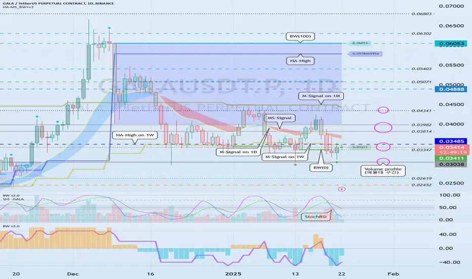
Example of how to use the Trend-Based Fib Extension tool
Hello, traders.
If you "Follow", you can always get new information quickly.
Please also click "Boost".
Have a nice day today.
-------------------------------------
There was a question about how to select the selection point when using the Trend-Based Fib Extension tool, so I will take the time to explain the method I use.
Since it is my method, it may be different from your method.
-
Before that, I will explain the difference from the general Fibonacci retracement tool.
The Fibonacci retracement tool uses the Fibonacci ratio as the ratio to be retracement within the selected range.
Therefore, the low and high points are likely to be the selection points.
The reason I say it is likely is because the lowest and highest points are different depending on which time frame chart it was drawn on.
Therefore, in order to use a chart tool that specifies a selection point like this, you must basically understand the arrangement of candles.
If you understand the arrangement of candles, you can draw the support and resistance points that make up it and determine the importance of those support and resistance points.
The HA-MS indicator that I am using is a more objective version of this.
Unlike the published HA-MS indicator, several have been added.
I do not plan to disclose the formulas of these added indicators yet.
However, if you share my ideas, you can use them normally at any time.
The selection point for using the current Fibonacci retracement tool is the point that the fingers are pointing to.
In other words, the 1st finger is the low point, and the 2nd finger is the high point.
One question may arise here.
Why is it the position of the 1st finger?
The reason is that it is the starting point of the current wave.
Therefore, you can find out the retracement ratio in the current rising wave.
In fact, it is not recommended to use the Fibonacci ratio as support and resistance.
This is because it is better to use the Fibonacci ratio to check how much wave is being reached and how much movement is being shown in chart analysis.
However, the Fibonacci ratio can be usefully used when the ATH or ATL is updated.
-
If the Fibonacci Retracement tool was a chart tool that found out the retracement ratio in the current wave, the Trend-Based Fib Extension tool can be said to be a chart tool that found out the extension ratio of the wave.
Therefore, while the Fibonacci Retracement tool requires you to specify two selection points, the Trend-Based Fib Extension tool requires you to specify three selection points.
That's how important it is to understand the arrangement of the candles.
The chart above is an example of drawing to find out the extension ratio of an uptrend
The chart above is an example of drawing to find out the extension ratio of a downtrend
Do you understand how the selection points are specified by looking at the example chart?
-
The chart above is the chart when the 1st finger point is selected.
The chart above is the chart when the 1-1 hand point is selected.
When drawing on a lower time frame chart, you should be careful about which point to select when the arrangement of the candles is ambiguous.
Examples include the 1st finger and the 1-1 finger.
It may be difficult to select 1-1 and 1 depending on whether they are interpreted as small waves or not.
The lower the time frame chart, the more difficult this selection becomes.
Therefore, it is recommended to draw on a higher time frame chart if possible.
The reason is that the Fibonacci ratio is a chart tool used to analyze charts.
In other words, it is not drawn for trading.
In order to trade, you trade based on whether there is support or resistance at the support and resistance points drawn on the 1M, 1W, and 1D charts.
-
Thank you for reading to the end.
I wish you successful trading.
--------------------------------------------------

I need objective information to help me interpret the chart
Hello, traders.
If you "Follow", you can always get new information quickly.
Please click "Boost" as well.
Have a nice day today.
-------------------------------------
With this decline, the BW(100) indicator was created at 104556.23.
Accordingly, the high boundary section is the 101947.24-104556.23 section.
Unfortunately, since it fell below 101947.24, the key is whether it can receive support near the MS-Signal (M-Signal on the 1D chart) indicator, i.e., around 98892.0, and rise.
If it falls below the MS-Signal (M-Signal on the 1D chart) indicator and shows resistance, it is highly likely to turn into a short-term downtrend.
-
The settings for the StochRSI indicator I use are 14, 7, 3, 3 (RSI, Stoch, K, D).
The source value is ohlc4.
If you set it as above, it will show a movement similar to the StochRSI indicator on my chart.
When the StochRSI indicator
- falls in the overbought zone,
- is located near the 50 point,
- rises in the oversold zone,
volatility is likely to occur.
However, you should check whether there is support near the support and resistance points drawn on the 1M, 1W, and 1D charts and think of a corresponding response plan.
Therefore, by checking the relationship between the movement of the StochRSI indicator and the support and resistance points drawn on the 1M, 1W, and 1D charts, you can choose the point where you can make a trade.
If you can calculate these selection points, I think it is highly likely that you will be able to create a trading strategy that suits your investment style.
It is good to predict future movements with trends or waves, but if you can calculate the point where you can actually make a trade, I think you can create a better trading strategy.
-
I wrote a long article, but
1. Will the StochRSI indicator fall in the overbought zone?
2. Will it receive support near the MS-Signal (M-Signal on the 1D chart) indicator?
3. Will it rise to the high boundary section?
You should focus on the three things above.
---------------------------------
The method of drawing support and resistance points is drawn according to the arrangement of candles.
This method can actually include subjective thoughts, so it requires skill.
Therefore, if possible, I recommend that you sign up as a paid member of TradingView and share my charts with me, and use the HA-High, HA-Low, BW(100), BW(0), OBV, +100, -100 indicators that appear on 1M, 1W, and 1D charts by the HA-MS_BW+v2 indicator as horizontal lines and use them as support and resistance points.
Then, even if others look at the charts, they will be easier to understand, and it will be easier to share opinions on trading strategies according to each other's investment styles.
By utilizing indicators that anyone can use in this way, you will be able to view the charts objectively.
If you trade based on what others tell you, you will likely not be able to respond quickly when sudden volatility occurs.
Therefore, when creating a trading strategy, you should roughly think about how to respond to all cases, both when it goes up and when it goes down.
That's why it's best to draw support and resistance points or other reference materials on your chart if possible and prepare countermeasures accordingly.
-
Thank you for reading to the end.
I hope you have a successful trade.
--------------------------------------------------

Example of Interpretation of USDT, USDC, BTC.D, USDT.D
Hello, traders.
If you "Follow", you can always get new information quickly.
Please also click "Boost".
Have a nice day today.
Trading Strategy
-------------------------------------
(USDT 1D chart)
USDT is a stable coin that has a great influence on the coin market.
Therefore, the gap decline of USDT is likely to have a negative impact on the coin market.
Since the gap decline means that funds have flowed out of the coin market, it can be interpreted that funds have currently flowed out through USDT.
(USDC 1D chart)
USDC cannot help but have a lower influence on the coin market than USDT.
The reason is that USDC markets are not operated in all exchanges around the world.
In other words, USDC can be seen as having limitations compared to USDT as an American investment capital.
Therefore, the gap increase of USDT is likely to have a short-term impact on the coin market.
----------------------------------
(BTC.D 1D chart)
You can refer to BTC dominance to choose which side (BTC, Alts) to trade in the coin market.
Since the rise in BTC dominance means that funds are concentrated on BTC, it can be interpreted that Alts are likely to gradually move sideways or show a downward trend.
For this interpretation to be meaningful, USDT dominance must show a downward trend.
(USDT.D 1D chart)
Because the decline in USDT dominance is likely to result in a rise in the coin market.
Therefore, if USDT dominance rises, it may be a good idea to pause all trading and take a look at the situation.
-
You can roughly figure out whether funds are flowing into or out of the coin market with USDT and USDC.
You can roughly figure out which direction the funds in the actual coin market are moving with BTC dominance and USDT dominance.
As I am writing this, BTC dominance is rising and USDT dominance is falling, so it is better to trade BTC rather than Alts.
-
Thank you for reading to the end.
I hope you have a successful trade.
--------------------------------------------------

Example of how to trade without chart analysis
Hello, traders.
If you "Follow", you can always get new information quickly.
Please also click "Boost".
Have a nice day today.
-------------------------------------
Since the coin market can be traded 24 hours a day, 365 days a year, gaps do not occur as often as in the stock market.
(However, gaps may occur frequently in exchanges with low trading volume.)
In any case, I think that these movements provide considerable usefulness in conducting transactions.
Sometimes I told you to buy when the price drops by -10% or more.
Today, I will tell you why.
--------------------------------------
In order to trade, you must have basic knowledge of charts.
Otherwise, you are likely to conduct transactions incorrectly due to volatility.
However, such cases are less common in the coin market than in the stock market.
One of the reasons is that the current coins (tokens) are not being used for actual business purposes.
So, I think there are quite a few issues that cause volatility other than charts like stocks.
-
If the price falls one day and falls by about -10% from the high before a new candle is created, I buy.
The next day, if it falls by about -10% from the high again, I buy again.
When it falls by about -10% like this, I continue to buy in installments.
That's why I need to adjust my investment ratio.
-
If I buy like that, there will come a point where my price rises more than the average unit price.
In that case, when I'm making a profit, I sell the amount corresponding to the purchase principal in installments and leave the number of coins (tokens) corresponding to the profit.
If you want cash profit, you can sell a certain portion in installments.
Also, on the contrary, when it rises by about +10%, we proceed with a split sale.
-
As shown in the example chart, you can see that there are not many cases where it rises by -10% or +10%.
However, since it occurs more often in the case of altcoins than in BTC or ETH, you should pay special attention to adjusting your investment ratio when trading altcoins.
That is why you must check the price fluctuation range 1-3 hours before a new candle is created on the 1D chart.
This method is a method that can be traded even if you lack knowledge about charts.
If you let go of your greed a little and have the ability to split sell when you are making a profit, you will be able to meet the moment when a crisis becomes an opportunity.
-
Thank you for reading to the end.
I hope you have a successful trade.
--------------------------------------------------

Example of how to select a volatility period
Hello, traders.
If you "Follow", you can always get new information quickly.
Please also click "Boost".
Have a nice day today.
-------------------------------------
The date that I am talking about as a volatility period refers to a period in which there may be a movement that may change the trend.
In other words, it means that there is a high possibility of creating a new wave as the volatility period passes.
Basically, the volatility period is expressed as an issue regarding the coin (token) or a global issue, but the volatility period that I am talking about is expressed by the support and resistance points and trend lines drawn on the chart.
-
The support and resistance points refer to the points drawn on the 1M, 1W, and 1D charts.
In other words, they refer to the points of the HA-Low, HA-High, BW(0), BW(100), and OBV indicators displayed on each chart.
When indicating support and resistance points, indicators connected to the current price candle are unconditionally drawn.
Also, indicators that are not expressed up to the current price candle are drawn starting from the one with the longest horizontal line.
Among indicators that are not expressed up to the current candle, horizontal lines expressed less than 5 candles are not drawn if possible.
If there are support and resistance lines that are expressed too closely, the support and resistance lines that are closest to the current candle are used.
-
The StochRSI indicator is used to draw a trend line.
When the StochRSI indicator enters the oversold or overbought zone and reverses, that is, when a peak is created, those points are connected and expressed.
Therefore, the peak created in the 20~80 range of the StochRSI indicator is ignored.
Therefore, the trend line is created by connecting the high and low points of the StochRSI indicator.
However, the high point connection line connects the opening price of the falling candle.
If there is no bearish candle at the peak of the StochRSI indicator, move to the right and use the first bearish candle.
When drawing the trendline for the first time, it is better to draw it from the vicinity where the current wave started.
If the StochRSI indicator has two peaks in the overbought or oversold area, use both when it leaves the overbought or oversold area and then re-enters it.
Otherwise, use only one peak at a time.
-
Draw support and resistance points and trendlines on each chart.
-
Find and mark points where trend lines or support and resistance points intersect at least two times.
The importance is determined in the order of trend lines drawn on the 1M chart > trend lines drawn on the 1W chart > trend lines drawn on the 1D chart.
Therefore, in order to express a period of volatility with a trend line drawn on the 1D chart, there must be at least two intersecting points.
In other words, there must be at least two intersecting points when indicating a period of volatility, such as when trend lines intersect each other or when trend lines intersect support and resistance points.
In addition, support and resistance points are also important in the order of 1M > 1W > 1D charts, so when they intersect with support and resistance points, they are selected according to this importance.
-
Then, if you hide the trend line, you will complete the chart showing the period of volatility.
-
When drawing for the first time,
1. When indicating support and resistance points, if you do not understand the arrangement of candles, it may be difficult to select.
2. It may be difficult to select the peak and candle of the StochRSI indicator.
3. It may be difficult to select which intersection point to select when indicating the volatility period.
Since you cannot get used to everything at once, it is recommended to draw and observe one by one and try to solve the difficulty of the next step once you get used to it.
-
The StochRSI indicator on this chart is an indicator whose formula has been changed from the basic StochRSI indicator.
Therefore, if possible, it is recommended to use the StochRSI indicator on my chart.
If you use your own StochRSI indicator,
Settings: 14, 7, 3, 3 (RSI, Stoch, K, D)
Source value: ohlc4
If you change the values above, it will be expressed similarly.
-
Thank you for reading to the end.
I wish you successful trading.
--------------------------------------------------

Example of creating a trading strategy chart
Hello, traders.
If you "Follow", you can always get new information quickly.
Please click "Boost" as well.
Have a nice day today.
-------------------------------------
To interpret the chart from a trend perspective, you can use the MS-Signal indicator.
The MS-Signal indicator consists of the M-Signal indicator and the S-Signal indicator.
Therefore, you can analyze the chart by checking the arrangement of the M-Signal indicator and the movement around it.
The most important thing in chart analysis is support and resistance points.
Therefore, if you do not indicate support and resistance points, it can be said that the chart analysis cannot be used for trading.
-
So, Fibonacci retracement and trend-based Fibonacci extension are widely used in chart analysis.
I used the Trend-Based Fib Extension tool.
I selected and displayed the low and high points pointed by the fingers.
The selection of the candles pointed by the fingers corresponds to the inflection points of the StochRSI indicator.
-
If you connect these, you get a trend line.
The important thing when drawing a trend line is to connect the high points of the StochRSI indicator by connecting the opening prices of the falling candles.
When connecting the low points, you can connect the low points regardless of whether it is a falling candle or an rising candle.
This is because I think it best expresses the trend and volatility period based on my experience using it.
When drawing the Fibonacci ratio and when drawing the trend line, the selection points are different, so you should draw it with this in mind.
-
If it is drawn as above, you can see that the chart is ready to be analyzed.
Since the channeling most commonly used in chart analysis has been formed, I think chart analysis will not be difficult.
However, the above method is a drawing for chart analysis, so it is not suitable for trading.
This is an important point.
If you are good at chart analysis, but wonder why you lose money when trading, you should change the drawing of support and resistance points.
Do not trade with Fibonacci ratios, but mark support and resistance points according to the candle arrangement on the 1M, 1W, and 1D charts and create a trading strategy according to their importance.
-
The chart above shows the support and resistance points drawn on the 1M, 1W, and 1D charts.
To display this, we used the HA-High, HA-Low, OBV 0, OBV Up, OBV Down, BW (100), Mid (50), BW (0) indicators.
To display the exact volatility period, we also need to draw a trend line on the 1M, 1W chart.
The indicators that are important for support and resistance points are HA-Low, HA-High, BW (100), BW (0).
Therefore, the point where the trend line intersects this point is likely to correspond to the volatility period.
It is not accurate because it is displayed only with the trend line that was created right away, but I think it explains well how to display the volatility period.
-
If you display the volatility period like this and hide all indicators, you will have a complete chart that can be used for trading.
-
Have a good time.
Thank you.
--------------------------------------------------
