1h

USDCHF - 1h• Time Interval: 1h
• Entry price: 0.90356 (54 Pips)
• Stop loss: 0.90564
• Take profit: 0.89813


USDCHF - 1h• Time Interval: 1h
• Entry price: 0.90799 (59 Pips)
• Stop loss: 0.91042
• Take profit: 0.90208

EURNZD 1H BEAR FLAG 2 SHORT TRADE SETUPSSETUP 1 SHORT TRADE
Enter with 1H Candle Close
below Bear Flag Bottom
SETUP 2 SHORT TRADE
Enter with 1H Candle Close
below Support level @ 1.8056
Measure TP for both trades
@ 1.7976
SL above Swing High

USDCAD - 1h• Time Interval: 1h
• Entry price: 1.33110 (178 Pips)
• Stop loss: 1.33798
• Take profit: 1.31325


EURUSD - 1h• Time Interval: 1h
• Entry price: 1.17884 (109 Pips)
• Stop loss: 1.17266
• Take profit: 1.18977

EU 1H 50% Retracement Entry on multiple time framesUsing the analysis from the 50% retracement strategy on the 1H time frame I have entered on the 1m TF using the same retracement strategy. This allows me to enter with a significantly smaller stop loss and in turn the ability to become risk free in a far shorter space of time


The line in the sandPRICE HAS REACHED A CRITICAL LEVEL!
The Bears need an injection of new shorts to continue the bear trend from the Financial crises of 2008.
The Bulls require an injection of new longs to counter the renewed bearish sentiment.
Moving to lower time frames, Price Action begins to show the significance of this level.

BCHUSD 1H BEST MOMENTUM TRADING STRATEGYThe Best Momentum Trading Strategy using the Best Forex Momentum Indicator
Our team at Trading Strategy Guides believes that smart trading is the way to build the best momentum trading strategy. In this regard, we don’t want to predict when the momentum will happen, but we let the market tips his hands and then react.
One principle of the momentum indicator strategy is, “buy high to go higher” and “sell low to go lower.” In other words, we trade in the direction of the trend while having the momentum on our side. Also read the hidden secrets of moving average.
Moving forward, we present the buy side rules of the best momentum trading strategy.
Step #1: Define the Trend. An Uptrend is defined by a Series of HH Followed by a Series of HL.
The definition of an uptrend is pretty much standard. In an uptrend, we look for a series of higher highs followed by a series of higher lows. Two HH followed by at least another two HL is enough to define an uptrend.
A higher high is simply a swing high point that is higher than the previous swing high. While a higher low is simply a swing low that is higher than the previous swing low.
All momentum traders know that the trend is our friend. But without momentum behind the trend, we might actually not have any trend.
For active traders, we also look at the actual price action in order to gauge momentum. Besides reading the best forex momentum indicator.
Step #2: In an Uptrend Look for Bold Candlesticks that Close Near the Higher End of the Candlestick .
A technical analysis concept is that you want to use multiple confirmation signs when buying and selling. This will increase the likelihood that’s a high probability trading setup.
In this regard, the momentum trading strategy besides using the best Forex momentum indicator, also incorporates the price action.
A practical way to read momentum from a price chart is to simply look at the candlestick length. What we want to see in an uptrend is big, bold bullish candlesticks that close near the higher end of the candlestick.
In the figure above, we have an ideal representation of what we’re looking for. The upside price movement is preceded by big bullish candlesticks. This confirms the momentum behind the trend.
Now, it’s time to focus on the Williams %R. This is the best forex momentum indicator. Which brings us to the next step of our momentum indicator strategy.
Step #3: Wait for the best Forex Momentum Indicator to get oversold (below -80). Then rallies above the -50 level before Buying .
We’re going to use Williams %R, the best forex momentum indicator in a smart way. In an uptrend, we buy after the best forex momentum indicator has reached oversold conditions (below -80). And then rallied back above the -50 level.
Now, we have confirmation from both the price and the best forex momentum indicator. The real momentum is behind this trend and the probabilities are in favor of more upside prices from here on.
Note* If the best forex momentum indicator continually stays in overbought territory (above -20 level), it signals a strong momentum and conversely a strong trend. Inversely the same is true in a downtrend.
The next important thing we need to establish is where to place our protective stop loss.
Step #4: Place Your Protective Stop Loss below the Recent Higher Low.
We want to hide our protective stop loss. It is below the most recent higher low level that formed right before the best momentum trading strategy issue the buy signal.
Alternatively, you can also trail your stop loss below each most recent higher low. This strategy will allow you to lock-in the potential profits in case of a sudden market reversal.
Last but not least the momentum indicator strategy also needs a place where we need to take profits, which brings us to the last step of the best momentum trading strategy.
Step #5: Take Profit once we break below the Previous Higher Low
A trend in motion can stay in that state longer than anyone can anticipate. And since we want to maximize our potential profits we let the market tips it hands before liquidating our trades. In this regard, we look for a break in the trend structure. Respectively a break below the most recent higher low.
Alternatively, you can take profit once the best forex momentum indicator breaks below the -50 level.
Note** The above was an example of a BUY trade using the Best Momentum Trading Strategy. Use the same rules for a SELL trade.
Summary
The best momentum trading strategy leverages the tendency of a market’s price to continue moving in a single direction. This is where the momentum might be upwards or downwards. In essence, market timing is crucial for a momentum indicator strategy. And in this regard, we incorporated the best Forex momentum indicator (Williams %R) in our momentum strategy. Here are some of the trading conditions you want to avoid in the forex market.
Timing the market can be a daunting task. But our team at Trading Strategy Guides believes that using a pure price action can get you a long way.


USDJPY BEARISH TO THE INITIAL MOVEMENTUSDJPY Bearish, the final target is the initial movement. RSI is on 50 level in a downtrend

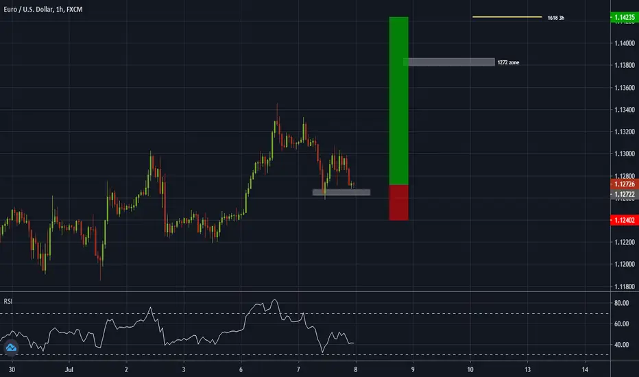
EURUSD BULLISH IMPULSEEURUSD Is on correction, prepared to do the last bullish impulse to 161,8 fibonnaci
GBPJPY 4H 15M RABBIT TRAIL CHANNEL TRADING STRATEGY LONG TRADERule #1: Draw a channel on a 1 or 4 hour chart.
Rule #2 Identify If there is a Breakout on 1 hour or 4 hour chart.
Rule #3 Wait for a Pull Back on a 15 minute Chart.
Rule #4 After Pull Back on 15m, Make Entry.
Rule #5 Find a Stop Loss Placement.
Rule #6 Ride The Rabbit Trail to 50 pips with a TP Order!
Rule #1: Draw a channel on a 1 hour or 4 hour chart.
The first thing you need to do to get this strategy started off is you need to find a channel on a
four hour or one hour chart. Remember there must be two resistance and support points to
validate a channel.
This strategy can use many currency pairs. Make sure you search through all of them. Many say
that they “only trade EURUSD.” There is no reason for that..
Get in the charts and see for yourself! There are channels everywhere. This strategy will work
with any currency pair. The opportunities are endless..
Not too bad. So basically all you are doing here is drawing parallel lines on the tops and
bottoms of the price movement. This example hit a quite a few resistance and support levels
which means that when it breaks this channel it has the potential to make a huge move!
Rule #2 Identify If there is a Breakout on a 1 hour
chart.
The way you find the trade is to find a breakout of the channel that you drew on your chart..
In a perfect world the support and resistance levels will hold on forever..
But the world isn’t perfect..
So that’s why we have what is called a breakout.
This breakout happened on the top of the channel. So that means you will BUY.
If the breakout happens on the bottom of the channel then you will SELL.
Great! We have breakout candle let’s get in the trade and follow the rabbit trail to pip glory!
Rule #3 Wait for a Pull Back on a 15 minute Chart.
Why wait? Because the market is money grabbing machine, and they want your hard earned
cash!
You wait because sometimes the market does a “head fake” and turns against you.
So if you would have got in this trade right when it broke out of the channel you would soon
have got stopped out.
That is why it is so important to Wait for it to pull back.
This is where many people struggle. They see that it broke out so they want to click BUY or
SELL right now!!!
Think about the sayings you have heard since you were a child, “Patience is a Virtue,” Or “Good
things in life take Time”
Just be patient and wait…
This trade would not have burned you, but countless other trades would have!
Think about the pull back as the candle that closes towards the channel. So if the pull back is
above the channel you are looking for a bearish (red) candle. If the pull back is below the
channel you are looking for a bullish (green) candle.
*We only need one of these pull back candles on a 15 minute chart. Once this happens
move on to the next step.
Rule #4 After Pull Back, Make Entry.
We are getting so close to getting on our rabbit trail to make some serious pips!
Our lines are drawn, we identified the breakout, and waited for the pull back. It is now time to
make our trade.
The criteria to make an entry after a pull back on a 15 minute chart to enter a trade is that there
must be two 15-minute candles that support our trade.
If it is a BUY trade we want to see TWO bullish (up) candles after the pull back.
If it is a SELL trade we want to see TWO bearish (down) candles after the pull back.
Enter after the two bullish 15 minute candlesticks close.
So again, we WAIT for a pull back candle to close and then we need two BULLISH (green)
candles to close to many an entry.
Rule #5 Stop Loss Placement
This is probably one of the most important rules of the strategy.
You always need to place a stop loss somewhere for a reason. If you are throwing in stop
losses 5 to 10 pips from your entry order just because someone you read that somewhere, then
you are without a doubt treading some dangerous waters.
In a Buy The stop loss will be placed in the channel below the last support point.
In a SELL The stop loss will be placed in the channel above the last resistance point.
That way if it does come back in the Channel it will hit the support level and end up going back
up in a bullish movement.
Rule #6 Ride The Rabbit Trail to 50 pips!
The last thing you need to do is know when to exit the trade.
This strategy goes for a 50 pip target.
So when you make your entry, you calculate 50 pips take profit mark and place it.
The rabbit trail may be 2 hours, or could take as long as two days. You have your target so
really you have nothing else to do but sit back and watch your trade make you some money!
Stay in the trade and remember your rules. You are going for a 50 pip breakout trade!

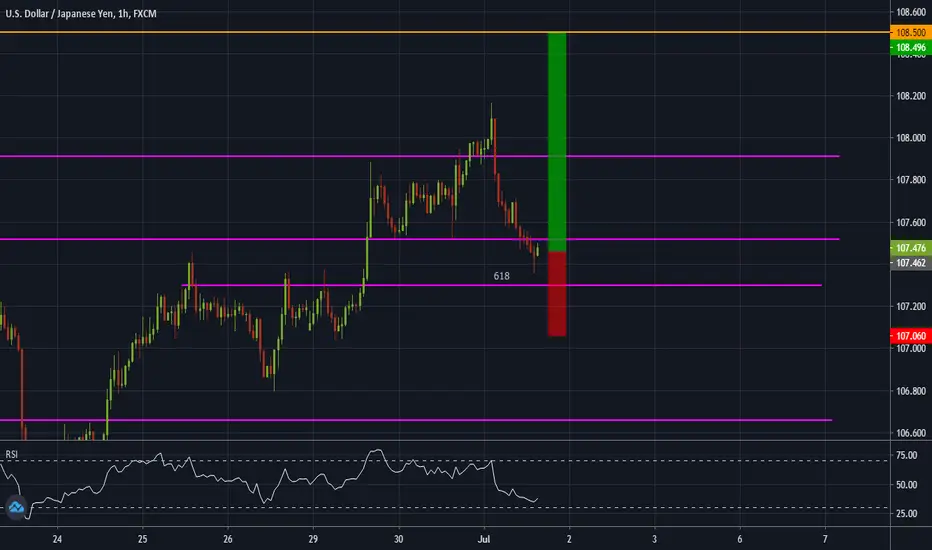
USDJPY BULLISHUSDJPY Is near 61.8 retracement of second wave. The price can reach the price 108.500 as last target

Short trade on EUR/USD 1HHi. There is might be a short setup for EUR/USD.
We have overbought on Stoch and cross k% & D%.
We have a nice resistance level on 1.1303


EURUSD 1H VOLUME TRADING STRATEGY LONG TRADEVolume Trading Strategy
This volume trading strategy uses two very powerful techniques that you won’t see written anywhere else. These are trade secrets that we’ve only been taught to professional traders.
The Chaikin indicator will dramatically improve your timing and teach you how to trade defensively. Having a good defense when trading is absolutely critical to keep the profits that you’ve earned.
In this article, we’re going to look at the buy side.
The Importance of Buying Volume and Selling Volume
Volume trading requires you to pay careful attention to the forces of supply in demand.
Volume traders will look for instances of increased buying or selling orders. They also pay attention to current price trends and potential price movements.
Generally, increased trading volume will lean heavily towards buy orders. These positive volume trends will prompt traders to open a new position.
On the other hand, if the cash flow and trading volumes decrease– we see a “bearish divergence”, meaning that it will likely be an appropriate time to sell.
You also need to pay attention to the relative volume—regardless of the raw number of transactions occurring in a trading period. Ask yourself how is the prospective asset performing relative to what was expected?
By learning how to use the Chaikin money flow and other relevant indicators, you will easily be able to identify whether the buyer or the seller is currently “in control.”
With practice, volume trading strategies can yield wins for your portfolio 77% of the time!
Step #1: Chaikin Volume Indicator must shoot up in a straight line from below zero (minimum -0.15) to above the zero line (minimum +0.15).
When the Volume goes from negative to positive in a strong fashion way it has the potential to signal strong institutional buying power. That’s our base heavy lifting signal!
Basically, we let the market to reveal its intentions.
When big money steps into the market, they leave a mark as their orders are so big that it’s impossible to hide. When the volume indicator Forex goes straight from below zero to above the zero line and beyond, it shows accumulation by smart money.
We’re a firm believer that you get the maximum bang for your buck when you trade side by side with smart money. Chances are that institutions have more money and more resources at their disposal. Odds can be stacked against you, so if you want to change that, just follow the smart money.
There is one more condition that needs to be satisfied to confirm a trade entry.
Step #2: Wait for the Volume Indicator Forex to slowly pullback below the zero line. The price needs to remain above the previous swing low.
Once we spotted the elephant in the room, aka the institutional players, we start to look for the first sign of market weakness. Here is how to identify the right swing to boost your profit.
We’re going to let the Chaikin Money Flow indicator slowly drop below the zero line. The keyword here is “slowly”. We don’t want to see the volume dropping fast because this will invalidate the accumulation noted previously.
Second, as the volume decreases and drops below the zero, we want to make sure the price remains above the previous swing glow. This will confirm the smart money accumulation.
The Volume strategy satisfies all the required trading conditions, which means that we can move forward and outline what is the trigger condition for our entry strategy.
Step #3: Buy once the Chaikin Forex indicator breaks back above the zero line. Wait for the candle to close before pulling the trigger.
Now that we have observed real institutional money coming into the market, we wait for them to step back in and drive the market back up.
When the Chaikin indicator breaks back above zero, it signals an imminent rally as the smart money is trying to markup the price again.
We would need to wait for the candle close to confirm the Chaikin break above the zero line. Once everything aligns, we’re free to open our long position.
*Note: The trigger candle needs to have the closing price in the upper 25%.
This brings us to the next important step. We need to establish the Chaikin trading strategy which is finding where to place our protective stop loss.
Step #4: Hide your protective Stop Loss under the previous pullback’s low
Using a stop loss is crucial if you want to have an idea of how much you’re about to lose on your trade. Never underestimate the power of placing a stop loss as it can be lifesaving.
Simply hide your protective stop loss under the previous pullback’s low. Never use a mental stop loss, and always commit an SL right at the moment you open your trades.
Trading with a tight stop loss can give you the opportunity to not just have a better risk to reward ratio, but also to trade a bigger lot size.
Step #5: Take profit when the Chaikin Volume drops below -0.15
Once the Chaikin volume drops back below -0.15, it indicates that the sellers are stepping in and we want to take profits. We don’t want to risk giving back some of the profits gained so we liquidate our position at the first sign of the smart money stepping in on the other side of the market.
We always can get back into the market later if the smart money buyers show up again.
**Note: The above was an example of a BUY trade using the best volume indicator. Use the same rules for a SELL trade – but in reverse.
Conclusion – Best Volume Indicator
The Volume Trading Strategy will continue to work in the future because it’s based on how the markets move up and down. Any market moves from an accumulation (distribution) or base to a breakout and so forth. This is how the markets have been moving for over 100 years.
Smart money always seeks to mask their trading activities, but their footprints are still visible. We can read those marks by using the proper tools.
Make sure you follow this step-by-step guide to properly read the Forex volume. The Chaikin indicator will add additional value to your trading because you now have a window into the volume activity the same way you have when you trade stocks.
Volume Indicator Forex
In the Forex market, we don’t have a centralized exchange of total volume because we’re trading over the counter. If we look at any trading platform like TradingView, they have a volume attached to their chart. But, since we don’t have a centralized exchange that volume is coming from the feed that TradingView uses. Each retail Forex broker will have their own aggregate trading volume.
We can see that the volume in the Forex market is segmented, which is the reason why we need to use our best volume indicator.
The Volume indicator Forex used to read a volume in the Forex market is the Chaikin Money Flow indicator (CMF).
The Chaikin Money Flow indicator was developed by trading guru Marc Chaikin, who was coached by the most successful institutional investors in the world.
The reason Chaikin Money Flow is the best volume and classical volume indicator is that it measures institutional accumulation-distribution.
Typically on a rally, the Chaikin volume indicator should be above the zero line. Conversely, on sell-offs, the Chaikin volume indicator should be below the zero line.


