Volume Spread Analysis - Understanding Traps & ConfirmationDespite the fact that the so-called “Big Players” in the game of ups and downs we call the market have the power to manipulate it in ways some cannot even imagine, what they ultimately seek is a healthy market. I’ve mentioned in previous posts that the market behaves like a living organism — and like any organism, it must be healthy in order to grow.
In simple terms, the traps institutional players set are there because they need cash flow — liquidity — to achieve that growth. But why do they need to use traps at all? The answer lies in the numbers: one institutional player is equivalent to hundreds, if not thousands, of uninformed or poorly trained retail traders. So, to sustain growth, they are not just inclined but sometimes forced to create traps.
Now imagine this: in a market with enormous capital, one big player is equivalent to 100 retail traders. If 25% of those traders were skilled — truly good at the game — think of how much more cash flow would occur, and how much healthier and more stable that growth could be.
But don’t be fooled — while big players may benefit from a small portion of skilled retail participants, it’s not their actual goal. Still, it wouldn't hurt them either, as long as liquidity and volatility are preserved. In fact, a higher percentage of skilled players could deepen liquidity and reduce the need for extreme manipulation.
However, if too many retail traders become skilled, the game tightens. Profit margins shrink. The edge that institutions hold becomes harder to maintain. And in such a scenario, consistent profitability becomes more difficult — for everyone.
As I’ve emphasized in previous ideas, there is a way to understand institutional traps — and one of the keys is learning how to interpret the Relative Strength Index (RSI) properly. However, since RSI is by nature an oscillator, its signals require confirmation. And what better tool to use for confirmation than Volume — specifically through the lens of Volume Spread Analysis (VSA)?
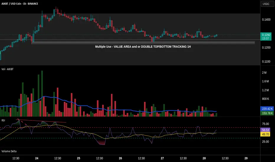
In this post, we’ll partially explore how these traps are revealed, using basic tools available on TradingView. We'll also uncover a potential trap in the chart of AIXBT/USD Coin from Binance, using the 1-hour time-frame.
🔹 1. Pre-Top Volume Cluster
Let’s begin at the very top of the chart. Just before this top, we can spot a bullish volume cluster — four consecutive volume spikes with rising price. In VSA, such a cluster often suggests that the current trend is reaching exhaustion.
⚠️ Important Note: Not all clusters mark a reversal. Even if we see one or two bearish candlesticks after-ward — even if they are engulfing — that alone does not confirm the reversal. The real signs are already present in the volume indicator.
As I’ve said in the past, in previously posted ideas: Big Players always leave footprints. Learning to read those footprints is the language every serious retail trader must eventually understand. And one of the clearest footprints is what we’ll discuss next.
🔻 2. The Buying Climax
A Buying Climax is a tell-tale sign of professional distribution — it appears (in our case) as a large bullish volume spike accompanied by a bearish candlestick, signaling the potential end of a rally.
In our AIXBT/USD Coin chart, we observe two buying climaxes:
• The first comes at the end of the bullish volume cluster, followed by a bearish candle.
• The second follows right after, repeating the same bearish confirmation.
🧠 Even though price was making a new Higher High — these repeated climaxes on increasing volume suggest supply is entering the market, and the uptrend is likely unsustainable.
✅ Conclusion
This is just one piece of the larger puzzle, but even basic tools like RSI and Volume, when read in the context of structure and intent, can reveal traps set by institutional hands. The more we train ourselves to see these signs, the closer we get to trading in harmony with the market’s true rhythm — not against it.
Now let’s take a look at another signal that hints at a possible reversal. But before we continue, keep in mind: what I’m about to describe doesn’t always play out in the simplified way I’ll mention here. The market behaves differently at any given moment — so this kind of analysis always requires a careful and adaptive approach.
This time, I’m referring to a smaller bearish cluster, made up of three volume spikes, each of them clearly above the 20-period Moving Average — and appearing just before the bullish cluster I highlighted earlier.
• The fact that the first spike in this bearish group breaks above the MA is a strong signal that bearish pressure is stepping in.
• The fact that all three spikes remain above the MA adds weight to that signal.
However — and this is crucial — just like I mentioned before, this alone doesn't confirm a reversal. It still requires confirmation.
Even though this smaller bearish cluster forms a new low, and even though it aligns with a bearish RSI divergence marked with a dashed trend line, it’s not a signal to enter a trade. Why? Because volume confirmation is missing. And that's exactly why RSI alone isn't enough. It can point to weakness — but not confirm the turn.
True confirmation only comes with the next bullish volume spike, which:
• a) breaks above the MA,
• b) is higher than the first bearish spike in the previous cluster,
• c) appears with an engulfing candlestick, and
• d) is supported by an RSI plot that follows the move.
This collective behavior — the interaction between price, volume, and momentum — is not random. It’s one of the many harmonies that exist in the market’s structure. And learning to recognize these harmonies is key to understanding when the market is genuine — and when it's trying to trap you.
🔚 Conclusion
All of this leads me to one conclusion — based not just on theory, but on direct experience.
We’ve all seen the countless videos across platforms where retail traders explain things like RSI divergences as if they’re guaranteed signals. But the truth is: not all of these videos are made by successful traders — and blindly following them can be dangerous.
Early in my trading journey, I made that exact mistake. I followed those “educational” videos without question, and nearly blew my account in the process.
Can you imagine what would happen if someone entered a trade solely based on the divergence we discussed — without waiting for confirmation?
If you’ve followed this chart example to its end, you already know the answer.
Worse, this kind of psychological frustration often leads to even bigger mistakes — especially if you haven’t applied one of the simplest protective tools: the Stop Loss. And sadly, many traders skip it.
So let this be a reminder:
A divergence is not a signal. Confirmation is everything.
Let’s now take things a step deeper — by partially revealing something that remains known only to a small circle of elite traders.
Something that’s rarely discussed in public — yet sits hidden in plain sight.
Many traders know that Volume Spread Analysis (VSA) is based on the teachings of Richard Wyckoff and expanded through Tom Williams in Master the Markets. And yes — the most of VSA’s power comes from those principles.
But that’s only part of the story. What did these two big names revealing in secret code using multiple paragraphs and terminologies, but purposely do not reveal it in simple words in a few lines. And they are doing the right thing. Because if I said to myself that if everyone knew that then the market might crashed, then for sure they had that thought as well
What truly sets VSA apart, and what gives it its real power, is that it operates in two distinct languages.
🧩 The Hidden Language of VSA — What Most Don’t See
Let’s now go a step deeper — by partially revealing something known only to a few traders who’ve spent enough time observing the market beyond surface-level signals.
Something that’s often overlooked, yet has always been in plain sight.
We all know that VSA stands for Volume Spread Analysis.
And we commonly refer to “spread” as the distance between the open and the close of a candlestick. This is what many traders fixate on — the relationship between price movement and volume.
But that’s only part of the story.
What did names like Wyckoff and Tom Williams really reveal?
They spoke in code — long paragraphs, obscure terminology, layered ideas — never quite saying "this is the hidden key" in a few plain words.
And they were right to do so.
Because I’ve thought the same thing myself:
If everyone knew this… if it was simplified and passed around like a hack… the market could collapse into chaos.
If I’ve had that thought, I’m certain they did too.
So instead, they left trails. Patterns. Puzzles.
They left the second language in the open — but made sure only those with patience, discipline, and time in the charts would ever truly hear it.
There are things the open and close can’t tell you, but...
That… is part of what I meant earlier when I said VSA speaks in two languages.
Some of you already sense what I’m pointing toward.
For the rest — keep watching.
You’ll know it when you see it.
And once you do, you’ll never unsee it again.
Let’s begin with what most traders already know.
We say "spread" in VSA to refer to the range between the open and the close of a candlestick. This spread, in relation to volume, tells us whether a candle shows strength or weakness.
• A wide spread on high volume may signal professional activity.
• A narrow spread on high volume could suggest absorption or hidden effort.
This is the first language — the most commonly taught, and the most widely shared.
But what about the second?
Here's where things get interesting.
Let’s revisit our AIXBT/USD Coin chart, and specifically the large engulfing candlestick that forms around 18:30, just after the very top.
Now ask yourself:
• 🔍 Where did this candle open?
• 📍 What previous zone did it revisit or retest? What’s the story behind on that retest?
• Have you noticed the macro scale Hidden bearish divergence between RSI & PA?
What you're seeing is not just a rejection.
It’s a trigger zone — a price level left behind earlier by institutional activity.
This candle, with its precise open, combined with the volume behavior, is no coincidence. It's not just a rejection — it's a setup, part of a pre-engineered trap. By stealing what Tom Williams said: Big players are simply saying to uninformed traders – “thank you for your money”.
The interaction of price levels over time, the zones formed by previous activity, and how volume behavior aligns with those zones to signal intent.
Most traders never see this and even fewer can interpret it.
Why This Matters
That engulfing candlestick is not just a visual cue — it's a multiple level footprint.
It confirms everything we discussed earlier about how the market is manipulated — often in ways most traders can’t even begin to imagine. Two opposite forces within a zone. One prevails while the other reveals a future!
So now, let this sink in:
To truly master VSA, one must learn to read both languages.
The visible structure, and the hidden context.
One without the other is incomplete.
Now you know why Confirmation is so crucial.
That’s all for now. I hope that all the above paragraphs were able to give you a hint of how things work! And remember: Everything I write is just a small glimpse of the whole that needs to be considered.
Until next time — stay safe, trade wisely, and never stop learning.
Absorption

Understanding Buying Climax, Stop, and Spring in VSAMastering Institutional Trading: Understanding Buying Climax, Stop, and Spring in Volume Spread Analysis (VSA)
Observation – Understanding Buying Climax, Stop, and Spring in Market Structure
A buying climax (BC) occurs when price surges sharply alongside high trading volume, signaling strong buying activity. However, this aggressive move often exhausts demand, leading to a stop, where price movement either pauses or begins to reverse. At this point, the market assesses whether buyers can sustain the uptrend or if selling pressure will take over.
In Volume Spread Analysis (VSA), a classic sequence is:
1. Buying Climax (BC): A sharp move up with high volume.
2. Stop Bar: Price consolidation or minor pullback after the climax.
3. Spring Bar: A downward shakeout followed by a reversal, indicating the presence of renewed buying interest.
A spring bar after a stop is a bullish signal, suggesting that previous selling pressure has been absorbed and institutions may be accumulating positions. If confirmed by a strong up bar with high volume, this signals a potential breakout, as it demonstrates that buyers are stepping back into the market.
The strength of the bar following the spring is crucial. A wide-range bullish candle with rising volume confirms that buying pressure is resuming, increasing the probability of an uptrend continuation. However, weak volume or failure to clear key resistance levels can indicate a fakeout, leading to further downside.
🔥 XAUMO Institutional Analysis – Gold (XAU/USD) Tokyo Session (Feb 18, 2025)
Market Context – Tokyo Session vs. Prior Market Structure
📍 Current Price: $2,902.98
📍 Key Institutional Levels from Yesterday:
• Resistance Rejection: $2,906.30 (VSA Liquidity High)
• Support Zone: $2,891.67 - $2,888.11 (Institutional Demand Area)
• XAUMO 2RC/Black Swan Stop Zones: $2,892.92 (Key Bullish Trigger or Stop Hunt Zone)
Tokyo Session Key Observations
✅ Buying Climax (BC) → Strong price rally with high volume.
✅ Stop Bar Formation → Market paused following the aggressive buying.
✅ Spring Bar Emergence → Potential bullish reversal structure forming.
✅ VSA Condition: Neutral → The market is in transition; no clear trend yet.
✅ Volume Change: -10.7% (Slight decline, indicating caution among buyers).
✅ Spread Change: +23.27% (Wide price movements suggest liquidity testing by institutions).
📊 XAUMO Institutional Breakdown – Understanding Buying Climax & Spring
1️⃣ Buying Climax (BC) – Institutional Aggression & Liquidity Test
🔹 Yesterday, price reached resistance at $2,906.30 and pulled back.
🔹 A sharp rally (BC) on high volume suggested aggressive buying by institutions.
🔹 Liquidity was likely absorbed in the $2,892.92 - $2,891.67 range before the price pushed back up.
📌 XAUMO Key Takeaways:
• A buying climax signals strong demand, but the pause suggests Smart Money is evaluating the next move.
• The next confirmation move is crucial—continuation or reversal depends on volume and structure.
2️⃣ Stop Bar – Institutional Liquidity Testing
🔹 After the BC, price stalled and formed a stop bar (consolidation).
🔹 This stop represents either accumulation (buying) or distribution (selling).
📌 XAUMO Key Takeaways:
• Break below $2,892.92 → Indicates deeper liquidity absorption; potential downside continuation.
• Holding above $2,891.67 → Suggests institutions are accumulating for a bullish breakout.
3️⃣ Spring Bar – The Institutional Shakeout Before a Move?
🔹 Price dipped towards $2,891.67 before rebounding—forming a spring bar.
🔹 This can be a bullish signal, but confirmation is needed.
📌 XAUMO Key Takeaways:
• If the next candle is a strong up bar with increasing volume → Confirms bullish continuation.
• If the price struggles above $2,905+ or volume remains weak → Expect a fakeout and potential dump.
🚀 XAUMO Institutional Trade Plan – Tokyo Session Execution
📈 Scenario 1: Bullish Breakout (Spring Confirmation & Volume Increases)
💰 Buy XAU/USD @ $2,903.50 - $2,905
📍 Stop Loss: $2,892.92 (Institutional Stop Zone)
🎯 Target Levels:
1️⃣ $2,910
2️⃣ $2,916
3️⃣ $2,923
✅ Probability: 75%
📌 Why?
• The spring bar bounced from liquidity → Possible upside confirmation.
• If the next bar shows strength, buyers are stepping in → Expect breakout above $2,906.
📉 Scenario 2: Bearish Rejection (Failure at $2,905 - $2,906 Again)
💰 Sell XAU/USD @ $2,905
📍 Stop Loss: $2,910
🎯 Target Levels:
1️⃣ $2,895
2️⃣ $2,892
3️⃣ $2,888
✅ Probability: 70%
📌 Why?
• If price rejects resistance at $2,906.30, Smart Money is distributing positions.
• Volume drop (-10.7%) suggests buyers aren’t fully committed.
• Break below $2,892.92 could trigger more sell pressure towards $2,888.
📢 XAUMO Execution Strategy – Final Institutional Outlook
✅ Next hourly bar confirmation is critical → The spring must be followed by a strong up bar for a bullish breakout.
✅ If price holds $2,892 - $2,891.67, upside potential remains valid.
✅ If price fails at $2,906 and volume weakens, expect another rejection and potential downside move.
🔥 Smart Money moves strategically—wait for confirmation before entering! 🚀
📖 XAUMO Institutional Strategy – Simplified for Beginners
1️⃣ Buying Climax (BC): The price surges fast, attracting late buyers, but Smart Money is already planning their next move.
2️⃣ Stop Bar: The price pauses or reverses. This is where institutions test liquidity to see if there’s enough demand for a move higher.
3️⃣ Spring Bar: A small drop that shakes out weak traders before a possible reversal. If confirmed, it means Smart Money is accumulating.
🔹 Next Step?
• If buyers come back strong, price breaks higher (bullish).
• If volume remains weak, Smart Money sells into the rally, and price drops again (bearish).
💡 Tip: Don’t rush in! Institutions don’t reveal their moves immediately—wait for confirmation before entering a trade. 🚀

QS one to put in the booksYes they are dirt cheap and have been but this company is in position to have explosive results. They are operating right now at a negative balance per year. However They have somewhere around $821 million to use for R&D and just signed a deal with one of The V named Car Companies I want to say Volkswagen.
-QuantumScape (NYSE:QS) soared by more than 20% in trading on Thursday after the company announced that it has entered into a collaboration with Volkswagen’s (OTC:VWAGY) battery unit PowerCo....
There you have it. The kick is I was in an option play on this when it was still Low $5 and it leaped to +$6.
Because of this (I know all those lines its going to give me a seizure. or it looks like spaghetti.) To anyone that doesnt like the indicator let me say this. It makes me money. And I am not the only one that understands it now. ChatGPT can read it too. So know there are at least two smart people in the world that appreciate this indicator.
Using the indicator I can find quickly Everything I need to know about a company just by waiting for specific conditions to align.
I think this stock hits double digits in the next 3 months if not sooner.
That Said I NEVER talk about stocks that are less then Bili. Bili Bili is the cheapest company I will talk about because its proven to hit $30 and come back to low Teens several times a year.
So for me to post an idea on this, really says a lot.
The indicator, timing of the news after the signals. The Pop to $6 to show its going into expansion phase. Its all aligning.
by iCantw84it
01.02.25

Short ES on Absorption at 5536With the selloff at the beginning of trading Sunday night June 23rd, ES is at risk of the "three bar reversal". I think ES will need some work to find a bottom before pushing higher.
There is a large block of resting liquidity after the selloff between 5532-5536. I am playing an Absorption Reversal after that liquidity is grabbed back to the downside. Stop loss is at 5540, take profit at 5526 for a 2:1 RR.

SPX500 - Absorption takes time .. takes placeThe Weis-methods shows clearly that the ice is tested for a following up-move.
-first lines converged
-strong down movement cutting the chanel
-a strong spring acoured and brought the price to the highest point and threw the strong midpoint like a hot knife cutting butter
-actually the midpoint is tested

Li Auto is about to manipulate the highs it made a year ago!I annotated this chart so hard this time and I know its annoying to look at...but you have your own clean screens to look at it... This should atleast explain what I see and help those who don't know, what to look for. I accidentally came across this chart because I was trying to type bili bili but when i saw the chart with my ESVO lines on it I was like I have to play it. So for me this is just an update to this play that I got into a week ago. Obviously it looks a lot better now that we are here. And I never once thought my bias was wrong as you can tell it didn't want to dump. Because if it did want to it would have. The price was always withing a dollar or a dollar and change to the entry. Now that it has come back to this area I broke down everything the lines are telling me plus everything I see with the amount of space that I have to work with. I could go into about 5 other kinds of trading styles and break those down but I figure I will just leave it at this. Its bullish! All the other stocks in the group are moving with it. So that tells me that big money has been fostering this group of stocks to get it to this point over the last year or less. Since the last highest high.
So that should tell you there is a pile of shorts up there that need to be covered for them to continue this move up above that. unless there is a massive surge of volume it might take a while to consolidate all of them. I will be looking for a trend line that this will be tapping into over the duration of this move. And also a trend change which shows that liquidation of shares has begone and that we should be looking for an exit.
I do think this could take another 3-6 months to complete. all of the hot areas for this stock are marked on this chart with the exception of the three just below our current price.
And Current Price of HKEX:26 this weeks highest volume area
$24 Automatic, Session, Daily, Highest High
HKEX:23 Daily. Weekly
HKEX:22 Highest Low
all great supports as they are all stacked under us.
If nothing else I think we should hit HKEX:30 however, HKEX:38 and $41.50 are also huge areas of untapped stop losses and pockets of retailers waiting.
by iCantw84it
04.17.23

***Bili Put Update**** Had to take profits.Sorry, I know I said I was sticking this in but it wasn't until the final moments of the market that it finally finished a reaccumulation....where it had not been able to even come close in the last couple of days. When it started to form I was charting it out which you can see the starts of in the previous video. But again it wasn't ready or even looked ready until the last 5 mins of the market. I ended up using the same trick as the one I used on the TRKA video where I showed absorption and the how the market responds to it as it explodes upward. So if you want to see that video check out the related video.
Price target going up is $21.60 then I think we retest this low.
Again if you are intrigued by anything I am showing you. Please Like Follow and of course hit the Boost button as thats the only way people can find my videos.
by iCantw84it
04.05.23

TRKA Can it get out of the low .20s? Absorption Pop!TRKA was setting up to make a move that was going to pop so I had to jump on real quick to catch it. Using Volume and price you can find synergy in between the two and watch for when the set up is about to capitalize on everything it had set up. We are talking about institutional trading and algo trading. Using the ESVO (an indicator i made with ChatGPT to identify the bottom and the move after that sets up an explosion off the bottom.) Really is a beautiful thing. Will TRKA make it out of the 20s? Who knows! That's not why I made the video. I made it to show off how I use my indicator and share how to identify the bottom and what is needed to move up.
If you find any of this intriquing please like follow and of course Boost, as its the only way more people can see my videos. Thank you.
by iCantw84it
04.05.23

ABSORPTION MODELHello everyone!
Today I want to share with you a very strong pattern that I use myself and that you can find on any chart.
When used correctly, this pattern is able to suggest the best entry point and possible reversal, which potentially promises you good profits.
Identification
The engulfing pattern looks like two candles, the first of which is small, and the second is large and its body will be larger than that of the first, and the candle is directed in the opposite direction.
The logic of this model is simple - there is no more strength left in the market to push the price - the first candle, after which a large one is formed and uses weakness to push the market in the opposite direction.
A couple of important conditions:
There must be a trend before the pattern.
The second candle should be large and have the opposite direction.
In addition, the first candle should close almost without a shadow, that is, at its maximum.
Trading in a flat can bring a lot of losses, since a lot of false signals appear in such a market.
Trade
The entry into the market is made after the level of the first candle is broken - that is, the market has swallowed the candle and goes in the opposite direction.
The stop loss is placed beyond the high of the first candle.
Take profit . There are several ways to set a take profit.
You can set it at a ratio of 3:1 or more to your stop loss.
Another way is to set a take profit in the area of the next level. This method can bring more profit, while it is worth remembering that the market may not reach the level.
Timeframes
The choice of timeframe depends on your trading style, as this pattern occurs on all timeframes.
But it should be understood that the lower the timeframe, the worse the figure will be worked out.
The ideal time frame for trading is 4 hours.
You can choose the one that suits you.
Conclusions
This pattern, like all the others, provides a guide for trading, but this does not mean that the market will definitely go in the direction you need.
When analyzing, it is worth analyzing the whole picture, do not rely on only one pattern, use indicators.
When trading from the level, this model will be worked out more often.
Use patterns correctly.
Good luck!

Magalu vai às compras!O preço do ativo retornou ao ponto de ignição do Bull Market no semanal em 16 de março de 2020.
Percebemos a intensidade, agressividade e volume das negociações nunca antes vista no ativo nesta absorção desde 08 de novembro de 2021 até a presente data.
Há indícios de surgimento de um spike ignando o Bull Run, caso contrário, este fundo deverá ser rompido por um Red Candle fechando abaixo de R$5,50.

Viewing Break of Market Structures as Broken ExpectationsBreak of expectations is a perspective from which I look at market moves a lot of the time. Broken expectations manifest in the form of broken structures. It's the same thing, but just another way of looking at such moves which makes the liquidity story a bit clearer thereby inducing more confidence in taking trades off these zones. Obvious trend continuation zones, when broken, catch many a trader offside. These make for high probability trade locations (for trades in the opposite direction).

Decentraland LONGBased off of wyckoff this base is looking like re accumulation/absorption and I expect and 1:1 move if this 4hour closes above resistance. We have strength in the background so this should be a low risk long


EURUSD pair, the price formed the Absorption patternOn the EURUSD pair, the price formed the Absorption pattern, rebounding from the 0.1900 level. It seems that there is still not enough strength to update the highs and more sellers need to be recruited. But in general, we should expect continued growth. I will look for buy already at the breakdown of the resistance level.

Oil update: ready to breakout?PRICE HOLDS ABOVE $58 IN THE SUPPLY ZONE INDICATING LESSER SELLING AND SUGGESTING A BREAKOUT

S&P Update: Short term supply under absorptionShort-term supply produced a period of vulnerability which is being resolved through current absorption

JSE:MEI Mediclinic Being AbsorbedMediclinic is showing signs that the stock is being absorbed. Volume has been declining since the trading ranged (TR) started in January. There are some signs of strength and recent minor signs of strength. Watch for the jump out of the TR.

Bitcoin AccumulationPresenting a wyckoff accumulation for Bitcoin
The main area of focus on this chart is the JAC (jumping above creek) that we see near the bottom of the trading range.
Price displayed a change in/of character by jumping over the dynamically forming resistance (made by connecting the peaks of the highs) on noticeably higher volume. This illustrates the market absorbing supply.
After this JAC, price entered an uptrend illustrated by the demand line and the supply lines. Price has reacted very nicely to these boundaries.
We're currently facing the top of the trading range that happens to coincide with the upper creek. The appropriate course of action is to wait for another JAC and observe the volume. If the volume is markedly higher, then we accept bullish momentum and seek to enter long positions during a retracement...most likely @ the top of the TR/upper creek itself.
( It is worth noting that crypto doesn't always provide textbook retracements, so a pullback of any sort should be seen as an opportunity if the volume supports an entry. )
Lastly, the target range is taken by using a horizontal count and a point and figure chart of BTC. A reversal of 3 and a box size of 50 was used. TF's of the 1D and the 15min were used. As BTC has a lot of intraday volatility, each TF gave different results. I used the min and max for each resulting in a large target zone. However, the bearish order block (indicated by the red dotted lines) can be used to narrow down targets and observe reactions.

Bottom formation with signs of strong hand absorptionGE stock price has been in the free fall style crashing down since October break down of the 12 dollar mark.
The falling has been exacerbated by the back drop of weak general market. As the panic sets in, the sharks moved in.
The volume expanded at the low while the price is making a flat correction below 8 dollar mark. My suspicions of strong hand absorption has been confirmed by the price action of the first trading day of the year 2019 that
It has broken decisively above the 8 dollar mark.
I believe that the absorption stage is likely to be finished and a retest of the absorption range is very likely in the next few days.
At this moment, the risk reward does not favours who he/she chases the prices as the stock is traded quite close to the 9 dollar major resistance level and bearish gap.
If it trades back down from 9 and retest the absorption range, then it would be a much better long trade.
If it would take out the resistance at 9 dollar mark with strong momentum, a long entry can be considered after seeing a bull flag formation appeared in the chart.

