Beyond Technical Analysis
Gold Likely to Extend Gains as USD Weakens, but Faces Resistance📊 Market Move:
Gold surged to a three-week high near $3,370/oz, driven by safe-haven demand amid renewed trade tensions between the U.S. and EU/Mexico and threats of a 100% tariff on Russian imports.
Investors are now focused on upcoming U.S. CPI data, which could trigger sharp moves if inflation comes in below expectations.
📉 Technical Analysis:
• Key Resistance: ~$3,365–$3,372; a breakout could open the way to $3,400–$3,440
• Nearest Support: ~$3,340 (S1), then ~$3,326 (SMA50), and deeper at $3,300–$3,320 (Fibonacci zone)
• EMA: Price remains above short-term EMAs (20/50/100), suggesting a continuing bullish bias
• Candlesticks / Volume / Momentum:
• RSI is neutral-to-bullish around 54; MACD shows strengthening bullish momentum
• Bollinger Bands are narrowing, signaling potential for a breakout
📌 Outlook:
Gold may continue edging higher or consolidate around the $3,365–$3,372 resistance zone if no new geopolitical shocks occur. However, if U.S. CPI comes in below expectations or if USD/Yields weaken, gold could rally further toward $3,400–$3,440.
________________________________________
💡 Suggested Trading Strategy
🔻 SELL XAU/USD at: $3,370–3,373
🎯 TP: 40/80/200 pips
❌ SL: $3,376
🔺 BUY XAU/USD at: $3,340–3,337
🎯 TP: 40/80/200 pips
❌ SL: $3,334
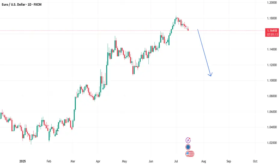
Bearsih EurUsd!The fibre has begun its downward spiral. You can look for sell set-ups from now on; every time it buys, wait and look for sells. Unless of course you can trade both sides of the market. Price is aiming for 1.1060 level.
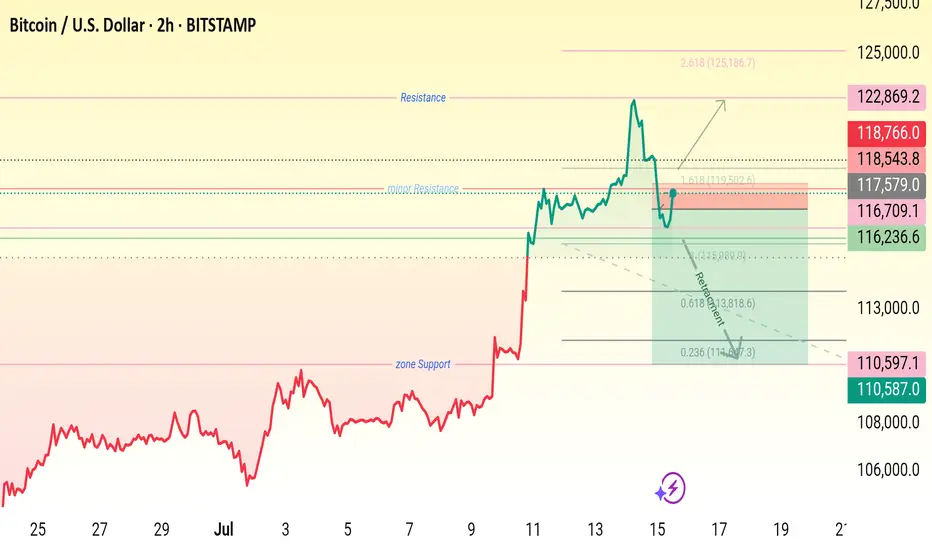
Btc key levels,
Wait for price rejection .
•Entry Zone: 115,900 – 116,700
• Stop Loss: Below 110,587
🎯 Target 1: 118,543
🎯 Target 2: 122,869
• Extension Target: 125,186 (1.618 Fib)

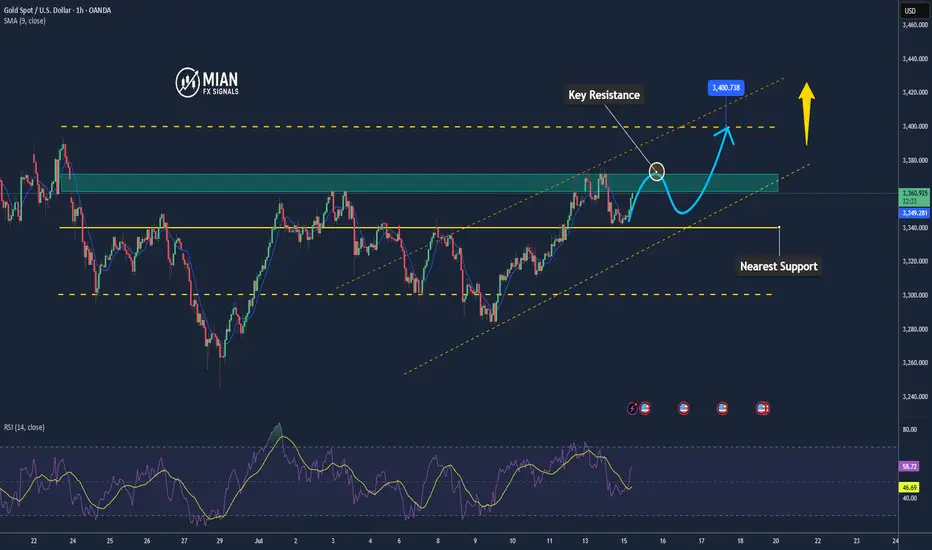
TIME TO BUY GOLD From the daily time frame we can see that gold has respected a rising trend line, so this rising trend line is acting as support.
But going forward we are bullish on gold,so we wait for price to retest the rising trend line on the daily time frame and from there we buy.
Levels to look out for in order to buy:3315,3320,3325,3330

Pre-Market PrepToday’s market insights show a lot of potential opportunities across the board:
S&P 500: We’re in a strong upward imbalance, trading above the prior day’s range and value area. The focus is on long opportunities, but waiting for confirmation on any pullbacks.
NASDAQ & Russell 2000: Similar to the S&P, both are also in an upward imbalance. For the Russell, there’s a specific focus on looking for long setups around the prior day’s high.
Gold: The market is rotational within the prior day’s range and value area, with a slight bias toward looking for long opportunities from the lower end of that range.
Crude Oil: After some initial volatility, it has settled back into the prior day’s range. Long opportunities look promising, especially on a pullback to the CVA low.
Euro Dollar: The market is a bit low on volume and holding below the CVA. Longs are considered if we see acceptance back into that area, while shorts are on the table if we remain below the prior day’s value area.
Yen Dollar: Trading below the prior day’s range and value area, the focus is on short opportunities, especially if we see continued acceptance below key levels.
Aussie Dollar: It’s rotational and currently above the prior day’s value area, making both long and short opportunities viable, depending on how the market moves.
Nat Gas: It’s also rotational within the prior day’s range, but further analysis is needed after updating levels.
Overall, the strategy is to trade smart, confirm setups, and stay aware of the bigger trends while managing risk.

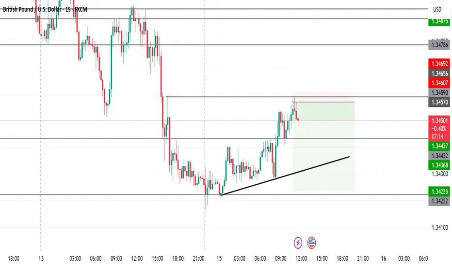
GBPUSD London PlayWhat I see and what I am in, already 1:3RR and will keep an eye for news in 2 hours as well as the lower levels marked
SMCI: The Monthly Chart says it ALL
Stochastic is way oversold.
MACD is converging.
RSI is converging back up.
Would not be surprised to see this soar back towards the CRT value of $65, then take on new challenges back towards it previous ATH of $122.90 in March, 2024.
Regards,
Terrapins

TIME TO BUY GOLD From the daily time frame you can see that gold has respected a rising trending, so this rising trend line is acting as support.
But going forward we are bullish on gold, so we wait for price to come and retest that rising trend line on the daily time frame and then we buy.
Levels to look out for in order to buy:-3310,3315,3325,3330

GE Aerospace Options Ahead of EarningsIf you haven`t bought GE before the rally:
Now analyzing the options chain and the chart patterns of GE Aerospace prior to the earnings report this week,
I would consider purchasing the 270usd strike price Calls with
an expiration date of 2025-8-15,
for a premium of approximately $8.60.
If these options prove to be profitable prior to the earnings release, I would sell at least half of them.
Disclosure: I am part of Trade Nation's Influencer program and receive a monthly fee for using their TradingView charts in my analysis.
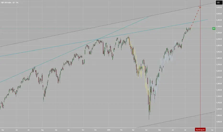
SPX to 6600+ by Aug 5This leg up in SPX is not over yet. Target at upper bound of the channel around 6.6K+ by Aug 5.
XAUUSD, GOLDBullish view on GOLD for New York session, Daily FVG, if price taps in will look for confirmations to go long

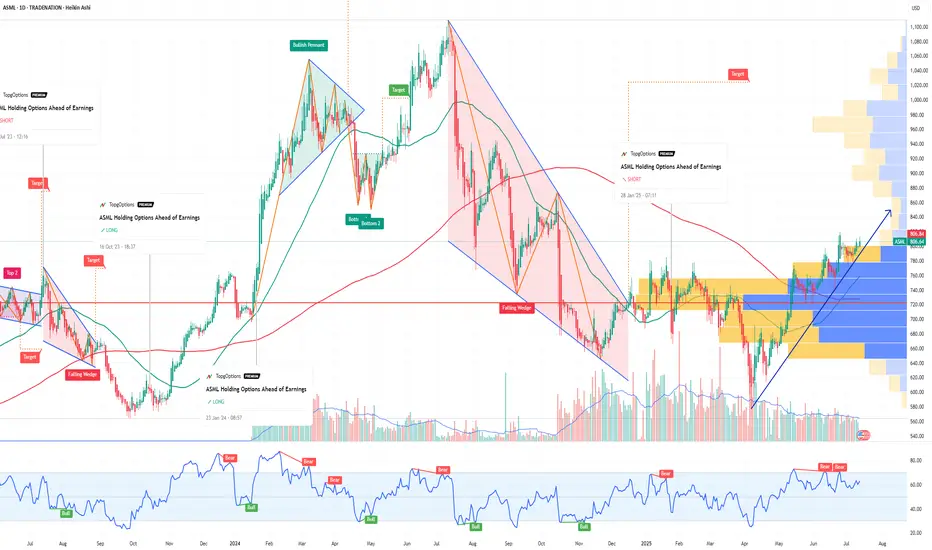
ASML Holding Options Ahead of EarningsIf you haven`t bought the dip on ASML:
Now analyzing the options chain and the chart patterns of ASML Holding prior to the earnings report this week,
I would consider purchasing the 800usd strike price Calls with
an expiration date of 2025-7-25,
for a premium of approximately $32.00.
If these options prove to be profitable prior to the earnings release, I would sell at least half of them.
Disclosure: I am part of Trade Nation's Influencer program and receive a monthly fee for using their TradingView charts in my analysis.
HEROMOTOCO BUYING ABOVE 4465..Hero moto Corp ltd,very bullish above 4465
stock has already changed its character from bearish to bullish
and now consolidating in a good range.
looking to buy above 4465, can give very quick move whenever it happens.

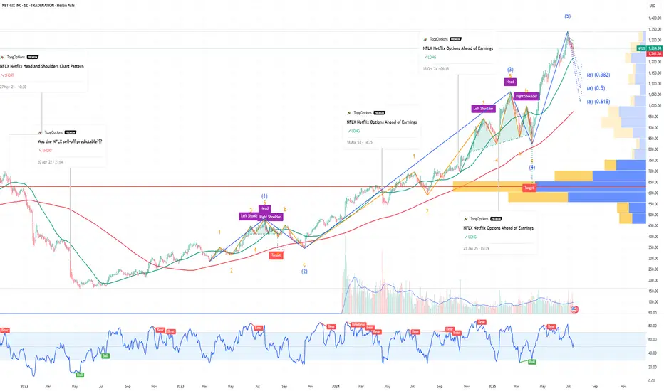
NFLX Netflix Options Ahead of EarningsIf you haven`t bought NFLX before the previous earnings:
Now analyzing the options chain and the chart patterns of NFLX Netflix prior to the earnings report this week,
I would consider purchasing the 1260usd strike price Puts with
an expiration date of 2025-9-19,
for a premium of approximately $71.10.
If these options prove to be profitable prior to the earnings release, I would sell at least half of them.
Disclosure: I am part of Trade Nation's Influencer program and receive a monthly fee for using their TradingView charts in my analysis.
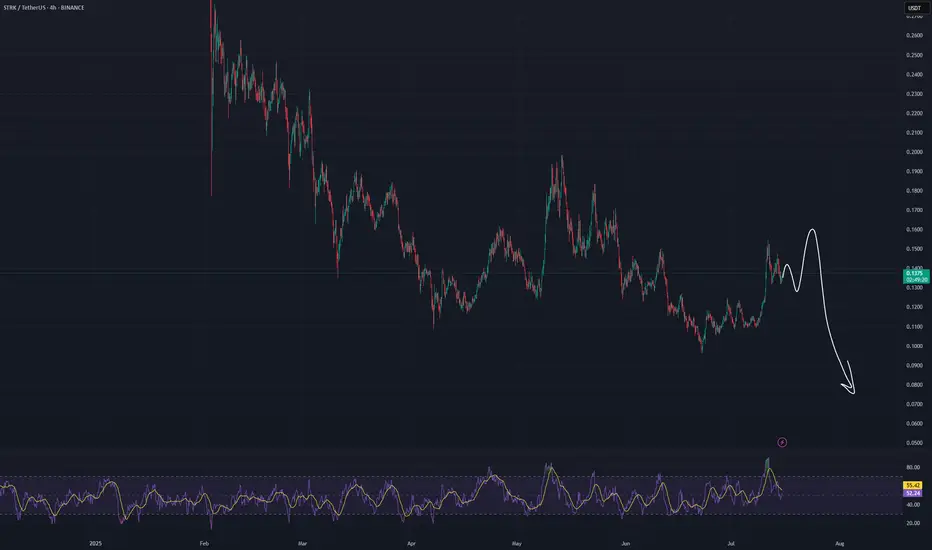
#STRK/USDT - SHORTI expect a decrease in the asset within a month.
(Not an investment recommendation).
#AN021: TRUMP Threats on Tariffs and FOREX Tensions
Global markets are waking up to a currency cold war. Hi, I'm Trader Andrea Russo, and today I want to share the latest news with you.
Donald Trump set the day alight, launching a barrage of threats from a rally in Ohio:
"If re-elected, I will impose 60% tariffs on all of China, 20% on Mexico, and 10% on the European Union. And I'm telling Putin clearly: if you continue to help China evade our embargoes, we will hit Russia too."
The words reverberated across global investment banks, triggering an immediate reaction in the dollar and emerging market currencies.
Markets React: USD Soars, GBP and NOK on Alert
The US dollar gained ground against nearly all major currencies, while the GBP collapsed under pressure from fears of a BoE rate cut and a slowing labor market.
The GBP/NOK pair, in particular, is showing signs of a structured bearish breakout: the pound is under dual pressure (domestic politics + trade war), while the Norwegian krone is indirectly benefiting from rising energy prices and pro-commodity sentiment.
US CPI at 2:30 PM: The Real Detonator
The US core inflation figure will be released at 2:30 PM Italian time. The consensus is for +3.4%, but a higher reading could push the Fed to remain more hawkish for longer. This would strengthen the dollar and create new shock waves in weak and emerging market currencies.
Specifically:
USD/JPY could break above 162.00 with strength.
GBP/USD risks a break below 1.29.
USD/SEK and USD/MXN are the key pairs to watch for explosive movements.
Trump vs. Powell: A Showdown
Meanwhile, fears are growing of a direct attack by Trump on the Fed. According to Deutsche Bank, markets are underestimating the possibility that Trump will attempt to remove Jerome Powell if he returns to the White House.
"The market is ignoring the Trump-Powell variance. If he really tries, the dollar could fall 4% in a week," – Deutsche Bank
We are about to enter the best time of the month for Forex. Those who get their timing wrong today will burn capital. Those who wait for the right signal can ride the trend arising from a predicted global crisis.

USDJPY 1H - market buy with a confirmed structureThe price has bounced from a key support zone and is showing early signs of recovery. A clear base has formed, and the MA50 is starting to turn upward, indicating a shift in short-term momentum. While the MA200 remains above the price, the overall structure suggests a potential continuation of the bullish move.
Trade #1 — entry at market, target: 145.939, stop below recent local low.
Trade #2 — entry after breakout and retest of 145.939, target: 148.000, stop below the retest zone.
Volume has stabilized, and the reaction from support is clear. As long as price holds above the last swing low, buying remains the preferred strategy.

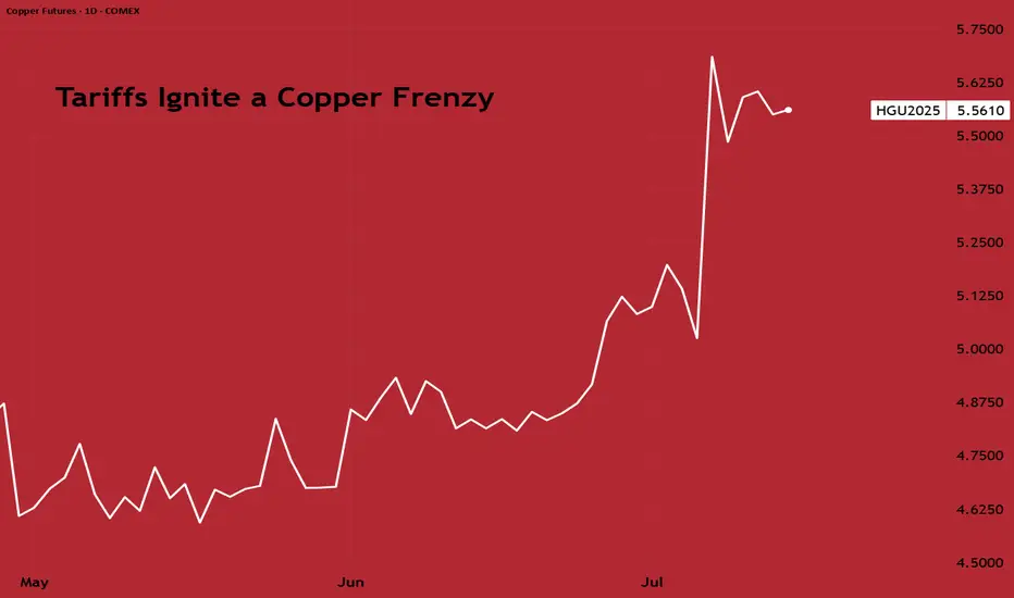
Tariffs Ignite a Copper FrenzyCOMEX copper has surged to a record premium over London Metal Exchange (LME) copper over the past few weeks, reflecting a lucrative arbitrage as traders rush metal into the U.S. ahead of looming import tariffs.
President Donald Trump’s announcement of a 50% tariff on U.S. copper imports (effective August 1, 2025) has dramatically disrupted the global copper market. U.S. futures are now trading at a significant premium of $2,600 per metric ton over LME prices, pulling physical copper into the US from around the world.
As a result, inventories have ballooned in U.S. warehouses while declining sharply elsewhere. COMEX (CME) stockpiles have surged to exceed the combined copper inventories of LME and SHFE (Shanghai), indicating massive stockpiling in the U.S.
Correspondingly, LME warehouse stocks have fallen to multi-year lows, fuelling a steep backwardation (near-term prices trading above far-dated futures) as available supply in London shrinks. LME–tracked inventories have declined by roughly 60% so far in 2025.
Source: Bloomberg
This tariff-induced distortion is also evident in trade flows. Analysts estimate the U.S. imported around 881,000 tons of copper in the first half of 2025, roughly double its underlying consumption, as buyers rushed to secure cheaper metal before tariffs hit.
Once the tariff is implemented and these stockpiles start being utilised, U.S. imports are expected to plunge and weigh on global copper prices later this year.
Going forward, clarity on the tariff’s scope regarding any exemptions for key suppliers like Chile or Canada will determine if COMEX Copper sustains a large premium.
CHINA'S PIVOT FROM HOARDING TO DRAINING
While the U.S. has been hoarding copper, demand in China, the world’s largest consumer, presents a mixed picture. On the one hand, China’s property construction sector remains sluggish, and manufacturing activity has only tentatively improved.
Earlier in the year, Chinese copper inventories surged to multi-year highs; an unusual build likely driven by weak consumption and precautionary stockpiling. However, this trend has since reversed sharply. Chinese copper stockpiles peaked around 377,000 mt in March before plunging to 126,000 mt by end-June.
This drawdown suggests that, despite macroeconomic headwinds, China’s copper usage remained resilient. Grid companies and manufacturers continued buying copper at high levels, even as consumer sectors slowed.
Source: Crux Investor
Copper demand in China is coming from strategic industries: State Grid investment soared nearly 20% YoY until May 2025, and manufacturing of electric vehicles and appliances remains a bright spot.
Owing to reduced demand in construction, though, the net effect for near-term demand remains somewhat on the softer side, but it is still far from collapsing.
Any further government stimulus for infrastructure or housing in H2 2025 could quickly translate into a bump in copper demand, given the low inventories now in China.
LONGER-TERM UPSIDE THROUGH SUPPLY CHALLENGES
Beyond the immediate cross-currents, the medium-to-long-term outlook for copper is fundamentally bullish, owing to the significant constraints on the supply side.
Many of the world’s largest copper mines are ageing, with declining ore grades and operational challenges.
In Chile (the top copper-producing country), Codelco’s output hit a 25-year low in 2023 amid falling grades and project delays. The state-owned giant is striving to boost production in 2025, but first-quarter 2025 output was essentially flat (+0.3% YoY), and was hampered by unforeseen disruptions like heavy rains and a nationwide power blackout.
Similarly, Anglo American, another major producer, has warned of lower production. Anglo expects its copper output to drop to 690–750 thousand tons in 2025, down from 773k in 2024, due to lower ore grades and water restrictions at its Chilean operations.
Due to the massive wedge between demand and supply dynamics, analysts have predicted the copper market to slip into a substantial deficit next year, even sans tariffs.
The recent tariff saga, creating all the noise, would exacerbate near-term tightness, and would lead to U.S. consumers drawing down global supply. This sets the stage for sharper shortages later.
Supply from recycling is also expected to take a hit due to the trade friction between China and US.
Source: Bloomberg
In response to the tariffs, China could cut back imports of US scrap copper. This would, in effect, reduce China's exports of refined copper, with less refined copper entering the global supply consequently.
This further strengthens the case for prolonged upward price pressure.
HYPOTHETICAL TRADE SET-UP:
For investors, the divergent short- and long-term forces in copper open several strategy avenues. In the very near term, prices may remain volatile or even pull back once U.S. imports pause, with others having increased access to the metal.
However, any such dip would present a buying opportunity given copper’s strong fundamentals. A straightforward bullish strategy is to establish a long position in copper futures, taking advantage of any weakness.
For example, one could go long the CME Copper futures (March 2026 expiry) to express a positive view on copper into next year.
Source: CME QuikStrike
Open interest for this contract lies just under 30,000, with volume as on 11/Jul clocking 3095.
The hypothesis is that after a period of consolidation, copper prices will resume an uptrend as the market shifts focus from temporary inventory builds to the looming supply deficit. Indeed, the term structure is also signalling tighter conditions down the line; while nearby copper prices spiked on the tariff news, longer-dated futures have also firmed as traders anticipate future scarcity.
Source: CME QuikStrike
With that in mind, a possible trade setup is outlined below:
● Entry: $5.68 per pound
● Target: $6.20 per pound
● Stop Loss: $5.37 per pound
● Profit at Target: $13,000 ((6.20 – 5.68) = 0.52 x 25,000 pounds/contract)
● Loss at Stop: $ 7,750 ((5.37 – 5.68) = -0.31 x 25,000 pounds/contract)
● Reward-to-Risk: 1.7x
The same view can also be expressed through CME Micro Copper futures, which offer smaller notional positions and more flexibility. Each Micro contract is priced in USD per pound and represents 2,500 pounds of copper, compared to 25,000 pounds for the standard contract.
As history shows, the “electrifying metal” tends to reward those who can weather short-term volatility in pursuit of its long-term uptrend.
MARKET DATA
CME Real-time Market Data helps identify trading set-ups and express market views better. If you have futures in your trading portfolio, you can check out on CME Group data plans available that suit your trading needs tradingview.com/cme .
DISCLAIMER
This case study is for educational purposes only and does not constitute investment recommendations or advice. Nor are they used to promote any specific products, or services.
Trading or investment ideas cited here are for illustration only, as an integral part of a case study to demonstrate the fundamental concepts in risk management or trading under the market scenarios being discussed. Please read the FULL DISCLAIMER the link to which is provided in our profile description.
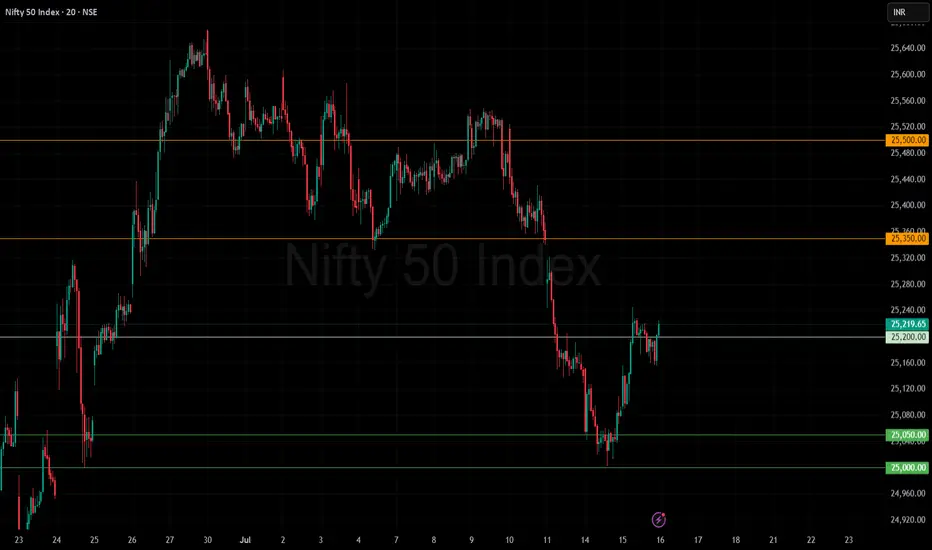
Nifty bounced from support and looking in some momentumNifty Update (15 July 2025) 📈
Nifty bounced back from yesterday’s support zone 25,000 and closed in green ✅
Crossed above the first target and finished near the resistance zone of 25,200
🔹 Support: 25,000–25,050 (watch this zone for dip-buying opportunities)
🔹 Resistance: 25,200 (current hurdle)
🚀 If Nifty sustains above 25,200:
Next upside targets 👉 25,350
Further upside: 25,500
ℹ️ On the downside: 25,000–25,050 remains the key support. Breaking below could lead to more weakness.
Stay alert, keep stop-losses in place, and watch for a breakout above 25,200 to catch momentum!
👉 Follow Navonnati Market Insights (@navonnatimarket) on X for more updates and analysis!
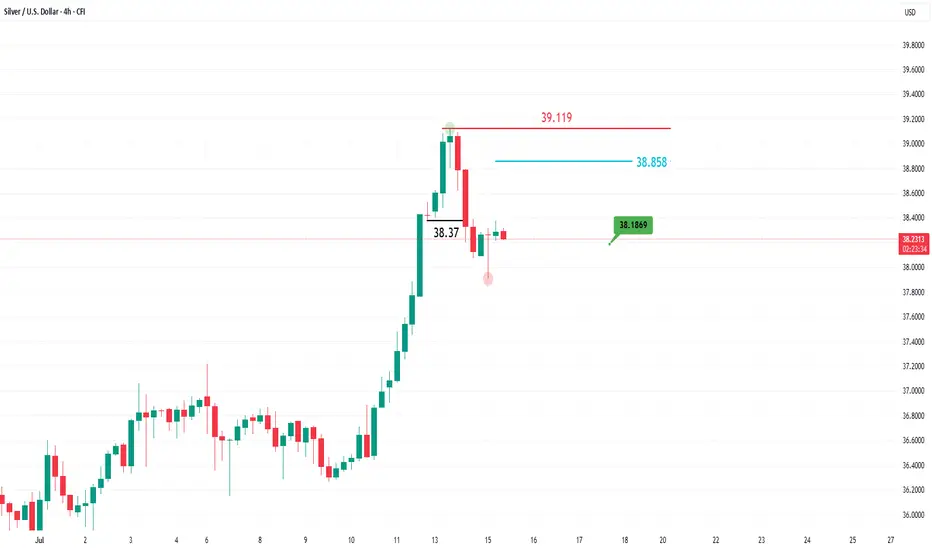
A temporary pause for silver!After its recent surge to reach the highest levels since September 2011, silver is showing short-to-medium-term negative signals on the 4-hour timeframe, before potentially resuming its upward trend on the daily chart.
As seen in the chart above, the price dropped quickly below the 38.37 level, forming a new low and shifting the 4-hour trend from bullish to bearish. The rebound to the 38.858 level appears to be a corrective move targeting the 38.1869 level.
The bearish scenario would be invalidated if the price rises again and forms a higher high on the 4-hour chart above the 39.119 level.