Momentum DecliningI know that I am against the trend. But we are a bit to extended and the momentum is declining .
Worth a try.
Breadth Indicators
Time for manufacturing companies to get paidmanufacturing companies for semi conductors showed a while ago that the direction of semi chip stocks was headed south.
Now, I see a great long term set up for the companies that actually make the parts. After these pop off with IWM soon, then mega cap stocks will see a push up.
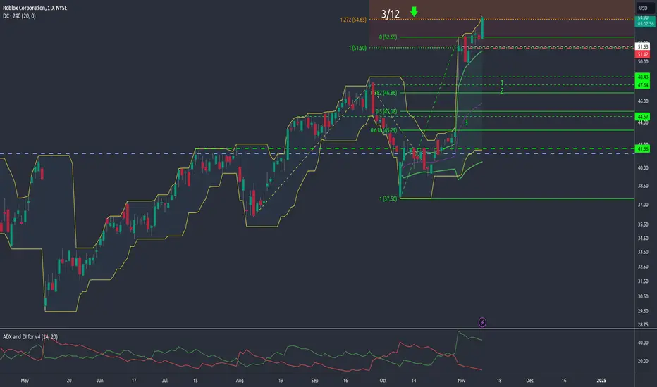
Target 1 is $50
Target 2 is $55
May see a pull back right after this and then the rally

TRADE EUR USD SELL LIMITTRADE EUR USD SELL LIMIT
Baron fx trade idea
ICT and SMC concepts
Liquidity
Fair value gap
SSL
BOS and MSS

SPY shows signs of topping outSPY hits all time high throwing multiple signals that the rally is coming to a close
Following long term trend, we see we are at same resistance as July hit before reversing
declining volume as recent rally continues gives a bearish signal
OBV remains flat while price hits higher highs through out September and October
We should expect to see a reversal in the near future. The best move to make right now is tighten up stop losses and keeping watching for more bearish signals.

NZDUSD (SHORT)USD relative strength is above 50, From our trade plan its critical to only trade USD pairs, USDNZD is leading USD pairs. Betting USD strength to strength across currencies but with a larger magnitude in NZDUSD
USD BANK HOLIDAY TODAY, Trade idea has a hypothetical 50/50 probability of getting executed

Its time! Maybe....I think its a perfect time to re enter or put crypto names back on your radar for a short term pump. We have shaken out all of the hype and bitcoin halving people, hope and happiness is almost dried up in retail.
If we break our dark green line, I would stop out and wait for a re entry at next support. I see COIN to $230 soon....

How to Use Trading Zones in CryptoHello, Skyrexians!
Last two articles were the deep dive into the Awesome Oscillator and Acceleration Deceleration indicators by Bill Williams. In conjunction with the fractals and the alligator these indicators are the powerful concept in cryptocurrency trading. It can significantly boost your cryptocurrency trading strategy, crypto trading algorithm or you can implement it into trading bot. Today we will expand this concept with the trading zones - the periods on the market with the bullish or bearish superiority.
Trading zones is not the popular concept in comparison to Awesome Oscillator, that's why using it can give you a huge advantage in crypto trading because even top crypto traders don't use it in their trading routine. Let's go through its concept.
Before start observing the trading zones concept we have to understand what are the Awesome Oscillator and Acceleration/Deceleration. Awesome oscillator is the approximation of the market's driving force. Usually it starts moving before the price if this is an impulsive wave. During corrections it can flash the false signals. Before the driving force starts moving the acceleration changes its direction. That's why combination of these indicators is so important.
What is the trading zone?
As you know from AO and AC descriptions they can have 2 conditions: increasing (greed bars) and decreasing (red bars). According to this we can define 3 marker conditions:
Green zone. Both AO and AC have the increasing columns. This is the strong bullish phase. Only long trades are allowed.
Red zone. Both AO and AC have the decreasing columns. This is the strong bearish phase. Only short trades are allowed.
Gray zone. AO and AC have the different directions. No signals can be generated by this trading zone

Good options activity There is a lot of movement in call options for majority of expiration dates.
IV levels are the lowest for the 28 strike. Calls expiring 10-11 or 10-18 with a strike between 28-30 should be the safest and most profitable contracts if it goes in our favor.

Elementary TA - Cup & HandleIn pure return % from the 2022 bottom (+330%) ; following 'Cup & Handle' TA guidelines, the +330% yields a future CRYPTOCAP:BTC price near the $300k mark...
Using the drawdown % from the 2021 ATH (-76.5%) and applying the same 'Cup & Handle' methodology, we have a more sober target of +76.5% from ~$70k and yield a future CRYPTOCAP:BTC price of $125k...
God speed

SMH shows long term signs of troubleSMH fails to make new highs since July peak going into sideways trend. This paints a picture of a long term reversal to bear side coming
Comparing OBV trend with the March and July peak, we see that OBV diverges downwards while price continues indicating reversal
After severe sell off in August, we see that price trends sideways failing to make new highs
The sideways trend is during a typical rough time of the year, so weakness and volatility is expected
Nov and Dec normally bring in strong rallies
We could be simply looking at a pullback in time as ETF takes a breather from July peak, before rallying continues. The other alternative is that this may be distribution phase of a high risk sector preparing for a huge sell off.

Example of Conditions for Starting Trading
Hello, traders.
If you "Follow", you can always get new information quickly.
Please also click "Boost".
Have a nice day today.
-------------------------------------
I will publish in advance due to an external schedule tomorrow.
Accordingly, I will take time to provide additional explanations on the ideas published today.
----------------------------------------
I will talk about the basis for indicating the direction of progress shown in the chart above.
In order to differentiate from other people's analyses, I am trying to explain the basis for indicating the support and resistance points or sections on the chart.
I think that if you understand why those points and sections were set, you will eventually be able to understand them without having to read the explanation all the way through.
For this, more support and resistance points are needed.
This is because we can select the volatility period by additionally drawing the trend line.
However, since all of these processes are displayed on the chart, there are many complaints that the chart is messy and confusing, so we are trying to reduce them as much as possible.
Therefore, there are cases where the chart is displayed in two versions.
The chart below is a chart that shows many support and resistance points and draws a trend line to select the volatility period.
Therefore, since the support and resistance points may be displayed differently, it is recommended that you refer to the points or sections that I have written.
-
The conditions for starting a transaction are simpler than they look.
However, when these conditions are met, the support and resistance points drawn on the 1M, 1W, and 1D charts must be displayed.
Therefore, even if the conditions for starting a transaction are met, if the support and resistance points are not displayed at the corresponding price, you cannot start a transaction.
Please read this carefully and thank you.
-
(It would be good to see this as an example of how to find the conditions that fit you and how to utilize them.)
Conditions for starting a transaction are
1. Buying time conditions
- When the StochRSI indicator rises in the oversold range and maintains the state of StochRSI > StochRSI EMA
- When the BW indicator forms a horizontal line at the lowest point (0)
- When the OBV indicator rises below the 0 point
- When the DMI indicator rises below the 0 point
2. Selling time conditions
- When the StochRSI indicator falls in the overbought range and maintains the state of StochRSI < StochRSI EMA
- When the BW indicator forms a horizontal line at the highest point (100)
- When the OBV indicator falls above the 0 point
- When the DMI indicator falls above the 0 point
When the above conditions are met, check whether there is support at the support and resistance points drawn near the price. Confirmation is used to proceed with the transaction.
The current price position is 60672.0-61099.25.
Therefore, you can proceed with the transaction depending on whether there is support in this section.
Since it is currently falling below 60672.0, there is nothing you can do in spot trading other than cutting losses.
In futures trading, you can enter with a sell (SHORT) position.
-
It is rare for all the conditions for starting a transaction mentioned above to be met.
Therefore, it is recommended to basically check whether the BW indicator forms a horizontal line at the lowest point (0) or highest point (100), and then proceed with the transaction by checking the movement of the StochRSI indicator.
Also, it is recommended to select a split sell section to make a profit by calculating the fluctuation range while checking the strength of the rise or fall with OBV and DMI.
-
In summary of the above,
Since the StochRSI indicator has not yet risen from the oversold zone and StochRSI < StochRSI EMA, it is recommended to check whether a reversal is occurring.
Also, you should check whether the BW indicator has fallen to the lowest point (0) and formed a horizontal line.
If the OBV and DMI indicators rise below the 0 point without meeting these conditions, you should proceed with an aggressive purchase (a transaction that requires a quick response similar to scalping or day trading).
If you do not proceed with an aggressive purchase, you should wait.
-
It is not a good idea to enter a current sell (SHORT) position in futures trading.
However, if you proceed with an aggressive transaction (scalping or day trading), you can start trading.
The reason why it is not a good condition for trading is because the price is located in the 1. purchase timing condition section among the conditions for starting a transaction mentioned above.
Therefore, the profit is small or you may even suffer a loss.
-
If you are not currently trading, I think the section where you should trade is when it rises around 61K.
Before that, it is highly likely that you will not be able to purchase because it seems like it will fall further.
I think this point, or the section where you actually trade, is the psychological volume profile section.
This psychological volume profile section is the section where psychology applies that you must trade even now.
Since this point is ultimately a low or high point, it is a section where you are likely to incur losses if you purchase.
The 61K section that I mentioned earlier is a section where it is highly likely to be a low point, so it is a section where you are likely to incur losses if you cut your loss or enter a sell (SHORT) position.
-
If it shows resistance near 60672.0, there is a possibility that a sharp decline will occur momentarily and touch 59K and then rise.
This phenomenon can be a fake or a sweep movement, so you need to be careful.
In order to avoid losses from this phenomenon, auxiliary indicators are necessary.
Since auxiliary indicators are lagging, they are unlikely to show large movements in sudden price fluctuations.
-
What I am talking about is not a method of chart analysis, but an example of how to set a standard for trading.
Therefore, I hope you do not misunderstand the above as about chart analysis.
Since chart analysis and trading are different, what you see on the chart is also different.
In order to complement this difference, what is needed is the support and resistance points drawn on the 1M, 1W, and 1D charts.
Since charts without support and resistance points are likely to be for chart analysis, there is no need to try to find a trading point on these charts.
-
Have a good time.
Thank you.
--------------------------------------------------
- Big picture
It is expected that the real uptrend will start after rising above 29K.
The section expected to be touched in the next bull market is 81K-95K.
#BTCUSD 12M
1st: 44234.54
2nd: 61383.23
3rd: 89126.41
101875.70-106275.10 (overshooting)
4th: 134018.28
151166.97-157451.83 (overshooting)
5th: 178910.15
These are points where resistance is likely to be encountered in the future. We need to see if we can break through these points.
We need to see the movement when we touch this section because I think we can create a new trend in the overshooting section.
#BTCUSD 1M
If the major uptrend continues until 2025, it is expected to start by creating a pull back pattern after rising to around 57014.33.
1st: 43833.05
2nd: 32992.55
-----------------

Next Volatility Period: Around October 5th - 10th
Hello, traders.
If you "Follow", you can always get new information quickly.
Please click "Boost" as well.
Have a nice day today.
-------------------------------------
The BW indicator is currently leveling off near the midpoint (50).
Therefore, I think it is not suitable to trade around 60672.0-61099.25.
If you want to trade around 60672.0-61099.25 depending on the support, you will need a short and quick response.
-
When the BW indicator is leveling off at the lowest point (0) or highest point (100), a BW line is created on the price chart.
I think you can trade more stably by using this BW line as a support and resistance point.
Therefore, you can wait until the next BW line is created or check whether it is supported when touching the previous BW line (61759.99) and then trade.
At this time, the StochRSI indicator is also worth looking at.
Since the StochRSI indicator creates waves in any case, I think it is an indicator worth referring to when trading.
Therefore,
- If the StochRSI indicator rises in the oversold zone and maintains the state of StochRSI > StochRSI EMA, it is a time to buy,
- If the StochRSI indicator falls in the overbought zone and maintains the state of StochRSI < StochRSI EMA, it is a time to sell.
However, you should be aware that since you cannot know the size of the fluctuation range, you may see little profit or even a loss.
To prevent this, you need the support and resistance points drawn on the 1M, 1W, and 1D charts.
Based on these support and resistance points, you should proceed with the transaction depending on whether the movement mentioned above is supported or not.
Then, since you can calculate the approximate fluctuation range, it will be a reference for deciding whether to proceed with the transaction.
Accordingly, if you display the rise and fall range based on the 60672.0-61099.25 section, it will be as shown in the chart above.
-
When a new candle is created,
- Whether it will definitely enter the oversold section
- Whether there is a change in the slope of the StochRSI indicator
- Whether the StochRSI EMA falls below the midpoint (50)
You should check whether the above is satisfied and create a response strategy according to the next movement.
-
Have a good time.
Thank you.
--------------------------------------------------
- Big picture
It is expected that the full-scale uptrend will start when it rises above 29K.
The next expected range to touch is 81K-95K.
#BTCUSD 12M
1st: 44234.54
2nd: 61383.23
3rd: 89126.41
101875.70-106275.10 (overshooting)
4th: 134018.28
151166.97-157451.83 (overshooting)
5th: 178910.15
These are points that are likely to receive resistance in the future.
We need to check if these points can be broken upward.
We need to check the movement when this range is touched because it is thought that a new trend can be created in the overshooting range.
#BTCUSD 1M
If the major uptrend continues until 2025, it is expected to start forming a pull back pattern after rising to around 57014.33.
1st: 43833.05
2nd: 32992.55
-----------------

The key is whether it can be supported at 64748.70
Hello, traders.
If you "Follow", you can always get new information quickly.
Please also click "Boost".
Have a nice day today.
-------------------------------------
There is a content about the volatility period of the StochRSI indicator in the previous idea, so please refer to it.
(BTCUSDT 1D chart)
The HA-High indicator on the 1D chart is expected to be generated at the 64748.70 point.
Accordingly, the key is whether it can rise above 64748.70 and be supported.
If not, as I mentioned in the previous idea, we need to check the support in the above section
- 63118.62.64000.0
- 60672.0-61099.25
.
Since the M-Signal of the 1D chart is passing around 63118.62.64000.0, it is an important support and resistance section,
and since the M-Signal of the 1W chart is passing around 60672.0-61099.25, it is an important support and resistance section.
However, if the decline continues, the M-Signal of the 1W chart is expected to rise around 61759.99, so this area is also an important support and resistance section.
-
(1D chart)
Since the HA-High indicator of the 1D chart has been touched, if it fails to rise above the HA-High indicator, it is likely to touch the HA-Low indicator.
Therefore, as the price falls, we need to check where the HA-Low indicator is generated.
If it is not generated, it is likely to touch around the 56204.13 point.
However, as I mentioned earlier, there is an important section, so it is not expected to fall easily.
-
The volatility period is expected to be around October 5-10 (up to October 4-11).
Therefore, the point of interest is whether it will pass the 66676.87-68249.88 section or the 56150.01-56950.56 section after this volatility period.
If not, and it moves sideways, you need to check if the M-Signal of the 1D chart > M-Signal of the 1W chart can be maintained.
If the M-Signal of the 1D chart < M-Signal of the 1W chart is maintained, there is a possibility that it will converge near the M-Signal of the 1M chart.
I will explain this in detail again when there is movement.
-
(1M chart)
This is the day when a new moon candle is created.
Therefore, I will explain this after a new candle is created.
-
Have a good time.
Thank you.
--------------------------------------------------
- Big picture
It is expected that a full-scale uptrend will start when it rises above 29K.
The next expected range to touch is 81K-95K.
#BTCUSD 12M
1st: 44234.54
2nd: 61383.23
3rd: 89126.41
101875.70-106275.10 (overshooting)
4th: 134018.28
151166.97-157451.83 (overshooting)
5th: 178910.15
These are points that are likely to receive resistance in the future.
We need to check if these points can be broken upward.
We need to check the movement when this range is touched because it is thought that a new trend can be created in the overshooting range.
#BTCUSD 1M
If the major uptrend continues until 2025, it is expected to start forming a pull back pattern after rising to around 57014.33.
1st: 43833.05
2nd: 32992.55
-----------------

Next Volatility Period: Around October 11Hello, traders.
If you "Follow", you can always get new information quickly.
Please click "Boost" as well.
Have a nice day today.
-------------------------------------
It is showing sideways movement around 63118.62-64000.0.
Therefore, if it breaks out of this area,
- 65920.71-67614.25 when up
- 60672.0-61099.25 when down
You should check for support around the above area.
The StochRSI EMA is almost approaching the 100 point.
Accordingly, the possibility of volatility is increasing.
As I mentioned in the previous idea, I think we can predict the future trend depending on how the initialization of this StochRSI indicator proceeds.
-
(BTCUSDT.P 1h chart)
The section that the finger is pointing to is the section that fell below the 5EMA of the 1D chart, then touched the HA-Low indicator and rose.
When it fell below the 5EMA of the 1D chart this time, we need to check whether it touches the HA-Low indicator and rises.
The M-Signal indicator of the 1D and 1W charts is passing through the 60651.2-61149.2 section, so the key is whether it is supported around this area when falling.
When rising
1st: 65922.3
2nd: 67612.8-68215.5
You need to check whether there is support near the 1st and 2nd above.
-
It is not easy to know whether it will rise or fall right now.
However, you can predict the next support or resistance section depending on how it breaks through the support and resistance points of the 1M, 1W, and 1D charts drawn on the chart.
Therefore, I think it is a good idea to trade with a response strategy for rising and falling from the current position.
For this, you need to have your own trading strategy established.
-----------------------------------------
(USDT.D 1D chart)
USDT dominance is showing a decline in an important section.
Therefore, we need to watch whether it can fall after receiving resistance near the M-Signal indicator on the 1W, 1M chart.
I think that in order for the coin market to show an upward trend, the USDT dominance must show a downward trend.
Therefore, it is expected that we will be able to know whether the coin market can start an upward trend depending on whether the USDT dominance falls below 4.97 and is maintained or shows a downward trend.
--------------------------------------
The purpose of adding DMI and OBV is to find out the strength of the trend.
The final formula was changed accordingly.
Based on the 0 point,
- If it rises above 0, it means that the upward force is strong.
- If it falls below 0, it means that the downward force is strong.
The important thing to note here is when it touches the 2 or -2 point.
At this time, you can proceed with a transaction by checking the movement of the BW indicator and StochRSI indicator.
The trading time should be conducted depending on whether there is support at the support and resistance points drawn on the chart.
It is recommended to use the movement of the indicator only as a basis for judging whether it is supported at the support and resistance points.
-
Have a good time.
Thank you.
--------------------------------------------------
- Big picture
It is expected that the real uptrend will start when it rises above 29K.
The area expected to be touched in the next bull market is 81K-95K.
#BTCUSD 12M
1st: 44234.54
2nd: 61383.23
3rd: 89126.41
101875.70-106275.10 (overshooting)
4th: 134018.28
151166.97-157451.83 (overshooting)
5th: 178910.15
These are points where resistance is likely to occur in the future.
We need to check if these points can be broken upward.
We need to check the movement when this section is touched because I think a new trend can be created in the overshooting section.
#BTCUSD 1M
If the major uptrend continues until 2025, it is expected to start forming a pull back pattern after rising to around 57014.33.
1st: 43833.05
2nd: 32992.55
-----------------

3-sigma short signal
We expect this to rug on the fundamentals, but FOMC had opposite effect
The 3-sigma Bollinger will light any wick that enters it
Let the wick burn and wait for a close outside the 2.5-3 sigma channel to trigger the trade, and watch it explode to the downside
Risk the highest wick in the channel
Target 3x
BoJ is watching you do this

Flash Crash to $490?War with Iran and market finally pricing in low growth can have a nice flash effect to $490.
I also think the higher probability trade would be a dead cat bounce or reversal, as peak fear enters.

US30 Market breadth EMA50 [INVESTIC]
Introducing the 50-day Exponential Moving Average (EMA) Market Breadth for the Dow Jones Industrial Average (DJIA). This tool is designed for traders who want to assess the market’s short- to mid-term momentum with precision. By tracking how many of the 30 Dow Jones stocks are trading above their 50-day EMA, the indicator gives a clear view of market strength or weakness over a moderate timeframe.
Traders may use the indicator to identify and confirm the market's medium-term trends. It strikes a balance between the sensitivity of shorter-term indicators like the 20-day EMA and the long-term perspective of the 200-day EMA. Displayed as a histogram ranging from 0 to 30, this indicator provides a quick and effective way to see how many Dow Jones stocks are maintaining their trends over this mid-range period.
🔶Usage
The 50-day EMA Market Breadth is incredibly versatile, catering to different trading styles. For example:
Intraday Trading:
While the 50-day EMA is more commonly associated with swing or mid-term trading, intraday traders can still use this indicator to confirm the broader market trend, which is crucial for trading with confidence throughout the day.
If the majority of stocks are above their 50-day EMA, it suggests strong underlying momentum. Use this information to support your intraday trades in the direction of the trend. For example, if the histogram shows 20 or more stocks above the 50-day EMA, you might prioritize long positions, knowing that the overall market sentiment is positive. Conversely, if the histogram is low, it may be better to focus on short positions or be more cautious with longs.
Swing Trading:
For swing traders, the 50-day EMA Market Breadth Histogram is a key tool for timing entries and exits within the market's medium-term trends.
You can monitor the histogram regularly to gauge whether the market is supporting your swing trades. If you notice the histogram starting to decline, consider tightening your stop losses or scaling out of positions, as this may signal weakening momentum. Additionally, use the histogram to confirm breakout trades or to stay in trades that are running strong, ensuring that you are aligned with the market’s mid-term direction.
Longer-Term Trading:
Long-term traders can leverage the Market Breadth to gain insights into the market's medium-term health, helping to fine-tune their long-term strategies.
Use the histogram as a barometer for market strength when making decisions about your long-term portfolio. A consistently high histogram suggests a strong mid-term uptrend, which could reinforce your conviction to hold or add to long-term positions. On the other hand, if you see a sustained decline in the histogram, it may be a signal to reassess your portfolio and consider implementing risk management strategies. The indicator can also help you identify potential market lows, when you see the number of stocks on the histogram goes near bottom.
No matter your trading style, the 50-day EMA Market Breadth Indicator offers a comprehensive view of market momentum. By integrating this tool into your daily, weekly, or monthly analysis, you can make more informed decisions that align with the prevailing market trends.

US30 Market breadth EMA20 [INVESTIC]Introducing our Market Breadth Indicator for the Dow Jones Industrial Average (DJIA), based on the 20-day Exponential Moving Average (EMA). This tool is designed for traders looking to gauge short-term market sentiment and momentum within the Dow. By tracking how many of the 30 Dow Jones stocks are trading above their 20-day EMA, this indicator offers a quick and precise snapshot of the market’s short-term strength or weakness.
Traders can use this shorter-term market breadth indicator to identify emerging trends, confirm the direction of the market, and make more timely trading decisions. The 20-day EMA provides a more responsive view of market conditions compared to the longer days EMA, making it ideal for traders focused on capturing near-term movements. Displayed as a histogram ranging from 0 to 30, the indicator helps you quickly assess how many Dow Jones stocks are in a bullish or bearish stance over the short term.
🔶Usage
The Market Breadth based on the 20-day EMA is perfect for traders of all styles, from those who thrive on fast-paced intraday action to those with a longer-term view. Here’s how you can apply this indicator in different trading scenarios:
Intraday Trading:
Market Breadth is a powerful tool to spot shifts in momentum throughout the trading day. As the market moves, the histogram will quickly reflect changes in the number of stocks trading above their 20-day EMA, helping you identify potential entry or exit points.
As an example, this tool can be use to find short-term lows or peaks. As the histogram rises above the green zone in the session it may indicate increasing buying pressure, suggesting opportunities for quick long positions from the low.
Also it can help spot potential rebound in the near term, for example, a rising number of stocks while the index declines could signal a quick short-term trades.
Swing Trading:
Swing traders can use the Market Breadth to time trades more effectively within short- to medium-term trends. When the histogram is consistently high, it indicates that the majority of Dow stocks are experiencing short-term uptrends, making it a favorable environment to hold onto positions. However, if the histogram starts to drop, it may be an early warning that the trend is losing strength, prompting you to consider exiting or tightening your stop losses. This indicator helps you stay in tune with the market’s short-term direction, optimizing your swing trade entries and exits.
Longer-Term Trading:
While the 20-day EMA is more commonly associated with short-term analysis, it can still be valuable for longer-term traders who want to keep a pulse on shorter-term market movements. By monitoring the Market Breadth over weeks or months, you can spot when the market is reaching its peak or its low on a shorter timescale.
The 20-day EMA Market Breadth is a versatile tool that provides actionable insights across various trading horizons. Whether you’re looking to capture quick intraday moves, time your swing trades with precision, or keep an eye on short-term trends as part of a longer-term strategy, this indicator is designed to enhance your market analysis and trading decisions.

US30 Market breadth EMA200 [IAS]Introducing our Market Breadth Indicator, specifically designed for traders looking to gain a deeper understanding of the overall health of the Dow Jones Industrial Average (DJIA). This indicator tracks how many of the 30 Dow Jones stocks are trading above their 200-day Exponential Moving Average (EMA), giving you a quick snapshot of market momentum.
Traders typically use market breadth indicators to assess whether the market is broadly strong or weak. When more stocks are trading above their 200-day EMA, it suggests a healthy, bullish environment. Conversely, fewer stocks above this threshold could indicate a weakening market or a potential downturn. Our indicator takes this concept and visualizes it in an easy-to-read histogram, ranging from 0 to 30, where 0 represents no stocks above the 200-day EMA and 30 represents all stocks above this key level.
🔶Usage
Using the Indicator in your trading is straightforward, you can simply implement it by looking for:
1. Bullish Signals: When there are higher number of stocks highlighted in red (e.g., 25-30) trading above their 200-day EMA, it’s a strong signal that the market is in a robust uptrend.
2. Bearish Signals: When the histogram starts declining towards the lower end (e.g., 0-10, where below 6 is highlighted in green). This can be use as a warning sign that the market might be entering a bearish phase.
3. Confirming Trends: The indicator is also useful for confirming trends. For example, if the overall market is rallying but the histogram is showing a decline in stocks above the 200-day EMA, it could be a sign of underlying weakness. This divergence can alert you to potential trend reversals.
This indicator is versatile and can be adapted to various trading styles, whether you’re an intraday trader, or a longer-term investor.
Intraday Trading:
For intraday traders, this tool can be use to find short-term lows or peaks. As the histogram rises above the green zone in the session it may indicate increasing buying pressure, suggesting opportunities for quick long positions from the low. Conversely, if the histogram declines from a red zone, it could be a signal to explore short setups. Using this indicator alongside your usual intraday strategies can help you fine-tune your entries and exits, reducing risk and enhancing your trading precision.
Longer-Term Trading:
For longer-term investors or those looking to position trade on a weekly basis, Market Breadth is an excellent tool to assess the overall health of the market. A histogram consistently near its upper range (e.g., 25-30) over several weeks signals a strong, sustained uptrend, making it a good time to add to positions or initiate new ones. On the other hand, a gradual decline in the histogram over time may indicate that the market is weakening, suggesting a more cautious approach, such as rebalancing your portfolio or exploring defensive strategies. This longer-term perspective can help you stay aligned with the broader market trend, reducing the risk of being caught on the wrong side of a major market move.
By using the indicator across different timeframes, you can better align your trading strategy or even plan your risk management with the underlying market conditions, making more informed decisions whether you’re trading by the minute or planning for the months ahead.

KRRO a biotech company with earnings coming LONGKRRO is in the biotechnology space in the gene-editing realm. It is in portfolios of C. Woods .
A recent analyst gave it an upside to 100 which is very favorable given its product line and track
record with an all-time high of about $250 ( which is about 450% over current valuation)
On the one-hour time frame, it has had a great week and is breaking out over its moving
averages as well as bullish momentum on the dual TF RSI indicator. This is a stock-long trade
in the biotechnology sector which is prognosticated to be among the best of 2024. The dramatic
reversal on the chart tells me this is a long entry. Targeting $57.5 in the short term and
$75.00 for most of the position in consideration of the analyst report.

Failed Attempt to Kill Trump, Bitcoin at Key Resistance Very conflicted with this one at the moment.
Mostly all signs point to a bearish continueation long term but we have a chance to push through this resistenace and build structure for a reversal.
If its not possible I think the next support zone is 52k

Perfect example of Bearish DivergenceBoth OBV and RSI show weakness as price makes a higher high, this is a perfect indication of a trend reversal. OBV (on balance volume) measures buying and selling pressure, RSI (relative strength index) measures the momentum of price. Combining these 2 indicators allows you to identify a change in the market before price does.

(ETH) ethereum monday June 10th 20249:50pm greenwich time, 3:50pm local time.
PHASE 9 ARRAY REACHED
Ethereum prediction circle. Array phase in last declining assembly w/ most likely divider to become an expansion on price during this month of June. I don't foresee losses for Ethereum and at worst case scenario neutral prices until the time when the price of Ethereum encapsulates the flattening theory on supply.
