Tracking the correlation/decoupling of BTC & tech stocks🚨🌊🔜👀This idea seems to be continuing on pretty well, showing the "slow" decoupling of BTC and the stock market. Currently the trend has been broken and there seems to be a confirmed retest of the upper trend. A good bounce off this should see the ratio move towards the 0.29 level and a break of that resistance level would signal a strong continuation. This (to me) would be the final signal that BTC has begun (perhaps in a big way) to decouple from the growth/fall rate of the stock market. This may be sparked by retail returning to the market, institutional investors taking a more BTC targeted strategy, or a combination of the two. If this is mostly caused by institutions then I would also be looking to see the "hype news" starting to come out, with headlines such as "Bitcoin will hit $100k" and things like that. As the US market goes into recession, big investors may just look to BTC and other cryptos to meet there profit-making needs. IMO this is how the next "short-term" bull-run may begin.
Correlation

US Tech Index vs. BitcoinBy charting the growth rates of both the NASDAQ US TECH 100 and Bitcoin, it clearly shows a recent decline against BTC. This decline may also show the recent correlation Bitcoin has had with the NASDAQ, as the closer it gets to 0, the more correlated they are. It has broken an important trend, which is in favor of the growth rate for BTC. IMO this shows the beginning of a decoupling of the two, and the possibility that BTC will begin to grant more returns, even as the NASDAQ declines overall.

Waiting for the worst...In the chart we have the SPX versus the US10Y (US 10 Year Government Bonds Yeld Rate, in the blue line).
We are at a peak moment.
In principle, the rate in US10Y is inverse, that is, when it goes down, more people are buying — more people leave the stock market and buy government bonds.
The correlation with SPX is high in periods of extreme volatility, as shown in the circles.
Frighteningly, the US10Y is close to the same levels as March/2018 and October/2018.
If it drops like it did before, will we see a strong correction in global markets?
Analyzing the US10Y alone:
The US10Y has broken up a long bearish channel.
The RSI (Relative Strength Index) indicates an extremely stretched value, signaling a possible reversal to the downside.
On the weekly chart it is in a resistance test region, similar to the periods mentioned.

While Aussie Finishing Correction, Stocks Approaching SupportHello traders and investors, today we want to update SP500 and AUDUSD charts, as we see them finishing a correction and approaching strong and important support zone.
As you can see on the left correlation chart between SP500 and AUDUSD pairs, always when Aussie finds the support, we see SP500 stabilization.
Well, if we take a look on the right Aussie chart from Elliott Wave perspective, we can clearly see a corrective movement, ideally a complex (W)-(X)-(Y) decline. We are already tracking final wave (Y), but it has to be finished in three legs A-B-C and as you can see, wave C of (Y) is still missing.
From technical point of view, ideal support for SP500 here around 4000 level, maybe slightly lower, while Aussie may retest 0.68 support zone before we will see a bullish reversal.
So, if we are on the right path, then stocks might find the support soon, as we see Aussie in final stages of a corrective decline, where final leg may also occur as a spike down like back in March 2020 and January 2019.
Happy trading!
If you like what we do, then please like and share our idea.
Disclosure: Please be informed that information we provide is NOT a trading recommendation or investment advice. All of our work is for educational purposes only.

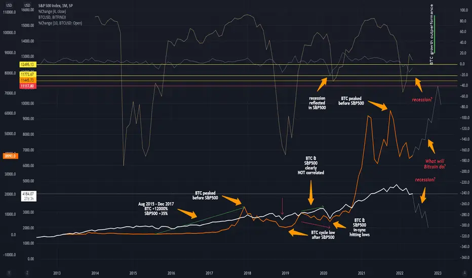
Bitcoin Stock Market & Recession CorrelationI wanted to create a view to hightlight correlation and Bitcoin (BTC) with the stock market (here the S&P500).
This chart has many areas of interest.
It shows Bitcoin can be completely detached from the stock market (as it runs it somewhat independent cycles).
It also show Bitcoin can be indicating a stock market top.
We only have one recesssion to observe Bitcoins behaviour. It show Bitcoin seems to have been affected by the recession in 2018 (respectively the 20% drop in S&P500).
If we consider where in the cycle Bitcoin is and expect a recession in global markets it is difficult if not just simply impossible to predict Bitcoins behaviour.
The assumption is Bitcoin can act independent of the market.
Market participants could more and more use Bitcoin and not to forget the crypto market as a whole to hedge inflation.
What the chart shows beautifully is that Bitcoin clearly has the higher rates of return! ;)
--------------------------------------------------------------------------------------------------------
** Please support this idea with your likes and comments, it is the best way to keep it relevant and support me. **
--------------------------------------------------------------------------------------------------------
!! Donations via TradingView coins also help me a great deal at posting more free trading content and signals here !!
BTC, NDXT, and DXY at a CrossroadsPreviously, I’ve demonstrated stepping-stone descending horizontal Wyckoff re-distribution trading ranges for BTC. The fact that the BTC price action broke the trading range support to the downside for a sustained period of time supports the notion of a re-distribution trading range. I opened a short position near the trading range support ($41,313). Since then, my first target of $37,400 has been hit. Based on an analysis of the Phoenix Ascending (PA) indicators (bottom panel), I expect an upthrust toward the trading range support followed by downward price movement.
Short position open: $41,313
Take profit target #1: $37,400
Profit/Loss (%): 9.44
Significant bars, which help define important areas of support and resistance, are given by the blue shading. The blue arrows point to volume spikes.
Wyckoff abbreviations: automatic rally (ARa), buying climax (BC), selling climax (SC), secondary test (ST), upthrust (UT), failed upthrust (FUT), last point of supply (LPSY), shakeout (SO), sign of weakness (SO), Phase A (Ph A), Phase B (Ph B), Phase C (Ph C), Phase D (Ph D), Phase E (Ph E).

Elliott Wave Analysis: AUDJPY May Have Found The TopHello traders! Today we will talk about AUDJPY pair in which we see a completed Elliott wave five-wave bullish cycle and potential top formation after recent break below strong trendline.
In Elliott wave theory, we always have to expect a minimum three-wave reversal after a completed five-wave cycle.
We are now observing a minimum three-wave A/1-B/2-C/3 decline, where wave C or 3 can be already in play.
The main reason why AUDJPY could be turning down is strong support on US bonds and also still bearish looking stocks in current risk-off sentiment. A positively correlated SP500 is just about to break Feburary 2022 lows, which can easily send AUDJPY pair lower, at least towards 88 area for wave C, if not even down to 85 area for wave 3.
Trade well!
If you like what we do, then please like and share our idea!
Disclosure: Please be informed that information we provide is NOT a trading recommendation or investment advice. All of our work is for educational purposes only.

MACRO BEARISH PICTURE FOR BTC/ STOCKSSo BTC has been correlated to stock market especially to NASDAQ nearly perfectly. Very hard to predict any moves on lower time frames as we rely on traditional markets. Best to do is bid at the best monthly/weekly supports in low 30ks. Looking at two scenarios:
1. Either we bounce from low 30ks and continue crab range into the mid 40s
2. Or we capitulate below support, loose that level and then bounce back much stronger with new ATH target.
BTC currently still at the weekly support in 38k and it finds the bids there. Would definitely not short in that area until we lose 38k and then retest it. Patience wins the game so still waiting for 30ks to play out OR a move above 43k to show strength.

DXY vs BTCDXY is inverse correlate with BTC price.
When the $ is crashing (or slowly grinding) the BTC price is going parabolic (or performing well).
The assets that have a high risk (crypto) are not performing very well when the $ index is rising.
Best strategy now is to be patience and zoom out.
Even if the recession is confirmed, we'll have the best buying opportunities of the lifetime no matter what.
The fear and downtrends always are followed by greed and uptrends.
The question is, how long this downtrend will take?

Play around Key level at 2.65 and daily trend-line.Looking for a reversal sign for a long oppurtunity. Just from at least 1-2 daily close above trend-line.
Looking for a test of 2.65 and re-test of trend-line for a short opportunity.
Must be coordinate with bitcoin sentiment.

BRIEFING Week #17 : BTC/Nasdaq Correlation ??!
Here's your weekly update ! Brought to you each weekend with years of track-record history..
Don't forget to hit the like/follow button if you feel like this post deserves it ;)
That's the best way to support me and help pushing this content to other users.
Kindly,
Phil

Correlation Between BTC and DXYPreviously, I’ve demonstrated that, oftentimes, there exists a strong positive correlation between the BTC price and the NASDAQ 100 Technology Sector (NDXT) price suggesting that knowledge of the BTC price allows one to predict the NDXT price with a reasonable degree of accuracy and vice versa.
The purpose here is to test the notion that when the US dollar is strong, BTC is weak and vice versa. To test this notion, I plotted the BTC closing price (purple solid line) and the US Dollar Currency Index (DXY) closing price (black solid line) on the daily time frame. The DXY closing price was used here as an index of the degree of US dollar strength. Based on visual inspection of the upper panel of the chart, there are time periods during which there exists a strong positive correlation, time periods during there exists little to no relationship, and time period during which there exists a strong negative correlation.
Given in the lower panel is the Pearson correlation coefficient value over time (red, white, and red solid line), the 95% confidence interval for the correlation coefficient (boundaries of the confidence interval is given by the solid cyan lines), the lower limit of the correlation coefficient (lower limit = -1.0, inverse relationship, white dotted line), upper limit for the correlation coefficient (upper limit = +1.0, direct relationship, white dotted line), and probability value (P value, yellow histogram) for the correlation coefficient. Note that the correlation coefficient is considered statistically significant (i.e., highly unlikely to be due to chance) when the P value is less than 0.05.
When the correlation coefficient line is green, there is a statistically significant positive correlation between the BTC price and the DXY price.
When the correlation coefficient line is red, there is a statistically significant negative correlation between the BTC price and the DXY price.
When the correlation coefficient is white, there is no meaningful relationship between the BTC price and the DXY price.
An important caveat to note: Each Pearson’s correlation coefficient is calculated on 20 days of price data.
Interestingly, from Jan 1, 2022 to the present the DXY price has increased by greater than 44%. During the same time interval, the BTC price has decreased by greater than 14%
The Correlation with P-Value and Confidence Interval indicator is by @balipour.
This is not financial advice. I am not your financial advisor. This is my opinion.

Correlation Between BTC and NDXTNumerous podcasts and other news sources suggest that there exists a strong positive correlation between BTC price and the price of tech stocks. To test this notion, I plotted the BTC closing price and the NASDAQ 100 Technology Sector (NDXT) closing price on the daily time frame. Based on visual inspection of the upper panel of the chart, there are time periods during which there exists a strong positive correlation, time periods during there exists little to no relationship, and time period during which there exists a strong negative correlation.
Given in the lower panel is the Pearson correlation coefficient value over time (red, white, and red solid line), the 95% confidence interval for the correlation coefficient (boundaries of the confidence interval is given by the solid cyan lines), the lower limit of the correlation coefficient (lower limit = -1.0, white dotted line), upper limit for the correlation coefficient (upper limit = +1.0, white dotted line), and probability value (P value, yellow histogram) for the correlation coefficient. Note that the correlation coefficient is considered statistically significant (i.e., highly unlikely to be due to chance) when the P value is less than 0.05.
When the correlation coefficient line is green, there is a statistically significant positive correlation between the BTC price and the NDXT price.
When the correlation coefficient line is red, there is a statistically significant negative correlation between the BTC price and the NDXT price.
When the correlation coefficient is white, there is no meaningful relationship between the BTC price and the NDXT price.
An important caveat to note: Each Pearson’s correlation coefficient is calculated on 20 days of price data.
This is not financial advice. I am not your financial advisor. This is my opinion.

Bitcoin and ESmini Hard core correlationJust a visual on how correlated these two tickers are. Pivots line up eerily close, though price reacts at different degrees of magnitude.
More up dates in my other locations. Cheers

USDJPY Could Retest The Highs, While US Bonds Are DownHello traders!
Today we want to share an intraday update for USDJPY pair in which we see nice and clean bullish impulse in progress, ideally back to highs for wave 5 that can retest the highs and 125 - 126 area.
The main reason why USDJPY may stay up is still an unfinished five-wave decline on 10Y US Treasury Notes.
As you can see, there's a negative correlation, so if bonds are still pointing lower for wave (5), then USDJPY could easily stay up, while the price is above 123.05 invalidation level.
Trade well!
If you like what we do, then please like and share our idea.
Disclosure: Please be informed that information we provide is NOT a trading recommendation or investment advice. All of our work is for educational purposes only.

How To Invest In Bitcoin & Ethereum Using S&P500 IndexIn this video, I explain how Ethereum and Bitcoin have been trading in tight correlation to the U.S S&P500 stock market Index.
I will show you how to use historical Volatility, to know how much the two cryptocurrencies fluctuate on average per month, alongside price swings in the S&P500.
Equipped this this knowledge, you will be able to see when the S&P500 pulls back within its long-term bullish trend, this is the time to buy Ethereum and Bitcoin.
Its been well documented in the media about this correlation, but let me show you how to make money from it.

DXY I am looking to see DXY shoot to the given resistance level. As we can see we are in an ascending channel, let's see how it goes.

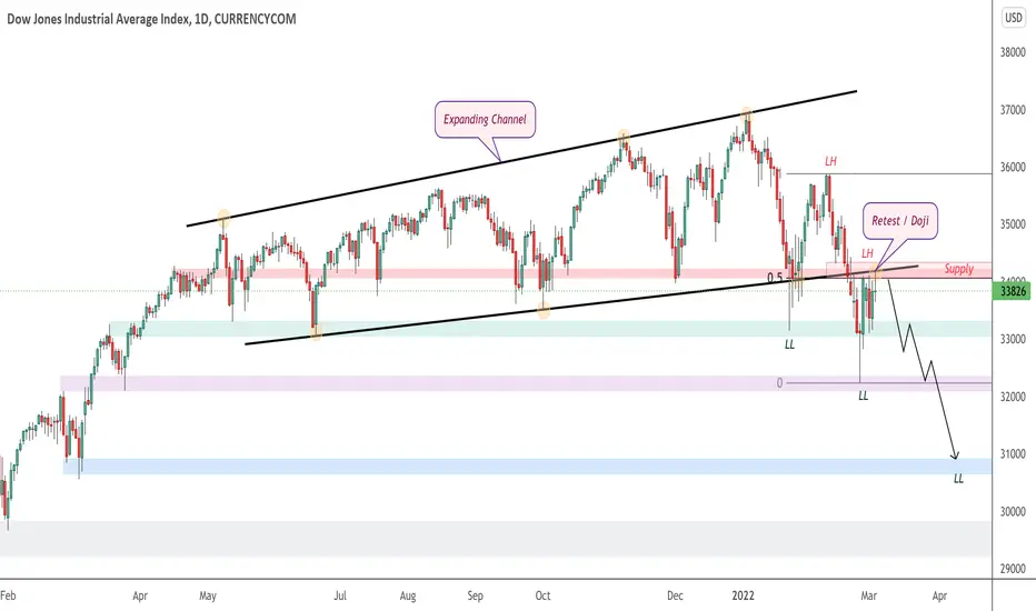
US30 Daily Price was previously in a rising expanding channel, then a breakout to the downside occur, & current market structure is a downtrend where price is now forming lower lows & highs. Price has now made a new lower high, making a retest of the broken channel. This zone also aligns perfectly with the 50% fibonacci retracement & a strong zone of previous support now new resistance. Price has been stalling at this region all week now, & today a Doji indecision candlestick has formed. I am now anticipating for price to remain below this supply region, & form a new potential lower low towards a strong area of daily demand below.
Stonk-Crypto Update (#10) : Crypto/Stocks ready to Decouple ?Here's your weekly update ! Brought to you each weekend with years of track-record history..
Don't forget to hit the like/follow button if you feel like this post deserves it ;)
That's the best way to support me and help pushing this content to other users.
Kindly,
Phil

BTC vs Gold vs NASDAQ CorrelationAn overview comparison of the correlation between BTC, Gold, and Stock (NASDAQ).

DXY MELTING!I am looking to see DXY melt. Let see how it reacts to the given resistance zone. Lets hope for the best.

NAS100 H1Price has previously created a rising wedge pattern, & has broken it to the downside after failing multiple times to break above key level resistance, which aligns with the higher timeframe descending trend line which was rejected for a "3rd time today. Price also has formed a head on shoulders formation on the lower timeframe & has made a successful break & retest of the neckline. I am watching the intraday supply zone here for price to print a fresh lower high, where then on the lower timeframe I will be anticipating for price to make a lower low towards 4 Hour support below.

DXY MELTING!I am seeing a lot of weakness in the US Dollar. I have set the first tp zone but if things continue this way we may see the dollar reach the 94.415 level. Let's see how it goes.
