BTC - Trap, Tap, and Blast Off!BTC has been overall bullish, trading within the rising blue channel (1). After reaching a local high, it entered a short-term correction, forming a falling red channel (2).
👀All eyes are now on the key demand zone (3), which aligns with the lower bound of both the red channel and the rising blue structure.
🔎As long as this confluence holds, we anticipate a potential bullish impulse in August.
A retest of the $111,500–$112,000 zone could serve as the trigger for the next leg toward $128,000. Let’s see if BTC is gearing up for another breakout or if a deeper correction is in play.
🔔 Disclaimer: This analysis is for educational and informational purposes only. It does not constitute financial advice or a recommendation to buy or sell any asset. Always do your own research and manage your risk accordingly.
📚 Always follow your trading plan => including entry, risk management, and trade execution.
Good luck!
All strategies are good, if managed properly.
~ Richard Nasr
Cycle

LOOKS CAN ENTER LONG TERM CYCLE AFTER THISLooks seems to make an important trend, which can allow this coin to enter a cycle area.
On the low time frame, it shows breakdown. The main view is that this coin is positive.
$0,035 is an important cycle target, which can be done with time depending on the last confirmations.

TheKing Cycles- Nothing can be perfect in Life or in Trading, but you can always brighten up your day.
- Remember "Cycles are Cycles"
- Everything is in graph
- You can follow bears, predicting 10 years of recession, but we are in a big recession and for a long time already.
- You can fall in the deep and predict the darkness.
- i like to see the sunshine in the morning and i will always radiate warmth.
- Follow Hope, and always believe in your own judgement.
- Be Bold and do the opposite of what commons peoples think.
Happy Tr4Ding !

BTC is Back in Price Discovery Mode — Targeting $140K!After a clean break above the previous all-time high, Bitcoin has officially entered a new impulse phase, trading within a steep rising channel.
The green zone around the previous ATH is now acting as a strong support zone, confirming the shift in market structure.
🟠 The macro trend remains intact, and bulls are clearly in control.
🌀 Corrections continue to offer opportunities for trend-following entries, and if momentum holds, BTC could be on its way toward the $140,000 mark — the upper boundary of the macro channel.
Until then, every dip is a gift in this bullish cycle. 🔥
🧠 Trade with the trend. Manage your risk. Stay ready.
📚 Always follow your trading plan regarding entry, risk management, and trade management.
Good luck!
All Strategies Are Good; If Managed Properly!
~Richard Nasr

BTC – Bullish Continuation Ahead ?Bitcoin has been trading within a well-defined rising channel since mid-2023, respecting both upper and lower bounds beautifully.
After each impulsive move, we’ve seen healthy corrections followed by bullish continuations — a classic market structure in play.
🟦 Accumulation Zone: After a long accumulation phase, BTC kicked off a strong bullish cycle.
🟥 Correction Phases: Each major move was followed by a red correction zone before resuming the uptrend.
🟧 Current Phase: BTC is consolidating just below the upper channel boundary. A breakout above this zone could confirm the next bullish wave toward $140K+.
🔵 Key Observations:
Structure remains intact within the channel
Previous breakout zones now acting as support (blue arrows)
Continuation patterns are forming, signaling potential upside
🏹As long as the orange zone holds, BTC remains in a bullish structure, and a breakout would likely push us to new highs.
📍Will history repeat and BTC continue its journey toward the upper channel boundary? Let’s wait for confirmation!
💬 What’s your bias here? Are you bullish or waiting for a deeper pullback?
📚 Always follow your trading plan regarding entry, risk management, and trade management.
Good luck!
All Strategies Are Good; If Managed Properly!
~Richard Nasr

Bitcoin's 4-year bullish cycle is coming to an end.The price reversal and manipulation zone could be between $120K and $133K, indicating a big bearish movement.
Quarterly analysis indicates a target of approximately $24,750.
QT + ICT + SMC
- Sainty

BTC Macro Cycle Outlook (Log Chart)Bitcoin continues to respect its logarithmic ascending channel that has defined every major bull and bear cycle since 2015. Each cycle top has historically aligned with the upper blue trendline, marked by sharp rejections (red arrows 🔴).
Currently, BTC is pushing within a steep short-term channel, mirroring previous parabolic phases. If the structure holds, we could see a final push toward the $300,000 zone, which aligns with the channel resistance — potentially marking the next cycle top.
📈 This chart captures the bigger picture — filtering out short-term noise and focusing on the rhythm of Bitcoin’s long-term cycles.
Do you think this cycle will end like the last two? Or are we in for something different?
All Strategies Are Good; If Managed Properly!
~Richard Nasr

is WLD READY FOR NEW CYCLE to $4Worldcoin looks to have new data, which could mean a new cycle is on processing.
Low time frame focus target $1,70

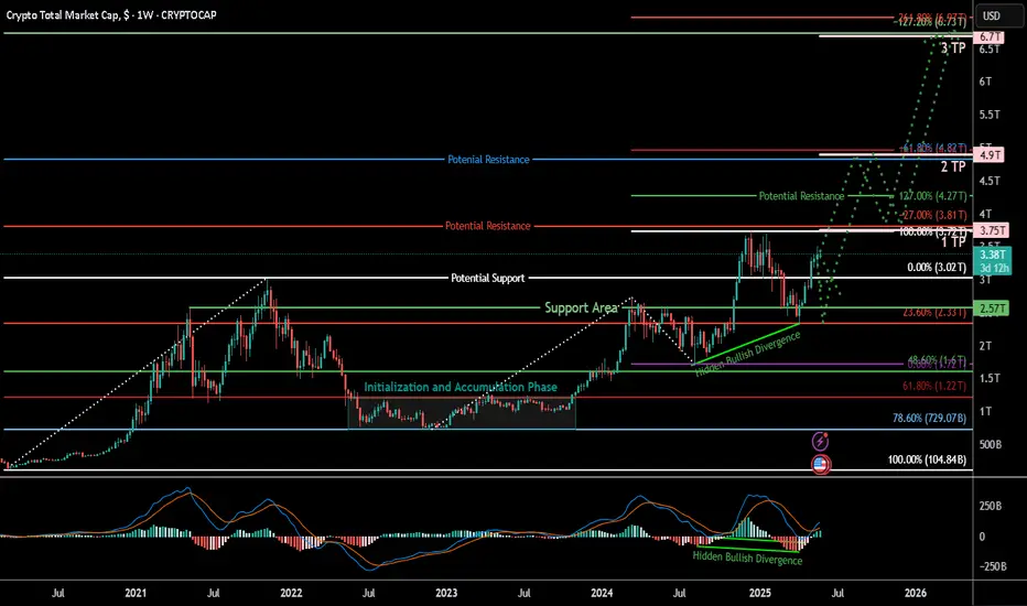
TOTAL Crypto Market Cap: Structural Breakout Aligns with Macros## 📊 TOTAL – Crypto Market Cap Ready for Expansion Phase?
---
### 🧵 **Summary**
The crypto market is showing signs of strong macro strength, with TOTAL reclaiming major support levels and forming a structurally bullish setup. Our multi-Fibonacci confluences and hidden bullish divergence point toward the possibility of a sustained breakout and new expansion leg toward \$4.9T and beyond.
This bullish view is further supported by powerful macro fundamentals expected over the next 8–10 months, including:
* Central bank rate cuts and liquidity expansion
* U.S. and EU regulatory clarity (stablecoins, ETFs, MiCA)
* Strong institutional adoption and geopolitical shifts
* Ethereum scaling upgrades and Bitcoin halving cycle effects
Together, these narratives form a compelling foundation for a broad-based market cap expansion.
---
### 📈 **Chart Context**
This is a **weekly chart of the TOTAL crypto market cap**, providing a bird’s-eye view of market cycles, macro structure, and capital flow across the entire ecosystem.
---
### 🧠 **Key Technical Observations**
* **Reclaim of \$3.02T level** (key support/fib level) signals macro bullish momentum.
* Market is forming **higher lows and bullish continuation structures**.
* **Support zones:** \$3.02T (reclaimed), \$2.57T (key pivot),
* **Resistance/TP zones:**
* **TP1 – \$3.75T** (100% trend-based fib + -27% retracement expansion)
* **TP2 – \$4.9T** (161.8% trend-based fib + -61.8% retracement expansion)
* **TP3 – \$6.9T** (261.8% fib extension target)
---
### 🧶 **Fibonacci Confluences and TP Logic**
We’ve employed both **standard Fibonacci retracement** and **trend-based extension** tools to build our target structure. The **1TP and 2TP zones** are defined by confluences between:
* **Retracement expansion levels** of **-27% and -61.8%**
* **Trend-based extension levels** of **100% and 161.8%**
If price reaches 2TP (~~\$4.9T) and **retraces toward the parallel legs** (100%–127%), this would confirm structural symmetry and open the door for a final push toward \*\*TP3 (~~\$6.9T)\*\* — the 261.8% extension.
---
### 🔍 **Indicators**
* **MACD Crossover** and rising histogram bars
* **Hidden Bullish Divergence** between MACD and price – a classic continuation signal
* Weekly trendline breakout from accumulation zone
---
### 🧠 **Fundamental Context**
While not directly charted, key macro catalysts like ETF approvals, global liquidity cycles, monetary easing, and increasing institutional interest will likely play a role in the next phase of expansion. This chart captures the structural readiness for that narrative.
## 📊 Fundamental Context (Extended Outlook: Mid-2025 to Early 2026)
Below is a detailed breakdown of upcoming macroeconomic, geopolitical, and crypto-specific developments sourced from:
* Bitwise Asset Management
* Fidelity Digital Assets
* ARK Invest
* CoinDesk, Reuters, Axios, WSJ
* CapitalWars, Cointelegraph, Coinpedia
* European Commission (MiCA regulations)
* U.S. Congressional records and SEC announcements
These events are chronologically aligned to support a structured macro bullish thesis for TOTAL market cap.
Bullish Crypto Catalysts (June 2025 – Feb 2026)
Summer 2025 (Jun–Aug): Monetary Easing and Regulatory Breakthroughs
Central Bank Policy Pivot: By mid-2025, major central banks are shifting toward easier policy. Market expectations indicate the U.S. Federal Reserve will stop tightening and begin cutting interest rates in 2025, with forecasts of up to three rate cuts by end-2025
bitwiseinvestments.eu
. Declining inflation and rising unemployment are pushing the Fed in this direction
bitwiseinvestments.eu
bitwiseinvestments.eu
. Easier monetary policy increases global liquidity and risk appetite, historically providing a tailwind for Bitcoin and crypto prices
bitwiseinvestments.eu
. In fact, global money supply is near record highs, a condition that in past cycles preceded major Bitcoin rallies
bitwiseinvestments.eu
. Should economic volatility worsen, the Fed has even signaled readiness to deploy fresh stimulus, which would inject more liquidity – “another tailwind for Bitcoin price growth”
nasdaq.com
.
Liquidity and Inflation Trends: With inflation trending down from earlier peaks, central banks like the Fed and European Central Bank are under less pressure to tighten. This opens the door for potential liquidity injections or QE if growth falters. Analysts note a strong correlation (often >84%) between expanding global M2 money supply and Bitcoin’s price rise
nasdaq.com
. There is typically a ~2-month lag for liquidity increases to flow into speculative assets like crypto
nasdaq.com
nasdaq.com
. The monetary easing expected in mid-2025 could therefore boost crypto markets by late summer, as new liquidity finds its way into higher-yielding investments. One projection even models Bitcoin retesting all-time highs (~$108K by June 2025) if global liquidity continues upward
nasdaq.com
– underscoring how “accelerated expansion of global liquidity” often aligns with crypto bull runs
nasdaq.com
.
U.S. Stablecoin Legislation: A landmark regulatory catalyst is anticipated in summer 2025: the first comprehensive U.S. crypto law, focused on stablecoins. The Senate has advanced the Guiding and Establishing National Innovation for U.S. Stablecoins (GENIUS) Act to a final vote
coindesk.com
. Passage of this bill (expected by mid-2025) would create a federal framework for stablecoin issuers, resolving a major regulatory gray area
coindesk.com
. Analysts call this “one of the most important regulatory developments in the history of crypto” – potentially even bigger than the approval of spot Bitcoin ETFs in impact
coindesk.com
. By enforcing prudential standards on stablecoin reserves and permitting licensed issuance, the law would legitimize stablecoins as a core part of the financial system. Bitwise predicts that clear rules could trigger a “multi-year crypto bull market,” with stablecoin market cap exploding from ~$245B to $2.5 trillion as mainstream adoption accelerates
coindesk.com
coindesk.com
. A U.S. law would also likely set a global precedent, encouraging other regions to integrate crypto-dollar tokens into commerce. Bottom line: expected stablecoin regulation in summer 2025 is a bullish game-changer, improving market integrity and unlocking new liquidity for crypto markets
coindesk.com
.
Regulatory Clarity in Europe: Meanwhile, Europe’s comprehensive MiCA regulations have fully taken effect as of late 2024, so by summer 2025 the EU has a unified crypto framework. This gives legal clarity to issuers, exchanges, and custodians across the 27-nation bloc
pymnts.com
skadden.com
. The harmonized rules (covering everything from stablecoin reserves to exchange licensing) are expected to expand Europe’s crypto market size by 15–20% in the coming years
dailyhodl.com
. With MiCA in force, firms can confidently launch crypto products EU-wide, and institutional investors have more protection. U.K. regulators are on a similar path – e.g. recognizing stablecoins as payment instruments – further globalizing the pro-crypto regulatory trend. By mid-2025, this regulatory thaw in major economies is improving investor sentiment. Goldman Sachs recently noted that 91% of crypto firms are gearing up for MiCA compliance – a sign that industry is preparing to scale under clearer rules
merklescience.com
merklescience.com
. Overall, the summer of 2025 marks a turning point: governments are embracing sensible crypto rules (rather than harsh crackdowns), reducing uncertainty and inviting institutional capital off the sidelines.
Initial ETF Impact: The first wave of U.S. spot crypto ETFs – approved in late 2023 and January 2024 – will have been trading for over a year by mid-2025
investopedia.com
. Their success is already far exceeding expectations: BlackRock’s iShares Bitcoin Trust amassed a record $52 billion AUM in its first year (the biggest ETF launch in history)
coindesk.com
, and other Bitcoin funds from Fidelity, ARK, and Bitwise quickly joined the top 20 U.S. ETF launches of all time
coindesk.com
. These products have unleashed pent-up retail and institutional demand by offering a regulated, convenient vehicle for crypto exposure
coindesk.com
. By summer 2025, ETF inflows are still robust, and many Wall Street analysts expect a second wave of approvals. Indeed, 2025 is being called “the Year of Crypto ETFs”
coindesk.com
. Observers predict dozens of new funds – including spot Ether, Solana, and XRP ETFs – could win approval under revamped SEC leadership in the post-2024 election environment
coindesk.com
. If so, late 2025 could see a broad menu of crypto ETF offerings, widening investor access to the asset class. This steady drumbeat of ETF launches and inflows adds a structural source of buy-pressure under crypto markets throughout 2025. (Notably, Bloomberg data showed over $1.7B poured into spot crypto ETFs in just the first week of 2025, on top of 2024’s flows
etf.com
.) In short, the ETF effect – “shocking the industry to its core” in year one
coindesk.com
– is set to grow even stronger in 2025, channeling more traditional capital into crypto.
U.S. Political Shift (Post-Election): The outcome of the Nov 2024 U.S. elections is a crucial backdrop by mid-2025. A new administration under President Donald Trump took office in January 2025 and immediately signaled a markedly pro-crypto policy stance. Within his first 100 days, Trump’s appointments to key financial agencies (SEC, CFTC, OCC) effectuated a “180° pivot” in crypto regulation from the prior administration
cnbc.com
. Industry observers describe a sharp policy reversal – where previously the sector faced hostility, now it’s courted as an engine of innovation. President Trump has publicly vowed to be “the first crypto-president,” hosting crypto industry leaders at the White House and promising to boost digital asset adoption
reuters.com
. He even floated creating a strategic Bitcoin reserve for the United States
reuters.com
– a striking show of support for Bitcoin’s role as a reserve asset (though it remains to be seen if this materializes). More tangibly, regulatory agencies have begun rolling back onerous rules. For example, the SEC under new leadership scrapped a prior accounting guideline that made bank crypto custody prohibitively expensive
reuters.com
. And the Office of the Comptroller of the Currency (OCC) has “paved the way” for banks to engage in crypto activities like custody and stablecoin issuance
reuters.com
. These changes in Washington brighten the outlook for crypto markets: with regulatory uncertainty fading, U.S. institutions feel more confident to participate. In essence, by mid-2025 the world’s largest capital market (the U.S.) is shifting from impeding crypto to embracing it, a narrative change that cannot be overstated in its bullish significance
coindesk.com
reuters.com
.
Geopolitical Easing and BRICS Actions: Global macro conditions in summer 2025 may also improve due to geopolitical developments. If major conflicts (like the Russia-Ukraine war) de-escalate or move toward resolution by late 2024 or 2025, it would remove a key source of risk-off sentiment. Lower geopolitical risk and easing of war-driven commodity shocks would help cool inflation (especially energy prices) and bolster global growth – factors that support risk asset rallies (crypto included). On another front, the BRICS nations (Brazil, Russia, India, China, South Africa + new members) are continuing their de-dollarization agenda in 2025. At the BRICS summit in October 2024, they discussed creating a new gold-backed reserve currency (“the Unit”) as an alternative to the U.S. dollar
investingnews.com
. They also announced a BRICS blockchain-based payment network (“BRICS Bridge”) to connect their financial systems via CBDCs, bypassing Western networks
investingnews.com
. Going into 2025, these initiatives are expected to progress (with Russia currently chairing BRICS). While a full-fledged BRICS currency may be years away (and faces hurdles
moderndiplomacy.eu
), the bloc’s move to settle more trade in non-USD currencies is already underway (by 2023, roughly 20% of oil trades were in other currencies)
investingnews.com
. Implication: A shift toward a more multi-polar currency world could weaken U.S. dollar dominance over time
investingnews.com
. For crypto, this trend is intriguing – as nations seek dollar alternatives, Bitcoin’s appeal as a neutral, supranational asset may rise. In sanctioned or economically volatile countries, both elites and the public might accelerate adoption of crypto for cross-border value storage. For example, U.S. sanctions on Russia and China have already catalyzed talk of reserve diversification
investingnews.com
. Fidelity analysts note that “rising inflation, currency debasement and fiscal deficits” globally are making Bitcoin strategically attractive for even nation-states and central banks
coindesk.com
coindesk.com
. Summing up: a backdrop of improving geopolitical stability (if realized) plus a weakening dollar regime provides a bullish macro and narrative case for borderless cryptocurrencies as we enter the second half of 2025.
Fall 2025 (Sep–Nov): Institutional Inflows, Adoption & Tech Upgrades
Surging Institutional Adoption: By autumn 2025, the cumulative effect of regulatory clarity and market maturation is a wave of institutional adoption unlike any prior cycle. In traditional finance, major U.S. banks and brokers are cautiously but steadily entering the crypto arena. Reuters reports that Wall Street banks are now receiving “green lights” from regulators to expand into crypto services, after years of hesitance
reuters.com
reuters.com
. Many top banks have been internally testing crypto trading and custody via pilot programs
reuters.com
. As one example, Charles Schwab’s CEO said in May 2025 that regulator signals are “flashing pretty green” for large firms, and confirmed Schwab plans to offer spot crypto trading to clients within a year
reuters.com
. Banks like BNY Mellon, State Street, and Citigroup – which collectively manage trillions – are expected to roll out crypto custody solutions by 2025, often via partnerships with crypto-native custodians
dlnews.com
. The OCC has explicitly authorized banks to handle crypto custody and stablecoins (under proper safeguards), removing a key barrier
reuters.com
. And the SEC’s friendlier stance under new leadership means banks no longer face punitive capital charges for holding digital assets
reuters.com
. The net effect is that by late 2025, institutional-grade crypto infrastructure is falling into place. More pension funds, endowments, and asset managers can allocate to crypto through familiar channels (regulated custodians, ETFs, prime brokers). Even conservative banking giants are warming up: Bank of America’s CEO stated the bank “will embrace cryptocurrencies for payments if regulations permit” and hinted at possibly launching a BOA stablecoin for settlement
reuters.com
. Likewise, Fidelity and BlackRock’s crypto units are expanding offerings after seeing outsized demand. This institutional legitimization dramatically expands the pool of potential investors in crypto markets, supporting a higher total market capitalization.
Crypto ETF Expansion: In Q4 2025, the roster of crypto-based ETFs and funds is likely to broaden further. As noted, analysts foresee 50+ crypto ETFs by end of 2025 under the pro-industry U.S. regulatory regime
coindesk.com
. By fall, we may see Ethereum spot ETFs (building on the successful Bitcoin products) and even funds for large-cap altcoins. For instance, Nate Geraci of The ETF Store predicts spot Solana and XRP ETFs are on the horizon in the U.S.
coindesk.com
. Internationally, Canada and Europe already have multiple crypto ETPs – their continued growth adds to global inflows. With a year of performance history by late ’25, crypto ETFs will likely start seeing allocations from more conservative institutions (insurance firms, corporate treasuries, etc.) that needed to observe initially. Fidelity’s strategists noted that in 2024 much of the ETF buying came from retail and independent advisors, but 2025 could bring uptake from hedge funds, RIAs, and pensions as comfort grows
coindesk.com
coindesk.com
. In summary, fall 2025 should witness accelerating capital inflows via investment vehicles, as crypto solidifies its place in mainstream portfolios. This sustained demand – “2025’s flows will easily surpass 2024’s” according to one strategist
coindesk.com
– provides a steady bid under crypto asset prices, reinforcing a bullish trend.
Nation-State and Sovereign Adoption: A notable development to watch in late 2025 is the entry of nation-states and public institutions into Bitcoin. Fidelity Digital Assets published a report calling 2025 a potential “game changer in terms of bitcoin adoption”, predicting that more nation-states, central banks, sovereign wealth funds, and treasuries will buy BTC as a strategic reserve asset
coindesk.com
. The rationale is that with rising inflation and heavy debt loads, governments face currency debasement and financial instability, making Bitcoin an attractive hedge
coindesk.com
. By Q4 2025, we could see early signs of this trend. For example, there are rumors that Russia and Brazil have explored holding Bitcoin reserves
fortune.com
, and Middle Eastern sovereign funds flush with petrodollars might quietly accumulate crypto as diversification. In the U.S., President Trump and crypto-friendly lawmakers like Senator Cynthia Lummis have openly discussed establishing a U.S. Bitcoin reserve or adding BTC to Treasury holdings
coindesk.com
. Lummis even introduced a “Bitcoin Reserve” bill in 2024, which if enacted would set a precedent for national adoption
coindesk.com
. While such bold moves might not happen overnight, even small allocations by governments or central banks would be symbolically massive. It would validate crypto’s role as “digital gold” and potentially ignite FOMO among other nations (a game theory dynamic Fidelity’s report alludes to). Thus by late 2025, any announcements of central banks buying Bitcoin or countries mining/holding crypto (similar to El Salvador’s earlier example) could spur a bullish frenzy. At minimum, the expectation of this “sovereign bid” provides a narrative supporting the market. As Fidelity’s analysts put it: not owning some Bitcoin may soon be seen as a greater risk for governments than owning it
coindesk.com
. Ethereum & Crypto Tech Upgrades: The latter part of 2025 is also packed with technological catalysts in the crypto sector, which can boost investor optimism. Chief among these is Ethereum’s roadmap milestones. Ethereum core developers plan to deliver major scaling improvements by end-2025 as part of “The Surge” phase
bitrue.com
. This includes fully rolling out sharding – splitting the blockchain into parallel “shards” – combined with widespread Layer-2 rollups, aiming to increase throughput to 100,000+ transactions per second
bitrue.com
. If Ethereum achieves this by Q4 2025, it would vastly lower fees and increase capacity, enabling a new wave of decentralized application growth. For users, that means faster, cheaper transactions; for the market, it means Ethereum becomes more valuable as utilization can skyrocket without bottlenecks. Progress is well underway: an intermediate upgrade (EIP-4844 “proto-danksharding”) was implemented earlier to boost Layer-2 efficiency, and the next major upgrade (code-named Pectra) is slated for Q1 2025 focusing on validator improvements and blob data throughput
fidelitydigitalassets.com
. After that, the final sharding implementation is expected. By late 2025, Ethereum’s evolution – including MEV mitigation (The Scourge) and Verkle trees for lighter nodes (The Verge) – should make the network more scalable, secure, and decentralized
bitrue.com
. These upgrades are bullish for the ecosystem: a more scalable Ethereum can host more DeFi, NFT, and gaming activity, attracting capital and users from traditional tech. Investors may speculate on ETH demand rising with network activity. Beyond Ethereum, other protocols (Solana, Cardano, Layer-2s like Arbitrum, etc.) also have roadmap milestones during this period, potentially improving their value propositions. Overall, the tech backdrop in late 2025 is one of significant improvement, which supports a positive market outlook – the infrastructure will be ready for mainstream scale just as interest returns.
Bitcoin Halving Aftermath: Although the Bitcoin halving took place in April 2024, its bullish impact historically materializes with a lag of 12-18 months. That puts late 2025 into early 2026 right in the window when the post-halving cycle may reach a euphoric phase. By fall 2025, Bitcoin’s supply issuance will have been at half its prior rate for ~18 months, potentially leading to a supply-demand squeeze if demand surges. ARK Invest notes that previous halvings (2012, 2016, 2020) all coincided with the early stages of major bull markets
ark-invest.com
. Indeed, by Q4 2025 we may see this pattern repeating. ARK’s analysts observed in late 2024 that Bitcoin remained roughly on track with its four-year cycle and expressed “optimism about prospects for the next 6–12 months” following the April 2024 halving
ark-invest.com
. That optimism appears well-founded if macro conditions and adoption trends align as discussed. By November 2025, Bitcoin could be approaching or exceeding its previous all-time high ( ~$69K from 2021) – some crypto analysts foresee six-figure prices during this cycle. Importantly, a rising Bitcoin tide tends to lift the entire crypto market cap. Late 2025 could see a broad rally across altcoins, often referred to as “altseason,” as new retail and institutional money, emboldened by Bitcoin’s strength, diversifies into higher-beta crypto assets. The expectation of the halving-driven bull cycle can itself become a self-fulfilling sentiment booster: investors position ahead of it, providing additional buy pressure. In summary, fall 2025 is poised to be the crescendo of the Bitcoin halving cycle, with historical analogues (2013, 2017, 2021) suggesting a powerful uptrend in crypto prices. Reduced BTC supply + peak cycle FOMO + all the fundamental drivers (ETF flows, low rates, tech upgrades) make this timeframe particularly conducive to a bullish market cap expansion.
Winter 2025–26 (Dec–Feb): Peak Momentum and Continued Tailwinds
Bull Market Momentum: Entering winter 2025/26, the crypto market could be in full bull mode. If the above developments play out, total crypto market capitalization may be approaching new highs by late 2025, driven by strong fundamentals and investor FOMO. Historically, the final leg of crypto bull markets sees parabolic gains and surging liquidity inflows. We might witness that in Dec 2025 – Feb 2026: exuberant sentiment, mainstream media coverage of Bitcoin “breaking records,” and increased retail participation. Unlike the 2017 and 2021 peaks, however, this cycle has far greater institutional involvement, which could imply more sustainable capital inflows (and possibly a larger magnitude of inflows). Key macro factors are likely to remain supportive through early 2026: central banks that began easing in 2024-25 may continue to hold rates low or even consider renewed asset purchases if economies are soft. For instance, if a mild U.S. recession hits in late 2025, the Fed and peers could respond with quantitative easing or liquidity facilities, effectively “printing” money that often finds its way into asset markets, including crypto
nasdaq.com
. China’s PBoC could also inject stimulus to boost growth, adding to global liquidity. Such actions would prolong the “risk-on” environment into 2026, delaying any end to the crypto uptrend. Additionally, global equity markets are projected to be strong in this scenario (buoyed by low rates and easing geopolitical tensions), and crypto’s correlation with equities means a rising stock tide lifts crypto too – as was observed in May 2025 when stock rallies coincided with BTC and ETH jumps
blockchain.news
blockchain.news
.
Investor Sentiment and Retail Revival: By early 2026, investor sentiment toward crypto could be the most bullish since 2021. With clear regulatory frameworks, high-profile endorsements (even governments buying in), and tech narratives (Web3, AI+blockchain, etc.), the stage is set for a positive feedback loop. Retail investors who largely sat out during the harsh 2022–23 bear market may fully return, spurred by “fear of missing out” as they see Bitcoin and popular altcoins climbing. This broadening of participation (from hedge funds down to everyday investors globally) increases market breadth and can drive total market cap to climactic heights. Notably, the availability of user-friendly investment onramps – e.g. spot crypto ETFs through any brokerage, crypto offerings integrated in fintech apps and banks – makes it much easier for average investors to allocate to crypto in 2025-26 than in past cycles. The removal of friction means inflows can ramp up faster and larger. Social media and pop culture hype also tend to peak in late-stage bulls; we might see Bitcoin and Ethereum becoming water-cooler talk again, drawing in new demographics. All of this contributes to strong sentiment and capital inflows in winter 2025/26, reinforcing the bullish outlook.
Continued Policy and Geopolitical Tailwinds: The policy landscape is expected to remain a tailwind into 2026. In the U.S., if the pro-crypto Trump administration stays aligned with its promises, we could see additional positive actions: perhaps tax clarity for digital assets, streamlined ETF approvals for more crypto categories, or even federal guidelines for banks to hold crypto on balance sheets. Such steps would further normalize crypto within the financial system. Regulatory coordination internationally might also improve – for example, G20 nations in 2025 have been working on a global crypto reporting framework and stablecoin standards, which, once implemented, reduce the risk of harsh crackdowns in any major economy. On the geopolitical front, the BRICS de-dollarization efforts might bear first fruit by 2026, such as increased trade settled in yuan, gold, or even Bitcoin. If Saudi Arabia (a new BRICS invitee) starts pricing some oil in non-USD, that could weaken dollar liquidity at the margins, and some of that displaced value might flow to alternative stores like crypto or gold. Additionally, by 2026 the world will be looking ahead to the next U.S. Presidential election cycle (2028) – typically, in the lead-up, administrations prefer supportive economic conditions. This could mean fiscal stimulus or at least no new financial regulations that rock markets, implying a benign policy environment for risk assets. In Europe, 2026 will see MiCA fully operational and possibly updated with new provisions for DeFi and NFTs, further integrating the crypto market. In sum, early 2026 should carry forward many of 2025’s positive drivers – ample liquidity, regulatory support, and growing mainstream acceptance – giving little reason to suspect an abrupt end to the bullish trend during this window.
Bitcoin Halving Cycle Peak: If history rhymes, the crypto market might reach a cycle peak somewhere around late 2025 or early 2026. Past bull cycles (2013, 2017, 2021) peaked roughly 12-18 months after the halving; a similar timeframe would put a possible top in the Dec 2025 – Feb 2026 period. That could mean Bitcoin at unprecedented price levels and total crypto market cap in multi-trillions, barring any unforeseen shocks. ARK Invest’s analysis as of late 2024 remained optimistic that Bitcoin was “in sync with historical cycles” and poised for strong performance into 2025
ark-invest.com
. By early 2026, those cycle dynamics (diminished new supply vs. surging demand) might reach a crescendo. One metric to watch is the stock-to-flow or issuance rate – post-halving Bitcoin’s inflation rate is below 1%, lower than gold’s, which can drive the digital gold narrative to its zenith at this point. Moreover, Ethereum’s upcoming transition to a deflationary issuance (with EIP-1559 fee burns and Proof-of-Stake) means ETH could also be seeing declining supply into 2026, potentially amplifying its price if demand spikes. Thus, both of the top crypto assets would have increasing scarcity dynamics during the period when interest is highest – a recipe for a dramatic run-up. Importantly, capital rotations within crypto during peak phases often send smaller altcoins skyrocketing (as investors seek outsized gains), temporarily boosting total market cap beyond just Bitcoin’s contribution. All told, the early 2026 period could represent the euphoric apex of this cycle’s bull market, supported by solid macro and fundamental fuel laid in the preceding months. Even if volatility will be high, the overall outlook through February 2026 remains strongly bullish for crypto’s total market capitalization, given the confluence of loose monetary conditions, favorable policy shifts, geopolitical diversification into crypto, institutional FOMO, and major network upgrades powering the narrative.
✨ Philosophical Reflection
In the ever-unfolding rhythm of cycles—accumulation, expansion, distribution, and reset—crypto mirrors the deeper architecture of nature and consciousness. Just as seeds lie dormant in winter awaiting the kiss of spring, so too does capital bide its time in the shadows before surging into momentum. The Fibonacci spirals found in shells, storms, and galaxies reappear in price action—offering not just numbers, but a language of emergence. What we witness in the TOTAL market cap is not just a breakout—it is a reawakening. A collective pulse of belief, liquidity, and intention. In this confluence of technical geometry and macroeconomic tides, the market becomes more than price—it becomes a story, a symbol, a signal. We don’t just analyze this chart—we read it like a sacred map, charting the ascent of value, vision, and velocity.
History repeats itselfOANDA:EURUSD
Here’s a technical analysis of the higher timeframes, specifically the monthly chart for EUR/USD.
As clearly visible, price action is currently moving within a respected descending channel. The saying "history repeats itself" seems particularly relevant here, especially in the context of Trump’s presidency. While this topic has been discussed frequently, I wanted to highlight the striking similarities once again.
The current market cycle closely mirrors the previous one from 2016-2017 — in terms of structure, timing, and volume. At present, we appear to be in the distribution phase, which is far from complete.
It’s quite plausible that we may see further downside before another significant move to the upside begins. If we take the 2017 distribution phase as a reference (lasting approximately 300 days), the current phase has only been unfolding for around 80-100 days.
Of course, there is no guarantee that price will rise again — but I consider it very likely that this market cycle has not yet fully played out. Technical analysis on higher timeframes often provides stronger probabilities and a clearer picture of the overall trend.
On the right-hand side of the chart, I’ve marked a weekly imbalance (not directly visible on the monthly chart), which aligns with the 50% retracement level of the Fibonacci tool. I view this confluence as a strong potential entry for a swing trade targeting the upper boundary of the descending channel.
This outlines my current trading outlook.

Predicting the Next Bitcoin 200MA Peak Using Exponential DecayIn my ongoing study of Bitcoin market cycles, I noticed a compelling pattern in the behavior of the 200-day moving average (200MA) across bull markets. Specifically, I observed that the percentage rise of the 200MA from each cycle bottom to cycle top is decreasing over time, and this decline follows an exponential decay pattern.
Historical Observations:
• 2015 Cycle Bottom to 2017 Peak:
The 200MA increased by approximately +686%
• 2018 Cycle Bottom to 2021 Peak:
The 200MA increased by approximately +450%
This pattern suggested to me that the next peak in the 200MA might continue this decaying trajectory. To estimate this, I applied a simple exponential decay model using the two previous data points:
y(t) = A.e^{-kt}
Solving for the next value (t = 2), the model predicts an approximate increase of +296% in the 200MA from the current cycle bottom to the expected peak.
Implication for the Current Cycle:
Assuming the 200MA bottomed around $16,200, a +296% rise implies a target 200MA near:
$16,200 x (1 + 2.96) is approx. $64,000
This aligns remarkably well with the 2021 bull market top, reinforcing the idea that the previous all-time high (~ GETTEX:64K –$69K) could serve as a strong macro support level once this cycle matures.
Conclusion:
If this exponential decay pattern continues, we can expect the 200MA to peak around $64,000 during the current bull cycle. This target also coincides with historical resistance turned potential support, making it a critical level for long-term investors and swing traders alike.
This type of decay-based modeling, while not exact, offers a unique lens through which we can assess Bitcoin’s macro behavior across cycles. I’ll continue to monitor how this projection plays out and refine the model with new data as the market evolves.

BTC - Will we repeat last year price action?Bitcoin (BTC) has recently been trading within a relatively wide range, fluctuating between the $108,000 and $74,000 levels. Over the past several months, the asset experienced a notable decline from its local high of $108,000 down to a low of around $74,000. However, since reaching that bottom, BTC has been on a recovery trajectory, climbing back up toward the $106,000 region as of May. This rebound has brought renewed optimism to the market, but the key question now arises: is this upward momentum sustainable, or is it merely another temporary relief rally within a larger consolidation phase?
To evaluate the potential sustainability of this move, it is insightful to compare the current price action with that of exactly one year ago. In the same May period last year, BTC was also trading within a defined range, between $73,000 and $56,000. The pattern that unfolded then may offer clues as to what might happen next.
At that time, Bitcoin formed a double top, a classic technical pattern that often signals weakening bullish momentum. This structure developed over two distinct peaks, let's call them Point 1 and Point 2. Following the double top formation, the market began to retrace, initiating a decline that led to the creation of Point 3. This low established a key trendline, marking the beginning of a longer-term structural setup.
After bouncing from Point 3, BTC managed to rally once more, approaching a new all-time high but falling just short. This rally formed what can be referred to as Point 4, and notably, this occurred in May, exactly where we are now on the calendar. However, this attempt to break to new highs ultimately failed. The market lost momentum, and BTC turned downward once again, culminating in another test of the established trendline. This next low, which we can label Point 5, occurred in July and served as the third touchpoint of the trendline, reinforcing its significance.
Fast forward to the present, and it appears that Bitcoin may be following a similar structural path. The current price action suggests that Points 1, 2, and 3 have already been formed in recent months. The bounce that we’re witnessing now could potentially be developing into Point 4, mirroring the rally seen last May. If history were to repeat or even slightly rhyme, we may be approaching a local high, after which the market could face renewed downward pressure.
Such a move would align with a third touch of the longer-term trendline, potentially occurring in the coming months, perhaps around July, just as it did the previous year. Furthermore, this prospective downside move would also serve to close a daily Fair Value Gap (FVG) that has remained largely unfilled, a technical factor that many traders are currently watching.
In summary, while the recent price recovery in Bitcoin is encouraging, a closer examination of past market structure and recurring seasonal patterns suggests caution. The market may be setting up for a local high in May, followed by a potential retracement that would once again validate key support levels and trendlines. Whether this scenario plays out in full remains to be seen, but the parallels with last year’s behavior are worth noting for any trader or investor closely monitoring the charts.
Thanks for your support.
- Make sure to follow me so you don't miss out on the next analysis!
- Drop a like and leave a comment!

Bitcoin Is Final Stages Of A Bullish CycleBitcoin is still bullish and the rise looks impulsive on the monthly chart, but cyclically, we are in the late stages of a 3-year bull run that can end this year, ideally around October 2025. There’s actually still about 5 months of a bullish trend to complete 35 monthly bars, like in previous bullish cycles, so we may easily see more gains this year from a technical perspective.
Next year we should be aware of a bear market that can last at least 12 monthly bars or one year.

Bitcoin's Path to $172KChart speaks for itself.
Cyclical patterns point to a Bitcoin top around the end of September 2025.
Unpacking my bags at $150K - $170K

Wyckoff Cycle - Practical Example (SUI)Dear TradingView community and fellow traders,
I am Richard, also known as theSignalyst.
I find the SUI daily chart to be intriguing as it appears to be following the famous Wyckoff Cycle.
I would like to apply Richard Wyckoff's four market stages/phases to this chart for analysis as a practical example.
1️⃣ Accumulation
SUI rejected the $0.50 round number and entered an accumulation phase, consolidating for several months.
2️⃣ MarkUp
After breaking above the accumulation range at $1, SUI kicked off the markup phase.
3️⃣ Distribution
SUI found resistance at the $5.50 round number, with the lower bound of its range near $4—forming a wide distribution phase.
4️⃣ MarkDown
Once SUI broke below the $4 major low and exited the distribution zone, it transitioned into the markdown phase.
🔄🔄🔄🔄🔄⬇️
1️⃣ Accumulation
After finding support around the $2 round number, SUI hovered within a range, forming another accumulation phase.
2️⃣ MarkUp
We're here 🙂 This week, SUI broke above the $2.80 major high and the accumulation range—signaling the beginning of a new markup phase.
❓ What's next?
Will SUI continue to trade higher from here, or will this cycle play out differently?
I hope you find this post useful, and I would appreciate your likes and support.
Which scenario do you think is more likely to happen first? and why?
📚 Always follow your trading plan regarding entry, risk management, and trade management.
Good luck!
All Strategies Are Good; If Managed Properly!
~Richard

BTC - From Bullish to Extreme Bullish...Hello TradingView Family / Fellow Traders. This is Richard, also known as theSignalyst.
🏢 BTC Building Blocks:
📈 Bullish:
BTC is currently trading within the second floor, between $92,000 and the previous all-time high (ATH) at $109,000.
As BTC retests the $96,000 demand zone, we’ll be looking for trend-following long setups!
📈 Extreme Bullish:
For the momentum to shift from Bullish to Extreme Bullish and enter the price discovery phase, a break above the previous ATH around $109,000 is needed.
📚 Always follow your trading plan regarding entry, risk management, and trade management.
Good luck!
All Strategies Are Good; If Managed Properly!
~Rich

CYCLE 4 | LOG Trend Lines Chart - For Fun!Quick post looking at how BTC has historically respected 'log trend lines and how they may affect BTC future price action.
Will be fun to see how this model holds up over cycle 4 and future BTC cycles (view on a computer and use the future price action tools to see what happened past todays post date).

SILVER XAG $24 | Range for entry $18 | $40 Oil has a 20 year cycle that resets from $5 to $120 per barrel
this Rock has less than 20 .. 10year of winding down and 3 years of unstoppable pump

Ethereum has been highly volatile and is rapidly losing value.Ethereum has been highly volatile and is rapidly losing value. This is not only due to actions taken by Trump but also because of the looming recession that many analysts are predicting. But will this recession truly materialize, and if so, will it also impact the crypto market?
The recession is most likely to continue affecting traditional markets, especially financial firms. Tech companies have already suffered significantly and may face an additional decline of up to 20%. Ethereum will also be affected, as it is not classified as a digital currency but rather as an asset—primarily due to U.S. regulatory policies.
This means Ethereum is tied to recessionary trends. Since the crypto market hasn't yet entered its own growth cycle, which is still expected to come, we may still see a short-term drop in price down to around $831. After that, our mid-term price targets are up to $2,460.

Short Idea On GBPCADBased On :
- Cycles and quantitative analysis
- supply zone
- Small speculators buying at extremes so we do the opposite

High volatility till the end of 2025The vix shows high volatility cycles of 46 weeks. Indexes have started a correction phase that will last till the end of 2025

Buy idea on Crude Oil (CL1!)Based on
- Cyclical analysis and quantitative data
- Undervalued Conditions
- Commercials hedging higher

Sell in May, if you're g....ame to miss out.
Bitcoin needs to reach a 60 day cycle high above $90k AND close the next 60 day cycle above ~84k to stand a chance at keeping hopes for a right-translated cycle alive.
Failure to do this will make the previous top of $109k look much stronger as the left-translated cycle top and crush many dreams.
Even if momentum for a right-translated top stays alive through these targets in the 60 day cycle, most people are delusional calling for highs of $169k - $250k, these expectations are baked in and will likely not be reached--too much complacency on these price targets.
If we do see a right-translated cycle top towards November of this year, it's likely the top will be just barely higher than previous ATH and crush many expectations. Many will fail to take profits and will get stuck bag-holding for 4 years.
