The death cross is still in play, and its awfully close to...The death cross is still in play, and its awfully close to the bearish estimated close of the bearish pennant pattern. looks bearish to me.
Deathcross

Death Cross incoming?If, and Only IF?, the price shoots up to reach the moving averages crossing, then death cross spiral downwards.
That'd be great for people that missed better buying opportunities.
Horrible for anyone wanting to take profit.
Let's see.

DEATH CROSS!? Bulls & Bears still battling.the bulls have been fighting to avoid this death cross of the purple 200 ema and the green 50 ema on the 4 hour. if back tested you will see major plays to the downside if we confirm a cross. we can go either way. let me know your thoughts. (I took off all my other moving avg. except for these two.
PURPLE 200 EMA
GREEN 50 EMA

4hr chart 50 & 200 EMAs currently at a stalemate. Neutral until a confirmed break here however my assumption is we will see a inv h&s fakeout breakout taking us up to 11.1-11.2k and then dumping not long after to instigate the exponential 4hr death cross eventually bringing us down to the gap at 8.5k potentially. Just a thought...it could also very easily hit the full target of the inverse hea dand shoulders pattern as well or even never making back above the neckline. So for now I remain neutral.

Bitcoin Price Action Update (day 352)Disclaimer: If you are primarily interested in copying other people’s trades then this is not for you. However, if you are willing to put in the work that it takes to learn how to trade for yourself then you have found the right place! Nevertheless please be advised that you can give 10 people a profitable trading strategy and only 1-2 of them will be able to succeed long term. If you fall into the majority that tries and fails then I assume no responsibility for your losses. What you do with your $ is your business, what I do with my $ is my business.
Sawcruhteez Strategies: Comprehensive Trading Strategy - Consensio | Comprehensive Trading Process | How to BUY THE DIP | Advanced Dollar Cost Averaging Methods
Consensio: Long term is bullish. Short and medium term starting to turn bearish. If 50 and 200 EMA’s get death cross on 4h then medium term trend will be bearish for me.
Patterns: Pulling up and into death cross on 4h? If so would that be considered a pattern?
Horizontals: R: $10,800 | S: $10,500
Parabolic SAR: If looking for SAR based on Welles Wilder’s original calculations then use “Lucid SAR” on Trading View. Weekly bullish SAR recently brokedown which indicates medium term bear trend.
Futures Curve: Contango, but spread is narrowing on this selloff which is bullish
Funding Rates: Shorts pay long 0.01%. Nothing out of balance here.
BTCUSDSHORTS: Shorts are at new all time low
TD’ Sequential: 4h hit a green 9 on this last move
Ichimoku Cloud: Weekly and daily are bullish. Look at how the daily cloud (traditional settings) acted as support. 4h is bearish.
Relative Strength Index: Appears to be resisting 50 on daily.
Average Directional Index: Daily has fallen below 20 which is similar to the RSI resisting 50. Weekly is just showing the first signs of reversing.
Price Action: 24h: +8.51% | 2w: -3.76% | 1m: +16.67%
Summary: My last update was on July 7th and that is when I predicted “four figure Bitcoin within 48 hours”. Furthermore my price target for the expected selloff was $8,975 by July 10th.
Both of those predictions were wrong. I roughly got the price targets right, but the time targets were about 1 week premature. Profitable trading revolves around projecting the price and the time. If you get one of those wrong then you are wrong, simple as that.
This has been a great example. I shorted above $11,000 with a $9,000 price target and I lost money eventhough the price went to $9,000 within weeks of entering my position. I had a stop set at $11,876 and that was triggered before the selloff that followed.
This is a great example of why trading revolves around price and time. Get one wrong and you will lose money.
About 5 days after my call the price of bitcoin reached my target of $9,000. I had a pretty good idea of where the price was going in the future but I still lost money because I thought it would happen a little sooner than it did.
With all of that being said I am prepared to take my second stab at the same call. As it stands I strongly expect four figure Bitcoin within the next 48 hours. From my perspective the market is very overbought while testing a major resistance level. This tells me that resistance will hold and that another leg down is to be expected.
Therefore I am viewing this as a good opportunity to sell. Whether that be short or a profit take.
It looks to me like $10,800 resistance is holding. If that is the case then we should get a death cross with the 50 and 200 EMAs on the 4h chart. If we do get a death cross then it would lead to a $7,500 target, at a minimum.
As a result I am viewing this as a selling opportunity. Selling $10,500 - $10,700 with a stop at $10,900 makes a lot of sense to me. If we are able to breakthough $10,800 and spend some time above that price (> 1 day) then I will very much be changing my tune while looking to buy back what I sold around $11,000.

btc goes against the herd pumps during initial deathcross.Btc has done a fantastic job faking out the herd after dipping back below the double top neckline then shooting all the way back up to test the 4hr 50ma which is currently maintaining resistance. If it can find a way to rise above both the 4hr 50ma and 200ma and flip them to solidified support then odds are likely this deathcross will end up being a fakeout. However, having jus deathcrossed could give both moving averages extra resistance momentum in which case we could still go down from here and reach he 8.5 target. We must also remember the breakout target of h falling wedge is around 11.1k so we could also still continue up to 11.1-11.2k before finally plunging back below the 4hr 50 and 200mas as well, I'd say at this point anything is possible and until we clear about 11.5k and flip it o support a trip back down to 8.5k07.2k-or even 6k if a double op is triggered is still possible. Best to pay close attention to how price action reacts to testing these mas and if it goes above that how it reacts to the 11.1-11.2k level.

BTC 4H chart - have we been here before? I will not enter any long position until a higher high was made on the 4H with a candle close above 10900.
Impeding "death cross" on the 4H chart delayed by the pump but let's see if next candle can hold above 10600. I found a similar situation after the ATH which didn't end well for BTC.
Im just a noob so don't trade my advise.

4hr deathcross commencesodds are better that we'll be heading towards the 8.5k gap before the 11.2k gap now that the 4hr deathcross has commenced.

BTCUSD going DOWN: Double Top on BitCoin...Just like March 2018!There's been a big sympathetic bullish move on BTCUSD recently, very likely related to the move on FB to legitimize cryptocurrency with Libra. It's kind of ironic, because near total control by a massive corporation like FB of a cryptocurrency pretty much goes against the very basic fundamental idea of what an ideal cryptocurrency should be: A form of digital exchange for the masses that isn't beholden to anybody, especially a major company or corporation. But the point is, when a big name like FB gets involved, crypto investors start seeing $$$$$ signs, and a sympathetic bullish move on BTCUSD (and actually ANY other crypto) was totally predictable once the announcement on Libra came out. The bullish BTCUSD move was clearly too much too fast, and Trump/Munchin's recent negative tweets and threats of governmental oversight put a big block/resistance (at around $13500) to a near repeat of a parabolic move from the 2018-2019 lows of BTCUSD of $3000
Forget the fundamentals for a second, from a strict technicals standpoint, the BTCUSD chart is showing very ominous signs of breaking down. We clearly see a formation of a #doubletop, which is a very bearish sign. I should point out this #doubletop also occurred during March 2018, after the initial January 2018 breakdown that led to the recent downtrend and lows of BTCUSD. In addition, you can see (circled on the daily chart) the formation of a #deathcross on the Moving Average Crossover indicator as WELL as a negative/downward bearish move on the MACD Crossover indicator. About the only thing that is positive is the RSI indicator, which seems to temporarily indicate that we are in an oversold period that could lead to a temporary small buy-back.
My thesis? Simply put: BTCUSD is going to clearly break down even further, down to $6000 or even $5000, although the first level of support is around $7500. There MAY be a brief buyback period first before the big breakdown, but unless BTCUSD makes a strong move above the resistance of the double top around $13500, it's unlikely to last. Therefore, I would say now is a HORRIBLE time to buy BTCUSD, and if for some reason you were lucky enough to buy it down at the lows of 2018-2019, you should probably take some of the table and lock in your profits now. I definitely would not add to any BTCUSD position until the $7500 support line holds OR the top/resistance of the double top is breached and that breach holds. If the $7500 level breaks, again we could easily see lows on BTCUSD of $6000, or $5000. Or in a very bearish environment back down to the lows of $3000.
Don't believe me? Maybe I'm wrong...I'm just looking at technical patterns, and have no position/skin in the game. But I want to point out that back in December 2018 (see link below), I was able to predict/call the top of BTCUSD looking at a clear Descending Triangle chart pattern that was about to break down.
Let's see if I'm right again...My prediction is the strong move downward will occur very soon, likely before the middle of August 2019. Hold on to your hats, crypto boys and girls!
P.S. That guy, Peter Brandy, who thinks BTCUSD is going to hit $100000/Bitcoin soon is clearly high as Snoop Dogg at a marijuana dispensary Black Friday sale ...At least for the short-term future! :P

Possibility of a doubletop in play; if triggered 6k target. a large price dump that was instigated by a 3hr chart deathcross has us now potentially about to break down from what looks like a double top on the 1 day chart...price action is currently below the neckline and is right now trying to retest that neckline...if the retest is rejected then odds are good we will break down from the double top and retest the 1 day 200ma down at 6k. However I wouldn't be sure of a rejection until at least 1-2 1day confirmation candles + bearish volume surge to go with it...we are also currently testing the breakdown of a 1hr bear flag pattern which could dip to 8.6k. If we go to 8.6k odds are very good we will be filling the 8.5k gap from the CME futures chart....whether or not we'd reach the full dip target of the double top of 6k is uncertain considering there is also the famous "golden pocket" on the fib retracement right at 7.2 which we also had a small gap on on the cme futures charts....so dipping to the 7.2k zone would fill the final gap below us and reach that always magical bounce level of 61.8%. We can see the 8.5 level also hits a very significant fib line as well as it has confluence with the 50% retracement line. So we may see bounces at both of these zones or support for candle closes. However 6k is also a possibility because of the double top which also has confluence being double reinforced support with the 1 day charts 200ma which should provide solid support. My move is going to be to wait for price action to retest the yellow neckline of the double bottom and if the daily candles confirm solidified resistance I'm then going to short and ladder out portions at a time at a couple pips above 8.6, 8.5, 7.2, and 6.1k respectively...until I get the confirmation of resistance/rejection at the neckline however I remain neutral for now...with slight bias temporarily to the downside. During this downtrend we may see some altcoins make gains against btc such as xrp. I also believe that when this correction is over the next leg up bitcoin will be taking alt coins with it and they may even lead the 2nd leg up. I think the next temporary leg down on btc will coincide with a 4day deathcross and the next significant longterm leg up will coincide with a 3 day golden cross.
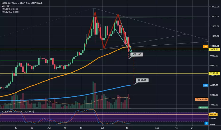
3hr deathcross could take us back to fill the gaps a 8.5kmaybe even 7.2k where the fib retracements golden pocket currently sits.

Ethereum death cross poloniexNo reaction. Market ignored this important weekly death cross. Poloniex is not highly used exchange. Conclusion?

Golden cross vs Death cross on one charthere is a look at a golden cross and a death cross on the same chart. Look at the effect on the price slightly before the event as traders were anticipating the arrival of the golden cross and the death cross. Pretty simple, but good to know

SPX DownTrend to Correction OR Crash; Oil/Gold Divergence!Looks like a crash setup. Powerful bearish divergence in oil - dropping while gold rockets. Last seen this divergence in 2000, 2008 just weeks before the crashes.
Probably not a good idea to sell puts short right now... Fool's rally going for a day or two; if we see a pinbar that would be identical confirmation pattern we saw in Aug 2008.
Rally could get as high as 26200 Dow, near 2880 SPX; or just get rejected from the down channel TL. Getting long in here is pretty risky. Scalp if you dare! GLTA!
MW Article: www.marketwatch.com
The Chart of Divergence: ei.marketwatch.com


Russell 2000 IndexRussell 2000 Index Negative Divergence & possible death cross indicating potential selloff ...!

Very Simple Chart Patterns Showing Downward Intel MovementThe ongoing trade-war with China is proving unfruitful for most tech assets, especially chip/semiconductor suppliers, including NASDAQ:QCOM and NASDAQ:INTC . Aside from these fundamental negatives, the hourly chart reveals several very simple, basic patterns that provide further confirmation of such bearish sentiment. There are two consolidation-breakout points, both leading to major gaps and spikes in short volume. The death cross, in between, is the cross of the 65-period Exponential Moving Average under the 200, a very strong sell signal. Additionally, the unusually large number of gaps is a sign of volatility and growth-instability.
Traders and investors alike are bearish on NASDAQ:INTC due not only to fundamentals but the simple technical indicators and patterns shown on the hourly chart.

Potential death cross on HKSE 700 (Tencent) in formation 1. Would be extremely cautious as death cross forming with EMA20 and 50 crossing EMA200. Possibly around price of HK$350 in coming 2-3 trading days.
2. Oversold now but remains to see if rebound can support at $330 will hold.
3. Price has already retraced to 50% of run up to HK$480.
4. Would not enter until we see support hold at either HK$325 / HK$300 (higher probability) confirmation. Or some low chance of price falling until strong resistance at HK$260, erasing all gains.
HKEX:700

Simple QCOM Hourly Patterns Exhibit Further Bearish SignalsSimple price action patterns on the hourly NASDAQ:QCOM chart are showing bearish indicators. First, a simple consolidation-breakout pattern on the downside, followed by a 65/200 EMA death cross. The cross backed a severe downtrend, covering the large gap from the 17th. These signs are highly indicative of further bearish NASDAQ:QCOM movement; and extremely reduced chance of a major reversal.

ltcbtc chart at a cross roads.We can see LTC had a very ncie pump against btc after its ltcbtc golden cross occurred on the daily....it has since corrected and appears like it may have a chance at triggering a cup and handle pattern...however the threat of a 1 day ltcbtc death cross quickly approaches. If the death cross is to materialize this cup and handle pattern will most likely fail...and on the flipside validating this cup and handle pattern could help prevent the death cross...so for now against btc ltc is at a cross roads and could easily continue either way, For this reason this idea will remain neutral.

TRXBTC not looking as bullish as TRXUSDIt appears we will bullishly trigger/break an adam and we've double bottom pattern on the daily on the trxbtc chart however we must keep in mind tha since we recently had a deathcross on this chart more losses against btc are anticipated after it hits its breakout target. I assume it will get rejected back down from the 1day 200ma resistance and be bounced back and forth between it and the 1 day 50ma(in orange) as support a couple times before breaking under and hopefully forming a higher low...if it ends up forming a lower low more loss against btcs value at that time will be probable. I do see it likely it can reach the breakout target in the meantime however. If somehow it continues up then we may have a deathcross fakeout on our hands which given the current overall sentiment of the crypto market in generally is much more probable than it would normally be. until we see evidence of a death cross fake out though we must put the downside as probabilities preference. My guess is a quick typical tron pump and dump due to an announcement of an announcement from Justin Sun. It can be a rewarding ride though if you time your entrance and exit right. *not financial advice* Thanks for reading.

Exxon Mobile (XOM) Trend Analysis: Bearish SentimentI am predicting that Exxon Mobile will have further bearish movement, due to a few sequential chart patterns appearing. First, the death cross. At this point, the 65 period EMA closed below the 200 period moving average, an extremely strong sign of negative movement. The confirmed resulting downtrend resulted in a period of consolidation. When price action leads to consolidation for an extended period of time, it usually leads to a large breakout, highly indicative of the overall price movements for a given period of time. XOM consolidated and broke out downwards, beginning to correct itself. A quick correction with high volume formed a resistance level. If all holds, XOM has more volatility and downtrending in its future before it has a reversal.

STILL FEEL BULISH? What's coin on?
Well, there is a lot of things I could describe here, but I won't, because I charted pretty much everything relevant to my current bias.
All indicators are indicating top, and potential reversal here. I could be wrong, but that option is less likely. Some indicators have still to confirm bearish divergences, but one thing is for sure, this rally has lost a lot of its strength.
