DOW JONES Short-term correction has began.Dow Jones (DJI) has had yesterday the strongest red 1D candle since February 13 and 2nd strongest since the October 27 2023 bottom. Just as recently as last week (February 26, see chart below) we called for a 'very clear bearish signal' as not only was the price near the top (Higher Highs trend-line) of the 1.5 year Channel Up but also the 1W MACD was on a Declining Histogram similar to the August 2023, December 2022 and August 2022 tops:
To get a better idea of the shorter term implications of that signal, we view Dow today from the 1D time-frame, where the 1D RSI has been on a Bearish Divergence (Lower Highs against the index' Higher Highs) December 19 2023. Again within the structure of the Channel Up, the same RSI pattern was formed during the August 01 2023 and December 2022 Higher Highs. Both declined by virtually the same percentage (-9.25%).
Such a decline would push the price as low as 35650, which is where the 1D MA200 (orange trend-line) currently is. Instead we would like, as mentioned, to keep a shorter term perspective here and time a 3-4 week target. Once the 1D MA50 (blue trend-line) breaks, it will be the most optimal sell confirmation, with a conservative short-term Target being Support 2 at 37120.
Notice that this would be near the 0.5 Fibonacci retracement level of the Channel and if it takes place in early April, it will be as close to the 1D MA200 as possible. In any case, the 1D RSI touching the 30.00 oversold barrier, is technically always a solid level to start buying again for the long-term. Note also how the current top is virtually the same rally % (+21.00%) as December 13 2022. This shows that we shouldn't neglect the symmetry of waves within this long-term Channel Up.
-------------------------------------------------------------------------------
** Please LIKE 👍, FOLLOW ✅, SHARE 🙌 and COMMENT ✍ if you enjoy this idea! Also share your ideas and charts in the comments section below! This is best way to keep it relevant, support us, keep the content here free and allow the idea to reach as many people as possible. **
-------------------------------------------------------------------------------
💸💸💸💸💸💸
👇 👇 👇 👇 👇 👇
DJI

Hellena | DJI (4H): Short to support area 38604.Dear colleagues, the price rushed upwards and did not update the low 38045. This means that wave 2 has long been formed and now the formation of the upward wave 3 is underway. But we are observing a price gap, and as we know, the gap is usually closed. Besides, it does not violate the wave structure in any way.
So I suppose that the price will close the gap and reach the support area 38604.
Manage your capital correctly and competently! Only enter trades based on reliable patterns!

Solana’s breaking above an invh&s that’s also a right shoulder Priceaction is currently above the neckline of this daily chart inverse head and shoulder pattern on solusd with one daily candle close above the neckline so far. Should it trigger the breakout the measured move target is $135 which would put price action above the neckline of a much bigger weekly chart inverse head and shoulder pattern’s neckline. The measured move breakout target for that larger invh&s. Pattern would be around $242. Last October we saw the Dow Jones Industrial chart also start to break above a big inverse head and shoulders pattern that also had a right shoulder which was it’s own smaller inverse head and shoulders pattern just as we are seeing come to fruition now on the Solana chart. We must remember on that chart we had an initial fakeout above both necklines around July so there’s always a chance the initial break above the necklines for this solana chart starts as a fakeout too. However since then, The DJI chart has hit the target of it’s smaller inv h&s target and is very close to hitting its bigger inv h&s target so I’d say using that as a precursor, probability is rather high for solana to also hit both of its breakout targets within the coming months. *not financial advice*

Dow Jones in Focus: Fake Rally?Today, we're taking a closer look at the Dow Jones Index, specifically the E-Mini Dow Jones Futures. It appears we're in Wave (2), overshooting the target and forming an Expanded Flat correction. If there's a turnaround here, typical for such waves, we might see a correction somewhere between 50% and 61.8%. We consider more than 78.6% unlikely, so we're betting on a correction in the 50 to 61.8% range.
Digging deeper, we've spotted an exciting pattern: a short Wave (i), followed by a long Wave (ii), a quick Wave (iii), and a very brief Wave (iv). This sequence could lead us to either Wave (v) or a larger B wave. Should the index continue to climb, we'll need to rethink everything. Surpassing the $40,000 mark would mean we're entering a new uptrend, requiring a different analysis. For now, we're leaning more towards a downward movement than an upward one. After much consideration, we've decided to initiate a short position on the Dow Jones as a bit of a hedge. We're particularly cautious about unexpected market movements triggered by insider trades. This strategy isn't about putting all our eggs in one basket but about spreading our risk.
In short, this strategy is our insurance policy. If the market continues to rise, any loss on the short position would be offset by gains in our long trades. Conversely, if the market declines, the short trade will help minimize our losses. This balanced approach keeps us flexible and eager to see what unfolds.

DOW JONES Very clear bearish signal.Dow Jones (DJI) is approaching the top (Higher Highs trend-line) of the the 1.5 year Channel Up, while flashing a very unique medium-term sell signal. That is the 1W MACD Histogram, which is declining, a Bearish Divergence that during that period of time, has initiated 3 declines of more than -9% each.
Given the fact that the current Bullish Leg of the Channel Up has extended to almost 21.9%, which is almost as high as the October - December 2022 sequence, we are expecting a medium-term correction back to at least the middle of the Channel Up. Target is 37120 (Support 1) and if a 1W candle closes below the middle, we expect a bottom around the 1W MA50 (blue trend-line) at 36000 (Support 2).
-------------------------------------------------------------------------------
** Please LIKE 👍, FOLLOW ✅, SHARE 🙌 and COMMENT ✍ if you enjoy this idea! Also share your ideas and charts in the comments section below! This is best way to keep it relevant, support us, keep the content here free and allow the idea to reach as many people as possible. **
-------------------------------------------------------------------------------
💸💸💸💸💸💸
👇 👇 👇 👇 👇 👇

DJI, Elliott wave analysisOutlook for DJI on 3-day chart.
Lower-degree wave (4) has already been completed and the final wave (5) has started.
I think wave (5) will be completed soon, and upper-degree wave (b) will also be completed.
The next phase is upper-degree wave (c).
It will probably crash.

DJI, Elliott wave analysisOutlook for DJI on 12h chart. I will update my ideas from last time.
I think we are on sub-wave 5 of wave (5).
This sub-wave is the last motive wave.
If this scenario is correct, upper-degree wave (b) of c will be completed soon.
The next phase is upper-degree wave (c).
It will probably crash.
Last time my idea.
■Feb 10, 2024. middle-term analysis.
■Jan 27, 2024. middle-term analysis.

DOW JONES: Still bullish inside the Channel Up.Dow Jones has turned neutral on the 1D technical outlook (RSI = 53.990, MACD = 135.700, ADX = 29.049) as it crossed under the 4H MA50 and is on a lengthy consolidation phase inside the two month Channel Up. The 4h RSI is on a Bearish Divergence, which doesn't mean much unless the 4H MA200 breaks, as the very same divergence emerged during the December - January consolidation. If the 4H MA200 breaks, we will prepare our short under the S1 level and target the top of the S2 zone (TP = 37,200). Until then, the Channel Up favors buying (TP = 39,500).
## If you like our free content follow our profile to get more daily ideas. ##
## Comments and likes are greatly appreciated. ##

RSI & Money Flow comparison to other time periodsMarkets may remain irrational for an extended period of time. This can happen even when data conflicts.
For the moment on the daily TVC:DJI :
RSI is weakening.
$ Flow is lower, but it is stable.
Buys slightly outpace the sells since Mid January.
(Only weekly is shown here. Pls see our profile for more information)
---------------------------------------------
Things change a bit when seen on weekly data. Daily they seem weak but weekly there's 2 things of importance.
Weekly TVC:DJI RECENT indicators show that RSI & $ flow seem OKAY.
Let's compare them to years past.
Compared to 2021:
RSI is lower
$ FLOW same
Compared to 2017 + 2018:
Both indicators are MUCH LOWER!
(makes sense as it takes a lot more $ to move things around as indices and prices are higher)
Showing 2 previous examples, blue boxes) as no market is identical.
But, seeing the past we may get enlightenment to PREPARE for any outcome that may ensue.
AMEX:SDOW AMEX:UDOW

Hellena | DJI (4H): Short to 61.8% Fibo 37810.Dear colleagues, the price has gone down. I believe that the price has not yet finished its downward movement and wave 2 will go even lower. I assume that the price will reach the 61.8% Fibonacci level of 37810.
Manage your capital correctly and competently! Only enter trades based on reliable patterns!

TARGET REACHED - And ongoing to Target 2 - 40,0042The trade analysis we had for Dow Jones couldn't have played out better.
On paper and theory, this just rocked to its first target 37,242.
But then, it entered into a trending market. This is where it's very tough for breakout traders to get in.
This is very tough for reversal traders to trade.
This is very tough for range bounded trades to buy and sell.
So, all we can do is wait for the trend to continue up and form a new pattern. Or continue holding and raising the trailing stop loss each week.
But it looks like the next target is set for 40,0042.
I'll wait and observe as it feels top heavy and I don't really have a good strategy to get in right now.

Hellena | DJI (4H): Long to 61.8% Fibo 39259.Dear Colleagues, I suppose that the price is in an upward movement and will continue its movement in wave 3. I suppose that a small correction is possible, after which I expect that the price will come at least to the area of 61.8% Fibonacci extension level 39259.
Manage your capital correctly and competently! Only enter trades based on reliable patterns!

Hellena | DJI (4H): Long to 100% Fibo 38931.Dear colleagues, I suppose that the price will continue its upward movement. Now I see the formation of wave 3 and it may reach the area of 100% Fibonacci extension level 38931. Before this movement a small correction to the 38186 area is possible.
Manage your capital correctly and competently! Only enter trades based on reliable patterns!

DOW JONES Channel Up with the 4H as the key level.Dow Jones (DJI) is trading within a Channel Up pattern on the 4H time-frame with the 4H MA50 (blue trend-line) supporting since the January 19 break-out, being right on its bottom (Higher Lows trend-line). As long as the price action is closing candles above it, we remain bullish, targeting a Higher High at 39100.
If it closes a 4H candle below the 4H MA50, we will take the loss and sell instead, targeting the 1D MA50 (red trend-line) at 37800. Note that the last medium-term Support has been the 1D MA200 (orange trend-line) on January 18 and being overbought for too long on the 1D time-frame while the 4H RSI is on a Bearish Divergence throughout the index' whole Channel Up, a short-term correction to the 1D MA50, would technically be quite likely here.
-------------------------------------------------------------------------------
** Please LIKE 👍, FOLLOW ✅, SHARE 🙌 and COMMENT ✍ if you enjoy this idea! Also share your ideas and charts in the comments section below! This is best way to keep it relevant, support us, keep the content here free and allow the idea to reach as many people as possible. **
-------------------------------------------------------------------------------
💸💸💸💸💸💸
👇 👇 👇 👇 👇 👇

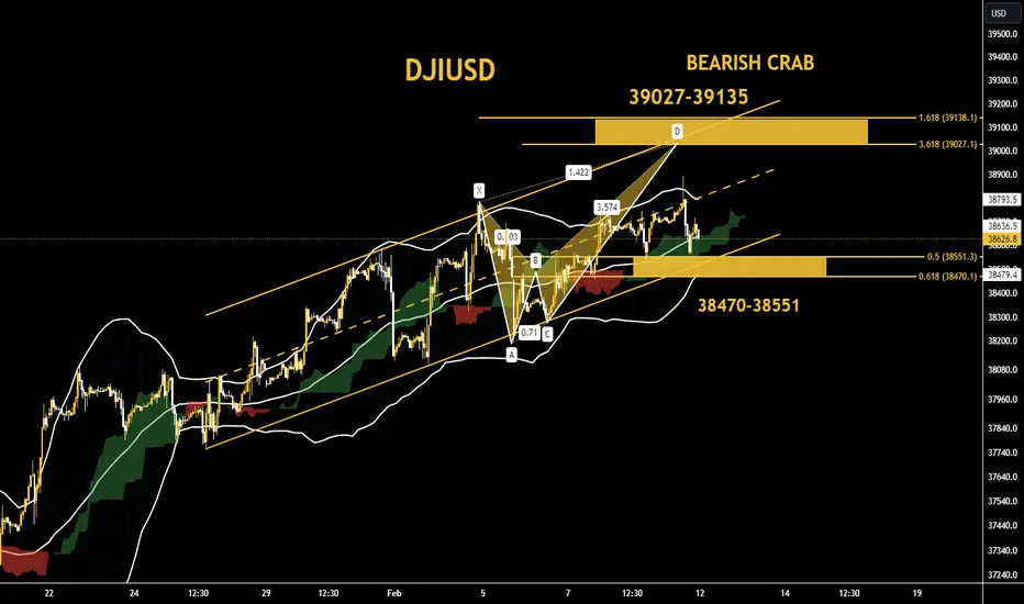
"DOW: Expert Predictions on Where DOW Prices are Heading Next!⭕️Technically, the Dow Jones index in the one-hour time frame has the support interval of the bottom of the ascending channel in the range of 38470-38551, and on the condition of maintaining and not registering any close candle time of four hours below it, the rate can aim to complete the BEARISH CRAB harmonic pattern up to The resistance range should increase in the range of 39027-39135.📌🎯
DJI, Elliott wave analysisOutlook for DJI on 4h chart.
There has been no changes since the last update.
I think we are on sub-wave 5 of wave (5).
If this scenario is correct, Upper-degree wave (b) of c will complete.
next phase is upper-degree wave (c).
It will probably crash.
Last time my idea.
■Jan 27, 2024. middle-term analysis.

Russel 2000 WeakLet's take a look at the Russel 2000. This index seems to be the only one between the Dow, Nasdaq, and S&P that is failing to break to new ATH while they are.
What we're seeing is a triple top/triple resistance in Aug 2022, than again February 2023, and again August 2023 which was confirmed with a break down to the lows of October 2023 before more manipulation came into play. Some will say inflation is declining and talks of rate cuts seems to be the reason markets rose, but from what we are hearing today from the Fed is that rate cuts aren't likely as they continue to backtrack and downplay rate cuts.
Perhaps, they know something before we do... perhaps double peak inflation like the 1970s? Just as everyone believes its declining, surprising new data comes out that proves otherwise? Let's see.
Once again we see the Russel 2K failed more recently to break and hold above 2020 with constant rejections. This would be the 4th rejection and we could be on the 5th rejection. And why not? Banks once again are starting to shake, with JPMorgan losing deposits, NY Community Bank failing, banks invested in CRE are tanking and this before the big ending to their Bank Term Funding Programme (BTFP) officially ending. Look at the chart for it, it spiked in March 2023 with the failure of SVB, and it is spiking once again Jan and Feb of 2024. Something coming down the pipelines?
I shudder when I see markets breaking ATH, because it has ALWAYS meant markets are more vulnerable to bad news (be it financial, economical, or geopolitical). What we're witnessing is a market that is getting fundamentally weaker and weaker. The economy does not support equities hitting ATH, as earnings are revised lower, personal debt is $17 TRILLION dollars (an ATH) and personal savings are at an all time low. This is not including the decaying jobs market, retail, national debt, manufacturing, consumer sentiment and so on. The floor is a 1 centimeter sheet of ice and it's warming up. This bubble is poised to pop any moment now.
My advice
Obviously, be vigilant. If you are holding positions from a lower price point and you are making profit, I say hold until whatever event happens and breaks the glass floor. If you are new money looking to invest, I can not suggest investing now at the top with such toxic economy and financials. Do your own research, look at the economic data and see if any of it or at least majority of it gives you peace about investing. People are broke, debt is exploding so retail will inevitably collapse and since we're a retail based economy, you can imagine what comes next.
Targets for Russel 2K - IWM
1) 1915, if we break that then
2) 1730, if we break that then
3) 1680, if we break that then
4) 1630, if we break that then run for the hills.

Biden Economic Failure, You Are Now in a Recession [SPX 1599]Hello everyone, I am back with another chart, this is the top for SPX. We are now in a recession.

DOW JONES / 4H / TECHNICAL ANALYSISTVC:DJI I have set my target on the chart. If the support drops below 36238, the analysis will be canceled.
Like and comment if you find value in our analysis.
Feel free to post your ideas and questions at the comments section.
Good luck

"SPY Peaks: Signs Point to Market Reaching Pinnacle"SPY ETF Approaching Critical Resistance Amid Bearish Signals
The SPDR S&P 500 ETF Trust (SPY) has been a focal point for investors seeking exposure to the broader equity market. However, recent indicators suggest a potential shift in sentiment as the ETF nears significant resistance levels, hinting at a looming bearish turn.
As of late, SPY has been on a notable uptrend, consistently climbing towards one-year high resistance levels. This trajectory has garnered attention from investors eyeing the possibility of continued gains. Yet, caution flags are waving as the ETF approaches the $500 to $520 range, projected to materialize by March or April of 2024.
Market analysts and technicians are closely monitoring this critical juncture, as historical data indicates a propensity for price rejection and subsequent correction around such resistance zones. While past performance is not indicative of future results, the confluence of technical factors underscores the significance of this price range.
One factor contributing to the bearish sentiment is the overextension of the current rally. With the market experiencing an extended period of growth, there is growing concern about unsustainable valuations and the potential for a market pullback. Additionally, macroeconomic uncertainties, including inflationary pressures and geopolitical tensions, further amplify the apprehension among investors.
Moreover, sentiment indicators such as the fear and greed index are signaling heightened investor optimism, often considered a contrarian indicator suggesting potential market reversals. As greed eclipses fear, complacency may set in, leaving the market vulnerable to downside risks.
Investor psychology plays a crucial role in market dynamics, particularly during pivotal moments such as approaching resistance levels. The psychological barrier of reaching a milestone price range can trigger profit-taking among investors, leading to selling pressure and downward price momentum.
Institutional investors, who often have the firepower to influence market movements, may also opt to rebalance their portfolios in anticipation of market headwinds. As such, increased selling activity from institutional players could exacerbate the downward pressure on SPY and the broader market indices.
While the outlook remains uncertain, prudent investors are advised to exercise caution and closely monitor developments in the coming weeks. Key technical levels and market indicators will offer valuable insights into the potential direction of SPY and the broader market.
In conclusion, as the SPY ETF approaches critical resistance levels amidst bearish signals, investors brace for a possible shift in market sentiment. With the $500 to $520 range looming ahead, caution is warranted as historical precedents and technical indicators point to the potential for a corrective phase. Vigilance and adaptability will be essential for navigating the evolving market landscape in the months ahead.

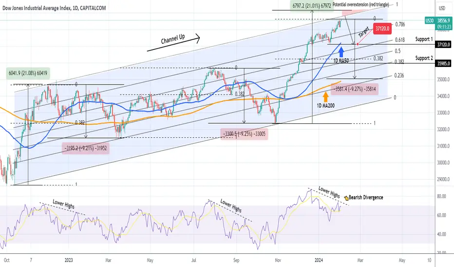
DOW JONES at the top of the 18month Channel Up. Medium-term SellDow Jones has been trading within a 18-month Channel Up pattern since the October 13 2022 global market bottom. The current price action is approaching its top (Higher Highs trend-line) for the first time in more than 1 year (since December 13 2022). With the 1D RSI on Lower Highs, which is a Bearish Divergence against the Higher Highs of the price action, the current levels are a strong candidate for a medium-term pull-back.
Even though we are past the transition year of 2023, which got the index out of the 2022 Bear Cycle and into the new Bull Cycle, thus we do not necessarily need a strong correction like those of August - October 2023 and December 2022 - March 2023, a smaller technical pull-back would be natural to normalize the overbought technical indicators and extend the long-term bullish trend.
As a result, we are targeting at least 37120, which is Support 1 and just above the 0.618 Fibonacci Channel level, the first target of the December 19 2022 pull-back and a typical % correction similar to August 24 and May 25 2023.
Not that the 1D RSI was under a Lower Highs trend-line both during the August 2023 and December 2022 corrections. Interestingly enough, both corrected by -9.20%, so technically we can see a correction as low as the 1D MA200 (orange trend-line) and the 0.236 Fibonacci Channel level at 35000 (even though it is less likely unless very negative fundamentals hit the market). Also it is worth pointing out that there is a technical maximum extension above the Channel Up, which is the red Triangle, in case the current Bullish Leg of the pattern goes for a +21% rise, like the December 01 2022 did.
-------------------------------------------------------------------------------
** Please LIKE 👍, FOLLOW ✅, SHARE 🙌 and COMMENT ✍ if you enjoy this idea! Also share your ideas and charts in the comments section below! This is best way to keep it relevant, support us, keep the content here free and allow the idea to reach as many people as possible. **
-------------------------------------------------------------------------------
💸💸💸💸💸💸
👇 👇 👇 👇 👇 👇
New all time high by end of JanFollowing DJI and NDX, SPX is on its way to ATH by the end of January.

Hellena | DJI (4H): Long to 100% Fibo 38516.Dear colleagues, the waves continue their development. After the correction a b c, wave 1 in the upward movement is completed. At the moment I suppose that the price will either update the maximum of wave 1, or make a correction to the area of 50% Fibonacci level in the area of 37500 (wave 2), then I expect the price in the area of 100% Fibonacci extension level 38516.
Manage your capital correctly and competently! Only enter trades based on reliable patterns!
