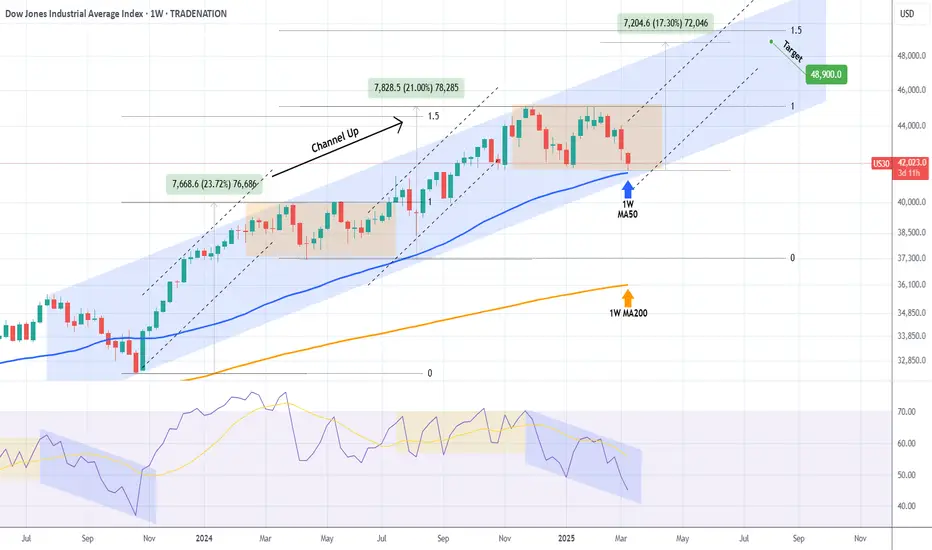
DOW JONES: Starting the final stage of 3year Bull Cycle.Dow Jones got oversold on its 1D technical outlook (RSI = 29.297, MACD = -550.130, ADX = 76.606) as it is currently testing its 1W MA50. This is a level that has been intact since November 2023 and is of high importance to the trend as it has a key cyclical attribute. The driving growth pattern of Dow since the 2009 bottom is a Channel Up and every time a Bull Cycle starts, the 1W MA50 is the first level of support, with every touch of it being the strongest buy opportunity. When the 3 year Bull Cycle is coming to an end, the 1W MA50 breaks and the index approaches the 1M MA50 during its Bear Cycle correction, which becomes the ultimate buy entry for the new long term 3 year Bull Cycle.
The current Cycle should starts getting completed technically after September 2025, so there is a high chance that the 1W MA50 holds here. The three Bull Cycles we've had so far had a fairly similar growth percentage, rising by +70.38% to +76.64%. If the +70.38% minimum range is followed on the current (4th) Bull Cycle, then we're aiming at 48,000 (TP) towards the end of the year. The 1M CCI seems to be printing the exact same build up to the Bear Cycle as in the past.
## If you like our free content follow our profile to get more daily ideas. ##
## Comments and likes are greatly appreciated. ##
Dowjones

DOW-JONES INDEX BEARISH BREAKOUT|SHORT|
✅DOWJONES/US30 index is
Going down now and the price
Made a bearish breakout which
Is confirmed so we are bearish
Biased and we will be expecting
A further bearish continuation
SHORT🔥
✅Like and subscribe to never miss a new idea!✅

Dow Jones - Bearish Double TOPHello Traders !
The US30 failed to create a new higher high.
The price ormed a double top pattern.
Currently, The neckline is broken !
So, I expect a bearish move📉
____________
TARGET: 40320🎯

DowJones INTRADAY Key Trading Levels post CPI dataThe softer-than-expected inflation data has fueled optimism among equity investors, as cooling inflation could alleviate pressure on the Federal Reserve to maintain an aggressive tightening stance. The positive market reaction suggests that participants are increasingly pricing in the possibility of a more gradual approach to interest rate adjustments.
With inflation appearing to moderate, the Federal Reserve may be more inclined to pause or slow the pace of rate hikes in the coming months. The data supports the case for a more dovish stance, as policymakers assess the effectiveness of prior rate increases and the risk of economic slowdown. Markets will continue to monitor upcoming economic releases and Federal Reserve statements to gauge the likelihood of a shift toward a less aggressive monetary policy.
Key Support and Resistance Levels
Resistance Level 1: 42256
Resistance Level 2: 42600
Resistance Level 3: 43000
Support Level 1: 41150
Support Level 2: 40576
Support Level 3: 40073
This communication is for informational purposes only and should not be viewed as any form of recommendation as to a particular course of action or as investment advice. It is not intended as an offer or solicitation for the purchase or sale of any financial instrument or as an official confirmation of any transaction. Opinions, estimates and assumptions expressed herein are made as of the date of this communication and are subject to change without notice. This communication has been prepared based upon information, including market prices, data and other information, believed to be reliable; however, Trade Nation does not warrant its completeness or accuracy. All market prices and market data contained in or attached to this communication are indicative and subject to change without notice.

Dow Jones Potential DownsidesHey Traders, in today's trading session we are monitoring US30 for a selling opportunity around 41900 zone, Dow Jones is trading in a downtrend and currently is in a correction phase in which it is approaching the trend at 41900 support and resistance area.
Trade safe, Joe.

Bearish Cypher on the Daily DJI?Ruh oh. It's probably not a given considering the flip floppy nature of the Trumpian markets, where every move hinges on his every word, but my whiskers are twitchin'. That's usually not good.
What do you think?
Owhooooo!

S&P500 INDEX (US500): More Down
With a confirmed bearish breakout of a key daily horizontal support,
US500 index opens a potential for more drop.
Next key support is 5425.
It looks like the market is going to reach that soon.
❤️Please, support my work with like, thank you!❤️
I am part of Trade Nation's Influencer program and receive a monthly fee for using their TradingView charts in my analysis.

Dow Jones: A Make-or-Break Buy Setup with Smart Money BackingDow Jones Industrial Average - Buy Setup
Technical: U.S. markets have struggled recently due to uncertainty over tariffs imposed by President Trump. While the S&P 500 and NASDAQ have broken key support levels, the Dow remains resilient, holding the critical 41,648 support. A break below would confirm a large double-top pattern, signaling a bearish outlook. This is a pivotal moment. The rebound from overnight lows is encouraging, but with the U.S. CPI release tomorrow, caution is warranted. While speculative, COT and seasonal data favour a short-term move higher.
Fundamental: The latest Commitment of Traders (COT) Report shows increasing long interest in the Dow, suggesting "smart money" accumulation.
Seasonal: Historically, from March 12 – May 2, the Dow has posted gains 84% of the time, averaging +3.68% over the past 25 years.
Setup:
Entry: 41,800 – 42,000
Stop Loss: 41,285 (below the Nov 2024 low at 41,648)
Target: 44,290
Disclosure: I am part of Trade Nation's Influencer program and receive a monthly fee for using their TradingView charts in my analysis.

DOW JONES Can the 1W MA50 hold and spark an end-of-year rally?Dow Jones (DJIA) has been trading within a Channel Up pattern since the late July 2023 High. The decline of the last 30 days can be technically seen as the Bearish Leg that will price its new Higher Low bottom.
The price isn't only close to the Channel's bottom but also the 1W MA50 (blue trend-line), a level that has been supporting since the October 30 2023 bullish break-out. As a result, a 1W MA50 hit will be a potential double support test, with the 1W RSI also printing a Bearish Leg similar to the one that led to the October 2023 bottom.
On the other hand, the ranged price action since the late November 2024 High, resembles the sideways volatility of the first half of 2024. Both were initiated after Higher High pricings at the top of the Channel Up. The rallies that led to those tops have been +21.00% and +23.72% respectively.
If there is a decreasing rate on each Bullish Leg, then the new one should be +17.30% (i.e. -3.30% less than the previous one), which falls marginally below the 1.5 Fibonacci extension, which is where the November 2024 High was priced.
As a result, as long as Dow is closing its 1W candles above the 1W MA50, the 2-year Channel Up is more likely to push upwards again for its new Bullish Leg, potentially targeting 48900 (+17.30%).
-------------------------------------------------------------------------------
** Please LIKE 👍, FOLLOW ✅, SHARE 🙌 and COMMENT ✍ if you enjoy this idea! Also share your ideas and charts in the comments section below! This is best way to keep it relevant, support us, keep the content here free and allow the idea to reach as many people as possible. **
-------------------------------------------------------------------------------
Disclosure: I am part of Trade Nation's Influencer program and receive a monthly fee for using their TradingView charts in my analysis.
💸💸💸💸💸💸
👇 👇 👇 👇 👇 👇
DOW New LowAs per my view DOW is going down side in near future , this is totaly based on price action and Astro based .

AMAZON at important support. Positive days coming?AMZN looking at good support. We can see positive days if it works.
Many cryptocurrency dominance charts, as well as Nasdaq and other stock charts too, showing the same pattern. Is the reversal starting? Check my other analysis too.
We’ll see.
This is not investment advice. Please do your own research.
Wishing you best.
-YusufDeli

Dow Jones at the bottom of the trading rangeGiven the recent emotional decline in the Dow Jones and S&P500, the Dow Jones is expected to make an upward correction from the bottom of its confirmed trading range. The stop loss is equivalent to the closing of the 4-hour candle below today's last low, with a target of 43,500 in the final step.

US30 buy ideaThe index is down about 7% from its high in a short space of time due to market uncertainty. However, the market will start to price in that uncertainty and be on the lookout for more opportunities.

DOW JONESThe price of 42276.9 is suitable for a long trade with a stop loss of 42153.7, with a target of 44100. Note that I checked the prices on theCapital.COM broker chart.

S&P, NASDAQ, DOW JONES Weekly Market Forecast: Mar 10-14 In this video, we will analyze the S&P 500, NASDAQ, AND DOW JONES Futures. We'll determine the bias for the upcoming week, and look for the best potential setups.
Markets have been bearish due to mixed numbers employment, Fed statements, and uncertainty in US trade policies. Are the markets poised for a bounce back week? Perhaps. Traders will need to exercise patience before jumping in these volatile markets, waiting for the proper confirmations before we determine a bias. Once the markets tip their hand in that way, we can take advantage.
Enjoy!
May profits be upon you.
Leave any questions or comments in the comment section.
I appreciate any feedback from my viewers!
Like and/or subscribe if you want more accurate analysis.
Thank you so much!
Disclaimer:
I do not provide personal investment advice and I am not a qualified licensed investment advisor.
All information found here, including any ideas, opinions, views, predictions, forecasts, commentaries, suggestions, expressed or implied herein, are for informational, entertainment or educational purposes only and should not be construed as personal investment advice. While the information provided is believed to be accurate, it may include errors or inaccuracies.
I will not and cannot be held liable for any actions you take as a result of anything you read here.
Conduct your own due diligence, or consult a licensed financial advisor or broker before making any and all investment decisions. Any investments, trades, speculations, or decisions made on the basis of any information found on this channel, expressed or implied herein, are committed at your own risk, financial or otherwise.

DowJones The Week Ahead 10th March '25Sentiment: Neutral, Price action is consolidating in a tight trading range.
Resistance: Key Resistance is at 43145, followed by 43600 and 44000.
Support: Key support is at 43303 followed by 42000 and 41650.
This communication is for informational purposes only and should not be viewed as any form of recommendation as to a particular course of action or as investment advice. It is not intended as an offer or solicitation for the purchase or sale of any financial instrument or as an official confirmation of any transaction. Opinions, estimates and assumptions expressed herein are made as of the date of this communication and are subject to change without notice. This communication has been prepared based upon information, including market prices, data and other information, believed to be reliable; however, Trade Nation does not warrant its completeness or accuracy. All market prices and market data contained in or attached to this communication are indicative and subject to change without notice.

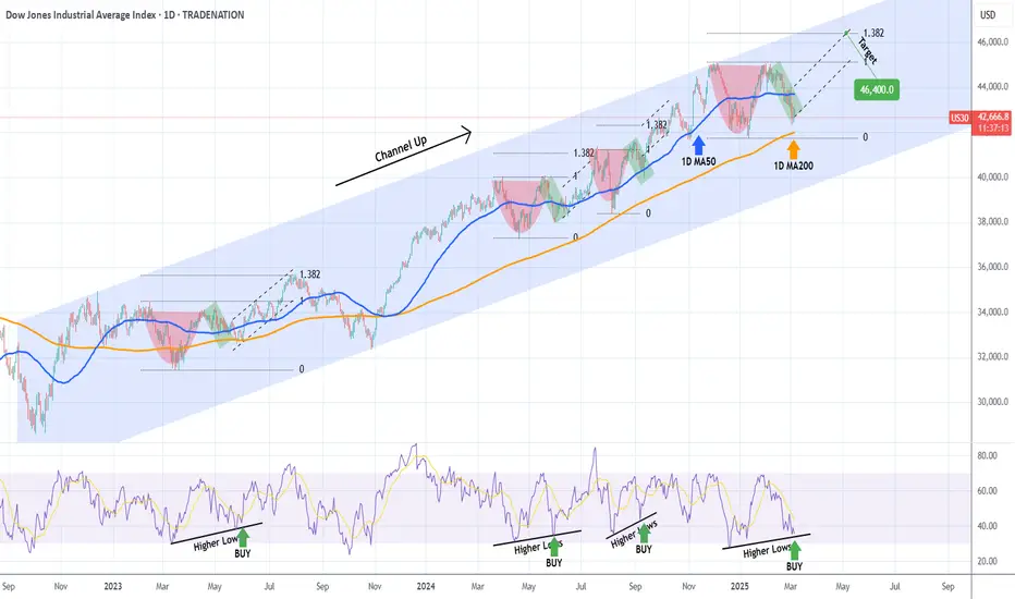
DOW JONES MA200 (1d) test on the Channel Up bottom. BULLISH.Dow Jones is trading inside a Channel Up but lately finds itself on a pull back.
This pull back is about to test the MA200 (1d) at the bottom of the pattern.
The MA200 (1d) has been holding as Support since November 3rd 2023, so overall that makes it a buy opportunity.
Trading Plan:
1. Buy on the current market price.
Targets:
1. 46400 (the 1.382 Fibonacci extension).
Tips:
1. The RSI (1d) is almost oversold and at 35.00 it has turned sideways. Every time the RSI was on this level or belowsince October 2023, it was the best buy opportunity.
Please like, follow and comment!!

Dow INTRADAY NFP, US Employment data to drive the next moveMarket Context:
After a period of heightened volatility, the Dow Jones (US30) has undergone a corrective pullback. Investor sentiment is now focused on the upcoming US jobs report (8:30 a.m. Washington time, 13:30 London time) as a key catalyst for the next move in equity markets.
A weaker-than-expected jobs report could raise concerns about a slowing economy, potentially fueling recession fears and triggering another leg lower in equities. Conversely, signs of resilience in the labor market may reinforce risk appetite and support a continued recovery in the index.
Technical Outlook:
Current Price Action: Sideways Consolidation
Resistance: 43145
Support: 42303
Bullish Scenario:
A breakout above 43145 would signal renewed upside momentum, with initial resistance at 43337, followed by 43636 and 44026 as extended targets.
Positive labor market data or market resilience post-jobs report could provide the necessary catalyst for a bullish continuation.
Bearish Scenario:
A confirmed loss of 42303 support would shift the bias bearish, increasing the likelihood of further downside toward 42000, with a deeper retracement potentially testing 41650.
A significant deterioration in job market data could heighten recession concerns, amplifying risk-off sentiment and weighing on equity markets.
Conclusion:
The US jobs report will be the key driver of market direction. A breakout above 43145 could confirm bullish continuation, while a breakdown below 42303 may open the door for deeper losses. Traders should closely monitor price reactions around these levels for confirmation of the next trend move.
This communication is for informational purposes only and should not be viewed as any form of recommendation as to a particular course of action or as investment advice. It is not intended as an offer or solicitation for the purchase or sale of any financial instrument or as an official confirmation of any transaction. Opinions, estimates and assumptions expressed herein are made as of the date of this communication and are subject to change without notice. This communication has been prepared based upon information, including market prices, data and other information, believed to be reliable; however, Trade Nation does not warrant its completeness or accuracy. All market prices and market data contained in or attached to this communication are indicative and subject to change without notice.

US30 Setup: 50% Fib & Imbalance in Focus for a Potential Short.The US 30 Dow Jones index is under pressure 📉 but is currently hovering around a significant previous support level. I’m watching for a retracement into a four-hour imbalance as a potential opportunity to go short. Additionally, I’m looking for the retrace to align with the equilibrium point, which is the 50% Fibonacci level of the current price swing from high to low 📊. For this trade, the price must stay within the imbalance zone and avoid breaking the high. If there’s a clear break of structure near the imbalance point of interest, I plan to sell 🔻. This is not financial advice. 🚨

DOW JONES Massive 1D MA200 reversal for Cup and Handle?Dow Jones (DJIA) has been trading within a Channel Up since the September 2022 market bottom. Throughout this long-term structure, Cup and Handle (C&H) patterns have emerged that were always contained above the 1D MA200 (orange trend-line) and subsequently initiated a rebound to at least the 1.382 Fibonacci extension before the next pull-back.
The 1D MA200 is right below us at the moment and the current C&H seems to be on the verge of completing its Handle. Moreover, the 1D RSI is on its usual Higher Lows trend-line that prompts to a the most optimal buy entry. We're bullish, targeting 46400 (the 1.382 Fibonacci extension).
-------------------------------------------------------------------------------
** Please LIKE 👍, FOLLOW ✅, SHARE 🙌 and COMMENT ✍ if you enjoy this idea! Also share your ideas and charts in the comments section below! This is best way to keep it relevant, support us, keep the content here free and allow the idea to reach as many people as possible. **
-------------------------------------------------------------------------------
Disclosure: I am part of Trade Nation's Influencer program and receive a monthly fee for using their TradingView charts in my analysis.
💸💸💸💸💸💸
👇 👇 👇 👇 👇 👇
US30 - Clean and Clear!Hello TradingView Family / Fellow Traders. This is Richard, also known as theSignalyst.
As per my last US30 analysis attached on the chart, it rejected the upper bound of the range and has been trading lower.
What's next?
📦We will be trading the range as long as it holds.
🏹As US30 approaches the lower bound of the range around $42,000, I will start looking for bullish reversal setups.
For now, we wait! ⏱️
📚 Always follow your trading plan regarding entry, risk management, and trade management.
Good luck!
All Strategies Are Good; If Managed Properly!
~Rich
Disclosure: I am part of Trade Nation's Influencer program and receive a monthly fee for using their TradingView charts in my analysis.

Dow INTRADAY Key Trading Levels ahead of US OpenThe Dow Jones Industrial Average (US30) index maintains a bullish outlook within its long-term uptrend. However, after reaching an all-time high on December 4, 2024, price action has entered a sideways consolidation phase, suggesting indecision in the market.
________________________________________
Bullish Scenario:
• The 42980 level serves as a critical support zone, aligning with the previous consolidation range and the rising trendline.
• A pullback to this level, followed by a bullish rebound, would reaffirm the uptrend and could trigger upside momentum.
• Potential upside targets include:
44240 (20-day moving average)
44660 (next resistance level)
45000 (key psychological resistance)
A strong recovery from 42980 would reinforce bullish sentiment and indicate a continuation of the broader uptrend.
________________________________________
Bearish Scenario:
• A confirmed break below 42980, with a daily close beneath this level, would signal weakness in the uptrend.
• This could lead to a deeper retracement, exposing key downside levels:
42520 (next significant support)
41920 (200-day moving average), a critical level for long-term trend validation
A sustained breakdown below 42980 could shift sentiment in favour of sellers, increasing the probability of further declines.
________________________________________
Market Outlook:
The 42980 level remains pivotal—holding above this zone will keep the bullish trend intact, while a decisive break lower could trigger an extended pullback. Traders should watch for price action signals and volume confirmation at this key level to assess the market's next move.
This communication is for informational purposes only and should not be viewed as any form of recommendation as to a particular course of action or as investment advice. It is not intended as an offer or solicitation for the purchase or sale of any financial instrument or as an official confirmation of any transaction. Opinions, estimates and assumptions expressed herein are made as of the date of this communication and are subject to change without notice. This communication has been prepared based upon information, including market prices, data and other information, believed to be reliable; however, Trade Nation does not warrant its completeness or accuracy. All market prices and market data contained in or attached to this communication are indicative and subject to change without notice.

Bearish drop?Dow Jones (US30) is rising towards the pivot which acts as an overlap resistance and could drop to the pullback support.
Pivot: 43,026.07
1st Support: 42,138.59
1st Resistance: 43,672.97
Risk Warning:
Trading Forex and CFDs carries a high level of risk to your capital and you should only trade with money you can afford to lose. Trading Forex and CFDs may not be suitable for all investors, so please ensure that you fully understand the risks involved and seek independent advice if necessary.
Disclaimer:
The above opinions given constitute general market commentary, and do not constitute the opinion or advice of IC Markets or any form of personal or investment advice.
Any opinions, news, research, analyses, prices, other information, or links to third-party sites contained on this website are provided on an "as-is" basis, are intended only to be informative, is not an advice nor a recommendation, nor research, or a record of our trading prices, or an offer of, or solicitation for a transaction in any financial instrument and thus should not be treated as such. The information provided does not involve any specific investment objectives, financial situation and needs of any specific person who may receive it. Please be aware, that past performance is not a reliable indicator of future performance and/or results. Past Performance or Forward-looking scenarios based upon the reasonable beliefs of the third-party provider are not a guarantee of future performance. Actual results may differ materially from those anticipated in forward-looking or past performance statements. IC Markets makes no representation or warranty and assumes no liability as to the accuracy or completeness of the information provided, nor any loss arising from any investment based on a recommendation, forecast or any information supplied by any third-party.
