$USINTR -Fed Keeps Rates Unchanged (May/2025)ECONOMICS:USINTR
May/2025
source: Federal Reserve
- The Federal Reserve kept the funds rate at 4.25%–4.50% range for a third consecutive meeting as officials adopt a wait-and-see approach amid concerns about the effects of President Trump’s tariffs.
Policymakers noted that uncertainty about the economic outlook has increased further and that the risks of higher unemployment and higher inflation have risen.
Fedfundsrate

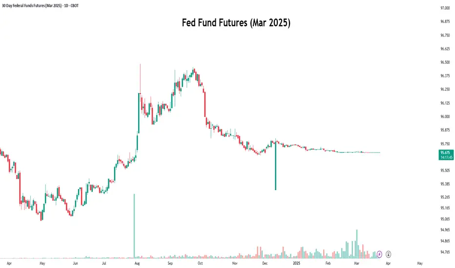
Decoding Fed Rate Changes via Federal Funds Futures Index◉ What Are Federal Funds Futures?
● Definition: Federal Funds Futures are financial contracts traded on the Chicago Mercantile Exchange (CME) that allow market participants to bet on or hedge against future changes in the federal funds rate (the interest rate at which banks lend to each other overnight).
● Purpose: These futures reflect the market's expectations of where the Fed will set interest rates in the future.
◉ How Federal Funds Futures Work?
● Pricing: The price of a federal funds futures contract is calculated as 100 minus the expected average federal funds rate for the contract month.
➖ Example: If the futures price is 95.00, it implies an expected federal funds rate of 5.00% (100 - 95 = 5).
● Contract Expiry: Each contract represents the market's expectation of the average federal funds rate for a specific month.
◉ Why Use Federal Funds Futures?
● Predict Fed Policy: Traders and investors use these futures to gauge the likelihood of the Fed raising, cutting, or holding interest rates.
● Hedge Risk: Institutions use them to protect against potential losses caused by interest rate changes.
● Market Sentiment: They provide insight into what the broader market expects from the Fed.
◉ Steps to Analyze Fed Policy Using Federal Funds Futures
● Step 1: Check Current Federal Funds Futures Prices
Look up the prices of federal funds futures contracts for the months you're interested in. These are available on financial platforms like Bloomberg, Reuters, or the CME Group website.
● Step 2: Calculate the Implied Federal Funds Rate
Implied Federal Funds Rate = 100 - Futures Price.
➖ Example: If the futures price for March is 95.5, the implied rate is 4.5% (100 - 95.5 = 4.5).
● Step 3: Compare Implied Rates to the Current Rate
If the implied rate is higher than the current federal funds rate, the market expects the Fed to raise rates. If it's lower, the market expects a rate cut.
● Step 4: Estimate the Probability of Rate Changes
By comparing the implied rates of contracts expiring before and after an FOMC meeting, you can estimate the probability of a rate change.
➖ Example: If the implied rate for March is 4.75% and the current rate is 4.5%, the market is pricing in a 25 basis point (0.25%) hike.
● Step 5: Monitor Changes Over Time
Track how futures prices change over time. Shifts in prices indicate changes in market expectations. For example, if futures prices drop (implying higher rates), it suggests the market is anticipating a more hawkish Fed.
◉ Practical Applications
● Trading: Traders use federal funds futures to speculate on interest rate movements.
● Economic Forecasting: Economists use them to predict the Fed's monetary policy and its impact on the economy.
● Investment Strategy: Investors adjust their portfolios based on expected rate changes (e.g., shifting from bonds to equities if rates are expected to rise).
◉ Limitations of Federal Funds Futures
● Market Sentiment: Futures prices reflect market expectations, which can be influenced by sentiment and may not always accurately predict Fed actions.
● External Shocks: Unexpected events (e.g., geopolitical crisis, pandemics) can disrupt rate expectations.
● Liquidity: Less liquid contracts (further out in time) may not accurately reflect expectations.
◉ Example Analysis
Let’s assume:
➖ Current federal funds rate: 4.5%
➖ March federal funds futures price: 95.5
● Step 1: Calculate the implied rate:
100 − 95.5 = 4.5%.
● Step 2: Compare to the current rate:
The implied rate (4.5%) is equal to the current rate (4.5%), suggesting the market expects no change in rates by March.
● Step 3:
If the futures price drops to 95.25, the implied rate becomes 4.75%, indicating the market now expects a 25 basis point rate hike..
◉ Why This Matters?
● For Traders: Federal funds futures provide a direct way to bet on or hedge against interest rate changes.
● For Investors: Understanding rate expectations helps in making informed decisions about asset allocation.
● For Economists: These futures offer valuable insights into market expectations of monetary policy.
◉ Conclusion
Federal funds futures are a powerful tool for analyzing and predicting the Fed's interest rate decisions. By understanding how to interpret these futures, traders, investors, and economists can gain valuable insights into market expectations and make more informed decisions. However, it's important to consider their limitations and use them in conjunction with other economic indicators for a comprehensive analysis.
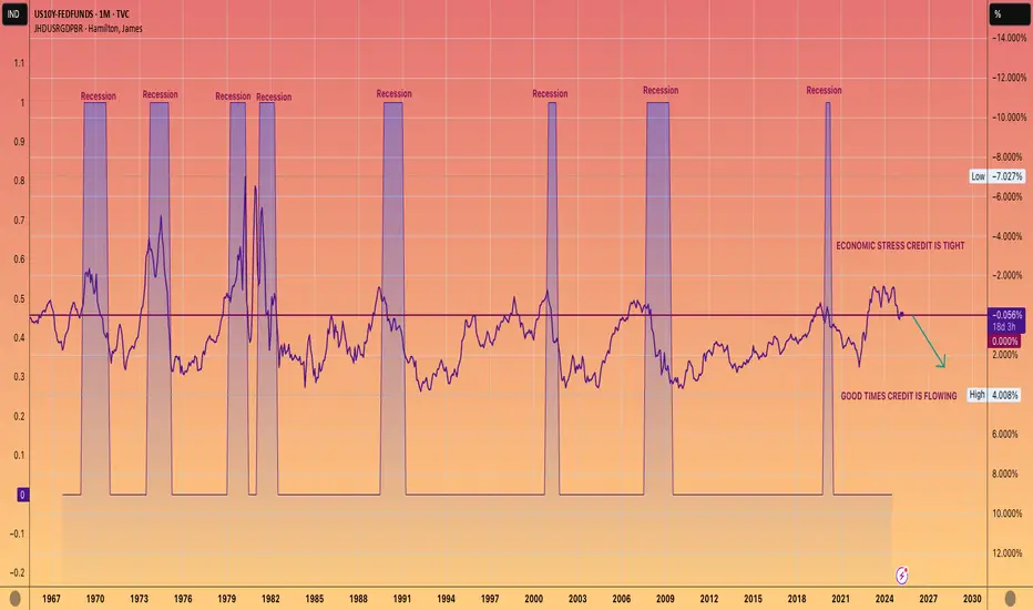
WE ARE COMING OUT OF A RECESSION. NOT GOING INTO ONE.This chart shows 10-year yield, which is closely tied to mortgage rates, minus the Federal funds rate.
When this figure is negative, it typically indicates that we are experiencing a recession or economic downturn.
Conversely, a positive number usually aligns with economic growth, often referred to as the good times.
While it's up to you to determine the reasons behind a official recession not being declared during the Biden administration, the undeniable data reflects a prolonged period of economic strain.
However, the current trend seems to be shifting towards a positive reading, which should lead to more accessible lending and economic growth.
AKA The good times are coming.
Rate Cuts Coming Up?Simply put, yes , the Fed has appeared to switch its position on the FRED:FEDFUNDS remaining flat and are expecting further rate cuts. So what can we hypothesize the market's reaction will be? Well, you guessed it, the market will probably like the news and cash will flow into "risk-on" assets including crypto assets and, of course, stocks. Furthermore, we can infer that the market is not currently pricing in any rate cuts and we have yet to see a TRUE correction specifically in the TVC:DJI , TVC:NDQ , and the $SP:SPX.
The image above shows an example of the 200 EMA significance and how it can be used to buy the dip at the right timing. PLEASE do not try to buy each top and bottom as it's virtually impossible to perfectly time the market. However, it should be suggested that you buy the day after the underlying bounces off the EMA. This is the most effective way to avoid a "fake out" in the trend. When this EMA it touched and rebounded, it could imply that a correction has taken place and that momentary downtrend is about to reverse to continue its previous bull trend. This could look as shown below.
Just because it is shown on the chart doesn't make it so. Please keep in mind an equal and opposite possibility, where the EMA is broken through and a Bear market begins. Even though the odds for this are less than likely, the market simply not getting a rate cut could lead to this situation becoming a reality. In this market, nothing is impossible so be ready for everything.
In conclusion, prepare for rate cut from not only the Fed, but ECB, and Bank of England as well. With this, we can expect rising markets as cash moves its way into risk assets. However, no one is a visionary, so if the markets don't get what they want (and we all know that it wants rate cuts more than anything), expect a lowering market and prepare to exit positions until a rebound appears reasonable.

THE LIQUIDITY PARADOX: Charting the Macro Environment for 2025WEN QE !?
TL;DR there will be NO Quantitative Easing this cycle.
YES the markets will still go to Valhalla.
LIQUIDITY DRIVES MARKETS HIGHER. FULL STOP.
Global M2 has a highly correlated inverse relationship with the US Dollar and 10Y Yield.
Hence why we have been seeing the DXY and 10YY go up while Global M2 goes down.
THE SETUP
We are in a similar setup to 2017 when Trump took office.
M2 found a bottom and ramped up, which toppled the DXY.
Inflation nearly got cut in half until July 2017, where it then slowly started to creep back up as M2 and markets exploded.
To much surprise, all this occurred while the Fed continued to RAISE INTEREST RATES.
This was in part due to policy normalization with a growing economy coming out of the financial crisis and having near 0% interest rates for so long.
In Q4 2014, the Fed paused QT, keeping its balance sheet near neutral for the next 3 years.
As inflation started rising, QT was once again enacted, but very strategically with a slow roll-off in Q4 2017. This allowed markets to push further into 2018.
THE PLAYBOOK
M2 Global Money Supply: Higher
Dollar: Lower
Fed Funds Rates: Lower
10YY: Lower
Fed Balance Sheet: Neutral
Inflation: Neutral
TOOLS
Tariffs
Deregulation
Tax Cuts
Tax Reform
T-Bills
HOW COULD WE POSSIBLY WEAKEN THE DOLLAR?
Trump has been screaming from the mountain tops; TARIFFS.
Tariffs will slow imports and focus more on exports to weaken the dollar.
The strong jobs data that has been spooking markets and strengthening the DXY will be revised to show it’s much worse than numbers are showing.
The Fed will pause QT, saying it has ample reserves, but not enable QE.
At the same time, they could pause interest rate cuts to keep a leash on markets and not kickstart inflation.
Then once all the jobs data is revised and markets get spooked at a softened economy (Q2), they will continue cutting.
WHY DOES THE FED KEEP CUTTING RATES EVEN WITH A STRONG ECONOMY?
In short, the Fed has to cut interest rates for the US to manage its debt.
THE US government is GETTEX:36T in debt.
In 2025, interest projections are well above $1T.
That would put the debt on par with the highest line items in the national budget such as social security, healthcare and national defense.
The Treasury manages its debt by issuing securities with various maturities. When rates are low, they can refinance or issue new debt.
As rates rise, the cost of servicing debt increases, and vice versa.
It’s one of the underlying reasons why the Fed cut (but no one will say it out loud)…
hence why everyone is so confused and screaming that they cut too early and the bond vigilantes have been revolting.
HOW DOES THE MONEY SUPPLY GO UP IF NO QUANTITATIVE EASING?
We’ve seen this before.
President Trump and Treasury Secretary Scott Bessent have been telling you their playbook.
In 2017, deregulation and tax cuts led to an increase in disposable income from individuals and corporations.
Banks created more money in the markets through lending based on increased economic activity.
Global liquidity increased in other major central banks like the ECB, BOJ, and PCOB who were still engaged in QE, and / or maintained very low interest rates, which created more liquidity in the US money supply.
We’re seeing the same thing now with Central Banks around the world.
The tax reform allowed for the repatriation of overseas profits at a lower tax rate, which brought a significant amount of cash back to the US.
Like 2017, the US Treasury will increase short-term bill issuance (T-Bills), providing an alternative to the Reverse Repo (RRP), which reduces RRP usage. This provides liquidity to the markets because once the T-bills mature, funds can use the proceeds to invest in other assets, including stocks.
Banks will buy T-bills and sell in the secondary market or hold til maturity, where they can then lend the cash or invest in equities.
Another strategy to inject cash into the banking system would be standard Repo Operations. Here the Fed buys securities from banks with an agreement to sell them back later. This would increase lending and liquidity.
Hopefully now you can see why markets DON’T NEED QUANTITATIVE EASING !
That would for sure lead to rampant inflation (see 2021), and blow up the system all over again.

The 3-way of Economic Nightmares.I recently had a discussion on X, with regard to the Forecasting ability of High Yield Spreads. I was making the claim they do possess Leading Indicator qualities, while a gentleman took the other side of this debate.
To illustrate my views, I've put together a chart of FedFunds Rate, Unemployment Rate, and said High Yield Spreads.
This chart shows the last ~28yr of the above mentioned series, and how they "play" with one another.
A) Shows the period leading into the "DotCom" Bubble. We see High Yield Spreads rise first - Leading the other two data series. In a Coincident fashion, FedFunds then rolls over, while Unemployment shoots higher. A successful "Forecast" by High Yield Spreads of the impending Downturn/Recession. A successful Leading Indicator.
B) Shows the period leading into the "GFC". We once again see High Yield Spreads rise, this time SHARPLY, albeit with much less "lead time" than the previous example. As with example A), FedFunds and Unemployment then begin their inverse (to each other) dance. Once again showing High Yields Spread giving us that Advanced/Leading warning that things were getting fragile in the economy. A successful Leading Indicator - with admittedly less warning time.
C) Shows us an outlier in this analysis, and for good reason. We see our 'significant' rise in High Yield Spreads, but what we do NOT see, is FedFunds and Unemployment doing their typical dance. Unemployment continues to head lower, while FedFunds begin to rise - the OPPOSITE of what they did in the prior 2 examples.
D) Shows the period surrounding Covid. Once again High Yield Spreads shoot up in a dramatic fashion, warning bells should be going off in markets. Much like 2 of the previous 3 examples, FedFunds had also been in a "hiking" cycle. And right on cue, Unemployment skyrockets; completing our 3-way from Hell.
We now find ourself in E). In the Oval we see our significant rise in High Yield Spreads, but this is accompanied by rising FedFunds, so we do not have our "danger" signal. Unemployment also remains low. We now however see High Yield Spreads beginning to turn up, with talks of Rate Cuts to FedFunds, as well as Unemployment rising.
History may not repeat, but it does often rhyme. Are we starting to see warning signs flashing? Only time will tell, but as stated in previous posts... It's definitely not a time to be leveraged, or riding on large gains you haven't secured.
TLDR; High Yield Spreads followed by Fallings FedFunds and Rising Unemployment = Market/Economic Stroke.
As always, good luck, have fun, practice solid risk management. And thank you for your time.

Oil giving us a HINTMarkets keep hitting ATHs, gold doesn't stop hunting for higher highs, and oil underperforms.
Anytime price reacts to a historic zone it either sells off or rallies, and then reverses to confirm if the reaction in price was indeed true/false.
In this example oil sold off brining us to point 'A' and is now at point 'B' which is the pullback phase also know as a continuation/pause to the overall trend. This happened during the times of 2019 and a larger pattern that lasted from 2011 - 2014. Each time this pattern played out in the oil markets negative outcomes occurred in the rest of markets.
To add more confluence to this TA I'm analyzing the MACD distribution patterns (the same way I analyze price action), the agreement and disagreement between the two, and how price action reacts around the EMA lvls.
We probably have about a year or less to earn more gains trading crypto and stocks till the market goes bust.

Macro Monday 58 - Recession Warning Charts Worth Watching Macro Monday 58
Recession Charts Worth Watching
If you follow me on Trading view, you can revisit these charts at any time and press play to get the up to date data and see if we have hit any recessionary trigger levels. They are very handy to have at a glance.
CHART 1
10 - 2 year treasury yield spread vs U.S. Unemployment Rate
Subject chart above
Summary
▫️ The chart demonstrates how the inversion of the Yield Curve (a fall below 0 for the blue area) coincides with U.S. Unemployment Rate bottoming (green area) prior to recession onset (red areas).
▫️ The yellow box on the chart gives us timelines on how many months passed, historically, before a confirmed economic recession after the yield curves first definitive turn back up towards the 0% level (also see circled numbers showing connecting bottoming unemployment rate).
▫️ Using this approach, you can see that the average time frame prior to recession onset is 13 months (April 2024) and the max timeframe is 22 months (Jan 2025).
▫️ This is only a consideration based on historical data and does not guarantee a recession or a recession timeline however it significantly raises the probability of a recession, and the longer into the timeframe we are the higher that recession probability.
▫️ We typically we have a recession (red zones) either during or immediately after the yield curve moves back above the zero level. At present we are at -0.08 and fast approaching the zero level which is one of the most concerning data points of this week.
▫️ The unemployment rate moved from a low of 3.4 in April 2023 to 4.3 in July 2024. This is a significant increase and is typical prior to recession onset.
Conclusion
▫️ If both the 10 - 2 year treasury yield spread and the U.S. Unemployment Rate continue in their upwards trajectory in coming weeks and months, this is a significant risk off signal and recession imminent warning.
▫️ The Sahm Rule triggered this week which has been one of the most accurate indicators of a recession starting. It is triggered when the three-month moving average of the U.S Unemployment Rate above rises by 0.50 percentage points or more, relative to its low over the previous 12 months. The Sahm rule triggering adds to recession concerns, however the designer of the rule has stated that I may not be accurate factoring in recent events like COVID-19 which has thrown unemployment and economic data to extremes.
What is the 10-2 year Treasury yield spread?
The 10-2 year Treasury yield spread represents the difference between the yield on 10-year U.S. Treasury bonds and 2-year U.S. Treasury bonds. It’s calculated by subtracting the 2-year yield from the 10-year yield. When this spread turns negative (inverts), it’s significant because it often precedes economic downturns. An inversion suggests that investors expect lower future interest rates, which can signal concerns about economic growth and potential recession. In essence, it’s a barometer of market sentiment and interest rate expectations
What is the U.S. Unemployment Rate
The unemployment rate is calculated by dividing the number of unemployed people by the total labor force in the U.S (which includes both employed and unemployed individuals).
CHART 2
Interest Rate Historic Timelines and impact on S&P500
Summary
▫️ This chart aims to illustrate the relationship between the Federal Reserve’s Interest rate hike policy and the S&P500’s price movements.
▫️ This is obviously pertinent factoring in the expectations of a rate cut in Sept 2024. This chart which I shared in Sept 2023 may have accurately predicted this likely Sept 2023 interest rate cut but is this positive for the market?
▫️ Interest Rate increases have resulted in positive S&P500 price action
▫️ Interest rate pauses are the first cautionary signal of potential negative S&P500 price action however 2 out of 3 pauses have resulted in positive price action. The higher the rate the higher the chance of a market decline during the pause period.
▫️ Interest rate pauses have ranged from 6 to 16 months (avg. of 11 months).
▫️ Interest rate reductions have been the major, often advanced warning signal for significant and continued market decline (red circles on chart)
▫️ Interest rates can decrease for 2 to 6 months before the market eventually capitulates.
▫️ In 2020 rates decreased for 6 months as the market continued its ascent and in 2007 rates decreased for 2 months as the market continued its ascent. This tells us that rates can go down as prices go up but that it rarely lasts with any gains completely wiped out within months.
Conclusion:
▫️ Rate cuts should signal significant concern as most are followed immediately by recession or followed by a recession within 2 to 6 months of the initial cut. This is high risk territory.
▫️ During the week I seen the 2 year treasury bill which matches closely the Federal Reserve interest rate cycle. The spread developing between the two suggests rate cuts are imminent. Remember point one above. The chart below:
CHART 3
Relationship between 2 Year Bonds and Interest Rate
▫️ Very briefly, you can see the red areas where gaps formed when the Federal Reserve interest rate was lagging behind the 2 year treasury bonds declines.
▫️ Currently there is a large gap of 1.74% between the two data sets. The last time we had gaps like this were prior to the 2000 and 2007 recessions. Even prior to COVID-19 you can see the Federal reserve was playing catch up.
What to watch for in coming weeks and months?
▫️ If both the 10 - 2 year treasury yield spread and the U.S. Unemployment Rate continue in their upwards trajectory in coming weeks and months, this is a significant risk off signal and recession imminent warning.
▫️ Since 1999 the Federal reserve interest pauses have averaged at 11 months. July 2024 is the 11th month. This suggests rate cuts are imminent.
▫️ The 2 year bond yield which provides a lead on interest rate direction is suggesting that rates are set to decline in the immediate future and that the Fed might lagging in their rate cuts. Furthermore, rate cuts are anticipated in Sept 2024 by market participant's.
▫️ Finally, rate cuts should signal significant concern as most are followed immediately by recession or followed by a recession within 2 to 6 months of the initial cut. Yet the market appears to be calling out for this. This is high risk territory. Combine this with a treasury yield curve rising above the 0 level and an increasing U.S. unemployment rate and things look increasingly concerning.
We can keep any eye on these charts for a lead on what might happen next. I will be reviewing some other charts over coming days around jobless claims and ISM figures to see how positive and negative we are looking.
PUKA

2 Year yields are weakeningWhich often signals a incoming recession.
The market leads the #FED who always raise and lower rates too late.
We have #Unemployment starting to tick up
Tight financial conditions, delinquencies on the rise.
So make hay over the next few months in memestocks, coins, bitcoin, alts, NVDA and so on.
But don't be left holding the hot potato when the music stops playings.
#Macro
#Meltup
#NVDA
#Nasdaq
#Stocks
#Bitcoin
#Altcoins
#Ethereum
#Pulsechain

Unemployment, FED Rates, SPXLooks like market bottoms just before the Unemployment peak.
Market peaks just before fed starts reducing the rates.
At the current situation, we have fed fund rates high and also unemployment started to climb.
Will be looking at the unemployment going high and markets roll over and fed cuts rates.
if FED keeps the same rate for long, something in the economy will break and they have to reduce the rate and if it happens then it's already too late.
Looks like CD's and earning ~5% interest on cash is much better than risking for very limited upside in the market.

UNEMPLOYMENT | FED FUNDS RATE | S&P500As requested (through a few personal DMs), I have created this companion post to allow for easy exploration of this relationship with respect to the S&P500.
As always your thoughts and inputs are appreciated.
Enjoy!

Bearish on DXYThis week we have CPI and US Fed funds rate announcements. Most probably we don't get a rate cut for now (as the market expects). However, I think this week the announcements are coming out with a more dovish tone.
Let's see what happens . . .
If the CPI number come out lower or equal to the expectations and the Fed Chair Powell signals 1 or 2 rate cuts for this year. I believe we can expect the yellow scenario. Otherwise, we can expect the red scenario happens in short term.

Interest Rate Cuts 3 Times This Year May Not Happen - Here's WhyMany interpreted from the latest FOMC meeting that the Fed is going to have three rate cuts this year, but Jerome Powell did not say that.
Let me quote directly from his transcript:
“If the economy evolves as projected, the median participant projects that the appropriate level of the federal funds rate will be 4.6 percent at the end of this year”
And he added:
“These projections are not a committee decision or plan”
In today’s tutorial we will discover why so many of us got it wrong in what he is trying to tell us.
And who are these participants?
10-Year Yield Futures
Ticker: 10Y
Minimum fluctuation:
0.001 Index points (1/10th basis point per annum) = $1.00
Disclaimer:
• What presented here is not a recommendation, please consult your licensed broker.
• Our mission is to create lateral thinking skills for every investor and trader, knowing when to take a calculated risk with market uncertainty and a bolder risk when opportunity arises.
CME Real-time Market Data help identify trading set-ups in real-time and express my market views. If you have futures in your trading portfolio, you can check out on CME Group data plans available that suit your trading needs www.tradingview.com

FEDFUND vs SPX vs BitcoinHello,
Looks like Federal fund rates are going to be in uptrend (Double Bottom + Bullish Divergence in RSI), in the past from 1958 to somewhere around till 1980 SPX was in sideways move or economic decline.
Can we see something similar kind of movement in SPX?
IMO yes.
So, will Bitcoin follow SPX?
IMO Bitcoin also moves in sideways, or Bitcoin is risk on asset so may make lower lows.

higher prices on Crude oil (update) If prices continue to struggle going bullish after inventory
or week come in red. I expect prices to drop into mitigation and if that happens you will see an explosive move on oil.
Otherwise, they should take buy side liquidity @70.77 and come back into internal range (mitigation/volume imbalance)
Mind you, if the fed also cuts rates today that will weaken the USD and strengthen foreign currencies creating more demand for oil and short inventory reports will surge prices higher.

Gold forecast: Crazy to expect rate cut tomorrow? Gold forecast: Crazy to expect rate cut tomorrow?
Mostly yes. Market consensus leans towards the U.S. central bank maintaining current interest rates following the conclusion of its two-day meeting tomorrow. However, the potential impact on the U.S. dollar and gold is likely to hinge on statements from Fed Chair Jerome Powell regarding expectations for a rate cut.
While there is an anticipation of a somewhat dovish shift from Fed officials in the market, the robust January data and the positive JOLTS job report this morning present a case for the possibility of a sustained hawkish stance,
The JOLTS report revealed that U.S. job openings in December surged to 9.026 million, surpassing the expected 8.750 million and marking the highest figure in three months.
XAU/USD was trading in the green for a second consecutive day before the JOLTS report. Gold is currently above a mildly bearish 20 Simple Moving Average for the first time in over two weeks, with longer moving averages situated significantly below the current level.
Still, gold has breached its minor downtrend line originating from the early January high raises the possibility of a bullish target towards $2055, presumably reliant on the possibility of a Fed rate cut (or not).

US 10Y : "FED vs MARKETS" (...who will win?)Hello Traders!
The FED's monetary policy is not convincing the markets, but Powell seems very determined to meet his inflation targets. In near term, market seems to want to counter this hawkish monetary policy, but that could change going forward. In short term, yields remain at high levels and I don't exclude that this rally could continue for the last bullish impulse with wave 5 formation.
Does this bullish pattern meet economic fundamentals over the medium term? ...What is your opinion?
--------------------------------------------------
--------------------------------------------------
...trade with care! 👍
If you think that my analysis is useful, please...
"Like, Share and Comment" ...thank you! 💖
Cheers!

FOMC - is this the top of the rate cycle? Be cautious buying this uptrend, and be especially cautious trying to catch the bottom of a mediocre company in a downtrend. I don't view the current environment to be fully risk off or fully risk on, but showing signs of the last leg of the business cycle. My preference is to target 20-30% cash and focus on companies with a high sharpe ratio, and lower dependence on debt.
The market has had a nice uptrend, but there is a consistent pattern of trend reversals after FOMC updates. The fed delivers a message and the market reacts. Then the market begins to shift the narrative in between meetings, only to be caught off guard by the fed remaining on course for inflation.
I personally expect the fed to separate price stability from banking stability and remain on the tightening path with a 25bps increase. However, a pause in rates will likely mark the top of the rate cycle. In this chart we see the following business cycle trends:
• Local bottoms in global net liquidity signal local bottoms in risk assets (Oct 2022)
• The last leg of the cycle starts when the market for 2yr bonds rolls over fed funds and remains there (remains there being the key). This makes the current rate decision meaningful.
• The market can continue 20-40% upward movement for 15-30 months until experiencing a credit crisis
• Market bottoms are confirmed once maximum unemployment is reached
• Maximum unemployment is observed to be 24-36 months from the double top of core inflation (Mar 2022)
While every business cycle is unique, monetary and fiscal policy tend to adjust to conditions with similar tactics and in similar time frames. I will continue to move my assumptions outward if rate increases continue.
SP:SPX FRED:FEDFUNDS

How the Fed affects long Bond YieldsInverse chart of US10Y Yield to show changes in Bond prices.
Overlayed with the following:
Fed Funds Rate
US Treasury Deposits to Federal Reserve Banks
Increase/Decrease Rate of change to Fed Balance Sheet
Balance Sheet Total in separate pane below
The USCBBS Percentage Change shows the money raining down :-D
It's clear to see the relationship between the Fed buying Treasuries, i.e. Quantitative Easing (QE) and the increase in US10Y prices.
Quantitative Tightening (QT) is the name of the game now. There is A LOT of QT left to do, we're at most 25% into QT since the Fed has only rolled off roughly 1Trillion. They likely have 3+ Trillion to go. Expect US10Y to be under continued pressure as long as QT is in effect. Even when Fed Funds rates are lowered it will have little effect on US10Y while the biggest buyer of Treasuries is on hiatus.

Again macro conditions don't foretell a crash soonIn May and August I made posts saying "Macro conditions don't foretell a market crash soon." Time has passed and it's all pretty much the same.
BUT!! Current world events might change everything. And see my other posts re likely imminent drops in the market. This post is just about macro.
Once again, some points here looking back to 2001. (2020 was an irregular event). Sorry for all the colors here, but everything is connected.
1. The Fed Rate (FEDFUNDS dark purple) falls before unemployment rises and recession. Note that the market rose while the interest rate was at its peak in 2006-2007 and 2019. So a further interest rate rise in November shouldn't be a worry, not that it seems likely today looking at the CME Fedwatch Tool www.cmegroup.com
2. There are still more job openings than people to fill them (JTSJOL Non-Farm Job Openings minus USCJC US Continuing Jobless Claims - dark blue). Still unchanged since May.
3. Unemployment Rate (UNRATE dark gray) rises before SPX (yellow) drops. Currently UNRATE is up to 3.8% and unchanged August-September. Relatively static and close to multi-year lows.
4. Note that since May:
* Initial Jobless Claims (USIJC light blue at the bottom) have dropped
* Continuing Jobless Claims (USCJC light gray) are unchanged
* Non-farm Payrolls (USNFP green) are unchanged
* Job openings (JTSJOL light purple) fell slightly and rose back to the May level. At over 9m there are more available jobs that any time pre-COVID.
* The number of Employed Persons (USEMP light pink) is rising continuously and is now at 161.5m - almost 3m more that pre-COVID. There's your economic growth.
5. After a year in decline, M2 Money Supply rose during the summer but might now be falling - a negative indicator?
6. The SPX drop last year was a result of inflation -> rate rises -> fear. But the recession didn't happen and the economy still looks strong
Conclusion is that macro conditions still don't foretell a market crash in the immediate future.
NOT TRADING ADVICE. DO YOUR OWN RESEARCH.

Oil, S&P, FED Funds & CPIPurple droplets indicate where CPI peaks (pink line) and green arrows point to the corresponding oil peak.
Blue dotted lines measure where oil peaks to allow a reference point to S&P chart. Light blue is FED Funds rate.

Cutting interest rates will mean hard landing is unavoidable.Look how strong the correlation is between 2y/10y spread and interest rates in the last two decades. Once it starts peaking watch it roll over slowly, a pause, usually indicates the last stages.

S&P500 vs Yield Curve vs FedFunds vs Unemployment📢 Yield curve inversion alert! Here's what you need to know:
📉 The 10-year minus 2-year yield curve has inverted 📉 This occurrence, where the shorter-term yields surpass longer-term yields, often raises concerns about the economy's health. Historically, such inversions have been associated with impending economic downturns. The inversion of the yield curve is a signal that investors are expecting short-term interest rates to rise above long-term interest rates in the future. This can happen when investors are worried about the economy and are demanding higher yields on long-term bonds to compensate for the risk of a recession.
The inversion of the yield curve has been followed by a decline in the S&P 500 stock index in the past. On average, the S&P 500 has fallen by 10% within a year of a yield curve inversion.
However, it is important to note that the yield curve inversion is not a perfect predictor of recessions. There have been times when the yield curve has inverted, and a recession has not followed.
🔍 Let's compare past inversions:
1️⃣ 2000 .com bust: The yield curve inversion preceded the dot-com bubble burst, signaling an economic recession. The S&P 500 experienced a significant decline, eroding investor wealth. 2️⃣ 2008 financial crisis: Another yield curve inversion preceded the global financial crisis and housing market collapse. The S&P 500 plummeted, leading to a severe recession and widespread financial turmoil.
📊 How does the yield curve inversion relate to the S&P 500? In the past, yield curve inversions have often been followed by stock market declines. While it doesn't guarantee an immediate crash, it serves as a warning sign for investors and may impact market sentiment and investment strategies.
💰 Relationship to the federal funds rate and unemployment rate: A yield curve inversion can influence the Federal Reserve's decisions on interest rates. In response to an inversion, the Fed may reduce rates to stimulate the economy and prevent a recession. The Federal Reserve is closely watching the yield curve inversion and has signaled that it is committed to raising interest rates in order to combat inflation. However, the Fed may be more cautious about raising rates if the yield curve continues to invert.
Additionally, unemployment rates tend to rise during economic downturns associated with yield curve inversions. The unemployment rate is an important indicator to watch. A rising unemployment rate can be a sign that the economy is slowing down. However, the unemployment rate is currently at a low level, which may give the Fed more confidence to raise interest rates.
🔮 Projections for the current yield curve inversion: While it's challenging to predict exact outcomes, historical patterns suggest caution. The current inversion may signal a potential slowdown or economic headwinds. The stock market could face increased volatility, and the Fed may consider adjusting interest rates accordingly. Monitoring unemployment rates becomes crucial as they may rise if economic conditions deteriorate.
Overall, the yield curve inversion is a sign that investors are worried about the economy. However, it is too early to say whether a recession is imminent. Investors should continue to monitor the yield curve and other economic indicators for signs of a slowdown.
⚠️ Stay informed, diversify investments, and consult financial professionals for personalized advice during uncertain times.
