ARKK: when a breakout isn’t just a breakout-it’s a runway to $91On the weekly chart, ARKK has broken out of a long-standing ascending channel, ending a year-long consolidation phase. The breakout above $71.40, with a confident close and rising volume, signals a transition from accumulation to expansion. The move came right after a golden cross (MA50 crossing MA200), further confirming institutional interest. Price has already cleared the 0.5 and 0.618 Fibonacci retracements — and the 1.618 extension points to $91.40 as the next technical target.
Momentum indicators like MACD and stochastic remain bullish with room to run. Volume profile shows low supply above $75, which could fuel an acceleration toward the target zone.
Fundamentally, ARKK remains a high-beta, high-risk vehicle — but one with focus. The ETF is positioned around next-gen tech: AI, robotics, biotech, and automation. Assets under management now exceed $9.3B with +$1.1B net inflow in 2025. YTD return stands at 37%, and its top holdings (TSLA, NVDA, COIN) are back in favor. This isn’t just a bet on innovation — it’s diversified exposure to a full-blown tech rally.
Tactical setup:
— Entry: market $69.50 or on retest
— Target: $80.21 (1.272), $91.40 (1.618 Fibo)
Sometimes a breakout is just technical. But when there’s volume, a golden cross, and billions backing it — it’s a signal to buckle up.
Goldencross

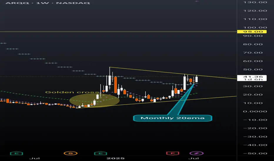
ARQQ weekly pennantBeautiful weekly pennant on ARQQ weekly timeframe. This chart is coiling nicely for a continuation. Still early in the process of reaching breakout but given the recent momentum in this sector a premature break to the upside can happen at any moment.
The ticker is currently sitting above the monthly 20ema (overlayed on this weekly chart), and just had a strong bounce off the daily 20ema (overlayed on this weekly chart). Golden cross is also highlighted that occurred in December 2024 with the daily 50ema retracing back to the daily 200ema and then continuing the uptrend earlier this spring.
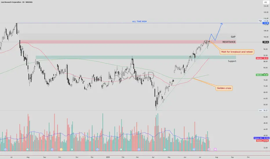
LRCX – Gap Fill First, Then Retest and Potential Move to ATHLRCX NASDAQ:LRCX is currently trading just below a key resistance zone, supported by strong bullish momentum and a confirmed Golden Cross formation.
🔍 Technical Scenario
There is a high probability that price may fill the gap above without retesting the current resistance. After the gap is filled, we could see a pullback to retest the previously untouched resistance zone (now acting as support).
If this retest is successful and holds, the structure may support a continuation move toward the All-Time High (ATH) zone.
📌 Trade Plan
Entry: Avoid chasing the breakout candle. Wait for a gap fill, followed by a clean retest of the broken resistance zone. Enter on confirmation of support holding.
Stop Loss: Place SL just below the retest zone or under the most recent higher low (structure-based stop).
Target 1: Gap fill completion
Target 2 : All-Time High (ATH), if retest confirms
⚠️ Risk Management
The gap-fill rally without retest can be volatile. Patience is key — let the price come back and confirm the breakout zone as new support.
As always, DYOR and manage your position sizing based on your risk profile.
CARR – Bullish Breakout Toward Gap and ATHCarrier Global NYSE:CARR has closed above a key resistance zone near $76.50–$77.00 , indicating a possible breakout setup in progress. This move comes after a Golden Cross , where the 50 SMA crossed above the 200 SMA — a long-term bullish signal.
🔍 Technical Highlights:
✅ Golden Cross: Bullish momentum building.
✅ Breakout level: Price broke above horizontal resistance zone.
🔄 Next step: Wait for a potential retest of the breakout zone.
🔊 High volume on the breakout and retest would increase the strength and reliability of the setup.
🎯 Target Levels:
First Target (TP1): ~$80.00 — near the top of the existing gap.
Second Target (TP2): ~$83.32 — the current All-Time High (ATH).
🛡 Trade Plan:
Entry idea: After a clean retest of the breakout level with supportive volume.
Stop-loss: Below the retest zone or under 50 SMA (~$72-74 area).
Invalidation: If price falls back below resistance on high volume.
Conclusion:
CARR shows a strong breakout setup after a Golden Cross. A confirmed retest with volume could open the door toward the gap fill and new all-time highs.
DYOR – This is not financial advice.

Golden Cross on GME WeeklyGME Chart Breakdown, Déjà Vu or Destiny? Something big just lit up the weekly chart, the 50 MA has pierced through the 200 MA, forming that golden cross traders dream about. On the weekly timeframe. Not a drill.
Now, let’s rewind. The last time this pattern appeared? January 2021. The infamous squeeze. Back then, GME didn’t just nudge upward, it catapulted nearly 4000%, going from a $3 floor to $120 in a blink.
Fast forward to today, new golden cross, new setup, and a $23 floor. If history rhymes even remotely, we’re staring down a hypothetical $1000 per share move. Yes, one thousand.
Is lightning about to strike twice? Stay tuned to find out!

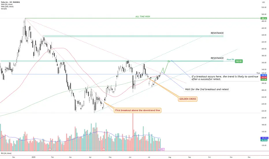
TSLA – Golden Cross + Dual Breakout Structure Targeting $363 andIdea Text:
Tesla NASDAQ:TSLA has recently printed a powerful Golden Cross , where the 50 SMA has crossed above the 200 SMA — signaling a potential long-term bullish shift in trend.
But price action shows more:
We’re observing a dual-breakout structure, where the first breakout above the long-term downtrend line has already occurred (see orange label), and the price is now approaching a critical horizontal resistance zone.
Let’s break it down step-by-step:
🔸 Step 1: Golden Cross
The 50 SMA crossed above 200 SMA — a classic signal for trend reversal. This often attracts institutional interest, especially if followed by breakout confirmation.
🔸 Step 2: First Breakout (Already Confirmed)
Price broke above the descending trendline, retested it, and maintained higher structure. This breakout initiated a shift in market sentiment from bearish to neutral-bullish.
🔸 Step 3: Second Breakout (Setup Forming)
Price is now testing horizontal resistance around $330–$335 zone. This zone also coincides with dynamic resistance from prior failed swing attempts. A successful breakout above this level, followed by a clean retest, can serve as confirmation for a bullish continuation.
🔸 Step 4: Target Setting
🎯 First TP is set at $363.92, a well-defined resistance level. If the breakout holds, next potential targets may develop around key zones such as $395 and $440, depending on price strength and continuation.
🔸 Risk Management
✅ Ideal entry after retest of breakout above ~$335.
❌ Stop-loss below the breakout level or below 50 SMA (~$315 area), depending on entry style.
🔄 Monitor volume: breakout without volume = weak move.
Conclusion:
We are watching a classic price action + moving average confluence setup. Golden Cross, breakout + retest structure, clean resistance level, and defined targets all align.
This setup is valid only with confirmation. No breakout = no trade.
⚠️ Not financial advice. DYOR.
The daily chart for total2 to look at the impending golden crossWanted to also post a daily chart tie frame of my previous idea. I first posted it in weekly to fit the entire cup and handle breakout target in the frame, but wanted to also post the daily time frame to provide both a close up of the inverse head and shoulders pattern as well as the impending golden cross on the daily time frame. Loos very likely that alt season may finally be approaching here. Gonna pay close attention to both this chart and the bitcoin dominance chart btc.d to know for sure. *not financial advice*

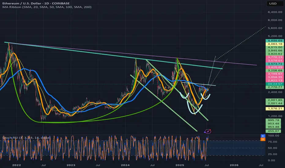
Ethusd breaking above invh&sEthusd chart has a similar set upas the total2 chart, a cup and handle that is breaking up from a smaller inverse head and shoulders that will complete the handle to the cup. Ethereum actually has two potential to trendlines for its cup and handle and I wouldn’t be surprised if both are valid. The breakout target for the inverse head and shoulder pattern will take price action above both of them. Once we solidify the top trendline for the cup and handle patterns as support the breakout target for it is $7161. Ethereum just recently had a golden cross on the daily which adds to the probability the inverse head and shoulder pattern breakout will be validated. *not financial advice*
VTI 1D: breakout on the daily within a long-term weekly uptrend On the daily chart, VTI (Vanguard Total Stock Market ETF) has broken through the key $303.5 resistance level with strong volume. This breakout occurs within a larger weekly uptrend channel, highlighting a continuation of the long-term bullish structure.
Volume profile shows a clear path ahead: $321.7 (1.272 Fibo) and $345 (1.618 Fibo). The golden cross (MA50 crossing MA200 from below) further supports the bullish case.
Fundamentally, VTI represents the entire U.S. equity market - large to small caps - and benefits from economic resilience, declining inflation, and passive inflows. It’s a logical macro play for trend continuation.
Tactical plan:
— Entry by market or after retest $303.5
— TP1: $321.7
— TP2: $345
— Invalidation below $300
The whole market breaking out? That’s not noise — it’s the signal.

$BTC Failed to Reclaim EMA9 - 200DMA in SightSo close, but so far away.
CRYPTOCAP:BTC held the 50DMA as support today but failed to break above the EMA9.
I suspect ₿itcoin now makes it way back down for the long awaited retest of the 200DMA ~$95k as I’ve been stating since the death cross.
If BTC can reclaim the EMA9 to close the week there may be a shot to continue the bullish uptrend, otherwise this correction will take a few weeks to play out.

$TOTAL Crypto Market Cap Meltdown As suspected, a head and shoulders pattern has formed on the CRYPTOCAP:TOTAL Crypto Market Cap.
We could see a big relief rally with the golden cross happening today, but i expect the market to sell off to 2.85T before seeing any real signs of reversal.
RSI also shows more downside ahead on the Daily.

Golden Cross vs. Death Cross: What Do They Really Tell Us?Hello, traders! 🤝🏻
It’s hard to scroll through a crypto newsfeed without spotting a headline screaming about a “Golden Cross” forming on Bitcoin or warning of an ominous “Death Cross” approaching. But what do these classic MA signals can really mean? Are they as prophetic as they sound, or is there more nuance to the story? Let’s break it down.
📈 The Basics: What Are Golden and Death Crosses?
At their core, both patterns are simple moving average crossovers. They occur when two moving averages — typically the 50-day and the 200-day — cross paths on a chart.
Golden Cross: When the 50-day MA crosses above the 200-day MA, signaling a potential shift from a bearish phase to a bullish trend. It's often seen as a sign of renewed strength and a long-term uptrend.
Death Cross: When the 50-day MA crosses below the 200-day MA, suggesting a possible transition from bullish to bearish, hinting at extended downside pressure.
📊 Why They Work (and When They Don't)
In theory, the idea is simple: The 50-day MA represents shorter-term sentiment, while the 200-day MA captures longer-term momentum. When short-term price action overtakes long-term averages, it’s seen as a bullish signal (golden cross). When it drops below, it’s bearish (death cross).
This highlights a key point: moving average crossover signals are inherently delayed. They’re based on historical data, so they can’t predict future price moves in real time.
🔹 October 2020: Golden Cross
On the weekly BTC/USDT chart, we can clearly see a Golden Cross forming in October 2020. The 50-week MA (short-term) crossed above the 200-week MA (long-term), marking the start of Bitcoin's explosive rally from around $11,000 to its then all-time high above $60,000 in 2021. This signal aligned with growing institutional interest and the post-halving narrative, reinforcing the bull case.
🔹 June 2021: Death Cross
Just months after Bitcoin’s peak, a Death Cross emerged around June 2021, near the $35,000 mark. However, this was more of a lagging signal: by the time it appeared, the sharp pullback from $60K+ had already taken place. Interestingly, the market stabilized not long after, with a recovery above $50K later that year, showing that Death Cross signals aren’t always the end of the story.
🔹 Mid-2022: Another Death Cross
In mid-2022, BTC formed another Death Cross during its prolonged bear market. This one aligned better with the broader trend, as price continued to slide towards $15,000, reflecting macro pressures like tightening monetary policies and the collapse of major players in the crypto space.
🔹 Early 2024: Golden Cross Comeback
The most recent Golden Cross appeared in early 2024, signaling renewed bullish momentum. This crossover preceded a significant rally, pushing Bitcoin above $100,000 by mid-2025, as seen in your chart. While macro factors (like ETF approvals or regulatory clarity) also played a role, this MA signal coincided with a notable shift in sentiment.
⚙️ Golden Cross ≠ Guaranteed Rally, Death Cross ≠ Doom
While these MA crossovers are clean and appealing, they’re not foolproof. Their lagging nature means they often confirm trends rather than predict them. For example, in June 2021, the Death Cross appeared after much of the selling pressure had already played out. Conversely, in October 2020 and early 2024, the Golden Crosses aligned with genuine upward shifts.
🔍 Why Care About These Signals?
Because they help us contextualize market sentiment. The golden cross and death cross reflect collective trader psychology — optimism and fear. But to truly understand them, we need to combine them with volume, market structure, and macro narratives.
So, are golden crosses and death crosses reliable signals, or just eye-catching headlines?
Your chart tells us both stories: sometimes they work, sometimes they mislead. What’s your take? Do you use these MA signals in your trading, or do you prefer other methods? Let’s discuss below!

AU Bulls Make A Break For Higher Prices! Time To Long??OANDA:AUDUSD has practically been caught in an Ascending Channel for most of this year but that might not be for "Long"!
A few key things to point out:
- Early April delivered a False Breakout where Price reached the Previous 5 Year Low @ .5980 and was immediately sent back up into the Channel! (Liquidity Sweep??)
- Most of the Price Action that's occurred in this range has been contained to the Upper Chamber of the Channel between the Rising Resistance and Linear Regression.
- Price Consolidated tightly into a Pennant Pattern underneath the Rising Resistance for the past few weeks before delivering a Bullish Break just earlier this evening.
If Bulls are able to sustain Price outside the Channel, this could generate potential Long Opportunities on the Retest of the Break of the Ascending Channel!
Once a Breakout is validated and Retest is successful, the Price Target would be the Next Swing High @ .66875 where Bears were able to push Price down last.
Fundamentally, RBA will be releasing CPI y/y numbers on Tuesday, May 27th with analysts forecasting a .1% Decrease in Inflation from 2.4% to 2.3% after last week having made a 25 basis point rate cut from 4.1% to 3.85%.

$BTC Historic Daily Close Above ATH - Pullback Warning*HISTORIC Daily Close for ₿itcoin marking a new ATH 🥇
Some hefty volume poured in as the Golden Cross nears.
If CRYPTOCAP:BTC breaks down from this impulsive trend we should see a pullback to the .786 Fib ~$102k to confirm this new ATH.
Bulls need the Weekly Close above $109k to prevent that.
Nonetheless, this confirms the start of the parabola I’ve mentioned over the past month in my analysis 💯
Next big target is the 1.618 Fib ~$130k 🤑
Congrats Hodlers 🥳

GME bullish with Golden crossGME bullish right now with:
- Golden cross in Day frame chart.
- Dragongly doji today maybe bullish if the volume higher tomorrow.
- MACD bullish .
- Pre Golden cross in Week frame chart too.
Today (05/15/2025) price closed: $28.63.
Entry now, R/R: 3.34.
Price target: $34.40.
Stop-loss: $26.90.
IMO.

Bitcoin bullish rsi can lead to 133kbitcoin can lead to 133k without any stop as bullish convergence and diversion has been identified with RSI above 50 there is no stopping.
MA & EMA BOTH ARE SHOWING GOLDEN CROSS OVER .
Probable higher high ,lower low pattern can form for more push to 200k

CELH - Golden cross bullishWith Day frame chart, we have Golden cross and MACD bullish.
The price today (05.06.25) closed at $35.52 (up 4.81% with ER fell !!!).
The price after hours: $35.39.
If entry right now. R/R: 2.91.
Price target: $42.52.
Stop loss: $32.94.
IMO, amateur trader.

Golden Cross means Golden Opportunity?Here's What You Need to Know About Moving Averages
One of the signs of the beginning of a bullish trend is the golden cross — a crossover between two moving averages. The shorter-period moving average (closer to the price) crosses above the longer-period moving average (farther from the price).
When this happens, it could be a signal to consider buying or opening a long position, especially if supported by candlestick confirmation. The target is usually set higher than the previous high.
Case Study: BINANCE:STEEMUSDT
The price began trading above the EMA 20 (white line) and EMA 50 (pink line), then the EMA 20 crossed above the EMA 50 — forming a golden cross.
But instead of entering immediately, you should wait for a price retracement back to the EMAs, allowing them to act as support (also known as dynamic support, since EMAs move with price).
In this case, a bullish engulfing candlestick pattern appeared right at the EMAs. The confirmation level is at 0.1303, which means the price needs to close above this level to validate the bounce from the EMAs. The invalidation level is below the bullish engulfing candle — at 0.1270.
Target prices:
Target I: 0.1570 – 0.1632
Target II: 0.1802 – 0.1887
You might be wondering: How do I choose which target to aim for?
Let me explain — the main target is 0.1802 – 0.1887 because it’s above the previous high (in a bullish trend, price tends to form higher highs).
Then why include 0.1570 – 0.1632? Even though we aim for the higher target, we still need to be cautious of potential resistance in that zone. Once the price hits that level, observe how it reacts.
If there’s a significant rejection or price drop, consider reducing your position to secure profits. But if the price keeps pushing up with strong momentum, let the profits run.
So in this case, 0.1570 – 0.1632 acts more like a level of awareness rather than a fixed take-profit target.
Let me know what you think about this post!
Would love to hear your thoughts and how I can support your trading journey with more technical insights or educational content like this. 🙌

Golden Cross Alert on EUR/USDFor the first time since August, the Euro has printed a Golden Cross — the 50-day moving average (SMA) has just crossed above the 200-day SMA.
This is one of the most well-known technical signals, often interpreted as a bullish shift in trend. Here's why this is worth watching:
✅ Strong momentum leading into the cross
✅ EUR/USD breaking above recent resistance levels
✅ Long-term downtrend possibly reversing
But remember: Golden Crosses don’t guarantee sustained upside. Many are followed by consolidation or even bull traps — volume and confirmation matter!
📈 Could this be the beginning of a bigger move in the Euro? Time to zoom in.

2012-2017 Deathcross Goldencross Pattern for BTC Deathcross then Goldencross then Deathcross creating a zone indicates a bearish move.
The time to sell before bigger dump ahead
Goldencross then Deathcross then Goldencross creating a zone indicates a bullish move.
The time to buy before bigger pump ahead

MKR/USDT: Accelerated Golden Cross & Strong Uptrend ConfirmationMKR is showing clear bullish momentum, forming higher lows and seeing increasing trading volume, both signs of a sustained uptrend. The price has reclaimed key moving averages and is now testing the 200 SMA ($1,517)—a critical level that, once broken, could trigger a strong upward move. Initially, the golden cross (50 SMA crossing above 200 SMA) was expected within 2-4 weeks, but given BTC’s renewed strength and rising market liquidity, this formation could now happen much sooner—potentially within 7-14 days if the current momentum continues.
With BTC stabilizing and likely resuming its uptrend toward $95K-$100K+, liquidity is expected to flow into strong altcoins like MKR. If MKR breaks and holds above $1,517, initial targets of $1,8 and $2,1 could be reached quickly. However, with higher volume and strong technical confirmation, a move toward $2,4 - $2,8 is highly probable. If momentum accelerates further, $3,0+ could be a mid-term target, supported by both technical and macro market conditions.
For traders, a confirmed breakout above $1,517 with strong volume would signal a breakout opportunity, while investors looking for accumulation zones might watch for pullbacks to $1,493 (100 SMA) or $1,223 (50 SMA) as potential re-entry points. With increasing volume, higher lows, and a likely golden cross arriving earlier than expected, MKR is positioned for a significant rally in the coming weeks.

Ascending Triangle on the Daily for GME!Alright folks, brace yourselves for another electrifying update on the saga of GME! Since our last rendezvous, we've witnessed the impressive cup and handle pattern and the striking inverse head and shoulders breakout. But that was just the beginning. After our latest dip, in tune with the broader market's downturn, we've now sculpted an absolute monster of an Ascending Triangle on the daily chart, also visible even on the 4-hour.
Using the trend-based Fibonacci extension, the golden pocket awaits us at $37.09, with the next pocket above that at $52.58. Adding to the excitement, we've got the Bull Flag breaking out on the weekly chart and the golden cross appearing on both the weekly and daily charts. Not to forget the substantial cup and handle formation on the hourly chart.
Hourly Chart : Cup and Handle: This pattern is setting the stage for potential bullish movement.
4-Hour Chart: Ascending Triangle: Reinforces the pattern seen on the daily chart, confirming the bullish setup.
Daily Chart: Ascending Triangle: Visible on both the daily and 4-hour charts, suggesting an imminent breakout.
Weekly: Golden Cross: This crossover indicates long-term bullish momentum.
Bull Flag: This continuation pattern indicates that the existing uptrend is likely to continue.
All signs point to an explosive few months ahead for GME, with multiple breakouts on the horizon. Stay tuned, because the next chapter of this epic journey is about to unfold

LTC Breaking above tan invh&s neckline, right on goldencrossI have the weekly chart timeframe selected here simply because I needed to expand the timeframe on the chart to be able to fit both inverse head and shoulders patterns and their respective breakout targets in the frame. Wanted to put the timeframe on the daily chart so. Could show once again how these recent crypto pumps have all being launching on the exact day that the Daly golden cross occurs. I will post. Daily chart version of this as well that zooms in on the golden cross and subsequent priceaction and link it below. Anyways it looks like on this 2nd breach above the tan neckline that Litecoin is likely to finally trigger a breakout ths go around. If so the highest measured move target is in the $170s here, and reaching it will obviously also allow us to hit the white inverse head and shoulders breakout target too on the way there. In order to ensure that price acton doesn’t dip back below the tan neckline for a second time, it will need to flip the weekly 200ma(blue line) to solidified support once that happens I think it will definitely confirm the breakout at that point. Alt season has officially began! *not financial advice*
