Bitcoin- 175-200k by year's endEvery major Bitcoin move over the last decade — whether a jaw-dropping bull run or a brutal crash — has shared one silent macro trigger.
It’s not the halving.
It’s not ETF hype.
It’s not Twitter sentiment or TikTok FOMO.
👉 It’s global liquidity.
And right now, this powerful force is expanding fast — the same setup that previously drove Bitcoin from $5K to $70K in under a year.
But here’s the twist: as of today, Bitcoin is already trading near $120,000, not $20K or 30k.
That means the engine is already roaring — and if this macro thesis holds, the next stop might just be $175,000-200.000 by year's end.
________________________________________
🧠 What Is Global Liquidity, Really?
Global liquidity = the total money sloshing around the financial system.
It’s often measured through M2 money supply, combining:
• Cash
• Checking/savings deposits
• Easily accessible liquid assets
The most comprehensive view comes from Global M2, which aggregates liquidity from 20 of the world’s largest central banks.
Right now, Global M2 is not just rising — it’s breaking to all-time highs.
And if history repeats itself, Bitcoin tends to follow this wave closely.
________________________________________
📅 Past Performance: Bitcoin and Liquidity Walk Hand in Hand
Let’s break it down:
• 2016–2017: Liquidity surges → BTC +5,000%
• 2020–2021: Post-COVID easing → BTC $5K to $69K
• 2018 & 2022: Liquidity dries up → BTC crashes ~70%
It’s a recurring pattern:
Liquidity drives the crypto cycle.
________________________________________
💡 Why Liquidity Moves: Interest Rates and Central Banks
Central banks control the tap.
• 🟢 Cut rates → Easier credit → More lending → More liquidity
• 🔴 Raise rates → Tighter credit → Less spending → Liquidity contraction
In 2022, the Fed tightened hard.
🧊 U.S. money supply shrank.
📉 Bitcoin fell from $70K to $15K.
But starting August 2023, the Fed paused, then pivoted.
Since then:
• 🟢 The U.S. M2 supply rebounded
• 🟢 Global M2 began expanding again
• 🟢 Over 64 global rate cuts were made in just six months — one of the fastest global easing cycles in history
The last time we saw this much cutting? 2020.
And we all know what happened to Bitcoin then.
U.S M2
________________________________________
🟢 Today’s Setup: The Engine Is Already Running
Fast forward to mid-July 2025:
Bitcoin is no longer at $30K — it’s already testing $120K.
Intraday highs have touched $123K, with a current consolidation zone between $117K–$120K.
This isn’t a "recovery rally" — we’re already in price discovery territory.
The question now becomes:
Is $150K and above next… or are we topping out?
________________________________________
📈 Charting the Path: Bitcoin vs Global M2
When we overlay Bitcoin price over global liquidity trends, one thing becomes crystal clear:
📊 Bitcoin tracks liquidity direction.
• When money supply expands, Bitcoin rallies.
• When money dries up, Bitcoin tanks.
Given that global M2 is at record highs, and liquidity conditions are easing globally, the chart suggests there’s still plenty of fuel in the tank.
And if we follow the same growth, Bitcoin could realistically reach $175,000 before 2026 kicks in.
________________________________________
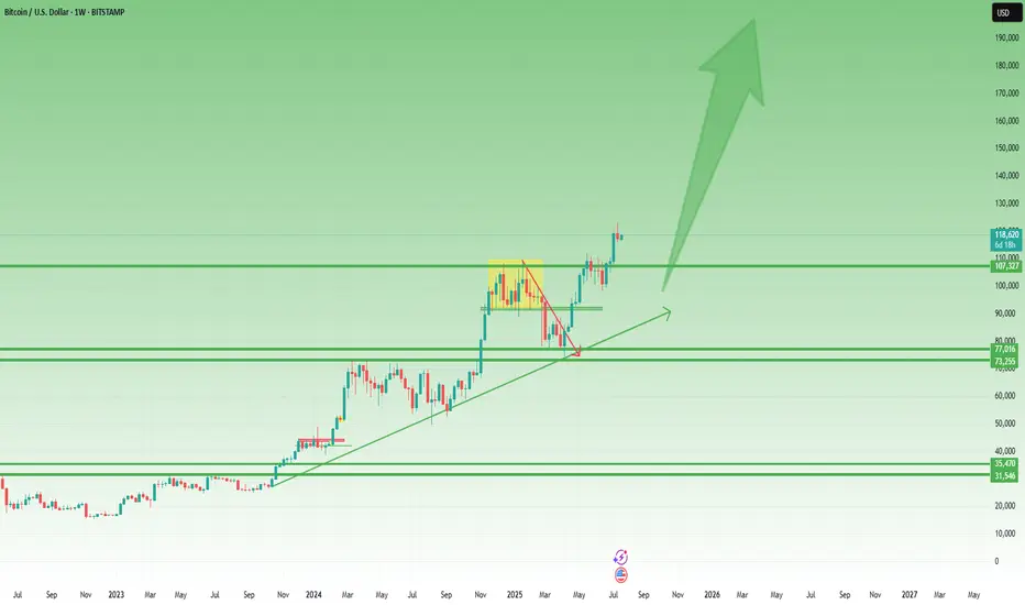
Technically:
As we can clearly see from the posted weekly chart, you don’t need to be an expert to recognize the strength of the current uptrend.
While last week printed a small bearish Pin Bar, this alone shouldn’t raise major concerns — especially considering the presence of multiple key support levels, starting from the 110K zone.
In the context of a strong and well-established trend, such candles often reflect normal short-term profit-taking, not a reversal.
🎯 Conclusion – Don’t Fight the Tide
This isn’t about hopium.
It’s not moon talk.
It’s about macro flows and monetary velocity.
Ignore the noise.
Watch what the central banks are doing.
Because Bitcoin moves not on wishful thinking, but on waves of liquidity — and the tide right now is rising fast.
Whether $175K comes by year-end, one thing is clear:
We are in the middle of a liquidity-driven expansion phase, and Bitcoin is already responding.
Stay focused, manage your risk, and don’t chase — ride the wave. 🌊
M2
Global M2 Money Supply (70/84/90 Day offset) and $150k BTCI'm using Global M2 slightlty different than most here, and showing it behaves differently during different periods of the cycle.
Many people say M2 leads Bitcoin by 10-12 weeks (70 - 84 Days) and I've seen periods where it does... But in this phase of the bull-run 90 days is working best.
We can see the dip in M2 around now coinciding with the drop in Bitcoin prices.
Of course, these are not directly correlated and can't be relied upon as predictive.
But it's following pretty close, and overall looks great for further upside!
I'll follow up with a video on this if anybody is interested.

Is SP500 / US M2 Money Supply telling us a story?Historically this ratio has inflected from key levels. Last week the upper boundary of what 8 would call a normal range has acted as support. If history rhymes to dot com bubble, this AI bubble can bounce from these levels and see an increase until Q4 2026, then a sharp fall will follow. To the lower boundary of that normal range.

Argentina Money Supply Reduced Along With InflationWe once again see that MMT ("Modern" Monetary Theory) is 100% wrong. Milton Friedman wins again.
"Inflation is always and everywhere a monetary phenomenon."
Don't let modern economic hacks fool you.

Global M2 Money SupplyWith more money than ever before in circulation available. Asset prices should go up..
Do you agree or disagree?

Altcoins (Market Cap) - Excluding Top 10 Coins - Inverted H&SBullish setup on the daily chart. CRYPTOCAP:OTHERS have once again made a inverted head & shoulders pattern which is a bullish reversal pattern. With the yellow chart below showing the Global M2 Liquidity index breaking out aswell. With more money in circulation, the propabilty is that more money will enter the market over time. Although, there can be latency.
For now I will trust the patterns in the chart of Others and follow it to see IF we can confirm the Inverse H&S. We have to break the neckline which should be around 310-325 B for June and July. But still, after that we need a pullback to confirm that neckline and make it support for continueation.
It´s a very interesting world right now. And much can happen. But IF this break out. It would probably be one of the most explosive bull markets to remember for a long time.. I myself are holding quality coins and tokens. Im not in memecoins, whats so ever. With the adoption happening right now in crypto I don´t believe that is the right market to be in right now.
Nothing on this profile should be interpreted as financial advice. Always do your own research and investment decisions. Im only expressing my thoughts and beliefs. Nothing else. Crypto is a risky business but It also has a lot of reward If being right. I can´t find equal yield in any other markets for now. If you know any, plz comment below =)
BINANCE:BTCUSD
CRYPTOCAP:OTHERS
CRYPTOCAP:TOTAL
MARKETSCOM:ETHEREUM
BINANCE:SOLUSD
BINANCE:SUIUSD
ICEUS:DXY

BTC is basically SPX with a higher multiplesince Wall Street got in we actually got significantly more correlated (obviously)
(it wasn't as much prior to 2021)
BTC has basically become SPX with a higher multiple.
Do with that what you will

BTC M2 CorrelationMaybe Raoul is right and it was M2 all along.
Monetary policy driving all markets, see correlation and time-lag (offset) on chart.

BTC Log Trend accumulation/expansionnoticed this Accumulation/Expansion/Contraction idea when trending along the Log Pitchfork lines.
and the high correlation to SPX (and M2) for direction.

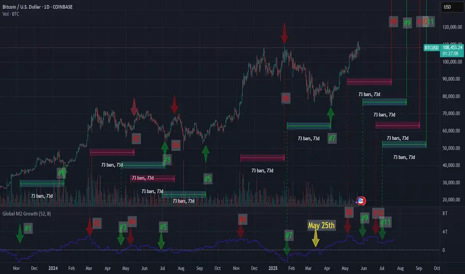
73 days looks to be spot on73 Day Lag to the Global M2 Money Supply looks to be spot on for the last year. If it is, this is good news with the M2 still climbing.
If I am right, we will have a dip within 24 hours of May 28th, only to get another pump to the upside withing 24 hours of June 2nd.
(I tried inputting all this data to Grok in order for him to give me some price targets. They were close to where I think the price will be but using the M2 for price targets still needs some work.)
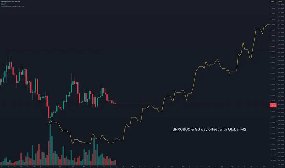
$SPX6900 following Global M2 money supplyFollowing Colin Talks Crypto's BTC & Global M2 money supply.
I'm using his script to generate global M2, in his version there is a 108 day - 86 day offset.
Here with SPX I adjusted to between that range at 96 days.
This sets up a strong outlook for SPX6900 going into the new few months.
Gold Skyrockets Like It's 2011: Are We There Yet?Gold has been on a powerful run since breaking above the 2100 resistance level in March 2024. After just one year of relentless gains and a return of over 60%, it has become one of the top-performing assets. But the big question now is: how far can this rally go? To the moon?
It's difficult to predict how far prices can climb during these kinds of parabolic moves. In 2011, the final green monthly bar alone rose 17% from open to high. These FOMO-fueled surges often lead to euphoric tops followed by painful bear markets. So, are we there yet?
Since Richard Nixon ended the dollar's gold backing and introduced the modern fiat system, gold's status as a safe haven has become even more prominent. Whenever there are heightened risks, whether geopolitical, fiscal, or related to the fiat money system, investors tend to flock to gold. The 2011 rally was a clear example of this. After the 2008 financial crisis and the quantitative easing that followed, gold became the go-to asset for both preserving value and speculative opportunity.
A similar pattern has unfolded following the COVID-19 shock. The Federal Reserve returned to aggressive quantitative easing, while both the Trump and Biden administrations increased fiscal spending, including direct payments to households. This surge in money supply and concerns about fiat stability, along with rising government debt, helped trigger another major gold rally. With the added risk of a trade war, the rally has accelerated further, pushing gold beyond 3300 and creating a situation that closely mirrors 2011.
Looking at the money supply-to-gold ratio and the US federal debt-to-gold ratio, gold now appears to be testing trendline levels. Its recent surge has made metrics like M2 and federal debt seem relatively smaller, which may be a sign that the rally is approaching exhaustion.
Still, history shows that final euphoric moves can stretch even higher before a true top is formed. Rather than trying to predict the peak, it's often better to wait for signs of price stabilization. Gold typically offers a second opportunity, often forming two peaks with the second lower than the first, before entering a bear phase.
In 1980, gold fell more than 60% within two years. After the 2011 top, it declined nearly 40%. Even if the retreat expected to be milder this time, gold could still offer a 20% or greater downside opportunity once the top is in.
Smart money has already started to take profits gradually. Net managed money positions in the COT report have decreased by 40% since January, as we discussed in our earlier post:

Prepare for LIFTOFF $ADAThe Global Net Liquidity index is breaking out of its multiyear downtrend channel on the back of a weak TVC:DXY dollar. Altcoins like CRYPTO:ADAUSD and other risk assets historically wildly outperform during Global Net Liquidity uptrends and dollar debasement cycles. As the business cycle heats up with ISM Manufacturing PMI ECONOMICS:USBCOI rising above 50, expect altcoins to gain relative strength to CRYPTO:BTCUSD and a Bitcoin Dominance
CRYPTOCAP:BTC.D collapse into the 35-45% range.
This is your last chance.

M2 LiquidityTrend reversal expected around March 25-30!
77k support, bull run can start. Bounce is expected if the fall continues. Double bottom formation with narrow STOP entry option.
M2 Liquidity indicator forecast 10 week offset W1 (68 day D1 view).
M2 GLOBAL LIQUIDITY COMING TO SAVE THE DAYDoes the market look dead?
Wanna know what brings it back?
PRICE.
Wanna know what brings back price?
LIQUIDITY.
Steady lads, deploying more capital 🚢

BITCOIN hasn't made a new high versus M1 money since 2017What does it do
You see what could be a continuation inverse head and shoulders
and the two targets.
PLAN B hot alot of people wrecked last time, and he still adamant #BTC will hit $500K this cycle.
The chart says otherwise
and more likely we peak above the high meet the linear target & double top (at least for now )
what say you?

All Stars Aligned: Bitcoin, Gold, Fiat, and DebtThis post explores the idea that Bitcoin, often referred to as "digital gold," might one day replace gold as the preferred store of value.
Gold’s price (shown in yellow) has traditionally been sensitive to inflation, which is influenced by money printing, as indicated by the US M2 money supply (shown in white on the chart). Geopolitical and economic insecurity also drives demand for gold, the "safe-haven" metal. To add further context, I've also included US debt (shown in red).
The chart reveals that the market seems to have found some form of equilibrium at current levels, with gold’s price finally tracking the M2 money supply and debt parameters closely. Interestingly, Bitcoin (shown in orange) has mirrored this behavior in a similar fast-paced manner.
Around the $3,000 mark for gold and near $100,000 for Bitcoin, both assets are aligning with the money supply and debt trends. This suggests that any further price increases could be limited unless additional money is printed or debt increases. Of course, a Black Swan event could disrupt this equilibrium at any time.
I also used TradingView’s Correlation Coefficient tool to examine the relationship between Bitcoin and gold. The correlation is impressively high at 0.87, indicating an almost perfect alignment between the two assets.
The chart supports the idea that Bitcoin is tracking gold closely, strengthening the notion that Bitcoin could indeed be positioning itself as the "digital gold" of the future.
Let me know your thoughts in the comments below!

US Elections impact on BitcoinHistorically, no matter who wins the elections, Bitcoin wins:
- Bitcoin’s supply capped at 21 million coins;
- Immutable monetary policy;
- While governments will continue to print money;
- And expanding government debt;
Volatility is only short-term.
Here's why:
Like Paul Tudor Jones said, "All roads lead to inflation".
Cash will always lose money over time BUT assets like stocks, Bitcoin and crypto will go up in value.
In the short term, crypto might perform a bit better if Donald Trump wins the elections. He seems that the big crypto corporations (Coinbase, XRP, a16z) donated millions to Trump in exchange for more crypto friendly regulations.
In the long term, it doesn't matter who wins the elections. In the long term, Bitcoin and crypto are likely to perform well both under Trump or Harris. Why? Because the correlation coefficient between Bitcoin and the US M2 money supply is 83%.

Nasdaq 100 (QQQ) due for a correction ?US M2 Money stock / Nasdaq 100 (QQQ)
has reached its March's 2000 low.
Bullish divergence on both the RSI and MACD.
The Nasdaq 100 seems due for a correction which
would imply a rebound on this ratio of M2/QQQ

Bitcoin's Covid Crash Bottom Was KnowableThe BTCUSD bottom of the March 2020 Covid-19 correction looks a lot like a textbook flip of resistance into support when adjusted for the money supply.

Global M2 Set to ResurgeGlobal money printers are starting to rev up.
After a brief hiatus, it won't be long before U.S., Europe, and Japanese M2 charts new highs again. Are you ready for a new liquidity cycle?

Key stores of value over economic history: SP500 vs GoldWhen the pandemic shocked markets in 2020, the Fed quickly printed trillions of dollars (while purchasing bonds to support corporations and the government). As the U.S central bank’s balance sheet surged, so did the broad money supply in close parallel with stock markets and gold prices.
Unlike the Fed’s intervention during the Great Financial Crisis — plus a similarly unprecedented fiscal expansion — consumer prices spiked at the fastest pace since the 1970’s. Since 2019 (and even as far back as 1971 when the U.S. broke the dollar’s tie to gold), both gold and especially the S&P 500 have been reliable “stores of value.”
Since around 1970, both gold and the S&P 500 (which looks even more impressive accounting for dividends) are up nearly 7,000% versus a dollar designed to lose value every year. Granted there have also been several harrowing drawdowns for both the S&P 500 and gold. Meanwhile, consumer prices are up *only* 700% since the dollar lost its golden luster.
If history is any guide… It leaves us with a simple framework for wealth preservation: If you work hard to earn $10,000, don’t let it decay under your metaphorical mattress for multiple decades thereafter. Gold and the S&P 500 have historically been reliable assets to preserve wealth. However, timing is greatly important as well.

Macro Monday 61 - Fed Balance Sheet Signals Liquidity BounceMacro Monday 61
Fed Balance Sheet Hits Long Term Supporting Trend Line
The Federal Reserve Balance Sheet
The balance sheet is published weekly, typically on Thursday afternoons, and it provides valuable information on the direction of global liquidity and the fed’s monetary policy.
When the Federal Reserve’s balance sheet increases, it means that the central bank is acquiring more assets. This expansion can occur through purchases of Treasury securities, mortgage-backed securities, or other financial instruments. The increase in assets typically leads to greater liquidity in the financial system and can influence interest rates. Conversely, a decrease in the balance sheet indicates asset sales and reduced liquidity
The Chart - FRED:WALCL
▫️ Since April 2022 the Federal Reserve Balance Sheet has reduced from $8.973 trillion to $7.140 trillion (reduction of $1.833 Trillion).
▫️ Right now, the chart has signaled that we have hit a critical diagonal trend line support (red line on chart).
▫️ We have hit this red trend line twice in the past (Sept 2019 & Aug 2008) and on both occasions it bounced from the red trend line and the balance sheet thereafter increased significantly for 2 to 5 years.
If you follow me on Trading view, you can revisit this chart at any time and press play to get the up to date data and see if we have held the line or fallen below it.
What does the following mean to you?
✅High likelihood of interest rate reductions in Sept.
✅Apparent stabilization of the rate of inflation (U.S)
✅A current stable labor market in the U.S
⏳The possibility of the balance sheet bouncing from trend support and increasing from the support line as it did in the past for 2 years+ (Increasing Global Liquidity).
Versus
🚨 The yield curve un-inverting (moving above 0)
🚨 Sahm Rule Triggered
🚨 The marginal increase in the U.S. Unemployment Rate which is consistent with prior recessions.
🚨 U.S. Initial Jobless Claims and Continuous Jobless claims have had increases consistent with pre recession historic activity.
🚨Job openings reducing since March 2022 from approx. 12m to 9m (this would be the largest pre recession drop ever if followed by a recession.
🚨 Warren Buffet sitting on the biggest pile of cash ever.
Does this all say “soft landing” imminent or should we be worried?
In my opinion, we will know by Jan 2026. Its a big window of time, but the timing is the biggest challenge, and if we can take one thing from the above, volatility is guaranteed.
Happy Trading
PUKA
