XAUUSD Monthly Technical OutlookMarket Structure Overview:
• The chart reveals consistent Breaks of Structure (BOS) to the upside, confirming a strong bullish market trend.
• Price has successfully reclaimed and retested the strong resistance zone (~3390–3400), which now acts as new support.
• A series of higher highs and higher lows show clear bullish intent, supported by sustained bullish momentum after each correction.
⸻
📈 Volume & Price Action:
• The Volume Profile (VRVP) on the left shows strong historical accumulation near the current breakout zone.
• After the breakout from resistance, the price retested this zone—validating it as support—and is expected to continue its bullish leg toward $3,500, the next psychological and technical target.
⸻
📍 Key Levels:
• Support Zone: $3,375 – $3,390 (previous resistance turned support)
• Immediate Resistance: $3,425
• Target Level: $3,500 (Monthly High Projection)
⸻
📘 Educational Note:
• This setup aligns with classic market structure theory: BOS + Retest + Continuation.
• The pullback into the breakout zone is a textbook bullish continuation signal often used in institutional trading strategies.
• Traders watching this pattern should combine it with confirmation entries such as bullish engulfing candles, FVGs, or order block rejections for safer entries.
⸻
🎯 Projection:
• As long as the price holds above $3,375, the bullish scenario toward $3,500 remains valid.
• Expect possible consolidation or minor pullbacks before continuation.
⸻
📌 Disclaimer:
This analysis is for educational purposes only and does not constitute financial advice. Always do your own research before entering the market.
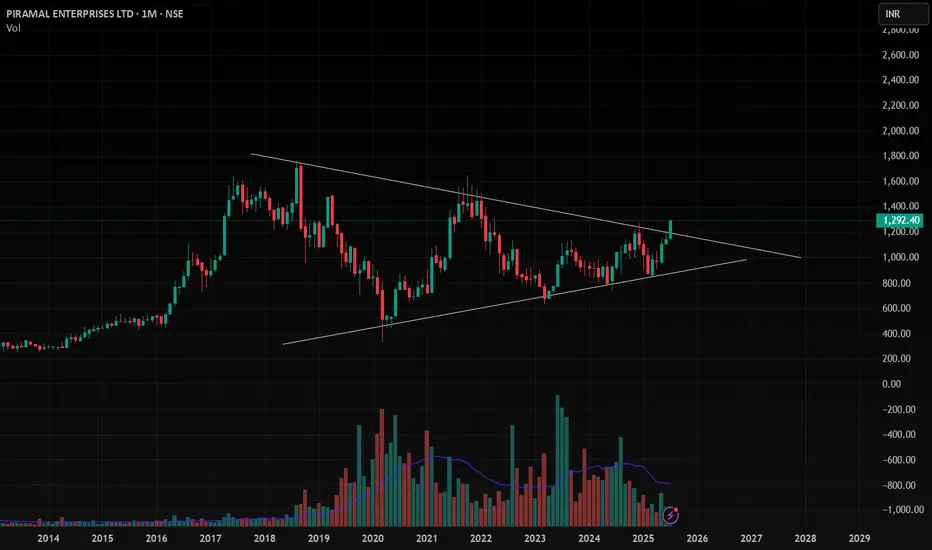
Monthlychart

PEL , 1M , BullishThe Triangle Pattern is Breaking Out in Monthly Time Wait for Strong and Perfect close in Weekly Time and Enter after Confirmation .
Take Risk According to your capital
Follow for more ideas like this
Apple Is Climbing the Fibonacci Channel Ladder – Step 5 Ahead?On the monthly chart, Apple (AAPL) is steadily moving within a well-defined ascending Fibonacci channel, like climbing a ladder — step by step.
The price is currently testing Step 4 , a zone that has acted as a strong resistance barrier.
Despite the pressure here, the structure still appears bullish, and even a minor pullback might simply be a pause before the next move.
If momentum picks up, we could soon see a breakout toward the next step — targeting 234 at Step 5.
The trend remains technically intact unless the channel is broken, and the overall formation still leans toward continuation.

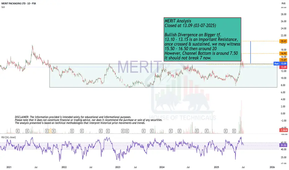
Bullish Divergence on Bigger tf.MERIT Analysis
Closed at 13.09 (03-07-2025)
Bullish Divergence on Bigger tf.
13.10 - 13.15 is an Important Resistance,
once crossed & sustained, we may witness
15.50 - 16.50 then around 20
However, Channel Bottom is around 7.50
It should not break 7 now.

Monthly Closing above 63.50 ..?IBLHL Analysis
Closed at 63.49 (26-06-2025)
Monthly Closing above 63.50 is important
to move price further up.
Upside targets can be 79 - 80 initially.
On the flip side, it should not break 49 - 50,
otherwise we may witness further down side.

#FORTIS Today this stock brooked ATH level with strong volume. Through It can be predicted here that this will be a good investment option for the short term and long term.
CMP - 790
Key level:-
1) triangle pattern breakout
2) high volume
3) stock sustaining previous high
4) retest like formation

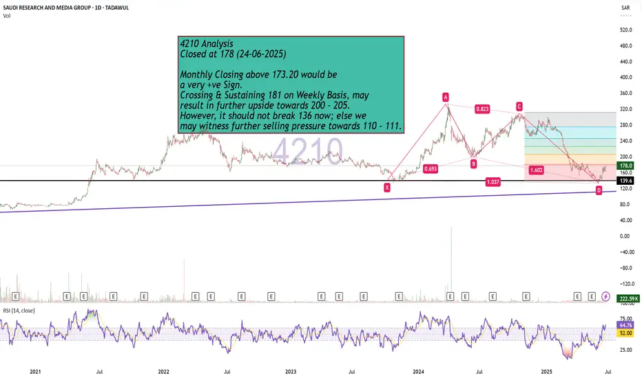
Bullish Monthly Candle Expected?4210 Analysis
Closed at 178 (24-06-2025)
Monthly Closing above 173.20 would be
a very +ve Sign.
Crossing & Sustaining 181 on Weekly Basis, may
result in further upside towards 200 - 205.
However, it should not break 136 now; else we
may witness further selling pressure towards 110 - 111.
Macro Analysis (GBP/USD)Likely aiming for 1.42491 and 1.43886 as potential targets.
There's also a possibility of a bounce near 1.17610 in the future.
The yearly timeframe failed at 1.05200 back in 2022, suggesting we're sitting at the bottom of the range.
Quick analysis — Despite all the social and political controversy in the UK, the macro chart clearly shows a long-term downtrend. Until price closes strongly above 1.43886, that's when this pair might have a chance vs the US dollar. (1.72062 for some stronger confidence lol)
That said, the past five monthly candles have all been green, showing some momentum and short to mid-term strength. Could easily just be a pullback before continuing lower, breaking below 1.05200, which honestly, wouldn’t surprise me.
But hey, let’s keep it to the charts. WOMEN lie, men lie, but numbers don’t. And this is all just numbers printed in a chart.

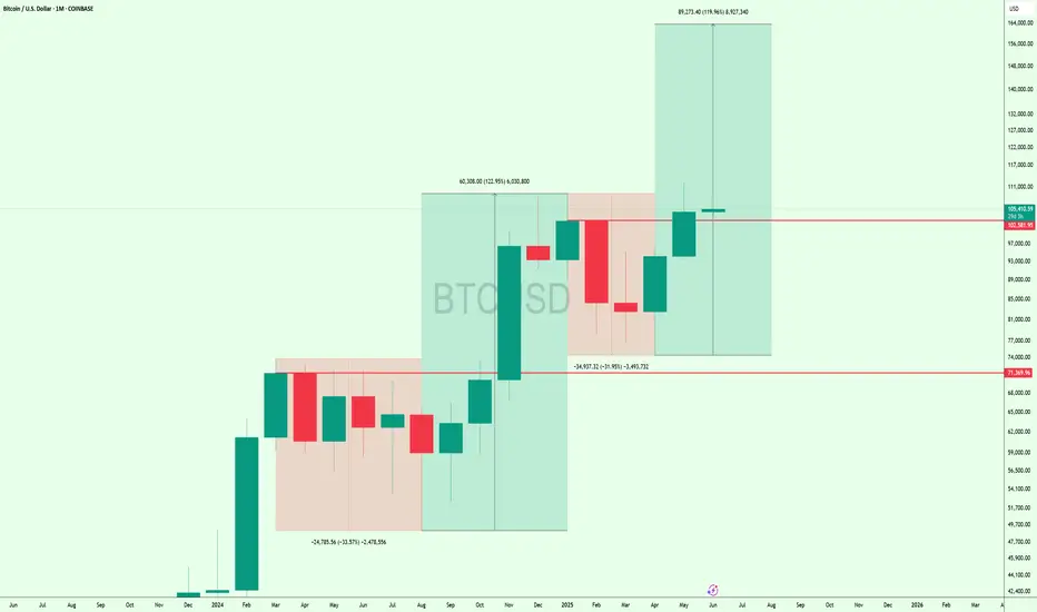
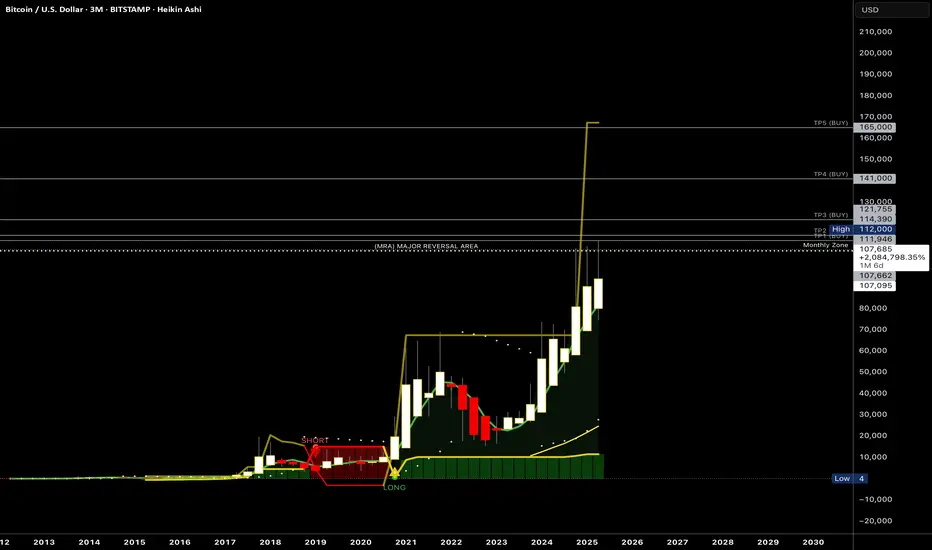
This Is Not a Top – It’s the Beginning of the Mega Bull RunThis is the monthly #Bitcoin chart, and honestly, how can anyone be bearish here?
CRYPTOCAP:BTC just bounced after a -31.95% correction and is now holding strong above the $101K breakout zone.
Last time, a similar setup led to a 122% pump... and this time, we could be looking at a move toward $160K that's 120% upside from here.
We’re likely entering the biggest bull market ever.
Get ready. 🚀
Beautiful Monthly Closing.
Closed at 122 (29-05-2025)
Beautiful Monthly Closing.
However, 125 - 126 is an Important
Resistance that needs to Sustain for
further upside.
Entry can be taken with a Stoploss below
117; targeting 125 - 126 initially.

SPX week & month review 5/30/25Intrigued by today as we closed the month and week. The charts appear bullish until something changes that. Key points I noticed...
*Monthly morning star pattern
*RSI above 50 on month and week chart
*MACD over zero line and signal up on month and week chart
*Key levels holding up (21 ema, FVGs)
We are still in volatile times and narratives are being thrown all over the place. Do you see what I see? Enjoy your weekend.

BTC Market Analysis for Q2BTC Market Analysis for Q2 - As we end the month the market tends to rescind. Pay close attention to the monthly and weekly zones. Price needs to break above the monthly zone. Let’s see if the month of June opens up above $107,700 that would indicate a continuation to the upside - possibly to $120-125K…
Monthly closing is Important!Monthly closing above 91-92 would
be OK.
Otherwise as mentioned earlier, next support
would be around 81 - 83 but then 88 - 90 would
become the Resistance.

Bajaj Finserv Ltd scending Triangle formation on the monthly📌 Trade Setup: Bajaj Finserv Ltd (NSE)
Pattern: Ascending Triangle
Timeframe: Monthly
Signal: Approaching breakout of horizontal resistance zone
✅ Buy Recommendation
Buy above: ₹2,075 (Monthly close above resistance confirms breakout)
Aggressive entry: ₹2,035 (Current level with early risk)
Target 1: ₹2,400
Target 2: ₹2,750
Target 3: ₹3,000+ (Long-term projection from triangle height)
❌ Stop Loss
SL: ₹1,850 (Below recent swing low and trendline support)
for educational purposes only

Morning Star Formation on Bigger Tf.Morning Star Formation on Bigger Tf.
14.35 - 14.75 is a Very Important Support level.
However, 15.80 - 15.90 is a Very Strong Resistance
as of now.
If this level is Crossed & Sustained with Good Volumes,
we may witness 17.50 - 18 & then around 19.

Play wisely.Cup & Handle Formation.
But Bearish Divergence is there which is dragging
the price down.
Immediate Resistance now is around 678 - 680.
Next Support is around 638- 651.
The Bullish Momentum will resume once it
will Cross 725

Hidden Bullish DivergenceMonthly Closing above
75000 would be a +ve sign.
Hidden Bullish Divergence on Daily TF
has also appeared.

No Bearish Divergence Yet!Bullish on Monthly TF.
Though HL Confirmed on Bigger TF but Important
to Cross & Sustain 730 & if this level is Crossed with
Good Volumes, we may witness 770 - 775 initially.
On the flip side, 640 - 645 may act as Immediate
Support.
It should not break 608, otherwise we may witness
more Selling Pressure towards 550 - 570.

Play On LevelsRetested the Breakout Level around 180 - 185 &
Closed just above a Very Important fib level around
188.
But, 188 - 195 is Very Important Resistance as of now.
If 195 is Crossed with Good Volumes, 212 - 215 can be
touched initially.
Couple of Positive Weekly Candles with comparatively good
volumes may confirm HL on Monthly basis.
On the flip side, 175 - 184 is a Support Zone & also Double
Bottom around 175 - 176, so Short Term Traders may
expect a bounce from this level.

XAUUSD Breaking Records: Bull & Bear Setups for the New Month 🔥 Attention all traders!🔥
XAUUSD is on fire, breaking records with power! Here’s the latest update:
🔻 Bearish Outlook: Watch for a potential dip below the 3076-3078 range. If it falls, targets like 3050 and 3030 could be in play. Keep an eye on these support zones! 👀
🔺 Bullish Outlook: A breakout above this range could open up buying opportunities! Look for price action above 3084 with targets at 3097 and 3110. 🚀
New Month Open Candle: As we step into a new month, keep a close watch on the market open candle 📅. This could set the tone for the next move!
💡 Risk Management** is key! Always trade smart and protect your capital! 💰
Join the discussion and share your thoughts! Let's ride this golden wave together! 🌟

Bullish Divergence on Monthly TF.Bullish Divergence on Monthly TF.
Weekly Support seems to be around 30.
& Important Resistance is around 32-33.
Though a re-testing of breakout done. but
Important to Sustain 24.90
As of now, Stock is in sideways movement;
& it will be Bullish once it will cross 36.
A positive point is that there are multiple
bullish / hidden bullish divergences on
different time frames.

AUDUSD | APRIL 2025 FORECAST| This Next Move will be Massive!AUD/USD is shaping up for a critical month, with price action hovering around a key support zone near . The pair has been reacting to , influencing both bullish and bearish momentum.
🔹 Trend Analysis: The pair remains in a on the higher timeframe, with acting as dynamic support/resistance.
🔹 Key Levels: Support at , resistance at .
🔹 Momentum & Structure: A break above could trigger bullish continuation, while failure to hold may lead to a deeper retracement.
With fundamentals aligning with technicals, this month could present solid trading opportunities. Will AUD/USD push higher, or are we in for a reversal? Drop your thoughts below! 🚀📊 #AUDUSD
