Nas100 updateTechnical Analysis:
Trend:
• The market is still in an overall uptrend, given the ascending channel structure.
• However, the recent break below the midline and rejection at the upper boundary suggest possible short-term bearish momentum.
Key Levels:
1. Support:
• 21,200–21,220: Current price level and a critical area to hold. A break below could lead to further downside.
• 20,766 (blue horizontal line): Major support and a previous demand zone. A test of this level is possible if the bearish pressure continues.
2. Resistance:
• 21,500: The midline of the channel and the 50-period MA align here, making this a key resistance zone to watch.
• 21,800–22,212: The upper channel boundary and previous swing highs. Price needs to break above this to regain strong bullish momentum.
Moving Averages:
• Shorter MAs (blue lines) are crossing below longer MAs (red lines), suggesting bearish momentum in the short term.
• The 200-period MA (thicker red line) is still acting as dynamic support, aligning with the channel’s lower boundary, adding confluence to the 20,766 level.
Possible Scenarios:
1. Bullish Case:
• If the price bounces from 21,200–21,220 and breaks back above the 21,500 resistance zone, it could retest 21,800 and potentially the channel’s upper boundary near 22,200.
• Entry: After a bullish breakout and retest above 21,500.
• Target: 21,800 and 22,200.
• Stop Loss: Below 21,200.
2. Bearish Case:
• If the price fails to hold 21,200, a move down to the 20,766 support zone is likely.
• A break below 20,766 could invalidate the ascending channel, leading to further downside toward 20,400 or lower.
• Entry: On a clean break and retest below 21,200.
• Target: 20,766 and 20,400.
• Stop Loss: Above 21,500.
Indicators to Watch:
• Volume: Look for increasing volume during key breakouts or breakdowns.
• RSI/MACD: Watch for divergence signals to confirm potential reversals near critical levels.
Conclusion:
The market is at a critical juncture. The reaction at 21,200 will determine whether bulls regain control or bears push the price lower toward the 20,766 support zone. Stay cautious and wait for confirmation before entering a trade.
Moving_average

Best Intraday stocks technical & fundamental analysis| 3-jan2025Technical Analysis stocks (3-jan-2025)
follow us for more updates and information
message us for any stocks entry & exit and targets and related information.

Best Intraday stocks technical & fundamental analysis| 31Dec2024Technical Analysis of Moving average stocks (31/Dec/2024)
follow us for more updates and information
message us for any stocks entry & exit and targets and related information.

Best Intraday stocks fundamental-technical analysis |30 Dec 2024Fundamental Technical Analysis of Moving average stocks (30/Dec/2024)
follow us for more updates and information
message us for any stocks related information

What Indicators Do Traders Use for Scalping? What Indicators Do Traders Use for Scalping?
Scalping is a fast-paced trading style where traders aim to take advantage of small price movements within short timeframes. Such traders often rely on technical indicators to make quick decisions. This article explores some of the most popular scalping indicators, providing insights into how they can help traders spot opportunities in fast-moving markets.
Understanding Scalping Indicators
As you know, scalping is a trading strategy where traders aim to take advantage of small price movements by executing numerous trades within short timeframes, often closing trades within a few minutes. This approach requires swift decision-making and precise timing.
Technical indicators are essential tools in this context, as they provide real-time data and insights into market trends, momentum, and volatility. Using these indicators, traders can identify optimal entry and exit points, potentially enhancing their ability to navigate the rapid pace of the market.
Below, we’ll break down five indicators for scalping. You’ll find these scalping indicators in MT4 and MT5, TradingView. Also, you can get started in seconds with FXOpen’s free TickTrader trading platform.
Moving Averages
Moving averages (MAs) are considered by some to be the best indicator for scalping, smoothing out price data to help identify trends by calculating the average price over a specific period. In scalping, where quick decisions are crucial, certain types of moving averages can be useful.
Exponential Moving Average (EMA)
Unlike the Simple Moving Average (SMA), which assigns equal weight to all data points, the EMA gives more significance to recent prices, making it more responsive to current market movements. This responsiveness is advantageous for scalpers. For instance, a 9-period EMA reacts swiftly to recent price changes, potentially providing timely signals for entry and exit points.
Hull Moving Average (HMA)
Developed by Alan Hull, the HMA further reduces lag and enhances smoothness compared to traditional moving averages. It achieves this by weighting recent prices more heavily and using a unique calculation method. The HMA's ability to closely follow price action while minimising lag makes it a valuable indicator for scalpers.
Applying Moving Averages in Scalping
- Crossover Strategy: Scalpers often use two EMAs of different lengths to identify potential trading opportunities. A common approach involves a fast EMA (e.g., 5-period) and a slow EMA (e.g., 15-period). When the fast EMA crosses above the slow EMA, it may indicate a bullish trend, suggesting a potential buying opportunity or a chance to close a short trade. Conversely, when the fast EMA crosses below the slow EMA, it may signal a bearish trend, indicating a potential selling opportunity or moment to close a long trade.
- Trend Confirmation: The EMA and HMA can be used to confirm trends identified by other indicators. For example, if the moving average is sloping upwards, it may confirm an uptrend, supporting decisions to enter long positions. If it's sloping downwards, it may confirm a downtrend, supporting decisions to enter short positions.
You can find these scalping indicators in TradingView and FXOpen’s TickTrader platform.
Relative Strength Index (RSI)
The Relative Strength Index (RSI) is a well-known scalping indicator that measures the speed and change of price movements, oscillating between 0 and 100. Traditionally, an RSI above 70 indicates overbought conditions, while below 30 suggests oversold conditions.
In scalping, traders often adjust the RSI from its typical length of 14 to shorter periods, such as 7 or 9, to capture rapid price swings occurring over minutes. This adjustment makes the RSI more sensitive to recent price changes, providing timely signals for quick trades.
Applying RSI in Scalping
- Overbought/Oversold Levels: When the RSI moves beyond 70 or drops below 30, traders watch for potential reversal points. However, scalpers may focus on the RSI’s movement back into the 30-70 range as an early sign of momentum shifting.
- Divergences: Scalpers also look for divergence between price movement and the RSI. For example, if the price reaches a new high but the RSI does not, it may signal a weakening trend and possible reversal. This divergence can be an effective tool for anticipating quick market shifts.
- Midpoint (50 Level): The 50 level serves as a midpoint, indicating the balance between gains and losses. An RSI crossing above 50 may suggest bullish momentum, while dropping below 50 can indicate bearish momentum. Scalpers use this midpoint to assess the prevailing market trend.
Bollinger Bands
Bollinger Bands are a technical analysis tool comprising three lines: a simple moving average (SMA) in the middle, with upper and lower bands set at a specified number of standard deviations from the SMA. These bands expand and contract based on market volatility, providing a visual representation of price fluctuations.
In scalping, traders often adjust Bollinger Bands to shorter timeframes, such as 1-minute or 5-minute charts, to capture quick price movements. A common approach involves setting the SMA period to 7-10 and the standard deviation to 1.5-2, potentially enhancing sensitivity to short-term market changes.
Applying Bollinger Bands in Scalping:
- Bollinger Squeeze: When the bands contract, indicating low volatility, it often precedes significant price movements. Scalpers watch for a breakout above or below the SMA to identify potential trading opportunities.
- Reversal: Price breaching the upper band may suggest overbought conditions, while below the lower band may indicate oversold conditions. Scalpers use these signals to anticipate potential price reversals.
Stochastic Oscillator
The Stochastic Oscillator is a momentum indicator that compares an asset’s closing price to its price range over a specific period, typically 14. It includes the %K line, the current closing price relative to the range, and the %D line, a moving average of %K. The scale runs from 0 to 100, where readings over 80 suggest overbought levels, and those under 20 point to oversold levels.
In scalping, traders may adjust the Stochastic Oscillator to shorter settings, such as 5,3,3, to increase sensitivity to rapid price movements. This adjustment can help in capturing short-term market fluctuations.
Applying the Stochastic Oscillator in Scalping:
- Overbought and Oversold Conditions: When the %K line crosses the %D line in the overbought (above 80) or oversold (below 20) zones, it can signal a potential reversal. Scalpers use these crossovers as quick alerts for shifts in momentum, helping them to act swiftly in volatile markets.
- Crossovers: Besides extreme conditions, traders also monitor crossovers between %K and %D. A %K line crossing above %D from a lower level can suggest an upward move, while a downward crossover may hint at a short-term price decline.
- Divergence: If the price makes a new high/low but the Stochastic Oscillator does not, it may signal a weakening trend, indicating a potential reversal.
Moving Average Convergence Divergence (MACD)
The Moving Average Convergence Divergence (MACD) is considered one of the top forex indicators for scalping. It’s a momentum indicator that reflects the relationship between two moving averages. It comprises the MACD line (the difference between the 12-period and 26-period exponential moving averages), the signal line (a 9-period EMA of the MACD line), and a histogram, which illustrates the gap between the two lines.
Scalpers prefer to adjust these settings to 3, 10, and 16, respectively, to make the MACD more responsive to rapid price movements.
Applying MACD in Scalping:
- Crossovers: When the MACD line crosses above the signal line, it may indicate bullish momentum; a crossover below suggests bearish momentum. Scalpers monitor these crossovers to identify potential entry and exit points.
- Histogram Analysis: The histogram represents the difference between the MACD and signal lines. An expanding histogram indicates strengthening momentum, while a contracting histogram reflects weakening momentum. Scalpers use these changes to gauge the intensity of price movements.
- Divergences: A divergence occurs when the price moves in one direction while the MACD line moves in the opposite. For example, if the price reaches a new low but the MACD does not, it may reflect a potential upward reversal. Scalpers watch for such divergences to anticipate shifts in market direction.
Combining Indicators for Scalping Strategies
Combining multiple indicators can enhance scalping strategies by providing a more comprehensive view of market conditions. Each indicator offers unique insights, and their combined use can help filter out false signals and confirm trading opportunities. Here are some pairings:
- EMA and RSI: Utilising the Exponential Moving Average to identify trend direction alongside the Relative Strength Index to gauge momentum can help traders confirm the strength of a trend before making decisions. For instance, if the EMA indicates an uptrend and the RSI is above 50, it may suggest strong bullish momentum.
- Bollinger Bands and Stochastic Oscillator: Bollinger Bands measure volatility, while the Stochastic Oscillator identifies overbought or oversold conditions. When prices touch the upper or lower bands and the Stochastic Oscillator reflects overbought or oversold conditions, it may indicate potential reversal points.
- MACD and RSI: The Moving Average Convergence Divergence (MACD) highlights momentum changes, and the RSI indicates overbought and oversold conditions. Using them together can help confirm potential entry or exit points. For example, if the MACD shows bullish momentum and the RSI is rising but not yet overbought, it may signal a buying opportunity.
Common Challenges When Using Indicators in Scalping
Scalping with indicators offers valuable insights, but there are some challenges traders should be aware of:
- False Signals: Rapid market movements can trigger misleading signals, causing traders to act prematurely.
- Overtrading: Relying too heavily on short-term indicators can lead to excessive trades, increasing transaction costs.
- Market Noise: High volatility and frequent price fluctuations can make it difficult to distinguish genuine trends from random market "noise."
- Lagging Indicators: Some indicators may react too slowly, causing traders to miss opportunities.
The Bottom Line
Scalping requires quick decisions and the right tools, and indicators like the EMA, RSI, and MACD can help traders navigate fast-moving markets. Found the best scalping indicator that suits your style? Open an FXOpen account to access four advanced trading platforms and start building your scalping strategy today with low-cost, high-speed trading conditions.
FAQ
What Is the 1-Minute Scalp Strategy?
The 1-minute scalp strategy involves making rapid trades on a 1-minute chart. Traders look for small price movements and enter multiple trades within a short period, often using scalp trading indicators like the EMA or RSI for quick signals.
What Is the 5-Minute Scalping Strategy?
The 5-minute scalping strategy focuses on capturing short-term price movements on a 5-minute chart. Traders typically combine trend and momentum indicators, like the MACD and Bollinger Bands, to make fast, informed decisions.
Which Stocks Are Good for Scalping?
The choice depends on the trader’s risk tolerance, trading approach, experience, and toolkit. However, according to theory, stocks with high liquidity, tight spreads, and significant daily volume are good for scalping. Popular choices include tech giants like Apple (AAPL) and Tesla (TSLA), as they offer frequent price fluctuations. But at the same time, they bear higher risks.
What Is the Best EMA for Scalping?
There is no best exponential moving average for scalping. However, traders often use a pair of EMAs, such as a 9- or 5-period and 21- or 15-period, to quickly respond to price changes in scalping. These EMAs help identify trend direction and momentum.
How Can You Use RSI for Scalping?
In scalping, the RSI is often set to shorter periods, like 7 or 9, to catch signals quickly. Traders watch for the RSI to cross key levels (30 or 70) and form a divergence with a price chart to spot potential reversals.
This article represents the opinion of the Companies operating under the FXOpen brand only. It is not to be construed as an offer, solicitation, or recommendation with respect to products and services provided by the Companies operating under the FXOpen brand, nor is it to be considered financial advice

Best Intraday stocks technical analysis | 27 Dec 2024Technical Analysis of Moving average stocks (20/Dec/2024)
follow us for more updates and information
message us for any stocks related information.

Best Intraday stocks technical analysis | 20 Dec 2024Technical Analysis of Moving average stocks (20/Dec/2024)
follow us for more updates and information
message us for any stocks related information.

Best Intraday stocks technical analysis | 19th Dec 2024Technical Analysis of Moving average stocks (19/Dec/2024)
follow us for more updates and information
message us for any stocks related information.

3.5% Decline on The Dow Jones 30 But Is This Unusual?Looking at the trend structure over the last 8 months, we can see a pattern play out.
Since April, pullbacks of between 3.5% and 7% have been part and parcel of the Dow Jones’s trend structure. (highlighted in red)
The current pullback of 3.5% falls within this range.
Note also how our trend filter remains mostly green and grey, with speckles of red, since April, in line with the long-term bull trend.
The index has now fallen to the d50sma (orange line), where we want to see it find support, bounce, break out and continue its climb to 50,000, as it has done since April.
The Dow Jones is also a good example of how trend structures can change despite no change in direction.
October to March saw a much faster trend, using the d20sma (blue line) as support, eventually breaking through in April and leading to a change in trend structure.
The Dow Jones is currently lagging behind the Nasdaq 100, which is setting record highs above 20,000 for the first time, and the S&P 500, which has settled into a mini consolidation above the 6000 level.
We ideally want to see Santa deliver in the final 2 weeks of December.
However, if the indices and stocks don't show new trend continuations through the rest of 2024, we want them to hold within consolidation, which will act a bases for trends in the New Year.
If you enjoyed this post, make sure to like, and follow for more quality content!
If you have any questions or comments, comment below. We reply to every comment. :0)
See below for more information on our trading and trend-following techniques.
As always, keep it simple, keep it Sublime.

Best Intraday stocks technical analysis | 18th Dec 2024Technical Analysis of Moving average stocks (18/Dec/2024)
follow us for more updates and information
message us for any stocks related information.

Best Intraday stocks technical analysis | 17th Dec 2024Technical Analysis of Moving average stocks (16/Dec/2024)
follow us for more updates and information
message us for any stocks related information.

Best Intraday stocks technical analysis | 16th Dec 2024Technical Analysis of Moving average stocks (16/Dec/2024)
follow us for more updates and information
message us for any stocks related information.

$REGN LongThis is just my observation, but not an advice.
Technical:
REGN touched its two strong trendline since 2020 and 2021.
REGN reached the 50% correction since 2020.
REGN is oversold daily and weekly.
A significant divergence is observable on daily chart.
Price touched SMA 200.
Fundamental:
P/E: 16.9x (moderate undervalue)
Since last ATH NASDAQ:REGN has come up with wide ranges of successful clinical trial outcomes. Nonetheless, prices dropped due to competitive pressures on Eylea.
Last week, after significant clinical trial results of Odronextamab and Poze-Cemdi, the market moved up. However, the price slid after the BoA's PT revision.
Analyst sentiments: 17 buy, 7 buy, 1 sell (BoA)
The long possibility is high from now on.

JTO | ALTCOINS | Mixed Signals in BEARs vs BULLsJTO was a hot topic when it was first released and there was a hype surrounding it, like many newly released altcoins (got to get that marketing right 😉)
However, it's been trading very "wicky" over the past few weeks, and the price seems indecisive as a pennant pattern forms. This could play out two ways, and it's likely that the next week will give clearer directions.
I'm largely watching Ethereum, King of the Alts, to make a move before expecting more upside on smaller cap altcoins.
_______________
BINANCE:JTOUSDT

BTC Long: 200D SMA Bull Regime & RSI SignalsWe are now trending in overbought territory across both Monthly, Weekly timeframes. However, there is still room to go... To measure RSI strength we are leveraging our powerful Adapted RSI indicator.
Whilst, the 200D SMA indicator helps traders identify market regimes using the powerful combination of 50 and 200 SMAs. It provides clear visual signals and detailed metrics for trend-following strategies.
Key Features:
- Dual SMA System (50/200) for regime identification
- Colour-coded candles for easy trend visualisation
- Metrics dashboard
Core Signals:
- Bullish Regime: Price > 200 SMA
- Bearish Regime: Price < 200 SMA
- Additional confirmation: 50 SMA Cross-over or Cross-under (golden cross or death cross)

Best Intraday stocks technical analysis | 12th Dec 2024Technical Analysis of Moving average stocks (12/Dec/2024)
follow us for more updates and information
message us for any stocks related information.

Intraday stocks for today (11/Dec/2024)Technical Analysis of Moving average stocks (11/Dec/2024)
follow us for more updates and information

What Are Lagging Indicators, and How Can You Use ThemWhat Are Lagging Indicators, and How Can You Use Them in Trading?
Lagging indicators are fundamental tools in technical analysis, helping traders confirm trends and assess market momentum using historical price data. This article explores what lagging indicators are, the types available, and how traders use them in their strategies. We’ll also discuss their limitations and common mistakes traders should avoid.
What Are Lagging Indicators?
Lagging technical indicators are tools that traders use to confirm the direction of a price trend after it has already begun. There are leading and lagging technical indicators. The difference between leading and lagging indicators is that the former signal future price movements while the latter relying on past data help traders spot well-established trends.
These indicators work by smoothing out price movements over time, which helps traders analyse whether a trend is likely to continue. For example, after a market has been rising steadily, a lagging indicator may show that the trend has solidified, giving traders more confidence in their analysis. However, because they react to past movements, lagging indicators can be slow to signal when a trend is reversing, which is why they’re often used alongside other tools.
A lagging indicator is particularly useful in trending markets, where it can help confirm the strength and direction of price action. They aren’t as effective in sideways or range-bound markets because they lag behind real-time movements. Still, when used correctly, they can offer traders valuable insight into the market’s overall momentum and help filter out noise from short-term fluctuations.
Types of Lagging Indicators
Lagging indicators come in a few main types, each offering a unique way to analyse market trends.
These include trend-following indicators, such as moving averages, which smooth out price data to highlight the overall market direction. There are also volatility-based indicators, like Bollinger Bands, which assess the market’s fluctuations to identify possible turning points.
Additionally, momentum indicators, such as the MACD, track the speed of price changes to provide insight into the strength of a trend. Each class of indicator serves a specific purpose, giving traders different angles for analysing market movements based on past price data.
Note that lagging indicators in technical analysis are distinct from lagging economic indicators. The former uses historical price data to offer insights into future market movements, while the latter reflects past economic performance, providing a backwards-looking view of trends like unemployment, inflation, or GDP growth, which confirm the state of the economy only after changes have already taken place.
Below, we’ll explore four examples of key lagging indicators. To see these indicators in action, try them out on FXOpen’s free TickTrader trading platform.
Moving Averages
Moving averages are among the most widely used tools in technical analysis, helping traders smooth out price data to better identify market trends. There are many types of moving averages, but most traders use two primary types: the Simple Moving Average (SMA) and the Exponential Moving Average (EMA). While both calculate averages over a set period, the EMA gives more weight to recent prices, making it more responsive to market changes compared to the SMA, which treats all price points equally.
One of the key signals moving averages produce is the crossover, also called the Golden Cross and Death Cross. A Golden Cross occurs when a shorter-term moving average, like the 50-period EMA, crosses above a longer-term moving average, such as the 200-period EMA, indicating potential upward momentum. On the other hand, a Death Cross happens when the 50-period EMA crosses below the 200-period EMA, signalling a possible bearish shift. These crossovers help traders identify potential trend reversals.
Moving averages can be utilised as dynamic support and resistance levels. In an uptrend, prices often bounce off a moving average, acting as support. In downtrends, the same moving average can act as resistance, preventing price rises.
Another signal is the angle of the moving average itself. A rising moving average suggests an uptrend and a falling one indicates a downtrend. Traders often interpret this alongside whether the price sits above or below the moving average.
Bollinger Bands
Bollinger Bands are a versatile tool in technical analysis, designed to measure market volatility and potential overbought or oversold conditions. Created by John Bollinger, the indicator consists of three lines: a middle band (typically a 20-period simple moving average), and two outer bands plotted at two standard deviations above and below the middle band. These bands dynamically adjust as volatility changes, making them useful in different market environments.
According to theory, buyers dominate the market when the price rises above the middle line, while a drop below this line signals sellers gaining control. The bands can often act as a dynamic support/resistance level. However, these aren’t stand-alone buy or sell signals and should be confirmed with other indicators, like the Relative Strength Index (RSI), to avoid false alarms.
Another common signal Bollinger Bands provide is overbought and oversold conditions. When prices exceed the upper band, the market might be overbought, indicating potential exhaustion of upward momentum. Conversely, a dip below the lower band may suggest the asset is oversold, potentially signalling a bounce or reversal.
Another important signal Bollinger Bands provide is the Bollinger Band squeeze. This occurs when the bands contract tightly around the price, indicating low volatility. Traders see this as a precursor to a potential breakout, though the direction of the move is unknown until confirmed by price action. Once volatility expands, traders can look for a breakout above or below the bands to gauge direction.
Moving Average Convergence Divergence (MACD)
The Moving Average Convergence Divergence (MACD) is a popular momentum indicator that helps traders identify changes in market trends. It includes three key components: the MACD line, the signal line, and the histogram.
The MACD line is calculated by subtracting the 26-period Exponential Moving Average (EMA) from the 12-period EMA, which provides insight into the relationship between short-term and long-term price movements. The signal line is a 9-period EMA of the MACD line, and the histogram shows the difference between the MACD and the signal line.
MACD generates two key signals. First is the signal line crossover, where traders watch for the MACD line to cross above the signal line, which is often seen as a potential bullish indicator. When the MACD crosses below the signal line, it could indicate bearish momentum. The second signal is the zero-line crossover. When the MACD line crosses above the zero line, it suggests a shift toward bullish momentum, while crossing below the zero line may indicate bearish momentum.
The MACD histogram helps traders visualise the strength of momentum. Histogram bars above the zero line indicate bullish momentum, while bars below the zero line signal bearish pressure. As the bars contract, it may signal a weakening trend and a potential reversal.
Another key feature of MACD is divergence. If the price moves in one direction but the MACD moves in the opposite direction, it may signal a potential trend reversal. For instance, when the price is making higher highs but the indicator is making lower highs, it could indicate that upward momentum is weakening.
Average Directional Index (ADX)
The Average Directional Index (ADX) measures the strength of a trend, regardless of whether it's moving up or down. Created by J. Welles Wilder, it helps traders assess whether the market is trending or moving sideways. The ADX line ranges from 0 to 100, where values below 20 suggest a weak or non-existent trend and values above 25 indicate a strong trend. The higher the reading, the stronger the trend, with anything above 50 signalling very strong market momentum.
The ADX doesn’t specify whether the trend is bullish or bearish—it only gauges strength. To determine the trend's direction, traders typically combine ADX with the Directional Movement Indicators (DMI), which include the +DI and -DI lines (in the image above, ADX is represented with the pink line, while +DI is blue and -DI is orange). When the +DI is above the -DI, the trend is likely upward, and when -DI is above +DI, the trend is likely downward.
Key signals include the 25 level: a reading above this suggests that a trend is gaining strength. As ADX rises, the trend intensifies, and when it falls, the trend may be weakening, though this doesn’t necessarily imply a reversal.
ADX is particularly useful for trend-following strategies, but it’s important to combine it with other indicators for confirmation, as it doesn’t determine market direction.
How Traders Use Lagging Indicators
Traders use lagging indicators to confirm trends and evaluate the strength of market movements based on historical data. Here are several common ways traders apply these tools:
- Trend Confirmation: Lagging indicators help verify whether a price trend is well-established. For example, moving averages smooth out price data to confirm whether the market is in an uptrend or downtrend. Traders use these indicators to avoid reacting to short-term volatility and focus on longer-term trends.
- Measuring Trend Strength: Indicators like the Average Directional Index (ADX) and Bollinger Bands are used to assess how strong a trend is. A rising ADX signals increasing momentum, while Bollinger Bands widening can indicate higher volatility, suggesting the trend might persist.
- Spotting Momentum Shifts: Lagging indicators such as the Moving Average Convergence Divergence (MACD) or moving average crossovers can highlight shifts in momentum. For instance, when the MACD line crosses the signal line, it suggests a change in momentum, which could signal the continuation or reversal of a trend.
- Filtering Noise: Lagging indicators help traders filter out short-term market noise. By focusing on longer periods, like a 200-period moving average, traders can avoid being misled by temporary price fluctuations, ensuring they base decisions on potentially more stable trends.
Drawbacks and Common Mistakes with Lagging Indicators
While lagging indicators can be helpful, they come with limitations that traders should be aware of.
- Delayed Signals: Lagging indicators rely on historical data, which means they often confirm trends after they’ve already started. This delay can cause traders to enter or exit positions too late, missing a significant portion of the move.
- False Confidence in Trending Markets: Traders might over-rely on lagging indicators during sideways or choppy markets, leading to misleading signals. For example, the MACD might generate false crossovers, causing unnecessary trades in non-trending environments.
- Overuse Without Confirmation: A common mistake is using a single lagging indicator without additional tools for confirmation. This can result in trades based solely on outdated data, ignoring real-time market shifts. Combining lagging indicators with leading ones, like the RSI, can help avoid this trap.
The Bottom Line
Lagging indicators are valuable tools for confirming trends and helping traders make informed decisions based on historical data. While they have their limitations, such as delayed signals, they remain essential for understanding market momentum. Ready to apply these insights to more than 700 live markets? Open an FXOpen account today and start trading on four advanced trading platforms with low costs and rapid execution speeds.
FAQ
What Is a Lagging Indicator?
The lagging indicators definition refers to a tool used in technical analysis that confirms trends based on historical price data. It provides insight into the strength and direction of trends after they’ve already started, helping traders to confirm the momentum. Such indicators are moving averages and the Average Directional Index (ADX).
What Are Forward (Leading) vs Lagging Indicators?
Forward (leading) indicators attempt to determine future market movements while lagging indicators confirm past trends. Forward indicators, like the stochastic oscillator, signal potential price changes, while lagging indicators, like moving averages, confirm established trends.
This article represents the opinion of the Companies operating under the FXOpen brand only. It is not to be construed as an offer, solicitation, or recommendation with respect to products and services provided by the Companies operating under the FXOpen brand, nor is it to be considered financial advice.

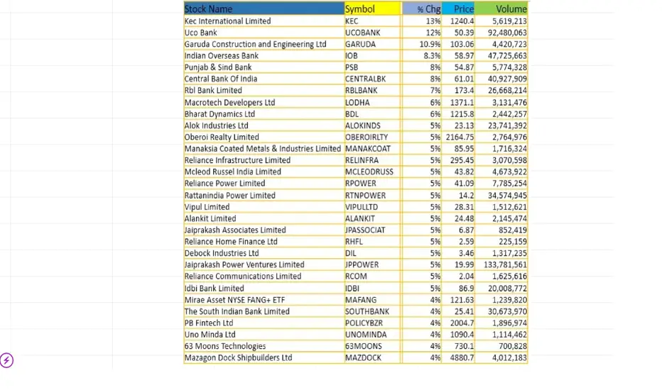
Intraday stocks for trading (09/Dec/2024)Technical Analysis of Moving average stocks (09/Dec/2024)
follow for more updates and information

Intraday top stocks for trading (06/Dec/2024)Technical Analysis of Moving average stocks (06/Dec/2024)
follow for more updates and information

Intraday moving average stocks for (05/Dec/2024)Technical Analysis of Moving average stocks (05/Dec/2024)
follow for more updates and information
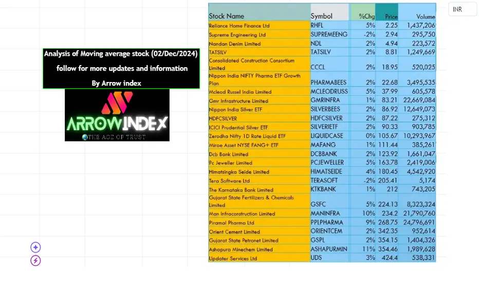
Analysis of Moving average stocks (02/Dec/2024)Analysis of Moving average stocks (02/Dec/2024)
follow for more updates and information
Benchmarking a trend with a moving average (Example: Gold)They say a bad workman blames his tools.
Quite often, good work means using the right tools.
In a trend you need to use trend-following tools - and the most famous indicator is the moving average.
When it's a fast-moving trend, you need to use averages taken over shorter periods (e.g. 20 day SMA > 200 day SMA). Likewise a slower trend needs averages taken over longer periods (e.g. 20 week > 50 day).
Gold has just bounced off the 20 week moving average for the fourth time. The market is clearly benchmarking this trend according to this specific average.
So while the price is above this moving average the trend is intact - and when it eventually breaks below it will be an important signal that the strength of the trend has weakened - and could be about to reverse.
On the daily chart a rising trendline has broken but we would argue the reason the rebound off the low has been so strong is because the price rebounded off the 20 week moving average.
For now our bias is bullish but there are no good risk:reward opportunities to buy and it remains unclear whether the short term uptrend can continue after the trendline break
