Bitcoin technical analysis - 2023-10-10Short position
If the bottom of the ascending channel is broken and the important support is broken at the price of 27,270
Entry 27200
Loss limit 27565
Risk Free 26833
Saving profit 26470
Profit limit 26070
Multitimeframeanalysis

EurUsd Change of Character 🔔Hello everyone so off to the races here with another week in the markets.
0:0 Monthly timeframe
2:59 Weekly timeframe
6:38 Daily timframe
9:10 4hr timeframe
12:08 1hr timeframe
12:50 Bias
My Analysis today is derived from the close of the Septmeber Monthyll candle. We observed the September monthly candle pull back up into the close with (2) Bullish Daily candles leading the way. Combine this with the fact that the Weekly candle last week closed above our Weekly/Monthly support level at 1.054. We currently are about 26 pips above our weekly support level and I can visualize price facilitating a move up from within this area. With that said, we have manufacturing in the coming session with the data expected to increase slightly but still contract overall ( which makes me more bullish on Eurusd). If I'm wrong then we will see a move back towards 1.054 Weekly support level and fail to hold it with NY session as a continue momentum on higher timeframes back to 1.05 daily support and psychological level..
What are your thoughts on the coming sessions?
Thanks for joining me today

Dancing into the Monthly Candle Closure 🩻AudJpyIn our last Analysis, we Called out Longs on AudJpy on Sept 3rd and we can observe a phenomenal 180 pips increase in price since then.
0:0 Monthly timeframe bigger picture
1:37 Weekly timeframe
4:45 Daily timeframe
8:11 4hr timeframe
11:19 1hr timeframe
12:30 Bias
Audjpy increased during the Month of September. At ShrewdCatFx, we were able to anticpate this increase by observing where candles close. Specifically, the weekly candle to close the month of August was especially telling of potential upside. This candle was the tell, thats it. Price has been trending up on Higher timeframes (Monthly/Weekly) ever since the pandemic. We have bullish market structure on the Monthly timeframe... and so when we got confirmation of a flip to bullish market structure on the weekly timeframe .. that was our hint. We'll have to see how this September monthly candle closes in comparison to the monthly resistance level that we are currently testing at 96.135. If we close above = confirms for more buys in October. If not, then we observe Audjpy go into a range to begin the 4th quarter 2023'.

EurUsd Dives to the Sea Floor?🌊 🤔Despite missed consumer confidence on Tuesday, Eurusd has been tanking and continuing the higher timeframe momentum.
0:0 Monhtly timeframe
2:56 Weekly timeframe
4:55 Daily timeframe
6:50 4hr timeframe
8:55 1hr timeframe
12:40 Bias
We may also observe that the market is pulling down into the close of the monthly candle. The same concept which you may hear me talk about with the weekly candle pulling down or pulling bak into the close of a weekly candle.. just on a larger scale. The Monthly candle here has pulled down 165 pips into the candle close vs on the weekly timeframe we may observe a 40-80 pip move into the candle closure. Now we have seen quite the move down and there were a few traders looking to take longs at the beginning of the week, little early but i think the time is nearing for a possible pullback with london or NY session. This is because we observed quite a large volatile move to the downside. Asian session has pulled up when typically it has been pulling down across the past few days.. foreshadowing possible retracement. Either way, flexibility is one of the best qualities to exercise as a scalper. We will be open- minded and patient with entries and exits when approaching risk. We have reached a psychological number and this coincides Eurusd approaching the lows of the year at 1.08486. Our next tsrgt for shorts is 1.04609 daily level. Our retracement target is 1.05419 or 1.056 4hr resistance level. GDP is anticpated to be good for the USD so this could provide a catlayst for a bear continuation. If it misses , then we may anticpate a retracement. This is the logical approach, but we all know the market isn't always logical but often irrational.
If you've read this far, leave a comment and a rocket and I will see you in the next analysis. Cheers.

Make the opponent flinch, and you've already won - Musashi 📼 The market has been relentless to the downside over the last 2-3 months.
0:0 Monthly timeframe
2:00 Weekly timeframe
5:35 Daily timeframe
8:45 4hr timeframe
12:35 let's zoom out a bit
12:30 1hr timeframe
15:15 Bias
Fueled by Inflation data and technical confirmations, the market has continued is descent time & again. Tuesday Wednesday and thursday have closed bearish. We have established momentum in the market and I believe it is likely that we contiue on this path to end the week. The weekly can may continue to pull to the downside as it is currently bearish and has a 77 pips top wick. The thursday daily candle closed bearish and we have a wick to go fill with momentum. The market set itself up early in the week as it was bullish on monday and observed bullish impulses on tuesday and wednesday. Thursday saw a continuation of the bear momentum established on wednesday and I believe we may also see a continuatiion on Friday. It is easier trading with the trend.. and they do say .. the trend is your friend.
With that said, we must remain flexible when trading the markets and our success across time realy depends on our ability to adapt to the changing market conditions.

Trading 101: The benefits of hard closesIntroduction:
In the world of technical analysis, traders are constantly searching for new and innovative methods to gain an edge in the market. One such technique that has gained popularity in recent years is the use of "hard closes." In this idea, we will delve into what hard closes are, why they are considered superior to conventional crossover methods, and the benefits and practical applications of incorporating hard closes into your trading strategy.
Understanding Hard Closes:
A "hard close" is a unique approach to analyzing price movements in financial markets. Unlike traditional moving average crossovers, which rely on the intersection of two moving averages, hard closes focus on the closing price of an asset. In essence, a hard close is an inflexible criterion that triggers a signal when the closing and opening price of an asset meets specific predetermined conditions.
How to Spot Hard Closes:
Let's say we have a level of resistance, and we are waiting for the price to break out so that we can long it, an up candle must open above the level of resistance, as well as close above it (because it also has to be an up candle). Similarly, if we are looking for a support breakout, we need a down candle to open below the level of support and close as a down candle. Hard closes can be used on both horizontal levels and trendlines.
Why Hard Closes Are Better:
Reduced Noise: Hard closes eliminate a significant amount of noise present in conventional crossover methods. By focusing solely on opening and closing prices, they filter out intra-period fluctuations as well as fakeouts and provide a cleaner and more precise signal.
Benefits of Hard Closes:
Risk Management: By reducing false signals, hard closes help traders make more informed decisions. This, in turn, enhances risk management strategies, preventing traders from entering ill-timed trades.
Versatility: Hard closes can be applied to various assets and timeframes as well as different kinds of levels, making them suitable for day traders, swing traders, and long-term investors alike.
Practical Uses of Hard Closes:
Trend Confirmation: Hard closes can be used to confirm the strength and direction of an existing trend. A bullish hard close, for example, can reinforce the conviction of a bullish trend.
Entry and Exit Points: Traders can employ hard closes to identify precise entry and exit points for their trades. This approach minimizes the guesswork involved in trading decisions.
Filtering Signals: Hard closes can be integrated into existing trading strategies to filter out less reliable signals, enhancing the overall effectiveness of the strategy.
In conclusion, hard closes represent a powerful and innovative approach to technical analysis that offers several advantages over conventional crossover methods. Their ability to reduce noise, improve accuracy, and adapt to different trading styles makes them a valuable addition to any trader's toolkit. Whether you are a seasoned professional or a novice trader, consider exploring the potential of hard closes to enhance your trading strategy and gain a competitive edge in the financial markets.

Keep uptrend even red marketWeekly Chart
Tron BINANCE:TRXUSDT has touched 4 times and bounced back from support by ascending trend line.
Chart 4H TF
Tron is in consolidation phase in range 778 - 795. It needs to confirm the support before go up on.
Wait for next move

Seen this Story before ... 🔖Following price action versus what you think price action will do are two completely different concepts.
0:0 Monthy timeframe
0;47 Weekly timeframe
1:52 Daily timeframe
3:52 4hr timeframe
5:46 1hr timeframe
6;40 Bias for upcoming
Understanding these concepts to their core has cost me. I have benefited though from reflecting on the outcomes of these two concepts. Price action will often times clue you on what will happen next. To listen to the price will take time and because you will be inclined to impose your beliefs on the market and invest your energy into solving, well, the wrong problems. Observing where candles close and understanding the nature of volume surrounding 1hr and 4hr candle closures is very important. These concepts make up the core of intra-day trading in the forex market. With that said, I am anticipating a bit of a retrace towards our previous daily resistance zone that may facilitate more longs. Our previous daily resistance was 1.0726 and it can now be characterized as Daily support since market structure flipped on the daily timeframe to bullish.

STX - broke out of CUP consolidationSTX rise that began in late Dec last year was disrupted as it went into a multi-month cup consolidation from February. Last week, it finally broke above the neckline of this CUP @ 71.50 on strong volume.
A number of technical signals are now going right for STX and it appears a trend continuation is underway:
1. its 200 day moving average is now subtly curving upwards
2. MACD on its MONTHLY chart has now begun to cross up into positive territory. This is significant and likely signals a longer term bullish outlook (whip saws not withstanding).
Any dip back towards the neckline @ 71.50 will be a lower risk opportunity to long with initial stop loss below 67.50. Trail profits up should trade goes our way.
Disclaimer:
TA is about improving our odds of a successful trade (not a guarantee). This is just my own analysis and opinion for discussion and is NOT a trade advice. Kindly do your own due diligence and trade according to your own risk tolerance and don't forget that money management is (probably the most) important! Take care and Good Luck!

AUDNZD Just made its turn off the bottom.AUDNZD need to reload with some stronger hands to continue going up. This move is already finished its bottom turn. I have a path copied from back in the past that mimics not only the candles but the placement of the lines and the intent or set up used to get it to look and move the way it does.
ESVO is the indicator that I use I made it with ChatGPT using my own formula and it shows all the interest of all the different timeframes and also identifies oppurtunities where price is in agreeance across all timeframes and launches for a profit run. It also has signals that let you know when the move is over as much as 24 hours prior to the event.
by iCantw84it
08.30.23

PATH Needs CPR & it looks like someone is breathing life in it!Path has been theta crushed for over a month but you know what.... Someone is breathing life back into it and its about to come back to life. This set up is strong.. all time frames are in agreeance with this price that is sitting right above it... that means price will slide right through this resistance area and find support... once that happens it will launch. I will make a smaller time frame version of this to watch.
This inidicator is my ESVO that I have upgraded and now has alerts for price contraction, speed doubling, and volume spikes... plus some icon love that shows when a explosion in price could happen following re-accumulation... which is represented by a nuclear reactor symbol and takes between 51-31-31 bars after each symbol.. typically you get 3 the last 31 marks when price goes back into contraction phase.
The lines depending on which is on top or bottom represent timeframes and the aqua is the key to the push up or down. Its location how straight or unruly it is. What other timeframes it crosses. When it crosses price action. This timeframe when an algo or big institutional is on a chart.... Tells you warning signals as early as 24 hours before an event. It takes a certain set of conditions that you have to learn to look for but thats as easy as just panning through charts one after another with about 1-5 secs on each. One day I will get a scanner to do it but IM not done playing with it.
When the lines are all together and price is about to pop it.. that's your move. It needs support after that. When it finds it... its gone. Now 3 problems you have to work out.
1. Are you in low enough or can you stomach the time it takes to pull back and find support?
2. Can you stomach the pull back if you didn't get in low enough?
3. Last and most important in this market... Can you pull the trigger and get out when you have made a profit, or will greed keep you in to see it dissapear?
The last one is the one I have the most issue with and am trying to find a solution to. When is enough.. I need to add an auto profit target to the indicator and I think it will be complete enough to stand on its own outside of any other alerts and goodies I want to add.
Thanks ChatGPT for the coding and Yes I used my own formula for the lines and how they are calculated, I also added some accelerators to make it more responsive for Forex and futures trading. The speed gauge is so you can take a pic when you get in and can pull it up and see where you are as far as speed and movement or velocity. is it ramping up or dying off.....
by iCantw84it
08.30.23

Time is Ticking ⏳-> Market Structure & Pin Bar Daily Candle What are your thoughts on the Daily Pin Bar that closed bullish?
0:0 Monthly timeframe
2:02 weekly timeframe
3:22 Daily timeframe
8:23 4hr timeframe
11:17 1Hr timeframe
As Eurusd Swept past the Monthly lows by 30 pips today, I 😁 because I called it out on the channel. Manufacturing data acted as a catalyst to continue the trend bearish. Was it luck when you are right? Idk but trading with the trend is often the Shrewd thing to do. The majority of participants whom share their thoughts on trading view here were heavily buy biased. This is precisely why the market moved down so swiftly with manufacturing data as many participants were liquidated in a short period of time as the pyramiding concept took over and there was an avalanche of liquidations. An important part to running a successful small business as a trader begins with having a mind of your own. Doing your own analysis and crafting your own view of market activity. With this said, I'm biased towards the long side as we are towards the lows of structure on the Daily chart and structure. I could be wrong and is why I always stay very flexible. It's not about being right, it's about making money.

🔔 Bulls can regain 1.09 before Bear continuation Bull market structure has flipped bullish early in the week.
0:0 Monthly Timeframe
1:42 Weekly timeframe
3:22 Daily timeframe
5:04 4hr timeframe
7:30 Bearish Channel from last week
9:07 1hr timeframe
The Market can do anything and it is always right. With that said, it's still okay to create a forecast. Looking at the way price respected 1.0853 Daily support level during Friday's NY session gives confidence for a relief rally. Also Friday's daily range was small compared to the rest of the week & it closed as a Doji. These are confluences and I'm using this critical thinking to arrive at possible scenario. If price fails to make it past 1.0883 1Hr resistance zone then we will likely retreat towards 1.0869 where there are (2) 1hr support zones. Otherwise I'm anticipating an early in the week push towards 1.089 4hr resistance zone and 1.09 which was weekly support level. 1.09 may now act as a weekly resistance zone since the weekly candle last week just closed below it. it may facilitate a selloff with this new week down to our next weekly support level 1.07

GBPJPY: Who can stop it?
Regarding our observations, currently there are Significantly more sellers in the market!
We think they are wrong!
We'll long after breaking 186.500 and the other setup is to long around intersection of bullish channel and zone.

Ethereum Bounce @ Weekly Resistance Zone $1,915 🗞️The Monthly candle is a Doji candle and with Eth's recent rise has returned back to Break Even on the Month. I'm anticipating that we will have some trouble breaking the $1,915 Weekly supply zone created on the week of May 29th. Ethereum's recent rise of 17% compared to Bitcoin's 25% has been quite disappointing for a smaller market cap cryptocurrency. Although we have broken out of a recent Bearish channel, I can see price pulling back before heading towards medium term highs at $2,121. Additonally we can observe the 2 most recent daily candle's have are shooting star - like candles. The top wick's on each candle being larger than the body of the candle. A Coincidence that these candles have printed at our weekly supply zone $1,915?
Bearish Monthly target for July is $1,660
Favoring Downside Because of Weekly Market Structure Pointing down.
Target's through rest of June and July are
Take profit 1 : $1,786
Take profit 2 : $1,730
Take profit 3 : $1,660
If Wrong, Firstly Cut losses short and the Bullish Monthly target for July is $2,121

Wait for a breakout at apex zoneBINANCE:LINAUSDT is going to apex zone in range 119 - 132 and will breakout or breakdown. Just wait for it
Lina is supported by the ascending trend line and low volume in consolidation phase
I expect LINA will breakout and close 132 that means for buying
So wait and see

Bitcoin's Dance- AI's PredictionFor Bitcoin's 1hr chart, the close price surpasses the 20-period EMA, suggesting a short-term uptrend. However, it lingers below the 50-period SMA, signaling medium-term bearishness. Interestingly, the long-term outlook seems bullish with the close price above the 200-period SMA. The daily chart contrasts this: Bitcoin's close price is under all EMAs and SMAs, indicating overall bearishness. Still, both charts have an ADX above 20, hinting at a strong trend, and the CCI remains bullish. This blend of indicators presents a complex scenario.
Trade Recommendation:
Considering the indicators, a trend-following LONG trade on a 1hr timeframe seems apt:
Entry: Wait for a slight pullback and enter around 29351.96.
Take Profit (TP): Aim for the 1hr resistance at 29459.77.
Exit (Stop-Loss): Set just below the 1hr medium-term support at 29045.81.
Given the proximity of the resistance, a fixed take profit is recommended rather than a dynamic trailing stop.
Confidence Score and Explanation:
Confidence: 3/5
The trade suggestion is moderate in confidence due to the mixed signals. The 1hr chart leans towards a bullish momentum, while the daily suggests bearishness. The approach is trend-following, banking on the short-term bullish signs in the 1hr chart. Still, traders should remain alert and adhere to the set stop-loss.

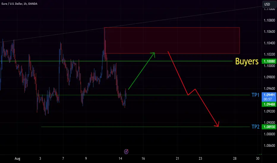
EURUSD levels and trading guide! Currently there are almost more buyers in the market
EURUSD is bearish! In case of any correction we could see a reversal from the level!
Shorter-term traders could enter long positions now. We don't enter!
These are best levels regarding Support and resistance, Channels, Weekly pivots, Buyers and Sellers focus and order_block.
Ethereum -> Buy Low And Sell High!Hello Traders and Investors ,
my name is Philip and today I will provide a free and educational multi-timeframe technical analysis of Ethereum 💪
If we are looking at the macro view on the monthly timeframe you can see that Ethereum perfectly retested the 0.768 fibonacci level in confluence with the previous cycle high so everything looks like we are starting the next major bullish crypto cycle.
With Ethereum once again retesting the weekly bullish trendline and also forming a continuation symmetrical triangle pattern I am just waiting for a bullish breakout before I then do expect more upside potential.
The daily timeframe on Ethereum is currently bearish though so I am waiting for a breakout of the decending channel formation and a break above previous resistance and then the daily is also ready for a bullish rally.
Keep in mind: Don't get caught up in short term moves and always look at the long term picture; building wealth is a marathon and not a quick sprint📈
Thank you for watching and I will see you tomorrow!
My previous analysis of this asset:

Huge Profit over 500% when breakout Bullish FlagWeekly Chart:
Chance to take over 500% for next BullRun
Daily Chart:
Aptos BINANCE:APTUSDT is increasing to $9 and try to breakout Bullish Flag
Chart 2H TF:
Aptos has a small pullback before going up
Short in lower timeframes
Wait and see next move

What price you bought APTDaily chart
Aptos BINANCE:APTUSDT is in accumulating phase nearly 2 months and it's trading around $7.1
APT's the support around 6.4 and #ApexZone in the same that range
Chart 4H TF
APT's rejected the support at 6.81x with RSI Oversold. That's created Reversal Pattern Double Bottom
It's a resistance at 7.4 ahead
So we wait for a next move

Banknifty intraday Levels 09/08/2023Buy Above 45120
Target-1 45250
Target-2 45340
Target-3 45400
Sell Below 44850
Target-1 44750
Target-2 44600
Target-3 44445
Target-4 44315

Banknifty Intraday Levels 08/08/2023There is no momentum in the market right now, so if you see the market moving in a Channel, trendline or support resistance in a range bound market, take your trade based on that or avoid the market .If the market consolidates 15-20 min and closes the 15 min candle above 44900
BUY ABOVE 44900
TARGET-1 45040
TARGET-2 45120
TARGET-3 45250
45040 is a good resistance zone, if it breaks then there can be good momentum in the market, otherwise there will be a fall back from here and 44500 will act as support.
SELL BELOW 44750
TARGET-1 44600
TARGET-2 44500
TARGET-3 44445
TARGET-4 44315
