$SPY Normal Pullback?I am posting the AMEX:SPY chart as many of the trade ideas I have posted over the last few weeks have not worked out well. This chart tells the story. The market has been choppy. While it is my belief that this is a normal pullback in a stronger secular trend, as a trader, I need to simply trade the chart in front of me and right now the market is fading. Many high growth stocks (the ones I concentrate on) have seen outsized declines as compared to the AMEX:SPY , $SPX. The NASDAQ:QQQ is similar.
I have made some notations on the chart that show what I am seeing. The biggest thing I notice is the decline in volume as this market pulls back. That tells me that there is no big rush for the door. That said, I would not be surprised to see this pullback to the 50 DMA which also aligns with the initial break-out area. Above that, there is an area that may see support and turn back up. It is all TBD.
In summation, it is time to simply observe the market and individual stocks. Those stocks that are holding up well may be the new leaders. Some of the existing leaders may pullback and set-up for great entries. All TBD. Patience is key until you see the market turn higher.
I welcome any feedback or comments. Thanks for taking the time to check this out.
NDQ

Market Update 3/1/2024Too lazy to type again. Just watch the video. Its pretty straight forward.
As before, Id still like to see a drop back to the day TF hulls .
I am hoping this corresponds to MARA starting under 21.5 and then I can grab it when we start a week back above 21.5. And by above, I dont mean 25-30% above like it did last week.

Current View on BTC and Market 12/10/2023Watch video. Too lazy to type what I said.
It would be nice if they had a speech to text thing for this so that it would write what I said.

NASDAQ has incredible place for sell we saw how strong was nasdaq last weeks, i think NASDAQ will touch that zone and its strong place for sell with care and low risk. see you soon and happy new year

Nasdaq - All Time HighsHello Traders, welcome to today's analysis of Nasdaq.
I will only take a trade if all the rules of my strategy are satisfied.
Let me know in the comment section below if you have any questions.
Keep your long term vision.

BTC Week Update: Full Update 12/10/23Bearish on short term. I explain it in the video. Too lazy to type it.

Bitcoin Losing The Crypto War?Don't judge a book from it's cover. Read on and soon, you will find out who the real winner might be.
The explosive crypto mania was born because of Bitcoin. It is the reason myriads of alt-coins are now traded every day.
From the countless of alternatives, one became strong enough to constitute an alternative to the coin that started it all.
Ethereum (ETH)
From the chart below it is apparent that Bitcoin Dominance is mainly affected by Ethereum
In this idea I will be ignoring the effect of alt-coins, the dominance of which is shown in the following chart.
So how do the big guys compare to each other?
Simple... right? Well not exactly... Not all candidates fight with the same rules. Ethereum started after Bitcoin, and the enthusiasm has given it an apparent advantage.
To fix things, we must make the game fair for everyone. To achieve that, we divide each coin with the total amount of addresses (the bubble part).
In this chart above, I did an important transformation. BTC_ADDRESSES, as noted on my previous idea, is the reason items like crypto get explosive.
You know this chart above reminds me of another dominance chart:
Bitcoin did show it's power compared to other crypto. After all, it is not important if you bubble without foundation.
Ethereum is in an even bigger bubble than Bitcoin.
And a final, short-term chart for today. The calculation is again "modified-btc"/"modified-eth"
Tread lightly, for this is hallowed ground.
-Father Grigori

BTC | Let NDQ Go Bust!Bitcooooooins... UP!
In the recent history, we have had two perma-bull trade-ables, NDQ and Bitcoin. No-one in their real mind would dare to short these 2 years ago... So what if, we could compare these two bulls? Who will survive in the years to come? Who is the record keeper? The answer is NOT as simple as it might seem. Read until the end to find out...
2022 will be marked as the worst year "ever" for equities (except The Great Depression of course). Money got much more precious last year compared to equities. Just by having money, you got "richer" last year. So compared to money, equities did get worse.
Items like Bitcoin suffered even worse. A 73% drop compared to SPX is a monumental way to break the crypto mania.
Bitcoin has been an over-leveraged, perma-bull trade-able item.
I don't know if it is a currency, a commodity or something else, so I call it a simple item.
The majority of Bitcoin's gains were thanks to derivatives (trading).
The same happens in Equities, but not to such an extent. NDQ is another perma-bull market full of stocks like AAPL and TSLA (everyones' favorites for some reason)
Bitcoin is on a whole new level of rapidness...
However, there is an exponential cousin to NDQ. That is SQQQ.
So how does it compare to NDQ? Since SQQQ is basically 1/QQQ, we will plot the QQQ*SQQQ chart to see the outcome.
This reminds me of the diminishing nature BTC_ADDRESSES showed.
We can raise SQQQ to the 0.2 exponent to bring it down to reality.
SQQQ is moving at the 5th exponent of QQQ. Incredible speeds really...
So how do these two lightnings (1/SQQQ and Bitcoin) compare??
I told you that the answer is not straight-forward.
And some short technical analysis:
This chart above describes the popular over-leveraged period when everyone traded Bitcoin.
There is a longer-term ticker showing the entire history of Bitoin ( INDEX:BTCUSD )
It shows us yet another perspective:
If these charts are true and breakout as intended, what could this mean for equities? Just how big of a bubble are equities in?
Tread lightly, for this is hallowed ground.
-Father Grigori
PS. The popular knowledge is not the truth, it is just a famous lie.

Inflation Wins, We LoseThere are two kinds of inflation, the normal one and the dangerous one.
Printing money creates inflation. The kind however which is not dangerous to the foundation of the economy.
With money printing, currency loses value and prices react accordingly. Nobody gets wealthy from money printing, and in a sense, "nobody" gets poor. By nobody I mean the economy as an average doesn't really get hurt. Inflation however widens the gap between poor and wealthy.
Poor get poorer while rich get richer...
Inflation analysis can be very simple. If one believes in simple support/resistance levels from consolidation patterns, then the following picture can be drawn for the standard inflation chart.
For further validation, we can try analyzing commodities like oil. In the main chart, crude oil value is divided by the "total value of money in circulation". The value of money is the yield percentage.
A massive consolidation pattern formed in 1986-2002, on which we are now supported. I believe that price cannot drop much lower than the point we are in. Dips can be expected, but in macro scale the chart is bullish.
From the chart above, we conclude that oil prices (inflation) will grow compared to yields themselves. Each increase in yields (inflation fighting) will lead to higher oil prices (higher inflation). Charts like these prove the Catch-22 phenomenon we are in.
This is the bad kind of inflation. This inflation is un-fixable.
There is a plethora of charts that prove what I say, that inflation is unfixable. One of these charts is GOLD*PPIACO.
@SPY_Master used the GOLD*DBC chart as a measure of inflation. Gold*PPIACO can be considered as another very-long-term inflation measure.
Commodity production cost is bull-flagging against money supply itself.
So okay, we all expect more inflation. And surely, equity prices have priced this in, right?
Wrong.
Equities have priced-in that the FED is controlling inflation. Investors expect both inflation and the FED to calm soon. So, equities have priced-in something that will never come. An investment can suffer when the investor judges the situation wrong. An investor who has understood the situation, "cannot" go bankrupt.
Equity prices show that markets ignore the FED.
In the chart above, DJI is divided by the yield curve as an attempt to measure the ability of equities to grow in a progressively tighter economy (falling yield-curve, negative yield curve). Even with all that money destruction and yield increases, equities are making all-time highs. The markets are very stubborn.
The yield curve may describe the "ease" the market shows for equities. In normal times, the yield curve is positive, long-term yields are higher than short-term ones. This encourages short-term borrowing and stimulates the economy. As the yield curve steadily lowers, short-term money borrowing is less and less interesting for investors.
(In the Spaaace!!! idea linked below, you can find more information about the DJI/yield-curve chart)
High inflation and stubborn markets by themselves don't render equities as worthless. After all, equities survived in the stagflation period of 1970s. While the stagflation outcome can play out, there are things that may happen before it. There are some charts which are very concerning for equities...
We tend to talk about the crypto bubble, and ignore the equity one.
Equities have been consistently growing for the last 15 years. But thanks to what? Are companies in a "better shape" than they were in 2010? Sure technology has evolved, but from dependable devices we are now filled with unstable gadgets. Consumer devices as well as corporate ones, are more vulnerable than ever before. Security gaps are now appearing from big-tech companies to banks. Sure, issues like these were commonly occurring throughout history.
But let's consider, is the immense equity growth representative of the dependence we can have on companies and their products/services?
Are equities growing because of actual innovation, or from the easy way of derivatives?
This chart shows the diminishing nature of derivatives. They are exponentially losing value, but their effect is much bigger than their cost. A purchase of cheap derivatives can bubble-up anything you can hope for.
Where does this chart lead us?
This chart attempts to calculate the effect of derivatives in QQQ price. Before 2020, QQQ consisted of a "stable" amount of derivatives. Price moved in the channel. In 2021 a bull-flag formed and launched the chart in incredible new highs (where we are now). It is one way to visualize the immense effect of derivatives, especially in big-tech stocks.
(More about this chart in the "who would you trust with your money" idea linked below)
Even if Bitcoin is "overpriced", it will be the winner if this golden bull-flag breaks out. Bitcoin seems to be beating many investments. Even if it may not be considered a commodity, it certainly behaves like one. Even if equities grow, each upwards move for equities, will lead to much higher prices for Bitcoin.
Just like Bitcoin is bull-flagging against the most powerful of equity bubbles (QQQ Derivatives), commodities are bull-flagging against the most stable of equities (DJI)
Not all equities are grim though... We may be witnessing a massive wealth transfer away from US corporations. In this idea, I attempt to analyze the massive shift of balance that we may be witnessing.
While much harm has come to Europe from the war, almost everything is priced in. If the chart is correct, it means that every upwards move for US equities will push Germany further upwards.
Germany has been enjoying a massive influx of money from the entire EU. After swallowing the entire European market, it is now forming a bull-flag against Europe and other countries.
Germany as well as emerging markets prove a significant challenge for the US. These are bad news indeed for US equities...
Tread lightly, for this is hallowed ground.
-Father Grigori

You against inflationMoney printing has been a double-edged sword. One one hand ample liquidity helped the exponential productivity of the economy, on the other hand inflation hit hard.
In periods of stagflation like the 1970s, immense inflation created an impenetrable ceiling for equities.
In periods of extreme deflation (2010s), equities bubbled. It is interesting that in this period, inflation figures were are all-time lows, with immense money printing.
With this chart we attempt to measure when and how much equities managed to overperform the weight of inflation.
There are two methods of calculating inflation, one is total money printed, and the other is the "cumulative inflation".
If we analyze SPX compared to money printed, this would be the outcome:
This is not very helpful, since SPX is too closely related to total money printed.
To measure "cumulative inflation" I attempted modifying this chart by @SPY_Master
DBC*GOLD is a good estimate of inflation. Since we don't have enough historical data for the DBC index, we analyze one of it's cousins, the PPIACO index. DBC is an energy-focused mutual fund, while PPIACO measures the production cost. We assume that PPIACO*GOLD is a suitable replacement for DBC*GOLD.
We end up with the cover chart, which I will briefly analyze, since it speaks on it's own.
For almost 10 years we were attempting at penetrating the ribbon, to no avail...
These fib-retracements are very beautiful...
SPX:
NDQ:
They all prove that there is massive weight on top of us.
After almost 10 years of trying to get back inside the high-energy-level above, can we do it now?
Tread lightly, for this is hallowed ground.
-Father Grigori

#NDQ Nasdaq 4hr approached bottom of channelGood level to monitor for a reversal at the bottom of the channel..

#NDQ Bullish flag breakoutI have no other ways to put this, but hard to see how this is negative with Nasdaq breaking above its bullish flag this week. Much higher targets in play here in the absence of some unknown which derails the rally.

Arbitrary LinesBabylon, the city where everybody spoke different languages.
In the end, Babylon met grave consequences.
(Macro perspective of the main chart)
Citizens of Babylon, in our case traders, can barely communicate.
They all speak in different timeframes, and with contradicting interests.
Which translator in their right mind can untangle spaghetti?
Many different lengths of regression.
How can any translator give a geographic position of anything?
Even if I try to make an argument...
... I am plotting arbitrary lines.
(bearish trendlines)
A line is nothing but weak. It can easily "disprove" what I have "proved".
(bullish trendline)
If we are to leap ahead, we must throw away all of which we are sure to be correct.
Surely there is something we can agree upon, right?
For I was conscious that I knew practically nothing...
-Plato
It seems that everything is based around the chaos theory.
The flight of a butterfly can affect tornadoes.
Traders (like me) fall in the trap of making chaos into facts and arguments, and conclude into definitive answers.
Clean and ordered answers taken out of chaos.
Ordo Ab Chao
Is anything/everything that we do a desperate attempt to revert entropy/chaos? Like an insane ritual?
Maybe we know nothing. Maybe making arguments and conclusions is meaningless.
Tread lightly, for this is hallowed ground.
-Father Grigori

Markets at resistanceThe SPY, QQQ , IWM all hitting resistance.
Gold looking a bit vulnerable for a small pullback.
Bitcoin looking extended & first negatives divergence.

Nasdaq $NDQ $NDXNasdaq remains in its channel despite the massive short squeeze week.
Approaching key levels, worth taking a shot to:
1: Remain in the channel (short)
2: Break above the channel (long)
Direction based on personal bias. GL

NDQ, NDX, Nasdaq, Us100 setupIf price should trade above my Take profit 15209.56 - 15210.69 before 9:30am NY time on the 6th of Nov 2023, then I favor a market reversal to take profit below. But if market doesn't do that, I look for a direction which I believe the market should be going. Idea will be updated frequently.
This is a daily chart


Mega Cap Tech Strong / Banks weakThe market almost closed positives today in the back of tech stocks rallying.
A massive gap down was bought up off the lows today. Banks continuing's to sell off despite yields and the dollar cooling off today.

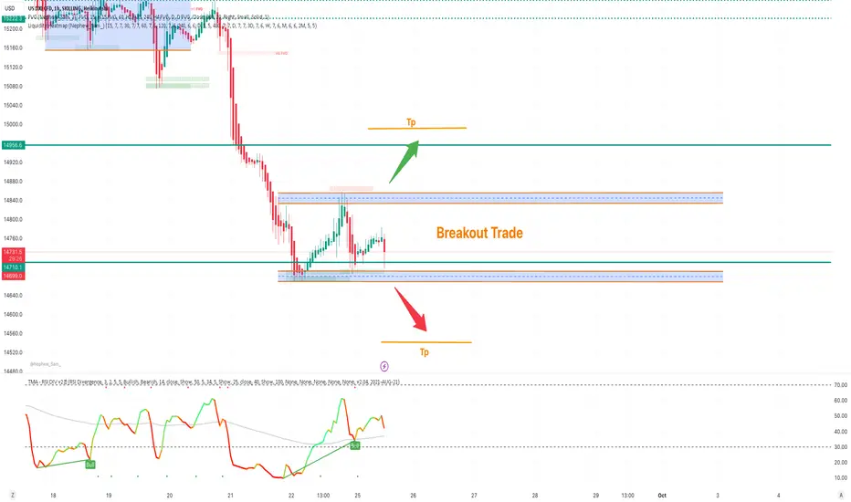
NASDAQ Range BoundNAS100 moving in range, wait for the breakout to get trade or place your buy and sell stop with given Tp's.
Mange your risk according to account size!
September 23 - Week 3: ThoughtsStill a defensive week. We will see what happens with the Fed Reserve stuff tomorrow.

NASDAQ possible moves its possible for nasdaq to move like how i said, please make sure you manage your risk.

NDQ LONG / SUPPORT ZONENDQ 3D support is now at $4100
Enter 50% at the current price
and try to set some BUY orders near the support zone
If NDQ stays above the trendline,
the Take-Profit target would be 5%, 10%, and 15% from your entry
Cheers

BTCUSD Parallel Channel Breakout TradeNASDAQ wait for breakout and trade in the direction of breakout or place your buy and sell stop.
Manage your risk according to account size!
