EURJPY H1 Analysis – Wave 4 Retracement in Play🕐 Timeframe: 1H
📅 Updated: 17 May 2025
📌 Pair: EURJPY
⸻
🔍 Technical Outlook:
• Price is in a clear bearish trend, respecting lower highs and lower lows.
• Awesome Oscillator (AO) shows bearish convergence — momentum is weakening but still bearish overall.
• Price retraced to the 2.618–2.786 extension zone (162.902–162.982), a common wave 4 reaction level.
• This zone may act as a rejection area, setting up for the start of wave 5.
⸻
🔧 Elliott Wave Structure:
• ✅ Wave 1–3: Completed with strong bearish momentum.
• 🟡 Wave 4: Likely completed at 162.982 or may slightly extend, but momentum is fading.
• 🔴 Wave 5: Expected next move — continuation to the downside.
⸻
📍 Key Levels:
• 🔺 Wave 4 Resistance Zone: 162.902–162.982
• 🔻 Potential Wave 5 Target:
• 🎯 TP1: 162.000
• 🎯 TP2: 161.835 (Fib 4.236 extension)
• 🎯 TP3 (Extension): 161.50 or lower if selling accelerates
⸻
🧠 Strategy:
1. Monitor price action at 162.982 — if rejected, likely wave 4 completed.
2. Look for bearish engulfing / momentum candles for entry signal.
3. Short Setup Idea:
• Entry: Below 162.88–162.90 after confirmation
• SL: Above wave 4 high (163.12 or tighter at 163.00)
• TP: 100+ pip potential — trailing to lock profit
⸻
✅ Summary:
• AO confirms bearish convergence → weak momentum
• Price hit Fib confluence zone → wave 4 likely done
• Wave 5 could give 100+ pips to the downside
• Wait for confirmation, then short the breakdown
Oscillators

USDJPY to continue uptrendUSDJPY is forming has broken out of the downward channel and formed a new upward channel/trend. Expect a break of the trendline around 145.850 and continue upward from area
of support to resistance zone/are of interest at 150.734. This resistance area extends all the way back to 10/2023 and appears quite strong. The 1h chart is also showing a potential crossover of the RSI/RSI EMA. The ADX is falling, the DMI is divergent. The MACD is divergent and downward momentum is slowing.
15/5/2025 0226 PDT

EUR/USD – Bullish Wave 3 in Play | AO Convergence + Fib Target PPair: EUR/USD
Timeframe: 15-Minute
Date: May 15, 2025
🧠 Technical Breakdown:
This analysis focuses on a clean impulsive Elliott Wave structure, Fibonacci projections, and Awesome Oscillator (AO) confirmation to support a bullish continuation.
🔍 Wave Count:
Wave 1: Clear impulsive push upwards, breaking previous market structure.
Wave 2: Completed corrective pullback into the key support zone, respecting the golden ratio levels.
Wave 3: Initiated after a dominant break above the minor structure and trendline resistance, confirming bullish momentum.
⚙️ AO (Awesome Oscillator) Confirmation:
Strong AO divergence between the Wave 1 and Wave 2 low confirms the bullish structure.
Within the early stage of Wave 3, the AO shows a convergence pattern forming between subwaves 1, 2, and 3 — indicating strengthening bullish momentum.
AO flipped green again after a minor pullback, signaling bullish continuation potential.
🎯 Fibonacci Extensions:
TP1 Zone: 1.618 – 1.88 Fibonacci extension range → 1.1216 – 1.1226
(High probability for Wave 3 termination)
TP2 Zone: 2.618 – 2.88 Fibonacci extension range → 1.1241 – 1.1258
(Extended target if bullish momentum accelerates)
Further projections (Wave 5 estimate):
4.236 – 4.618 → 1.1276 – 1.1288
🧱 Key Structural Zone:
1.11813 is the most critical support-turned-resistance (SNR) level — price broke above this level, retested, and bounced.
The green highlighted box marks the ideal buy zone, aligned with:
Dominant break confirmation
Fibonacci confluence
Bullish AO setup
✅ Trade Plan:
Entry: On retest or bounce from the green zone
Stop Loss: Below 1.11800 or below Wave 2 low (to protect structure)
Take Profit 1: 1.1216 – 1.1226
Take Profit 2: 1.1241 – 1.1258
Optional TP3 (extended): 1.1276 – 1.1288 (Wave 5 projection)
🧭 Summary:
This setup combines Elliott Wave theory, Fibonacci projections, and AO convergence to provide a highly probable bullish continuation scenario. Ideal for breakout traders and structure-based wave analysts.
📌 “Confluence is key. Let structure, momentum, and fibs guide the trade.”
#EURUSD #ElliottWave #Wave3 #AOIndicator #ForexAnalysis #Fibonacci #PriceAction #FXTrading #StructureBreak #TechnicalAnalysis

EUR/AUD: Resistance Test Coincides with Rising Risk AversionRiskier asset classes are starting to wobble following the sharp rebound from April’s lows. With signs the correlation between U.S. bonds and the dollar is strengthening again, it suggests the ‘sell America’ trade may be creeping back into favour—potentially an environment where the euro outperforms higher beta currencies.
With EUR/AUD testing horizontal resistance, it creates a setup that may suit the current environment. If it can hold above 1.7420 heading into the European open, you could look to establish longs above the level with a stop beneath for protection. The 50-day moving average and resistance at 1.7600 screen as potential targets. Momentum indicators have shifted bearish, so the setup is marginally going against the grain.
If EUR/AUD is unable to hold 1.7420, better setups may be found elsewhere.
Good luck!
DS

EUR/USD – Wave 3 in Play After Dominant Break | Elliott Wave + A📌 Overview:
EUR/USD is showing a strong bullish continuation setup following a clean Wave 1-2 formation, confirmed by both structure and momentum. A dominant trendline break, retest at support, and bullish signals from the Awesome Oscillator (AO) reinforce this high-probability buy scenario.
🧠 Elliott Wave Count:
Wave 1: Strong impulsive move up with solid structure.
Wave 2: Healthy correction into the 61.8% Fibonacci retracement zone.
Wave 3: Now initiating, expected to be the strongest leg.
🔍 Confluence Factors:
✅ Dominant Break: Price broke a descending trendline from Wave 1’s high, then retested it successfully at the green zone.
✅ 1.11813 marked as key SNR (Support & Resistance) — price is holding above it post-break.
✅ Green highlighted area = ideal buying zone aligned with:
Demand zone
Fibonacci golden zone
Structure support
✅ Awesome Oscillator (AO):
Bullish divergence between Wave 1 and Wave 2
AO histogram flipped back green = early momentum confirmation
💼 Trade Plan:
Buy Entry: Green zone (post-dominant break + SNR support)
Stop Loss: Below green zone / invalidation of structure
Take Profit 1: 1.618 – 1.88 Fib extension → 1.1216 – 1.1226
Take Profit 2: 2.618 – 2.88 Fib extension → 1.1241 – 1.1258
🎯 Strategy Notes:
Take partial profits at TP1 to reduce risk.
Let the remainder of the position run to TP2 for potential extended Wave 3.
Monitor AO and candle behavior near TP1 — possible Wave 4 may form afterward.
📈 Layered confirmation = high confidence. Trade the confluence, not the emotion.
#EURUSD #ElliottWave #Wave3 #AO #ForexStrategy #Fibonacci #StructureBreak #SupportResistance #TechnicalAnalysis

BTC bull cycle comes to an end.We can see it clearly on the chart. BTC has ended the 5 waves pattern in Elliot wave count. you can see it on the chart, you can see it on the MACD & RSI.
What we are seeing now is that because of Greed & Hype no one is selling bitcoin. the up-trend we are seeing now is the result of no sellers and Hype Buyers. This is a bull trap. We can see the divergence clear as day. Stay alert and dont let them catch you this time.

XAUUSD (Gold Spot / U.S. Dollar) - Elliott Wave Count & Bullish 🌟 XAUUSD (GOLD/USD) ANALYSIS: ELLIOTT WAVE + BULLISH AO DIVERGENCE 🌟
🌊 ELLIOTT WAVE STRUCTURE
• 🐻 Wave (1): Sharp decline from 3,440.00 → 3,400.00
• ⚖️ Wave (2): Shallow retracement to 3,440.00 (classic Wave 2 correction)
• 📉 Wave (3): Extended drop to 3,350.00 (strongest bearish wave)
• ➰ Wave (4): Sideways consolidation near 3,400.00 (Fibonacci-aligned)
• 🎯 Wave (5): Final leg down to 3,184.58 (completes 5-wave impulse)
🔄 CURRENT PHASE: Potential ABC correction forming between 3,184.58 and 3,140.00, signaling reversal!
⸻
📈 BULLISH AO DIVERGENCE
• 🔽 Price Action: Wave 5 made a LOWER LOW (3,184.58 vs. Wave 3’s 3,350.00)
• 📊 AO Momentum: Awesome Oscillator formed a HIGHER LOW (-60.00 vs. -100.00)
• 💡 Interpretation: Bearish exhaustion → Reversal ahead!
⸻
🎯 KEY LEVELS & STRATEGY
• 🛡️ Support: 3,140.00 - 3,112.50 (must hold for bulls)
• 🚀 Resistance: 3,200.00 (psych level) → 3,230.00 - 3,270.00
• ✅ Entry Trigger: Close above 3,200.00 🚨 or bullish candlestick (e.g., hammer 🕯️)
• 🎯 Targets: 3,270.00 (initial) → 3,350.00 (secondary)
• ⚠️ Stop Loss: Below 3,112.50 (risk management!)
⸻
📜 CONCLUSION
• 🐂 Bullish Case: 5-wave completion + AO divergence → Reversal likely above 3,200.00
• 🚫 Invalidation: Drop below 3,112.50 kills the setup
⸻
💬 CTA: “LIKE if you spot the divergence! 🚀 Share your thoughts below ⬇️”
⚠️ DISCLAIMER: Not financial advice. Trade responsibly.
⸻
🏷️ TAGS: #XAUUSD #GOLD #ELLIOTTWAVE #AO #DIVERGENCE

EWTSU XAUUSD H4 minute wave ((4)) update
Elliott Wave Trading Set Up XAUUSD
minute wave ((4)) ending in a double zigzag (w)(x)(y) if 3196 area hold.
motive wave should follow in 5 waves (impulsive or leading diagonal)
levels to pass trough: 3230 area first then 3276 area
invalidation: wave count must be update if price break down 3175 low first and then 3165
(minute wave ((1)) )

EURJPY 1H – Structure Broken!
⚠️ Bearish Divergence (Wave 3 vs 5) confirmed on AO
📉 Price broke key SNR at 164.671
Structure is gone — now waiting for a clean retest & rejection
🔻 Bearish bias below 164.671
Next target: 164.200 / 163.800
#EURJPY #Divergence #StructureBreak #ForexSetup

$SPY May 14, 2025AMEX:SPY May 14, 2025
15 Minutes.
AMEX:SPY crossed 586 and made a high 589 levels.
Oscillator divergence.
Too far away from moving averages in 15 minutes.
So, a pull bac to 580 is on cards.
We have seen this setup many times.
Working in our favor.
I don't see any different this time too.

EUR/USD Stages Rapid Roundtrip1.1200 is the key level to watch for traders, with price action around it likely to provide better guidance than the barrage of conflicting macro takes doing the rounds right now. If the price remains below it, establish shorts with a stop above it for protection, and vice versa if the opposite occurs.
Even with Tuesday's snapback, the edge still leans slightly bearish after last week’s break of uptrend support. That move flagged rising downside risks, and little has changed since. RSI (14) and MACD both point to waning bullish momentum, remaining locked in downtrends that could produce firm bearish signals if they persist.
The 50-day moving average is an obvious hurdle for bears to overcome on the downside. If it were to be broken, it opens the door for a run towards support at 1.0900 and the 200-day moving average. If the price is able to push back above 1.1200 it would put resistance at 1.1276 and 1.1380 on the menu for longs.
With a quieter data calendar on Wednesday, let the price action guide you on how to best proceed.
Good luck!
DS

$SOL About to Outperform $ETHToday looks like a good day to flip your CRYPTOCAP:ETH for CRYPTOCAP:SOL 😎
Flirting with the 200DMA,
RSI has bottomed,
feels good man 🐸

EWTSU EURUSD H4 minute wave ((4)) update
Elliott Wave Trade SetUp EURUSD H4
minute wave ((4)) Looks complete -
motive wave should follow in 5 waves steady above 1.1160 area - impulsive or leading triangle
To confirm the end of wave 4 the price must break the 1.13801 level upwards.
invalidation : price cant hold 1.1160 area and break below 1.1125

USD/CHF Elliott Wave Count – Building for Wave (5) 🌀 USD/CHF Elliott Wave Count – Building for Wave (5) 🚀
Chart Analysis – May 13, 2025
I'm tracking a well-structured 5-wave impulse on USD/CHF using Elliott Wave Theory, supported by Fibonacci confluence, Awesome Oscillator (AO) momentum shifts, and convergence-divergence signals.
🔹 Elliott Wave Count
We're currently in the corrective phase of Wave (4) after a strong Wave (3) extension. Here's the breakdown:
✅ Wave (1), (2), and (3) are clearly in place, with (3) showing healthy extension.
🔁 Wave (4) is pulling back and is now testing key support.
🔜 Anticipating a bullish Wave (5) continuation.
🔹 Key Fibonacci Levels & Buy Zone (Zone 1)
Wave (4) is approaching a high-probability reversal zone:
Zone 1 Buy Area: 0.8362 – 0.8341, marked by:
1.618–1.786 Fibonacci extension
Confluence with previous breakout structure (resistance turned support)
Classic Elliott correction depth for Wave (4)
This zone provides a strong technical base for a potential bounce into Wave (5).
🔹 Awesome Oscillator (AO) + Convergence/Divergence
AO confirms the wave count momentum:
Strong green bars during Wave (3)
Bearish red bars during Wave (4) correction
Potential bullish convergence forming:
Price is making lower lows
AO is showing higher lows – this is bullish divergence, a classic pre-Wave (5) signal
This momentum shift suggests buyers are returning, even as price dips into support — a strong signal for trend continuation.
🎯 Bias, Target & Invalidation
Trade Bias: Bullish
Buy Zone: 0.8362–0.8341 (Zone 1)
Wave (5) Target: 0.8470 – 0.8500 (based on Wave (1)-(3) projection and previous high)
Invalidation: Break and close below 0.8341 suggests deeper corrective structure or invalid wave count
✅ Summary
This setup combines:
Elliott Wave 5-impulse structure
Fibonacci confluence at key buy zone
Bullish divergence on AO supporting Wave (5) potential
Strong risk-to-reward opportunity from Zone 1
📉 Waiting for confirmation via bullish price action or stronger AO green bars before committing. Let me know your view or alternate wave counts!
#elliottwave #usdchf #wave5setup #fibonacci #awesomeoscillator #divergence #priceaction #forexanalysis #tradingview

TRBUSDT | MAJOR RESISTANCE OF THE LAST 100 DAYS🚀 TRBUSDT is currently testing a MAJOR resistance zone! 🚧🔥
After breaking out of a 134-day downtrend line 📉, and reclaiming the lowest high 🔄, TRB has now entered a critical 100-day resistance area 🧱.
📍 This zone has acted as a strong supply level in the past ⛔ — a successful breakout ✅ could open the path toward the previous major high around $95 🎯.
📈 RSI is holding above 65, indicating strong bullish momentum 💪🐂 — but the breakout still needs to be confirmed with volume 🔊 for continuation.
If rejected 🚫, a pullback to the $32–$29 support zone is likely 🛡️.
📊 Key Levels to Watch:
🔴 Resistance: $37.9 – $39.5 (MAJOR 100-DAY RESISTANCE)
🟢 Support: $32.1 and $29.0
🧠 Stay alert and manage risk wisely! 🛑

INR has made a major top against USDFall of INR against the USD began in early 1970s, or perhaps late 1960s--we don't know for sure for lack of trading data. Since then, it has depreciated against the USD in crystal-clear 5 legs, or waves according to Elliott Wave Theory (EWT). To validate EWT, there occurred a gigantic gap of 9.23% in July 1991 where third wave is supposed to be--a hallmark of third waves. Furthermore, there's even a divergence between Price and Elliott Wave Oscillator (5/35 MACD) on the Monthly chart--typical of fifth waves.
So, what's next then? Considering the time frame of the entire price move till date, I would say that a bear wave of Supercycle degree has just ended and we are looking at a 10-15 year advance in Indian Rupee against the US Dollar . In support of my forecast, INR has just posted a beautiful, unambiguous 5-wave advance in the shape of an expanding diagonal--hallmark of first waves--from 87.972 to 83.7625.
If I'm right, price should retreat a bit toward the classic 61.8% level at 86.3396, and then fall hard--and I mean very hard, with a gap--toward the levels below 80, followed by another pause and a small retreat, and another fall, thereby completing a set of 5 distinct waves . Should price follow the path of my forecast to that point, we would have a definite confirmation on hand that a Supercycle bear wave has indeed ended.
The final target of this Supercycle bull wave of INR vs. USD? It's too early and too far ahead to hazard a guess, but as per EWT principles, it should be somewhere close to 44. Yes. 1$ = ₹44. I hope I live to see that day. It's going to take a while, till 2040 perhaps, but we'll get there alright.

Ethereum Is Quietly Preparing for a Massive Move !Hello Traders 🐺
In this idea, I want to show you one of the coolest charts I’ve ever seen in my life — seriously!
These kinds of patterns, especially on the monthly time frame, take multiple years to form, and that’s exactly why they are extremely valid. When a structure develops on higher time frames, we can rely on it more confidently and make smarter decisions 📊
As you can see on the chart, ETH price is moving inside a very clear ascending channel, and its reactions to the channel lines are simply beautiful. Let’s take a closer look:
In addition to the top and bottom of the channel, we also have a “make or break” level, shown by the blue dotted line (which is the middle line of the channel).
Price reactions to this line throughout different time periods have been amazing. And here's the more interesting part:
👉 Price is currently above the middle line, and on its way up, it’s approaching one of the most critical resistance levels — the orange descending trendline.
If we zoom out, we’ll see that ETH is actually squeezed between this descending resistance and the ascending channel's middle line, forming a beautiful triangle 🔺
If ETH can break above this triangle, we could see a massive surge, possibly taking price all the way up to the top of the channel, which in my opinion is somewhere around $15,000 🚀
Now let’s talk about RSI:
If you take a closer look at the RSI below the chart, you’ll notice a repetitive pattern.
Each time ETH enters a major bull run or makes a new all-time high, RSI touches the upper resistance in the overbought zone.
We’re still in the early stage of this cycle — and both technically and indicator-wise, there seems to be plenty of room to grow.
Hope you enjoy this idea — I’ll be happy to answer your questions in the comments below 👇
And as always, remember our golden rule:
🐺 Discipline is rarely enjoyable, but almost always profitable 🐺
🐺 KIU_COIN 🐺

5/8/25 - UL: new SELL mechanical trading signal.5/8/25 - UL: new SELL signal chosen by a rules based, mechanical trading system.
UL - SELL SHORT
Stop Loss @ 65.43
Entry SELL SHORT @ 62.58
Target Profit @ 56.37
Analysis:
Higher timeframe: Prices have stayed below the upper channel line of the ATR (Average True Range) Keltner Channel and reversed.
Higher timeframe: Victor Sperandeo's (Trader Vic) classic 1-2-3/2B SELL pattern...where the current highest top breakout price is less or only slightly peaking higher than the preceding top price.

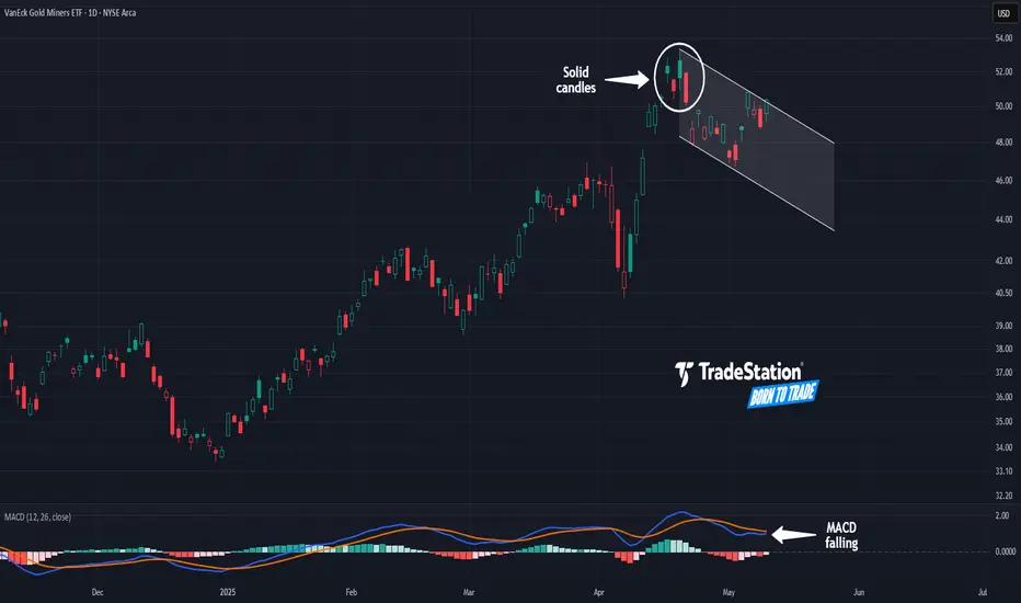
Gold Miners May Be FatiguedThe VanEck Gold Miners ETF had a major breakout in March, but some traders may think it’s getting fatigued.
The first pattern on today’s chart is the series of candles on April 16-22. Those bars occurred at the highest levels in almost four years. They’re also solid, illustrating that price wasn't able to hold the peaks.
Second, GDX fell sharply afterwards and made a lower high last week. That could mean April represented a peak. It could additionally suggest a new downward channel is taking shape.
Third, MACD is falling.
Next, gold and gold miners have benefited from the uncertainty caused by tariffs. Now, with signs of the trade war easing, some traders may find less appeal in the yellow metal.
Finally, GDX is an active underlier in the options market. (It averages more than 140,000 contracts per session, according to TradeStation Data.) That could help traders take positions with calls and puts.
Standardized Performances for the ETF mentioned above:
VanEck Gold Miners ETF (GDX)
1-year: +47.93%
5-years: +51.92%
10-year: +143.71%
(As of April 30, 2025)
Exchange Traded Funds ("ETFs") are subject to management fees and other expenses. Before making investment decisions, investors should carefully read information found in the prospectus or summary prospectus, if available, including investment objectives, risks, charges, and expenses. Click here to find the prospectus.
TradeStation has, for decades, advanced the trading industry, providing access to stocks, options and futures. If you're born to trade, we could be for you. See our Overview for more.
Past performance, whether actual or indicated by historical tests of strategies, is no guarantee of future performance or success. There is a possibility that you may sustain a loss equal to or greater than your entire investment regardless of which asset class you trade (equities, options or futures); therefore, you should not invest or risk money that you cannot afford to lose. Online trading is not suitable for all investors. View the document titled Characteristics and Risks of Standardized Options at www.TradeStation.com . Before trading any asset class, customers must read the relevant risk disclosure statements on www.TradeStation.com . System access and trade placement and execution may be delayed or fail due to market volatility and volume, quote delays, system and software errors, Internet traffic, outages and other factors.
Securities and futures trading is offered to self-directed customers by TradeStation Securities, Inc., a broker-dealer registered with the Securities and Exchange Commission and a futures commission merchant licensed with the Commodity Futures Trading Commission). TradeStation Securities is a member of the Financial Industry Regulatory Authority, the National Futures Association, and a number of exchanges.
Options trading is not suitable for all investors. Your TradeStation Securities’ account application to trade options will be considered and approved or disapproved based on all relevant factors, including your trading experience. See www.TradeStation.com . Visit www.TradeStation.com for full details on the costs and fees associated with options.
Margin trading involves risks, and it is important that you fully understand those risks before trading on margin. The Margin Disclosure Statement outlines many of those risks, including that you can lose more funds than you deposit in your margin account; your brokerage firm can force the sale of securities in your account; your brokerage firm can sell your securities without contacting you; and you are not entitled to an extension of time on a margin call. Review the Margin Disclosure Statement at www.TradeStation.com .
TradeStation Securities, Inc. and TradeStation Technologies, Inc. are each wholly owned subsidiaries of TradeStation Group, Inc., both operating, and providing products and services, under the TradeStation brand and trademark. When applying for, or purchasing, accounts, subscriptions, products and services, it is important that you know which company you will be dealing with. Visit www.TradeStation.com for further important information explaining what this means.
Nasdaq 100: Bulls in Control for Now, but Key Hurdles RemainNasdaq 100 futures have gapped higher upon the Asia market open, leaving them sitting above the important 200-day moving average. With momentum indicators like RSI (14) and MACD generating bullish signals, it’s an environment that favours buying dips and topside breaks.
However, the coast is not entirely clear for bulls with the price struggling to take out the March 28 high of 20,536. The January 2023 uptrend is also nearby, sitting just above 20,600. Zooming out, the price has also been coiling in a rising wedge pattern, warning there may be an eventual resumption of the bearish trend seen between late February and early April.
While some bulls may be willing to buy above the 200-day moving average with a stop beneath for protection, others may prefer to wait for a decisive push above the top of the resistance zone around 20,650 before establishing positions. Topside levels to keep on the radar include 21,000, 21,420 and 21,969.
If the price were to reverse back below the 200-day moving average and close there, it would swing near-term directional risks lower, invalidating the bullish bias.
Good luck!
DS

Bullish mode for BTCThe weekly MACD is about to make a bullish cross. The last two times this has happened, we've seen a nice run up for a couple of weeks to months.

$SOL / $BTC Inverse Head and Shoulders BREAKOUT!!CRYPTOCAP:SOL / CRYPTOCAP:BTC Inverse Head and Shoulders reversal pattern confirmed 🥳
PA has also reclaimed the 50DMA
Bullish Divergence on RSI
So many signs indicators aligning across the market.
IS IT REALLY TIME !!?!?

Everything is in recovery modeCoinbase stock looks like it wants to rally with the crypto market. 5 waves down completed, correction may be over. Breakout on the weekly RSI.
