Best Free Volatility Indicator on TradingView for Gold Forex
This free technical indicator will help you easily measure the market volatility on Forex, Gold or any other market.
It will show you when the market is quiet , when it's active and when it's dangerous .
We will go through the settings of this indicator, and you will learn how to set it up on TradingView.
Historical Volatility Indicator
This technical indicator is called Historical Volatility.
It is absolutely free and available on TradingView, MetaTrader 4/5 and other popular trading terminals.
TradingView Setup
Let me show you how to find it on TradingView and add it to your price chart.
Open a technical price chart on TradingView and open the "Indicators" menu (you will find it at the top of the screen).
Search "Historical Volatility" and click on it.
It will automatically appear on your chart.
"Length" parameter will define how many candles the indicator will take for measuring the average volatility. (I recommend keeping the default number, but if you need longer/shorter-term volatility, you can play with that)
Timeframe drop-down list defines what time frame the indicator takes for measuring the volatility. (I recommend choosing a daily timeframe)
And keep the checkboxes unchanged .
How to Use the Indicator
Now, let me show you how to use it properly.
Wider the indicator and analyse its movement at least for the last 4 months.
Find the volatility range - its low levels will be based on the lower boundary of the range, high levels will be based on its upper boundary.
This is an example of such a range on USDCAD pair.
When the volatility stays within the range, it is your safe time to trade.
When volatility approaches its lows, it may indicate that the market might be slow .
Highs of the range imply that the market is very active
In-between will mean a healthy market.
The Extremes
The violation of a volatility range to the downside is the signal that the market is very slow . This would be the recommended period to not trade because of high chance of occurrence of fakeouts.
An upward breakout of a voliatlity range is the signal of the extreme volatility . It will signify that the market is unstable , and it will be better to let it calm down before placing any trade.
Volatility Analysis
That is how a complete volatility analysis should look.
At the moment, volatility reached extreme levels on CADJPY pair.
The best strategy will be to wait till it returns within the range.
Remember This
With the current geopolitical uncertainty and trade wars, market volatility reaches the extreme levels.
Such a volatility is very dangerous , especially for newbie traders.
Historical volatility technical indicator will help you to easily spot the best period for trading and the moment when it is better to stay away.
❤️Please, support my work with like, thank you!❤️
I am part of Trade Nation's Influencer program and receive a monthly fee for using their TradingView charts in my analysis.
Oscillators

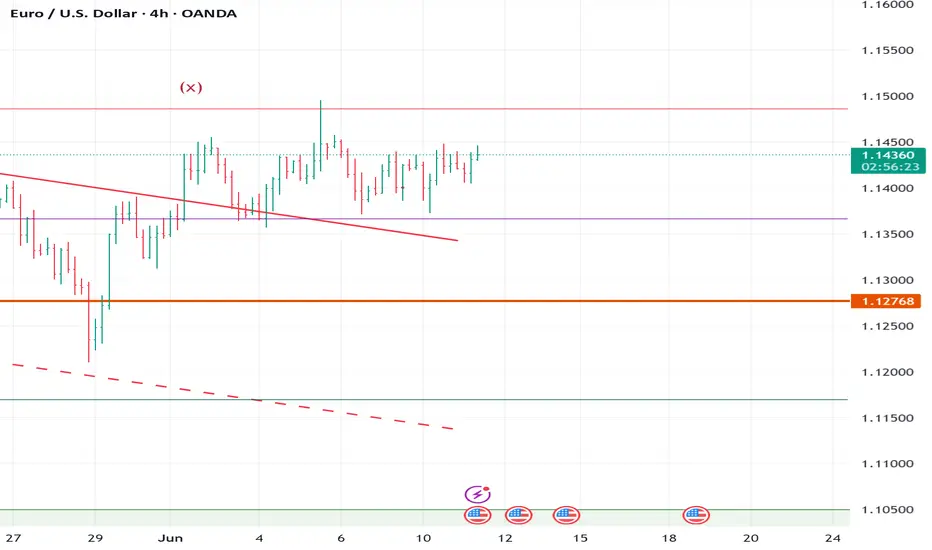
ELLIOTT WAVE EURUSD H4 update
EW Trade Set Up H4
minute wave ((ii)) is running.
the
The upside move from 1.1070a of 120525 to 1.1635a of 120625 does not seem a motive wave , so a sideways (flat) correction of the minute wave ((ii)) is more likely
key levels (area)
1.1590
1.1538
1.1366 POC
1.1169
1.1080

USD/CAD: Signs of a bottom as bulls fight backTuesday’s bullish move in USD/CAD has delivered a signal often seen at bottoms, taking out several key technical resistance levels in the process, including the December 2023 uptrend. With bearish momentum starting to reverse, upside risks look to be building.
Those in the market for a long setup could initiate positions around these levels with a stop beneath 1.3650 for protection. Tuesday’s high of 1.3693 now stands as an important near-term level. A break above opens the door to the June 10 high at 1.3728 as one potential target, along with 1.3750.
If either level is hit, reevaluate whether to hold, cut or reverse, given the setup runs counter to the broader trend.
Good luck!
DS

GBPUSD Wave Analysis – 17 June 2025- GBPUSD reversed from the resistance level 1.3615
- Likely to fall to support level at 1.3400
GBPUSD currency pair recently reversed down from the key resistance level 1.3615 (which has been reversing the price from the end of May) and the upper daily Bollinger Band.
The downward reversal from the resistance level 1.3615 formed the daily Japanese candlesticks reversal pattern Dark Cloud Cover – which was followed by the Shooting Star.
Given the bearish divergence on the daily Stochastic indicator, GBPUSD currency pair can be expected to fall to the next support level at 1.3400 (former resistance from April).

Bitcoin - Levels of the Range On the hourly time frame it is clear that BTC is within a rangebound environment. Using key levels such as the weekly highs and lows with Mondays highs and lows to to paint a picture of where support and resistance may be.
In the "weekly outlook" post for this week I suggested a retest of the $108,500 area, an orderblock that pushed prices lower and is notorious for protecting Stop losses of the shorts that pushed price lower, nearly instantly as the week starts we get that move to sweep the supply zone and stop hunt the short trades.
After a successful sweep the swing fail pattern typically follows when in a rangebound environment or absent of a trend. This structure plays out and the sell-off follows.
Price breaks through the Monday low with zero fight so momentum is with the bears in the low time frame. Should momentum continue the previous week low is @ $102,500 which is in line with HTF key level too.
RSI is also entering the oversold zone and in a rangebound environment can be when price reverses direction, as seen by the previous Monday High and Previous week low.
With FOMC just over 24 hours away volatility usually follows. No rate cut forecast however many think the interest rate should be brought down in line with inflation as the ECB has already done.
In conclusion, BTC is in a clear rangebound environment on the hourly time frame.
Stop loss hunt/supply zone sweep and then SFP, the LTF momentum is with the bears going into FOMC.
Next point of support at $102,500 (Previous week low) and could be boosted by the oversold RSI.
An FOMC rate cut should be bullish although currently thought to be unlikely.

Why I Think GBPUSD Will Sell...Technical AnalysisHey Rich Friends,
I hope you're well today. I wanted to share why I think GBPUSD will sell today and maybe more this week. This is only my technical analysis so make sure you check the news and cross reference the indicators you have on your chart. This is what I am looking at:
- The market hit a swing high on 4H and has been creating lower highs.
- The momentum is picking up for the sellers based on candle bodies.
- The stochastic is facing down, the slow line (orange) is on top of the fast line (blue) and both lines have crossed below 50. These are bearish confirmations for me.
Additional information:
- Wait for the stochastic to cross below 20.
- Wait for a break of structure below 1.35320.
- I will be setting sell stops so that my trades trigger on the way down. I will set previous highs as my SL and previous lows as my TPs.
Good luck if you decide to take this trade!
Peace and Profits,
Cha

SGX Iron Ore: Retest of 2025 Lows Back in PlaySitting in an established downtrend and with momentum indicators providing bearish signals, a retest of the 2025 lows may be on the cards for SGX iron ore.
A move below $93—where the price bottomed on Monday—would allow for shorts to be established targeting $91.75. A tight stop above would protect against reversal. Alternatively, if the price bounces towards downtrend resistance running from the May highs, bearish positions could be set with a stop above for protection.
If the trade target is achieved, either setup could be reevaluated with a more pronounced support zone located beneath $90.
Good luck!
DS

Descending Triangle in Apple?Apple has struggled all year, and evidence of a downtrend may be growing in the tech giant.
The first pattern on today’s chart is this month’s lower high relative to mid-May. Combined with the May 7 low of $193.25, some traders may think a descending triangle is taking shape. That’s a potentially bearish formation.
Second, TradeStation data shows that AAPL is the only trillion-dollar company now trading below its 200-day simple moving average (SMA). The 200-day SMA has also turned lower. Those points may confirm long-term price action is less bullish.
Next, prices remaining below the falling 50-day SMA may signal intermediate-term weakness.
Fourth, short-term trends may be weakening: The 8-day exponential moving average (EMA) is below the 21-day EMA and MACD is falling.
Finally, AAPL is one of the most active underliers in the options market. That could help traders take positions with calls and puts.
Check out TradingView's The Leap competition sponsored by TradeStation.
TradeStation has, for decades, advanced the trading industry, providing access to stocks, options and futures. If you're born to trade, we could be for you. See our Overview for more.
Past performance, whether actual or indicated by historical tests of strategies, is no guarantee of future performance or success. There is a possibility that you may sustain a loss equal to or greater than your entire investment regardless of which asset class you trade (equities, options or futures); therefore, you should not invest or risk money that you cannot afford to lose. Online trading is not suitable for all investors. View the document titled Characteristics and Risks of Standardized Options at www.TradeStation.com . Before trading any asset class, customers must read the relevant risk disclosure statements on www.TradeStation.com . System access and trade placement and execution may be delayed or fail due to market volatility and volume, quote delays, system and software errors, Internet traffic, outages and other factors.
Securities and futures trading is offered to self-directed customers by TradeStation Securities, Inc., a broker-dealer registered with the Securities and Exchange Commission and a futures commission merchant licensed with the Commodity Futures Trading Commission). TradeStation Securities is a member of the Financial Industry Regulatory Authority, the National Futures Association, and a number of exchanges.
Options trading is not suitable for all investors. Your TradeStation Securities’ account application to trade options will be considered and approved or disapproved based on all relevant factors, including your trading experience. See www.TradeStation.com . Visit www.TradeStation.com for full details on the costs and fees associated with options.
Margin trading involves risks, and it is important that you fully understand those risks before trading on margin. The Margin Disclosure Statement outlines many of those risks, including that you can lose more funds than you deposit in your margin account; your brokerage firm can force the sale of securities in your account; your brokerage firm can sell your securities without contacting you; and you are not entitled to an extension of time on a margin call. Review the Margin Disclosure Statement at www.TradeStation.com .
TradeStation Securities, Inc. and TradeStation Technologies, Inc. are each wholly owned subsidiaries of TradeStation Group, Inc., both operating, and providing products and services, under the TradeStation brand and trademark. When applying for, or purchasing, accounts, subscriptions, products and services, it is important that you know which company you will be dealing with. Visit www.TradeStation.com for further important information explaining what this means.

ADAUSDT Is Warming Up for a Major MoveYello, Paradisers! Did you notice what just happened on ADAUSDT? After sweeping liquidity, the pair has now printed a bullish internal change of character (I-CHoCH), confirmed by bullish divergence. This confluence significantly increases the probability of a bullish move from here—but only if you play it smart.
💎From the current price levels, the risk-to-reward ratio isn’t the most attractive for conservative entries. Aggressive traders might still consider taking a position with a tighter invalidation, but the trade needs to be managed with precision.
💎For those who prefer safer setups, it’s much wiser to wait for a pullback into the key support zone. A confirmed retest from there could offer a much cleaner risk-to-reward structure and a clearly defined invalidation level.
💎However, if the price breaks down and closes below that invalidation level, this entire bullish setup becomes invalid. In that case, it's best to stay patient and wait for a new structure to form before jumping back in. Entering too early in uncertain territory can turn a high-probability setup into a costly mistake.
🎖Strive for consistency, not quick profits. Treat the market as a professional, not a gambler. Discipline and timing are what separate the winners from the crowd. Be patient, wait for the high-quality trades, and execute with confidence. That’s how long-term success is built in this game.
MyCryptoParadise
iFeel the success🌴

BTC channels chart Here I provide you what I believe to be BTC channels down trend channels in terms of being bullish each dotted channel is median and all darken red are tops and bottoms currently we are at median level and as long as we hold this level we can get a bounce to top channel if not then targets of bottom channel it may not be clear the first time but trying channels can provide extra clarity and here’s my chart to witness the BTC breakouts since 2022

CAMS – Rounding Bottom Breakout | Momentum PlayStructure:
CAMS has completed a classic rounding bottom formation over the past three months, with the neckline placed around ₹4,200. Price action from the March 2025 lows (~₹3,100) has remained within a well-defined ascending channel, signaling steady accumulation and controlled institutional entry.
On June 5, 2025, the stock gave a clean breakout above ₹4,200 with a strong bullish candle, closing at ₹4,248.30. Importantly, the move came with a volume of 877.56K, significantly higher than the 20-day average (576K), validating the breakout strength.
Momentum indicators are supportive — RSI has now crossed 70, confirming entry into bullish momentum territory without showing divergence or exhaustion yet.
Breakout Snapshot:
Pattern: Rounding Bottom + Ascending Channel
Breakout Level: ₹4,200
Entry: ₹4,248.30 (EOD Jun 5, 2025)
Volume: 877.56K vs 20-SMA 576K
RSI: 70.11 → strong bullish confirmation
🎯 Target: ₹5,120
📉 Stop-Loss: ₹4,000 (below breakout and channel support)
📈 Potential Upside: ~20%
⚖️ Risk-Reward: ~3.6x
Why It Matters:
CAMS has historically respected multi-month consolidations and offers clean post-breakout runs when supported by volume. This setup reflects a transition from accumulation to trend. The ascending structure indicates that smart money entered gradually — now validated with the breakout and volume spike.
Not a call to chase — idea is based on price-volume confirmation after a long base formation. Ideal entries are either near breakout (done) or on retest toward ₹4,180–₹4,200.
Track These:
₹4,400: Minor resistance
₹5,120: Measured move target
₹4,000: Invalidation zone
RSI > 75: Overheat caution
Disclaimer:
This analysis is for educational and informational purposes only. It does not constitute investment advice or a recommendation to buy or sell any security. Please consult your financial advisor before making any trading decisions.

Profit taking on Netflix for the summer, only to buy in lowerNASDAQ:NFLX is still in a strong high time frame uptrend, I'm not saying the stock has turned bearish overall, however profits need to be taken when trading and this is one of those times.
I'd prefer to buy back in closer to $1,000 if possible though either way I'll keep 33% of my stack.

Gold Bullish ContinuationThe decision of the daily and weekly candles to close bullish shows a clear indication of further bullish intentions.
As visible on the chart, Price has been ranging after mitigating a 4 hour Fair Value Gap and has stayed within the range. However, since it'll eventually have to make a decision, the possibility of a more upside movement appears to be more likely.
Moreover, fundamentally, the rising geopolitical tensions further fuels its bullish fire as the demand for the favorite safe-haven asset increases - Gold.
Furthermore, technically visible trading opportunities are visible on the chart - However, we may face a pull back at the Supply zone above current price as the 15 minute chart shows bearish divergence on the RSI. As a result, the occurrence of price making a higher high and the RSI making a Lower High heightens the possibility of a pull back to the Mitigation Block/ RBS (Resistance became Support) Zone of 3384-8867. Should price make a further drop below this level, a deeper fall may be anticipated.
Always put your equity first, As tough as trading is, the upside is that opportunities always appear in the market. Don't blow your account and emotional balance on a trade or trade idea, another will come, maybe even better. Manage risks. Wish you success.

Futures RSII will go through why I prefer the 63 RSI to be OHLC4 or HLC3. That's because I think Volume Weighted MA is influenced by the high, low, and close price, so I use either that or OHLC4 after double smoothing it. Watch the 70-30 and oversold levels as a potential reversal play; typically, everything above 35 is bullish and everything below 65 is bearish, with 50 as TP. The most powerful aspect of the RSI lies in finding divergences from the strength of the RSI and the direction of price; that's where the largest trades I have taken were made.

$SSP Low volume on Wave 2, momentum risingFirstly, on the line chart is possible to watch the possible targets - blue lines - which one of it is almost as the same level as 2,618.
Fibonacci measured from the breakout to monthly resistance.
res M = monthly resistance
During the Wave 2, the two candles from last two days showed low volume as usual to happen during formation of W2, and it is possible to see that price at the breakout and after it was above average which can be read as high interest from buyers.
Confirming the volume, the EFI even though is decreasing still show strength,OBV follow the price trend but looks like buyers are entering again.
When it comes to momentum is possible to see that RSI did not crossed the equilibrium even after two bearish days, as ROC being a leading indicator which already changed direction . ADX is showing some strength for the trend direction confirmed by as DMI+ is still above DMI-
DTC = 1,36

Signs of reversalBTC hit its technical target after breaking below its range at the resistance of the January ATH. The hourly RSI is showing signs of reversal.

#XRPUSDT #4h (Bitget Futures) Descending channel near breakoutRipple just printed a dragonfly doji resting 50MA regained support, looks ready for short-term recovery.
⚡️⚡️ #XRP/USDT ⚡️⚡️
Exchanges: Bitget Futures
Signal Type: Regular (Long)
Leverage: Isolated (8.0X)
Amount: 5.2%
Entry Zone:
2.2438 - 2.2088
Take-Profit Targets:
1) 2.3535
2) 2.4493
3) 2.5450
Stop Targets:
1) 2.1199
Published By: @Zblaba
CRYPTOCAP:XRP BITGET:XRPUSDT.P #4h #Ripple #MadeInUsa xrpl.org
Risk/Reward= 1:1.2 | 1:2.1 | 1:3.0
Expected Profit= +45.7% | +80.1% | +114.5%
Possible Loss= -38.2%
Estimated Gaintime= 1-2 weeks

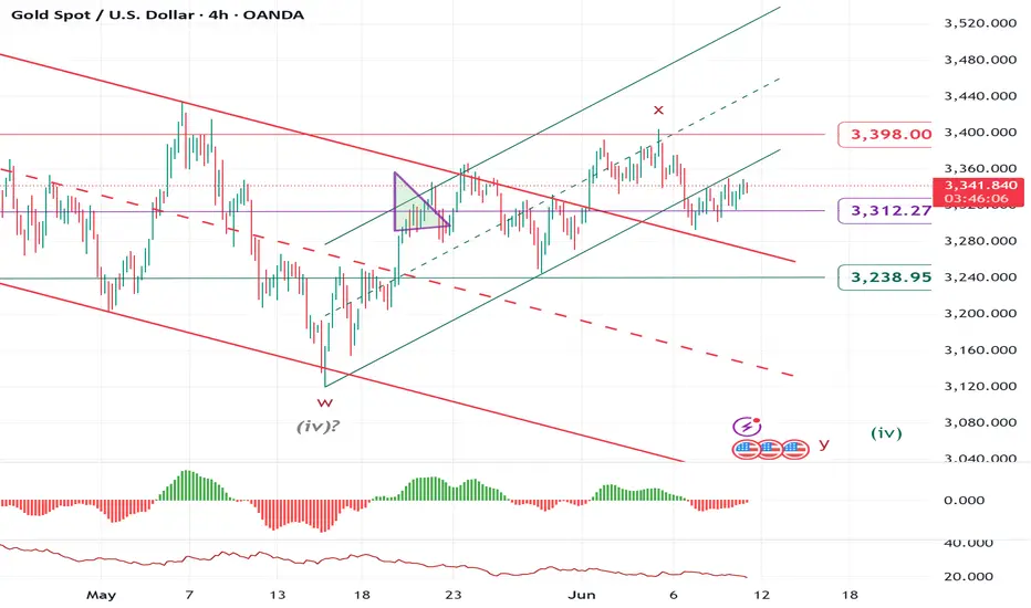
ELLIOTT WAVE XAUUSD H4 update
EW Trade Set Up H4
subminuette wave (iv):
downward price movement from 22 april high at 3500 area looks a sideway correction unless an impulsive movement start breaking up 3350 level first and then 3400 level shortly.
key levels (area)
3400
3350
3312 POC
3290
3240
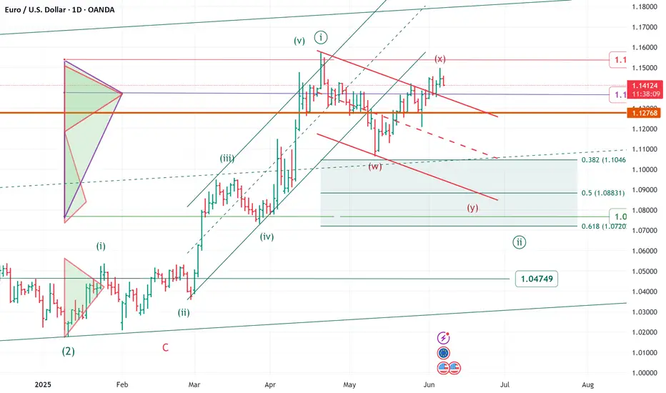
Elliott wave daily EURUSD update
Elliott wave daily EURUSD update
The price movement of the last few weeks requires a change
and update of the wave count
______________________________________
upward movement from area 1.018/genuary 2025 to area 1.1580/april 2025
looks impulsive - minute wave ((i)).
we are now in a corrective minute wave ((ii))
zigzag or flat or any double
target area 1.1040/1.0800 area
in the very short term level to monitor 1.1500 area
over 1.1500 area a flat correction more likely ( to area 1.1570)
note
FX option expiries for 6 June 10am New York cut
1.1500 (EUR 3.19bn)
1.1400 (EUR 2.38bn)
1.1300 (EUR 1.28bn)
FOREXLIVE
USD/CHF Testing June Low as Momentum Turns SouthRising geopolitical tensions and sliding U.S. Treasury yields have dragged USD/CHF sharply lower, delivering a bearish engulfing candle on the daily and pushing the pair back towards the June low at .8160. The move sets up a potential short should that level give way.
A clean break of .8160 would allow for positions to be established with a stop above for protection, targeting a retest of the April 21 swing low at .8040. Momentum signals are turning bearish, with RSI (14) breaking its uptrend and drifting further from neutral, while MACD looks set to cross the signal line below zero.
While a long setup is also a consideration should .8160 hold, recent price action and momentum shifts suggest it’s a low-probability play.
Good luck!
DS

Nasdaq Futures: Tariff Talk, Tech Fatigue Turn TideHaving surged more than 20% from the April lows, we could be nearing a turning point for Nasdaq 100 futures.
Bullish momentum is showing signs of shifting lower, while Wednesday’s inverted hammer candle—on a day when tech stocks were given every excuse to rally thanks to the soft U.S. inflation report and subsequent decline in Treasury yields—warns the rally may be running out of steam.
With Donald Trump talking about setting firm tariff rates for individual nations within the next two weeks, we’re already seeing signs of weakness in futures, bolstering the prospect for a three-candle evening star pattern being completed. Sitting in a rising wedge, directional risks seem to be skewing lower.
If the price breaks and closes beneath wedge support, it would create a setup where shorts could be established with a stop above Wednesday’s high to protect against a resumption of the bullish trend.
21436 is a minor support level that screens as an initial target, although 20800—where the price bounced strongly from on May 23—makes for a more appealing case from a risk-reward perspective.
A push and close above 21969—a minor resistance level established earlier this year—would invalidate the bearish bias.
Good luck!
DS

Cisco Wave Analysis – 11 June 2025
- Cisco reversed from the key resistance level 65.60
- Likely to fall to support level 62.20
Cisco recently reversed down from the key resistance level 65.60 (which has been reversing the price from the start of February).
The downward reversal from the resistance level 65.60 created the daily Japanese candlesticks reversal pattern Evening Star.
Cisco can be expected to fall to the next support level 62.20 (a low of the previous minor correction 2 from the end of May).

ELLIOTT WAVE EURUSD H4 update
EW Trade Set Up H4
minute wave (ii) running
is not already clear wheter it will develope in a sideway or sharp correction usually wave 2 is sharp in a zigzag to 0.618 retracement value.
short term key levels (area)
1.1445
1.1425
1.1365 POC
1.1320
1.1220