BTCUSD 1H timeframe(TF) overbought? Accending triangle probably will continue Bull run if it manages to break the structure to the upper side. It can possibly be reaching overbought levels which will force BTCUSD to break the structure to the downside. In any case great trading opportunities!
Overbought

I might be wrong, but I am bearish, fundamental Last time 1D RSI went this high we had a massive dump, furthermore we had a touch of top of bear flag, and you don't turn bear into bull (all these 20 to 30% pumps) into a few days or weeks, we still getting mt gox dump and the interest hikes

making money with Avaxusdt today!Avax gives you the chance to profit 20ish percent and make some cash! this is how you can short with less risk
God bless you

Opportunity to make some money Keep your eyes on matic in coming days. it's potentially ready to drops around 26% !
Invest with confident!

DXY Is Overbought! Sell!
Hello,Traders!
DXY is trading in a strong uptrend
But the index is super overbought at the moment
So IF we see a breakout of the horizontal key level
Then the price will go lower in the bearish correction
Sell!
Like, comment and subscribe to boost your trading!
See other ideas below too!

US OIL analyzehello everybody.
according to the technical analyze we can see the terminal trend in US oil.
and i think the trend in 1D timeframe become weak and i see a correction potential for that.
after we break out of disjoint channel that i draw on my chart we could have a pullback and after that
go down.
the first target for swing traders is around 93 94
and we can see a strengh support around 85-90 area like i illustrate in chart.
PCC(point of control)is in this area and we have the MA200 here too.
in addition longterm trendline is around this condition.
so we have 3 important levels and support in this area (85-90).
our momentum is in overbought level and going downward.
dont forget to put stoploss above the last major high.
(NOTE:friends this is my personal opinion and its not a trade suggestion.
please analyze in your own strategy and help me be better)
thank you all.

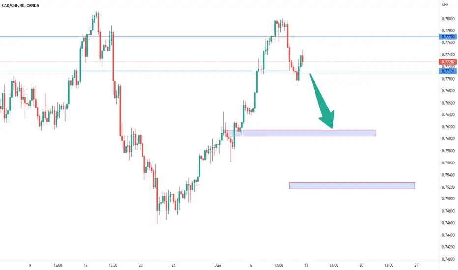
CADCHF SELLPrice has made a double top at the monthly resistance with bearish divergence on RSI.
We can expect a drop towards the monthly support with the initial target at the pivot highlighted on the chart.
DXY Short Term Massively Over Bought When DXY hit support on the bottom trend line, it has been pumping parabolically. Right now, it seems to have hit resistance and showing to be incredibly over bought on the RSI if it closes below the top trend line, we could expect a massive dump to occur for the rest of June. This could result in BTC to have that rally in June like we have been anticipating.

Soooooooo... CONTINUATION?! Or nah...I think everythings gonna keep moving the same way! I mean, AJ might've roc'd me a bit but that 200pip move on gold was saucy! EU did me som justice too. They also BLEW TF UP AGAIN! But, its not about trading all the time, its about trading well often ;)
So with that being said, make it do what it do my trading family!! Happy trading <3

CPS likely to continue downtrendBased on historical movement, the peak could occur anywhere in the larger red box. The final targets are in the green boxes. The pending bottom should occur within the larger green box as has been the historical case. Half of all movement has ended in the smaller green box. In this instance, the signal indicated SELL on June 3, 2022 with a closing price of 5.72.
If this instance is successful, that means the stock should decline to at least 5.675 which is the top of the larger green box. Three-quarters of all successful signals have the stock decline 2.502% from the signal closing price. This percentage is the top of the smaller green box. Half of all successful signals have the stock decline 4.91% which is the end point of the black dotted arrow. One-quarter of all successful signals have the stock decline 9.026% from the signal closing price which is the bottom of the smaller green box. The maximum decline on record would see a move to the bottom of the larger green box. These are the same concepts for the levels in the red boxes as well.
The ends/vertical sides of the boxes are determined in a similar fashion. The trough of the decline can occur as soon as the next trading bar after signal close, while the max decline occurs within the limit of study at 40 trading bars after the signal. A 0.75% decline must occur over the next 40 trading bars in order to be considered a success. Three-quarters of successful movement occur after at least 9.5 trading bars; half occur within 20.0 trading bars, and one-quarter require at least 34.0 trading bars.
The black dotted arrow represents median historical movement. Medians are a good metric, but they are just one of many I use when forecasting future movement.
As always, the stock could decline the very next bar after the signal without looking back (therefore the red boxes would not come into play) or the stock may never decline (and the green boxes may never come into play).

OLED looks overbought again, time for snapback?Based on historical movement, the peak could occur anywhere in the larger red box. The final targets are in the green boxes. The pending bottom should occur within the larger green box as has been the historical case. Half of all movement has ended in the smaller green box. In this instance, the signal indicated SELL on June 3, 2022 with a closing price of 124.42.
If this instance is successful, that means the stock should decline to at least 123.68 which is the top of the larger green box. Three-quarters of all successful signals have the stock decline 2.843% from the signal closing price. This percentage is the top of the smaller green box. Half of all successful signals have the stock decline 6.8475% which is the end point of the black dotted arrow. One-quarter of all successful signals have the stock decline 12.939499999999999% from the signal closing price which is the bottom of the smaller green box. The maximum decline on record would see a move to the bottom of the larger green box. These are the same concepts for the levels in the red boxes as well.
The ends/vertical sides of the boxes are determined in a similar fashion. The trough of the decline can occur as soon as the next trading bar after signal close, while the max decline occurs within the limit of study at 40 trading bars after the signal. A 0.5% decline must occur over the next 40 trading bars in order to be considered a success. Three-quarters of successful movement occur after at least 5.0 trading bars; half occur within 16.0 trading bars, and one-quarter require at least 31.5 trading bars.
The black dotted arrow represents median historical movement. Medians are a good metric, but they are just one of many I use when forecasting future movement.
As always, the stock could decline the very next bar after the signal without looking back (therefore the red boxes would not come into play) or the stock may never decline (and the green boxes may never come into play).

June swoon about to hit Starbucks stock?Based on historical movement, the peak could occur anywhere in the larger red box. The final targets are in the green boxes. The pending bottom should occur within the larger green box as has been the historical case. Half of all movement has ended in the smaller green box. In this instance, the signal indicated SELL on June 1, 2022 with a closing price of 76.28.
If this instance is successful, that means the stock should decline to at least 75.47 which is the top of the larger green box. Three-quarters of all successful signals have the stock decline 2.684% from the signal closing price. This percentage is the top of the smaller green box. Half of all successful signals have the stock decline 5.604% which is the end point of the black dotted arrow. One-quarter of all successful signals have the stock decline 13.653% from the signal closing price which is the bottom of the smaller green box. The maximum decline on record would see a move to the bottom of the larger green box. These are the same concepts for the levels in the red boxes as well.
The ends/vertical sides of the boxes are determined in a similar fashion. The trough of the decline can occur as soon as the next trading bar after signal close, while the max decline occurs within the limit of study at 35 trading bars after the signal. A 1% decline must occur over the next 35 trading bars in order to be considered a success. Three-quarters of successful movement occur after at least 6 trading bars; half occur within 14 trading bars, and one-quarter require at least 25 trading bars.
The black dotted arrow represents median historical movement. Medians are a good metric, but they are just one of many I use when forecasting future movement.
As always, the stock could decline the very next bar after the signal without looking back (therefore the red boxes would not come into play) or the stock may never decline (and the green boxes may never come into play).

NBHC about to correct with the rest of market?Based on historical movement, the peak could occur anywhere in the larger red box. The final targets are in the green boxes. The pending bottom should occur within the larger green box as has been the historical case. Half of all movement has ended in the smaller green box. In this instance, the signal indicated SELL on May 27, 2022 with a closing price of 40.89.
If this instance is successful, that means the stock should decline to at least 40.73 which is the top of the larger green box. Three-quarters of all successful signals have the stock decline 1.425% from the signal closing price. This percentage is the top of the smaller green box. Half of all successful signals have the stock decline 2.254% which is the end point of the black dotted arrow. One-quarter of all successful signals have the stock decline 3.606% from the signal closing price which is the bottom of the smaller green box. The maximum decline on record would see a move to the bottom of the larger green box. These are the same concepts for the levels in the red boxes as well.
The ends/vertical sides of the boxes are determined in a similar fashion. The trough of the decline can occur as soon as the next trading bar after signal close, while the max decline occurs within the limit of study at 50 trading bars after the signal. A 0.4% decline must occur over the next 50 trading bars in order to be considered a success. Three-quarters of successful movement occur after at least 7 trading bars; half occur within 24 trading bars, and one-quarter require at least 37 trading bars.
The black dotted arrow represents median historical movement. Medians are a good metric, but they are just one of many I use when forecasting future movement.
As always, the stock could decline the very next bar after the signal without looking back (therefore the red boxes would not come into play) or the stock may never decline (and the green boxes may never come into play).

Pending drop may not create a lower low for APAMBased on historical movement, the peak could occur anywhere in the larger red box. The final targets are in the green boxes. The pending bottom should occur within the larger green box as has been the historical case. Half of all movement has ended in the smaller green box. In this instance, the signal indicated SELL on May 26, 2022 with a closing price of 37.49.
If this instance is successful, that means the stock should decline to at least 37.28 which is the top of the larger green box. Three-quarters of all successful signals have the stock decline 2.643% from the signal closing price. This percentage is the top of the smaller green box. Half of all successful signals have the stock decline 4.675% which is the end point of the black dotted arrow. One-quarter of all successful signals have the stock decline 8.234% from the signal closing price which is the bottom of the smaller green box. The maximum decline on record would see a move to the bottom of the larger green box. These are the same concepts for the levels in the red boxes as well.
The ends/vertical sides of the boxes are determined in a similar fashion. The trough of the decline can occur as soon as the next trading bar after signal close, while the max decline occurs within the limit of study at 40 trading bars after the signal. A 0.5% decline must occur over the next 40 trading bars in order to be considered a success. Three-quarters of successful movement occur after at least 11 trading bars; half occur within 21 trading bars, and one-quarter require at least 33 trading bars.
The black dotted arrow represents median historical movement. Medians are a good metric, but they are just one of many I use when forecasting future movement.
As always, the stock could decline the very next bar after the signal without looking back (therefore the red boxes would not come into play) or the stock may never decline (and the green boxes may never come into play).

Marvell Technology appears to have set a bull trapBased on historical movement, the peak could occur anywhere in the larger red box. The final targets are in the green boxes. The pending bottom should occur within the larger green box as has been the historical case. Half of all movement has ended in the smaller green box. In this instance, the signal indicated SELL on May 27, 2022 with a closing price of 59.8.
If this instance is successful, that means the stock should decline to at least 59.55 which is the top of the larger green box. Three-quarters of all successful signals have the stock decline 1.956% from the signal closing price. This percentage is the top of the smaller green box. Half of all successful signals have the stock decline 3.897% which is the end point of the black dotted arrow. One-quarter of all successful signals have the stock decline 6.432% from the signal closing price which is the bottom of the smaller green box. The maximum decline on record would see a move to the bottom of the larger green box. These are the same concepts for the levels in the red boxes as well.
The ends/vertical sides of the boxes are determined in a similar fashion. The trough of the decline can occur as soon as the next trading bar after signal close, while the max decline occurs within the limit of study at 50 trading bars after the signal. A 0.4% decline must occur over the next 50 trading bars in order to be considered a success. Three-quarters of successful movement occur after at least 8 trading bars; half occur within 22 trading bars, and one-quarter require at least 43 trading bars.
The black dotted arrow represents median historical movement. Medians are a good metric, but they are just one of many I use when forecasting future movement.
As always, the stock could decline the very next bar after the signal without looking back (therefore the red boxes would not come into play) or the stock may never decline (and the green boxes may never come into play).

Blackstone Inc joins the overbought clubBased on historical movement, the peak could occur anywhere in the larger red box. The final targets are in the green boxes. The pending bottom should occur within the larger green box as has been the historical case. Half of all movement has ended in the smaller green box. In this instance, the signal indicated SELL on May 26, 2022 with a closing price of 118.28.
If this instance is successful, that means the stock should decline to at least 117.58 which is the top of the larger green box. Three-quarters of all successful signals have the stock decline 2.609% from the signal closing price. This percentage is the top of the smaller green box. Half of all successful signals have the stock decline 5.353% which is the end point of the black dotted arrow. One-quarter of all successful signals have the stock decline 9.08% from the signal closing price which is the bottom of the smaller green box. The maximum decline on record would see a move to the bottom of the larger green box. These are the same concepts for the levels in the red boxes as well.
The ends/vertical sides of the boxes are determined in a similar fashion. The trough of the decline can occur as soon as the next trading bar after signal close, while the max decline occurs within the limit of study at 40 trading bars after the signal. A 0.5% decline must occur over the next 40 trading bars in order to be considered a success. Three-quarters of successful movement occur after at least 10 trading bars; half occur within 29 trading bars, and one-quarter require at least 36 trading bars.
The black dotted arrow represents median historical movement. Medians are a good metric, but they are just one of many I use when forecasting future movement.
As always, the stock could decline the very next bar after the signal without looking back (therefore the red boxes would not come into play) or the stock may never decline (and the green boxes may never come into play).

Steel Dynamics is overbought according to thisBased on historical movement, the peak could occur anywhere in the larger red box. The final targets are in the green boxes. The pending bottom should occur within the larger green box as has been the historical case. Half of all movement has ended in the smaller green box. In this instance, the signal indicated SELL on May 27, 2022 with a closing price of 85.6795.
If this instance is successful, that means the stock should decline to at least 84.85 which is the top of the larger green box. Three-quarters of all successful signals have the stock decline 2.103% from the signal closing price. This percentage is the top of the smaller green box. Half of all successful signals have the stock decline 4.89% which is the end point of the black dotted arrow. One-quarter of all successful signals have the stock decline 8.016% from the signal closing price which is the bottom of the smaller green box. The maximum decline on record would see a move to the bottom of the larger green box. These are the same concepts for the levels in the red boxes as well.
The ends/vertical sides of the boxes are determined in a similar fashion. The trough of the decline can occur as soon as the next trading bar after signal close, while the max decline occurs within the limit of study at 40 trading bars after the signal. A 0.75% decline must occur over the next 40 trading bars in order to be considered a success. Three-quarters of successful movement occur after at least 10 trading bars; half occur within 22 trading bars, and one-quarter require at least 36 trading bars.
The black dotted arrow represents median historical movement. Medians are a good metric, but they are just one of many I use when forecasting future movement.
As always, the stock could decline the very next bar after the signal without looking back (therefore the red boxes would not come into play) or the stock may never decline (and the green boxes may never come into play).

Overextended Markets (Overbought And Oversold)1) Bollinger Bands:
Some traders will determine the market as "over-extended"
when the price is piercing above or below the Bollinger bands.
If above then the price is considered overbought and price may start to reverse.
If below then the price is considered oversold and the price may start to reverse.
2) Stochastic RSI:
some traders will determine the market as "over-extended" once the price is over the 70% line or below the 30% line.
The bottom 30% means the price might be oversold and buyers are projected to come in.
When the price is above the 70% line the market is considered overbought and sellers are projected to come in.
3) Supply And demand
When we have 3x continuation patterns in a row DBD or RBR in a row, we can draw a downward or upward aggressive trend line (momentum line).
When this happens, we consider the market overextended and call it the “elastic band effect”.
stretch out an elastic band to the breaking point and let go, the elastic band snaps back at a high-speed force and hurts.
This is the same for trading, When the market is overextended and breaks the downward or upward momentum line, we can assume the market will snap back and remove 2 if not 3 of the opposing zones that gave us the ability to draw the aggressive momentum line.
Buying or selling the pullback into the demand or supply is usually a good call if the criteria are met for a good trade.

Pfizer:Pure Technical Play!Pfizer
Short Term - We look to Sell at 53.30 (stop at 55.53)
Price continues to trade within the triangle formation. A move higher faces tough resistance and we remain cautious on upside potential. Selling spikes offers good risk/reward. Further downside is expected although we prefer to sell into rallies close to the 53.56 level.
Our profit targets will be 48.29 and 43.36
Resistance: 53.56 / 56.32 / 61.71
Support: 47.50 / 45.44 / 40.94
Please be advised that the information presented on TradingView is provided to Vantage (‘Vantage Global Limited’, ‘we’) by a third-party provider (‘Signal Centre’) . Please be reminded that you are solely responsible for the trading decisions on your account. There is a very high degree of risk involved in trading. Any information and/or content is intended entirely for research, educational and informational purposes only and does not constitute investment or consultation advice or investment strategy. The information is not tailored to the investment needs of any specific person and therefore does not involve a consideration of any of the investment objectives, financial situation or needs of any viewer that may receive it. Kindly also note that past performance is not a reliable indicator of future results. Actual results may differ materially from those anticipated in forward-looking or past performance statements. We assume no liability as to the accuracy or completeness of any of the information and/or content provided herein and the Company cannot be held responsible for any omission, mistake nor for any loss or damage including without limitation to any loss of profit which may arise from reliance on any information supplied by Signal Centre.

USDJPY RETEST 126.94-125.10 BUT ABOVE 121.27 STILL TARGET 131.34USDJPY overbought and corrected lower after hit 131.34.
Support at 126.94, 125.10 & 121.27.
While Above 121.27, USDJPY Still Bullish To Retest 131.34.
Break Above 131.34, Bullish Countinue To Target 134.06.
But, Break Below 121.27, Cancel Bullish Outlook.
Break Below 121.27, Open The Way To Retest 116.33-112.07 Area.
You can also see USDJPY outlook in the bigger time frame as shown in my previous outlook:

A Silent Build Using the SPY Weekly Chart, I.D Your Pivots-WicksWassup people, I have another "Silent Build" here. A quick 3 min video on the movement of the market & to keep in mind always use your wicks or pivots as a price action guide. Always use your higher timeframes just as much as you use your lower timeframes. Taking a look at SPY's weekly chart, we see the COVID recovery from Mar-Aug. In Aug price stalled & went rangebound for over 2 months.
Then in Oct, a week before the U.S election the market printed a Double Bottom Pattern & one week after the election the market broke out into new ATH's & never looked back. That run lasted a year from Nov 2020 until Dec 2021.
This crazy Bull market has been on fire, but let's be honest, with all the money the government was dumping into the economy we knew some pain was ahead & here it is. If you were keeping tabs on your higher timeframes, you could have begin to get in front of it from Nov 2021 up to Jan 2022.
Some of the key pivot levels on the way down have already been broken. 426 & 405 to be exact. We had a strong bear leg from April of last month until May.
Here's a fun fact, historically when the market sells off for 6-7 weeks straight, it usually was the pre-cursor to a bear market & recession. Go pull up your chart & pinpoint the years: 2000, 2001, 2002, 2008, 2011 & 2022 to grasp my POV.
The market usually bounces after 4 week selloffs. This time around it kept rolling over for another 3 weeks!
Investors/Traders should start to pay attention if they haven't been before. Everything isn't a "Dip Buy" some investors & traders have & may continue to find that out the hard way.
Overall, my downside levels are 383-320. With 320 being a pre-election level. Granted these levels are long-term levels.
You have to account for bounces and minor recoveries as well. The market could just as well reverse back into the range of 404-470 over the course of 2022.
In the case of any continued downside movement, I will keep 383, 378, 367, 360 & 320 has my targets.
Hope everyone collects a bag rather we bounce or roll!!
Peaaacceeeeeeee!!!!!

Outlook on USDJPY I have been monitoring USDJPY for quite some time now and I believe we are likely to see some sell offs in the JPY considering the current overbought situation on other dollar pairs nevertheless we could also see an uptrend if we see something significant above the major level of resistance created.

DAL 46.64 ShortFundamental Analysis
With Airlines getting business back up and running in a slow fashion, the Airline industry as a whole has to return back to profitability. However it looks like investor confidence is still not bullish, and DAL isn't an exception to this case. For the short-run, there is still a bearish outlook for the industry considering the consistent Covid variants causing havoc.
Technical Analysis
Price volatility since last year month-to-month.
Price is in a downtrend at resistance level of 46.64.
Widening channel with no breakout creating lower lows in the price without higher highs. This is a bearish trend in the near term.
MACD is flat near the zero line.
RSI level at 51.80. A breakout here can signal a potential upward momentum, however confirmation with a breakout at 46.46 is also needed.
Stochastics showing mixed readings so it's not valid.
Fibonacci retracements showing lows have retraced to 23.6 while resistance at 61.8 level has remained steady.
Candlesticks showing that every time there has been a push to the upside, a doji star has confirmed a reversal on several occassions.
