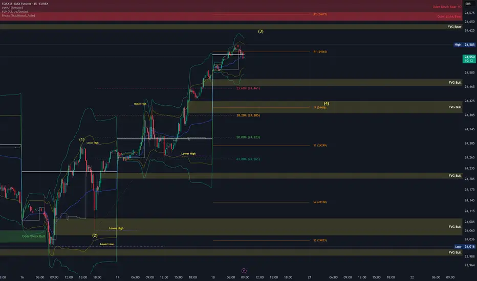
FDAX Today 1. Wave (3) likely near completion:
Price hit the 1.618 extension of Wave 1, which is textbook for a Wave 3 target.
There’s also confluence with the 23.6% retracement from the previous swing high (24,703), and we're near a Bearish FVG + Order Block zone.
High-probability zone for a short-term rejection or distribution top.
2. Wave (4) could start today
If Wave 3 is topping into OpEx, dealers might unwind long gamma hedges, contributing to volatility + pullback.
Pivot
EURUSD Bearish SMC Setup | Premium Supply Rejection + CHoCH +FVGPair: EUR/USD
Timeframe: 4H
Price reacted strongly from a Premium Selling Zone, forming multiple CHoCH (Change of Character) and BOS (Break of Structure) confirmations.
🔻 Red Zones indicate strong institutional selling
🔺 Weak High is now likely to remain protected
Market structure has shifted bearish, and price is targeting imbalances (IMB) and Fair Value Gaps (FVG) below.
⸻
✅ Entry: Taken from the premium supply rejection
🎯 Target 1: 1.16000 – Minor imbalance fill
🎯 Target 2: 1.15000 – Mid-level demand
🎯 Final Target: 1.14500 – Major liquidity zone
❌ Invalidation: Clean break above 1.18000
⸻
📉 Smart Money Confirmation Setup:
• Premium Supply
• CHoCH
• BOS
• FVG & IMB below
🔄 Missed the entry? Wait for a pullback into lower OB or supply zone.
#EURUSD #SmartMoney #SMC #CHoCH #BOS #FVG #OrderBlock #Forex #LiquiditySweep #SupplyDemand

Everybody loves Gold Part 6Great week in Part 5.
Starting this week with a strong bias towards the upside.
Here's a breakdown of trading dynamics:
1. Expecting price to break past green line, level of significance (LOS) for continuation up
2. Price might bounce back for which; will be looking for a continuation from -50/-100 or -150pips to the upside
3. Will be looking for double tops/bottom along the way
As always price action determines trades

Upward Momentum, Caution Near 106,500–110,000 Resistance__________________________________________________________________________________
Technical Overview – Summary Points
Momentum: Strong bullish bias on mid/long-term (1D-4H), short-term "Down" divergences (1H/2H). Overall alignment, no capitulation/euphoria signals.
Key supports / resistances: Supports at 103,300/102,600 (D Pivot Low, 720 Pivot). Major resistances: 106,480–109,952. Price compression under daily/weekly resistance, technical rejection risk.
Volumes: Normal to moderately high, 1H abnormal volumes signal possible squeeze.
Multi-TF: Bullish confluence 1D–6H, short-term Down divergences, caution required for late long entries under resistance.
Risk On / Risk Off Indicator: "Strong Buy" signal consolidated across all timeframes except 15min (neutral ST), sector bullish.
ISPD DIV: Neutral on all TFs – no behavioral overheating or exhaustion.
__________________________________________________________________________________
Strategic Summary
Overall bias: Bullish HTF setup (1D–4H), buy opportunities on dips towards 103,300/102,600, stop <102,000.
Risk zones: 106,480–109,950 = resistance cluster, active management required. Technical invalidation below 102,000.
Macro catalysts: Window of increased volatility 15:00–16:00 UTC (CB Consumer Confidence & Powell speech). Middle East geopolitics = “wildcard”, caution on any escalation.
Action plan: Buy on pullback, manage actively >106,000, mandatory protection during news hours, reassess post-macro-volatility.
__________________________________________________________________________________
Multi-Timeframe Analysis
1D & 12H: Upward momentum confirmed, solid supports, no exhaustion signals, Risk On / Risk Off Indicator "Strong Buy".
6H–4H: Technical and behavioral confirmation, constructive volumes, caution near immediate resistances.
2H–1H: Short-term downside divergence, 1H very high volumes = potential squeeze or shakeout, active caution required under resistance.
30min–15min: Consolidation/digestion; Risk On / Risk Off Indicator neutral at 15min, no impulsive entry point yet.
Summary: Robust up-structure on HTF, buy-side strategies on dips favoured, active management imperative near resistance and macro volatility events.
__________________________________________________________________________________
Fundamental, On-Chain & Macro Risks Analysis
Macro news: No immediate catalysts except USD news (CB Consumer Confidence, Powell) at 15:00-16H00 UTC, source of temporary volatility – no prevailing trend in question at this stage.
On-chain / Market: High volumes, institutional leadership, no “retail” panic, no flush/fomo, healthy structure.
Leverage: OI >$95B, stablecoin dominance, risk contained except on external triggers (macro, geopolitical).
Geopolitics: Middle East context = spike risk, active management mandatory on escalation.
__________________________________________________________________________________
Summary:
• Dominant bias Up (buy on dips >102,600), active management below major resistances (106,500–110,000).
• Key stop <102,000 (invalidation).
• Increased risk window: 15:00–16:00 UTC (USD news).
• Monitor leverage, adjust exposure ahead of key catalysts.

Two MAs, One Ribbon: A Smarter Way to Trade TrendsSome indicators aim to simplify. Others aim to clarify. The RedK Magic Ribbon does both, offering a clean, color-coded visualization of trend strength and agreement between two custom moving averages. Built by RedKTrader , this tool is ideal for traders who want to stay aligned with the trend and avoid the noise.
Let’s break down how it works, how we use it at Xuantify, and how it can enhance your trend-following setups.
🔍 What Is the RedK Magic Ribbon?
This indicator combines two custom moving averages:
CoRa Wave – A fast, Compound Ratio Weighted Average
RSS_WMA (LazyLine) – A slow, Smooth Weighted MA
When both lines agree on direction, the ribbon fills with:
Green – Bullish trend
Red – Bearish trend
Gray – No-trade zone (disagreement or consolidation)
Key Features:
Visual trend confirmation
No-trade zones clearly marked
Customizable smoothing and length
Works on any timeframe
🧠 How We Use It at Xuantify
We use the Magic Ribbon as a trend filter and visual guide .
1. Trend Confirmation
We only trade in the direction of the ribbon fill. Gray zones = no trades.
2. Entry Timing
We enter near the RSS_WMA (LazyLine) for optimal risk-reward. It also acts as a dynamic stop-loss guide.
🎨 Visual Cues That Matter
Green Fill – Trend is up, both MAs agree
Red Fill – Trend is down, both MAs agree
Gray Fill – No-trade zone, MAs disagree
This makes it easy to:
Avoid choppy markets
Stay aligned with the dominant trend
Spot early trend shifts
⚙️ Settings That Matter
Adjust CoRa Wave length and smoothness
Tune RSS_WMA to track price with minimal lag
Customize colors, line widths, and visibility
🧩 Best Combinations with This Indicator
We pair the Magic Ribbon with:
Structure Tools – BOS/CHOCH for context
MACD 4C – For momentum confirmation
Volume Profile – To validate breakout strength
Fair Value Gaps (FVGs) – For sniper entries
⚠️ What to Watch Out For
This is a confirmation tool , not a signal generator. Use it with structure and price action. Always backtest and adjust settings to your asset and timeframe.
🚀 Final Thoughts
If you want a clean, intuitive way to stay on the right side of the trend, the RedK Magic Ribbon is a powerful visual ally. It helps you avoid indecision and focus on high-probability setups.
What really sets the Magic Ribbon apart is the precision of its fast line—the CoRa Wave. It reacts swiftly to price action and often aligns almost perfectly with pivot reversals. This responsiveness allows traders to spot potential turning points early, giving them a valuable edge in timing entries or exits. Its accuracy in identifying momentum shifts makes it not just a trend filter, but a powerful tool for anticipating market moves with confidence.
Try it, tweak it, and let the ribbon guide your trades.

Follow the Flow: Trading with Liquidity ZonesLiquidity is where the market breathes. The Liquidity Zones indicator by BigBeluga helps traders visualize where large players may be hiding orders—revealing the zones where price is most likely to react, reverse, or accelerate.
Let’s break down how this tool works, how we use it at Xuantify, and how you can integrate it into your own strategy.
🔍 What Is the Liquidity Zones Indicator?
This open-source tool identifies pivot highs and lows filtered by volume strength and plots them as liquidity zones —highlighting areas where buy/sell orders are likely to accumulate.
Key Features:
Volume-filtered pivot detection (Low, Mid, High)
Dynamic or static liquidity zone boxes
Color intensity based on volume strength
Liquidity grab detection with visual cues
These zones act as magnets for price , helping traders anticipate where reactions, reversals, or stop hunts may occur.
🧠 How We Use It at Xuantify
We use Liquidity Zones as a contextual map for structure and execution.
1. Entry & Exit Planning
We align entries near untested liquidity zones and use them as targets for exits—especially when confirmed by structure or momentum.
2. Liquidity Grab Detection
When price pierces a zone and reverses, it often signals a liquidity sweep . We use this as a trigger for reversal setups.
3. Volume Context
Zones with higher volume intensity are prioritized. These are more likely to attract institutional activity and generate stronger reactions.
🧭 Dynamic vs. Static Zones
The indicator offers both dynamic and static zone modes:
Dynamic : Box height adjusts based on normalized volume, showing how much liquidity is likely present.
Static : Consistent box size for cleaner visuals and easier backtesting.
Why this matters:
Dynamic zones reflect real-time volume strength
Static zones offer simplicity and clarity
Both modes help visualize where price is likely to “grab” liquidity
⚙️ Settings That Matter
To get the most out of this tool, we recommend:
Volume Strength = Mid or High for cleaner zones
Enable Dynamic Mode when trading volatile assets
Use Color Intensity to quickly spot high-liquidity areas
🔗 Best Combinations with This Indicator
We pair Liquidity Zones with:
Market Structure Tools – BOS/CHOCH for context
Momentum Indicators – Like RSI or MACD for confirmation
Fair Value Gaps (FVGs) – For precision entries near liquidity
This layered approach helps us trade into liquidity , not against it.
⚠️ What to Watch Out For
Liquidity zones are not signals —they’re context . In fast-moving or low-volume markets, price may ignore zones or overshoot them. Always combine with structure and confirmation.
🔁 Repainting Behavior
The Liquidity Zones indicator is designed to be non-repainting . However, due to waiting for pivot confirmation, the zones are plotted in hindsight. This makes it suitable for real-time execution .
⏳ Lagging or Leading?
This tool is partially lagging —it waits for pivot confirmation and volume validation before plotting a zone. However, once plotted, these zones often act as leading levels , helping traders anticipate where price may react next.
🚀 Final Thoughts
The Liquidity Zones indicator by BigBeluga is a powerful visual tool for traders who want to understand where the market is likely to move—not just where it’s been. Whether you’re trading reversals, breakouts, or mean reversion, this tool helps you stay aligned with the market’s hidden intent.
Add it to your chart, test it, and see how it sharpens your edge.

Chainlink will explode this cycleChainlink has been moving sideways for the last couple of years. Fundamentally, it is one of the few entities well-positioned to dominate the space. CCIP furthers Chainlink's dominance with a stronger use case and incentives built in for users to pay with Link. With the plethora of blockchains continuing, it is obvious that no one blockchain will rule them all and Chainlink CCIP will the the standard for cross-chain transactions.
Fundamentals aside, I am a technical trader, and the fundamentals allow me to invest with little fear, however, the trader in me salivates at this chart.
I have observed that tight pivot points cause explosive upside movement. In this chart, we have the one-year, two-year, and three-year pivots, stacked on top of each other with the Bollinger band centerline and linear regression line threading them. This indicates that any further upside in price could likely trigger huge upside when this MA crosses these pivots. With three pivots, fueling the price action, what you are seeing is essentially a launchpad that will send Link to the moon. I am expecting 5x plus easy in the next 16 months, but I would not be surprised to see Link eclipse all the resistance points in the 3-year chart relatively quickly.

Dog Go To The MoonDog is poised to recover well from the bottom. It was way over sold. At this pace it'll naturally run into the weekly basis or mid BB Band, which I estimate is around May. If you bought around the range where the buy signal is, you'll probably be all right to Hodl long term. However, without a Tier 1 listing I suspect it will continue to fully retrace. So, for now the plan is to swing this till may and reassess then. Very promising project. DOG•Go•To•The•Moon•

LEAP: GBPUSD Week 16 Swing Zone/LevelsSwing zone and levels are calculated and set.
As always price action determines trades.

11-4-25 YEN Pivot LevelLevels are set
Price had swift breaks of yesterday's levels, but shows, it must react to them.

$SPY Bounce to 590s?Hey everyone, it's your boy pic. AMEX:SPY looks primed for a typical ABC correction to around 590 going into the second half of March. Chart lines up with NextPivot Indicator and FIB levels just as pretty as you please. Nice look with clear stops. Good luck!

SHORT ON EUR/AUDVery Nice Break and Retest of a Rising Channel which is a bearish reversal pattern.
Clean rejection off of a resistance pivot point.
moving averages are also nicely fanned out!
This will fall at least 100-200 pips This week.
Rock with Me!

YM pivots and targets for tomorrow/tonight YM levels for tomorrow with retracements/pivots (blue boxes) and targets (grey boxes)

Close to Key Resistance with Strong MomentumNYSE:DELL is in a clear recovery phase after a substantial drop. Following the recent uptrend, it’s now approaching a significant resistance level near $135. This resistance level represents a prior high from June, a point where price previously struggled to hold.
Volume has increased slightly on this approach, suggesting that buyers are gaining confidence. However, if the stock fails to break above this level, it could face a pullback to test the support zone around $120.
Watch for a breakout above $135 with volume confirmation, as this could signal a continuation of the upward trend.

Strong EUR? - A EUR/USD AnalysisEUR/USD has displayed bullish characteristics over the last couple of weeks.
- We have reach a high in the market @ 1.095.
- This high was made after a bullish A,B,C,D pattern aka (Trend).
- In bullish markets, prices tend to find support at the previous high, the previous high in this market (To me) is @ 1.085.
- We currently have made a bullish pin bar rejection candle on 3/19/2024.
- Currently we have untapped orders at 1.098, this is where I believe prices want to go in the next month.
- Breaking the 1.098 level, could lead to a bigger move up toward 1.11.
** as always, trade smart, trade responsible, and manage the risk as much as the reward **

payo are you gonna correct?after the great boom payo brought us some great profits. tbh i havent closed anything and i am still bullish on payo.
payo accumulation and bingbongdingdong has been formed for 3 years as of this moment we are attempting to turn previous critical resistance into support.
2 scenerios according to wykoff theory.
1. correction then big money needs to defend its positions and at a reasonable price.
fundementally that could be previous value area high (vah upper white line) because we need to create a new value range it would only make sense to turn vah to the new point of control (poc) or the new value area low (where price is traded the most e.g mid range val bottom area)
another point to consider for the correction is the gap, so previous point of control to turn value area low or a sweep to that level would provide 4 things
first it will close the gap and get rid of that imbalance.
2nd it will shake off weak hands and get rid of breakout traders when it
grabs the single print
3rd it will provide a decent price for big money to enter at.. liquidity liquidity liqduidity.
4th provide the oprotunity for hedge shorting and basically thats more fuel to the upside when said shorts close. (so basically proffesionals get paid to pump the market for free)
2. leave everyone behind everyone whos waiting for the correction. that scenerio is less likely to anticipate, depends more on the company preformance and has less upside for big money that wants to accumulate low and provide big gains.
i believe the first scenerio is more likely that the other one.
the teal circles on the green lines are where i am looking to see reactions for swing fail patterns and adding to my positions
luckily i already have an open position on payo for quite a while now, so im chilling.

ETH Journey to 2025: Key Levels and Market ScenariosHello friends,
In late 2021, Ethereum ( BINANCE:ETHUSDT ) reached an all-time high of approximately $4,900 before experiencing a significant correction, dropping around 80% to a low of $880. Since that dip, ETH has been consistently making higher highs and higher lows, suggesting a potential long-term bullish trend.
I'm focusing on these key levels as important points for any macro cycle movement:
Pivot Points High Low Levels:
HH: $4,100 (Near ATH)
HH: $2,700 (Previous resistance)
HH/LL: $2,100 (Critical pivot)
LL: $1,500
LL: $880 (2022 low)
Bollinger Bands Analysis :
Currently, ETH is within the lower Bollinger Band, indicating a potential oversold condition. Historically, this has been a favorable zone for accumulation, as the price may revert to the mean once the selling pressure eases.
Potential Scenarios:
Bullish Case:
The most critical level to watch is $2,700. A decisive break above this level could pave the way for ETH to challenge the psychologically important $3,000 mark. If ETH can establish $3,000 as support, it would confirm a higher high and potentially signal the start of a new macro bull cycle.
Consolidation Case:
ETH may continue to trade between the $2,100 support and $2,700 resistance, forming a tightening range. This consolidation could set the stage for a significant move once resolved.
Bearish Case:
A failure to hold above $2,100 could lead to a retest of lower support levels. However, as long as ETH maintains its pattern of higher lows, the long-term bullish structure remains intact.
Conclusion:
The $3,000 level appears to be the key for initiating a potential macro bull cycle. Accumulation near the lower Bollinger Band could be a strategic move for those bullish on ETH's long-term prospects.
Risk Management:
Consider using the $2,100 level as a potential stop-loss for long positions, as a break below this level could invalidate the bullish thesis.
Happy Trading!

New Features For Dynamic Pivot Levels - Percentage indicatorIn our latest update, we’ve packed in some exciting new features and enhancements that will elevate your analysis experience to the next level:
Exciting New Features: We’ve added additional Exponential Moving Averages (EMAs), allowing you to track five different EMAs tailored to your needs. But that’s not all – we’ve introduced smiley indicators that give you instant feedback on whether the price is above or below the moving average. Now you can analyze with a clean, clutter-free chart!
Fibonacci Level Enhancements: We’ve upgraded the logic behind Fibonacci levels to give you more accurate insights. The improved Fibonacci calculations provide a clearer, more precise visual representation, helping you make better-informed decisions.
A Sleek, Streamlined User Interface: We know how important it is to work with a smart, efficient tool, so we’ve revamped the user interface! Settings are now neatly organized into categories, allowing you to quickly and easily customize everything you need. This makes your workflow smoother and faster.
This update doesn’t just bring new capabilities – it makes the tool more accessible and user-friendly than ever. It’s your key to staying focused on precision analysis, without the distractions!

USD/CHF: Bearish Bias with Key Levels in FocusThe USD/CHF pair is showing a continued bearish outlook, with an expected range around 0.84481. A potential bullish scenario is only likely to emerge if the price breaks above the key resistance level of 0.85341.
⚠️ Key Pivot Level: The daily pivot at 0.85042 is critical, as it may serve as a reversal point for the current upward move. Keep a close eye on this level for any shifts in momentum.

Bitcoin’s Pivotal Moment: Key Technical and Fundamental InsightsTechnical Analysis
Neutral:
1 - Price action has been fluctuating in a falling channel from around the 1 March 2024 and appears to be respecting support and resistance lines since.
2 - Price has fallen 28% since ATH compared to the 56% crash in the previous cycle during the same period.
Bearish:
1 - Price fell below the 125 day SMA level around the 20th of June and has been trading below since.
2 - The 60,000 BTC/USD psychological level has also been broken and not regained for approx 2 weeks.
3 - Volume since ATH has been approximately 7% over the same period in previous cycle.
4 - Price has clear short term bearish momentum
Bullish:
1 - Subtle Bullish Divergence on the RSI chart
2 - Price is trading above the shaded support area supported by volume session profile and clear historical trends.
3 - Extreme Fear displayed on the Fear and greed index.
Fundamental Analysis:
1 - Real GDP has grown consistently over the past 10 quarters.
2 - Inflation appears to be easing with new US CPI appear beating analysts estimates but concerns about being behind the curve estimating a inflation to rise again in the winter.
3 - Short term unemployment data seems improving but as interest rates are still high a record number of credit defaults occurring which could potentially lead to worsened employment data by end of year.
4 - Gold price hitting ATH reflecting uncertainty due to heightened geopolitical tension.
Pattern
A cup and handle formation can be observed since Nov 2021 but handle seems elongated which might invalidate such pattern.
Summary:
With the current Bitcoin price at $58,637 and a 50% increase YTD, we can assert that the market is still in a bullish cycle. However, some critical points need to be analysed. Technical indicators suggest that Bitcoin is trading at a crucial level. A breakdown below the $53,000 level would not inspire confidence and is likely to lead to a continuation down to the $49,500 level. This is a significant threshold, as a break below it could trigger substantial selling pressure.
For Bitcoin to reverse this trend, it is crucial to reclaim the $60,000 psychological level, with trading above $61,000 providing confirmation. Subsequently, reclaiming the critical SMA level around $65,000 could likely lead to a new all-time high. Macro indicators suggest that most positive news has already been priced in. However, the overall geopolitical climate is radiating uncertainty, which is negative for the market. This is exacerbated by factors such as the upcoming US elections, the Ukraine-Russia conflict, and the Israel-Gaza conflict.Additionally, the Bitcoin hash rate is falling for the first time in two years, though a short-term drop does not confirm a long-term trend.
Given these factors, I believe that BTC/USD will continue to trend downward in the short term until approximately late August/early September. The extent of this downward trend will depend on the behaviour at the key levels mentioned and the global climate. A reclaim of $65,000 would invalidate this bearish outlook.

$INJ setup for 50% gain on next days, 3D timeframeCRYPTOCAP:INJ setup for 50% gain on next days, 3D timeframe:
We are on 3D timeframe here. Blue arrows number '1' and '2', were bottom pivots on Hodlfire Indicator (copyrighted) right over the Exponential Moving Average 200 (3D 200EMA) line (green), and we just got a 3rd, right over the 200EMA again (the last blue panel under late price movements)
So, as we are pivotting the bottom here, we expect next target on the last reset of VWAP line (orange line) at 38.60 usd, bringing over 50%
There was a first and second confirmation of trend, (1.) the support on all-time-high of the last cicle (pink line) and (2.) break of diagonal blue trendline; if you want to wait for another confirmation, the 3rd, just wait suport over the black VWAP quarter line around 27.00 usd

A little bot moreThe pair is heading to an important demand zone. I think next or the next after is going to start going up. I'll be waiting for price action in the daily timeframe.

EURUSD: We are waiting for a breakHello traders,
The bearish channel is obvious in the chart! you can see that upward moves are weak but the downwards are so strong. I consider the trend to be bearish. However, while my total bias over the pair is still bearish I think any breaks over the zone might lead the price to reach the next strong zone which is around 1.0790
At the same time breaking the bullish yellow trend line down and the zone would alter our bearish scenario. Can't wait to the results.
Have fun and enjoy your life.
