Gold up move has lost momentum - and looks correctiveSignificant loss of upside momentum on the daily RSI suggests that the gold market is vulnerable to a correction short term, you may wish to tighten up those stops.
The information posted on Trading View is for informative purposes and is not intended to constitute advice in any form, including but not limited to investment, accounting, tax, legal or regulatory advice. The information therefore has no regard to the specific investment objectives, financial situation or particular needs of any specific recipient. Opinions expressed are our current opinions as of the date appearing on Trading View only. All illustrations, forecasts or hypothetical data are for illustrative purposes only. The Society of Technical Analysts Ltd does not make representation that the information provided is appropriate for use in all jurisdictions or by all Investors or other potential Investors. Parties are therefore responsible for compliance with applicable local laws and regulations. The Society of Technical Analysts will not be held liable for any loss or damage resulting directly or indirectly from the use of any information on this site.
Rsi_divergence

📉BTC Looking for a move up📈BINANCE:BTCUSDT
COINBASE:BTCUSD
Bitcoin analytical series S01E04!!!
Hello traders, Don't forget to risk-free your positions.
Please share ideas and leave a comment,
Let me know what's your idea.
CrazyS✌

Curious SymmetryNotice how similar the patterns highlighted. Diverging RSI with higher prices;
Exact RSI pattern as well. Could be setup for another drop, keep an eye out!

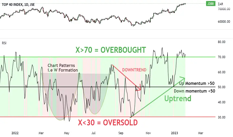
HOW IT WORKS: RSI (Relative Strength Index) IndicatorThe RSI is a popular momentum indicator used in technical analysis. It was originally developed by a mechanical engineer turned technical analyst J. Welles Wilder Jr.
It was first published in a 1978 book, “New Concepts in Technical Trading Systems” and in Commodities Magazine (Futures magazine) in June’s 1978 issue.
Today the RSI is one of the most popular indicators used to measure the speed and change of price movements.
In other words, it measures the strength of its trend direction (up, down and sideways) on any market by monitoring the changes in its closing price.
THE MAKE UP
The RSI is a line graph that moves between two extremes…
On the vertical axis (Y-Axis) the RSI line moves up and down in a range between 0 and 100.
NOTE: As the indicator is between a range, it is considered a closed indicator.
On the horizontal axis (X-Axis), the RSI line moves to the right which is plotted as time.
NOTE: You can choose your own time frame i.e. days, hours, minutes etc…
For all you technical boffins…
If you want to know how the RSI is calculated, I’ve saved this at the end of the article.
As a trader you won’t need to worry about the maths at all.
Three trading signals you’ll use with the RSI
1. Overbought and Oversold levels
2. Patterns and Trend lines
3. Bullish and Bearish Divergences
Trading signal 1:
Overbought and Oversold levels
When we see the market’s price move up, this means the buyers are outweighing the sellers.
And the more higher closing prices we see, on a market, the higher the RSI line moves…
When we see the market’s price drop, this means the sellers outweigh the buyers.
And the more lower closing prices we see, on a given market, the lower the RSI line moves…
However…
If the buying continues at an unsustainable rate, the RSI will reach a point that traders call OVERBOUGHT (top heavy).
This is where we could start to expect the price to drop from these levels and for the market to enter into a correction (dip).
If the selling volume continues at an unsustainable rate, the RSI will reach a point that traders call OVERSOLD (undervalued).
This is where we could start to expect the price to turn up from these levels and for the market to enter into a recovery (upside).
Now that you understand overbought and oversold terms, let’s explain what I mean with the RSI chart.
Overbought RSI: 70 (Sell opportunity)
When you see the RSI line touch or cross above 70 (Red horizontal line), this is considered an overbought situation.
At this point, traders may start to anticipate that the rising trend is about to end.
Traders may then start to prepare to sell and short their positions, as they believe the market’s price has run up too much.
If the market then turns down and starts to drop in price, the RSI line will drop below 70 and head back to equilibrium at 50 (Black horizontal line).
Oversold RSI: 30 (Buy opportunity)
When you see the RSI line touch or cross below 30 (Green horizontal line), this is considered an oversold situation.
At this point, traders may start to anticipate that the falling trend is about to end.
Traders may then start to buy (go long) their positions, as they believe the market’s price has dropped too much.
If the market then turns up from the 30 mark and starts to rise in price, the RSI line will move back to equilibrium at 50 (Black horizontal line).
Trading signal #2:
Trend lines & Patterns
The second way to spot buying and selling trade ideas is with trend lines and patterns.
Uptrend confirmation
To confirm the strength of the market’s uptrend, you should be able to draw a support (floor level) under the high low RSI prices.
And when the RSI breaks below the support line, it could signal the end of the uptrend and a start to the next bear market.
Downtrend confirmation
To confirm the strength of the market’s downtrend, you should be able to draw a resistance (ceiling level) over the lower RSI high prices.
And when the RSI breaks above the resistance line, it could signal the end of the downtrend and a start to the next bull market.
These are great confirmation and reversal trading signals to use with your strategy.
NOTE: You can also base your buy or sell ideas on trading chart patterns…
Trading signal #3:
Bullish & Bearish Divergence
The third signal I use to spot trade opportunities with the RSI is looking at the market’s price VERSUS the RSI’s direction.
In short…
BEARISH DIVERGENCE – Warning for downside
If the markets price makes higher lows, while the RSI makes lower highs – it’s a warning for DOWNSIDE to come.
BULLISH DIVERGENCE – Sign for upside
If the markets price makes lower highs, while the RSI makes higher lows – it’s a signal for UPSIDE to come.
Either way with both bullish and bearish divergences, the RSI fails to accept the current market’s price movements.
And so it is making a probability prediction that soon the market will make a reversal in its current trend.
Ok so now you know how the RSI works. Let’s sum up what we learnt.
RSI Summary in 3 Trading Signs:
Trading signal #1:
Overbought & Oversold levels
Overbought zone X > 70 = Selling opportunity
Neutral zone: X = 50
Oversold zone X < 30 = Buying opportunity
Trading signal #2:
Trend lines & Chart patterns
Uptrend confirmation: RSI makes higher lows (draw support line)
Downtrend confirmation: RSI makes lower highs (draw resistance line)
Breakout confirmation: RSI breaks out of a chart pattern
Trading signal #3:
Bullish & Bearish Divergence
Bullish divergence: Market’s price – lower highs
RSI – higher lows
Bearish divergence: Market’s price – higher lows
RSI – lower highs
Here’s how to calculate the RSI
The most common (default) settings for the RSI is 14 (Which we’ll use))
There is a two-part calculation with the RSI.
Part 1: Calculate the RSI (step 1)
RS or Relative Strength is (Average Gain ÷ Average Loss)
Average Gain = (Sum of gains over the past 14 periods) ÷ 14
Average Goss = (Sum of losses over the past 14 periods) ÷14
Calculate the RSI (Step 1)
Part 2: Calculate the RSI (Step 2)
Once you have this result, we then smoothen the RSI result with part 2…
And so that’s how the RSI continues with each closing price of the time frame you choose.
Trade well, live free.
Timon
(Financial trader since 2003)
ETH Long to 2000 USDTDear All, welcome to our trading ideas section.
This is not investment advice, and we are just sharing our point of view on what we see on the chart.
In this Chart we are using the TFLOW V3 MTF Indicator, which is our product as well as the MACD, Volume Profile and CHOP LRSI V1 (we keep only the LRSI).
We go to the weekly chart to see the bigger picture.
So the indicators show us that:
The MACD is heading to point zero so we have a reversal in motion.
The LRSI is showing us that there is plenty of energy to move the price.
The Cap & Handle Pattern shows us that the target price for ETH is 2000.

$BTC Overbought #RSIDo you know about #RSI?
RSI is the Relative Strength Index and can be utilized as a confluence indicator to see when a stock/crypto is overbought/oversold.
Here we can see $BTC is WELL oversold and in dire need of a retracement.

BTCUSDT BearishBTCUSDT is at its resistance level and also forming double top formation.
Also we can there is a bearish divergence on The relative strength index (RSI) and also BTC is at very mush over bought position.
As we saw on 13 sept 2022 there was a huge bearish candle on this level.
BTC can fall down from this point, we have to wait for today's candle closing, bearish side seems strong.

ETHUSD - Overbought - Bearish DivergenceOn the 4h-timeframe (left chart) chart of Ethereum (ETHUSD) we can see bearish regular divergence has appeared. Divergence is a strong indication that the price will move in the opposite direction. This chart is showing that it is likely for the price to drop.
On the 1d-timeframe (right chart) of Ethereum (ETHUSD) we can see an overbought condition. The three indicators are all suggesting this condition and it is likely for the price to drop. The three indicators used are the Bollinger Bands, RSI, and the Stochastics.
There are two indications on different timeframes and are complementary to each other and suggest that the price will drop.
All further details are shown on the charts.
Good luck!

Simple ETH SHORTSimple ETH Bearish divergence Losing steam on 4H RSI and clear bearish divergence on AO. Bears have been taking control above mondays high per fixed range volume profile im looking to enter on lower tf break in market structure.

LONG WINTERInvestor is back, so it´s Bears hibernation time.
Guess what, my oldie bull divergence explanatory Bitcoin chart is still alive and ...
I think that Bitcoin might be in the anomaly state where HIGH RSI doesnt mean a :poo: bear divergences are painted over higher time frames but yet its ignored and going higher and higher until a huge extended bear divergence smashes for a massive and fast correction and it can even continue growing higher.
There is many reasons for this and if you will studdy the chart further and deeply then you might found the key in this work.
Yet keep in mind, there is still chance to fail if the RED LINE resistance doesn´t get break threw in a short period of time.
This short term chart might be a first confirmation for this theory
Can history repeat itself ? Again & again ?
Crypto TOTAL market cap to 10T ?
s3.tradingview.com
The time is NOW
----------------------------
BITCOIN HALVING
(MAJOR EVENT) countdown at the time of writing
434days
What is the Bitcoin Halving (Halvening)?
New bitcoins are issued by the Bitcoin network every 10 minutes. For the first four years of Bitcoin's existence, the amount of new bitcoins issued every 10 minutes was 50. Every four years, this number is cut in half. The day the amount halves is called a "halving" or "halvening".
In 2012, the amount of new bitcoins issued every 10 minutes dropped from 50 bitcoins to 25. In 2016, it dropped from 25 to 12.5. In the most recent May 11, 2020 halving, the reward dropped from 12.5 to 6.25 BTC per block.
In the 2024 halving, the reward will drop from 6.25 BTC per block to 3.125 BTC.
----------------------------
R:R, money management, risk, reward, technique, style, trading, bitcoin , bitcointrading, profitable trading, profittrading, profit trading, secret, divergence, bull divergence, bear divergence, divergencetrading, divergence trading, trading strategy, how to trade bitcoin , bitcoin trades, bitcoin trading, make profit, take profit, trading strategy, trading technique, successful, successful trader, successful technique, successful strategy, successful secret, how to trade, trend analysis, technical analysis , indicators, rsi , relative strenght index, let it rain, successful life, easy strategy, easy trading, easy technique, make money, crypto investing, investing, crypto, cryptocurrency, cryptocurrencies, mentoring, money, chartart, beyond

ES Futures Bear Div
RSI Bear Div + RSI-Stoch Bear Div in overbought zones, in line with ATH trendline, wouldn't be surprised to see a bull trap around 4070. Bulls will think ATH trendline is broke but just testing VWAP from ATH middle band.

DXY DivergenceThe USD has been dumping after an epic run, back into support zones.
I dont quite trade RSI (as its not as reliable) , but here we have a strong downtrend pulling back into support with a slight bearish divergence.
ES and BTC have been moving relatively strong in the last few weeks...
Well see how things play out.

Oceanusdt local shortThe OCEAN price formed a RSI and MACD divergence at 8h tf and RSI is located at overbought zone.
Also there are a MOM and OBV divergences.
All of them go over to longer timeframes.
It could bring the price to 0.2 level.

EUR/USD trading near key retracement levelEUR/USD is trading near the 61.8% Fibonacci retracement from the high of 2022 to the low of 2022, near 1.0747. The area also confluences with the bottom trendline of an upward sloping channel that the pair was in until January 3rd.
If price closes above 1.0747, the next resistance isn’t until 1.0937. Above there, price can move to the highs of March 31st at 1.1185.
However, notice that price is diverging with the RSI, an indication of a possible pullback. If price does pull back, support is at the January 6th lows of 1.0482, then the 200 Day Moving Average at 1.0310. If EUR/USD breaks below the key moving average, the next support is at the highs from October 27th at 1.0094.

BTC RSI positive divergence & high volumePositive RSI divergence on weekly interval and high volume. Might indicate reversal to upside.

View on BTC$ LONGTERMY’all can clearly see a downtrend reversal pattern on the chat on the daily time frame (CUP AND HANDLE) which suggests the bulls might be taking charge of the market in no time. I have a few bias tho. Aside from a few strong resistance zones which might make this difficult, RSI shows divergence to the upside heading for an overbuy zone. This is my view, might be wrong. Feel free to analyze with me, if I’m wrong tell me why you think I am.

Bitcoin Bearish Divergence RSIAs you can see Bitcoin is forming a bearish divergence on the 4 hourly chart which could cause a short-term reversal in price to the two potential support lines.

YINN China Leveraged 3x Bull Setting Up Reversal ShortYINN the China Bull EFT has uptrended dramatically of late however
it is far extended above its moving averages while the RSI indicator shows
decreasing strength as a divergence. Price rise is hitting the resistance of
the POC line of the intermediate-term volume profile where sellers will
step in and invoke selling pressure in a triple top making the resistance strong.
I expect it to drop now and perhaps dramatically,. Inversely the YANG
ETF, a bearish leveraged fund will rise. By a Fibonacci analysis, a 15%
drop is expected before another inflection. Accordingly, I would set
up a stop loss of 3-5% on the short swing trade setup .

XOM Long position - BUY - Similar pattern to 23rd Sept 2021.
Immediate-term confirmations from Stochastics, RSI, MACD.
If trends repeats and continues, estimated time to profitability is 4 months ~ May 2023.
Bearish engulfing candle gives a good confirmation of entry point at 110.
Stop-Loss of 10%.

RAD bullish pattern repetition?Similar pattern formation to Jul and Oct 2022.
High Stoch and strength from a rising RSI can help boost the price over an estimated 3-month range.
MACD at zero level cross. Good entry point. We want to see this MACD maintain well over the zero level along with an RSI maintained over 50.
More peaks above 80 in Stochastics can help support the bullish thesis.
Assumption is a Q3-2022 pattern repetition.
A bullish engulfing candle is expected but is a lagging indicator on such a chart. It can be used as a trend confirmation.

APPL bearish signalMACD has been below zero level for past few days and volume profile is in the red.
RSI struggling to stay above 50 level. Has broken below 20 level multiple times and not crossed 80 level over the past few days. This is a bearish sentiment.
Stochastic has been below 20 level for the past few days and struggled to cross the 80 level. This shows price is biased more towards the 52 week lows.

Price Action Analysis of Corn Futuresas we can see the apparent divergence was shown between April 2021 and April 2022.
followed by a drop-down below 0.236 Fibonacci level.
the price is still moving in a trading range which makes it hard to predict his next move.
Break bellow MA 209 with Big Volume signal a short entry.

SPY Consolidation going into expansionGreat time to start trading based on the expansion direction of SPY in the coming week.
Using RSI and Fibs, along with candlestick patterns, there are potential patterns to emerge from this.
Currently loading up on Calls for 3/31 $410
Starting small position in 2/17 $350 Put
Will trim and add based on the expansion momentum next week. Using 15min RSI diversions and min max levels to load and trim corresponding options.
Expecting SPY to retest $400-410 zone, then test $360-330 zone before starting new bull wave.
