Silver Destined to Break Multi Year ResistanceWhat a time to be a trader...and what a day! U.S. markets gapped up and held their gains throughout todays session after Moderna, Inc. reported positive phase 1 results of a potential Covid-19 vaccine. Could it really be that simple for the bulls? It'll be interesting to see how the market reacts when the Fed Chair Jerome Powell speaks at a scheduled Senate hearing tomorrow. Perhaps the Dow rips another 1000 points or maybe, just maybe the long side is getting too crowded? More on this on upcoming posts. Today, I wanted to go over Silver .
It's Happening!
Yes, we told you so! More than a week ago we mentioned how Silver could potentially begin to out perform Gold in the coming weeks. Well, it has! Already out performing Gold by nearly 10% since last Thursday. Sure, Gold is up significantly over the last year but, the reason why I am so excited is because Silver could just be getting started. Want the proof? Let's take at some charts below.
Above is the daily chart of Silver. Currently Silver is getting rejected off a six month cluster of resistance. It wouldn't surprise me if price took a breather before heading higher. RSI is approaching overbought levels, so any price action higher would lead to bearish divergence potentially requiring resolution. Stacking bids at the support highlighted would serve as optimal entires.
Next, is the weekly chart of silver (see below). Notice how I have't updated resistance #1 . Yes, we broke above it, but we haven't had confirmation of support. This will likely end up being support but in trading you never take things as 100% certainty.
I also added a comment in between stating that the current range silver is trading within could be considered a no trade zone. What I am getting at is not to FOMO . Be smart on your approach. Let price consolidate and provide us with clear entries. With that said, if Silver does continue to rip higher, a daily close above the resistance #2 which coincides with a major descending trendline could be a breakout entry. Of course, practice good risk management by using stops.
The most bullish signal in more than a decade may be on the monthly chart below.
Above, you'll see the last two instances when Silver was either at or crossing the 20 SMA and experienced a bullish MACD cross within the positive territory. Yup, It's happening again! Will history repeat itself? I am betting that it will. Bias: Bullish .
More than Silver
Alternatives to buying Silver are ETFs and also silver miners. I'll be touching up these stocks in upcoming posts.
Have a great evening and happy trading!
SLV

SILVER: potential bearish ABCD pattern. Retrace almost DONE!SILVER: potential bearish ABCD pattern. Retrace almost DONE!
Define stops according to your risk profile.

SIlver (USD)- Monthly chart. Must break out of downslopping chanSIlver (USD)- Monthly chart. Must break out of down-slopping channel (pink).
Sadly, hasn't even retraced past the 23.6% Fib Retracement from the 2011 highs.
Silver (USD)- clearly has a lot of work to do to recover from the blow off top of 2011.

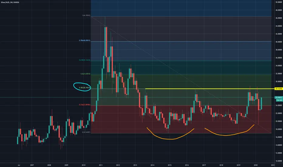
Silver (AUD)- Monthly chart. Forming Double bottom.Silver (AUD)- Monthly chart. Potentially forming a Double bottom.
Note over head resistance (yellow line)- 4 failed previous attempts.
Yellow line also coincides with 38.2% Fib retracement from the 2011 highs. So a very important line to break to complete Double bottom.


BREAKTHROUGH The iShares Silver Trust (the 'Trust') seeks to reflect generally the performance of the price of silver.Silver exchange-traded funds (ETFs) closely track the price of silver and are generally more liquid than owning the precious metal itself. Like other precious metals, silver ETFs are favored by investors seeking a hedge against inflation or a safe haven in times of market turmoil. Their Stock chart value said to bullish $15.3. Silver now a days potentially in demand This market is just so fantastic.Wanna Know More About Bullish Strategy READ MORE:

Gold to Silver Ratio FallingThis ratio shows the amount of silver it takes to equal one ounce of gold in price. When the ratio is rising it means that gold is outperforming silver; when the ratio is falling it means that silver is outperforming gold.
The gold to silver ratio is currently at 106 and falling after hitting an all-time high of 126:1. The average ratio in modern times is about 50:1, with the long-term historical average dating back 5,000 years being closer to 15:1. In recent times, 80:1 was about the peak we would see in the ratio before it would fall again, so the recent jump to 126 was more than likely a once-in-a-lifetime event as silver became severely undervalued compared to gold.
The chart currently shows three yellow price candles which indicates that extreme bullish volatility was experienced in the move up as gold outperformed silver. This was most likely due to investors fleeing to gold due to its main function being a store of value, while silver failed to see the same gains due to it mostly being an industrial metal, and since global production has dropped off during the virus outbreak silver was not in high demand. That trend appears to now be shifting in silver's favor due to the extreme disconnect in the ratio.
The three yellow price candles show a strong move up on the first yellow candle, followed by a second yellow candle with a small body and long lower wick, and now the current price candle is retreating. This three-candle pattern resembles a hanging man reversal candle pattern with the second yellow candle being the hanging man candle. This occurs when the price of an asset sees high demand, and then a sudden pause as traders become indecisive, followed by a reversal. This pattern tends to mark the top of price advance, and since we are looking at the gold-to-silver ratio it likely means that we have seen the end of gold outperforming silver, at least in the short-term, and can expect silver to now begin to outperform gold.
The expected move going forward is a decline in the ratio back to 80:1, and more than likely being followed by an undershoot back down to 50:1. If you're playing precious metals, now would be a good time to go heavier in silver trades and then convert back to gold when the ratio hits 50:1 or lower.


Silver vs. GoldIf a bull market in precious metals is truly underway, we want to see silver outperforming gold!


THE WEEK AHEAD: CSCO, SLV, IWM, VIX/VIX DERIVATIVESEARNINGS:
CSCO (46/40) announces earnings on Wednesday after market close. The metrics aren't ideal here with the at-the-money 42.5 short straddle in June paying 4.39, just a smidge north of 10% of the value of the underlying (10.2% to be exact) and the month to month implied differential almost nil (June's at 40.5, July at 40.3%). Nevertheless, a bet that CSCO stays within its expected move -- the June 19th 40/46 short strangle is paying 2.00 at the mid price here with break evens at 37.99/48.01.
EXCHANGE-TRADED FUNDS ORDERED BY RANK WITH >35% IMPLIED:
SLV (62/44)
EWZ (51/63)
GDXJ (51/63)
GDX (49/51)
EWW (45/40)
XLE (41/48)
USO (34/110)
SMH (32/38)
XOP (30/61)
BROAD MARKET FUNDS ORDERED BY RANK:
IWM (52/42)
EEM (39/31)
EFA (35/24)
QQQ (30/29)
SPY (26/28)
IRA DIVVY-PAYERS ORDERED BY RANK:
EWZ (51/63), 5.15% Yield
EWA (51/42), 5.31% Yield
EWW (45/40), 4.26% Yield
IYR (43/34), 3.77% Yield
XLU (41/31), 3.48% Yield
EWU (37/28), 5.56% Yield
EFA (35/24), 3.79% Yield
HYG (28/18), 5.49% Yield
TLT (27/21), 1.79% Yield
SPY (26/28), 1.98% Yield
EMB (26/20), 4.92% Yield
Notes: Kind of a new section here to track background IV for potential acquisitional plays for the IRA in dividend yielding exchange-traded funds. Currently, running short put ladders in IYR, HYG, XLU, and EWA, but now that I've gotten organized here, may consider similar setups in EWZ (5.15% yield), EWW (5.31%), and EWU (5.56%).
VIX/VIX DERIVATIVES:
VIX finished the week at 27.98 with the /VX term structure in front months contango. Back months are still "wonky" and present a (for lack of a better word) sinuous path from here to December.
TRADE OF THE WEEK:
Pictured here is a Plain Jane delta neutral IWM short strangle in the June cycle (40 days) paying 3.37 at the mid price. The highest implied, broad market exchange-traded fund on the board at the moment.

Silver Could Outperform Gold in Coming WeeksToday is the big day! The Bureau of Labor Statistics releases the unemployment number at 8:30AM EST. As I am writing this post, U.S. index futures are pointing up and so are Gold and Silver . This morning I'll be touching upon the CBOE Volatility Index (VIX) and Silver Futures (SI!).
The VIX
Bears will be watching the VIX closely today and they should be. Below is the monthly chart of the VIX.
Is it possible to build a bearish case for major indicies with the VIX? Maybe. It's a difficult instrument to chart when using indicators. So instead, I like to use the line chart to cancel out the noise. Notice how support and resistance comes out more cleanly.
Lastly, if you follow the URL below is an image of how the Put/Call ratio is now at its lowest point since early March. Sentiment in the market could be getting overly bullish.
stockcharts.com
Short term, I could see a rise on the VIX. Bias: Bullish .
Silver or is it a Slug?
I've been reading a lot of articles on Gold and how Silver is a major laggard. It's true, Silver moves a hell of a lot slower than Gold. However, that could be changing soon. The chart below is the weekly view of Silver Futures.
The sell off in March in my view was the definition of a terminal shakeout. Price should not retest those lows. If it did it would be bearish. There is strong support between 13.70 - 14 and dips are for buying.
On the chart I highlight the divergence between price and Chaikin Money Flow (CMF) during the sell off in March. Though, a technician should not use CMF by itself. Confirmation is required when a divergence like this is spotted. Here I am looking at MACD to confirm the CMF bullish divergence. Silver may be a few weeks away and could potentially outperform Gold. I'll be keeping an eye on this one! Bias: Bullish .
Happy Friday everyone and good luck trading the employment numbers this morning!

Silver Trendline TestSilver(Sl1!) closed at $15.59 from an opening price of $14.92 for a gain of $0.67(+4.49%) today. Price also closed just above the orange downtrend resistance line which is bullish seeing as how this line has been acting as resistance since early April. Going forward, we need to see price hold above the orange resistance line and make an eventual push above the horizontal red line at $16.30 which is a strong price level stretching back to July 2019 where price peaked and then eventually rose above, and then found support at again in late 2019. This level briefly acted as support in February 2020, but then failed in March with a rejection at that level coming in again in April. A move above $16.30 would be significant and likely mark the beginning of a new push back up toward $19. The stop-loss level for long trades rests at $14.50 which is near the low made in mid-April, as long as price remains above that level the short-term trend will remain bullish.
The Relative Strength Index(RSI) show the green RSI line rising up off of the 50 level which is the midpoint of the total RSI range. An RSI reading above 50 indicates bullish price momentum while a reading below 50 indicates bearish price momentum. The purple RSI signal line is also rising, but remains below the 50 level with a cross above looking to come soon. The signal line indicates intermediate-term momentum so that line rising above the 50 level would be another bullish indication that price is gaining upward momentum.
The Price Percent Oscillator(PPO) show the green PPO line and purple signal line overlapping at the 0 level. In general, you want to see the green line rising above the purple line and for both lines to be trending up and above the 0 level. Both lines trending up above the 0 level indicates bullish price momentum.
The Average Directional Movement Index(ADX) show the green direction line trending above the purple direction line which indicates a positive trend in price. The histogram behind the ADX lines is trending flat which indicates no strength in the trend yet. In general during an uptrend, you want to see the green line rising above the purple line and for the histogram bars to be rising as a sign that the trend is increasing in strength.
Volume is relatively low, but beginning to show a slight uptick. Should price continue higher we would want to see volume rise in order to sustain the movement in price to the upside.
Overall, silver is looking good here today with the strong move in gold. The gold-to-silver ratio remains near all-time highs at 112:1, meaning it takes 112 ounces of silver to equal ounce of gold in price. Historically, a ratio of 80:1 is considered high and a good time to enter silver trades. The historical average over the past 5,000 years is a ratio of 15:1, so we’re either looking at gold price being extremely overvalued, or silver being extremely undervalued. It’s my opinion that both are still very undervalued with silver being the more extreme of the two. As gold continues to gain in price I expect silver begin to close that ratio and outperform gold as silver usually does during periods of bullish trends in the precious metals space.

Tricky Silver, Tricky Metals...Silver looks bearish but it will follow gold.
In the bullish count, we don't have the 1-4 overlap to define the upward sub structure as a leading diagonal. Very tricky.
Algos are pushing prices higher.


QQQ - Test of the High FailYesterday the battle to take out 219.07 raged on but in the end, The Qs fell short of taking out the monthly closing high. This is my first major sell signal. It is possible that prices will move higher as the inter-month high in February moved above 237, still nearly 10% higher than current prices so I will look for inter-month, i.e., daily or weekly signals in addition to other statistical indicators I follow to give me a better timing model. I traded SQQQ this week, a 3X down but decided I did not want to be that aggressive trying to pick a top, especially in a vehicle that has been as strong as QQQ even as we face a possible depression of unknown proportions.
For now, I am totally on the sidelines (stocks) with only a position in SDS, a 2X down instrument for SPX. I liquidated gold and silver stocks for the week but have October puts and short calls on SLV. While the trading action this week has shown strength, seems that the gold/silver cycle is topping and I wait patiently for better prices.
