Collapse of SPX? $SPX broke out of a bigger bear flag possibly forming another for the continuation. As money has flowed out of $SPX there is a chance it can continue to flow out.
Target 1: $3721.05
Target 2: $3582.29
Swing Trade
Spyshort

next possible spy box range.up, down, up, down. it all repeats itself. As we near a possible breakout from this annoying range here is my speculation of the next range if we break to the upside. We may not break upward this time though as markets conditions get stricter and interest rates harsher all this noise about the FED and their power may force spy down making it a bystander to this range expectation. Happy trading!

ES EZ SHORTSES/SPY/SPX is currently in a consolidation pattern. The S&P tends to make a big move out of these consolidation patterns once they are given time to play-out. NOTE that these consolidation patterns CAN breakout in any direction AND/OR fake-out in either direction but, observing the weekly price action, Im banking on this pattern being bearish along with the fact that this stock is currently in a overall downtrend. I see the ES' falling to 3745 in less than 2 weeks.

S&P 500 (SPX)/Producer Price Index (PPIACO) Leading Market LowerToday, I wanted to share a chart setup that was inspired by @Badcharts that highlights the ratio of S&P 500 (SPX) / Producer Price Index (PPIACO) correlatio n — which, as @Badcharts recently highlighted on a Twitter space led (or very closely correlated) with the downturn in the S&P 500 (SPX SPY ES1!) starting in late 21’.
In addition to this, I wanted to layer on the S&P 500 (SPX), Unemployment Rate (UNRATE), & U.S. Recessions as these (3) inputs seem to have a very intersting correlation to the relative predictive timing of previous recessionary periods — both in 01’ & 08’.
I’ve also added the “MACD Indicator” (bottom indicator) & the “Distance from Moving Average” (first indicator), using the SMA 144 & 200 Bar Lookback as these help highlight overbought/oversold conditions in the ratio of S&P 500 (SPX) / Producer Price Index (PPIACO) — which could help you identify tactical market positioning opportunities (long or short).
Here is the chart key for this setup: 📊🔑
Black/White Bars = S&P 500 (SPX) / Producer Price Index (PPIACO)
Blue Line = SPX (SPY ES1!)
Orange Line = Unemployment (UNRATE)
Vertical Black Dotted Line = Pre-Recession Ratio Peak (SPX/PPIACO)
Vertical Orange Dotted Line = Pre-Recession Unemployment Trough (UNRATE)
Vertical Blue Dotted Line = Pre-Recession S&P 500 Peak (SPX)
1990 - 2023 Overview (Monthly) 📊
*2001 Recession* (Monthly & Weekly) 📊
*NOTE: First indicator peak/trough to last indicator peak/trough = 5 bars (months)*
Peak (SPX/PPIACO) = Mar. 00’
Trough (UNRATE) = Apr. 00’
Peak (SPX) = Aug. 00’
*2008 Recession* (Weekly & Daily) 📊
*NOTE: First indicator peak/trough to last indicator peak/trough = 5 bars (months)*
Trough (UNRATE) = May 07’
Peak (SPX/PPIACO) = June 07’
Peak (SPX) = Oct. 07’
2023 Recession? (Weekly & Daily) 📊
*NOTE: First indicator peak/trough to last indicator peak/trough = 7 bars (months), but no “technical recession”…*
Peak (SPX) = Dec. 21’
Peak (SPX/PPIACO) = Jan. 00’
Trough (UNRATE) = July 22’
What are your initial thoughts & observations from this chart setup? Let me know in the comments below! 👇🏼

40 Bar Cycle Chart - S&P 500 SPY SPX Q - Updated 010323After a sloppy last few weeks of trading to wrap up the year-end 22', SPY closed right around the (Q4/22') SPX JPM J.P. Morgan Quarterly Collar sitting right at $3,830.
Looking ahead to the month of January, we have lots of upcoming data including December Inflation CPI, Jobs Report(s)/Unemployment Data (UNRATE), Producer Price Index (PPIACO), Leading Economic Data such as the OECD Composite Indicators (USALOLITONOSTSAM), Upcoming Q4/22' Earnings Releases, etc., of which is seems markets are staying relatively "pinned" for the time being until this data starts hitting the markets & investors come back from the extended holiday season.
Per our "40-Bar Cycle" chart, while I expect that this next down-leg in SPY SPX will likely play out as shown in the in the charts. However, do keep in mind that there are some seasonal tailwinds & also some tailwinds for markets regarding mid-term election cycles.
Here is what history tells us about pre-presidential election mid-term seasonality: 🇺🇸🗳🗓
“Third year pre-presidential election is the strongest.” (Up Double Digits, Historically)
Dow = 19.3% (Since 1949) Dow Jones Industrial Average
S&P 500 = 20% (Since 1949) SPY SPX ES1!
Nasdaq = 29.3% (Since 1971) QQQ NQ1!
Election Cycle Data 📊: twitter.com
Election Cycle Data 📊: twitter.com
Election Cycle Data 📊: twitter.com
Election Cycles Data Explained via Twitter Space 🔊: twitter.com
SPY Daily Chart Template
www.tradingview.com
Which camp are you in on the short-term (Q1/23') direction of markets?
Camp A: We are likely we headed for new lows in Q1/23 (Lowering, But High Inflation aka Stagflation + Persistent Price/Wage Pressures + Hawkish FED + Downward Earnings Revisions/Misses).
Camp B: We are likely to break the downtrend into Q1/23', as mid-term election/pre-presidential cycle seasonality kicks in & also as the economy proves more "strong" than many are discounting (Peak Inflation + Light Deflationary Forces + Dovish FED via Pending 'Pause' + Nominal Earnings "Resiliency").
Let me know your prediction in the comments below! 👇🏼

$SPY afternoon update $SPY has taken out the $378.43, we've been retesting the 9EMA, rejecting it and making lower lows each time. However, be careful heading into power hour.
Please let me know if you have any questions, feedback is welcome as well.
Cheers :champagne_glass:
AMEX:SPY

NO CHANGE. SPY to 351 and BTC to 14kNot financial advice. I am still bearish across the board to lower prices. I have not changed anything except my minor blue pattern from a symmetrical triangle to a rising wedge

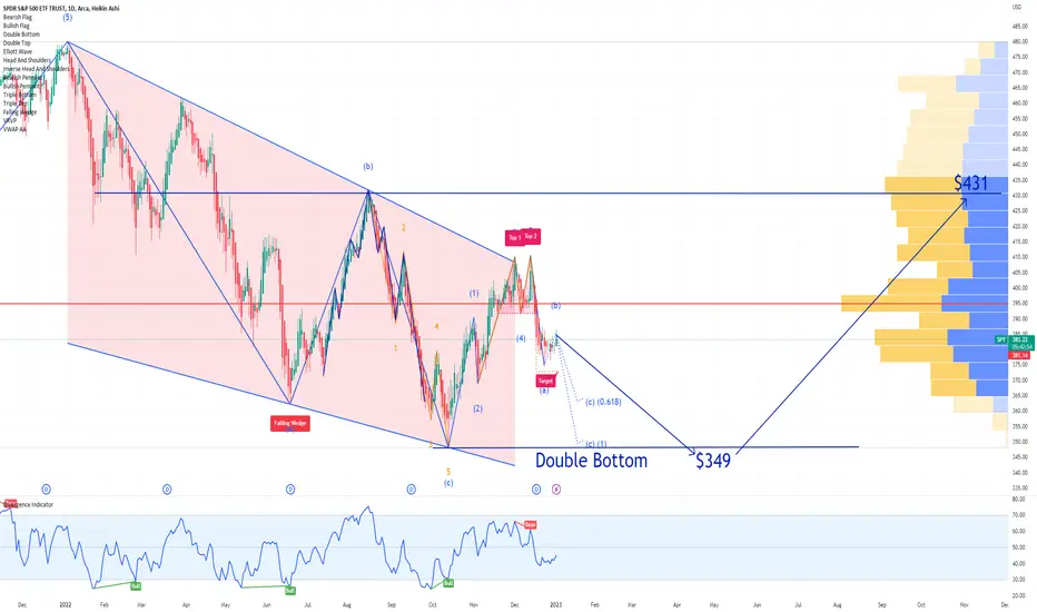
SPY S&P 500 ETF Price Prediction for 2023SPX S&P statistics the year after a drop:
81% chance of a rise and 14% average gain.
I expect a Double Bottom by mid year, Price Target at $349 and a year close at $431.
I think it`s reasonable.
Looking forward to read your opinion about it.
SPX 2023 Trade idea...Simply follow the supertrend indicator for SPX quarterly ITM calls/puts at the given buy/sell signals. Follow the volume on larger time frames. Use any profit to first pay off 2022 debts then start building a diverse ETF portfolio with high dividend yields. 80% of portfolio going into equities 20% used for options.

Bearish Continuation for the SPYIt was subtle but it happened. Lower high for the SPY with a higher high on the RSI. I project a breakout of the bottom end of this range next week. Bearish divergence continuation to kick off the new year? As mentioned in previous posts, it is perfectly fine to hold some trades to the upside, but I do not recommend going into the new year without a bias to the short side.
More interest rate increases, negative economic data and slowing of the global economy incoming. I put a link below that helps traders understand the idea of a bearish divergence. Hope this helps and hope you all have a very great new year.
AMEX:SPY

SPY Short Rising WedgeOn the daily time frame spy has formed and a rising wedge and broke its bottom support

ROTATION FROM 'GROWTH' TO 'DEFENSIVE' OVER LAST 10 DAYSCHART DISPLAYS LAST 30 DAYS
Utilities ($XLU) outperforming the broader market as represented by ($SPY) and growth oriented, tech based, sub-sector ($XLK) over the last 30 days.
This has a correlation with an increased 'potential' for instances of heightened, near term (2 to 4 weeks) market volatility.
During the recent selloff we can see that the 'bids' did not push the broader market as represented by ($SPY) or the S&P 500 tech sector ($XLK) back over its pre-selloff top. On the other hand, the market did buy the utilities (XLU) back up over its respective, pre-selloff top. (see yellow horizontal lines)
So utilities stay bid while tech and the broader market begin to falter. In my opinion this is what a rotation out of 'growth' ($XLK) from the last 6 weeks and into 'defensives'($XLU) looks like from a price structure perspective. I would interpret this as an expression of 'risk off' market sentiment going into 2023. (NOT FINANCIAL ADVICE)

Puts on SPY Last 3 cycles of SPY have been ~60 days and ~19% on each leg. We have a good chance of coming down to the lower trendline in ~60 days. About 19% on the next leg down.

40 Bar Cycle Chart - S&P 500 SPY SPX ES1! - Updated 122322With a key level of the $JPM Quarterly Options Collar sitting at $3,855 on SPX ES1!, markets seemed to have been "pinned" for the time being as market makers position for the close of business ahead of the Christmas holiday.
Question now is are the bulls hopes of a Santa Rally into year-end wishful thinking? 🎅 🎄 Or, we see another attempt at a short-term relief rally within what is likely to be a continuation of the downward "40-Bar Cycle" that is projected to continue into the first few weeks of 23'?
SPY Daily Chart Template
www.tradingview.com
Which camp are you in on the short-term (end of year into Q1/23') direction of markets?
Camp A: We are likely we headed for new lows in Q1/23 (Fluctuating Inflation + Persistent Price/Wage Pressures + Hawkish FED + Downward Earnings Revisions/Misses).
Camp B: We are likely to break the downtrend into the start of Q1/23' (Peak Inflation + Deflationary Forces + Dovish FED + Earnings "Resiliency").
Let me know your prediction in the comments below! 👇🏼

Possible SPY Long opportunity from smart money Please read the chart text. Furthermore we are in a box that has proved there are lots of bulls at this area hence the previous rally at this zone. Could this be the Santa rally everyone is talking about to save spy? We can hope for smart money to re-enter longs here to boost spy back up towards the top of this range otherwise, I fear spy may drop slowly into 360's or lower. There is also a chance that spy just trends sideways and ranges more into the new year. What do you guys think is brewing?

spy boxlots of people saying bullish, this is also a big selloff zone for smart money. Will they step in to range this box back down to 377ish areas?

$SPY on 1HR 12/21 Analysis$SPY on 1HR 12/21 Analysis
For SPY i am expecting a morning pump.
This pump could potentially run to the 50 day SMA on the hourly chart of $384.44 and retrace.
As for pullback, looking at the stochastic, it shows there needs to be a pullback. It currently way too high imo.
I expect the rest of the day for spy to be relatively red or a sideway if it consolidates there after.
SPY:
1st Resistance: $382.56
1st Support: $378.19
What are your thoughts?
Thanks,
Kelly :)

SPX Model Trading Plans for MON. 12/19Next Support Level Being Tested
The key support level identified in our trading plans published on Wed., 12/07 - and, reiterated on Thu., 12/15 - at 3900-3910 has been decisively broken down, and the index is now testing the next key support level around the 3825-3835 range. Our models are indicating a range-bound trading while the index is trading within the broader 3810-3830 range on a daily close basis. If you are short, you might want to take profits on a break out of this range. If you are itching to go long, you might want to wait until the range is broken out of to the upside.
Positional Trading Models: Our positional trading models went short on Thursday, 12/15, on a break below 3895 (opened at 3893.51) with a 40-point trailing stop and a break-even hard stop in effect. Models are indicating instituting a hard stop at 3843 for today. If stopped out, models indicate staying flat for the rest of the session.
By definition, positional trading models may carry the positions overnight and over multiple days, and hence assume trading an instrument that trades beyond the regular session, with the trailing stops - if any - being active in the overnight session.
Intraday/Aggressive Models: Our aggressive, intraday models indicate the trading plans below for today.
Trading Plans for MON. 12/19:
Aggressive Intraday Models: For today, our aggressive intraday models indicate going long on a break above 3825, 3838, 3844, or 3852 with a 9-point trailing stop, and going short on a break below 3840, 3833 or 3820 with a 10-point trailing stop.
Models indicate long exits on a break below 3863, and short exits on a break above 3813. Models also indicate a break-even hard stop once a trade gets into a 4-point profit level. Models indicate taking these signals from 11:31 am ET or later.
By definition the intraday models do not hold any positions overnight - the models exit any open position at the close of the last bar (3:59pm bar or 4:00pm bar, depending on your platform's bar timing convention).
To avoid getting whipsawed, use at least a 5-minute closing or a higher time frame (a 1-minute if you know what you are doing) - depending on your risk tolerance and trading style - to determine the signals.
(WHAT IS THE CREDIBILITY and the PERFORMANCE OF OUR MODEL TRADING PLANS over the LAST WEEK, LAST MONTH, LAST YEAR? Please see for yourself how our published trading plans have performed so far! Seeing is believing!)
***** No Idle Analysis-paralysis here! Only actionable trading plans - every morning! And, transparent, verifiable results of each and every trading plan, every night!
LET THE RESULTS SPEAK FOR OUR MODELS! See for yourself how our Morning Trading Plans have been doing for the last one month or one year or since started! *****
NOTES - HOW TO INTERPRET/USE THESE TRADING PLANS:
(i) The trading levels identified are derived from our A.I. Powered Quant Models. Depending on the market conditions, these may or may not correspond to any specific indicator(s).
(ii) The results of these indicated trades would vary widely depending on the timeframe you use (tick chart, 1 minute, or 5 minute, or 15 minute or 60 minute etc), the quality of your broker's execution, any slippages, your trading commissions and many other factors.
(iii) These are NOT trading recommendations for any individual(s) and may or may not be suitable to your own financial objectives and risk tolerance - USE these ONLY as educational tools to inform and educate your own trading decisions, at your own risk.
#spx, #spx500, #spy, #sp500, #esmini, #indextrading, #daytrading, #models, #tradingplans, #outlook, #economy, #bear, #yields, #fomc, #fed, #newhigh, #stocks, #futures, #inflation, #powell, #interestrates, #rates, #earnings, #midterms, #elections, #cpi, #fedpivot, #shortsqueeze, #bulltrap
TradingView Tags:
spx500
spx
spy
es1!
spx500usd
spx500long
spx500short
es1
esmini

Spy breakout?Currently spy is at the bottom of a box. Spy could see a bounce if there is support here otherwise, if this support zone fails then spy could see a lower trading price. I have circled areas where spy has sold off at before at this relatively similar price. What do you guys think?

SPY Several Possible Outcomes For Fall 2023 Longs/ShortsGreen indicates Bull Thesis
Red indicates Bear Thesis
We have seen a rejection from our well-respected channel that began at the start of 2022.
Best Case Scenario (Bulls)
Dip to lowest point around 3800s, then retest previous highs of 4180.
Best Case Scenario (Bears)
Dip to lowest point around 3600, then slight leg up towards 0.5 fib around 3800, reject 3800 leg down to test new lows.

40 Bar Cycle Chart - S&P 500 SPY SPX ES1! - Updated 121722This last week, markets initially rallied on the release of the "cooler" than expected November CPI (Consumer Price Index) — only to be smacked back to reality on the comments via Federal Reserve Chairman J. Powell during the December Interest Rate Decision (FOMC) meeting this last Wednesday as "higher for longer" is the communicated pathway forward for the FED and financial markets.
Whether this is all talk to put some intentional downward pressure on markets, as financial conditions have eased as of late — or this is the actual pathway forward and the bond markets are mis-pricing the projected Terminal FFR (Fed Funds Rate, now >5% into 23'), some indicators such as our (40-Bar Cycle Chart) 📉 are highlighting what is likely another leg down in financial assets as QT ramps up and higher interest rates take their toll on real economic activity. Keep in mind that behind the scenes, the FED in coordination with the U.S. Treasury are working their magic 🧙🏼♂️🔮 in terms of FED Net Liquidity to keep things "(dis)orderly".
Here is the updated 40-Bar Cycle Chart for SPY ES1! SPX, which seems to be sitting on some major support. Given the structure of the markets after losing the $390 SPY / $3,900 ES1! SPX, along with J. Powell and other FED speaker comments post-FOMC on Friday, is the hopes for a year-end 🎅 🎄 rally wishful thinking?
SPY Daily Chart Template
www.tradingview.com
Which camp are you in on the short-term (end of year into Q1/23') direction of markets?
Camp A: We are likely we headed for new lows in Q1/23 (Fluctuating Inflation + Persistent Price/Wage Pressures + Hawkish FED).
Camp B: We are likely to break the downtrend into the start of Q1/23' (Peak Inflation + Deflationary Forces + Dovish FED).
Let me know your prediction in the comments below! 👇🏼

SPY S&P 500 ETF Options Ahead of the CPI ReportIf you haven`t shorted the Bearish Flag Chart Pattern:
The U.S. Bureau of Labor Statistics will release Consumer Price Index ( CPI ) data for the month of November 2022 on December 13, 2022, at 8.30am ET.
The rate of inflation is the most important data that will impact the Fed’s coming rate hike decision.
Now looking at the SPY options chain Ahead of the CPI Report, i would buy the $387 strike price Puts with
2023-1-20 expiration date for about
$8.96 premium.
If the options turn out to be profitable Before the CPI Report, i would sell at least 50%.
Looking forward to read your opinion about it.

SPXThinking the 5th on the expanding diagonal finishes around 3,330 but if not then diagonal likely invalid and 2900-3,000 will hold as massive support.
