two directions for cyber security stocks (cibr)if there is bullish continuation in the nasdaq cibr could hit the 53.5 area soon
and if there is return to volatility cibr could revisit the 50.89 area
Technicals

two different directions for five g stocks (fivg)either were in for immediate continuation of the breakout pattern to above the 42 area or, if the nasdaq isnt doing as well, a pullback to revisit the 40.5 area

two different directions for self driving (idrv)there will be a continued daily downtrend bqck below the 53 area, or a breakout to 54.5 levels

s&p500 futures still have bull momentumas long as we respect the 1-4 hr neckline, and we dont roll over breaking to new lows there are still lots of attractive areas of price above 4783
the bottom line is that calls are still cheap as long as we keep consolidating, so shooting for a intraday high above 4800 is a sound judgement
this means quick profit can be taken as we snap back to higher prices on the 15 minute
4780.25 is a decent target

head and shoulders if we roll over and break neck (es1!)its pretty clear that setting a lower high on the hourly, especially around the left shoulders price, and breaking to new lows and closing 15 mins in bear territory would be a bearish pattern for s&p500 futures to put

a hard drive to the upside or retracement and bouncetwo directions for the nasdaq
either a hard drive to the upside before volatility returns, and subsequent melt up
or theres another wave of increased volatility immediately, and there is a bounce off the same support area

bear gold miners headed into oversold territorymultiple timeframes are showing oversold stoch, rsi and negative macd for dust
19.74 a target area for bounce

two vix forecasts that could both hit (uvxy)this is a dual forecast for volatility index futures derivative uvxy
by the end of the week we may dip below the 13.89 area
by fri, jan 7 '22 we may rise above the 14.5 area

dual 15 minute forecast (es1!)es1! undergoing snap back to highs not seen since dec 23
increased volatility would be the natural position, even in bullish continuation
both targets are equally valid
essentially a topfishing play

tightening range will break sooncould go either direction but falling support will be broken or rising resistance will break either way volatility will increase

channel break short entry s&p500 futures emini 15 minute (es1!)if we form a lower high on the 15 minute timeframe this area in emini futures are a target for short selling

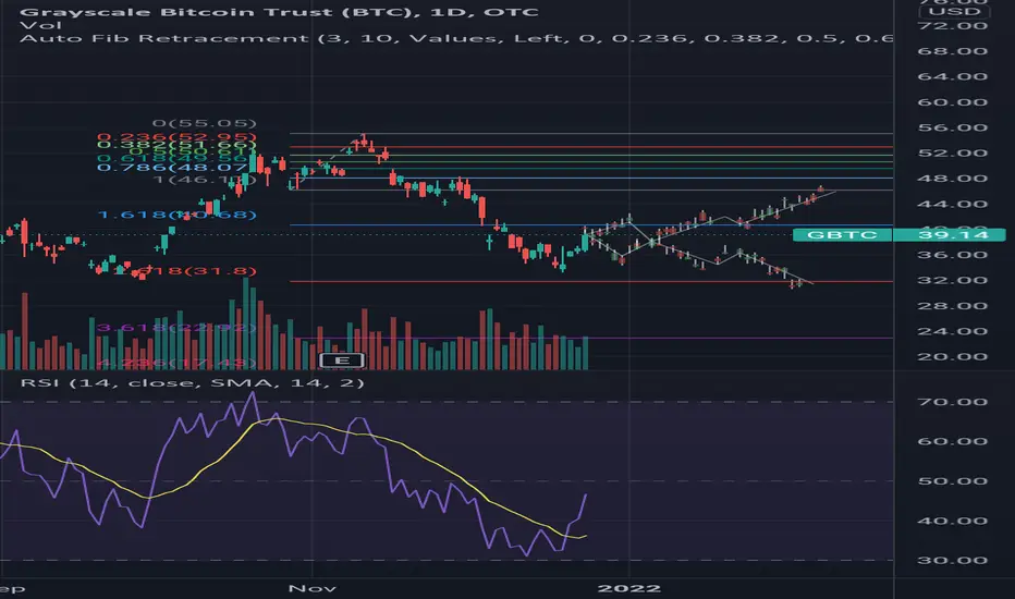
two directions for bitcoin (gbtc)the worlds largest, most popular crypto currency is headed for a break of the 42.5 area
or were headed back beneath the 34.5 region soon
Bank of America (BAC) LongBank of America has already made a high and is starting to pull back.. Will be waiting until price gets to around 40.0 to enter long positions and calls on this play long term.


rebound or continued weakness for clean energy (qcln)either clean energy is making an ernest rebound to the 71 area
or the continued volatility will carry us back to the 64 area

return of volatility, or new weekly lows for vixthe forecast in s&p500 futures either immediately recovering, or getting hit with another wave of volatility would look something like the two paths drawn in this ghost feed

Daily Crypto Market Update - How I now plan to play my trades?In this video:
* With the crypto markets now looking to have gone bearish, I discuss what my trade strategy is moving forward
* I also discuss how we can still utilize level trading strategy in a downtrend

Daily Crypto Market Update - Showing Bullish Signs Again - OXTIn this video:
A discussion of the overall crypto market sentiment
A discussion of future price action
A look at the altcoins market
Is sentiment beginning to turn bullish again?
Orchid OXTUSD charted with levels for paid subscribers at substack

SHIB BULLISH TILL 0003It will take some time, but shib will eventually move up again.
Of course all coins will go up over time, its just in what manner we question. the Elliot wave principal suggest it will just repeat into infinity

EUR/USD - BearishEUR/USD is bearish on the monthly, weekly, daily & 4H timeframes so only looking for sells, treating any move up as a pullback
Expecting USD strength
Looking for some sort of correction up to the daily structure level, 61.8 Fib & trend line to enter a short position.

Oil Gains Strength After API DrawOil has regained strength, rebounding nearly to highs again. We have blasted through all levels of resistance in the 82's and 83's, and are currently just below the high at 85.55. We seem to be hovering around 84.75, which has been tested and rejected before, therefore we are adding it as a new technical level. Oil appears to be in a sideways corrective pattern for the longer term, ranging from the high 70's to 84.75. If we are able to break out then 87.21 is the next target.

New Pattern Spotted on Bitcoin Chart!!! TARGET $100,000!In this video:
We discuss a NEW Cup and Handle Pattern Spotted
Old C&H Patterns may have been legit, but are completed now
New C&H Pattern makes much more sense mathematically and in conjunction with the Bitcoin Dominance chart
New Cup and Handle pattern puts us at a target of $100,000!

Twitter bull & bust Casetwitter has recently made a sharp downside move towards 100EMA on the weekly chart which looks like will hold for a couple of upside sessions as of now as the market is over all in strong upside momentum with daily record close across the board. That being said, the over all picture for the company and stock looks a bit shaky with sharp sell off from the past week. if the stock does manage to climb back towards the 70/72ish area i believe it can still dive down towards the 2019 Area all over again. which will be an Ideal place to go long on this stock. but for Day traders this stock can be a real treat as the daily volume is high so the volatility is there to make money both ways. Personally i would go long with $48 as the stop loss area and $70 as Take profit and would be a seller at $70 with stop loss at $76 and all the way towards $30/35$ take profit.
