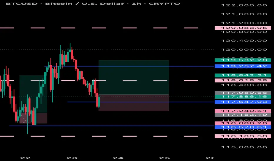
Nifty 24780 Pullback possible on next 1-2 days On 31 July, if someone watch closely price action he could capture Today up move coz Nifty gave almost same price action as 13 June let's try to find what is the Same thing: -
(A)31 July 2025: gap down is (-70%)
volume around 97 million
Bounce Back after gap down around +1%
(B) 13 June: gap down was (-80%)
Volume around 93 million
Bounce back after gap down around +1
On 13 June Nifty faced resistance of 24980 level then retraced. Due to such similarities, we can conclude that it could be pullback around 24780 level although I don't say market will behave same as before, I know every second of market is very dynamic and different from past days, but technical analysis always based on historical data. so, this is just assumption. take the trade on your own analysis & research.
Tradingpatterns

“BNBUSD Educational Breakdown – Support Rejection “BNBUSD Educational Breakdown – Support Rejection with $846 Target in Sight”
Market Structure Overview:
BNBUSD is exhibiting a bullish market structure after forming a textbook higher low at the major demand zone near $740–$750. This zone has been historically significant, offering strong rejections and triggering aggressive bullish rallies.
A new bullish wave appears to be forming after price respected the ascending trendline and reclaimed the supertrend level, now acting as dynamic support around $782.2.
⸻
🔧 Technical Confluences:
• Support Zone: Highlighted between $738–$750, serving as a demand base. Recent price rejection here confirms buyers’ dominance.
• Trendline Support: Price has respected an ascending trendline, signaling short-term trend continuation.
• Supertrend Confirmation: Trend flip has occurred—price is now trading above the Supertrend line, indicating a fresh bullish momentum phase.
• Break of Structure (BoS): Minor resistance around $784–$790 was breached, suggesting bullish continuation.
⸻
🎯 Target Projection:
Using recent swing highs and market symmetry, the next logical resistance lies at $846.9, aligning with the previous supply zone. This target also fits within the measured move from the support base to previous highs.
⸻
📈 Trade Plan (Educational Only):
• Long Bias Zone: Between $770–$780
• Invalidation Level: Below $738 (loss of support structure)
• Target: $846.9
• Risk-Reward: Roughly 1:2.5 – favorable for swing traders
⸻
📚 Educational Note:
This chart is an excellent example of:
• Structure trading (support/resistance)
• Trend confirmation using a dynamic indicator (Supertrend)
• Risk-managed entries with clearly defined stop-loss and take-profit zones.

BITCOIN UPDATE Bitcoin seems to be preparing to fix its lows so it’s time to target a trade to the up side because, it had dropped to a fair amount of lows
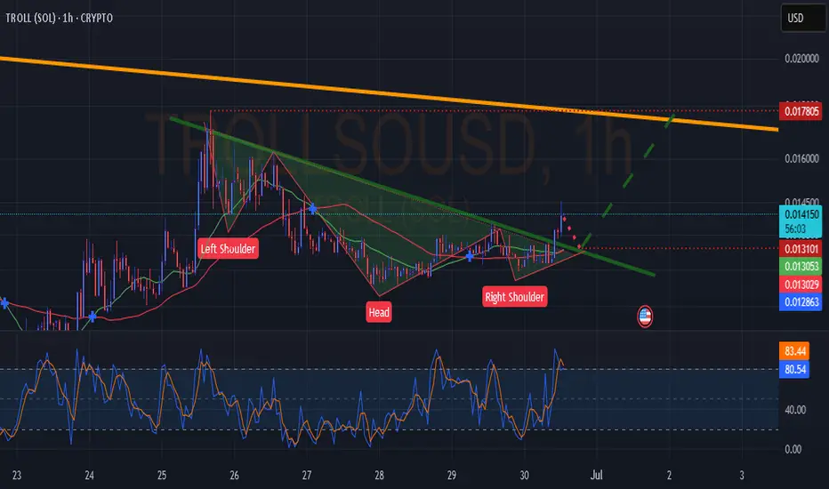
TROLL(SOL) IH&SGood day everyone. IH&S On troll. Touch back to the trend_line & take off to the upper red dotted line. Not financial advice.
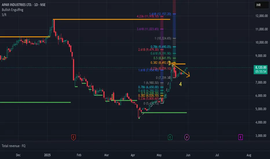
APAR Industries Trading IdeaNSE:APARINDS is on the Move and we can have an Immediate Target for 8450. On the Risk Reward Part, we can Target for 10,200, if Market conditions are good, with Trailing stoploss.
Head and Shoulders Pattern: Advanced Analysis for Beginners█ Head and Shoulders Pattern: Advanced Analysis for Beginners
The Head and Shoulders pattern is one of the most widely recognized and reliable patterns in technical analysis. And today, I am going to teach you how to use it as efficiently as an experienced trader would.
Learning to spot and trade this pattern can be a great asset in your tool belt —whether you’re trading stocks, forex, or cryptocurrencies.
The Head and Shoulders is a well-known reversal pattern in technical analysis that signals a potential trend change.
⚪ It consists of three peaks:
The Left Shoulder: A peak followed by a decline.
The Head: A higher peak formed after the left shoulder, followed by a decline.
The Right Shoulder: A smaller peak resembling the left shoulder, followed by another decline.
When these peaks form in a specific order and the price breaks below the neckline (the line connecting the two troughs between the shoulders), it indicates a bearish reversal from an uptrend to a downtrend.
█ What about Bullish reversals? Don’t worry — there's good news!
Conversely, the Inverse Head and Shoulders pattern forms at the bottom of a downtrend and signals a potential reversal to the upside. By recognizing the pattern early, you can position yourself for a high-probability trade with a clear entry and exit strategy.
█ How to Identify a Head and Shoulders Pattern?
I truly believe the best way to learn any trading strategy is to keep it simple, away from the “technical” jargon unless absolutely necessary. We’ll do the same with this strategy.
Despite its varied usage, you can break it down into four simple steps:
1. Look for the Left Shoulder
The first part of the pattern forms when the price rises , creating a peak. Then, it declines back down to form the trough . This creates the Left Shoulder of the pattern.
Example: If the price of Bitcoin (BTC) rises from $85,000 to $90,000, and then declines to $87,500. This is your Left Shoulder.
2. Spot the Head
The second part of the pattern is the Head . After the Left Shoulder, the price rises again , but this time, it forms a higher peak than the Left Shoulder. The price then declines again, creating a second trough .
Example: Continuing with Bitcoin, after the price dropped to $87,500, it rises to a new high of $95,000 before dropping back to around $90,000. This $95,000 peak is the Head, which is higher than the Left Shoulder.
3. Find the Right Shoulder
After the decline from the Head, the price rises again, but this time, the peak should be smaller than the Head, forming the Right Shoulder . The price then starts declining again, and this is where the neckline is formed (connecting the two troughs).
Example: Bitcoin then rises from $90,000 to $92,000 (lower than the $95,000 peak). This forms the Right Shoulder, and the price starts to decline from there.
4. Draw the Neckline
The neckline is drawn by connecting the lows (troughs) between the Left Shoulder and the Head, and between the Head and the Right Shoulder. This is your key reference level.
█ How to Trade the Head and Shoulders Pattern
Once you've spotted the Head and Shoulders pattern on your chart, it’s time to trade it. And yes, it did need a separate section of its own. This is where most amateur traders mess up - the finish line.
1. Wait for the Neckline Breakout
The most crucial part of the Head and Shoulders pattern is the neckline breakout . This is when the price breaks below the neckline, signaling the start of the trend reversal.
Example: After the price rises to form the Right Shoulder at $92,000, Bitcoin then drops below the neckline (around $90,000). This is the confirmation that the pattern is complete. The price of BTCUSD is likely to continue downward past the 90k mark.
2. Enter the Trade
Once the price breaks below the neckline, enter a short position (for a bearish Head and Shoulders pattern). This is your signal that the market is reversing from an uptrend to a downtrend.
3. Set Your Stop Loss
Your stop loss should be placed just above the right shoulder for a bearish Head and Shoulders pattern . This makes sure you are protected in case the pattern fails and the price reverses back upward.
Example: Place your stop loss at around $93,000 (just above the Right Shoulder at $92,000) on BTCUSD.
You can also try one of these strategies I have used in the past:
⚪ Conservative Stop: Place the stop above the head (for bearish H&S) or below the head (for bullish iH&S) for maximum safety.
⚪ Aggressive Stop: Place the stop above the right shoulder (for bearish H&S) or below the right shoulder (for bullish iH&S) to reduce your stop size.
⚪ Neckline Reclaim Invalidation: Exit the trade if the price reclaims the neckline after breaking it. This could be an indication of a false positive/invalid pattern.
4. Set Your Profit Target
To calculate your profit target, measure the distance from the top of the Head to the neckline and project that distance downward from the breakout point.
Example: The distance from the Head at $95,000 to the neckline at $90,000 is $5,000. So, after the price breaks the neckline, project that $5,000 downward from the breakout point ($89,800), which gives you a target of $84,800.
5. Monitor the Trade
We’re in the home stretch now, people. This is the 9th inning.
There’s only one job left: keeping an eye on any retests or contrarian moves.
As the price moves in your favor, you can scale out or move your stop loss to break even to lock in profits.
█ What makes H&S strategy an all-time classic?
It’s simple. It works.
This pattern works because it reflects a shift in market sentiment:
In a Head and Shoulders pattern , the uptrend slows down as the market struggles to make new highs, and then the price ultimately breaks down, signaling that the bulls have lost control.
In an Inverse Head and Shoulders pattern , the downtrend weakens as the market fails to make new lows, and the price breaks upwards, signaling a bullish reversal.
⚪ Here are a few points to remember as a cheatsheet for Head and Shoulders patterns:
Wait for the neckline breakout to confirm the pattern.
Set a stop loss above the right shoulder for protection.
Project the price target using the height of the head for a realistic profit goal.
Always monitor the trade for any signs of reversal or false breakouts.
Mastering this pattern can be a game-changer for any trader, but like any tool, it’s only effective when combined with other indicators, strategies, and a solid risk management plan.
-----------------
Disclaimer
The content provided in my scripts, indicators, ideas, algorithms, and systems is for educational and informational purposes only. It does not constitute financial advice, investment recommendations, or a solicitation to buy or sell any financial instruments. I will not accept liability for any loss or damage, including without limitation any loss of profit, which may arise directly or indirectly from the use of or reliance on such information.
All investments involve risk, and the past performance of a security, industry, sector, market, financial product, trading strategy, backtest, or individual's trading does not guarantee future results or returns. Investors are fully responsible for any investment decisions they make. Such decisions should be based solely on an evaluation of their financial circumstances, investment objectives, risk tolerance, and liquidity needs.

What Is an ABCD Pattern, and How Can You Use It in Trading?What Is an ABCD Pattern, and How Can You Use It in Trading?
Are you looking to improve your trading strategy and technical analysis skills? The ABCD trading pattern may be just what you need. This tool may help you identify potential market reversals and decide when to enter a trade. Keep reading to learn more about the ABCD pattern and how to apply it to your trading strategy.
What Is an ABCD Pattern?
The ABCD pattern is one of the basic harmonic patterns. It gives traders an idea of where the market might reverse. Therefore, when combined with other forms of technical analysis, it may be a great addition to your trading arsenal.
The ABCD pattern comprises two legs, AB and CD, and one retracement, BC, with D as an entry point. More specifically, an ABCD can be identified by:
- AB Leg: A trend starts at A and makes a high or low at B.
- BC Retracement: The price retraces from B to C.
- CD Leg: The trend continues from C to D.
- D Entry Point: Once another high or low forms and traders enter at D.
These price movements create the “zig-zag” or “lightning bolt” shapes.
In fact, ABCD patterns are present across every market and every timeframe. The up-down movements in financial assets represent opportunities to identify and trade ABCD patterns.
Why Use the ABCD Pattern in Your Trading Strategy?
Before we move on to identifying and trading the ABCD pattern, it’s worth explaining why you might want to consider using it. Here are a few reasons traders favour the ABCD pattern:
- It’s one of the harmonic patterns suitable for traders of all experience levels.
- It’s versatile and works for stocks, commodities, and cryptocurrencies*, not just forex trading.
- Traders use ABCD patterns to make informed decisions about potential turning points in the market.
- It can form the basis of a working trading strategy if used correctly alongside other forms of technical analysis.
- It provides quite an effective risk/reward ratio if reversals are caught.
How Traders Identify an ABCD Trading Pattern
The first step in finding ABCDs is to look for that classic zig-zag shape. Once you’ve found one, it’s time to apply Fibonacci ratios to confirm the pattern. If you’re struggling, you can consider using pre-made ABCD pattern indicators or scanners to help your eyes get used to spotting them.
The ABCD pattern requires that the BC leg is between a 38.2% to 78.6% retracement of AB, ideally between 61.8% and 78.6%. This means that if you put a Fibonacci retracement tool at A and B, C should be between 0.382 and 0.786.
The second CD leg should be a 127.2% to 161.8% extension of the BC retracement. For extra confirmation, consider specifying that AB is equal to the same length as CD.
While it can be tempting to start trading based on these conditions, you’ll find that, in practice, identifying point D can be trickier than it seems. That’s why traders typically use Fibonacci ratios, key levels, candlestick patterns, and higher timeframe convergence to confirm their entries, which we will touch on shortly.
ABCD Pattern Examples
Now that we understand how to identify the ABCD pattern, we can start applying it to real price action.
Note that the ratios won’t always be perfect, so allowing for slight variability above or below the defined ratios is acceptable.
Bullish ABCD Pattern
For a bullish formation, the following must be present:
- The AB leg should be between the high A and low B.
- The BC bullish retracement should be between the low B and high C, which is below the high A.
- The CD leg should be between the high C and low D.
- BC is a 38.2% to 78.6% retracement of AB, preferably between 61.8% and 78.6%.
- CD is a 127.2% to 161.8% extension of BC.
Additionally, you may look for AB to be an identical or similar length to CD.
Entry: Traders set a buy order at D.
Stop Loss: The theory suggests traders place a stop below a nearby support level or use a set number of pips.
Take profit: Traders place take-profit orders at the 38.2%, 50%, or 61.8% retracement of CD or hold for higher prices if they believe there’s the potential for further bullishness.
Bearish ABCD Pattern
The bearish ABCD chart pattern is essentially the same, just with the reversed highs and lows. As such:
- The AB leg should be between the low A and high B.
- The BC bullish retracement should be between the high B and low C.
- The CD leg should be between the low C and high D.
- BC is a 38.2% to 78.6% retracement of AB, preferably between 61.8% and 78.6%.
- CD is a 127.2% to 161.8% extension of BC.
You can choose to apply the same AB = CD rules in a bearish ABCD pattern if desired.
Entry: Traders typically place a sell order at D.
Stop Loss: A stop may be placed above a nearby resistance level or at a set number of pips.
Take profit: Traders often take profits at the 38.2%, 50%, or 61.8% retracement of CD or hold for lower prices if there’s a bearish trend on a higher timeframe.
ABCD Pattern Strategy
A momentum-based ABCD trading strategy can help traders confirm potential reversals by incorporating indicators like the RSI (Relative Strength Index). This approach often adds an extra layer of confluence.
Entry
- Traders may wait for point D to form and for the RSI to indicate overbought or oversold conditions, typically above 80 or below 20.
- Additional confirmation can be sought if there is a divergence between price and RSI, signalling weakening momentum.
- Once the RSI crosses back into normal territory, it can suggest a reversal, providing an opportunity to enter the market.
Stop Loss
- A stop loss is often placed slightly above or below point D, depending on whether the formation is bearish or bullish, respectively. This helps potentially manage risk in case the reversal doesn’t hold.
Take Profit
- Traders can consider taking profits at Fibonacci retracement levels of leg CD, such as 38.2%, 50%, or 61.8%.
- Another common target is point C, but traders may also hold the position for longer if further price movement is anticipated.
Looking for Additional Confluence
Given that trading the ABCDs usually relies on setting orders at specific reversal points, consider looking for extra confirmation to filter potential losing trades. Below, you’ll find three factors of confluence you can use to confirm your entries.
Key Levels
If your analysis shows that D is projected to be in an area of significant support or resistance, there’s a greater chance that the level will hold and the price will reverse in the way you expect.
ABCD Timeframe Convergence
One technique to potentially enhance the reliability of ABCD chart patterns is to check for multiple timeframes. When you identify the formation on a lower timeframe—say, the 5-minute chart—you can then look to a higher timeframe chart, such as the 30-minute or 1-hour chart to see the overall trend.
If the pattern converges with the longer-term trend, it strengthens the analysis and increases the likelihood of an effective trade.
Candlestick Patterns
Some traders look for particular candlestick patterns to appear. The hammer and shooting star patterns are commonly used by ABCD traders for extra confirmation, as are tweezer tops/bottoms and engulfing candles. You could choose to wait for one of these candlesticks to form before entering with a market order.
Common Mistakes to Avoid When Identifying an ABCD Chart Pattern
Of course, ABCD patterns aren’t a silver bullet when it comes to effective trading. There are several common mistakes made by inexperienced traders when trading these types of patterns, such as:
- Confusing the ABCD with other harmonic patterns, like the Gartley or three-drive pattern.
- Trading every potential ABCD formation they see. It’s preferable to be selective with entries and look for confirmation.
- Not being patient. ABCDs on higher timeframes can take days, even weeks, to play out.
Experienced traders wait for the pattern to develop before making a trading decision.
- Ignoring key levels. Instead, you could allow them to guide your trades and look for the ABCD pattern in these areas.
The Bottom Line
The ABCD pattern is a versatile tool that can enhance a trader’s ability to identify potential market reversals and refine their overall strategy. When combined with other forms of technical analysis, such as momentum indicators, an ABCD trading strategy can be an invaluable addition to your trading arsenal.
For traders looking to apply the ABCD pattern in forex, stock, commodity, and crypto* markets, consider opening an FXOpen account and take advantage of low-cost, high-speed trading across more than 600 assets. Good luck!
FAQ
What Is an ABCD Trading Pattern?
The ABCD trading pattern is a simple harmonic pattern used by traders to identify potential market reversals. It consists of three price movements: the AB leg, BC retracement, and CD leg, with point D marking a potential entry for a reversal trade. It helps identify changes in trend direction.
How Can You Use the ABCD Pattern in Trading?
Traders identify the ABCD pattern by finding the characteristic zig-zag shape and using Fibonacci ratios to confirm it. Entry points are typically placed at point D, with stop losses and profit targets based on the formation’s structure. Confluence with other technical analysis tools improves its reliability.
Is the ABCD Pattern Bearish or Bullish?
The ABCD pattern can be either bearish or bullish. A bullish ABCD indicates a potential upward reversal, while a bearish ABCD suggests a downward reversal. The structure remains the same, but the highs and lows are reversed.
What Is the ABCD Strategy?
The ABCD strategy revolves around identifying trend reversals using the formation and confirming entry points through tools like Fibonacci retracements or momentum indicators like the RSI for added accuracy.
*At FXOpen UK, Cryptocurrency CFDs are only available for trading by those clients categorised as Professional clients under FCA Rules. They are not available for trading by Retail clients.
This article represents the opinion of the Companies operating under the FXOpen brand only. It is not to be construed as an offer, solicitation, or recommendation with respect to products and services provided by the Companies operating under the FXOpen brand, nor is it to be considered financial advice.

GOLD - its a WAKE-UP Call, its breakout of Wedge? #GOLD. A perfect move as per our analysis and market perfectly placed our wedge upper line.. and now its time to WAKE UP.
market giving us a WAKE UP call.
that wedge line is a very important for buyers. because if market closed above that line then next it will leads to towards further upside up to 2990
stay sharp
good luck
trade wisely

EURUSD Potential Shorts (Technical Analysis)Overall Context:
The dollar's been flexing its muscles lately, and EURUSD is feeling the pressure. We saw some crazy gaps when the markets opened on Monday morning – a sign of shaky liquidity, which usually snaps back. But with the trade war rumbling on, who knows?
As traders, we've got to stay prepared, expecting a correction but ready with our contingency plans if it doesn't happen. Let's dive in -
Technical Outlook:
Failure of the previous accumulation cycle - Classic Wyckoff stuff, cycles run their course.
A re-distribution is likely on the horizon, especially if the lower timeframes agree with the bigger picture. (Fractally, we need to see the LTF accumulation fail and for distribution to align with the HTF sentiment and cycle).
Price has broken to the downside and has created multiple lower highs.
Trading below the 200 EMA and has recently tested and bounced of the 50 EMA (at a correlating level of supply)
Keep in mind that USDJPY and EURUSD are inversely correlated and are currently in line - While the inverse correlation is a significant factor, it's not the only thing that influences these currency pairs. Interest rates, economic data, and global events can also play a role and we know how that story looks at present so this is just additional confluence for us.
Potential Scenarios & Probabilities:
Scenario 1 (High Probability) - Price will pull back into the supply and drop from there.
Scenario 2 (Medium Probability) - Price will continue to plummet and break structure to the downside.
Trading Considerations:
If price fills the gap and reaches supply levels above, you should wait for bearish confirmations to get involved.
If price drops past the previous low, identify new levels of supply and trade accordingly. (I'll try to post an update if this happens).
Final Notes:
Strong technical picture but this week has a lot of upcoming economic events (NFP, anyone?).
With the Tariffs imposed so close to the NFP release one can only assume there will be a power play by the Trump administration which we may not see coming.
All we can do for now is follow the money flow to stay in the know!
Disclaimer: This analysis is for informational purposes only and does not constitute financial advice. Trading involves substantial risk and may not be suitable for all investors. Conduct your own research and consult with a financial advisor before making any investment decisions.
OANDA:EURUSD TVC:DXY FX:USDJPY

GOLD - one n single support, holds or not??#GOLD. guys there is only single area that is our today supporting area 2792
keep close it and cut n reverse below that on confirmation...
stay sharp.
good luck
trade wisely

ALUMINIUM - Short Opportunity in sight PEPPERSTONE:ALUMINIUM is nearing a critical resistance zone that has consistently acted as a barrier for bullish momentum. This area aligns with prior supply levels and may attract seller interest.
If rejection patterns, such as bearish engulfing candles or long upper wicks, appear, I anticipate a move toward 2,600. A break above this resistance could indicate a shift in sentiment.
What you should monitor closely is confirmation before entering short positions. If you have any thoughts or agree with this analysis, I’d love to hear your perspective in the comments!

MRF - Cup and Handle & Bullish Flag patterns (30% upside)MRF has sustained for almost a year in sideways mode. Given the Patterns of Cup and Handle along with Bullish Flag. Potential Target can be 178k from current level of 141k (30% upside)

Alkem Laboratories Ltd. (NSE: ALKEM)Technical Analysis and Key Levels
1.Current Price Action:
Alkem Laboratories is trading at ₹5,484.40, testing a critical support zone (₹5,300–₹5,450) identified by historical price action and volume profile.
2.Resistance and Support Levels:
Immediate Resistance: ₹5,811.55 (previous swing high).
Key Resistance Zone: ₹6,000–₹6,346.55. A breakout above ₹6,346.55 can lead to fresh bullish momentum.
Immediate Support: ₹5,323.60 (near-term support).
Critical Support: ₹4,629.85, a major demand zone. Failure to hold this level could trigger further downside.
3.Volume Profile:
High-Volume Node (HVN): Significant buying interest is observed around ₹5,450–₹5,800.
Low-Volume Node (LVN): Below ₹5,300, liquidity decreases, increasing the risk of a sharp drop toward ₹4,629.85.
4.Moving Averages:
The stock is currently hovering around the 50-day moving average, indicating short-term indecision.
The 200-day moving average at ₹5,323.60 acts as crucial support for long-term trend analysis.
5.RSI Indicator:
The RSI is neutral but leaning towards the oversold region, suggesting potential accumulation in this zone. A break below ₹5,323 could push RSI into bearish territory.
6.Key Observations:
Nomura's Price Target Update: Nomura revised the price target to ₹6,097 (Neutral stance), close to the immediate resistance levels, which aligns with market consolidation.
7.Potential Scenarios:
Bullish Case: Sustaining above ₹5,484.40 and breaking ₹5,811.55 may open doors for ₹6,346.55.
Bearish Case: A decisive break below ₹5,323.60 could lead to ₹4,629.85.
8.Trading Strategy:
For Bulls: Look for confirmation above ₹5,811.55 with increased volumes before entering long positions.
For Bears: Short opportunities arise if the stock breaks and sustains below ₹5,323.60 with a target near ₹4,629.85.

CAD JPY Trade Setup Daily timeframe CAD JPY has tapped into a daily resistance level that was previously a support level.
we will be looking for selling opportunities to get our sell entry lets scale down to the lower timeframe to find pattern and confirmations.

$SOUN :Is Sound Hound AI the next small cap to SURGE?! 98% move!NASDAQ:SOUN
Is Sound Hound AI the next small cap to SURGE?!
I believe this stock is gearing up for a 98% move higher! So, let's dive into my video below, which talks about the NASDAQ:SOUN stock charting setup for a SURGE to the upside and how it meets my 5/5 trading setup! (My personal trading strategy)
Not financial advice.
Like ❤️ Follow🤳 Share 🔂
Comment what stock you want to see charting analysis on below.

XAUUSD - it's breakout? What's next??#GOLD.. market just broke his important support 2613 14
It was final area actually guys.. and if this is a breakout then a further drop on table..
Good luck
Trade wisely

BITCOIN BULLISH H&S ON W1 to possible $89000BITCOIN Fails to break below a Demand Area, confirming a clear H&S as we close on the W1 Timeframe. Using Fibonacci, we are looking directly towards $89000 minimum. M1 also will create a very bullish Cup & Handle price action. Any trader/investor will not miss this rare opportunity.

EUR USD Trade Setup Daily Timeframe.EUR USD is currently sitting on a Daily Support level and the price is showing signs of bullish momentum by forming a bullish Engulfing candlestick, so we will be looking for buying opportunities.
To get our buy entry lets scale down to the lower timeframe to identify patterns and entry confirmation.

$MBLY The Future is Bright with Massive Upside. 10x Opportunity!NASDAQ:MBLY
The Future is Bright with Massive Upside. 10x Opportunity!
In this video, we will be going over the following with Mobileye Stock:
- The potential for a short squeeze in the name 17%+ short float
- NASDAQ:MBLY aligning with my 5/5 trading strategy
- Potential acquisition of NASDAQ:INTC by NASDAQ:QCOM and what that means for NASDAQ:MBLY
- Upcoming earnings preview
Like ❤️ Follow🤳 Share 🔂
Comment what stock you want to see charting analysis on below.
Not financial advice.
NASDAQ:QQQ AMEX:SPY NYSE:QS NASDAQ:BIVI NASDAQ:VKTX NASDAQ:ASTS NASDAQ:MNPR
#SmallCaps #TradingSignals #TradingTips #options

EUR JPY Trade Setup 4 Hour TimeframeOn the 4-hour timeframe, EUR JPY is pulling back for a retest of the broken resistance level, which has now turned into a new support level.
The pair continues to move in an uptrend, forming higher highs and higher lows while bouncing off a support trendline.
We will be looking for buy opportunities as the price tests this key support level.

GOLD - a ATH placed? what's next??#GOLD.. market very well placed 2740 as per our video analysis.
now market just retest that area and keep in mind that if market hold it then its means market life high placed so far. and be ready for a drop.
don't buy until market hold your region that is mentioned on chart.
good luck
trade wisely

LCRX RETURNS TO THE SEEN OF THE CRIMENASDAQ:LRCX returning to the seen of the CRIME! ☕️
LCRX is retesting the Cup N Handle BREAKOUT FROM 2023! 🤯
LRCX has already tested and bounced off of its Cup n Handle breakout from 2023 twice and is forming the right shoulder of a shorter-term inverse H&S pattern!
Will it bounce again?! Drop a comment below.
The risk/reward ratio on this one is crazy good, IMO! It's going to take something drastic for that CupnHandle breakout support to bust!
My Short Term PT for this chart is: 🎯$80
My Long Term PT for this chart is: 🎯$107
Not financial advice! 🖖

USOIL... just near to his supporting area? what's next??#USOIL.. perfect move as per our last idea and now market just reached near to his major supporting area and that will play key role in next move.
keep close that region mentioned on chart. that is around 69.60 to 69.90
keep close and if market hold it in that case you can see again bounce from that area otherwise not at all.
don't float your buying's below that.
good luck
trade wisely
