CADJPY short bearish push expecting
OANDA:CADJPY short bearish push expecting here, analysis is based on DESCENDING TRIANGLE
SUP zone: 110.100
RES zone: 109.000, 108.800
Trendlineanalysis

AMD to $200 (61%) – Strong Support ends ConsolidationNASDAQ:AMD weekly charts looks very good. The trendline from March 2023 is intact and we also touched the 61.8 fibonacci from the complete move (starting in October 2023). The descending wedge could be broken to the upside today, which would be a bullish sign for a stronger move towards $200. All in all, many semiconductor stocks are currently on supports or are fundamentally more attractive than they were months ago.
Fundamentally NVIDIA still dominates the AI datacenter market with a market share of over 90%. But Advanced Micro Devices is improving its hardware and software offerings. The recently released MI325X and the upcoming MI350 series could give AMD more market share with faster release cycles. First signs show significant customer interest. In addition, AMD has a more stable revenue stream from other products like CPUs and non-AI datacenters. Given the high prices of NVIDIAs products the market itself should have a deeper interest in more competition.
Target Zones
$135
$160
$200
Support Zones
$117-$120

BNB → Big Accumulation. In Step With The DistributionBINANCE:BNBUSDT is trying to move into the realization phase after quite a long accumulation, thanks to which the coin can give a very good growth.
The coin tested the strong support of 645 within the correction. False break of the support and quite aggressive buyout of the fall indicates buying potential. Bitcoin, which is testing the highs and ready to go even higher is a good driver for BNB
Accordingly, the focus is on near-term levels. If the price can break the near-term resistance and consolidate above, the market will further go to break ATH and try to renew it.
Resistance levels: 761, 793
Support levels: 691, 645
I don't exclude that the unexpected correction of bitcoin can provoke a correction in the cryptocurrency market, but in general the structure is bullish. High probability of resistance breakdown with the purpose of continuation of movement

BTC → Consolidation Before The Breakout When Do We Go Up?BINANCE:BNBUSDT continues to consolidate, but within a strong bullish structure. The price is approaching the trigger, the breakout of which may provoke the formation of an upward impulse
A good signal that hints that the growth is likely to continue is the fact that after a strong growth and testing 100K the price does not fall, but consolidates with gradually rising local lows, it is also worth paying attention to MA-50, which acts as a strong support. Within this consolidation we have clear zones, within which the price is trading and accumulating potential, and there is also a clear trigger, the breakout of which can provoke the continuation of growth (distribution).
But next week is the Fed meeting on December 17-18, and there may be short-term market manipulative reactions. Be careful
Resistance levels: 101.8K, 104.1K
Support levels: 98.9K, 94.15K
Technically, the focus is on 101.8 - 98.9. Consolidation is forming inside this channel. I do not exclude a chance of support retest in the format of a false breakdown before further growth. Another deep correction to the lower liquidity zone - 94.1K is also possible. But until the price breaks 101.8, bitcoin will not go up, and based on the chart, the event is close and the chance is high

STC: 85 CALENDAR DAYS PATTERN7010:STC has followed a pattern since the end of February 2023. Upon hitting the bottom trend line, Price appreciated 15-25% in 85 calendar days. This pattern has repeated 3 times over the last year.
Based on above observation, a long position can be opened once price hits the bottom trend line again.
TP1: 15%
TP2: 25%
OR simply close the trade on the 85th day of starting the trade
SL: 2% (just under the bottom trend line)
Keep waiting and hope the price comes back to the bottom trend line soon. Best of Luck!!

GBP USD Complete Analysis - Top Down - Structure wiseHi guys,
Below im going to go through a detailed breakdown of GBP USD for longer term swing trades and what i am looking for to confirm any trade direction.
Firstly i want to start of at the monthly time frame:
Below is a photo of the monthly timeframe clearly showing bearish structure with lower highs and lower lows:
So our monthly bias is bearish, and the last rally could just be a pull back to continue lower, However, considering that the low that was created in September of 2022 created a new all time low for the pair, i am skeptical that this pair will go any lower. Furthermore, looking at the price action from the low of 2016 till date we can see that price has been pretty much range bound, which also looks to be a Wyckoff accumulation schematic. However this will only be confirmed once price breaks above the last high marked up in the above drawing, as this will confirm bullish strength and a break of long term structure to the upside.
Conclusion of monthly time frame analysis: Trend is bearish but it seems to be at it's turning point. So we need to see confirmations of lower timeframe to determine weather price will continue to drop or go higher.
Now lets look at the daily time frame:
Looking on the daily time frame we clearly see bullish structure, with higher lows and higher highs, however remember this entire structure could just be a pull back of the monthly time frame's bearish structure.
So when will this move be considered a pull back of the bearish monthly structure? if price manages to break the recent low marked up in the above drawing at around 1.204. this will indicate a break of the bullish structure on the daily timeframe and a shift from bullish to bearish structure.
As long as price is above this low, 1.204 then the structure will remain to be bullish.
So to recap, on the monthly we are overall bearish but we are expecting that we are at the end of the bearish move, but we need to see the lower timeframes confirm if price wants to go higher. As of now, the daily structure is bullish and the structure is holding. So we can look for buys at this point.
Lets go down to the 4 hr time frame:
On the 4 hr timeframe we can see the clear bearish structure. but remember that as long as price is above the 1.204 mark then we are bullish on the daily, so this bearish structure gives us opportunities to enter long positions at lower prices. But in order to confirm that this bearish structure will not just continue to drop and shatter the 1.204 mark, then we need to see a shift in structure from bearish to bullish, which will occur when price breaks above the high in the above photo at around 1.28. This will indicate the end of this bearish pull back and a change in structure from bearish to bullish, so then we will have bullish structure on the 4 hr and the daily time frames. Entries however will be taken on the 15 or 5 min timeframes, when the time comes. For now i need to wait and see if the 4 hr structure will turn bullish or not.
Also another note on the 4 hr timeframe, structure aside, we can see some signs of accumulation where we have just done a quick sweep and stop hunt of the lows which also indicate that bullish strength may enter soon. As shown in the below photo:
So overall i am bullish on GBP USD but i need the 4 hr time frame to confirm my bias by breaking structure upwards and clearing the 1.28 mark. At that point we will scope in on the 15 min for entries on pull backs.
The other scenario is if price continues to be bearish, and breaks the low on the daily time frame at around 1.204, this will completely shift our bias from bullish to bearish, and will look for sell positions on pull backs.
So for now, we wait. Wait for price to show you what it wants to do, does it want to respect the bullish structure on the daily time frame? or does it want to shift the structure from bullish to bearish? this will be the deciding factor here. And based on that we can analyze further and look to take some good swing trades.
If you made it this far, i thank you for your time and patience, and i hope this helped you in some way.
Thank you, and happy new year to everyone!!

BNB - USDT UPDATE on 4th January 2025...Slowly slowly.... If you are in the trade already than congrats ! If not yet... Be careful & don't rush... Sometimes is a much better to look for something else instead of taking "halfway "trade already...
Don't rush... You still got all year to trade! ;)
PS: printer friendly "KISS" chart... & BTW...leverage *10 on Binance recommended... ;)

Actual ETH Cycle!!This would be a possible count for BINANCE:ETHUSDT in which we see a possible end of the cycle around $5,200. The substructure of the 5th wave converges in the zone with the end of the macro count so we have a high probability of ending at least 5200 to 5400 dollars.

Long Signal for Solana (SOL) | 100% Profit Potential with 1:5.5 📉 Analysis: Solana (SOL) has completed an ABC correction and successfully broken its descending trendline, signaling the start of a strong bullish move. This setup offers an excellent 100% profit potential with a 1:5.5 risk-reward ratio.
📌 Key Levels:
- 🔹 Entry Point: 213.50 USD
- 🔹 Stop Loss: 174.00 USD
- 🔹 Take Profit: 430.00 USD
📊 Outlook: The break above the descending trendline confirms a change in momentum, making SOL ready for its next major move upwards. A perfect setup for traders looking for high returns with calculated risk.
📢 Share your thoughts! Don't forget to share this signal with your trading circle and let us know your plans in the comments.

AUDCAD Risky ShortsBeginning of the year indicates new cycles. Be careful shorting but all signs point to the downside. Confluences include 3rd touch of the trendline, H4 SNR, 78.6 fib, H4 engulfing, H4 50 EMA

Micron Technology - The perfect chart!NASDAQ:MU is one of these stocks, which just respects every level, cycle and structure.
If I would give each chart an individual rating, the chart of Micron Technology would be 10 out of 10. Micron Technology is actually respecting every structure level and providing textbook trading opportunities. If we get a retest of the previous all time high, which is now turned support and perfectly lining up with the support of the rising channel, I will certainly look for longs.
Levels to watch: $90
Keep your long term vision,
Philip - BasicTrading

Porsche is a hot topic for investors in 2025Porsche is a hot topic for investors in 2025, trading near historic lows. Barclays recently upgraded the stock to Overweight with a price target of €70, saying the current price could represent a good opportunity for long-term investors. Despite a 15% decline in the past month, earnings growth expectations for 2025 and 2026 remain above 10% per year, despite doubts about volume and margin targets.
TRADINGVIEW
INVESTING.COM
Key risks include the company’s reliance on the U.S. and Chinese markets, as well as the impact of tariffs. However, the positive outlook for electric vehicles and Porsche’s luxury segment is keeping the stock attractive.

$C98USDT have Analysis 2025 See on Week Chart...$C98USDT:BINANCE have Analysis 2025 See on Week Chart...
Disclaimer: Digital asset prices are subject to high market risk and price volatility. The value of your investment may go down or up, and you may not get back the amount invested. You are solely responsible for your investment decisions and Binance is not available for any losses you may incur. Past performance is not a reliable predictor of future performance. You should only invest in products you are familiar with and where you understand the risks. You should carefully consider your investment experience, financial situation, investment objectives and risk tolerance and consult an independent financial adviser prior to making any investment.

Bank Nifty Fut Ready for ALL TIME HIGH....NSE:BANKNIFTY1! trade at 51830. You can long it with SL of trendline. for target of at all time high.

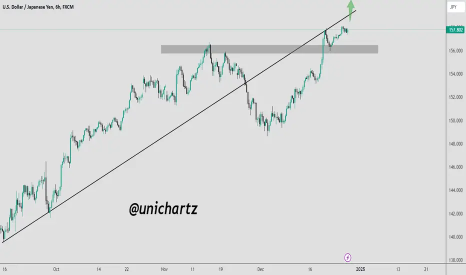
USD/JPY on the Verge of a Breakout: Key Levels to Watch!USD/JPY is encountering resistance at the trendline, previously a support level. The price attempted to break through earlier but faced rejection. Now, it is approaching the resistance level again, showing breakout potential.
We anticipate a possible breakout above the resistance trendline. A key support zone, marked in grey, provides a critical level to watch for pullbacks or reversals. Monitor price action for confirmation.
DYOR, NFA
ORDI 1D | Plan If the price reclaims the blue box first, it can target the range EQ and then the red box above.

Microsoft - We Will See A Correction!Microsoft ( NASDAQ:MSFT ) can actually create a correction:
Click chart above to see the detailed analysis👆🏻
Microsoft is one of the strongest stocks over the past decade and also over the past couple of months, there was no clear sign of weakness. Therefore, it is actually not extremely likely that a correction will happen, but if it does, this will offer a long term texbook trading opportunity.
Levels to watch: $420, $350
Keep your long term vision,
Philip (BasicTrading)

A Bullish Merry BTChristmasGlad this year Christmas isn't different from others before it, for all Crypto traders.
Bitcoin CRYPTOCAP:BTC flipped bullish on the eve of Xmas. My Yellow trend line was a huge confirmation for me. It reclaimed and broke above it.
3 Green back-to-back candles in 1 minute ✨✨✨
Happy Merry B-T-C hristmas 🎄🎅
Beautiful trade year for me and the entire Bulls

Google - Catch The 2025 Bullrun Now!Google ( NASDAQ:GOOGL ) is preparing for a strong year 2025:
Click chart above to see the detailed analysis👆🏻
So many confluences on Google are pointing to a strong year of 2025. First of all we have the resistance trendline breakout which we saw a couple of months ago and bears were also not able to significantly push price lower after we saw the retest of resistance. This is soo bullish.
Levels to watch: $220
Keep your long term vision,
Philip (BasicTrading)

Trading MRI comprehensive trade analysis for BNZIBanzai International, Inc. ( NASDAQ:BNZI ) is a marketing technology company that provides essential marketing and sales solutions for businesses of all sizes. Recent acquisitions, financial restructuring, and a reverse stock split signal strategic shifts aimed at enhancing the company’s market position. However, its financial metrics reflect significant challenges, including negative operating, profit, and gross margins.
Recent Stock Performance
Closing Price (Dec 20, 2024): $1.71 (+5.56% from previous close of $1.62).
Daily Trading Range: $1.63–$1.85.
Volume: 4.07 million shares (below the 4.23 million average).
Volatility:
5-day fluctuation: 16.33%.
30-day fluctuation: 11.04%.
Moving Averages:
+11.89% above 20-day SMA.
-19.48% below 50-day SMA.
-82.60% below 200-day SMA.
52-Week Range:
-99.23% from 52-week high.
+32.05% above 52-week low.
Recent Company Developments
Acquisitions:
Vidello: Adds 6.5M in revenue and 2.3M in EBITDA (announced Dec 20, 2024).
OpenReel: Enhances AI-powered marketing with enterprise video solutions (completed Dec 19, 2024).
Debt Restructuring (Sept 2024): 5.6M liabilities written off; 19.2M restructured.
Reverse Stock Split (Sept 19, 2024): 1-for-50 split to meet Nasdaq listing requirements.
These developments indicate strategic efforts to stabilize operations and capture growth in the video marketing sector.
Analysis Overview
Daily Timeframe:
Setup: Green Setup 3 progressing toward Green Setup 4.
Trend: Bullish short-term, supported by price action above the 20-day SMA.
Key Levels:
Resistance at $1.85.
Support at $1.60.
Weekly Timeframe:
Setup: Transition from Red Setup 8 to Green Setup 1.
Trend: Strong reversal potential.
Key Levels:
Resistance at $1.80–$1.95.
Support at $1.35.
Monthly Timeframe:
Setup: Red Setup progression from 2 to 4.
Trend: Bearish continuation.
Key Levels:
Breakdown below $1.45 signals bearish dominance.
Support at $1.30 and $1.20.
snapshot
Risk Assessment
1. Probabilities:
Daily (Bullish): ~50.7% success rate.
Weekly (Bullish Reversal): ~90% success rate.
Monthly (Bearish Continuation): ~55.6% success rate.
2. Risk-Reward Ratios:
Daily: 1:1.5 (moderate).
Weekly: 1:2 (favorable).
Monthly: 1:1.5 (moderate).
3. Trade Risks:
Financial instability and operational losses may limit upside potential.
Reverse stock split suggests efforts to manage compliance rather than growth.
Trade Recommendations
Daily Chart:
Action: Long on confirmation of Green Setup 4.
Entry: Above $1.75.
Stop-Loss: Below $1.60.
Targets: $1.85, $1.90.
Weekly Chart:
Action: Long on confirmation of Green Setup 2.
Entry: Above $1.80.
Stop-Loss: Below $1.35.
Targets: $1.95, $2.00.
Bold Prediction for Q1 2025 NASDAQ:BNZI
Optimistic Scenario:
If bullish reversals on daily and weekly charts are confirmed, supported by revenue growth from recent acquisitions:
Target Price: $2.10–$2.20.
Drivers: Growth in video marketing demand and operational cost savings from debt restructuring.
Target Price: $2.10–$2.50 by Q2 2025.
Pessimistic Scenario:
If bearish continuation dominates, compounded by financial challenges:
Target Price: $1.15–$1.25.
Conclusion and Bold Prediction
BNZI's stock performance in 2025 will hinge on the successful execution of its strategic initiatives and the market reception of its enhanced video marketing solutions.
Optimistic Scenario: Integration of Vidello and OpenReel drives growth and operational efficiencies, potentially lifting the stock to $2.50 by mid-2025.
Pessimistic Scenario: Continued financial losses and market volatility may push the stock to a low of $1.10 by mid-2025.
Investors should monitor quarterly updates on revenue growth, profitability improvements, and operational synergies from recent acquisitions. This will provide crucial insights into the company's trajectory in 2025.

NVIDIA to ATH $153 until end of 2024 (16% ROI)With NASDAQ:NVDA , we are currently in a promising position to see a final exaggeration into the end of the year. The stock has risen over 180% percent in 2024 and I think we have a good chance to make 200% out of that. Looking at the chart we can see a clear uptrend trendline starting in August this year with multiple touchpoints along the line. Since October we're consolidating within the range from $131 to $153. After touching the trendline on thursday last week we're good to go higher (at least for now). Resistance will be the current ATH at $153. If we fail to hold the level at $131 on the daily chart the trade will be invalidated. That leaves us with 16.54% ROI in total.
Target Zone
$153.00
Support Zone
$131.00

UNH Selloff Unreasonable - Still 15% ROI Short-TermSince my first NYSE:UNH idea a couple of days ago the price of this stock dropped significantly. If you've been part of the first idea you should've been able to lock in around 1.x% of return when using a tight stop-loss. Otherwise you've been stopped out with break-even. Nevertheless, the sell-off was not helpful and is completely exaggerating the situation at UNH since the company is not really effected by the current PBM debate.
"Deutsche Bank sees a potential divestiture as not having a significant impact on earnings, estimating the risk at likely less than $200M of the company’s roughly $30B+ operating earnings. Deutsche Bank noted, however, that CVS (CVS), Cigna (CI) and UnitedHealth (NYSE:UNH) 'could face additional risk from losing the ability to vertically integrate the PBM, fulfillment and manufacturing functions of biosimilars through organizations like Cordavis and Quallent.' Despite concerns about the potential breakup of their pharmacy businesses, Deutsche Bank maintained it's buy rating on UnitedHealth (UNH)."
From a technical standpoint we can see a confluence of support:
Weekly SMA200
Strong Trendline from March 2020
Horizontal Support at $480
UNH managed to bounce from the trendline intraday today. This could mean we're going to see a turnaround from here. If we break below the trendline on the daily chart this trade will be invalidated. Otherwise our target sits at $550.

SUGAR/USDT WILL SURGE TO 0.20 CENTS.To analyze the chart of SugarBoy (SUGARUSDT), let's break it down into key technical components:
1. **Price Action and Trend**:
- The current price of SUGARUSDT appears to be hovering around 0.00608 USDT, showing a slight decline in the short term (down -1.46% in the last hour).
- However, there are multiple support and resistance levels clearly marked above, which can help identify potential targets for the price.
2. **Moving Averages**:
- The chart shows multiple moving averages (12, 26, 45, 78, and 180-period) on the 1-hour chart, which helps smooth out the price action.
- **Bullish Signs**: The moving averages are indicating some support around the current price, with the 12-period EMA (Exponential Moving Average) likely acting as immediate support. When the shorter-term EMAs (like the 12-period) are above the longer-term EMAs (such as the 180-period), it could suggest a bullish trend, although it's important to monitor for any crossovers.
3. **Resistance Levels**:
- There are strong resistance levels above the current price, starting at 0.00680 USDT, and further up at 0.00733, 0.00805, and beyond. If the price breaks through these levels, it might show strong bullish momentum towards higher targets.
4. **MACD (Moving Average Convergence Divergence)**:
- The MACD at the bottom of the chart is showing a neutral stance currently, with no strong bullish or bearish divergence. It’s also hovering around zero, meaning no clear direction is signaled at the moment.
- However, a potential crossover or movement in the MACD histogram could indicate momentum picking up, either bullish or bearish, depending on the trend.
5. **Volume and Momentum**:
- Volume is crucial in confirming price movements. If volume picks up during a breakout above the resistance levels (e.g., 0.00680 or 0.00733), it could confirm the bullish momentum.
- The momentum indicators (like MACD) have shown some slight negative momentum, but if the price begins to rise and the histogram turns green, it could be a sign of increasing bullish interest.
6. **Potential to Reach 0.20**:
- While a jump to 0.20 cents (20x from the current price) is a highly optimistic target, investors may be drawn to the chart if they see a consistent trend of breaking resistance levels and a sustained uptrend.
- **Critical Price Levels to Watch**: If the price manages to hold above 0.00680 and further crosses 0.00733, there could be a potential for a breakout towards higher levels. Any break of the long-term resistance might ignite further buying interest.
### Strategy for Investor s:
- **Short-Term Action**: Focus on the potential breakout above the 0.00680 and 0.00733 resistance levels. If the price crosses these levels, this could be seen as a signal for short-term investors to act.
- **Long-Term Vision**: Present the chart with optimism, showing that SUGARUSDT has a solid support base and potential for upward movement. Focus on the upward targets (like 0.0080, 0.011, 0.018) in your messaging.
- **Volume Indicators**: Investors may be drawn to large volume spikes if the price breaks higher, so encourage watching volume patterns closely for validation.
By highlighting key resistance levels, the importance of moving average crossovers, and the potential for price movement with strong volume, you can present SUGARUSDT as an attractive asset for speculative investment, while also acknowledging the need for careful monitoring of price action in the short term.
