Undervalued JBHTEvery day I pick a few stocks - the most undervalued stocks in AMEX, NYSE & NASDAQ with lowest RSI and other technical analysis (200-day moving average action and volume change), to trade for the next day. Charts for JBHT is looking great for a 1-day long play (for tomorrow)
More Details:
youtu.be
Undervalued

Undervalued RYEvery day I pick a few stocks - the most undervalued stocks in AMEX, NYSE & NASDAQ with lowest RSI and other technical analysis (200-day moving average action and volume change), to trade for the next day. Charts for RY is looking great for a 1-day long play (for tomorrow)
More Details:
youtu.be

Severely Undervalued Gold Silver MinerSimply a return to 2016 levels would net us a 350% return. Hyper-conservatively speaking, bare minimum, I see a 50-90% increase in AUMN in the near future.
If AUMN experiences a crash near previous lows, I will be buying while others are selling.

Undervalued JEEvery day I pick a few stocks - the most undervalued stocks in AMEX, NYSE & NASDAQ with lowest RSI and other technical analysis (200-day moving average action and volume change), to trade for the next day. Charts for JE is looking great for a 1-day long play (for tomorrow)
youtu.be

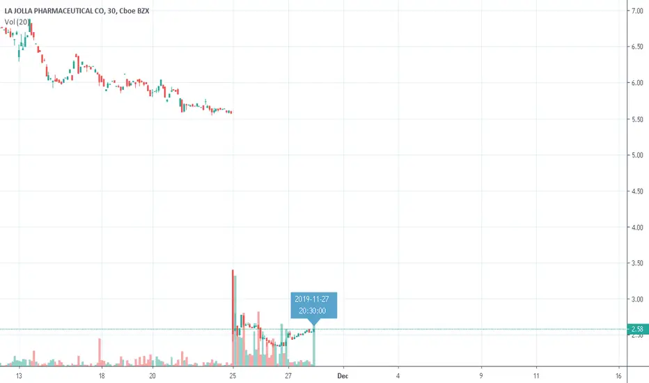
Undervalued LJPCEvery day I pick a few stocks - the most undervalued stocks in AMEX, NYSE & NASDAQ with lowest RSI and other technical analysis (200-day moving average action and volume change), to trade for the next day. Charts for LJPC is looking great for a 1-day long play (for tomorrow)
youtu.be

Undervalued JBHTEvery day I pick a few stocks - the most undervalued stocks in AMEX, NYSE & NASDAQ with lowest RSI and other technical analysis (200-day moving average action and volume change), to trade for the next day. Charts for JBHT is looking great for a 1-day long play (for tomorrow)
youtu.be

Undervalued APAEvery day I pick 2-5 stocks - the most undervalued stocks in AMEX, NYSE & NASDAQ with lowest RSI and other technical analysis (200-day moving average action and volume change), to trade for the next day. Below are my picks for tomorrow.
APA JBHT LJPC JE
Charts for APA is looking great for a 1-day long play (for tomorrow)
youtu.be

LJPC Still Undervalued Every day I pick 2-5 stocks - the most undervalued stocks in AMEX, NYSE & NASDAQ with lowest RSI and other technical analysis (200-day moving average action and volume change), to trade for the next day. Below are my picks for Monday.
LJPC charts look great for a 1-day long trade.
More Details in below link
youtu.be

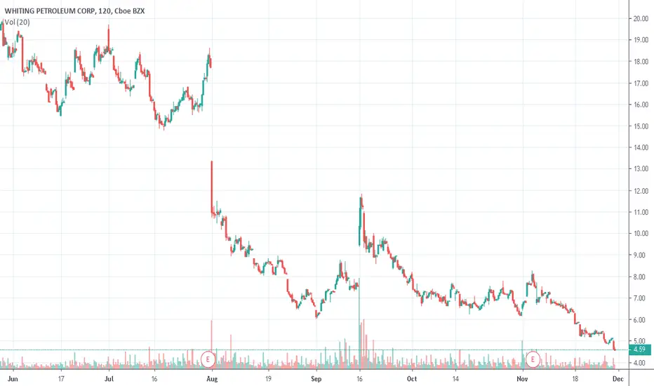
WLL is Undervalued Every day I pick 2-5 stocks - the most undervalued stocks in AMEX, NYSE & NASDAQ with lowest RSI and other technical analysis (200-day moving average action and volume change), to trade for the next day. Below are my picks for Monday.
Charts for WLL is looking great for a 1-day long play (for Monday)
More Details in below link
youtu.be
GER Undervalued Every day I pick 2-5 stocks - the most undervalued stocks in AMEX, NYSE & NASDAQ with lowest RSI and other technical analysis (200-day moving average action and volume change), to trade for the next day. Below are my picks for Monday.
Charts for GER are great for a 1-day long play.
More Details in below link
youtu.be

Undervalued BNSGreat chart set up for a long position for 1-day trade. Love that it is trading at 30% of its 50-day volume average, It has been down for 13 days, and RSI of 34 is great. TSX:BNS

LJPC is under-valuedI love how the chart is set up for a long position for 1-day trade. Love that it is trading at 220% of its 50-day volume average, It has been down for 3 out of past 4 days, and RSI of 10 is screaming that it is undervalued. I NASDAQ:LJPC NASDAQ:LJPC
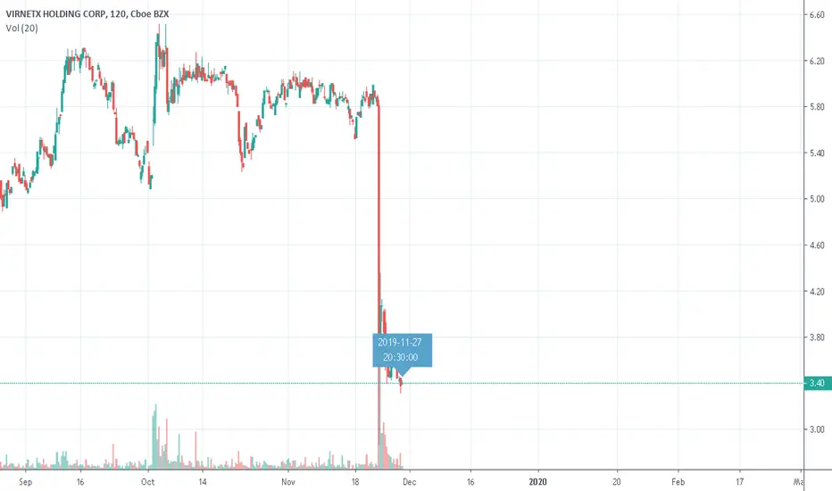
VHC UndervaluedI love how the chart is set up for a long position for 1-day trade. Love that it is trading at +37% of its 50-day volume average, -54% below 200 SMA AMEX:VHC , and RSI of 30 is screaming that it is undervalued. I NASDAQ:LJPC NASDAQ:LJPC
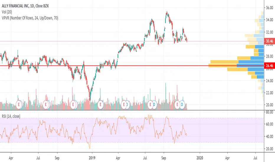
Ally Financial an undervalued stock setting up for a bounceI don't love banking stocks right now because they have so much bad debt on the books, but Ally Financial looks good for at least a short-to-mid-term play. With a P/E of 7.62 and a valuation rating of 94/100 from S&P Global Market Intelligence, Ally looks very attractively valued. It beat estimates and raised guidance on its last earnings report, its earnings grew 10% last quarter vs. the same quarter the previous year. With a 2% dividend yield, Ally offers decent quarterly cash return as well as good growth potential. Best of all, Ally is sitting on a support and looks ready for a bounce from $30 per share. This is definitely my pick of the day.
For more market news, stock analysis, and educational videos for traders, check out my YouTube channel, "Wall Street Petting Zoo."

Has Metcalfe's Law Stopped Working for Bitcoin?Metcalfe's Law has been successfully used to value a variety of network effect technologies and businesses, including Facebook and Tencent.
Applying Metcalfe's Law to Bitcoin , using "Daily Active Addresses" (DAA) as the "n" value, yields interesting results.
Historically, Bitcoin has tracked the Metcalfe Law Fair Price reasonably well. A number of studies have been performed over recent years which validate this and have used various derivations of Metcalfe’s Law. Note: this indicator sticks to the original Metcalf’s Law.
Prior to 2018, every time Bitcoin was above the Metcalfe’s Law fair price (calculated using a default “A” of 0.5 here), a bubble had formed, and price quickly reverted back down to the mean.
Nonetheless, since February 2018, Metcalfe's Law Fair Price has remained below the actual Bitcoin price, suggesting Bitcoin is currently overvalued.
There may be a few reasons for this:
1. Possibility A: Bitcoin may still be extremely overvalued. Since the December 2017 peak, Bitcoin has only reverted to the Metcalfe’s Law Fair Price briefly during the December 2018 bottom. If this case is true, there could be further to fall unless DAA numbers pick up to fill the gap.
2. Possibility B: The introduction of side-chains, private transactions and the Lightning Network may have fundamentally altered the effectiveness of using DAA to value Bitcoin . As more daily transactions are completed off-chain, or on large platforms/exchanges which use fewer addresses, the relative number and growth of DAA may be misrepresented and artificially low. In this case, DAA as it is reported today is no longer useful in assessing the fair value of Bitcoin with Metcalfe’s Law and this Indicator is effectively useless.
3. Possibility C: Neither of the above are true. We are just in an anomalous period in which price and Metcalfe’s Law Fair Price have deviated from the mean for an extended period (and will meet again in the future, potentially at a higher price).
4. Possibility D: Metcalfe’s Law doesn’t really work for Bitcoin .
I am inclined to believe Possibilities “C” and “D” are unlikely. Given the way Bitcoin infrastructure is being developed and used in 2019, Possibility “B” seems the most likely, as this case is supported by the fact that a number of other metrics indicate that Bitcoin is currently on the lower side of “fair value” (including Dynamic Range NVT Signal).
If Possibility “B” is false, or the impact of private network address usage is negligible, the Bitcoin network may not in a healthy state, with DAA values basically flat for the last 3 years.
Regardless, Possibility “A” remains a candidate. Only time will tell. It will be interesting to check back on this indicator in 12-24 months time. Hopefully this indicator has been proven redundant by then.


When to Buy Stocks - S&P 500 Dividend Yield CurveBefore start reading on; this chart is inverted. More on that later
Interpretation
According to Mike Maloney, the S&P 500 dividend yield curve is the second best way to measure a stocks value (after the Shiller S&P500 PE Ratio -made a post on this, go check it out). The ratio indicates how much a company pays out in dividends each year relative to its share price. In other words, it measures how much "bang for your buck" you are getting from dividends. In the absence of any capital gains, the dividend yield is effectively the return on investment for a stock. The lower the dividend yield, the less you get for your investment and hence the more overvalued a stock. The historic S&P 500 Dividend Yields were deducted by Robert Shiller and published in his book Irrational Exuberance.
Why is the chart inverted?
Two reasons
1. This allows you to see, bubbles are up instead of down, and undervalued is down instead of up
2. The higher the yield the more undervalued the stock is, the lower the yield the more overvalued the stock is
Areas of S&P 500 Dividend Yield Curve
Stocks are undervalued: 1% - 4%
Stocks are undervalued: 4% - 5%
Stocks are fair value: 4% - 6%
Stocks are undervalued: 6% +
Keeping an eye on...
The alarming thing when looking at this chart is it has only once ever been this high and that was at the beginning of the millennia and this chart goes all the way back to 1872. As of the time of this writing it is at 1.94. The highest it’s ever been is 1.11. This goes to show the size of the bubble we are currently is.
Note: This "indicator" is used to find the best time to purchase stocks, not to pick or find the market top/bottom
How to “rebalance the dividend yield curve”
Going back to Mike Maloney and his analysis...to bring down this dividend yield he sees two ways the market can seek equilibrium.
1. The market goes sideways for a decade while we have raging inflation that will balance this out and then bring dividend yields and PE’s ratios back into line
2. It crashes, the markets go down
The currency supply collapses, therefore this has to be a deflationary collapse, this cant be an inflation in what they call an invisible crash.
Note that the source of the material here is from 2011
Source: www.youtube.com (58:22)

Beark Creek Mining poised for huge run BCEKFThe year has been good so far for Bear Creek Mining, but as of recent, it has lagged behind it's competitors as the cost of silver has increased. I expect to see that once the 12-day EMA 26-day EMA, we should expect to see the start of a huge uptrend in the stock price. At this point of time with silver jumping above the $18/oz. level, this price is the base price analysis for the Corani Mine which will see huge increases in NPV. Corani NPV increases approximately US $112 M for every $1 increase in silver price (with
proportional increases in lead and zinc), According to a July 2019 power point presentation on Bear Creeks Website. This means that BCEKF is tremendously undervalued due to their ownership of one of the largest silver mines in the world, especially during the beginning of the bull market in silver and gold. Pick up this stock early if you can.

Baidu ready to recover after Q2 resultsThe stock has been in negative Weekly RSI since a few weeks now...
Last time this happened in 2015, the stock had jumped up by 70% after it recovered. In terms of Risk/Return it looks very attractive as the bottom has been hit while the recovery can be significantly interesting.
Fundamentally the stock has been hurt due to global environment (china trade war / economic slow-down) and the business has for the first time seen a real slow down in revenue and earnings (especially due to investment in new tech)
However, currently the valuation fundamentally doesn't make sense.
If you include CTRIP, IQIYI and the 12.5bn cash position. It means that Baidu Core Search engine is currently valued at 10BN
This mean 1x Revenue Multiple / 2x EBITDA Multiple. Not seen many companies trading at 2x EBITDA multiple. Huge undervaluation due to sentiment..

Guardion Health Sciences (GHSI) BounceGHSI recently peaked at $3 and is trading below 50 cents currently. Potential upside is over 60% making this a great buy for anyone looking to ride the wave up. I would not hold beyond 50 cents. Day trade only

ETH IS STUPIDLY UNDERVALUED - PRE-2017 BULLRUN LEVELS. WOWWoah. I think it is hard to judge how the market is really going when you consider the amount of coins that are REALLY low in value, compared to the levels that BTC has managed to jump up too...
Everyone goes on about a no alt-season, however, they do happen it is just a matter of when. But if your a betting man. ETH has a great opportunity to make you some more Bitcoin.
How: % of your profits from BTC into ETH. Accumulate at the bottoms and sell when they reverse = More Bitcoin...

Shiller S&P500 P/E RatioBrief Description About the P/E Ratio
The p/e ratio is the price of a share of a stock divided by the earnings per share, so it’s the earnings that the company makes during a year divided by the number of outstanding shares. Once calculated the answer is a multiple. This is one of the best valuation metrics that investors have been able to use to judge whether they’re buying an overvalued or an undervalued stock.
Using the logic of this fundamental indicator for individual stocks, Dr .Robert Shiller applied this to the S&P 500 , using the S&P 500 as a general gauge of the entire stock market. By doing this, it allowed us to see whether the stock market is undervalued, fair valued, overvalued, and in a bubble, etc.
About the Shiller S&P 500 P/E Ratio
The Shiller p/e ratio is slightly different from the traditional S&P 500 p/e ratio where; instead of dividing by the earnings of one year, this ratio divides the price of the S&P 500 index by the average inflation-adjusted earnings of the previous 10 years. The ratio is also known as the Cyclically Adjusted PE Ratio (CAPE Ratio), the Shiller PE Ratio, or the P/E10.
Areas of the Shiller S&P500 P/E Ratio
As you can see on the chart, there are several different ranges with each one describing the "state" of the stock market
0-5 = stocks are extremely undervalued
5-10 = stocks are undervalued
10-15 = stocks are at fair value
15-20 = stocks are overvalued
20-30 = stocks are in a bubble
30-40 = stocks are in an extreme bubble
Interpreting the Multiple
Think of the multiple this way; you are paying (insert multiple number) times the earnings . Another way to interpret the multiple, it can be counted as the number of years it would take for the individual to get his investment back.
Example #1 : Great Depression, one of the worst times in history, the Shiller S&P 500 p/e Ratio was above 32.56, this means you are paying 32.56 times the earnings , and it would take the investor 32.56 years to get his investment back.
Example #2 : 1998-2000 the Shiller S&P 500 p/e Ratio was 44.19, this means you are paying 44.19 times the earnings , and it would take you the investor 44.19 years to get your investment back, even if they were to give you all of the earnings as dividends you would still have to wait 44.19 years.
That’s insane, that is a lifetime!
“Timing beats speed, precision beats power”
Analyzing the Shiller S&P 500 P/E Ratio
One thing you will notice when doing some analyses of this multiple is the following: whenever the multiple surpasses the 20-30 area, the multiple always returns back to 0-10 area. Once the trend reverses and the bubble pops, it doesn’t stop until the multiple has reached some somewhere in the range of 0-10 (undervaluation) as I have illustrated above with the blue arrows. It does this without exception. It would need to revisit undervaluation before a new “healthy” real bull market were to start again. Once the trend has reversed it doesn’t go straight down, it mimics the movement of a ball rolling down the stairs. You can think of each step of stairs as one of the areas it has to go through before eventually reaching the bottom, similar to how the Fibonacci retracement tool works.
Using this historically repeating pattern, I'd say we are currently on another step down the stairs before we eventually make our way down the bottom of the stairs where we revisit undervaluation areas.
Once have reached the undervaluation areas, this will also be a moment of consolidation where investors, traders, pension fund managers, self-directed IRA owners will have most likely given up and have thrown in the towel. You will most likely see news article titles saying something along the lines of: to invest into the stock market is one of the worst things you could do, but it couldn’t be further from the truth. You can apply this reasoning to all the different kinds of markets and remember these...
"When the time to buy comes, you won’t want too"
"Buy when there’s blood in the streets, even if the blood is your own"
Why has the the multiple so high over the past 20 years or so, well at least why I think it is high
These are some explanations came up with
1 - Interest Rates are Low
Specifically the "Interest Rate - Investment" graph
For those who have taken macroeconomics in college or university, etc know about this graph. Essentially the idea/theory behind this graph is that investments change according to interest rates.
High interest rates = fewer "projects" approved
When interest rates are high, and people want a good return on their investment what do they buy? People buy bonds, not cash, because cash
doesn't earn interest. By having high interest rates, money is "expensive", it isn't readily available. High interest rates = slower economic growth .
Lower interest rates = more "projects" approved
When interest rates are low people are going to do the exact opposite of holding bonds, they are going to hold cash, because the rate of return
is low enough to not put their money in a locked contract for a specified time frame. When interest rates are low, money is "cheap", it is more
readily available. Low interest rates = fast economic growth.
alevelecons.weebly.com
twitter.com
2 - Bond Yields are Low ---> Stock Market
The second reason here ties in with the first one. When interest rates are low, bond yields are low, thus no where else for money to go, except the stock market, the money will flow elsewhere, it will flow to other parts of the economy where investors can get a higher rate of return on their investments compared to the rate of returns of bonds. Buying a bond forces you to be in a locked contract for a specified period of time, with interest rates varying. Whereas, in the stock market there is no locked contract, you have more mobility, very high amounts of liquidity, more mobility and freedom to do as you wish with your money.
Example: say you bought some 10 year US bonds in January 2000, you would be getting somewhere around high 5%-mid 6% on your investment, but remember this contract is for 10 years, your locked in for 10 years, can't move out. Instead of buying 10 year US bonds and getting on average 5-6%, you invested in the stock market (ex: SPY ) you would be getting more, about 7-10% on your investment. Which is more logical?
Bond yields have been dropping from the beginning of the millennia, you can see that from around 1998-present time (link below).
stockcharts.com
These are some explanation I was able to come up with and why I think the multiple has been so high ever since the beginning of the millenia or so, I might be wrong, I might be right, don't really know, but thought i'd just put it out there, that others may see this and can get the gears turning.
Hope you enjoyed the post!
