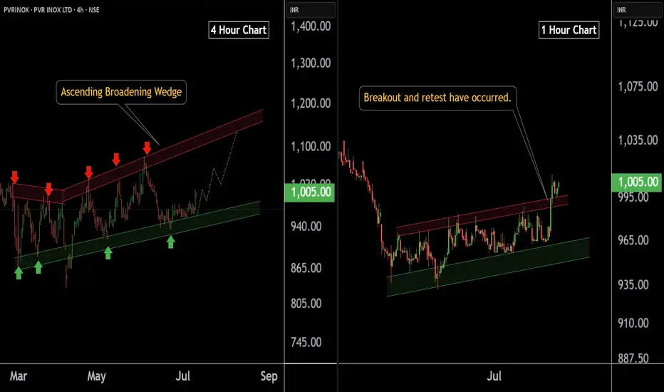
PVR INOX LTD at Best Support !! Breakout Alert !!Here are two charts of PVERINOX — one in the 4-hour timeframe and the other in the 1-hour timeframe.
4-Hour Timeframe Chart:
In the 4-hour timeframe, Power Inox is respecting its lower boundary, with a support range between 930–950.
ChatGPT said:
1-Hour Timeframe Chart:
In the 1-hour timeframe, the stock has given a breakout and has now completed a retest at 980-990 level.
If this level is sustain then , we may see higher in PVRINOX.
Thank you !!
VOLTAS In breakoutNSE:VOLTAS in breakout. As it approaches the key level of 1390, I recommend buying once it decisively crosses that threshold. With bullish momentum building, we can set our sights on the first target at 1480 and an ambitious second target at 1565!
Remember, investing requires careful analysis and risk management. Stay informed, and let’s navigate this market together! What are your thoughts? Are you eyeing VOLTAS or any other stocks for potential growth? Let’s discuss in the comments below! 💬💰 #StockMarket #InvestmentStrategy #VOLTAS #BreakoutTrading

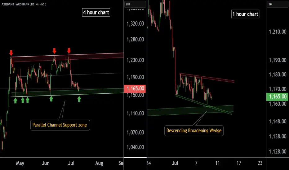
AXIS BANK at Best Support !!Here are two charts of Axis Bank — one in the 4-hour timeframe and the other in the 1-hour timeframe.
4-Hour Timeframe Chart:
In this chart, Axis Bank is moving within a parallel channel, with the support zone lying in the 1150–1160 range.
1-Hour Timeframe Chart:
Axis Bank is forming a descending broadening wedge pattern, with support near the 1150–1155 zone.
If this level is sustain ,then we may see higher prices in Axis Bank.
Thank You !!
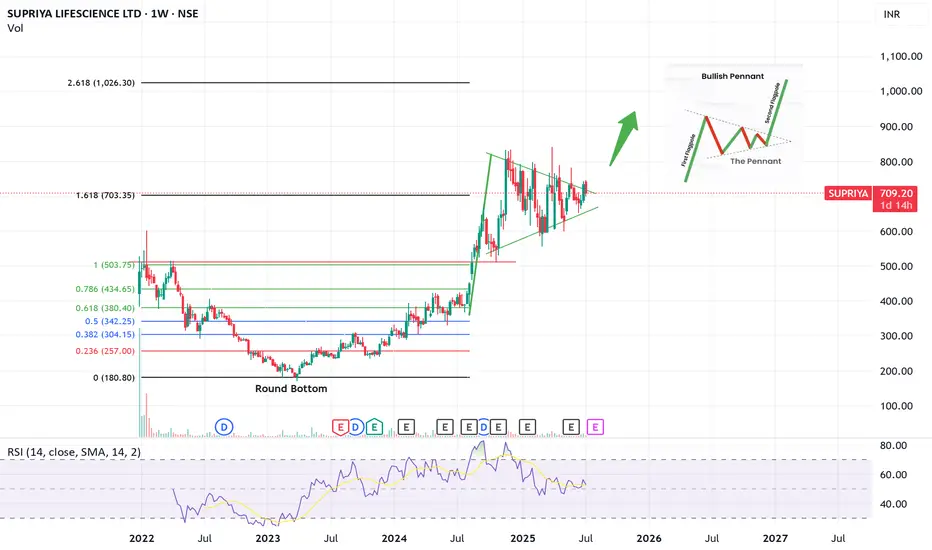
SUPRIYA! Bullish Penant. Weekly- Good company with decent fundamentals
- Bullish Penant visible. Need Breakout confirmation
- A little more consolidation possible
This is not a buy/sell advice. Only for educational purposes
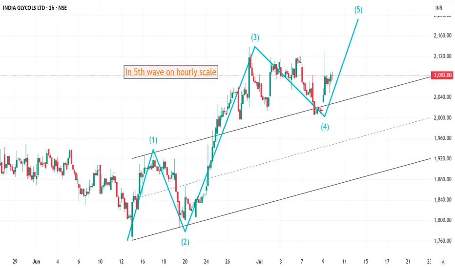
Elliott Wave Analysis of INDIAGLYCO on hourly timeframeThe stock is in 5th wave currently on hourly time frame. This must move upside at least 4-5% from here. Will update this chart as it progresses.
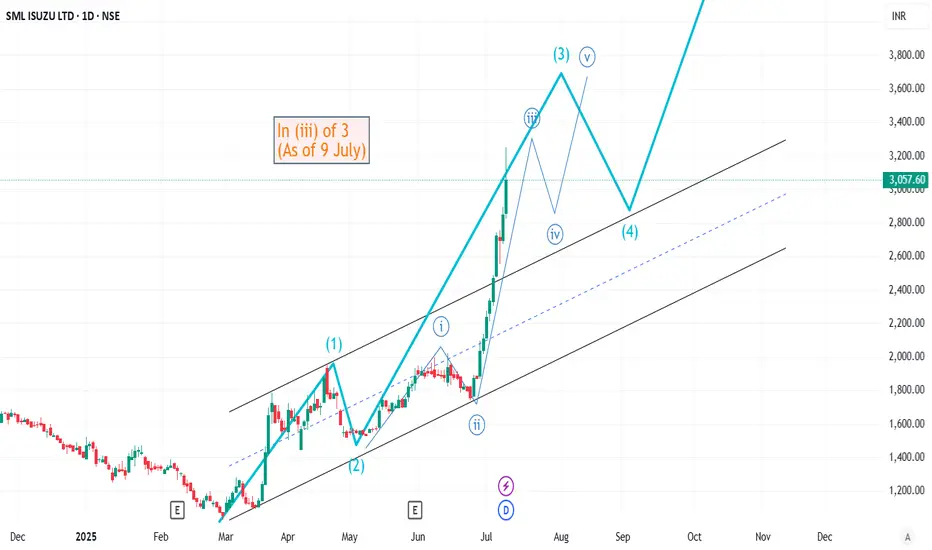
Elliott Wave Analysis of SMLISUZU on daily chartThe stock is currently in (iii) of 3rd wave. The probable wave directions and wave markings have been highlighted. Will update this chart as it progresses or as the (iv) wave gets over.
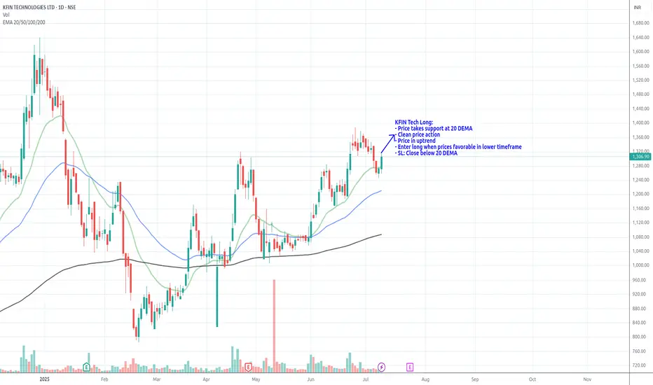
KFIN Tech_Long_Support @ 20DEMAKFIN Tech Long:
- Price takes support at 20 DEMA
- Clean price action
- Price in uptrend
- Enter long when prices favorable in lower timeframe
- SL: Close below 20 DEMA
Review and plan for 10th July 2025 Nifty future and banknifty future analysis and intraday plan.
Swing ideas.
This video is for information/education purpose only. you are 100% responsible for any actions you take by reading/viewing this post.
please consult your financial advisor before taking any action.
----Vinaykumar hiremath, CMT

Bajaj Finance Long_Support @ 20 DEMABajaj Finance Long:
- Price takes support at 20 DEMA
- Rebound from the trend line
- Enter long when the price are favorable in the lower timeframe
- SL: Close below 20 DEMA

Computer Age Management BuyComputer Age Management took support at trend line. Price crosses above 200-DMA and golden crossover. Buy @CMP (4225) with Sl of 4090 and target of 4340, 4770, 4930 & 5300.

NALCO SellNALCO breaks below trend line within bigger channel setup. Already in downtrend. Sell @CMP (186) with SL of 192 and target of 180, 175 & 155. May also reach 120.

SONATASOFTWARE techno-funda analysisSonata Software Ltd. is a global IT services and solutions company focused on digital transformation, cloud enablement, and platform modernization. It caters to sectors like retail, BFSI, travel, and manufacturing, with deep capabilities in Microsoft ecosystem technologies. The stock is currently trading at ₹509.35 and is forming a base after a broad retracement from previous highs.
Sonata Software Ltd. – FY22–FY25 Snapshot
Sales – ₹5,372 Cr → ₹6,214 Cr → ₹7,465 Cr → ₹8,155 Cr – Consistent revenue expansion led by digital and cloud
Net Profit – ₹410 Cr → ₹487 Cr → ₹548 Cr → ₹618 Cr – Margin stability despite macro cost pressures
Company Order Book – Moderate → Moderate → Strong → Strong – Strong deal pipeline in U.S. and Europe Dividend Yield (%) – 1.23% → 1.31% → 1.40% → 1.40% – Fair yield, supports total shareholder return
Operating Performance – Moderate → Moderate → Strong → Strong – Cloud and IP-led growth improving
Equity Capital – ₹140.23 Cr (constant) – Efficient capital structure
Total Debt – ₹195 Cr → ₹180 Cr → ₹165 Cr → ₹155 Cr – Low and declining, comfortable leverage
Total Liabilities – ₹2,030 Cr → ₹2,150 Cr → ₹2,270 Cr → ₹2,385 Cr – Growing with operating scale
Fixed Assets – ₹465 Cr → ₹480 Cr → ₹505 Cr → ₹528 Cr – Gradual tech and infra investment
Latest Highlights
FY25 net profit rose 12.8% YoY to ₹618 Cr; revenue up 9.2% to ₹8,155 Cr
EPS: ₹44.07 | EBITDA Margin: 17.4% | Net Margin: 7.58%
Return on Equity: 21.79% | Return on Assets: 10.96%
Promoter holding: 34.55% | Dividend Yield: 1.40%
Strong performance in cloud migration, managed services, and proprietary platform IPs
North America remains key growth driver, with robust enterprise digital transformation budgets
Technical Snapshot Sonata Software is trading at ₹509.35 with an RSI of 44.70, signaling neutral to mildly bearish sentiment. After correcting from the recent top, the stock has found support around ₹509.35 and earlier at ₹424.15 and ₹366.45. Price is coiling near the base of a structural channel with rebound potential. If sentiment turns, bullish retracement targets lie at ₹787.00, ₹923.05, and ₹1,096.40 in the medium term.
Business Growth Verdict Yes, Sonata Software is scaling steadily with a solid IP-led tech strategy
Margins are stable with strong ROE and limited debt exposure
Order book strength and platform-led solutions support future visibility
Capex and infra investments remain conservative and purposeful
Final Investment Verdict Sonata Software offers a mature growth narrative in the mid-cap IT services space. Its differentiated approach in digital engineering, Microsoft partnerships, and repeat global clientele provide high revenue stickiness. While broader IT demand is moderating, Sonata’s platform-led margin resilience and capital discipline stand out. The current technical base and improving order visibility make it a strong candidate for medium-term accumulation with a focus on operational consistency and yield support.

AXIS BANK at Best Support !!This is the 1 hour chart of AXIS BANK .
Axis bank having a good law of polarity at 1200 level.
Axisbank is moving in well defined parallel channel with support range 1160-1180 .
If this level is sustain , then we may see higher prices in AXISBANK.

HINDUSTAN ZINC LTD at Best Support !!There are two charts of Hindustan Zinc — one on the 4-hour time frame, and the second on weekly time frame.
Chart 1 (4-Hour Timeframe):
The stock is moving in a Higher High, Higher Low (HH-HL) structure, indicating a bullish trend.
Support zone is observed near the 400–410 range.
Chart 2 (Weekly Timeframe):
On the weekly chart:
the stock is approaching a major support zone in the range of ₹375 – ₹390, which has historically held strong.
If this level is sustain then we may see higher prices in HINDZINC.
Thank You !!

SYRMA SGS TECHNOLOGY LTD S/RSupport and Resistance Levels:
Support Levels: These are price points (green line/shade) where a downward trend may be halted due to a concentration of buying interest. Imagine them as a safety net where buyers step in, preventing further decline.
Resistance Levels: Conversely, resistance levels (red line/shade) are where upward trends might stall due to increased selling interest. They act like a ceiling where sellers come in to push prices down.
Breakouts:
Bullish Breakout: When the price moves above resistance, it often indicates strong buying interest and the potential for a continued uptrend. Traders may view this as a signal to buy or hold.
Bearish Breakout: When the price falls below support, it can signal strong selling interest and the potential for a continued downtrend. Traders might see this as a cue to sell or avoid buying.
MA Ribbon (EMA 20, EMA 50, EMA 100, EMA 200) :
Above EMA: If the stock price is above the EMA, it suggests a potential uptrend or bullish momentum.
Below EMA: If the stock price is below the EMA, it indicates a potential downtrend or bearish momentum.
Trendline: A trendline is a straight line drawn on a chart to represent the general direction of a data point set.
Uptrend Line: Drawn by connecting the lows in an upward trend. Indicates that the price is moving higher over time. Acts as a support level, where prices tend to bounce upward.
Downtrend Line: Drawn by connecting the highs in a downward trend. Indicates that the price is moving lower over time. It acts as a resistance level, where prices tend to drop.
Disclaimer:
I am not a SEBI registered. The information provided here is for learning purposes only and should not be interpreted as financial advice. Consider the broader market context and consult with a qualified financial advisor before making investment decisions.

MAZDA LTD S/RSupport and Resistance Levels:
Support Levels: These are price points (green line/shade) where a downward trend may be halted due to a concentration of buying interest. Imagine them as a safety net where buyers step in, preventing further decline.
Resistance Levels: Conversely, resistance levels (red line/shade) are where upward trends might stall due to increased selling interest. They act like a ceiling where sellers come in to push prices down.
Breakouts:
Bullish Breakout: When the price moves above resistance, it often indicates strong buying interest and the potential for a continued uptrend. Traders may view this as a signal to buy or hold.
Bearish Breakout: When the price falls below support, it can signal strong selling interest and the potential for a continued downtrend. Traders might see this as a cue to sell or avoid buying.
MA Ribbon (EMA 20, EMA 50, EMA 100, EMA 200) :
Above EMA: If the stock price is above the EMA, it suggests a potential uptrend or bullish momentum.
Below EMA: If the stock price is below the EMA, it indicates a potential downtrend or bearish momentum.
Trendline: A trendline is a straight line drawn on a chart to represent the general direction of a data point set.
Uptrend Line: Drawn by connecting the lows in an upward trend. Indicates that the price is moving higher over time. Acts as a support level, where prices tend to bounce upward.
Downtrend Line: Drawn by connecting the highs in a downward trend. Indicates that the price is moving lower over time. It acts as a resistance level, where prices tend to drop.
Disclaimer:
I am not a SEBI registered. The information provided here is for learning purposes only and should not be interpreted as financial advice. Consider the broader market context and consult with a qualified financial advisor before making investment decisions.

Indian Railway Catering & Tourism Corporation LtdStructure break in this stock with good volume now we can some good momentum

REL: Red Band is gone
REL : Red band , which was a major resistance level as mentioned in my previous post has disappeared now.
( Not a Buy / Sell Recommendation
Do your own due diligence ,Market is subject to risks, This is my own view and for learning only .)
BSE - BUY THE FEAR, SELL THE GREED !"Buy the fear, sell on greed" is an investment strategy that means you should buy assets when most investors are scared and selling (during periods of fear), and sell those assets when most investors are excited and buying (during periods of greed).
Why does this work?
⦁ When fear dominates the market, prices often drop below their true value because people panic and sell at low prices. This creates opportunities for disciplined investors to buy quality assets at a discount.
⦁ When greed takes over, prices often rise above their real worth because people are eager to buy, hoping for quick gains. This is usually a good time to sell, as the risk of a downturn increases.
How do emotions affect markets?
⦁ Fear leads to panic selling, causing prices to fall further and often locking in losses for those who sell at the bottom.
⦁ Greed leads to speculative buying, driving prices higher and sometimes creating bubbles that eventually burst.
Why is it hard to follow?
⦁ While the idea is simple, it is emotionally difficult to buy when everyone else is pessimistic and selling, or to sell when everyone else is optimistic and buying. Most people act on emotion rather than logic, which is why few consistently succeed with this approach.
Practical example:
During a market crash, negative news and panic cause many to sell at low prices. A disciplined investor who buys during this fear can benefit when the market recovers. Conversely, when markets are booming and everyone is rushing to buy, selling at this point can help lock in gains before a potential correction.
Key takeaway:
This strategy is about removing emotion from investing decisions and taking a contrarian approach—buying when others are fearful and selling when others are greedy—rather than following the crowd. This approach has been used by successful investors like Warren Buffett to achieve long-term success by focusing on value and maintaining emotional discipline.

SYNERGY GREEN IND. LTD S/RSupport and Resistance Levels:
Support Levels: These are price points (green line/shade) where a downward trend may be halted due to a concentration of buying interest. Imagine them as a safety net where buyers step in, preventing further decline.
Resistance Levels: Conversely, resistance levels (red line/shade) are where upward trends might stall due to increased selling interest. They act like a ceiling where sellers come in to push prices down.
Breakouts:
Bullish Breakout: When the price moves above resistance, it often indicates strong buying interest and the potential for a continued uptrend. Traders may view this as a signal to buy or hold.
Bearish Breakout: When the price falls below support, it can signal strong selling interest and the potential for a continued downtrend. Traders might see this as a cue to sell or avoid buying.
MA Ribbon (EMA 20, EMA 50, EMA 100, EMA 200) :
Above EMA: If the stock price is above the EMA, it suggests a potential uptrend or bullish momentum.
Below EMA: If the stock price is below the EMA, it indicates a potential downtrend or bearish momentum.
Trendline: A trendline is a straight line drawn on a chart to represent the general direction of a data point set.
Uptrend Line: Drawn by connecting the lows in an upward trend. Indicates that the price is moving higher over time. Acts as a support level, where prices tend to bounce upward.
Downtrend Line: Drawn by connecting the highs in a downward trend. Indicates that the price is moving lower over time. It acts as a resistance level, where prices tend to drop.
Disclaimer:
I am not a SEBI registered. The information provided here is for learning purposes only and should not be interpreted as financial advice. Consider the broader market context and consult with a qualified financial advisor before making investment decisions.

GLOBAL HEALTH LTD S/RSupport and Resistance Levels:
Support Levels: These are price points (green line/shade) where a downward trend may be halted due to a concentration of buying interest. Imagine them as a safety net where buyers step in, preventing further decline.
Resistance Levels: Conversely, resistance levels (red line/shade) are where upward trends might stall due to increased selling interest. They act like a ceiling where sellers come in to push prices down.
Breakouts:
Bullish Breakout: When the price moves above resistance, it often indicates strong buying interest and the potential for a continued uptrend. Traders may view this as a signal to buy or hold.
Bearish Breakout: When the price falls below support, it can signal strong selling interest and the potential for a continued downtrend. Traders might see this as a cue to sell or avoid buying.
MA Ribbon (EMA 20, EMA 50, EMA 100, EMA 200) :
Above EMA: If the stock price is above the EMA, it suggests a potential uptrend or bullish momentum.
Below EMA: If the stock price is below the EMA, it indicates a potential downtrend or bearish momentum.
Trendline: A trendline is a straight line drawn on a chart to represent the general direction of a data point set.
Uptrend Line: Drawn by connecting the lows in an upward trend. Indicates that the price is moving higher over time. Acts as a support level, where prices tend to bounce upward.
Downtrend Line: Drawn by connecting the highs in a downward trend. Indicates that the price is moving lower over time. It acts as a resistance level, where prices tend to drop.
Disclaimer:
I am not a SEBI registered. The information provided here is for learning purposes only and should not be interpreted as financial advice. Consider the broader market context and consult with a qualified financial advisor before making investment decisions.

at strong support level A support level is formed when a market's price action reverses and changes direction, leaving behind a peak or trough (swing point) in the market ..
