What is Inflation Climate and Weather? Copper is NextThe key driver of most markets — and a major influence on their trends — is inflation.
Once we understand the difference between short-term inflation weather and long-term inflation climate, we can better recognize where risk meets opportunity.
On this half yearly chart. We can see as the close on 30th June, copper settled firmly, closed above its $4.44 resistance that has been tested for years.
This study indicates that copper could be at the beginning of an uptrend. I will be looking out for buying-on-dips opportunities whenever they arise.
Mirco Copper Futures
Ticker: MHG
Minimum fluctuation:
0.0005 per pound = $1.25
Disclaimer:
• What presented here is not a recommendation, please consult your licensed broker.
• Our mission is to create lateral thinking skills for every investor and trader, knowing when to take a calculated risk with market uncertainty and a bolder risk when opportunity arises.
CME Real-time Market Data help identify trading set-ups in real-time and express my market views. If you have futures in your trading portfolio, you can check out on CME Group data plans available that suit your trading needs www.tradingview.com
Trading the Micro: www.cmegroup.com
www.cmegroup.com
Economy

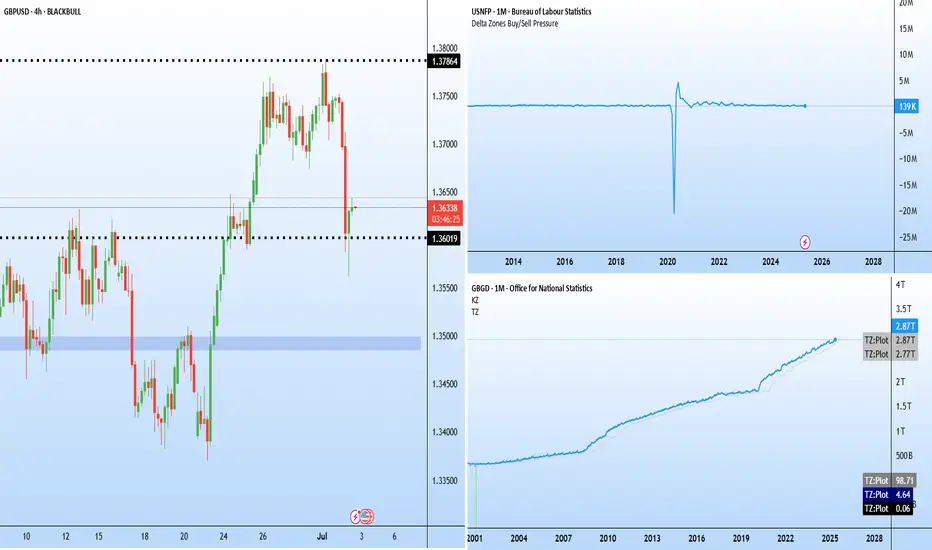
Jobs vs politics: GBPUSD caught in crossfire Two major stories are developing on either side of the Atlantic.
ADP reported a 33 k fall in June private payrolls (consensus +95 k). It is the third straight miss and sets the tone for Thursday’s early Non-Farm Payroll (NFP) release, brought forward because of the 4 July holiday.
In the UK, speculation is growing around the position of Chancellor Rachel Reeves after an emotional appearance in Parliament. Prime Minister Keir Starmer declined to confirm whether she would remain in the role, sparking questions over the government’s fiscal direction.
The political uncertainty helped accelerate the sell-off in GBPUSD, which has fallen sharply from recent highs near 1.38. The latest candles show a long lower wick around 1.3600, indicating that buyers are attempting to defend the area. If this support fails to hold, the next downside target lies near 1.3485–1.3500, which acted as a base for the late-June rally.
NFP report for Thursday July 3, the crucial figure of the weekBeware this week for stock market fundamentals, as it's a special week. Friday, July 4 is an Independence Day holiday in the United States. On July 4, 1776, the Continental Congress adopted the Declaration of Independence, a text drafted principally by Thomas Jefferson, which proclaimed that the 13 American colonies had officially separated from the United Kingdom.
For this first week of July on the stock market, this has a direct impact on the US fundamentals update. As you may know, it's the first Friday of every month that the US NFP report is updated, which is the monthly report on the US labor market. Consequently, this particular week sees the publication of the NFP report brought forward from Friday July 4 to Thursday July 3. It is therefore the stock market session on Thursday July 3 that will be the fundamental highlight of the week, with the NFP report likely to have a strong influence on the FED's monetary policy decision on Wednesday July 30.
1) The probability of the FED cutting its rate on Wednesday July 30 is just 21%
At this stage, and following last Friday's US PCE inflation update, the probability of the FED resuming the cut in the federal funds rate is just over 20%. Despite the strong pressure exerted by Donald Trump on Jerome Powell's FED, the FOMC (the FED's monetary policy committee) is in no hurry to cut rates in the face of the risk of a rebound in inflation caused by tariffs.
Last week, we offered you a fundamental analysis of the FED, which you can reread by clicking on the image below.
2) The US labor market seems to be starting to deteriorate according to the continuing weekly jobless claims
In reality, there is only one fundamental factor that could allow the FED rate to be cut at the monetary meeting on Wednesday July 30: a deterioration in the labor market with the NFP report figures on Thursday July 3. It's true that the latest updates on ongoing weekly US jobless claims show an increasingly negative dynamic which could end up feeding the US unemployment rate higher.
3) Beware, the slightest upward tick in the US unemployment rate when the NFP report is updated on Thursday July 3 could accelerate the FED's timetable for resuming the US federal funds rate
Keep in mind that the FED is pursuing two major objectives: inflation under control at around 2% and low unemployment. The FED's alert threshold is currently 4.4% of the labor force, and the consensus for the NFP report update of Thursday July 3 is 4.3% of the labor force.
CAUTION therefore: if the US unemployment rate makes 1 or 2 upward ticks this Thursday, the probability of a FED rate cut on Wednesday July 30 will rise sharply. This is the fundamental highlight of the week.
DISCLAIMER:
This content is intended for individuals who are familiar with financial markets and instruments and is for information purposes only. The presented idea (including market commentary, market data and observations) is not a work product of any research department of Swissquote or its affiliates. This material is intended to highlight market action and does not constitute investment, legal or tax advice. If you are a retail investor or lack experience in trading complex financial products, it is advisable to seek professional advice from licensed advisor before making any financial decisions.
This content is not intended to manipulate the market or encourage any specific financial behavior.
Swissquote makes no representation or warranty as to the quality, completeness, accuracy, comprehensiveness or non-infringement of such content. The views expressed are those of the consultant and are provided for educational purposes only. Any information provided relating to a product or market should not be construed as recommending an investment strategy or transaction. Past performance is not a guarantee of future results.
Swissquote and its employees and representatives shall in no event be held liable for any damages or losses arising directly or indirectly from decisions made on the basis of this content.
The use of any third-party brands or trademarks is for information only and does not imply endorsement by Swissquote, or that the trademark owner has authorised Swissquote to promote its products or services.
Swissquote is the marketing brand for the activities of Swissquote Bank Ltd (Switzerland) regulated by FINMA, Swissquote Capital Markets Limited regulated by CySEC (Cyprus), Swissquote Bank Europe SA (Luxembourg) regulated by the CSSF, Swissquote Ltd (UK) regulated by the FCA, Swissquote Financial Services (Malta) Ltd regulated by the Malta Financial Services Authority, Swissquote MEA Ltd. (UAE) regulated by the Dubai Financial Services Authority, Swissquote Pte Ltd (Singapore) regulated by the Monetary Authority of Singapore, Swissquote Asia Limited (Hong Kong) licensed by the Hong Kong Securities and Futures Commission (SFC) and Swissquote South Africa (Pty) Ltd supervised by the FSCA.
Products and services of Swissquote are only intended for those permitted to receive them under local law.
All investments carry a degree of risk. The risk of loss in trading or holding financial instruments can be substantial. The value of financial instruments, including but not limited to stocks, bonds, cryptocurrencies, and other assets, can fluctuate both upwards and downwards. There is a significant risk of financial loss when buying, selling, holding, staking, or investing in these instruments. SQBE makes no recommendations regarding any specific investment, transaction, or the use of any particular investment strategy.
CFDs are complex instruments and come with a high risk of losing money rapidly due to leverage. The vast majority of retail client accounts suffer capital losses when trading in CFDs. You should consider whether you understand how CFDs work and whether you can afford to take the high risk of losing your money.
Digital Assets are unregulated in most countries and consumer protection rules may not apply. As highly volatile speculative investments, Digital Assets are not suitable for investors without a high-risk tolerance. Make sure you understand each Digital Asset before you trade.
Cryptocurrencies are not considered legal tender in some jurisdictions and are subject to regulatory uncertainties.
The use of Internet-based systems can involve high risks, including, but not limited to, fraud, cyber-attacks, network and communication failures, as well as identity theft and phishing attacks related to crypto-assets.

Every cycle since 1970 has whispered the same sequence...Every cycle since 1970 has whispered the same sequence...
➊ Fed pivot (rate cutting cycle)
➋ Recessions + jobless claims uptrend
➌ Gold vs the stock market uptrend
That’s when commodities explode and outperform.

FED, rate cut possible on July 30? With the US Federal Reserve (FED) meeting on July 30 fast approaching, the markets are scrutinizing the slightest signals likely to indicate an inflexion in monetary policy. While a rate cut seems unlikely in the short term, it cannot be ruled out altogether. Despite Chairman Jerome Powell's firm stance, some influential members of the Monetary Policy Committee (FOMC) are actively pushing for monetary easing this summer.
1) Jerome Powell is not the only decision-maker on the FOMC, and there is pressure for a rate cut in July
Jerome Powell adopts a very cautious stance, making any monetary easing conditional on clear convergence towards the 2% inflation target. His main concern is the potentially inflationary impact of the tariffs currently under negotiation. However, Powell does not have absolute power. The FOMC has 12 voting members, including 7 permanent governors, the president of the New York Fed and 4 rotating regional bank presidents.
Although each vote is worth as much, the Chairman largely shapes the agenda and guides the discussions. Some members, such as Michelle Bowman and Christopher Waller, appointed under the Trump presidency, are pushing for a cut as early as July. Donald Trump's implicit support for this option adds political pressure, even if his direct influence is limited.
Below is a table showing the current balance of power between the voting members of the FOMC.
2) There will be a rate cut on July 30 if and only if the unemployment rate becomes worrying
On the fundamentals side, inflation measured by the PCE index, the FED's benchmark, remains slightly above target, but several key components are showing signs of normalization. Oil, which accounts for around 11% of the basket, is not showing any alarming technical signals with the geopolitical calm in the Middle East. The real estate sector and healthcare spending, also heavily weighted, are showing positive indications in favor of further disinflation. Moreover, tariffs are only marginally affecting services, which account for 67% of the PCE.
Despite this, Powell remains concerned about the risk of exogenous inflationary resurgence, especially if the universal 10% tariff were to apply to all US trading partners, with an expected impact on core PCE of +0.2% to +0.3%.
Markets are anticipating a first decline in September, but a July changeover cannot be ruled out if employment data, notably the NFP report of July 3, show a marked weakening of the labor market.
3) The S&P 500 index will need the FED's pivot to go higher, as it has returned to its all-time high
On the financial markets, a FED pivot would be a decisive bullish catalyst, especially for US equities, Bitcoin and other high-beta assets. Technical analysis of the S&P 500 shows a favourable technical configuration since the beginning of April, with a V-shaped recovery. But with the market now in contact with its all-time high, very positive fundamentals will be needed to consider going higher.
In short, the decision on July 30 will depend on a subtle trade-off between political pressures, inflation dynamics and the health of the job market. A status quo remains the central scenario, but a reversal is conceivable in the event of a sharp deterioration in macroeconomic data, good inflation figures or positive surprises on trade diplomacy.
DISCLAIMER:
This content is intended for individuals who are familiar with financial markets and instruments and is for information purposes only. The presented idea (including market commentary, market data and observations) is not a work product of any research department of Swissquote or its affiliates. This material is intended to highlight market action and does not constitute investment, legal or tax advice. If you are a retail investor or lack experience in trading complex financial products, it is advisable to seek professional advice from licensed advisor before making any financial decisions.
This content is not intended to manipulate the market or encourage any specific financial behavior.
Swissquote makes no representation or warranty as to the quality, completeness, accuracy, comprehensiveness or non-infringement of such content. The views expressed are those of the consultant and are provided for educational purposes only. Any information provided relating to a product or market should not be construed as recommending an investment strategy or transaction. Past performance is not a guarantee of future results.
Swissquote and its employees and representatives shall in no event be held liable for any damages or losses arising directly or indirectly from decisions made on the basis of this content.
The use of any third-party brands or trademarks is for information only and does not imply endorsement by Swissquote, or that the trademark owner has authorised Swissquote to promote its products or services.
Swissquote is the marketing brand for the activities of Swissquote Bank Ltd (Switzerland) regulated by FINMA, Swissquote Capital Markets Limited regulated by CySEC (Cyprus), Swissquote Bank Europe SA (Luxembourg) regulated by the CSSF, Swissquote Ltd (UK) regulated by the FCA, Swissquote Financial Services (Malta) Ltd regulated by the Malta Financial Services Authority, Swissquote MEA Ltd. (UAE) regulated by the Dubai Financial Services Authority, Swissquote Pte Ltd (Singapore) regulated by the Monetary Authority of Singapore, Swissquote Asia Limited (Hong Kong) licensed by the Hong Kong Securities and Futures Commission (SFC) and Swissquote South Africa (Pty) Ltd supervised by the FSCA.
Products and services of Swissquote are only intended for those permitted to receive them under local law.
All investments carry a degree of risk. The risk of loss in trading or holding financial instruments can be substantial. The value of financial instruments, including but not limited to stocks, bonds, cryptocurrencies, and other assets, can fluctuate both upwards and downwards. There is a significant risk of financial loss when buying, selling, holding, staking, or investing in these instruments. SQBE makes no recommendations regarding any specific investment, transaction, or the use of any particular investment strategy.
CFDs are complex instruments and come with a high risk of losing money rapidly due to leverage. The vast majority of retail client accounts suffer capital losses when trading in CFDs. You should consider whether you understand how CFDs work and whether you can afford to take the high risk of losing your money.
Digital Assets are unregulated in most countries and consumer protection rules may not apply. As highly volatile speculative investments, Digital Assets are not suitable for investors without a high-risk tolerance. Make sure you understand each Digital Asset before you trade.
Cryptocurrencies are not considered legal tender in some jurisdictions and are subject to regulatory uncertainties.
The use of Internet-based systems can involve high risks, including, but not limited to, fraud, cyber-attacks, network and communication failures, as well as identity theft and phishing attacks related to crypto-assets.

June 27 PCE inflation, stagflation is avoidable.The release of the U.S. Personal Consumption Expenditures (PCE) price index, due this Friday June 27, is the major macroeconomic event of the week. The Federal Reserve's (Fed) preferred inflation indicator, the PCE could play a decisive role in determining the direction of US monetary policy in the second half of 2025.
1) PCE inflation is the Fed's favorite inflation index
The economic context is particularly delicate. At its last meeting, the Fed maintained its key rate between 4.25% and 4.5%, while revising its macroeconomic projections. It now anticipates weaker growth, higher inflation and slightly higher unemployment by the end of 2025. This cautious stance reflects the many uncertainties, notably geopolitical and trade uncertainties, and tensions over raw materials, particularly oil. These factors could revive fears of a stagflation scenario, i.e. a combination of weak growth and persistent inflation.
Against this backdrop, the PCE figure for May is of strategic importance. The Fed remains attentive to what this indicator shows: confirmation of a slowdown in price rises would reinforce the hypothesis of a first rate cut as early as September. Conversely, an unexpected rebound, driven in particular by energy prices or the new tariffs introduced by the Trump administration, could postpone this deadline and intensify tensions on financial markets.
2) The stagflation scenario is still avoidable
However, the immediate outlook for PCE seems relatively contained. According to leading indicators of underlying inflation, the components most sensitive to fluctuations in world prices, such as services and real estate, are not showing any signs of overheating. On the other hand, the recent rise in oil prices, stimulated by tensions in the Middle East, could lead to a temporary increase in nominal inflation. Its overall impact is estimated at around 10%, which remains moderate at this stage.
Beyond this release, markets are weighing up the chances of the Fed taking action ahead of its key meeting on Wednesday September 17. Should geopolitical uncertainty diminish and inflation figures continue to normalize, the conditions for monetary easing would be met. At present, ten FOMC members are leaning towards two rate cuts by the end of the year, while seven prefer to maintain the status quo. Fed Chairman Jerome Powell was cautious, insisting on the need to be guided by economic data.
All in all, the June 27 ECP will act as an eye-opener. It will shed light on the current state of inflationary dynamics in the United States, and strongly influence investor expectations. If it reinforces the idea that inflation is converging towards the 2% target on a sustainable basis, markets could regain confidence in a more accommodating monetary policy.
In any case, the Fed will have to navigate skilfully between ambiguous economic signals, persistent exogenous risks and growing political pressure. Friday's PCE figure represents much more than a simple monthly indicator: it is a compass for US monetary strategy.
DISCLAIMER:
This content is intended for individuals who are familiar with financial markets and instruments and is for information purposes only. The presented idea (including market commentary, market data and observations) is not a work product of any research department of Swissquote or its affiliates. This material is intended to highlight market action and does not constitute investment, legal or tax advice. If you are a retail investor or lack experience in trading complex financial products, it is advisable to seek professional advice from licensed advisor before making any financial decisions.
This content is not intended to manipulate the market or encourage any specific financial behavior.
Swissquote makes no representation or warranty as to the quality, completeness, accuracy, comprehensiveness or non-infringement of such content. The views expressed are those of the consultant and are provided for educational purposes only. Any information provided relating to a product or market should not be construed as recommending an investment strategy or transaction. Past performance is not a guarantee of future results.
Swissquote and its employees and representatives shall in no event be held liable for any damages or losses arising directly or indirectly from decisions made on the basis of this content.
The use of any third-party brands or trademarks is for information only and does not imply endorsement by Swissquote, or that the trademark owner has authorised Swissquote to promote its products or services.
Swissquote is the marketing brand for the activities of Swissquote Bank Ltd (Switzerland) regulated by FINMA, Swissquote Capital Markets Limited regulated by CySEC (Cyprus), Swissquote Bank Europe SA (Luxembourg) regulated by the CSSF, Swissquote Ltd (UK) regulated by the FCA, Swissquote Financial Services (Malta) Ltd regulated by the Malta Financial Services Authority, Swissquote MEA Ltd. (UAE) regulated by the Dubai Financial Services Authority, Swissquote Pte Ltd (Singapore) regulated by the Monetary Authority of Singapore, Swissquote Asia Limited (Hong Kong) licensed by the Hong Kong Securities and Futures Commission (SFC) and Swissquote South Africa (Pty) Ltd supervised by the FSCA.
Products and services of Swissquote are only intended for those permitted to receive them under local law.
All investments carry a degree of risk. The risk of loss in trading or holding financial instruments can be substantial. The value of financial instruments, including but not limited to stocks, bonds, cryptocurrencies, and other assets, can fluctuate both upwards and downwards. There is a significant risk of financial loss when buying, selling, holding, staking, or investing in these instruments. SQBE makes no recommendations regarding any specific investment, transaction, or the use of any particular investment strategy.
CFDs are complex instruments and come with a high risk of losing money rapidly due to leverage. The vast majority of retail client accounts suffer capital losses when trading in CFDs. You should consider whether you understand how CFDs work and whether you can afford to take the high risk of losing your money.
Digital Assets are unregulated in most countries and consumer protection rules may not apply. As highly volatile speculative investments, Digital Assets are not suitable for investors without a high-risk tolerance. Make sure you understand each Digital Asset before you trade.
Cryptocurrencies are not considered legal tender in some jurisdictions and are subject to regulatory uncertainties.
The use of Internet-based systems can involve high risks, including, but not limited to, fraud, cyber-attacks, network and communication failures, as well as identity theft and phishing attacks related to crypto-assets.

Argentina Money Supply Reduced Along With InflationWe once again see that MMT ("Modern" Monetary Theory) is 100% wrong. Milton Friedman wins again.
"Inflation is always and everywhere a monetary phenomenon."
Don't let modern economic hacks fool you.

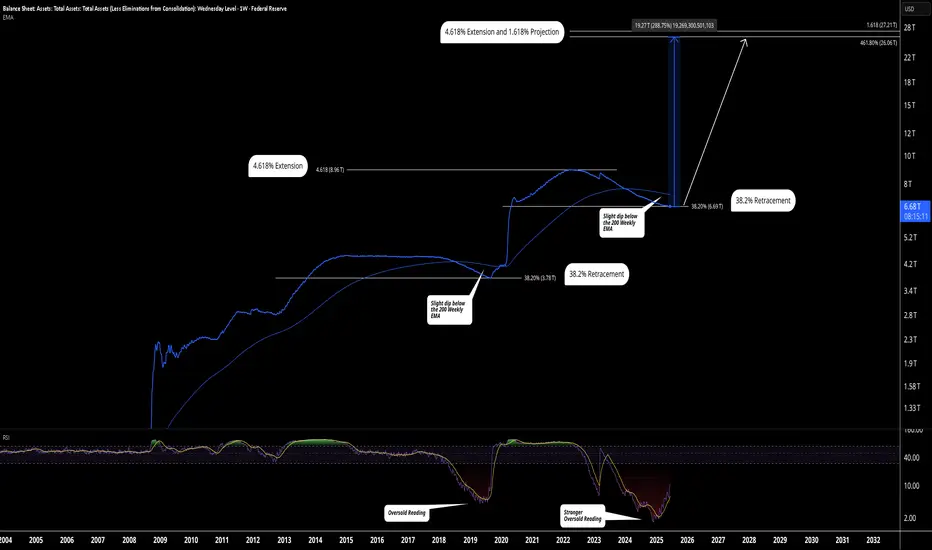
FED Balance Sheet Projection Using Technical AnalysisThis chart refers to the total assets owned by the Federal Reserve System. Essentially, if this chart is contracting, there is less liquidity in the economy/markets, if it's expanding, there is more liquidity. If this chart enters its expansion phase, we can expect risk assets to pump, reaching new all time highs and the dawn of a new super cycle. This doesn't happen often.
When we look at previous patterns, it looks like this chart has lined up for its next big move up.
Firstly, if we look at the similarities between the previous cycle and the present moment, we have a retracement to the 38.2% Fibonacci level, a slight dip below the weekly 200 EMA, and a stronger oversold reading on the RSI. It looks like WALCL is ready for another move higher, this would signal another round of QE by the FED.
For targets, we looking looking at the same target as the previous cycle, the 4.618% Fibonacci extension level, coupled with a confluence of the 1.618% projection, this would result in an increase of 288% in the FED's Balance Sheet, a massive move up and would result in an absurd amount of money printing and inflation.
If this projection plays out, the cryptocurrency, housing and stock market will absolutely skyrocket. Now is the time to consider loading up on some risk assets and protect yourself from the inflation that is to come, it's likely to be hyper inflationary. The definition of hyper inflation is: "Hyperinflation is a severe economic condition characterized by an extraordinarily rapid increase in prices, typically defined as an inflation rate exceeding 50 percent per month."
Let me know what you think.
Trade safe,
SunnyHillCapital
BofA High Yield SpreadsI check this chart all the time. If the blue line starts trending higher the market will struggle.

$JPIRYY -Japan CPI (May/2025)ECONOMICS:JPIRYY
May/2025
source: Ministry of Internal Affairs & Communications
- Japan's annual inflation rate edged down to 3.5% in May 2025 from 3.6% in the previous two months, marking the lowest level since November.
Price growth eased for clothing (2.6% vs 2.7% in April), household items (3.6% vs 4.1%), and healthcare (2.0% vs 2.2%), while education costs fell further (-5.6%). In contrast, inflation held steady for transport (2.7%) and miscellaneous items (1.3%), but accelerated for housing (1.1% vs 1.0%), recreation (3.0% vs 2.7%), and communications (1.9% vs 1.1%).
Meanwhile, prices of electricity (11.3% vs 13.5%) and gas (5.4% vs 4.4%) remained elevated.
On the food side, prices increased by 6.5%, staying at the slowest pace in four months, though rice prices soared over 100%, underscoring the limited impact of government efforts to rein in staple food costs.
Meanwhile, the core inflation accelerated to 3.7% from 3.5% in April, reaching its highest level in over two years, ahead of the summer election.
Monthly, the CPI rose 0.3%, after a 0.1% gain in April.

$GBINTR - Steady Rates by BoE (June/2025)ECONOMICS:GBINTR
June/2025
source: Bank of England
- The Bank of England voted 6-3 to keep the Bank Rate steady at 4.25% at its June meeting, amid ongoing global uncertainty and persistent inflation.
The central bank noted inflation is expected to remain at current rates for the rest of the year before easing back toward the target next year,
indicating that a gradual and cautious approach to further monetary policy easing remains appropriate.

Soon find it more expensive to fill up car with gas!Minimum wage earners can soon find it more expensive to fill up their cars with gas.
Breakdowns in this chart have also coincided with tops in the stock market.
Followed by impressive runs for gold, silver, uranium, platinum, copper, and of course... oil!

$USINTR -Fed Keeps Rates Uncut (June/2025)ECONOMICS:USINTR
June/2025
source: Federal Reserve
- The Federal Reserve left the federal funds rate unchanged at 4.25%–4.50% for a fourth consecutive meeting in June 2025, in line with expectations, as policymakers take a cautious stance to fully evaluate the economic impact of President Trump’s policies, particularly those related to tariffs, immigration, and taxation. However, officials are still pricing in two rate cuts this year.

GBIRYY - U.K Inflation (May/2025)ECONOMICS:GBIRYY
May/2025
source: Office for National Statistics
-The annual inflation rate in the UK edged down to 3.4% in May 2025 from 3.5% in April, matching expectations.
The largest downward contribution came from transport prices (0.7% vs 3.3%), reflecting falls in air fares (-5%) largely due to the timing of Easter and the associated school holidays, as well as falling motor fuel prices.
Additionally, the correction of an error in the Vehicle Excise Duty series contributed to the drop; the error affected April’s data, but the series has been corrected from May.
Further downward pressure came from cost for housing and household services (6.9% vs 7%), mostly owner occupiers' housing costs (6.7% vs 6.9%).
Services inflation also slowed to 4.7% from 5.4%. On the other hand, the largest, upward contributions came from food and non-alcoholic beverages (4.4% vs 3.4%), namely chocolate, confectionery and ice cream, and furniture and household goods (0.8%, the most since December 2023).
Compared to the previous month, the CPI rose 0.2%.

Mr. LATE drop the RATE!!"Jerome Powell aspires to be remembered as a heroic Federal Reserve chair, akin to Tall Paul #VOLKER.
However, Volker was largely unpopular during much of his tenure.
The primary function of the Federal Reserve is to finance the federal #government and ensure liquidity in US capital markets.
Controlling price inflation should not rely on costly credit.
Instead, it should be achieved by stimulating growth and productivity through innovation and by rewarding companies that wisely allocate capital, ultimately leading to robust cash flows... innovation thrives on affordable capital.
While innovation can lead to misallocations and speculative errors, this is a normal aspect of the process.
(BUT it is crucial that deposits and savings are always insured and kept separate from investment capital.)
By maintaining higher interest rates for longer than necessary, J POW is negatively impacting innovators, capital allocators, small businesses that need cheap capital to function effectively, job creators, and the overall growth environment.
Addressing price inflation is a far more favorable situation than allowing unemployment to soar to intolerable levels.
"Losing my job feels like a depression".
But if I have to pay more for eggs, I can always opt for oats.
$JPINTR -Japan Interest Rates (June/2025)ECONOMICS:JPINTR
(June/2025)
source: Bank of Japan
- The Bank of Japan kept its key short-term interest rate unchanged at 0.5% during its June meeting, maintaining the highest level since 2008 and aligning with market expectations.
The unanimous decision underscored the central bank’s cautious stance amid escalating geopolitical risks and lingering uncertainty over U.S. tariff policies, both of which continue to pose threats to global economic growth.
Tokyo and Washington agreed to extend trade talks after failing to achieve a breakthrough during discussions on the sidelines of the G7 Summit in Canada. Meanwhile, as part of its gradual policy normalization, the BoJ reaffirmed its plan to cut Japanese government bond purchases by JPY 400 billion each quarter through March 2026.
Starting April 2026, it will then slow the reduction to JPY 200 billion per quarter through March 2027, targeting a monthly purchase level of around JPY 2 trillion—signaling a measured but steady path away from ultra-loose monetary policy.

The FED on June 18 will be decisive for the stock market!Several fundamental factors will have a strong influence on the stock market this week, including trade diplomacy, geopolitical tensions and the FED's monetary policy decision on Wednesday June 18.
1) The FED on June 18, the fundamental highlight of the week
The stock market week will be dominated by one fundamental event: the US Federal Reserve's (FED) monetary policy decision scheduled for Wednesday June 18. This meeting promises to be crucial for the summer direction of the financial markets, against a backdrop of uncertainties linked to the trade war and an economic cycle nearing maturity. Although the consensus is for the US Fed Funds rate to remain unchanged, with a 99% probability according to the CME FedWatch Tool, investors' attention will be focused on the Fed's updated macroeconomic projections.
The expected evolution of inflation, employment and the Fed Funds rate will be at the heart of the debate, as will the tone of Jerôme Powell's press conference. The market, now expensive both technically and fundamentally, is demanding more accommodative signals to extend its rally.
2) The market wants confirmation of two rate cuts by the end of 2025
What investors now expect from the FED is not so much immediate action on rates as a clearer roadmap for the end of the year. Explicit confirmation of two rate cuts by December 2025 would represent the minimum required to support current equity market levels, particularly the S&P 500, which is trading close to its all-time highs.
However, the central bank remains under pressure, torn between calls for monetary easing and caution in the face of a possible rebound in inflation, particularly under the impact of customs tensions. If Jerome Powell reaffirms the Bank's wait-and-see stance, this could lead to market consolidation. Conversely, downwardly revised inflation forecasts and a Fed Funds curve pointing to further declines could be interpreted as a clear signal of a pivot.
We will also have to keep a close eye on the developments announced regarding the reduction of the Quantitative Tightening program.
Finally, beyond the fundamentals, the technical timing reinforces the importance of this meeting. The bond market is already providing clues, with a technical configuration that could herald an easing in yields if the Fed adopts a more conciliatory tone. In equities, the weekly technical analysis of the S&P 500 shows areas of overbought territory, reinforcing the need for monetary support to avoid a trend reversal. In this context, Wednesday's meeting is more than just a monetary policy decision: it is a strategic marker for the rest of 2025.
DISCLAIMER:
This content is intended for individuals who are familiar with financial markets and instruments and is for information purposes only. The presented idea (including market commentary, market data and observations) is not a work product of any research department of Swissquote or its affiliates. This material is intended to highlight market action and does not constitute investment, legal or tax advice. If you are a retail investor or lack experience in trading complex financial products, it is advisable to seek professional advice from licensed advisor before making any financial decisions.
This content is not intended to manipulate the market or encourage any specific financial behavior.
Swissquote makes no representation or warranty as to the quality, completeness, accuracy, comprehensiveness or non-infringement of such content. The views expressed are those of the consultant and are provided for educational purposes only. Any information provided relating to a product or market should not be construed as recommending an investment strategy or transaction. Past performance is not a guarantee of future results.
Swissquote and its employees and representatives shall in no event be held liable for any damages or losses arising directly or indirectly from decisions made on the basis of this content.
The use of any third-party brands or trademarks is for information only and does not imply endorsement by Swissquote, or that the trademark owner has authorised Swissquote to promote its products or services.
Swissquote is the marketing brand for the activities of Swissquote Bank Ltd (Switzerland) regulated by FINMA, Swissquote Capital Markets Limited regulated by CySEC (Cyprus), Swissquote Bank Europe SA (Luxembourg) regulated by the CSSF, Swissquote Ltd (UK) regulated by the FCA, Swissquote Financial Services (Malta) Ltd regulated by the Malta Financial Services Authority, Swissquote MEA Ltd. (UAE) regulated by the Dubai Financial Services Authority, Swissquote Pte Ltd (Singapore) regulated by the Monetary Authority of Singapore, Swissquote Asia Limited (Hong Kong) licensed by the Hong Kong Securities and Futures Commission (SFC) and Swissquote South Africa (Pty) Ltd supervised by the FSCA.
Products and services of Swissquote are only intended for those permitted to receive them under local law.
All investments carry a degree of risk. The risk of loss in trading or holding financial instruments can be substantial. The value of financial instruments, including but not limited to stocks, bonds, cryptocurrencies, and other assets, can fluctuate both upwards and downwards. There is a significant risk of financial loss when buying, selling, holding, staking, or investing in these instruments. SQBE makes no recommendations regarding any specific investment, transaction, or the use of any particular investment strategy.
CFDs are complex instruments and come with a high risk of losing money rapidly due to leverage. The vast majority of retail client accounts suffer capital losses when trading in CFDs. You should consider whether you understand how CFDs work and whether you can afford to take the high risk of losing your money.
Digital Assets are unregulated in most countries and consumer protection rules may not apply. As highly volatile speculative investments, Digital Assets are not suitable for investors without a high-risk tolerance. Make sure you understand each Digital Asset before you trade.
Cryptocurrencies are not considered legal tender in some jurisdictions and are subject to regulatory uncertainties.
The use of Internet-based systems can involve high risks, including, but not limited to, fraud, cyber-attacks, network and communication failures, as well as identity theft and phishing attacks related to crypto-assets.

LOWERing debt to GDP burden.HIGHER inflationary environments have been seen to LOWER debt to GDP burden.
Here is the chart showcasing this.

US NFCI shows path of BTC this yearThere is still well financial confitions in a financial system so it makes sense to expect this 2 scenarios.
1. BTC 130k from here
2. BTC 130k from 80-100k consolidation.
NFCI shows there is a lot of liquidity so markets should run higher this year.

Small Stocks vs. GoldThis index represents small caps minus big caps, divided by gold. A good representation of how small companies in USA are doing related to gold (hard asset). You could argue that this is more representing of real economy and it's health.

US Unemployment Rising: How Is This NOT a Recession?The U.S. unemployment numbers are steadily climbing, as indicated by recent Bureau of Labor Statistics data. Typically, significant rises in unemployment correlate directly with recessions, which are shaded gray in historical data charts.
Currently, unemployment has reached over 7 million, significantly higher than recent lows. Historically, every similar increase has coincided with or preceded an official recession declaration. Yet, mainstream economic narratives have avoided labeling this a recession.
What does this data tell us, and is the market accurately pricing in the risk? Are we already in a recession, or is this time different?
Share your thoughts below. Let's discuss the disconnect between the unemployment reality and official recession narratives.

Global M2 Money SupplyWith more money than ever before in circulation available. Asset prices should go up..
Do you agree or disagree?

$USIRYY -U.S CPI Below Expectations (May/2025)ECONOMICS:USIRYY 2.4%
(May/2025)
source: U.S. Bureau of Labor Statistics
- The annual inflation rate in the US increased for the first time in four months to 2.4% in May from 2.3% in April, though it came in below the expected 2.5%.
Prices rose slightly more for food, used cars and new vehicles but shelter cost slowed and gasoline prices continued to decline.
Meanwhile, the annual core inflation rate held steady at 2.8%.
On a monthly basis, both headline and core CPI increased by 0.1%, falling short of market expectations.
