US Real GDP YoY% vs ISMUS Real GDP YoY% vs ISM, comparison and long term correlation.
Background for The Everything Code on TradingView.
Economy

US Household Real Median Income/US Real Median House PriceUS Household Real Median Income/US Real Median House Price
Percentage Change of US Household Real Median Income against the US Real Median House Price. Basically incomes today buy less and less real estate.
Background for The Everything Code on TradingView.


Debt - US Total Debt as % of GDPDebt - US Total Debt as % of GDP
Background for The Everything Code on TradingView.

Debt - US Corporate Debt as % of GDPDebt - US Corporate Debt as % of GDP
Background for The Everything Code on TradingView.

Debt - US Household Debt as % of GDPDebt - US Household Debt as % of GDP
Background for The Everything Code on TradingView.

Debt - US Government Debt as % of GDPDebt - US Government Debt as % of GDP
Background for The Everything Code on Tradingview.

Mortgage Rates have fallen & at major supportGood Morning!
It certainly makes sense for #mortgagerates to follow the bond counterparts & go lower
The monthly chart shows the RSI weakening as it chugged higher.
LONG term, the 3rd chart, we see that rates overcame a STRONG RESISTANCE area & long downtrend, white line. We will soon see if it'll hold that new support, white line.
#RealEstate #InterestRate

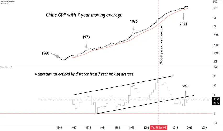
60+ years of Chinese GDP.60+ years of Chinese GDP.
Peak momentum was in 2008, has been slowing down ever since.
2 year yield always one step foward than fed ratesThe 2-year rate leads the Fed. Right now, it would be anticipating the famous pivot

M2 landingOh, that's news.
Usually M2 always flew over the indicator lines.
For decades.
Now there's a good reason to keep folding.

Correlation between the Fed rate and the 2-year yieldThe 2-year rate consistently anticipates the Fed rate. By examining the correlation coefficient, one can even estimate the breakdown of that correlation, which occurs with the introduction of a new macro narrative that displaces the previous one.

Macro Monday 22 - ISM Services Vs PMI US ISM Non-Manufacturing Index (ISM Services)
Next Release: 5th December 2023 (released on third business day of each month)
The U.S. Institute for Supply Management (ISM) Non-Manufacturing Index (“ISM Services”) encompasses a wide range of services across various industries.
The index is designed to measure the economic activity and health of the services sector in the United States some of which are professional services (accounting, legal, etc.), healthcare (hospitals, clinics & other practitioners), accommodation, leisure and food services.
Similar to the ISM Manufacturing Index (aka as the Purchasers Managers Index) which surveys producers and manufacturers which we covered in Macro Monday 13, the ISM Services index is also based on surveys conducted on participants in the relevant services sectors noted above. Also similar to the ISM Manufacturing index, the ISM Services is reported as a diffusion index, where values above 50 indicate expansion or growth in the sector, while values below 50 suggest contraction.
This makes both the ISM Manufacturing Index and ISM Services Index easy to compile onto a chart for comparison purposes.
The ISM Services Vs ISM Manufacturing Chart
The chart demonstrates the following:
▫️ At present ISM Services has been more resilient and is in expansionary territory at 51.8 (above 50) whilst ISM Manufacturing is in contractionary territory below the 50 level at 46.7.
▫️ Both the ISM Services Index and the ISM Manufacturing Index have been in a downward trajectory since 2021.
- You can clearly see that since March 2021 the
Manufacturing Index has declined from 64.5 down
to 46.7 today (Red Line).
- Thereafter from November 2021 the ISM Services
Index declined from 67.5 down to 51.8 today (Blue
Line).
▫️ As you can see on the chart a steep manufacturing decline can often provide advance an warning of a subsequent services decline (grey areas on chart).
It’s important to acknowledge that the Manufacturing Index can lead the ISM Services Index. It is important because we discovered in Macro Monday 13 that the Manufacturing Index (AKA Purchaser Managers Index) reading below 42 can provide an advance/confirmation warning of recession, thus more weight could be assigned to the Manufacturing Index than Services Index in predicting a recession (as it appears to lead services direction). For this reason we will review the ISM Manufacturing Index (PMI) indications below.
The ISM Manufacturing Chart
The main findings of the ISM Manufacturing Index (AKA Purchaser Managers Index)
From a Recession Perspective
▫️ 11 of the 12 recessions on the chart coincided with a PMI of less than 42.
▫️ 1 recession occurred that did not breach below the 42 level (No. 9 on the chart)
From a PMI Perspective
▫️ 12 of the 13 times that the PMI moved below the 42 level, this coincided with a recession.
▫️ 1 time we have had a sub 42 PMI reading without a recession (Between 11 & 12 on the chart).
At present we are at a level of 46.7 so we do not currently have a trigger event for a recession but we know exactly what to look for.
Based on both historical perspectives, there is an c.92% probability of a recession should a sub 42 PMI level be established, or vice versa, in the event of a recession confirmation there is a c. 92% probability it would coincide with the sub 42 PMI level.
Timing ISM Manufacturing Bottoms
o 10 out of 12 PMI Bottoms occurred in Q1 and the remaining two bottoms were in Q2. 83% of the time the PMI bottoms occur in Q1 which is good to know and watch for with Q1 2024 approaching swiftly.
o The average PMI Bottom to bottom timeframe over the past 6 cycles is 58 months (Min 37 – Max 86). We are presently at month 44 and month 58 is Jan 2025 (Q1)
The ISM New Orders Index (30% of the PMI)
Similar to the ISM New Orders Index Chart (covered in Macro Monday 6) which makes up 30% of the Purchaser Managers Index or Manufacturers Index (PMI), we have not reached below the 42 level on this chart either which has provided a 100% confirmation of recession when we have had a definitive move below the 42 level historically. At present we are at 45.5 on this chart and we seem to have a downward trajectory at present unless something changes upon the next data release.
In summary, we now know now that the Manufacturers Index (PMI) often leads the Services Index, and we need to pay close attention to the 42 level on both the New orders Index (Makes up 30% of PMI) and the Manufacturing Index (PMI) as a breach below this level on these charts increases the probability of a recession upwards of 92%. We are also now aware that there is a high incidence of the PMI bottoming in Q1 (83% of the time) and occasionally in Q2. These are quarters we can be on high alert for a sub 42 level.
The ISM Services PMI is released on the third business day of each month at 10:00 a.m. (EST) or 15:00 GMT. The next release will be on the Tuesday the 5th December 2023. Most of the ISM data releases commence within the first 5 working days of the month.
As always folks, I will watch the numbers and keep you informed. All of the above charts are updated on TradingView as data is released.
PUKA

A Holly Jolly Inflation OutlookLast Friday's University of Michigan Survey of Consumers revealed some surprising bullish trends as we head into the heart of the holiday season. November’s 69.4 sentiment score, the highest since August, was a massive jump from 61.3 in October, making a positive change in how consumers feel about the state of the economy. Within the report, though, is what really raised eyebrows on trading desks to wrap up last week.
My chart of the week is UMich 1-year inflation expectations. At 3.1%, it was the softest outlook for inflation since March 2021 and the biggest monthly drop since 2001. The stunning reversal comes amid rapidly falling gasoline prices. Bigger picture, the 5-year inflation outlook also came in tame at just 2.8%, tying for the lowest figure since July 2021.
It’s all music to the Fed’s ears ahead of this week’s key December FOMC meeting. Bond traders widely expect no change in the policy rate, but households’ collective outlook for lower inflation means they could be less aggressive in asking for significant wage increases in the new year, thus squashing the chance of a wage-price inflation spiral to take place in the coming quarters.
What does it mean for investors? It is yet another sign that inflation should continue its downward trajectory. Headline CPI is seen printing 0.0% for November, following October’s goose egg, while core prices are forecast to have risen by 0.3% last month. I assert this good news should help get the usually bullish back half of the December period off to a strong start, and the Santa Claus Rally period (the last five trading days of the year followed by the first two sessions of the new year) appear on track for gains.

Banks Keep Using BTFPprinter mode
Massive bullish volume, fundamentals are favorable if you're a value person. Still hasn't broken out though. I'm late to the party, but not too late.
Pullback to POC could be a nice add, or whatever strategy you have. Probably short term extended going into this week.
Banks getting massively bailed out. Idk for what, and idc

$CNINTR - Interest Rates Cut- The People’s Bank of China on Tuesday trimmed its one-year loan prime rate (LPR) by 10 basis points from 3.65% to 3.55%, and reduced the five-year rate by the same margin to 4.2%. The cuts follow reductions in other interest rates last week.
The LPR sets the interest that commercial banks charge their best clients, and serves as the benchmark for household and corporate lending. The one-year rate affects most new and outstanding loans, while the five-year rate influences the pricing of longer term loans, such as mortgages.
This is the first time the PBOC has cut both LPR rates since August 2022, when renewed Covid lockdowns and a deepening property downturn were pummeling the economy.

Housing DemystifiedResidential housing is a huge asset class so I wanted to analyze it in simplistic format.
I broke up this chart showing the period during the mid-1960's through early 1980's when inflation & interest rates took off and the period during the 40 year long downtrend in interest rates; which ended a couple of years ago. So we have another break in this chart that begins July 2020; most are calling for another period of high interest rates and high inflation. (Only time will tell...but it's no secret that interest rates broke out from the 40 year long downtrend and inflation usually comes in multiple waves)
I also included a log-linear regression channel to help show the long term trend lines.
What I took away from this chart:
1. The common saying that grandparents & parents tell their grandchildren & children..."if only I had kept that house I bought back when I was 25 years old; it would be worth a fortune now" is 100% correct. Residential real estate should be in everyone's asset class just as soon as you can "realistically" afford to purchase it.
2. The period of time where we see a reduction in housing prices or they flatten out has increased in timeframe so someone purchasing their 1st home needs to understand the importance of staying put for a 7-10 year timeframe, especially given the selling costs related to real estate sales.
3. Visually this chart looks to be in a very healthy uptrend
4. Interest rates, while important in computing affordability, has not had as big of an impact in regards to price over time. Under both scenarios prices rose over the long term.
5. The largest drop in housing prices was 20%; otherwise 5-10% or a small flattening period can be experienced.
What's not on this chart:
1. Housing prices are very local so some areas will experience greater downturns while other areas will maintain more stable or rising prices.
2. Perhaps the most important macro point...the myriad of charts showing how right now is the worst time in history to buy a house; in regards to house affordability.
3. The price of your house is not calculated daily, monthly or yearly so most people do not lose sleep over the value of their home unless it becomes unaffordable and you must sell it quickly.
Takeaway: There is no reason to think you are doomed if you buy a house right now. A house is a home and as long as you have stability and can afford it at today's prices then it should always be a consideration. If you are looking for a rental property or Airbnb...make sure you can afford it based upon no occupancy for 6-12 months AND you have plenty of reserves in the bank for repairs.
Lastly, one or the other or perhaps both will happen over the coming years. Either prices come down or wages go up to solve the affordability issue but at some point in time it will no longer be considered the worst time in history to buy a house. Affordability will come back in line with "the norm".

INTERERESTING POINT OF JOLTS AND SP500.
The recent months have shown contrasting trends between the JOLTS (Job Openings and Labor Turnover Survey) and the S&P 500.Which one provides a more accurate depiction: the JOLTS (Job Openings and Labor Turnover Survey) or the S&P 500?

Currency in Circulation versus SilverDo you think fiat is too expensive?
If this chart breaks down, then you are correct!
#silver #currency #gold #purchasingpower

houses priced in goldHouses priced in #gold are NOT expensive.
They can get less expensive if that thick black line fails.

Business Cycle Rotation Part 3Last year I produced several posts that described an exercise that utilizes long term momentum changes between asset classes and the relationship among asset classes to anticipate the business cycle. That series and parts 1 and 2 of this series are linked below.
Parts one and two of the series described the general methodology, presented the matrix with the raw data and showed the process used to consolidate the raw data and begin to draw conclusions around the economy's position in the current business cycle.
Before I plot the distilled sectors onto a stylized business/market cycle overlay, I plot equities, rates and commodities onto an overlay with the Organization for Economic Co-operation and Development (OECD) Composite Leading Indicator (CLI) for the United States. CLI readings above 100 (dashed red line) suggest economic expansion to come while below the 100 line suggests weakness, and perhaps recession to come. The index is currently below 100 but rising toward the 100 line. So still weakening but at a much slower pace.
To help visualize the cycle I plot 10 year rates (inverted), SPX and the Thompson Core CRB index along with the CLI. Viewed in the manner the cycle that began with the bond top appears to be consistent in terms of sequencing. Rates topped, economy (CLI) topped, followed by equities and finally commodities top as the CLI enters the economic contraction phase.
Fast forward to todays configuration. In this perspective, despite the sharp rally in early November, while there is room for a cyclic rally, there is no sign of a lasting bond bottom (see next chart).
Commodities, while off their lows don't appear to be suggesting a new leg up in the cycle (but may be moving that way).
I think of rates as the first mover in the cycle. To believe that the cycle has turned virtuous I like to see ten year rates make a solid top. The ten year note monthly chart has broken above the multi decade downtrend and above the 3.25% pivot. While a bit overbought in terms of momentum and a small RSI divergence is showing up, the structure from the 2020 low is completely intact. Until I see solid signs of a monthly perspective yield top in the two year and ten year, it will be difficult for me to label this as the kind of high that would lead a change in the economic cycle.
The distilled sectors are placed onto stylized market and economic cycle sine curves. If markets (dark blue curve) are correctly anticipating the business cycle (grey curve) the business cycle is somewhere past peak, and should be expected to steadily deteriorate over coming quarters.
In part 5 we will examine the totality of the evidence and draw conclusions around the current cycle and what it implies for 2024.
And finally, many of the topics and techniques discussed in this post are part of the CMT Associations Chartered Market Technician’s curriculum.
Good Trading:
Stewart Taylor, CMT
Chartered Market Technician
Taylor Financial Communications
Shared content and posted charts are intended to be used for informational and educational purposes only. The CMT Association does not offer, and this information shall not be understood or construed as, financial advice or investment recommendations. The information provided is not a substitute for advice from an investment professional. The CMT Association does not accept liability for any financial loss or damage our audience may incur.

Macro Monday 23 ~ US Factory Orders (released today 15:00 GMT)Macro Monday 23
US Factory Orders - ECONOMICS:USFO - Released Today
U.S. Factory Orders (USFO) are reported by the U.S. Census Bureau at the start of each month. The next release for the month of October is today Monday 4th Dec 2023 at 15:00 GMT.
The USFO Report provides information on the total dollar value of new orders, shipments, and unfilled orders for durable and non-durable goods. You might recall Macro Monday 18 where we looked at the at the Durable Goods Report (ticker: FRED:DGORDER ) which only provides data on new orders received on durable goods in isolation (goods lasting longer than 3 years) whilst the USFO Report is more comprehensive and includes durable goods, non-durables (items used once or not lasting a long time like light bulbs, detergent and clothing etc.), and also includes sub trends within durables and non-durables.
Let’s have a quick look at the differences between the USFO report and Durable Goods Report below;
U.S Factory Orders Versus Durable Goods
The USFO Report is more comprehensive than the Durable Goods Report, the USFO Report examines trends within industries. For example, the Durable Goods Report may account for a broad category, such as computer equipment, whereas the USFO Report will detail figures for computer hardware, semiconductors, and monitors. This lack of detail in the Durable Goods Report is attributed to the speed at which it is released.
Time Difference of the Releases: The Durable Goods Report for October was released almost two weeks ago on the 22ndNov 2023 whilst the USFO more comprehensive report (featured today) will be released today Monday 4th December 2023. It important to know this so you can get an early indication off the Durable Goods report as to how the later USFO Report may lean.
The USFO Charts
Whilst the figures within the USFO are reported in the billions of dollars, the chart shared today shows the percentage change month over month. Readings above 0% are more favorable and below 0% are less favorable. Essentially the increase or decrease shows the overall change in percentage terms orders from month to month.
Chart 1 – US Factory Orders (USFO)
▫️ The grey line on this chart shows how the volatile the percentage month to month readings can be for the USFO. For this reason we have assigned a 12 month moving average which smooths out the data making it easier to assess the longer term trend (thin Dark Blue line).
- On Chart 1 at present you can see that the 12 month MA recently came down to the just below the 0% level and has since started to turn upwards which is positive.
- From July 2023 to present we have moved from -2% to +2.8% (a positive move indeed)
Chart 2 – USFO 12 Month Moving Average (with S&P500 for reference)
▫️ In this chart we have isolated the US Factory Orders 12 month moving average and filled the area with the color dark blue from the 0% level to whatever reading was above it or below it. In other words, the USFO 12 month moving average is the exact same as in Chart 1 but illustrated differently, we just widened it vertically to make it easier to appreciate visually and we filled the area between the 0% line and whatever its reading was on the 12 month MA.
I have included the S&P500 in purple as a rough reference of what the market was doing when we fell below the 0% level on the 12 month moving average (red zones on the chart).
USFO Chart 2 informs us of the following:
- The most obvious finding when you look at the chart is that the S&P500 can go down sideways or upwards even with the USFO 12 Month MA below zero, therefore it is not a good standalone indicator of a general market decline. For this reason I have not utilized it as a pre-recession indicator.
- We can observe that sudden declines from high readings down to below 0% on the USFO 12 month MA can precede S&P500 market decline (see lower reddish arrows on the Chart 2). This appears to have happened before most market declines or as the market declines occur, its just that its happened also when the markets continued upwards, so it is a warning indicator but its not an absolute stand alone indicator. I think we can agree that if the USFO reading is going suddenly down and below 0% it is not a good thing for the market in general but price can be contrary and we need to keep in mind that the market can “climb walls of worry” for a long time.
- If we look at the red shaded areas, we can see that during these specific periods when the USFO 12 month MA was below 0%, in three out of four of the red areas on the chart you could argue that the market was range bound and moved relatively sideways, meaning real returns during these periods would have been less than ideal (Real returns are what is earned on an investment after accounting for taxes and inflation). Inflation and taxes could have more easily corroded your returns during these periods as the entry price into the red zone was not all that different to the exit price.
In reference to the real returns comment above, Lyn Alden a highly respected economist has been touting for months that she suspects a rangebound market, similar to the brief range bound markets in the first three red zones in Chart 2 (left to right). Worth keeping in mind that we recently dipped below the 0% level and should this occur again and we sustain a sub 0% level, it may indicate that real returns might be negative going forward (subject to below 0% reading). This is not a prediction and there are no guarantees. We are just looking at the data and trying to lean on the right side of probability. Three out of Four times in the recent past real returns were not great when the USFO 12 month MA fell below 0%.
Durable Goods Report
We mentioned the Durable Goods Report above which was released almost two weeks earlier than the U.S. Factory Orders (on 22ndNov 2023). Durable Goods is more specific and focuses on the obvious, durable goods (goods that last 3 years or longer) whilst the USFO Report is more comprehensive and in addition includes non-durables (items used once or not lasting a long time like light bulbs, detergent and clothing), and it also includes sub trends within durables and non-durables.
Using New Orders for Durable Goods to Anticipate Market Direction
▫️ We previously shared how the Durable Goods chart can be used to help anticipate price movements on the S&P500, in addition to providing an advance insight into the USFO report release which is released two weeks later.
▫️ The 30 month moving average for Durable Goods can act as a threshold level for buy and sell signals for the S&P500 whilst also providing advance warnings of recession and/or capitulation events. This has been clearly illustrated in the chart.
The main findings in the chart are as follows:
1. When Durable Goods Orders(blue) fall below the 30 month moving average(brown) this is sell signal
2. When Durable Goods Orders(blue) break above the 30 month moving average(brown) this is a buy signal
3. Declining durable goods and/or a fall below the 30 month moving average has offered advanced warning of recession and/or capitulation.
The chart demonstrates that using the 30 month moving average for Durable Goods New Orders can very useful in determining market trend.
At present we are above the 30 month moving average and the moving average appears to be trending upwards however the release on the 22ndNov 2023 came in lower dropping from $294 billion down to $279 billion. This provides insight into the USFO, with durables on the decline, will we see non-durables on the decline too and a lower USFO today Monday 4th Dec 2023?
We can continue to monitor the Durable Goods chart and watch for a cross of the 30 month moving average as an additional confirmation of a change to a bearish trend for the S&P500 when or if it happens. For now this is just another chart to help us identify bearish/bullish trend changes by using the economic data from Manufacturers New Orders for Durable Goods.
Similarly the USFO Report (inclusive of non-durables) which is released today should be interesting, I wonder could we see a drop down below the 0% level or a decline from the 2.8% MoM level in line with the Durable Goods decline already observed on the 22nd Nov 2023. We will find out later today.
SUMMARY
In summary, when the USFO 12 Month Moving Average drops and remains below 0% there is an increased probability of a rangebound market with an increased likelihood of negative real returns.
Separately, the Durable Goods Chart 30 month moving average has been apt at indicating buy and sell triggers for the S&P500. At present we are falling down towards the 30 moving average but we have not crossed it yet so no trigger event here. We wait for todays USFO report release and the next Durable Goods Report later in December as we do not have any trigger events on either, just cautionary data to keep an eye on.
I hope you found this useful in understanding and making use of both these important metrics which capture consumer spending habits and sentiment.
PUKA

Central Bank Balance Sheet vs NasdaqUntil the job market forces the Fed's hand, their balance sheet can keep on shrinking (letting Nasdaq to keep out performing it).
Using ratio charts (instead of overlaid data series) works as a Rosetta stone. Helps see the underlying macro economics is play.
#fed #fomc #nasdaq
