AMBUJA CEMENT FOR SWINGA Good opportunity in Ambuja Cement for swing trade, weekly resistance break and retesting, so add in your watchlist.

$SGRY | Surgery Partners – Confirmed Breakout NASDAQ:SGRY | Surgery Partners – Confirmed Breakout
NASDAQ:SGRY has broken out of a tight consolidation base after reclaiming key EMAs and building momentum across multiple sessions.
Technical Breakdown
Confirmed breakout above $22.20 base with strong candle close and volume
RSI has pushed above 57 with trend momentum building
EMAs have flipped bullish, with price holding above the ribbon
Low-volume zone above allows room to trend toward next supply shelf
Targets & Structure
First target hit: $23.25 (+3.8%)
Next target: $24.50 (+9.7%) — aligns with previous structure and Fib confluence
Invalidation level: Breakdown back below $22
Strategy Insight
This is a classic breakout continuation pattern from a low-volume zone.
If momentum holds, price has room to push toward $24.50.
A clean backtest to $22.20 could present a lower-risk entry before the next leg up.

SMCI buy cycle in progress into yr endStrong buy rates on order flow indicating buy-side targets as follows
tp1 = 88
tp2 = 96
tp3 = 105
...by end of 2025
Still expecting strong sell wave sometime by mid-2026 all the way back to 20's as the semiconductor space continues dealing with growing bearish forces. Recent weakness should be seen as "shots across the bow" or warning shots. Next set of highs will be opportunities to EXIT and go short imo.

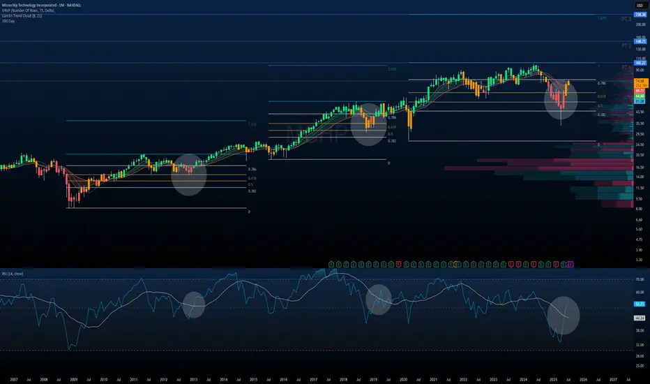
$MCHP | Microchip Technology — Monthly Macro PlaybookNASDAQ:MCHP | Microchip Technology — Monthly Macro Playbook
This chart illustrates the multi-decade rhythm of NASDAQ:MCHP , highlighting how past cycles and technical structure provide clarity on the current setup.
Historical Market Cycles & RSI Trends
Each gray circle marks a key market structure low with:
A bounce from macro Fibonacci retracement zones
A bullish RSI crossover through its signal line (white MA)
A recovery from oversold or mid-40 RSI levels, signaling trend reversal
We’ve now entered the fourth identical cycle dating back to 2009.
Current Technical Structure
Price just bounced off the 0.618–0.786 retracement zone from the 2020–2021 cycle.
Strong reversal candle printing off volume support, reclaiming major EMAs.
RSI is breaking through its signal line, just as it did in 2012, 2016, and 2019 — each of which led to multi-year rallies.
Fibonacci-Based Price Targets
Using prior extensions from similar fractals:
PT1: $102.77 — 1.0 extension of the last impulse
PT2: $148.71
PT3: $238.30
These are not short-term targets, but structural projections if this macro cycle repeats.
Macro Thesis
When price + momentum + Fib structure + RSI rhythm align like this, it usually sets the stage for multi-year compounding upside.
This chart doesn’t predict the future.
It just reminds us the past leaves footprints.
And NASDAQ:MCHP ’s footprint says: “This is where cycles begin.”
ADBE PUMP soonGood day traders!
As I See ADBE is in leading diagonal wave 1.
Currency, we are in wave correction2
And the price will go in wave 3 which i expect impulse wave the target as shown in chart y←
Good luck for all

4H Chart: How Meta's Double Top Turned Into a Reversal Buy How Meta's Double Top Turned Into a Reversal Buy Signal on the 4H Chart
Meta Platforms Inc. (META) recently formed a classic double top pattern, which is often interpreted as a bearish reversal signal.
The price touched a key resistance level twice and then pulled back, triggering caution among technical traders. However, the
stochastic RSI on the 4-hour timeframe is now flashing a potential reversal buy signal that could shift market sentiment.
This hidden momentum may catch short sellers off guard. Here’s a breakdown of the setup:
Technical Breakdown
1. Double top formation
Resistance was tested two times, forming a temporary ceiling.
Typically, this signals a possible trend reversal.
However, there has been no strong bearish follow-through after the second top.
2. Stochastic RSI buy signal on the 4H chart
The %K line has crossed above the %D line in oversold territory.
This suggests a potential bullish reversal.
RSI is also recovering from a low zone, pointing to increasing buying pressure.
3. Support is holding
The neckline of the double top remains unbroken.
Price action shows higher lows forming just below resistance, a bullish sign.
Strategy Outlook: Contrarian Reversal Play
While the double top suggests weakness, the stochastic RSI indicates a rebound. Traders may be witnessing a bear trap, where the market tempts sellers before reversing higher.
If the price moves above both the 50 EMA and 200 EMA on the 4-hour chart, it could trigger what some i call a rocket booster setup —strong upside momentum backed by moving average alignment.
A bullish confirmation candle with volume could solidify the reversal case.
Conclusion
Meta’s chart pattern might look bearish at first glance, but momentum indicators tell a different story. A reversal from here could lead to a breakout if bulls step in with strong follow-through.
Disclaimer: Trading is risky. Use a simulation trading account before you trade with real money and learn risk management and profit-taking strategies.
---

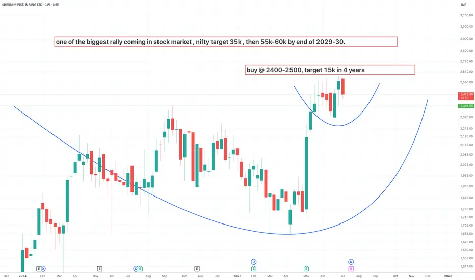
shriram piston buy at cmp 2500, target 15,000buy shriram piston at cmp , lomng term target 15,000 in 3 years.
cup and handle
INDIGO READY TO FLYINDIGO is nearing to all time high and now ready to FLY to make new Higher Highs.

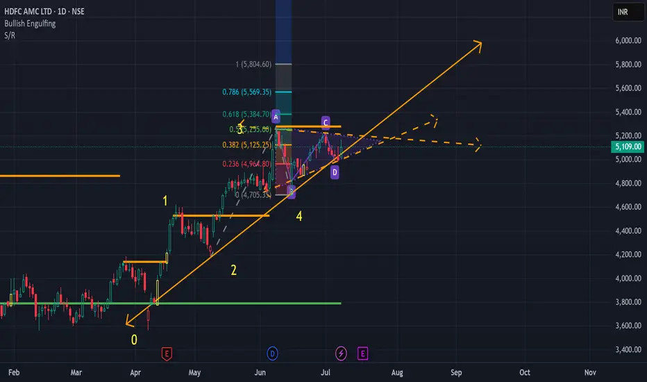
HDFCAMC in Pennant Trend PatternNSE:HDFCAMC shows a breakout of a Pennant Trend Pattern. Please Buy once there is a Bullish breakout. Target would be 5750
How to Use TradingView Alerts to Catch Momentum Shifts Here’s a quick video on setting alerts in TradingView.
I use alerts for stocks I’m interested in but want to give more time to set up. Instead of using a basic price alert, I prefer setting alerts on MACD crossovers to signal when momentum is shifting back in my favor. As a rule of thumb, the deeper the crossover, the better the value and potential momentum. Crossovers below the MACD zero line are particularly useful, especially for stocks that had strong momentum and were making new highs before pulling back.
This approach helps confirm that the stock has had time to build a solid base before I enter. TradingView will then send me an email alert or play a chime if I have it open, letting me track multiple stocks and setups without constantly checking charts. It’s also great for monitoring take-profit and stop-loss levels.
You can apply the same strategy with nearly any indicator on TradingView to time your entries and exits with more confidence.

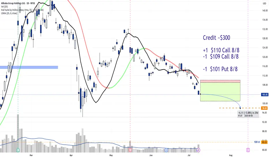
JADE LIZARD Trade for an Aug 8th expirationCredit ~$300
+1 $110 Call 8/8
-1 $109 Call 8/8
-1 $101 Put 8/8
AT EXPIRATION:
PRICE > $110 = profit of $200
PRICE between $101-$109 = profit of $300 (max)
PRICE < $101 = Assigned to purchase 100 shares of BABA @ $98 per share, (avg cost).
Feel like Reddit might be worth a watch. Managed to fill that gap where it ran hard from previously.
MACD below that 0 line and looks like its showing signs of momentum coming back in.
Might be worth keeping an eye on.

Positional Swing Trade Idea – GFL LTD 📌 Positional Swing Trade Idea – GFL LTD | Cup & Handle Pattern + Accumulation Zone
**GFL LTD (NSE\:GFL)** is showing a well-formed **Cup and Handle** pattern on the daily timeframe, with price action consolidating in a narrow range—indicating strength before a potential breakout.
🔍 **Technical Observations:**
* A well-rounded **cup base** has developed, signaling strong accumulation over time.
* A classic **handle** is now forming, showing controlled consolidation.
* The stock is currently **accumulating between ₹72.50–₹72.55**, creating a narrow resistance zone.
* Sustained movement and a breakout above this zone may lead to a **boombastic upside** move, backed by volume confirmation.
📈 **Trade Setup:**
* **Breakout Level to Watch:** ₹72.55+ on volume
* **Accumulation Range:** ₹72.50–₹72.55
* **Support:** Handle base and recent consolidation low
* **Potential Targets:** Based on pattern depth and momentum
The structure looks promising for a **positional swing trade**, especially if the price holds above the accumulation zone with strength.
⚠️ **Disclaimer:** This analysis is for educational purposes only. Please conduct your own due diligence before entering any trade.

DHUNSERI TEA & IND. LTD. swing/ Positional Trade opportunity### 📌 Positional Swing Trade Idea – DHUNSERI TEA & IND. LTD (DTIL) | Cup & Handle Pattern Forming
DHUNSERI TEA & INDUSTRIES LTD (NSE\:DTIL) is forming a classic **Cup and Handle** pattern on the daily chart, indicating a potential bullish breakout opportunity.
🔍 **Technical Highlights:**
* The cup is well-rounded, indicating strong accumulation over time.
* The handle is forming as a short consolidation/pullback, typical before a breakout.
* Price is approaching the **neckline resistance**, which if broken with volume confirmation, can signal a strong upward move.
📈 **Trade Setup:**
* **Breakout Zone:** Watch for a breakout above the neckline with volume.
* **Support:** Handle base acting as support.
* **Target:** Measured move based on cup depth offers a healthy upside.
This structure suits **positional and swing traders** looking for breakout trades with a defined structure and favorable risk-reward.
⚠️ **Disclaimer:** This idea is for educational purposes only. Please do your own analysis before making any trading decisions.

Exail Technologies European Drone Warfare and Robotics. Exail Technologies (previously Groupe Gorge S.A.) is a French tech company specializing in drones, robotics, and maritime autonomous systems, with growing exposure to defense and industrial markets.
It’s on a clear uptrend, sitting well above its 50 and 200-day EMAs with momentum firmly in play. Volume is steady, with recent trading activity picking up compared to its long-term averages, reflecting consistent investor interest.
If you’re looking for a high-growth, high-momentum play in the drone warfare / European tech space, Exail is showing strength. Just keep an eye out for a pullback, which could offer a cleaner entry without chasing the current highs.
Might be worth a watch.

AMSC eyes on $40.18: Golden Genesis fib holding up new ATHAMSC has been bobbing into a Golden Genesis fib at $40.18
Look for a Break-n-Retest to start next leg of uptrend.
Beware of a possible rejection for a high velocity dip.
.
Previous Analysis that gave a PERFECT SWING trade:
Hit the BOOST and FOLLOW for more such a PRECISE and TIMELY charts.
==============================================================
.

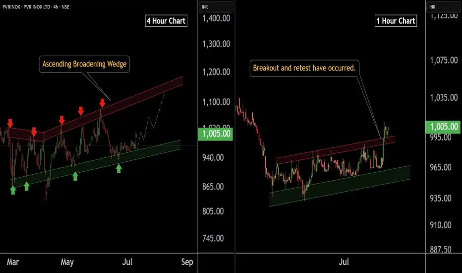
PVR INOX LTD at Best Support !! Breakout Alert !!Here are two charts of PVERINOX — one in the 4-hour timeframe and the other in the 1-hour timeframe.
4-Hour Timeframe Chart:
In the 4-hour timeframe, Power Inox is respecting its lower boundary, with a support range between 930–950.
ChatGPT said:
1-Hour Timeframe Chart:
In the 1-hour timeframe, the stock has given a breakout and has now completed a retest at 980-990 level.
If this level is sustain then , we may see higher in PVRINOX.
Thank you !!
IBKR watch $57.42-58:19: Double Golden Fib zone holding in OrbitIBKR has been in a strong uptrend but now consolidating.
Currently orbiting a Double Golden zone $57.42-58.19
This could be a TOP or a ReCharge zone for next leg.

VOLTAS In breakoutNSE:VOLTAS in breakout. As it approaches the key level of 1390, I recommend buying once it decisively crosses that threshold. With bullish momentum building, we can set our sights on the first target at 1480 and an ambitious second target at 1565!
Remember, investing requires careful analysis and risk management. Stay informed, and let’s navigate this market together! What are your thoughts? Are you eyeing VOLTAS or any other stocks for potential growth? Let’s discuss in the comments below! 💬💰 #StockMarket #InvestmentStrategy #VOLTAS #BreakoutTrading

Analyzing the Bearish Trend in $COIN with AI & Smart Money Insig📅 Posted on July 8, 2025 by WaverVanir International LLC
Today, our advanced predictive model highlighted a potential short-term decline in NASDAQ:COIN (Coinbase Global Inc.), leveraging AI-driven forecasts and Smart Money Concepts (SMC) analysis to validate the trend.
📊 Insights from AI Model:
- Current Price: $353.30
- Expected Movement: Decline to $284.67
- Confidence Level: 60%
- Timeframe: 1 hour
📉 Noteworthy Observation:
- VolanX Alpha Layer detected a significant -19.42% probability spike.
📉 SMC Analysis Overview:
- Identified distribution pattern in premium zone
- Rejection of weak high levels
- Anticipated liquidity gap below equilibrium point ($306.10)
- Imbalance in volume profile awaiting resolution
🧠 Key Takeaway:
The alignment of AI predictions and market structure signals a substantial institutional impact. WaverVanir remains proactive in the face of volatility, strategically reallocating resources based on high-probability scenarios.
⚠️ Risk Advisory:
Kindly note, this information is not financial advice but derived from our internal Decision Support System (DSS) and AI technologies. It is essential to prudently manage position sizes and account for potential scenario variations.
📡 Connect with WaverVanir for further insights into market dynamics, strategic signals, and structured trading approaches.
#WaverVanir #COIN #VolanX #SmartMoneyConcepts #AITrading #InstitutionalEdge #MarketStructure #LinkedInFinance #TradingAI #DSS #LiquidityHunting
