PROTECTED SOURCE SCRIPT
Yield Spread (10Y - 2Y)

Yield Spread
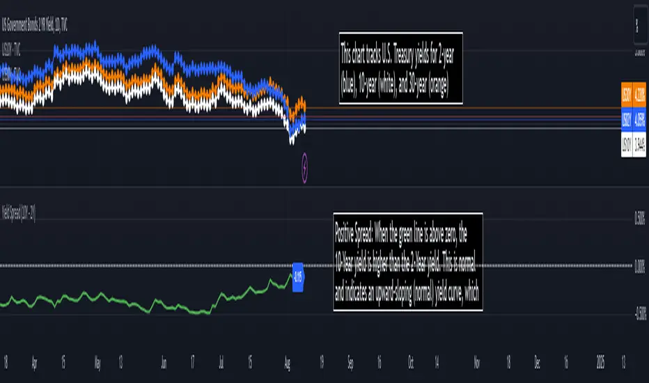
The green line shows the difference between the 10-Year and 2-Year yields.
Positive Spread: When the green line is above zero, the 10-Year yield is higher than the 2-Year yield. This is normal and indicates an upward-sloping (normal) yield curve, which typically suggests a healthy economy with expectations of future growth.
Flattening Curve: If the green line approaches zero, the yield curve is flattening, indicating that investors are uncertain about future economic growth. They are demanding similar yields for both short and long-term bonds.
Negative Spread (Inverted Yield Curve): If the green line goes below zero, this means the 2-Year yield is higher than the 10-Year yield, creating an inverted yield curve. An inverted curve is often seen as a predictor of a recession, as it indicates that investors expect weaker economic conditions in the future.
Short Explanation of the Chart layout:
This chart tracks U.S. Treasury yields for 2-year (blue), 10-year (white), and 30-year (orange) bonds, along with the yield spread (green) between the 10-year and 2-year bonds. A positive spread suggests a normal yield curve and economic growth, while a negative spread (inversion) often signals a potential recession.
Disclaimer
The information and publications are not meant to be, and do not constitute, financial, investment, trading, or other types of advice or recommendations supplied or endorsed by TradingView. Read more in the Terms of Use.