OPEN-SOURCE SCRIPT
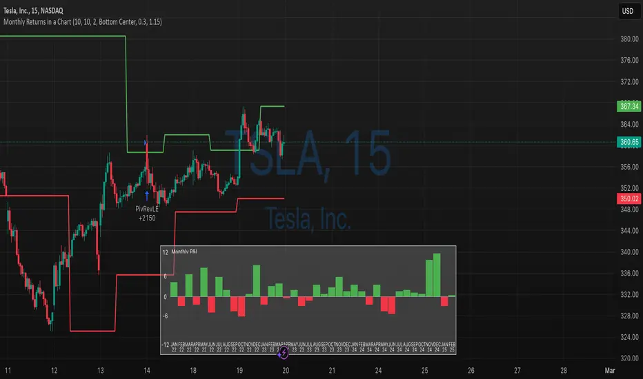
Monthly Returns of a Strategy in a Chart

It's a simple example of how you can present your strategy's monthly performance in a chart.
You maybe know that there is no support of these kind of charts in TradingView so this chart is actually a table object under the hood.
Table visual appearance is customizable, you can change:
Thanks to MUQWISHI for hard work, for helping me coding it.
It's not about the strategy itself but the way you display returns on your chart. So pls don't critique my choice of the strategy and its performance 🙂
Disclaimer
Please remember that past performance may not be indicative of future results.
Due to various factors, including changing market conditions, the strategy may no longer perform as well as in historical backtesting.
This post and the script don’t provide any financial advice.
You maybe know that there is no support of these kind of charts in TradingView so this chart is actually a table object under the hood.
Table visual appearance is customizable, you can change:
- Location
- Bar Width / High
- Colors
Thanks to MUQWISHI for hard work, for helping me coding it.
It's not about the strategy itself but the way you display returns on your chart. So pls don't critique my choice of the strategy and its performance 🙂
Disclaimer
Please remember that past performance may not be indicative of future results.
Due to various factors, including changing market conditions, the strategy may no longer perform as well as in historical backtesting.
This post and the script don’t provide any financial advice.
Open-source script
In true TradingView spirit, the author of this script has published it open-source, so traders can understand and verify it. Cheers to the author! You may use it for free, but reuse of this code in publication is governed by House rules. You can favorite it to use it on a chart.
💼 Hire me: qntly.com/hirepine
💻 Online Courses: qntly.com/courses
📝 Trials: qntly.com/trial
📖 Docs: qntly.com/docs
📰 Newsletter: qntly.com/news
𝕏: qntly.com/x
📩Telegram: qntly.com/tel
💻 Online Courses: qntly.com/courses
📝 Trials: qntly.com/trial
📖 Docs: qntly.com/docs
📰 Newsletter: qntly.com/news
𝕏: qntly.com/x
📩Telegram: qntly.com/tel
Disclaimer
The information and publications are not meant to be, and do not constitute, financial, investment, trading, or other types of advice or recommendations supplied or endorsed by TradingView. Read more in the Terms of Use.