Projection Dynamiques (CPD-V) - By Sese04 (XAUUSD)Key Concept of the Indicator: DPC-V FOR GOLD
Absolutely! Creating a relevant projection indicator for Gold (XAU/USD) requires combining several concepts: trend, volatility, and market structure (price action). A simple indicator that extends a straight line is not sufficient for an asset as complex as gold.
I will propose an advanced indicator concept, which we'll call the "Dynamic Projection Channels based on Volatility" (DPC-V). This indicator does not predict an exact price at an exact date, but rather projects probability zones where the price is likely to react, based on its recent historical behavior.
Key Concept of the Indicator: DPC-V
The idea is to create channels around a central trend line. Unlike Bollinger Bands which use standard deviation, we will use the Average True Range (ATR), which is a much more direct and relevant measure of the market's true volatility.
Indicator Components:
The Centerline (The "Center of Gravity"): An Exponential Moving Average (EMA). It represents the underlying mid-term trend. An EMA-50 is an excellent starting point for Gold on Daily or 4H charts.
The Projection Engine (The Volatility): The Average True Range (ATR) over 14 periods. The ATR measures the average "distance" that the price of Gold travels on each candle. This is the core of our projection.
The Projection Channels (The "Target Zones"): We will project several levels above and below the centerline, using multiples of the ATR.
Normal Reaction Zone (± 1x ATR): The zone where the price moves most of the time in a healthy trend.
Extension Zone (± 2x ATR): The price reaches this zone during strong moves. It is considered "stretched" or "over-extended," and a pause or reversal becomes probable.
Excess / Climax Zone (± 3x ATR): A rarely reached zone, often signaling a major market top or bottom, or trend exhaustion.
Why is this indicator relevant for Gold?
Adaptive: Gold experiences phases of low volatility (ranging) and phases of high volatility (explosive trends). The ATR adjusts automatically: the channels widen during high volatility periods and tighten during calm periods, making the projections always relevant to the current context.
Based on "Price Action": The ATR is calculated directly from the highs, lows, and closes. It therefore directly reflects the price action.
Provides Concrete Targets: It doesn't give a vague direction, but objective price zones that can serve as targets for taking profits or as potential entry points.
------------------------------USER GUIDE------------------------------------------
How to Use the Indicator with Historical Data (Strategy)
Open a chart of Gold (XAU/USD), for example, on the Daily timeframe. Apply the indicator. You will immediately observe its historical behavior.
1. Identifying the Underlying Trend:
If the price is above the yellow centerline (EMA 50) and the line is sloping up, the underlying trend is bullish.
If the price is below the yellow centerline and the line is sloping down, the underlying trend is bearish.
2. Buy Scenario (Bullish Trend):
Potential Entry Point: Look for price pullbacks towards the centerline (EMA 50) or, even better, towards the lower band of the reaction zone (Inf 1). A bounce off this zone, confirmed by a bullish candle (e.g., hammer, bullish engulfing), is a strong buy signal.
Take Profit (Target):
Target 1: The upper band of the reaction zone (Sup 1).
Target 2 (in case of strong momentum): The extension band (Sup 2). Reaching this zone is a good signal to take some or all of your profits.
Stop Loss: Place your stop loss below the last significant low, or more conservatively, below the lower extension band (Inf 2).
Historical Example (Buy):
Look at the gold rally from late 2022 to early 2023. You will see that the price regularly bounced on or near the EMA 50 centerline and the Inf 1 band before resuming its upward move to touch the Sup 1 and Sup 2 bands.
3. Sell Scenario (Bearish Trend):
Potential Entry Point: Look for price rallies towards the centerline (EMA 50) or the upper band of the reaction zone (Sup 1). A rejection from this zone, confirmed by a bearish candle, is a sell signal.
Take Profit (Target):
Target 1: The lower band of the reaction zone (Inf 1).
Target 2: The lower extension band (Inf 2).
Stop Loss: Place it above the last significant high or the upper extension band (Sup 2).
4. Using the Excess Zones (Level 3):
When the price touches the Sup 3 or Inf 3 band, you should NOT enter in the direction of the trend. This is a signal of exhaustion.
It is an aggressive profit-taking zone for existing positions.
For experienced counter-trend traders, it may signal a reversal opportunity, but this must be confirmed by other signals (RSI divergence, reversal patterns, etc.).
Conclusion and Warning
This DPC-V indicator is a powerful tool because it is dynamic and visual. It structures the apparent chaos of the market into clear probability zones. By analyzing it on gold's historical data, you can identify its relevance and build confidence in the signals it generates.
Important Reminder: No indicator is a crystal ball. The DPC-V should be used as a decision-support tool, in conjunction with fundamental analysis (economic announcements, interest rates, geopolitics) and rigorous risk management (Stop Loss).
Bands and Channels

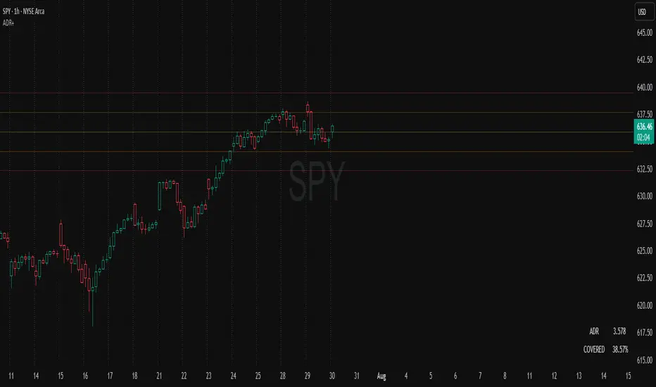
ADR Plots + OverlayADR Plots + Overlay
This tool calculates and displays Average Daily Range (ADR) levels on your chart, giving traders a quick visual reference for expected daily price movement. It plots guide levels above and below the daily open and shows how much of the day's typical range has already been covered—all in one interactive table and on-chart overlay.
What It Does
ADR Calculation:
Uses daily high-low differences over a user-defined period (default 14 days), smoothed via RMA, SMA, EMA, or WMA to calculate the average daily range.
Projected Levels:
Plots four reference levels relative to the current day's open price:
+100% ADR: Open + ADR
+50% ADR: Open + 50% of ADR
−50% ADR: Open − 50% of ADR
−100% ADR: Open − ADR
Coverage %:
Tracks intraday high and low prices to calculate what percentage of the ADR has already been covered for the current session:
Coverage % = (High − Low) ÷ ADR × 100
Interactive Table:
Shows the ADR value and today's ADR coverage percentage in a customizable table overlay. The table position, colors, border, transparency, and an optional empty top row can all be adjusted via settings.
Customization Options
Table Settings:
Position the table (top/bottom × left/right).
Change background color, text color, border color and thickness.
Toggle an empty top row for spacing.
Line Settings:
Choose color, line style (solid/dotted/dashed), and width.
Lines automatically reposition each day based on that day's open price and ADR calculation.
General Inputs:
ADR length (number of days).
Smoothing method (RMA, SMA, EMA, WMA).
How to Use It for Trading
Measure Daily Movement: Instantly know the expected daily price range based on historical volatility.
Identify Overextension: Use the coverage % to see if the market has already moved close to or beyond its typical daily range.
Plan Entries & Exits: Align trade targets and stops with ADR levels for more objective intraday planning.
Visual Reference: Horizontal guide lines and table update automatically as new data comes in, helping traders stay informed without manual calculations.
Ideal For
Intraday traders tracking daily volatility limits.
Swing traders wanting a quick reference for expected price movement per day.
Anyone seeking a volatility-based framework for planning targets, stops, or identifying extended market conditions.
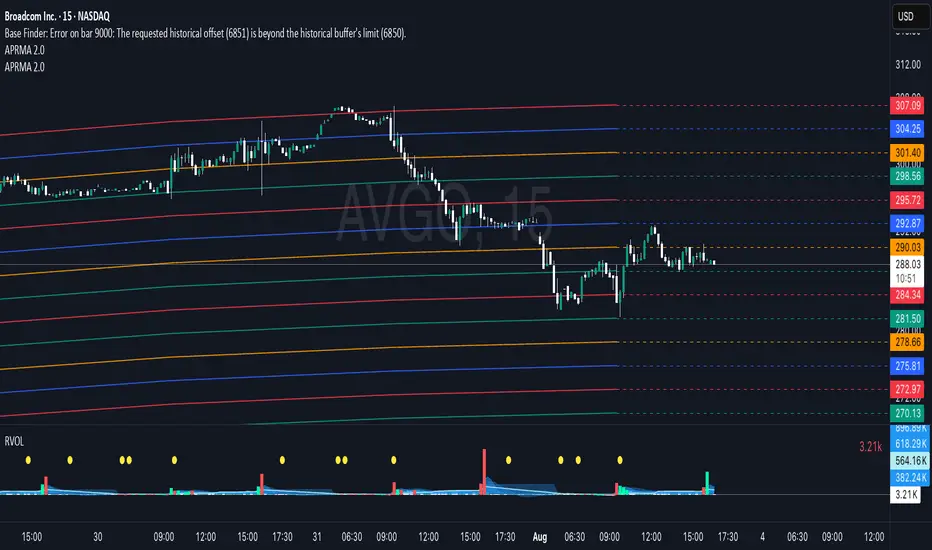
Adjustable Percentage Range Moving Average - Add'l LinesThe Adjustable Percentage Range Moving Average (APRMA), originally developed by @ReallyWendy, is a versatile PineScript indicator designed for traders and market analysts to analyze market volatility and identify trends dynamically. Building on the original concept, this updated version plots a central moving average (MA) with four customizable percentage-based range bands around it. Users can select the MA type (SMA, EMA, HMA, RMA, SWMA, TMA, WMA, VWMA), timeframe, and length, tailoring the indicator to their trading style. Each range band (upper and lower) is calculated as a percentage offset from the MA, with adjustable colors and transparency settings for enhanced visual clarity. Extension lines project the latest values forward, with customizable styles (solid, dashed, dotted). The indicator includes toggleable display options for the MA and each range pair, making it an effective tool for identifying price ranges, support/resistance levels, and trend dynamics.
Credit to @ReallyWendy for the foundational concept.
1 Hour HA Venkat Sir CommoditiesHere’s a clear and professional description you can use for your TradingView script:
---
### **Script Name:**
**1 Hour HA Venkat Sir Commodities**
### **Description:**
This indicator is designed for identifying potential **buy and sell signals** in commodity markets using **Heikin Ashi candlestick patterns** combined with a **Relative Strength Index (RSI) filter**. It works on the **1-hour timeframe** and aims to capture early trend reversals or momentum shifts.
### **Key Features:**
* ✅ **Heikin Ashi Pattern Detection:**
Detects the following reversal candlestick patterns on calculated Heikin Ashi candles:
* **Bullish Engulfing**
* **Bullish Harami**
* **Bearish Engulfing**
* **Bearish Harami**
* ✅ **RSI Confirmation Filter:**
Adds an extra layer of confirmation using the standard 14-period RSI on regular price candles:
* **Buy signals** trigger only when RSI < 40 (oversold zone).
* **Sell signals** trigger only when RSI > 60 (overbought zone).
* ✅ **Visual Signals:**
* **Green upward triangles** below candles for buy signals.
* **Red downward triangles** above candles for sell signals.
* ✅ **Alert Conditions:**
Built-in alerts to notify users when valid buy or sell conditions are met.
### **Usage Tip:**
Best used on commodities charts set to the **1-hour timeframe**. Ensure you're not using Heikin Ashi chart mode, as the script calculates its own Heikin Ashi values for accuracy and consistency.
---
Let me know if you’d like a shorter version or want this translated into Hindi or another language.

Safety TradeSafety Trade Free, Green - the lowest correction on bullmarket, Red the highest raise on bear market.
ORB Screener-Multiple Indicators [Marin adjusted]ORB Screener for multiple instruments
You can select the range of the ORB and see different indicators for the selected instruments
Williams Alligator with Background ColoringThe Benefits of the Williams Alligator – Without the “Spaghetti” on Your Chart
If you're one of those traders who prefer a clean, well-structured chart but don't want to miss out on the advantages of the Williams Alligator, this script is the perfect solution.
It includes all the features of the original TradingView script plus a background color feature based on your custom parameters:
Green when all candles are above the Alligator lines
Red when all candles are below all lines
Gray for everything in between
Feel free to customize the colors and transparency to your liking.
Happy Trading!

Opening-Range BreakoutNote: Default trading date range looks mediocre. Set date range to "Entire History" to see full effect of the strategy. 50.91% profitable trades, 1.178 profit factor, steady profits and limited drawdown. Total P&L: $154,141.18, Max Drawdown: $18,624.36. High R^2
█ Overview
The Opening-Range Breakout strategy is a mechanical, session‑based day‑trading system designed to capture the initial burst of directional momentum immediately following the market open. It defines a user‑configurable “opening range” window, measures its high and low boundaries, then places breakout stop orders at those levels once the range closes. Built‑in filters on minimum range width, reward‑to‑risk ratios, and optional reversal logic help refine entries and manage risk dynamically.
█ How It Works
Opening‑Range Formation
Between 9:30–10:15 AM ET (configurable), the script tracks the highest high and lowest low to form the day’s opening range box.
On the first bar after the range window closes, the range high (OR_high) and low (OR_low) are “locked in.”
Range‑Width Filter
To avoid false breakouts in low‑volatility mornings, the range must be at least X% of the current price (default 0.35%).
If the measured opening-range width < minimum threshold, no orders are placed that day.
Entry & Order Placement
Long: a stop‑buy order at the opening‑range high.
Short: a stop‑sell order at the opening‑range low.
Only one side can trigger (or both if reverse logic is enabled after a losing trade).
Risk Management
Once triggered, each trade uses an ATR‑style stop-loss defined as a percentage retracement of the range (default 50% of range width).
Profit target is set at a configurable Reward/Risk Ratio (default 1.1×).
Optional: Reverse on Stop‑Loss – if the initial breakout loses, immediately reverse into the opposite side on the same day.
Session Exit
Any open positions are closed at the end of the regular trading day (default 3:45 PM ET window end, with hard flat at session close).
Visual cues are provided via green (range high) and red (range low) step‑line plots directly on the chart, allowing you to see the range box and breakout triggers in real time.
█ Why It Works
Early Momentum Capture: The first 15 – 60 minutes of trading encapsulate overnight news digestion and institutional order flow, creating a well‑defined volatility “range.”
Mechanical Discipline: Clear, rule‑based entries and exits remove emotional guesswork, ensuring consistency.
Volatility Filtering: By requiring a minimum range width, the system avoids choppy, low‑range days where false breakouts are common.
Dynamic Sizing: Stops and targets scale with the opening range, adapting automatically to each day’s volatility environment.
█ How to Use
Set Your Instruments & Timeframe
-Apply to any futures contract on a 1‑ to 5‑minute chart.
-Ensure chart timezone is set to America/New_York.
Configure Inputs
-Opening‑Range Window: e.g. “0930-1015” for a 45‑minute range.
-Min. OR Width (%): e.g. 0.35 for 0.35% of current price.
-Reward/Risk Ratio: e.g. 1.1 for a modest profit target above your stop.
-Max OR Retracement %: e.g. 50 to set stop at 50% of range width.
-One Trade Per Day: toggle to limit to a single breakout.
-Reverse on Stop Loss: toggle to flip direction after a losing breakout.
Monitor the Chart
-Watch the green and red range boundaries form during the session open.
-Orders will automatically submit on the first bar after the range window closes, conditioned on your filters.
Review & Adjust
-Backtest across multiple months to validate performance on your preferred contract.
-Tweak range duration, minimum width, and R/R multiple to fit your risk tolerance and desired win‑rate vs. expectancy balance.
█ Settings Reference
Input Defaults
Opening‑Range Window - Time window to form OR (HHMM-HHMM) - 0930–1015
Regular Trading Day - Full session for EOD flat (HHMM-HHMM) - 0930–1545
Min. OR Width (%) - Minimum OR size as % of close to trigger orders - 0.35
Reward/Risk Ratio - Profit target multiple of stop‑loss distance - 1.1
Max OR Retracement (%) - % of OR width to use as stop‑loss distance - 50
One Trade Per Day - Limit to a single breakout order per day - false
Reverse on Stop Loss - Reverse direction immediately after a losing trade - true
Disclaimer
This strategy description and any accompanying code are provided for educational purposes only and do not constitute financial advice or a solicitation to trade. Futures trading involves substantial risk, including possible loss of capital. Past performance is not indicative of future results. Traders should assess their own risk tolerance and conduct thorough backtesting and forward-testing before committing real capital.

Average True Range with MAATR + Smoothing (SMA or EMA)
Default :
- 9 SMA
What is it for ?
- change of ATR to check sideway or trend

Opening Range v3 (Dynamic)Opening Range Signals v3 (Dynamic) - Indicator Guide
Created by: MecarderoAurum
Why This Indicator Exists: An Overview
The "Opening Range Signals" indicator is a sophisticated tool designed for day traders who focus their strategy on the price action that unfolds during the Regular Trading Hours (RTH) of the New York session (09:30 - 16:00 ET). The opening period of the market, often called the "initial balance," is a critical time where institutions and traders establish the early high and low for the day. Trading the breakout of this range is a classic and effective strategy, but it's often plagued by false moves and "head fakes."
This indicator was built to solve that problem. It not only identifies the initial range but also incorporates a powerful dynamic expansion feature. This allows the indicator to intelligently adapt to early session volatility, filter out false breakouts, and establish more reliable support and resistance levels for the rest of the trading day. It provides a clear, visual framework for executing opening range strategies with more confidence.
Key Features & How to Use Them
1. Customizable Opening Range
This is the foundation of the indicator. It draws the high and low of the initial trading period on your chart.
What it does: Establishes the initial support and resistance levels for the day.
How to use it: In the settings under "Time Settings," you can set the "Opening Range Duration" from 1 to 30 minutes. A shorter duration (e.g., 5 minutes) will be more sensitive and give earlier signals, while a longer duration (e.g., 30 minutes) will establish a wider, more robust range.
2. Dynamic Range Expansion
This is the indicator's most powerful and unique feature. It helps you avoid getting trapped in false breakouts.
What it does: If the price breaks out of the initial range but then quickly closes back inside, the indicator will automatically expand the range to include the full wick of the failed breakout. This tells you the market is still establishing its true range.
How to use it: In the settings under "Dynamic Range," you can:
"Enable Dynamic Range Expansion": This is on by default.
"Expansion Time Limit (Min)": Set how long the indicator should look for these failed breakouts. After this time, the range will be locked for the day.
3. Clear Visual Trading Signals
The indicator provides three distinct signals to help you interpret the price action around the opening range.
Breakout Body (Yellow plotshape):
What it means: The first confirmation that the price has decisively moved outside the established range. It appears when a candle's body closes entirely above the high or below the low.
How to use it: This is your alert that a potential breakout is underway. Do not enter yet; wait for confirmation.
Continuation (Green plotshape):
What it means: This signal appears on the candle immediately following a breakout if it shows momentum in the same direction. It confirms that the breakout has strength.
How to use it: This is a potential entry trigger. A continuation signal suggests the breakout is valid and may continue.
Failure (Red plotshape):
What it means: This signal appears if, after a breakout and continuation, the price quickly reverses and closes back inside the range. It's a strong indication of a false breakout.
How to use it: If you are in a breakout trade, a failure signal is a clear sign to exit. It can also be used as a setup for a reversal trade in the opposite direction.
Sample Strategy: The Breakout-Continuation Trade
This strategy uses the indicator's signals to trade a classic opening range breakout with added confirmation.
Setup:
Set the "Opening Range Duration" to your preferred time (e.g., 5 or 15 minutes).
Ensure the "Dynamic Range Expansion" is enabled to filter out early noise.
Entry Trigger:
Wait for a Breakout signal (yellow) to appear. This puts you on high alert.
Wait for a Continuation signal (green) on the very next candle. This is your entry trigger. Enter a long trade on a bullish continuation or a short trade on a bearish continuation.
Stop-Loss:
For a bullish (long) trade, a common stop-loss placement is just below the low of the continuation candle or, for a more conservative stop, just inside the opening range high.
For a bearish (short) trade, place your stop-loss just above the high of the continuation candle or just inside the opening range low.
Trade Management:
If a Failure signal (red) appears after you've entered, it indicates the breakout has failed. This is a strong signal to exit your trade immediately to protect your capital.
If the trade moves in your favor, you can manage it by taking profits at key levels or using a trailing stop.
Liquidity Zones, EMAs, Market Cipher BAll In One, market cipher b, divergences, ema 12/21/50/200, and liquidity zones

Daily EMA-21/34/50The EMAs and color coding can be changed, by default it contains 21/34/50 on Daily, The script can be edited to suit the timeframe whichever wanted

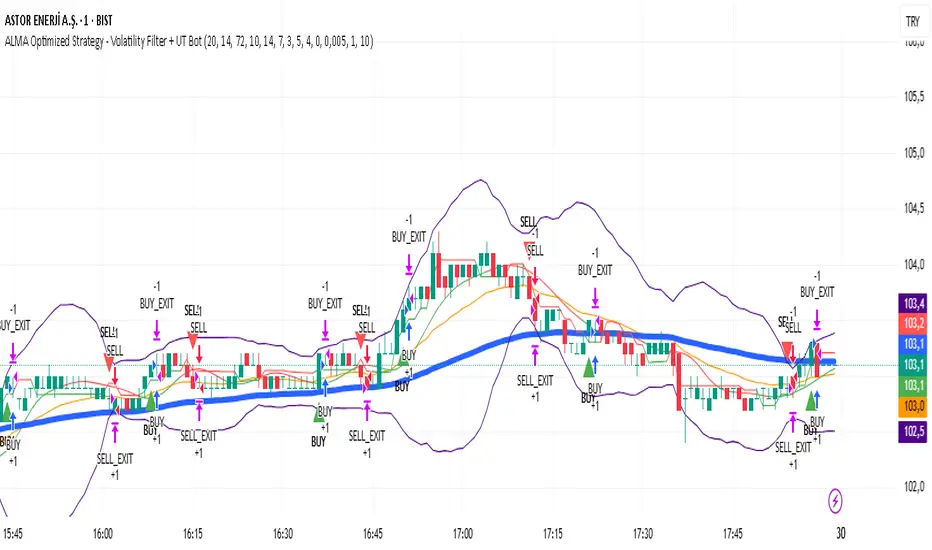
ALMA Optimized Strategy - Volatility Filter + UT BotThe strategy you provided is an ALMA Optimized Strategy implemented in Pine Script™ version 5 for TradingView. Here is a brief English summary of what it is and how it works:
It is a trend-following strategy combining multiple technical indicators to optimize trade entries and exits.
The core moving average used is the ALMA (Arnaud Legoux Moving Average), known for smoother and less lagging price smoothing compared to traditional EMAs or SMAs.
The strategy also uses other indicators:
Fast EMA (Exponential Moving Average)
EMA 50
ATR (Average True Range) for volatility measurement and dynamic stop loss and take profit levels
RSI (Relative Strength Index) for momentum with overbought/oversold levels
ADX (Average Directional Index) for confirming trend strength
Bollinger Bands as a volatility filter
Buy signals trigger when volatility is sufficient (ATR filter), price is above EMA 50 and ALMA, RSI indicates bullish momentum, ADX confirms trend strength, price is below the upper Bollinger Band, and there is a cooldown period to prevent repeated buys within a short time.
Sell signals are generated when price crosses below the fast EMA.
The strategy manages position entries and exits dynamically, applying ATR-based stop loss and take profit levels, and optionally a time-based exit.
Additionally, the script integrates the UT Bot, an ATR-based trailing stop and signal system, enhancing trade exit precision.
Buy and sell signals are visually marked on the chart with colored triangles for easy identification.
In essence, this strategy blends advanced smoothing (ALMA) with volatility filters and trend/momentum indicators to generate reliable buy and sell signals, while managing risk dynamically through ATR-based stops and profit targets. It aims to adapt to changing market conditions by filtering noise and confirming trends before entering trades.
Tram37This indicator calculates and plots a 377-day Simple Moving Average (SMA) based on the closing price, designed for long-term trend analysis. The fixed 377-day period helps smooth out short-term fluctuations, providing a clear view of the underlying trend for long-term trading or investment strategies.


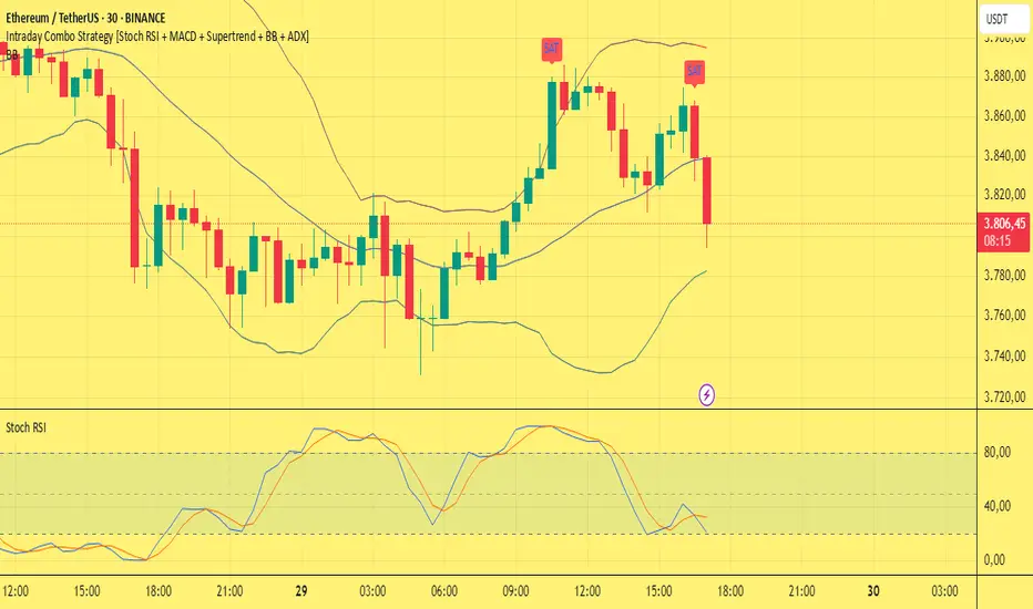
Intraday Combo Strategy HHStochastic RSI Momentum/Reversal quickly identifies overbought/oversold zones
MACD Momentum/Trend confirms a trend reversal, a late but powerful signal
Supertrend Trend Tracking provides clear and concise buy/sell signals
Bollinger Bands Volatility shows price deviation during breakouts/squeezes
ADX Trend Strength measures trend strength to filter out false signals
FRX_FORTUNE - EMA 9/15 Crossover Alert//@version=5
indicator("FRX_FORTUNE - EMA 9/15 Crossover Alert", overlay=true)
// === INPUTS ===
fastEmaLength = input.int(9, title="Fast EMA (9)")
slowEmaLength = input.int(15, title="Slow EMA (15)")
showArrows = input.bool(true, title="Show Buy/Sell Arrows")
enableAlerts = input.bool(true, title="Enable Alerts")
// === CALCULATIONS ===
fastEma = ta.ema(close, fastEmaLength)
slowEma = ta.ema(close, slowEmaLength)
bullishCross = ta.crossover(fastEma, slowEma)
bearishCross = ta.crossunder(fastEma, slowEma)
// === PLOT EMA ===
plot(fastEma, title="EMA 9", color=color.orange)
plot(slowEma, title="EMA 15", color=color.blue)
// === DRAW ARROWS ===
plotshape(bullishCross and showArrows, location=location.belowbar, color=color.green, style=shape.labelup, text="BUY", size=size.small)
plotshape(bearishCross and showArrows, location=location.abovebar, color=color.red, style=shape.labeldown, text="SELL", size=size.small)
// === ALERTS ===
alertcondition(bullishCross, title="Buy Alert", message="BUY: EMA 9 crossed above EMA 15")
alertcondition(bearishCross, title="Sell Alert", message="SELL: EMA 9 crossed below EMA 15")

LBB + RSI FX EditionLBB + RSI ForeX Edition (FX) — Version v6.4.8-fx
**Combine Log Bollinger Bands, multi-level RSI signals, optional trend & pin-bar filters, ATR-based optional TP/SL and a compact signal table — all in one overlay.**
### 1. Key Features
* **Logarithmic Bollinger Bands (LBB):**
* Uses log-price SMA and standard deviation to derive upper/lower bands
* Provides a more symmetrical response to percentage-based moves
* **RSI Multi-Level Entries:**
* Generates long signals when price closes below the lower LBB and RSI < 30 / 35 / 40
* Generates short signals when price closes above the upper LBB and RSI > 60 / 65 / 70
* Three “strength” tiers for both buys and sells
* **Signal Filters (optional):**
* **EMA Trend Filter:** only take longs above a 50-period EMA or shorts below it
* **Pin-Bar Filter:** require a clear wick-to-body ratio on the signal candle
* **Confirmed Candle:** wait for candle close before signaling
* **ATR Display (optional):** show current ATR on the signal table
* **Flexible TP/SL Settings:**
* **Static (pips) or Dynamic (ATR-based) TP/SL**
* Toggle between pips and ticks for FX precision
* Minimum pip/tick threshold to avoid overly tight stops
* Separate TP/SL controls for longs and shorts
* **Visuals & Alerts:**
* Color-coded shapes for each RSI tier (green/orange/yellow for buys; blue/purple/red for sells)
* Customizable display of Bollinger Bands, ATR, signal table and win-rate stats
* Built-in `alertcondition` for each tier with clear emoji & strength label
* **Compact Signal Table:**
* Shows 📈/📉 entry price, RSI, ATR (if enabled), pin-bar ✔/–, timestamp (with UTC offset) and win-rate placeholder
---
### 2. Inputs & Groups
| Group | Input | Default | Notes |
| ---------------------- | ------------------------------------------ | ------- | ------------------------------------- |
| **Indicator Settings** | LBB Period (`lbbLength`) | 20 | Length for log-price SMA |
| | LBB Multiplier (`lbbMult`) | 2.0 | Std dev multiplier |
| | RSI Period (`rsiLength`) | 14 | |
| | ATR Period (`atrLength`) | 14 | |
| | Show ATR (`showATR`) | true | Toggles ATR in table |
| | UTC Offset Hours (`timeOffsetHours`) | 0 | Adjust table time to your timezone |
| **Signal Filters** | Use EMA Trend Filter (`useTrendFilter`) | false | |
| | EMA Period (`emaPeriod`) | 50 | |
| | Use Pin-Bar Filter (`usePinBarFilter`) | false | |
| | Pin-Bar Ratio (`pinBarRatio`) | 2.0 | Wick-to-body minimum |
| | Only on Confirmed Candle (`onlyConfirmed`) | false | |
| **TP/SL Settings** | Show TP/SL for Long (`showLongTpSl`) | false | |
| | Show TP/SL for Short (`showShortTpSl`) | false | |
| | Use Dynamic TP/SL (`useDynamicTpSl`) | false | ATR × multiplier |
| | TP/SL in Ticks (`useTicks`) | false | Instead of pips |
| | Min TP/SL Threshold (`minTpSlThreshold`) | 10.0 | In pips |
| | TP Long (pips) (`tpLongPips`) | 20 | Static targets |
| | SL Long (pips) (`slLongPips`) | 10 | |
| | TP Short (pips) (`tpShortPips`) | 20 | |
| | SL Short (pips) (`slShortPips`) | 10 | |
| | ATR Multiplier for TP (`atrMultiplierTP`) | 1.5 | |
| | ATR Multiplier for SL (`atrMultiplierSL`) | 1.0 | |
| **Visual Settings** | Show Signal Shapes (`showShapes`) | true | |
| | Show Bollinger Bands (`showBands`) | true | |
| | Show Statistics (`showStats`) | true | Win-rate currently placeholder “NaN%” |
---
### 3. Calculation Overview
1. **Log Bollinger Bands**
```pinescript
logClose = math.log(close)
logBasis = ta.sma(logClose, lbbLength)
logDev = lbbMult * ta.stdev(logClose, lbbLength)
lowerBand = math.exp(logBasis - logDev)
upperBand = math.exp(logBasis + logDev)
basisBand = math.exp(logBasis)
```
2. **RSI & ATR**
```pinescript
rsi = ta.rsi(close, rsiLength)
atrVal = ta.atr(atrLength)
```
3. **Pin-Bar Detection**
```pinescript
body = math.abs(close - open)
upperWick = high - math.max(close, open)
lowerWick = math.min(close, open) - low
isPinBarBull = lowerWick > body * pinBarRatio and upperWick < body
isPinBarBear = upperWick > body * pinBarRatio and lowerWick < body
```
4. **Trend & Confirmation Filters**
```pinescript
emaTrend = ta.ema(close, emaPeriod)
trendLong = close > emaTrend
trendShort = close < emaTrend
trendOkLong = useTrendFilter ? trendLong : true
trendOkShort= useTrendFilter ? trendShort: true
signalOk = onlyConfirmed ? barstate.isconfirmed : true
```
5. **Entry Conditions**
* **Long**: `close < lowerBand` + RSI < {30, 35, 40} + filters
* **Short**: `close > upperBand` + RSI > {60, 65, 70} + filters
---
### 4. Signal Plotting & Alerts
* **Shapes on Chart**
* 📈 LONG signals plotted below bar in green/orange/yellow triangles, sized by strength
* 📉 SHORT signals plotted above bar in blue/purple/red inverted triangles
* **Alert Conditions**
```pinescript
alertcondition(cond_rsi30_long, title="LBB LONG RSI <30", message="📈 LONG signal | Strong Buy | {{ticker}} @ {{close}} | {{interval}}")
// … and similarly for other tiers
```
---
### 5. TP/SL Management
1. **Delta Calculation**
```pinescript
rawTP = atrVal * atrMultiplierTP * tfMultiplier
rawSL = atrVal * atrMultiplierSL * tfMultiplier
pip = syminfo.mintick
pipMult = pip == 0.00001 ? 10 : pip == 0.01 ? 1 : 100
unitMult = useTicks ? 1 : pipMult
minDelta = minTpSlThreshold * pip * tfMultiplier * unitMult
```
2. **Dynamic TP/SL Lines**
* Deletes old lines and draws new dashed lines at `entry ± max(rawΔ, minDelta)` when signaled and `useDynamicTpSl` is enabled.
3. **Manual TP/SL Labels**
* On each bar checks if price hit the TP or SL level and drops a permanent label “TP @ …” or “SL @ …”.
---
### 6. Compact Signal Table
Positioned in the top-right corner, updates on each new signal:
| Column | Content |
| ------ | ----------------------------------------- |
| 0 | 📈/📉 Entry price with color background |
| 1 | `RSI: XX` |
| 2 | `ATR: X.XXXXX` (if enabled) |
| 3 | `PinBar: ✔` or `–` |
| 4 | `Time: DD-MM-YY HH:mm` (with UTC offset) |
| 5 | `Win Rate: NaN%` (placeholder if enabled) |
---
### 7. Recommendations & Best Practices
* **Timeframe Selection:** works best on FX pairs; adjust `tfMultiplier` sensitivity by avoiding ultra-low minute charts unless needed.
* **Trend Filter:** enable `useTrendFilter` to align signals with broader trend, reducing noise.
* **Pin-Bar Filter:** turn on `usePinBarFilter` when you need higher-quality reversal candles.
* **Dynamic TP/SL:** use ATR-based exits (`useDynamicTpSl=true`) to adapt stop levels to changing volatility.
* **Ticks vs Pips:** for very tight markets (e.g. FX majors on low timeframes), switch to ticks.
* **Backtest Thoroughly:** before deploying alerts, test across multiple symbols/timeframes to tune multipliers and thresholds.
* **Alert Integration:** set up TradingView alerts using the built-in `alertcondition` names for fully automated notifications.

MJBFX VWAP WITH SIGNALSThe MJBFX VWAP Channel is a custom-built volume-weighted average price indicator designed around the MJBFX trading methodology.
This tool tracks multiple rolling VWAPs anchored to a user-defined timeframe (default: 1H), then calculates percentile levels (Max, Upper, Median, Lower, Min) to create a dynamic channel. These levels act as key support and resistance zones that adapt to market conditions.
🔶 Features:
Adjustable anchor period and VWAP count (up to 500 VWAPs)
Percentile-based VWAP levels (Max, Upper, Median, Lower, Min)
Customisable colours, widths, and line styles
Optional gradient channel fills
Anchor period highlights for session awareness
MJBFX Branded Signals:
🟠 Buy – Triggered when price crosses above the lower VWAP (MJBFX Orange)
⚪ Sell – Triggered when price crosses below the upper VWAP (MJBFX Grey)
Built-in alert conditions for automated trade notifications
🔶 How to Use:
The VWAP channel provides a dynamic structure for intraday trading.
Buy opportunities often occur when price sweeps below the lower band and reclaims it.
Sell opportunities often occur when price sweeps above the upper band and rejects.
Use in confluence with market structure, session timing, and your trading plan (e.g., MJB-FX Asian Sweep strategy).

EMA+ATR Band MTF Trend EntryThis is a Multi-Timeframe Trend Trading indicator strategy adapted from Sahil Rohmehtra’s Mentorship programme. The trading decision is made by first accessing the trend in higher timeframe (say Monthly) by using TWO EMAs. If the faster EMA (say 20 period) is above Slower EMA (say 50 period) and the price is above slower EMA then the trend is suitable for buyers. Similarly if faster EMA is below slow EMA and the price is below that then trend is suitable for sellers.
Once we access the trend in the higher timeframe we move to the lower timeframe (say Weekly) and access the 5-period RSI value. If RSI is below 30 then we can prepare for possible buy entry in lower (Daily) timeframe if entry conditions are met in daily timeframe. Similarly sell bias can be initiated when the higher timeframe EMA trend is down, daily RSI is above 70 and sell entry condition is met in daily timeframe. The RSI thresholds can be changed by the user.
Once we identified the RSI bias then wait for the confirmation candle in the lower timeframe (say 1 hour). In the entry timeframe we plot a band of 20 EMA of LOWs ± 1 ATR lines. Here,we wait for a candle to close above the 20 EMA of LOWs + 1 ATR for a buy signal with an increase in On Balance Volume (OBV) value. Similarly for sell signal we should get a candle close below the 20 EMA of LOWs - 1 ATR with corresponding change in OBV. This candle is the signal candle.
Once we get a Buy or Sell signal the corresponding stop loss is the nearest LOW - 1 ATR or HIGH + 1 ATR. The ATR scaling may be changed by the user. Now if another candle closes above the high of the buy signal candle then enter on buy. If the low of the buy signal candle is broken then it is a potential short-term sell entry. Similarly if another candle closes below the sell signal candle then enter short and if there is a close above high of the signal candle then it is a potential buy entry.

Indexrate Code SMIndexrate Code SM is an indicator and part of the Indexrate Code Set of Algorithm, which additionally includes the Indexrate Code A strategy and Indexrate Code B indicator.
The Indexrate Code Set of Algorithms can be used for any trading instruments and on any existing markets (Stock market, Forex, Cryptocurrency market, etc.).
Getting access to the Indexrate Code A strategy, you gain access to the whole set of Indexrate Code algorithms.
Indexrate Code SM is an indicator, based on the Smart Money concept. Smart money is large market participants with sufficient volumes to influence the price. This is a small group that includes banks and large funds. Their every move is controlled down to the smallest detail. In the modern world, this is done with the help of artificial intelligence and other complex algorithms that move the price to certain values. Unique programs that lower and raise the price are effective because they know the behavior of people, which will invariably be based on fear and greed.
On the other side are the majority of traders, including us - this is uninformed money. This group includes retail traders and small funds. Residents of this group believe that due to their numbers, they move the market. But in fact, the retail sector cannot have any influence on the price. This is due to low volumes: a large group in monetary terms is not as large as it may seem. Large volumes that can do this are in a small group - smart money. Retail traders are too small and make up only a small percentage of the money in circulation on the market (~5%), so the main target for smart capital is always funds.
Smart Money is following large market participants. With the help of this concept and its tools, you can identify and track the actions of smart money. As long as there is liquidity in the market, the concept will be effective in application.
Indexrate Code SM consists of a set of signals displayed on the chart, configured in a unique way to interact with each other and allowing traders to comprehensively analyze the movement of the asset price.
The indicator displays the zones of interest of "bulls" and bears", which are highlighted with lines of the corresponding color. Where gray is the zone of "bears", and blue is the zone of "bulls". When these zones are broken, the indicator displays the corresponding signals to buy or sell.
The indicator also displays the zone of fair price, highlighting it in yellow. This zone acts as a conditional magnet in the event of a price rebound from the zones of interest.
In addition, the indicator displays the zone of the greatest local interest of buyers (storng high) and sellers (weak low). When the zone of fair price is broken, the asset often rushes to these local levels. From which a rebound often occurs, both during a reversal of movement and during a breakout.
The lines of the previous daily high (PDH) and the previous daily low (PDL) give traders an understanding of the intraday range of price movement.
The Indexrate Code SM integrates the Sequential and Trend HMA trend algorithms, known to us from the Indexrate Code A strategy. By default, these algorithms are not displayed on the chart (you can enable the display in the settings), since they are displayed in the strategy, but they continue to work inside the indicator to establish more accurate signals to buy or sell. The settings of these algorithms are identical to the settings displayed in the Indexrate Code A strategy.
The search for optimal signal settings includes the time structure, that is, the period for which the calculation and search for areas of interest are carried out. As well as the number of order blocks.
drive.google.com
The settings of the Sequential and Trend HMA trend algorithms are aimed at eliminating false signals as much as possible.
drive.google.com
The signals on the chart are displayed as green dots for buying and red dots for selling.
Provided that the Indexrate Code A strategy is configured most successfully, the appearance of a confirmation signal can provide the potential probability of the strongest price movement.
It is also worth considering that when working with the Heiken Ashi chart, for which the Indexrate Code Set of Algorithm works, you must install OHLC as shown in the screenshot below. Since this parameter allows you to take into account real exchange prices, without calculating average Heiken Ashi values, which can mislead the trader regarding the current state of the market. And also take into account the percentage of the exchange commission and the On bar close parameter.
telegra.ph
The Indexrate Code Set of Algorithms is suitable for conservative traders who evaluate their success in the long term, and not in short-term excess profits.
IT IS IMPORTANT TO KNOW that no indicator is capable of 100% predicting a successful trade.
The market is a collection of people. It is thanks to human psychology that shapes the forces of supply and demand that financial markets exist (Charles Dow Theory).
Forecasting based on the analysis of mathematical algorithms (indicators) uses data from past trading - the price of the previous period of time and the volume of previous trading. It is these two indicators that are used by modern technical analysis.
The Indexrate Code Set of Algorithm is based on algorithms that evaluate trends, prices and volume indicators. As well as human psychology, which requires an assessment of the exact preceding periods for a specific timeframe, and not an assessment of the entire period from the moment of listing of a trading instrument on a specific exchange. Since market indicators completely change throughout the trading period and the exchange trading volume also changes.
All updates to the Indexrate Code Set of Algorithm will be free.
Trading is trading on probabilities. Investing is trading on opportunity. Nobody knows the future - Always protect your profits!
Russian translation
Indexrate Code SM - это индикатор являющийся частью Комплекта алгоритмов Indexrate Code, включающего в себя дополнительно стратегию Indexrate Code А и индикатор Indexrate Code B.
Комплект алгоритмов Indexrate Code, может быть использован для любых торговых инструментов и на любых существующих рынках (Фондовый рынок, Форекс, Криптовалютный рынок и тд).
Получая доступ к индикатору Indexrate Code SM, вы получаете доступ ко всему комплекту алгоритмов Indexrate Code.
Indexrate Code SM это индикатор, основанный на концепции Smart Money. Умные деньги — это крупные участники рынка, имеющие достаточные объемы, чтобы оказывать влияние на цену. Это небольшая группа, в которую входят банки и крупные фонды. Каждое их движение, до мельчайших деталей контролируется. В современном мире это делается с помощью искусственного интеллекта и других сложных алгоритмов, которые двигают цену на определенные значения. Уникальные программы, которые опускают и поднимают цену, эффективны, потому что они знают поведение людей, которое неизменно будет основываться на страхе и жадности.
По другую сторону находится большинство трейдеров, включая нас – это не информированные деньги. В такую группу входят ритейл трейдеры и небольшие
фонды. Резиденты такой группы считают, что из-за их численности они двигают рынок. Но на самом деле розничный сектор не может оказывать никакого влияния на цену. Обуславливается это низкими объемами: большая группа в денежном эквиваленте не так уж велика, как может показаться. Крупные объемы, способные это делать, находятся в небольшой группе — умных денег. Ритейл трейдеры слишком малы и составляют только небольшой процент обращаемых денег на рынке (~5%), поэтому основной целью для умного капитала всегда выступают фонды.
Smart Money это следование за крупными участниками рынка. С помощью
этой концепции и ее инструментов, вы сможете идентифицировать и отслеживать действия умных денег. Пока на рынке будет ликвидность, до тех пор концепция будет эффективна в применении.
Indexrate Code SM состоит из совокупности отображаемых сигналов на графике, настроенных уникальным образом для взаимодействия между собой и позволяющих трейдерам комплексно анализировать движение цены актива.
Индикатор отображает зоны интереса «быков» и медведей», которые подсвечиваются линиями соответствующего цвета. Где серый это зона «медведей», а голубой это зона «быков». При прорыве этих зон, индикатор отображает соответствующие сигналы на покупку или на продажу.
Также индикатор отображает зону справедливой цены, подсвечивая ее желтым цветом. Данная зона выступает в качестве условного магнита, в случае отскока цены от зон интереса.
Дополнительно на индикаторе отображены зона наибольшего локального интереса покупателей (storng high) и продавцов (weak low). При прорыве зоны справедливой цены, актив чаще устремляется именно к этим локальным уровням. От которых зачастую происходит отскок, как и при развороте движения, так и при пробитии.
Линии предыдущего дневного хая (PDH) и предыдущего дневного лоя (PDL), дают трейдерам понимание внутридневного диапазона движения цены.
В Indexrate Code SM интегрированы трендовые алгоритмы Sequential и Trend HMA, известные нам по стратегии Indexrate Code A. По умолчанию данные алгоритмы не отображаются на графике (можно включит отображение в настройках), так как они отображены в стратегии, но продолжают работать внутри индикатора, для установления более точных сигналов на покупку или продажу. Настройки указанных алгоритмов идентичны, настройкам, отображаемым в стратегии Indexrate Code A.
Поиск оптимальных настроек сигналов, включает в себя структуру времени, то есть период, за который идет расчет и поиск зон интереса. А также количество ордер блоков.
drive.google.com
Настройки трендовых алгоритмов Sequential и Trend HMA, направлены для максимального исключения ложных сигналов.
drive.google.com
Сигналы на графике отображены точками зеленого цвета на покупку и красного цвета на продажу.
При условии наиболее удачной настройки стратегии Indexrate Code A, появление подтверждающего сигнала, может давать потенциальную вероятность наиболее сильного движения цены.
Стоит также учесть, что при работе с графиком Heiken Ashi, для которого работает Комплект алгоритмов Indexrate Code, необходимо устанавливать OHLC как показано ниже на скриншоте. Поскольку этот параметр позволяет учитывать реальные биржевые цены, без расчета усредненных значений Heiken Ashi, которые могут ввести трейдера в заблуждение относительно текущего состояния рынка. А также учитывать процент комиссии биржи и параметр On bar close.
telegra.ph
Комплект алгоритмов Indexrate Code, подходит консервативным трейдерам, оценивающим свой успех в долгосрочном перспективе, а не в краткосрочной сверх прибыли.
ВАЖНО ЗНАТЬ, что ни один индикатор не способен на 100% предсказать успешную сделку.
Рынок - это совокупность людей. Именно благодаря психологии людей, формирующей силы спроса и предложения, существуют финансовые рынки (Теория Чарльза Доу).
Прогнозирование на основе анализа математических алгоритмов (индикаторов), использует данные прошлых торгов - цену предыдущего периода времени и объем предыдущих торгов. Именно эти два показателя и используются современным техническим анализом.
В основе Комплекта алгоритмов Indexrate Code, лежат алгоритмы оценивающие тенденции, цены и показатели объема. А также психология людей, которая требует оценки точных предшествующих периодов для конкретного таймфрейма, а не оценка всего периода с момента листинга торгового инструмента на конкретной бирже. Так как показатели рынка полностью изменяются на всем торговом периоде и также меняется биржевой объем торгов.
Все обновления Комплекта алгоритмов Indexrate Code, будут бесплатны.
Трейдинг - это торговля на вероятностях. Инвестиции - это торговля на возможностях. Никто не знает будущего - Всегда защищайте свою прибыль.

Keltner Channels MTFKeltner Channels MTF | Adapted 🌌
Navigate the market’s wild waves with these Keltner Channels, a sleek spin on AlchimistOfCrypto’s Bollinger Bands! This Pine Script v6 indicator tracks price action like a radar, highlighting trends with scientific precision. 🧪
Key Features:
Customizable Channels: Adjust period and multiplier to map market volatility, signaling potential reversals when prices hit the upper or lower bands. 📈
MA Options: Switch between Exponential or Simple Moving Average for trend clarity. ⚙️
Band Styles: Select Average True Range, True Range, or Range to define volatility edges. 📏
Glow Effect: Illuminate bands with 8 vibrant themes (Neon, Grayscale, etc.) for visual pop. ✨
Trend Signals: Spot bullish/bearish shifts with glowing circles, flagging momentum changes. 💡
Alerts: Catch price breakouts or trend reversals at band edges, warning of potential market U-turns. 🚨
Perfect for traders decoding market trends with a touch of cosmic style! 🌠
