Faster Heikin AshiFaster Heikin Ashi
The Faster Heikin Ashi improves traditional Heikin Ashi candles by introducing advanced weighting mechanisms and lag reduction techniques. While maintaining the price smoothing benefits of standard Heikin Ashi, this enhanced version delivers faster signals and responsiveness.
Key Features
Unified Responsiveness Control
Single parameter (0.1 - 1.0) controls all responsiveness aspects
Eliminates conflicting settings found in other enhanced HA indicators
Intuitive scaling from conservative (0.1) to highly responsive (1.0)
Advanced Weighted Calculations
Smart Close Weighting: Close prices receive 2-3x more influence for faster trend detection
Dynamic OHLC Processing: All price components are intelligently weighted based on responsiveness setting
Balanced High/Low Emphasis: Maintains price level accuracy while improving speed
Enhanced Open Calculation
Transition Speed: Open prices "catch up" to market movements faster
Lag Reduction Algorithm: Eliminates the typical delay in Heikin Ashi open calculations
Smooth Integration: Maintains visual continuity while improving responsiveness
Four-Color Scheme
- 🟢 **Lime**: Strong bullish momentum
- 🔴 **Red**: Strong bearish momentum
- 🟢 **Green**: Moderate bullish
- 🔴 **Maroon**: Moderate bearish
How It Works
Traditional Heikin Ashi smooths price action but often lags behind real market movements. This enhanced version:
1. Weights price components based on their predictive value
2. Accelerates trend transitions through advanced open calculations
3. Scales all enhancements through a single responsiveness parameter
4. Maintains smoothing benefits while reducing lag
Responsiveness (0.1 - 1.0)
0.1 - 0.3: Conservative, maximum smoothing
0.4 - 0.6: Balanced, good for swing trading and trend following
0.7 - 1.0: Aggressive, fast signals, suitable for scalping and active trading
Candlestick analysis

Doji Signals with Wick ColorThis indicator identifies Doji candlestick patterns on the chart and highlights both the candle body and wicks in yellow for better visibility.
A Doji is defined as a candle where the body size is relatively small compared to the full range (high - low), indicating market indecision. You can adjust the maximum allowed body size as a percentage of the total candle range using the "Doji's Max Body Size" input.
The indicator works by:
Calculating the body size (abs(open - close))
Comparing it to a threshold (precision * (high - low))
Highlighting candles that meet the condition as Doji, coloring both the body and wick in yellow
This visual aid helps traders quickly spot potential reversal or pause areas in price action based on candlestick psychology.

Squeeze Pro Momentum BAR color - KLTDescription:
The Squeeze Pro Momentum indicator is a powerful tool designed to detect volatility compression ("squeeze" zones) and visualize momentum shifts using a refined color-based system. This script blends the well-known concepts of Bollinger Bands and Keltner Channels with an optimized momentum engine that uses dynamic color gradients to reflect trend strength, direction, and volatility.
It’s built for traders who want early warning of potential breakouts and clearer insight into underlying market momentum.
🔍 How It Works:
📉 Squeeze Detection:
This indicator identifies "squeeze" conditions by comparing Bollinger Bands and Keltner Channels:
When Bollinger Bands are inside Keltner Channels → Squeeze is ON
When Bollinger Bands expand outside Keltner Channels → Squeeze is OFF
You’ll see squeeze zones classified as:
Wide
Normal
Narrow
Each represents varying levels of compression and breakout potential.
⚡ Momentum Engine:
Momentum is calculated using linear regression of the price's deviation from a dynamic average of highs, lows, and closes. This gives a more accurate representation of directional pressure in the market.
🧠 Smart Candle Coloring (Optimized):
The momentum color logic is inspired by machine learning principles (no hardcoded thresholds):
EMA smoothing and rate of change (ROC) are used to detect momentum acceleration.
ATR-based filters help remove noise and false signals.
Colors are dynamically assigned based on both direction and trend strength.
🧪 How to Use It:
Look for Squeeze Conditions — especially narrow squeezes, which tend to precede high-momentum breakouts.
Confirm with Momentum Color — strong colors often indicate trend continuation; fading colors may signal exhaustion.
Combine with Price Action — use this tool with support/resistance or patterns for higher probability setups.
Recommended For:
Trend Traders
Breakout Traders
Volatility Strategy Users
Anyone who wants visual clarity on trend strength
📌 Tip: This indicator works great when layered with volume and price action patterns. It is fully non-repainting and supports overlay on price charts.

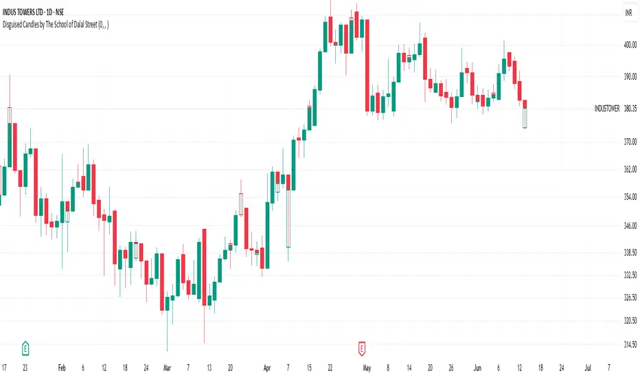
Disguised Candles by The School of Dalal StreetDisguised Candles corrects one of the subtle visual distortions present in normal candlestick charts — the mismatch between the close of one candle and the open of the next.
On many instruments (especially at day/session breaks), the next candle’s open often jumps due to price gaps or data feed behavior. This can make reading the flow of price action harder than necessary.
Disguised Candles fixes this by plotting synthetic candles where the open of each candle is forced to match the close of the previous one — creating a visually continuous flow of price.
Real candles are made fully transparent, so only the "corrected" candles are visible.
This allows traders to:
Visualize price flow as a smooth path
Better spot true directional shifts and trends
Avoid distractions caused by technical gaps that are not meaningful to their strategy
🚀 Pure visual clarity. No noise from false opens.
How it works:
The open of each synthetic candle = close of previous real candle
High, Low, Close remain unchanged
Colors are based on Close vs Corrected Open
Real chart candles are hidden under a transparent overlay
Use this as a clean canvas for trend analysis or as a foundation for building new visual systems.
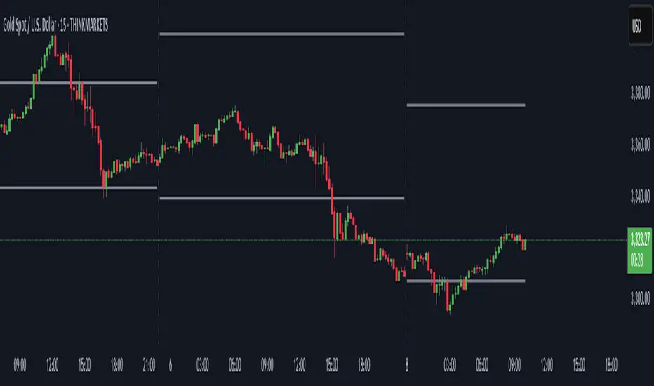
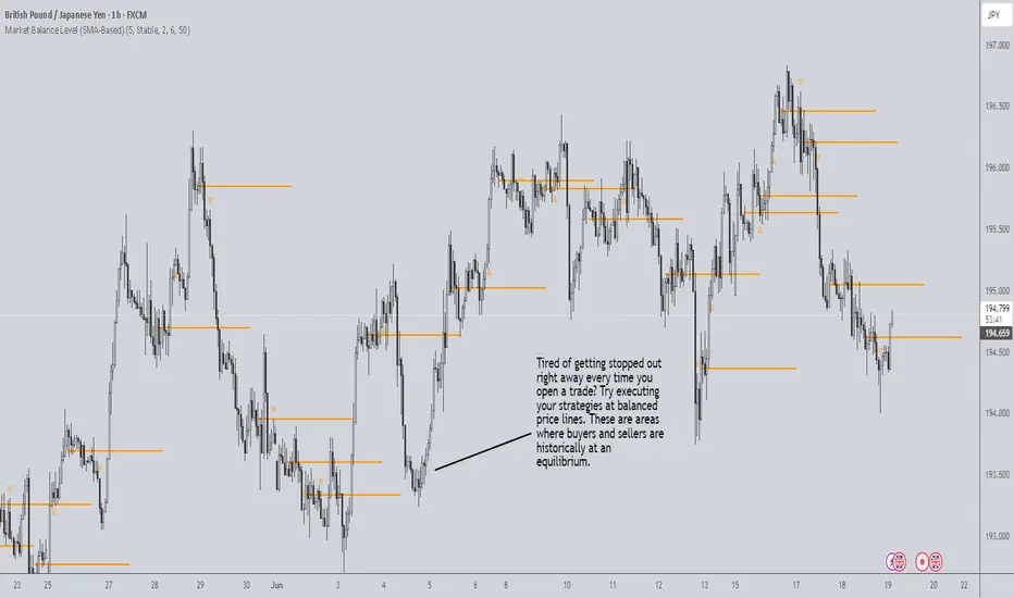
Market Balance LevelMarket Balance Level (MBL)
This indicator dynamically identifies price consolidation zones (market balance levels) and plots a horizontal line at the average midpoint of the range once a valid breakout occurs. It helps traders visualize key zones where the market was previously in equilibrium and is likely to retest before continuing its trend.
How It Works:
Detects consolidation ranges using consecutive candles within a tight high-low structure.
When a breakout occurs (above or below the range), it plots a line at the average midpoint of the consolidation.
Triangles are drawn on breakouts to visually confirm the breakout direction.
Lines can be customized by color, width, and breakout direction (bullish, bearish, or both).
Recommended Use:
Wait for price to return to the Market Balance Level (MBL). These levels often act as strong support or resistance.
Enter upon engulfment (candle closes strongly in the direction of the breakout), confirming continuation.
Features:
Adjustable consolidation sensitivity and line length.
Option to show/hide bullish or bearish MBLs.
Visual breakout markers (triangles) with alert support.
Optional alert messages for breakout events.
Use this tool to enhance your structure-based or SMC-style trading strategies.
HTF Candle Display (Evolution FX)HTF Candle Display (Evolution FX)
WHAT IT DOES
This tool overlays a **higher timeframe candle** (like Daily or Weekly) directly on your current lower timeframe chart (like 5m, 15m, 1h). It visually anchors current price action within its broader market context, ideal for traders using multi-timeframe confluence, liquidity mapping, or High-Timeframe-Based decision-making.
KEY FEATURES
Timeframe selection : Choose any higher timeframe (HTF) to display (e.g., D, W, M).
Dynamic candle placement : Position the HTF candle overlay away from price action using distance presets: `Close`, `Near`, `Far`, `Very Far`.
Adjustable thickness : Choose candle body width via `Thin`, `Thick`, or `Thicker` styles.
Fully customisable visuals : Set custom colours for bullish and bearish candles, borders, wicks, and labels.
Highlight box (optional) : Display a semi-transparent box aligned to the HTF candle's real time span.
Label with live countdown : Optionally show a floating label with timeframe info and time remaining in the HTF candle.
Previous candle display : Toggle to show or hide the prior HTF candle for better comparison.
HOW TO USE IT
Select your HTF (e.g., Daily) from the input dropdown.
Use "Distance From Price Action" to shift the visual away from the candles for a cleaner layout.
Adjust "Candle Width" to visually match your preferences.
Optionally toggle:
- "Show Previous Candle"
- "Show Label"
- "Highlight Current Day Price Action Box"
Customise your **colour scheme** to match your charting setup.
Recommended to use on charts like `15m`, `1h`, or `4h` for best visual clarity.
USE CASES
HTF liquidity hunting
Bias framing via daily/weekly structure
Institutional-style trading models
Scalping with macro trend context

Zero-Lag Linear Regression Candles🚀 Zero-Lag Linear Regression Candles
📊 What It Does
The Zero-Lag Linear Regression Candles change traditional candlestick analysis by creating smoothed, predictive candles that eliminate the lag inherent in standard linear regression methods. Instead of waiting for price confirmation, this indicator anticipates market movements using advanced mathematical modeling.
🎯 Key Features
Tri-Layer Super Responsive System
Layer 1: Weighted Linear Regression with exponential decay weighting
Layer 2: Zero-lag correction algorithm that projects future price direction
Layer 3: Adaptive intelligence that adjusts to current market volatility and momentum
Smart Market Adaptation
Automatically adjusts sensitivity based on market volatility (ATR)
Responds to momentum changes in real-time
Filters out market noise while preserving important signals
Customizable
Regression Length: Fine-tune responsiveness (2-50 periods)
Weight Decay Factor: Control how much emphasis to place on recent vs. historical data
Zero-Lag Periods: Adjust the aggressiveness of lag elimination
Adaptive Factor: Set market adaptation strength
🛠️ Usage Instructions
1. Add to Chart: Apply the indicator to any timeframe
2. Configure Settings: Adjust regression length and sensitivity to match your trading style
3. Interpret Signals:
- Green Candles: Bullish linear regression trend
- Red Candles: Bearish linear regression trend
Created by B3AR_Trades
Close alertingThis script generates alerts when the current candle CLOSES ABOVE the previous candle's HIGH, or CLOSES BELOW the previous candle's LOW.
✅ Works on ANY timeframe you are viewing (1m, 5m, 15m, 1h, 4h, etc.)
✅ Alerts can be created:
- "Close Above Previous High"
- "Close Below Previous Low"
The script is lightweight and works purely on current chart timeframe. No need to adjust or configure — just add to chart and set Alerts.
Enjoy and safe trading! 🚀

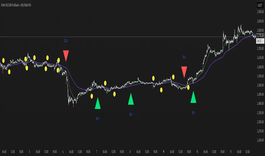
EMA 50/200 Pullback + RSI/SMA RSI
Strategy Description: EMA 50/200 Pullback + RSI/SMA RSI
1. Trend Identification with EMA:
Uses two Exponential Moving Averages (EMA): a fast EMA (default 50) and a slow EMA (default 200).
When the fast EMA crosses above the slow EMA (bullish crossover), an uptrend is identified.
When the fast EMA crosses below the slow EMA (bearish crossover), a downtrend is identified.
The lengths of both EMAs are fully customizable.
2. EMA Distance Condition:
Signals are only valid when the absolute percentage distance between the two EMAs is within a user-defined range (default: 0.4% to 1%).
This helps filter out weak signals when the EMAs are too close or too far apart.
3. Pullback Condition:
After a new trend is detected (EMA crossover), the strategy waits for the price to pull back to touch or cross the fast EMA (EMA 50).
This ensures entries are not taken immediately at the crossover, but after a retracement to a dynamic support/resistance area.
4. RSI Confirmation:
Uses the RSI indicator (default 14) and its Simple Moving Average (SMA RSI, default 14).
Buy signal: RSI crosses above its SMA.
Sell signal: RSI crosses below its SMA.
Both RSI and SMA RSI lengths are fully customizable.
5. Entry Rules:
The indicator only gives the first buy/sell signal after each EMA crossover (start of a new trend), and will not repeat signals until the next EMA crossover.
Buy signal:
Fast EMA crosses above slow EMA
EMA distance is within the valid range
Price pulls back to the fast EMA
RSI crosses above its SMA
Sell signal:
Fast EMA crosses below slow EMA
EMA distance is within the valid range
Price pulls back to the fast EMA
RSI crosses below its SMA
6. Customization:
All parameters (EMA lengths, RSI length, SMA RSI length, EMA distance range) can be adjusted in the indicator’s settings.
Note:
This is a signal indicator, not a complete trading strategy. For real trading, always combine with risk management and additional confirmations.
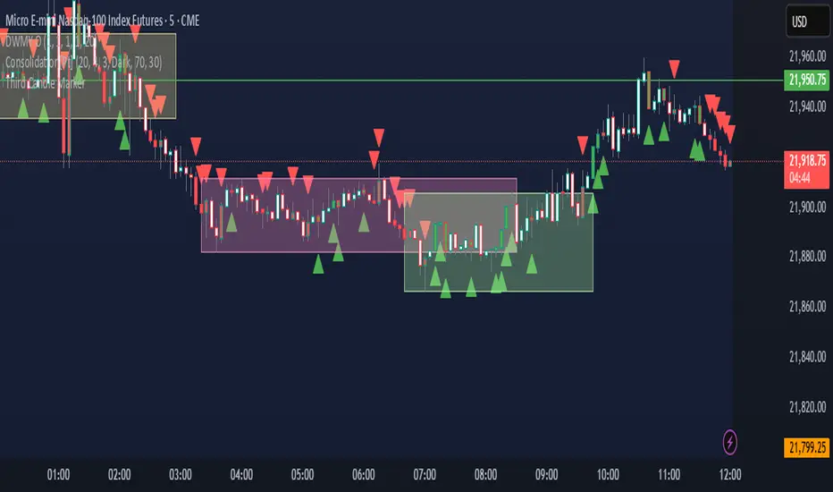
Third Candle MarkerTitel: Third Candle Marker – Highlights Trend Continuation
Beschreibung:
This script highlights potential trend continuation setups by marking the third candle after two consecutive candles of the same direction.
If the previous two candles were bullish (green), the third candle is colored green.
If the previous two candles were bearish (red), the third candle is colored red.
A white color indicates that no clear trend was detected in the previous two candles.
Additionally, the script plots small triangle markers:
Green upward triangle below the bar if the last two candles were bullish.
Red downward triangle above the bar if the last two candles were bearish.
Use this tool to visually identify potential continuation signals in trending markets. Suitable for all timeframes.
Note: This script does not generate buy/sell signals; it is meant to assist in visual trend recognition.
Worldwide Sessions and Open Range BreakoutThis script shows when the various normal market hours for each of the major worldwide markets (Asia, New York, and London). It also draws a line on the opening range for each of these market sessions. The opening range defaults to the first 15 minutes of the session, but this can be customized.
This script does automatically handle the session times regardless of your time zone or what time frame you are on. No need to set anything! This probably can't handle non-normal trading days, such as partial days.
This script is made for futures, but would likely work for other markets, like Forex.

LRHA Trend Shift DetectorLRHA Trend Shift Detector (TSD)
The LRHA Trend Shift Detector is an advanced momentum exhaustion indicator that identifies potential trend reversals and changes by analyzing Linear Regression Heikin Ashi (LRHA) candle patterns. TSD focuses on detecting when strong directional moves begin to lose momentum.
🔬 Methodology
The indicator employs a three-stage detection process:
LRHA Calculation: Applies linear regression smoothing to Heikin Ashi candles, creating ultra-smooth trend-following candles that filter out market noise
Extended Move Detection: Identifies sustained directional moves by counting consecutive bullish or bearish LRHA candles
Momentum Exhaustion Analysis: Monitors for significant changes in candle size compared to recent averages
When an extended move shows clear signs of momentum exhaustion, the indicator signals a potential trend shift with red dots plotted above or below your candlesticks.
⚙️ Parameters
Core Settings
LRHA Length (11): Linear regression period for smoothing calculations. Lower values = more responsive, higher values = smoother trends.
Minimum Trend Bars (4): Consecutive candles required to establish an "extended move." Higher number detects longer term trend changes.
Exhaustion Bars (3): Number of consecutively smaller candles needed to signal exhaustion. Lower is more sensitive.
Size Reduction Threshold (40%): Percentage decrease in candle size to qualify as "exhaustion." Lower is more sensitive.
Trend Trading
Pullback Entries: Identify exhaustion in counter-trend moves for trend continuation
Exit Strategy: Recognize when main trend momentum is fading
Position Sizing: Reduce size when seeing exhaustion in your direction
🎛️ Optimization Tips
For More Signals (Aggressive)
- Decrease LRHA Length (7-9)
- Reduce Minimum Trend Bars (2-3)
- Lower Size Reduction Threshold (25-35%)
For Higher Quality (Conservative)
- Increase LRHA Length (13-18)
- Raise Minimum Trend Bars (5-6)
- Higher Size Reduction Threshold (45-55%)
⚠️ Important Notes⚠️
- **Not a Complete Strategy**: Use as confluence with other analysis methods
- **Market Context Matters**: Consider overall trend direction and key support/resistance levels
- **Risk Management Essential**: Always use proper position sizing and stop losses
- **Backtest First**: Optimize parameters for your specific trading style and instruments

Candle Price % ChangeIf you are using candle bottoms/tops for your stop-loss, this indicator allows you to see the price percentage difference between the current price and the high or low of a candle. This eliminates the need to manually measure the candle every time you need to determine your stop-loss %. It's particularly useful when scalping on small time frames like the 1m.

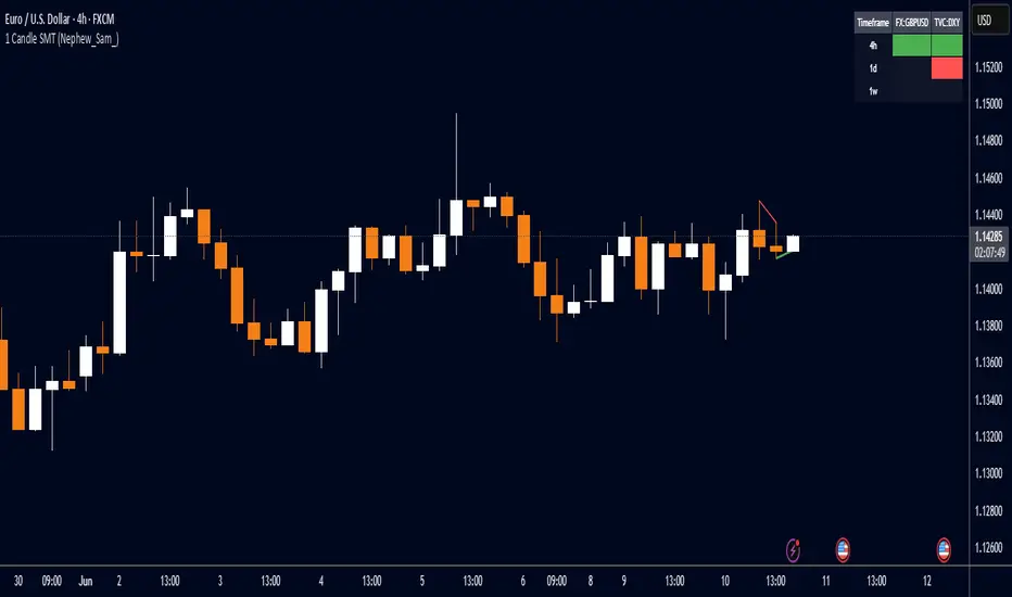
1 Candle SMT Divergence (Nephew_Sam_)📊 1 Candle SMT Divergence Detector
3-Way Smart Money Theory (SMT) Divergence Scanner for Multi-Symbol Analysis
This indicator identifies 1-candle SMT divergences by comparing one primary symbol against up to 2 correlation symbols across multiple timeframes simultaneously. Perfect for detecting institutional smart money moves and market inefficiencies.
🎯 Key Features:
3-Way Comparison: Compare 1 "From" symbol vs 2 "To" symbols (configurable)
5 Symbol Pairs: Pre-configure up to 5 different symbol combinations
Multi-Timeframe: Scan 5 timeframes simultaneously (Chart, 1H, 4H, Daily, Weekly)
Smart Filtering: Only displays timeframes equal to or higher than your chart
Real-Time Detection: Compares current vs previous candle highs/lows
Visual Alerts: Clean table display with color-coded divergence status
Line Drawing: Optional trend lines connecting divergence points
Replay Compatible: Works with TradingView's replay mode
📈 How It Works:
Detects when one symbol makes a higher high while correlated symbols make lower highs (and vice versa for lows). This creates SMT divergence signals that often precede significant market moves.
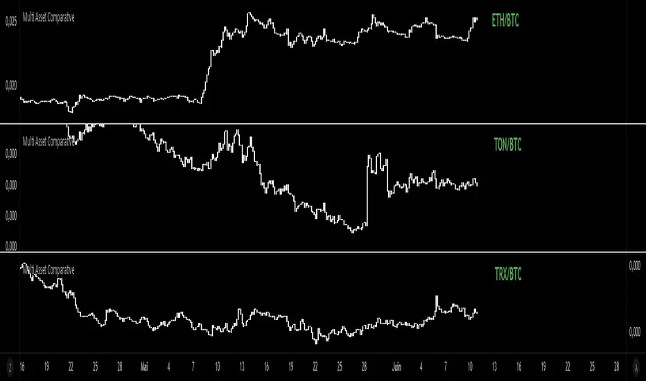
Multi Asset Comparative📊 Multi Asset Comparative – Compare Baskets of Cryptos Visually
This indicator allows you to compare the performance of two groups of cryptocurrencies (or any assets) over time, using a clean and intuitive chart.
Instead of looking at each asset separately, this tool gives you a global view by showing how one group performs relative to another — all displayed in the form of candlesticks.
🧠 What This Tool Is For
Markets constantly shift, and capital rotates between sectors or tokens. This script helps you visually track those shifts by answering a key question:
"Is this group of assets getting stronger or weaker compared to another group?"
For example:
Compare altcoins vs Bitcoin
Track the DeFi sector vs Ethereum
Analyze your custom portfolio vs the market
Spot moments when money flows from majors to smaller caps, or vice versa
🧩 How It Works (Simplified)
You select two groups of assets:
Group 1 (up to 20 assets) — the one you want to analyze
Group 2 (up to 5 assets) — your comparison baseline
The indicator then creates a single line of candles that represents the performance of Group 1 compared to Group 2. If the candles go up, it means Group 1 is gaining strength over Group 2. If the candles go down, it's losing ground.
This lets you see market dynamics in one glance, instead of switching charts or running calculations manually.
🚀 Why It's Unique
Unlike many indicators that just show data from one asset, this one provides a bird's-eye view of multiple assets at once — condensed into a simple visual ratio.
It’s:
Customizable (you choose the assets)
Visual and intuitive (no need to interpret tables or formulas)
Actionable (helps with trend confirmation, macro views, and market rotation)
Whether you're a swing trader, a macro analyst, or building your own strategy, this tool can help you spot opportunities hidden in plain sight.
✅ How to Use It
Choose your two groups of assets (e.g., altcoins vs BTC/ETH)
Watch the direction of the candles:
Uptrend = Group 1 gaining strength over Group 2
Downtrend = Group 1 weakening
Use it to confirm market shifts, anticipate rotations, or analyze sector strength
Multi-Timeline 1.0Multi-TimeLines 1.0 - Comprehensive Description
WHAT IT DOES:
This indicator creates dynamic horizontal support/resistance lines based on opening prices captured at user-defined New York times. Unlike static horizontal lines, these levels automatically appear and disappear based on sophisticated session logic, providing traders with time-sensitive reference levels that adapt to market sessions.
HOW IT WORKS - TECHNICAL IMPLEMENTATION:
1.
Timezone Conversion Engine:
The script uses Pine Script's "America/New_York" timezone functions to ensure all time calculations are based on NY time, regardless of the user's chart timezone. This eliminates confusion and provides consistent behavior across global markets.
2.
Dual-Category Time Classification System:
The indicator employs a unique two-category classification system:
Category A (16:00-23:59 NY): Evening times that extend overnight until next day 15:59 NY
Category B (00:00-15:59 NY): Day times that extend until same day 15:59 NY
This classification handles the complex logic of overnight sessions and prevents lines from incorrectly resetting at midnight for evening times.
3. Price Capture Mechanism:
Uses precise time-hit detection with backup systems for edge cases (especially midnight 00:00). When a specified time occurs, the script captures the bar's opening price and stores it in persistent variables using Pine Script's var declarations.
4. Session-Aware Display Logic:
Lines only appear during their designated "display windows" - periods when the captured price level is relevant. The script uses conditional plotting with plot.style_linebr to create clean breaks when lines are inactive.
5. Smart Reset System:
Different reset behaviors based on time classification:
Category A times persist across midnight (for overnight analysis)
Category B times reset on day changes (except 00:00 which captures AT day change)
Automatic cleanup when display windows close
ORIGINALITY & UNIQUE FEATURES:
1. Overnight Session Handling:
Unlike basic horizontal line tools, this script properly handles overnight spans for evening times, making it invaluable for analyzing gaps and overnight price action.
2. Automatic Session Management:
No manual line drawing required - the script automatically manages when lines appear/disappear based on NY market sessions (15:59 close, 18:00 after-hours start).
3. Time-Window Display Logic:
Lines only show during relevant periods, reducing chart clutter and focusing attention on currently active levels.
TRADING CONCEPTS & APPLICATIONS:
1. Session-Based Analysis:
Capture opening prices at key session times:
00:00 NY: Sydney/Asian session start
03:00 NY: London pre-market
08:00 NY: London session open
09:30 NY: NYSE opening bell
18:00 NY: After-hours start
2. Gap Analysis:
Evening times (20:00-23:59) that extend overnight are particularly useful for:
Identifying potential gap-fill levels
Tracking overnight high/low breaks
Setting reference points for next-day trading
3. Support/Resistance Framework:
Opening prices at significant times often act as:
Intraday support/resistance levels
Reference points for breakout/breakdown analysis
Pivot levels for mean reversion strategies
HOW TO USE:
1. Time Input:
Enter times in "HH:MM" format using 24-hour NY time:
"09:30" for NYSE open
"15:30" for late-day reference
"20:00" for evening level (extends overnight)
2. Line Behavior:
Blue/Green/Cyan/Red lines: Your custom times
Yellow line: After-hours day open (18:00 NY start)
Lines appear with breaks during inactive periods
3. Strategic Setup:
Use 2-3 key session times for your trading style
Combine morning times (immediate reference) with evening times (overnight analysis)
Toggle after-hours line based on your market focus
CALCULATION METHOD:
The script uses direct opening price capture (no smoothing or averaging) at precise time hits, ensuring the most accurate representation of actual market levels at specified times. This raw price approach maintains the integrity of actual market opening prices rather than manipulated or calculated values.
This method is particularly effective because opening prices at significant times often represent institutional order flow and can act as magnetic levels throughout subsequent sessions.

Multi-Timeframe Price Action AnalysisMulti-Timeframe Price Action Analysis
This indicator analyzes price action across multiple timeframes to determine bullish and bearish signals. It creates a dashboard showing how price interacts with previous candles' highs and lows.
Features
- Analyzes 4 customizable timeframes simultaneously
- Detects when price:
-- Grabs lows and comes back inside (bullish)
-- Grabs highs and comes back inside (bearish)
-- Grabs both highs and lows
-- Moves above previous high
-- Moves below previous low
-- Calculates bullish/bearish percentages for each timeframe
-- Visual dashboard with color-coded signals
Adjustable confirmation settings
-- Settings
-- Customize timeframes (default: 15min, 1H, 4H, D)
-- Toggle confirmation waiting
-- Set number of confirmation candles
This is a very rudimentary version.. I will make a more robust version soon
For it to be considered a "grab" the current price must be within the previous candle's range..
This also does not focus on candle closures just highs and lows
Also note that this is a little aggressive in that it does not require a bullish close for example to be considered bullish, a bearish close inside the previous candle is considered valid, this is to handle the morning stars that have a slightly bearish close in middle candle etc.. obviously do not rely on this indicator.. look at the price action and determine if you think its worth taking..
Same goes for bullish closes inside previous candle after grabbing highs..

Candle Ribbon [UkutaLabs]The Candle Ribbon is a powerful trading tool that creates a strong ribbon that indicates market strength. This ribbon is created using three moving averages that use the candle values (high, low, open and close) as its input values.
The center most MA will also be colored green, red or grey depending on whether or not its direction aligns with current market strength.
The outer band lines act as range indicators, plotted above and below the center ribbon, which represent volatility boundaries for price action.
█ USAGE
The Candle Ribbon is created using a series of three moving averages that uses values from the candle as its inputs. The user has the ability to select whether the moving averages are EMAs or SMAs, as well as the ability to control the period of the moving averages.
If the moving average calculated using the Candle Open is below the moving average calculated using the Candle Close, the ribbon will be colored green, indicating a bullish trend. If the moving average calculated using the Candle Open is above the moving average calculated using the Candle Open, the ribbon will be colored red, indicating a bearish trend.
This indicator also uses a series of hidden EMAs to determine market strength. If these EMAs do not align with the direction of the Candle Ribbon, the middle MA will instead be colored grey, indicating uncertainty in the market, as well as a possible reversal.
█ SETTINGS
Configuration
• Moving Average Type: Determines whether or not the Candle Moving Averages will be drawn as EMAs or SMAs.
• Moving Average Period: Determines the period of the Candle Moving Averages.
Moving Average
• Moving Average Input: Determines the input values for the hidden EMAs.

CHoCH + BOS Detector (con líneas)este indicador sirve para simplificar las entrada scalper en el oro

Engulfing Candles (ATR-Based) with Volume SpikeOverview:
This script is designed to detect high-probability bullish and bearish engulfing patterns — but with a twist: it filters them through ATR-based volatility and confirms strength with volume spikes, all while offering optional trend filtering. It's built for traders who want more than just surface-level candle patterns — it's for those who want contextual confirmation before entering a trade.
What Makes It Different:
Most engulfing candle indicators simply match two candle shapes. This script goes deeper by:
Measuring candle body size relative to recent volatility (via ATR).
Checking for volume confirmation using a dynamic spike threshold.
Filtering based on trend context using SMA-based structure detection.
This tri-layered logic aims to avoid false positives and give traders cleaner, more actionable entries that align with momentum.
Core Concepts:
1. Trend Detection (Optional)
You can choose between two structural filters:
SMA50 only: Looks for price above or below the 50-period SMA to define trend direction.
SMA50 + SMA200 alignment: A stricter rule requiring both fast and slow SMAs to confirm a trend.
Or turn off trend filtering entirely (No detection).
This helps ensure engulfing setups appear in line with the broader trend, increasing the likelihood of continuation.
2. ATR-Filtered Candle Bodies
To eliminate noise:
A candle is only considered a valid engulfing candle if it has a body larger than 1.5× ATR(14).
The previous candle must be a small-bodied candle (less than 0.5× ATR), creating a clear visual engulfing structure.
This method dynamically adjusts for market volatility, so setups are meaningful even during periods of compression or expansion.
3. Volume Spike Confirmation
Not all engulfing candles lead to follow-through. That’s why this script includes a volume confirmation filter:
A 20-period moving average of volume is calculated.
A spike is flagged if the current bar’s volume exceeds 1.5× this average (adjustable).
Patterns with this confirmation are marked with a “*” label (e.g., BU* or BE*) to distinguish volume-backed setups from weaker ones.
Visuals & Alerts:
BU = Bullish engulfing without volume spike
BU* = Bullish engulfing with volume spike
BE = Bearish engulfing without volume spike
BE* = Bearish engulfing with volume spike
A white background highlight is shown behind candles with volume-confirmed engulfing patterns.
Alerts are available for BU* and BE* so you can automate your edge.
How to Use:
Add the indicator to any chart.
Choose your trend filter from the settings panel.
Watch for BU* and BE* labels — these are your highest-conviction signals.
Optional: Combine with support/resistance, Fibonacci zones, or MTF confirmation to refine entries.
Use the included alerts to receive real-time push/email notifications when patterns emerge.
Performance Note:
I’ve found this script to be fairly good when applied to the 1-hour charts of the companies in the US100. The combination of ATR-based filtering and volume confirmation appears to provide clear, high-quality setups with good follow-through potential.
By blending candle patterns, volatility filtering, volume confirmation, and trend context, this script aims to filter out weak signals and highlight the most statistically significant engulfing opportunities.

Flexible Reversal DetectorFlexible Reversal Detector
An advanced, fully customizable analytical tool designed to identify local trend reversal zones based on candlestick formations. Users have full control over all logic parameters, making it adaptable to different trading styles and preferences.
Key Features
Adjustable maximum pattern length (number of candles)
Customizable body size ratios for initial, middle, and final candles
Configurable minimum price movement (in %) required before a pattern is considered valid
Colored horizontal lines showing the full length of the pattern – helpful in identifying structure, potential support/resistance zones
Optional volume filter – the volume of the final candle is compared to a volume SMA; multiplier can be adjusted (e.g. 1 = equal to average, 0.8 = 80% of average)
Logic Overview
U Pattern
Each bearish candle is treated as a potential start of a reversal pattern.
Subsequent candles, if small enough and within defined thresholds, form the middle part of the structure.
When a bullish candle with a sufficiently large body appears, it is marked as the final candle of the pattern.
The pattern is considered valid if it was preceded by a defined percentage price drop and – optionally – if the volume condition was met.
∩ Pattern
Each bullish candle may act as the initial candle of a potential reversal pattern in the opposite direction.
Following smaller candles form the middle part, as long as they meet the defined criteria.
The appearance of a strong bearish candle marks the end of the formation.
If this pattern is preceded by a certain price increase (and optionally meets the volume filter), it is highlighted on the chart.
Note: On markets with low volatility or on lower timeframes, it is recommended to reduce the percentage thresholds for signal detection. For more dynamic price action or higher timeframes, consider increasing them accordingly.
Visualization
The final candle of the pattern is marked visually on the chart (depending on direction)
Colored horizontal lines indicate the full span of the pattern – from initial to final candle

Trendline Breakouts With Volume Strength [TradeDots]Trendline Breakouts With Volume Strength is an innovative indicator designed to identify potential market turning points using pivot-based trendline detection and volume confirmation. By merging dynamic trendline analysis with multi-tiered volume filters, this tool helps traders quickly spot breakouts or breakdowns that may signal significant shifts in price action.
📝 HOW IT WORKS
1. Pivot-Based Trendline Detection
The script automatically scans for recent pivot highs and lows over a user-defined lookback period.
When it finds higher pivot lows, it plots green uptrend lines; when it finds lower pivot highs, it plots red downtrend lines.
These dynamic lines update as new pivots form, providing continuously refreshed trend guidance.
2. Volume Ratio Analysis
A moving average of volume is compared against the current bar’s volume to calculate a ratio (e.g., 1.5×, 2×).
Higher ratios suggest above-average volume, often interpreted as stronger participation.
The script applies color-coded cues to highlight the intensity of volume surges.
3. Breakout & Breakdown Detection
Each trendline is monitored for a defined “break threshold,” which helps avoid minor penetrations that can trigger premature signals.
When price closes beyond a threshold below an uptrend line, the indicator labels it a “BREAKDOWN.” If it closes above a threshold on a downtrend line, it labels it a “BREAKOUT.”
Volume surges accompanying these breaks are highlighted with contextual emojis and distinct color gradients for quick visual reference.
4. Trend Direction Table
A small on-chart table provides a snapshot of the current market trend—Uptrend, Downtrend, or Sideways—based on a simple moving average slope and the number of active uptrend or downtrend lines.
This table also displays quick stats on how many lines are actively tracked, helping traders assess the broader market posture at a glance.
🛠️ HOW TO USE
1. Choose a Timeframe
This script works on multiple timeframes. Intraday traders can monitor minute or hourly charts for frequent pivot updates, while swing and position traders may prefer daily or weekly intervals to reduce noise.
2. Observe Trendlines & Labels
Watch for newly drawn green/red lines connecting pivots.
When you see a “BREAKOUT” or “BREAKDOWN” label, confirm whether volume was abnormally high based on the ratio or color-coded bars.
3. Consult the Trend Table
Use the table in the bottom-right corner to quickly check if the market is trending or range-bound.
Look at the count of active uptrend vs. downtrend lines to gauge broader sentiment.
4. Employ Additional Analysis
Combine these signals with other tools (e.g., candlestick patterns, oscillators, or fundamental analysis).
Validate potential breakouts using standard techniques like retests or support/resistance checks.
❗️LIMITATIONS
Delayed Pivots: Trendlines only adjust once new pivot highs or lows form, which can introduce a slight lag in highly volatile environments.
Choppy Markets: Rapid, back-and-forth price moves may produce conflicting trendline signals and frequent breakouts/breakdowns.
Volume Data Reliability: Gaps in volume data or unusual market conditions (holidays, low-liquidity sessions) can skew ratio readings.
RISK DISCLAIMER
Trading any financial instrument involves substantial risk, and this indicator does not guarantee profits or prevent losses. All signals and visual cues are for educational and informational purposes only; past performance does not assure future outcomes. You retain full responsibility for your trading decisions, including proper risk management, position sizing, and the use of additional confirmation methods. Always consider the possibility of losing some or all of your original investment.

Previous Day High & Low)Previous Day High & Low (PDH/PDL)
This simple but essential tool plots the previous day's high and low as dynamic horizontal lines across the current trading session. Ideal for traders who rely on key support and resistance levels, this indicator automatically updates at the start of each new day and extends the levels across the chart.
🔹 Features:
Automatically tracks and draws the previous day’s high and low.
Lines update cleanly at each new session.
Helps identify breakout and reversal zones.
Perfect for scalpers, intraday traders, and anyone watching for reactions at key levels.