Sesión Asiatica 5-10 PM México + EMAs + Cruces# Asian Session EMA Crossover Indicator
## Overview
This Pine Script indicator is designed specifically for trading during the Asian session (5-10 PM Mexico time) and focuses on EMA crossover signals with visual markers.
## Key Features
### 1. **Multiple EMAs Display**
- **EMA 8** (Blue line) - Short-term trend
- **EMA 13** (Green line) - Medium-term trend
- **EMA 21** (Yellow line) - Intermediate trend
- **EMA 55** (Red line) - Long-term trend
- Toggle option to show/hide all EMAs
### 2. **Asian Session Focus**
- Configured for Mexico timezone (America/Mexico_City)
- Active trading window: 5:00 PM - 10:00 PM Mexico time
- Crossover signals only trigger during this session
### 3. **EMA 8/13 Crossover Detection**
- **Bullish Signal**: Green triangle (↑) appears below price when EMA 8 crosses above EMA 13
- **Bearish Signal**: Red triangle (↓) appears above price when EMA 8 crosses below EMA 13
- Signals only occur during Asian session hours
### 4. **Alert System**
- Real-time alerts for bullish crossovers
- Real-time alerts for bearish crossovers
- Alerts only fire during Asian session
## Configuration Options
- Customizable EMA periods (default: 8, 13, 21, 55)
- Show/hide EMAs toggle
- Show/hide crossover signals toggle
- Timezone selection (Mexico City, GMT-6, GMT-5)
- Session time adjustment
## Use Case
Ideal for traders who focus on Asian market hours and use EMA crossover strategies for entry signals. The indicator helps identify momentum shifts during the Asian session while filtering out noise from other trading sessions.
Candlestick analysis

Trading session High/Low (Lumiere)Trading session High/Low
What it does:
Plots the High and Low for each session (Asia, London, New York) as horizontal zones that “snap” to the first true extreme of the session and then extend right.
Key points:
Snap‑to‑extreme only: Lines don’t draw at the open; they appear only once price makes a new session high or low, and anchor exactly at that bar.
Persistent until next session: Once drawn, each session’s lines stay on the chart after the session ends, and are cleared only when that same session next opens (or when you hide it).
Three configurable sessions:
Asia: 18:00–03:00 (UTC‑4)
London: 03:00–09:30 (UTC‑4)
New York: 09:30–16:00 (UTC‑4)
Customizable appearance:
You can toggle each session on/off, choose its color, and set line width.
The time that is already set on the different sessions is based on the standard session open/close. If you want to change it, it will refer to the NY time, UTC -4.

Buy & Sell Arrows with Candle Line [mark804]The TrendZone FVG Suite is a premium trading toolkit that combines three powerful strategies into one clean and professional display. Designed for clarity and precision, this indicator helps traders make confident entries and exits across any market or timeframe.
1. Detects precise Buy & Sell zones using dual Moving Average crossover logic.
2. Multi-timeframe support gives more accurate trend confirmation.
3. Automatically highlights Bullish & Bearish Fair Value Gaps (FVGs).
4. Plots Support and Resistance zones using smart swing logic.
5. Displays clean Buy/Sell arrows with vertical candle lines for clarity.
6. Fully customizable — MA types, timeframes, visibility toggles.
7. Color-coded zones and labels give visual confirmation of structure.
8. Built-in alerts for trend shifts — great for real-time or automation use.

Hybrid candles by Marian BDescription
-------------
This script it does a very simple thing: it will color the candles according to the HeikenAshi rules.
It will keep the regular candle shape, but with the HeikenAshi colors. Some traders find it useful, especially those using the ATS methodology.
Originality
-------------
This script is not at all orginal and it will not make you win trades. There are a few others out there, but I could not find a public one that also colors the wicks; most of them just handle the color of the candle body.
Chart
-------
See a sample screenshot how it will look like.
Candle Size TableLast 3 Candle Stats – High, Low, Volume & Size
Description:
This intraday trading tool displays the High, Low, Volume, and Size (range) of the last 3 candles on your chart, providing a quick and clear reference for short-term momentum, volatility, and potential trade decisions.
Designed for scalpers and day traders, this indicator helps you:
Gauge momentum shifts by tracking how candle size and volume evolve.
Identify exhaustion or continuation patterns by comparing recent candle ranges.
Define entries and exits with more precision based on real-time market activity.
The candle size is calculated as the absolute difference between the high and low of each candle, making it easy to spot expanding or contracting price action.
Use this as a complementary tool with your price action strategy to enhance timing and confidence in fast-moving markets.

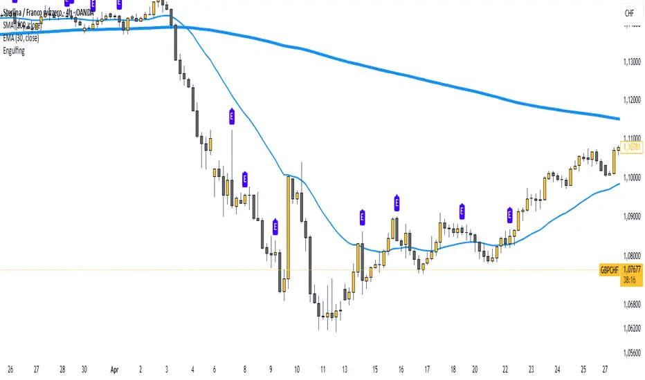
Body Engulfing Detector🔶 Body Engulfing Detector
This simple but effective indicator identifies candlestick patterns where the entire body of the current candle engulfs the body of the previous one — a classic signal of a potential reversal or momentum continuation.
🔍 What It Does:
Detects when the body (open-close range) of the current candle completely covers the body of the previous candle.
Triggers a visual signal on the chart once the candle is closed, avoiding premature alerts.
Includes a generic alert you can enable from the TradingView alert system, so you’ll be notified as soon as a body engulfing pattern occurs.
📈 Use Case:
This pattern can be interpreted as a shift in market sentiment and may signal a possible entry point depending on the context:
Use it as part of your price action strategy.
Combine it with trend analysis, volume, or other confirmation tools.
⚠️ This indicator focuses only on body engulfing and does not require the candle to be bullish or bearish specifically. If you'd like a version that distinguishes between bullish and bearish engulfing, feel free to request it.
Logios Traders Pro v1## 📈 Logios Traders Pro v1 – EMA Crossover + Signal Candle Extensions
**Logios Traders Pro v1** is a powerful and clean EMA crossover-based tool designed for traders who want precise entry zones, trend clarity, and support/resistance validation — all in one lightweight overlay.
### 🔍 Features:
* **Customizable Fast and Slow EMAs**
Set your preferred EMA lengths to generate Buy/Sell signals based on crossovers.
* **Signal Candle High/Low Extensions**
Each Buy/Sell signal marks the high and low of the signal candle and projects them forward as horizontal levels. These act as **dynamic support/resistance zones**, and extend until broken by price.
* **Trend EMA (e.g., EMA 50)**
An optional third EMA is displayed by default to help filter trades with the broader trend. Its length is also fully customizable.
* **Smart Visuals**
* Signal markers (`Buy` / `Sell`) with clean labels.
* Background coloring and EMA plots are optional and customizable.
* Alert-ready for both buy and sell conditions.
### ✅ Best Used For:
* Trend-following or reversal setups.
* Retest entries off signal candle zones.
* Entry confirmation aligned with trend direction (using the 50 EMA).
---
### ⚙️ Inputs:
* Fast EMA Length (default: 5)
* Slow EMA Length (default: 9)
* Trend EMA Length (default: 50)
---
Whether you're a scalper, intraday trader, or swing trader, **Logios Traders Pro v1** gives you high-precision insight into the market’s structure and key entry zones.
---

ICT Time CaptureICT 8am High/Low + 9am Capture (NY Time) — Fixed 1H
This indicator marks the High and Low of the 8am candle on the 1-hour timeframe fixed to New York time (America/New_York timezone). It also draws a line for the 9am candle open and indicates if the 9am candle “captured” (broke above or below) the 8am High or Low.
Key Features:
Always uses 1-hour data fixed on New York timezone, regardless of the chart’s current timeframe.
Draws horizontal lines for the 8am High and Low, with configurable colors, styles (solid/dashed), thickness, and extension length.
Draws a horizontal line for the 9am open price with customizable style.
Shows labels with price values explaining the lines.
Shows a capture label when the 9am candle breaks above the 8am high or below the 8am low.
Allows full customization of label text colors, line colors, line styles, thickness, and label distances from line start.
How to use:
Use this indicator to monitor key ICT timeframes (8am and 9am NY time) for intraday price action clues.
The capture labels help identify when price breaks key levels from the 8am candle during the 9am candle.
The configurable style options let you customize the indicator to your chart style.

Zembala_DMarkThis indicator uses a specific candle-counting technique to identify potential short-term exhaustion points in price action.
It works by comparing the current candle’s closing price to the closing price 9 candles earlier and maintains two separate counts:
Buy Count (13B): Increases when the current close is lower than the close 9 bars ago.
Sell Count (13S): Increases when the current close is higher than the close 9 bars ago.
When either count reaches 13 consecutive conditions, a signal is displayed:
13B (green triangle up) suggests downside exhaustion and a possible short-term rebound.
13S (red triangle down) suggests upside exhaustion and a potential short-term pullback.
These signals are not traditional buy/sell recommendations but instead highlight areas of potential trend fatigue or price extremes. This logic is loosely inspired by bar-counting methods used in certain sequential strategies, but simplified and adapted for general use without reliance on any proprietary methodology.

Breaker BlockUpdated version of breaker block indicator with a small change to the Unicorn detection logic

9:30 AM Candle High/Low Lineshelps to find intraday bullish and bearish signal...all most 80% + accuracy

Fixed First Candle Levels by TF with UTCFixed First Candle Levels by TF with UTC
This script draws High and Low levels of the first candle of each day based on a custom timeframe selected by the user (15m, 30m, 1h, 2h, 4h) and adjusted for the UTC offset.
Features:
✅ Automatically detects the first candle of the day for the selected timeframe
✅ Plots horizontal lines from the start of the day to the end of the day
✅ Highlights the actual candle’s range using a translucent background box
✅ Works across all chart timeframes
✅ Ideal for identifying potential support/resistance zones based on early market structure
You can customize:
Target timeframe (independent from current chart TF)
UTC offset
Useful for intraday traders, breakout strategies, and pre-market planning.

Hacim Patlaması Alarmı (3 Bar Ortalaması)//@version=5
indicator("Hacim Patlaması Alarmı (3 Bar Ortalaması)", overlay=false)
hacim = volume
hacimOrtalama = ta.sma(volume, 3)
limit = hacimOrtalama * 1.5
hacimPatladiMi = hacim > limit
plot(hacim, title="Hacim", color=color.new(color.blue, 0), style=plot.style_columns)
plot(hacimOrtalama, title="3 Bar Ortalaması", color=color.gray, linewidth=1)
bgcolor(hacimPatladiMi ? color.new(color.red, 80) : na)
alertcondition(hacimPatladiMi, title="Hacim Patladı", message="⚠ Hacim patlaması tespit edildi!")


Closed CRT Rejection in LON/NY Kill-ZonesThis is a Timed CRT Indicator for lazy markups without lifting a finger.

Niveles 7-8 AM México + EMAs + CrucesMexico 7-8 AM Levels + EMAs + Crossovers
Overview
This Pine Script indicator combines three powerful trading tools in one comprehensive overlay:
1. **Mexico 7-8 AM session levels** (high/low detection with dynamic color changes)
2. **Four customizable EMAs** (8, 13, 21, 55 periods)
3. **EMA crossover signals** (EMA 8 vs EMA 55)
Key Features
🕐 Mexico 7-8 AM Session Levels
- **Timezone Support**: Automatically adjusts for Mexico City timezone (America/Mexico_City)
- **Session Detection**: Identifies the crucial 7-8 AM Mexico trading session
- **Dynamic Levels**: Captures session high and low levels
- **Smart Color System**:
- Lines start **WHITE** after session ends
- Turn **RED** when price closes above the session high
- Turn **GREEN** when price closes below the session low
- **Duration**: Lines extend for 2 hours 30 minutes after session
- **Clean Labels**: Session levels clearly labeled on the left side
📈 Exponential Moving Averages (EMAs)
- **EMA 8** (Blue line) - Fast trend indicator
- **EMA 13** (Green line) - Short-term momentum
- **EMA 21** (Yellow line) - Medium-term trend
- **EMA 55** (Red line) - Long-term trend
- **Toggle Display**: Option to show/hide all EMAs
- **Customizable Periods**: All EMA periods can be adjusted
🎯 EMA Crossover Signals
- **Bullish Signal**: Green triangle up when EMA 8 crosses above EMA 55
- **Bearish Signal**: Red triangle down when EMA 8 crosses below EMA 55
- **Adjustable Size**: Choose from tiny, small, normal, or large markers
- **Clean Placement**: Bullish signals below bars, bearish signals above bars
- **Built-in Alerts**: Automatic alert conditions for both crossover types
How to Use
For Day Traders:
1. **Morning Setup**: Watch for price action around 7-8 AM Mexico levels
2. **Trend Confirmation**: Use EMA crossovers to confirm trend direction
3. **Entry Signals**: Combine level breaks with EMA crossovers for entries
4. **Risk Management**: Use session levels as support/resistance for stop losses
For Swing Traders:
1. **Trend Analysis**: Monitor EMA alignment for overall trend direction
2. **Key Levels**: Use Mexico session levels as important S/R zones
3. **Signal Confluence**: Look for crossovers near session levels for stronger signals
Configuration Options
Session Settings:
- **Session Time**: Default 7-8 AM (customizable)
- **Timezone**: Mexico City timezone with GMT offset options
EMA Settings:
- **Show/Hide**: Toggle EMA display
- **Period Adjustment**: Customize all four EMA periods
- **Color Coding**: Each EMA has distinct colors for easy identification
Crossover Settings:
- **Show/Hide**: Toggle crossover signals
- **Marker Size**: Adjust signal marker size
- **Alert Setup**: Enable notifications for crossover events
## Best Practices
1. **Combine Signals**: Don't rely on single indicators - look for confluence
2. **Respect Levels**: Pay attention to how price reacts at session levels
3. **Trend Context**: Use EMAs to understand the broader trend context
4. **Risk Management**: Always use proper position sizing and stop losses
Alert Conditions
- **Bullish Crossover**: EMA 8 crosses above EMA 55
- **Bearish Crossover**: EMA 8 crosses below EMA 55
Technical Requirements
- **Version**: Pine Script v5
- **Chart Type**: Works on all timeframes
- **Overlay**: Yes - plots directly on price chart
- **Resource Usage**: Lightweight and efficient
Disclaimer
This indicator is for educational and informational purposes only. Past performance does not guarantee future results. Always practice proper risk management and consider your risk tolerance before trading.
---
*Perfect for traders focusing on Mexico market hours and EMA-based strategies. Combines session-based levels with proven moving average crossover signals for comprehensive market analysis.*

3 EMA Indicator3 EMA Indicator Description
The 3 EMA Indicator is a customizable TradingView indicator designed to plot three Exponential Moving Averages (EMAs) on a price chart. It helps traders analyze trends, identify potential trading signals, and monitor price momentum through the interaction of three EMAs with user-defined periods.
Features
Three EMAs: Displays three EMAs with default periods of 9, 21, and 50, which can be adjusted via input settings.
Customizable Parameters:
Source: Choose the price data (e.g., close, open, hlc3) for EMA calculations (default: close).
EMA Periods: Set custom lengths for each EMA (minimum 1).
Colors: Assign unique colors to each EMA for clear visualization (default: red, blue, green).
Line Width: Adjust the thickness of EMA lines (default: 2).
Dynamic Label: A label on the last bar displays the configured EMA periods (e.g., "EMA1: 9, EMA2: 21, EMA3: 50") for easy reference.
Overlay: Plots directly on the price chart, making it intuitive to compare EMAs with price action.
Usage
Trend Analysis: Use the relative positions of the EMAs to identify bullish (e.g., shorter EMA above longer EMA) or bearish trends.
Crossover Signals: Monitor EMA crossovers (e.g., 9-period EMA crossing above the 21-period EMA) for potential buy or sell signals.
Customization: Adjust periods, colors, and line width through the indicator’s settings to match your trading strategy.
How to Apply
Open TradingView’s Pine Editor.
Copy and paste the indicator’s Pine Script code.
Add the indicator to your chart.
Customize settings (periods, source, colors, line width) via the indicator’s input panel.
This indicator is ideal for traders seeking a simple yet flexible tool to track price trends and momentum using multiple EMAs.
1H & 2H Candle Panel + Daily Grid v1.2Indicator: "1H & 2H Candle Panel + Daily Grid v1.2"
This powerful indicator combines two key features into one tool:
Daily Grid anchored to the previous day’s close
Multi-Timeframe Candle Panel for comprehensive market analysis
1. Daily Grid Logic
Input:
Grid Distance (Points): Adjustable spacing between grid lines (default: 5.0 pts).
How It Works:
Detects the start of a new trading day using ta.change(time("D")).
Fetches the prior day’s close via request.security().
Draws the following elements at each new session:
Thick Red Line: Previous day’s closing price (key reference level).
8-Point Grid:
4 blue lines above the close (+1x to +4x the grid distance).
4 gold lines below the close (-1x to -4x the grid distance).
Info Label: Displays the exact prior close value.
Automatically clears and redraws all elements daily to avoid clutter.
2. Multi-Timeframe Candle Panel
Timeframes Analyzed:
Current chart TF, 30M, 1H, 2H, 3H, 4H, 6H, 12H, and Daily (1D).
Data Displayed per TF:
Open, Close, High, Low
Price Difference (Close − Open)
Candle Type (Bullish/Bearish)
Time remaining until candle close (hh:mm:ss format)
Visual Output:
A right-aligned table with conditional coloring:
Bullish candles: Green background
Bearish candles: Red background
Current timeframe highlighted in purple.
Optimized Updates:
Uses request.security() for efficient cross-TF data fetching.
Tracks candle closing times via TradingView’s native time_close.
Updates only on the last bar or in real-time (barstate.islast/isrealtime).
3. Confluence Signals
Full Confluence:
Triggers when all timeframes align:
Buy Signal: All candles bullish → Green arrow + alert.
Sell Signal: All candles bearish → Red arrow + alert.
1H Special Confluence:
Activates 30 minutes after the 1H candle opens.
Requires alignment between 1H, 4H, and 6H candles.
Marks entries with price-level arrows (no alerts).
4. Technical Optimizations
Performance:
Dynamically manages graphic objects (no redundant redrawing).
Uses arrays to track grid lines efficiently.
Precision:
Leverages TradingView’s time_close for accurate countdowns.
Formats prices with format.mintick for asset-specific precision.
How to Use
Adjust Grid Distance based on asset volatility.
Monitor the panel for multi-TF trend strength.
Use the daily grid as support/resistance reference.
Confluence signals highlight high-probability setups.
Pro Tip: Combine with volume analysis or RSI for confirmation!
MTF Confirmation v2Multi-Timeframe Direction Confirmation Indicator
📊 Overview
This Pine Script indicator provides high-probability buy and sell signals by confirming that both 1-minute and 5-minute timeframes are moving in the same direction. It eliminates false signals by requiring multiple timeframe agreement before generating alerts.
🎯 How It Works
Trend Detection Method:
EMA Analysis: Uses 20-period Exponential Moving Average to determine trend direction
RSI Confirmation: 14-period RSI validates momentum (>50 bullish, <50 bearish)
Price Action: Confirms price is above/below EMA in trend direction
EMA Slope: Ensures EMA is actually rising (bullish) or falling (bearish)
Signal Generation:
BUY Signal: Only when BOTH 1M and 5M timeframes are bullish simultaneously
SELL Signal: Only when BOTH 1M and 5M timeframes are bearish simultaneously
Cooldown System: Prevents signal spam with 5-bar minimum between signals
📈 Visual Elements
Primary Signals:
Green "BUY" Labels: Appear below candles when both timeframes align bullish
Red "SELL" Labels: Appear above candles when both timeframes align bearish
Background Colors:
Light Green: Both timeframes trending up
Light Red: Both timeframes trending down
No Color: Timeframes not aligned or neutral
Trend Indicators:
Blue Dots: Show 1-minute timeframe trend direction
Orange Dots: Show 5-minute timeframe trend direction
Question Marks: Partial alignment (one timeframe trending, preparing for signal)
Status Table (Top Right):
Timeframe Status: Real-time direction of each timeframe
Alignment Status: Shows when timeframes are synchronized
Signal Status: Current signal state and cooldown timers
Cooldown Counters: Bars remaining until next signal available
⚙️ Customizable Settings
Technical Parameters:
EMA Period: Default 20 (trend smoothness)
RSI Period: Default 14 (momentum sensitivity)
Signal Cooldown: Default 5 bars (prevents overtrading)
Filter Options:
Volume Filter: Optional above-average volume requirement
Alerts Toggle: Enable/disable notifications
Table Display: Show/hide status information
🚨 Alert System
Instant Notifications: Alerts fire when both timeframes align
Price Information: Includes current price in alert message
Once Per Bar: Prevents alert spam during volatile periods
Clear Messages: "BUY SIGNAL: 1M and 5M both BULLISH" format
💡 Best Use Cases
Ideal For:
Scalping: Quick entries with multi-timeframe confirmation
Day Trading: Reliable intraday signals
Trend Following: Catching strong directional moves
Risk Management: Avoiding false breakouts
Timeframe Recommendations:
Works on any chart timeframe
Most effective on 1M, 5M, or 15M charts
Provides earlier signals than single-timeframe indicators
⚡ Key Advantages
Reduced False Signals:
Requires agreement between multiple timeframes
Filters out noise and whipsaws
Cooldown prevents overtrading
Clear Decision Making:
Simple buy/sell signals
Visual confirmation through colors and table
No complex interpretation required
Comprehensive Information:
Real-time status of all timeframes
Setup warnings with question marks
Countdown to next available signal
📋 Setup Instructions
Copy the Pine Script code
Open TradingView Pine Editor
Paste code and save
Add to chart
Configure settings to preference
Set up alerts for desired signals
🎪 Expected Performance
Signal Frequency: 3-8 signals per trading day (depending on volatility)
Quality Focus: Fewer but higher-probability setups
Win Rate: Improved due to multi-timeframe confirmation
Suitable for: Both automated and manual trading strategies

Light MA CrossExplanation of the "Light MA Cross" Indicator
Overview:
The "Light MA Cross" is a simple yet powerful trading indicator designed to identify potential buy and sell signals based on the crossover of two moving averages. This tool is optimized for short-term trading, specifically on 1-minute charts, making it ideal for active traders looking to capture quick market moves.

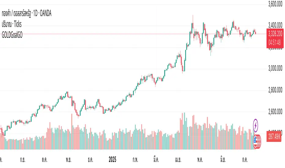
GOLDGoalGO - 2 Min SignalGOLDGoalGO" Indicator for TradingView
Introduction
The "GOLDGoalGO" indicator is designed to assist traders in analyzing short-term price movements of gold (XAUUSD). It provides buy and sell signals every 5 minutes, helping traders identify optimal entry and exit points based on recent price changes.
Concept and Functionality
Primary Goal: To offer clear and timely trading signals by analyzing short-term price trends, specifically tailored for 2-minute intervals.
How It Works: The indicator calculates the change in closing prices compared to the previous bar to generate buy and sell signals. These signals are only active during 2-minute timeframes, ensuring precision in short-term trading.
Signals Provided:
A buy signal (represented by an upward shape) appears when prices show upward momentum.
A sell signal (represented by a downward shape) appears when prices show downward momentum.
Visual Cues: The signals are displayed directly on the chart with intuitive shapes for quick recognition. Additionally, alert notifications are configured to inform you immediately when new signals occur.
How the Indicator Works in Detail
Timeframe Check: It activates only during 2-minute candlestick intervals to ensure signals are relevant for short-term trading.
Price Change Calculation: It compares the current close with the previous close to detect the direction of market movement.
Signal Generation:
If the price is increasing (positive change), a buy signal is generated.
If the price is decreasing (negative change), a sell signal is generated.
Chart Annotations: When a signal occurs, a shape appears on the chart indicating the optimal point for entering a trade.
Automated Alerts: The system sends a Thai-language notification every 2 minutes to alert you of new signals, enabling timely actions even when you're away from the screen.
How to Use
Paste this script into the Pine Editor in TradingView.
Click "Add to Chart" to activate the indicator.
Set up Alert rules:
Choose the alert condition for "Buy Signal" or "Sell Signal".
Select webhook or notification options to receive real-time alerts (for example, to Telegram).
The indicator provides real-time notifications every 2 minutes whenever new signals are generated.
Why Use This Indicator?
Simplicity: Designed for traders who prefer short-term, momentum-based trading strategies.
Timely Alerts: Signals are provided precisely every 2 minutes, helping you capitalize on short-term price movements.
Flexibility: Easily adaptable to other assets by adjusting the script if needed.
GOLDGoalGO"GOLDGoalGO" Indicator for TradingView
Introduction
The "GOLDGoalGO" indicator is designed to assist traders in analyzing short-term price movements of gold (XAUUSD). It provides buy and sell signals every 5 minutes, helping traders identify optimal entry and exit points based on recent price changes.
Concept and Functionality
Primary Goal: To offer clear and timely trading signals by analyzing short-term price trends, specifically tailored for 5-minute intervals.
How It Works: The indicator calculates the change in closing prices compared to the previous bar to generate buy and sell signals. These signals are only active during 5-minute timeframes, ensuring precision in short-term trading.
Signals Provided:
A buy signal (represented by an upward shape) appears when prices show upward momentum.
A sell signal (represented by a downward shape) appears when prices show downward momentum.
Visual Cues: The signals are displayed directly on the chart with intuitive shapes for quick recognition. Additionally, alert notifications are configured to inform you immediately when new signals occur.
How the Indicator Works in Detail
Timeframe Check: It activates only during 5-minute candlestick intervals to ensure signals are relevant for short-term trading.
Price Change Calculation: It compares the current close with the previous close to detect the direction of market movement.
Signal Generation:
If the price is increasing (positive change), a buy signal is generated.
If the price is decreasing (negative change), a sell signal is generated.
Chart Annotations: When a signal occurs, a shape appears on the chart indicating the optimal point for entering a trade.
Automated Alerts: The system sends a Thai-language notification every 5 minutes to alert you of new signals, enabling timely actions even when you're away from the screen.
How to Use
Paste this script into the Pine Editor in TradingView.
Click "Add to Chart" to activate the indicator.
Set up Alert rules:
Choose the alert condition for "Buy Signal" or "Sell Signal".
Select webhook or notification options to receive real-time alerts (for example, to Telegram).
The indicator provides real-time notifications every 5 minutes whenever new signals are generated.
Why Use This Indicator?
Simplicity: Designed for traders who prefer short-term, momentum-based trading strategies.
Timely Alerts: Signals are provided precisely every 5 minutes, helping you capitalize on short-term price movements.
Flexibility: Easily adaptable to other assets by adjusting the script if needed.
Summary
The "GOLDGoalGO" indicator helps traders stay on top of short-term market trends for gold, giving precise buy and sell signals every 5 minutes. With visual cues on the chart and notifications sent automatically in Thai, it ensures you're always informed of potential trading opportunities and can act swiftly to maximize profit.