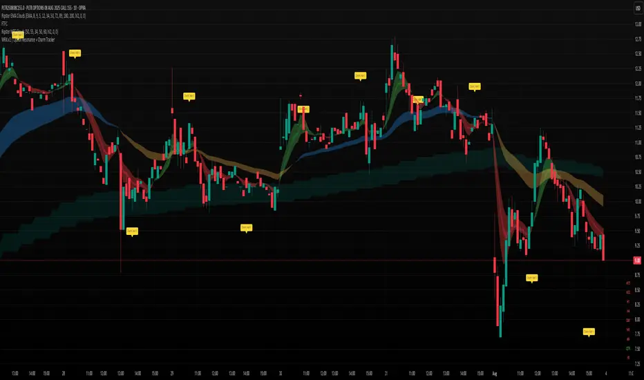
WRX.v2 | Option Resonance + Charm TrackerINSPIRED by RIPSTER
Charm tracker
Options use only
Charm vomma
Chart patterns
Trend Reversals(Mastersinnifty)Description
The Trend Reversals (Mastersinnifty) indicator highlights potential turning points in price direction using an ATR-based trailing stop mechanism. It provides clear trend reversal signals on the chart to help traders identify possible entry or exit points based on price behavior and volatility.
How It Works
This indicator applies a custom trailing stop logic inspired by SuperTrend-style mechanisms. It uses the Average True Range (ATR) to dynamically calculate upper and lower stop levels and monitors for price breaches that may indicate a shift in trend direction.
Trend change signals are plotted using conditional logic that compares price behavior against trailing levels, with labels appearing:
Below candles for bullish reversals
Above candles for bearish reversals
Inputs
Value for trend change – Threshold in % used to filter valid reversal signals.
ATR Periods – Number of bars for ATR calculation (internally fixed at 1 in the script).
Multiplier – Determines the sensitivity of the trailing bands (set internally).
Change ATR Type – Allows switching between standard ATR and SMA-based True Range.
Use Case
This tool is ideal for:
Spotting trend reversals early in intraday or swing trades.
Filtering false breakouts using volatility-adjusted thresholds.
Combining with other indicators like volume or oscillators for confirmation.
Use on trending instruments to ride swings more efficiently.
Disclaimer
This indicator is a technical analysis tool and does not guarantee any specific outcome. Always use with proper risk management and in conjunction with other forms of analysis. The author is not responsible for any financial losses incurred through the use of this script.

Gap Forecast Signals with Success Ratio(Mastersinnifty)Description
This indicator forecasts potential market direction based on price gaps at market open. It identifies gap-ups and gap-downs, color-codes background conditions, and displays forecast labels for the next session. Additionally, it evaluates the historical accuracy of its forecasts using a rolling success ratio.
How It Works
Compares the current open price to the previous close to calculate a percentage gap.
Classifies the gap as bullish, bearish, or neutral based on a user-defined threshold.
At the end of each day, the forecast is compared to the actual price movement to assess success.
Displays key statistics: success ratio, sample size, and correct/total count.
Visual cues include background colors, forecast labels, and optional table display.
Alerts can be triggered on bullish or bearish gap detection.
Inputs
Gap Threshold (%): Minimum gap size (in percent) to classify as significant.
Show Forecast Labels: Enables labels at end-of-day forecasting.
Show Background Color: Enables colored backgrounds based on forecast type.
Success Ratio Lookback Period: Defines how many previous days are used to calculate forecast accuracy.
Use Case
Traders seeking to understand the directional impact of opening price gaps.
Useful in gap trading strategies to confirm bullish or bearish biases.
Applies to intraday or daily charts where overnight gaps occur.
Traders wanting to evaluate the historical performance of gap-based predictions.
Disclaimer
This script is for educational and informational purposes only. It does not constitute financial advice. Use it with proper risk management and discretion. Past performance does not guarantee future results.

Breakout: HHHL & LLHL + Close ConditionWhat This Script Does:
Green triangle below the bar = Bullish breakout (Higher High + Higher Low + Close > Previous High)
Red triangle above the bar = Bearish breakdown (Lower High + Lower Low + Close < Previous Low)

🧠 Alfred: 10AM Monster Breakout Detectordetects where to buy and sell at 10 am zone using volume emas and trend

EMA9, EMA200 with Bollinger BandsThe indicator includes the EMA9 line, the EMA200 line and the Bollinger Bands into a single indicator plot.

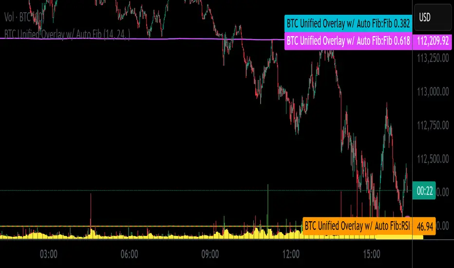
BTC Unified Overlay w/ Auto FibBTC Unified Overlay w/ Auto Fib, RSI, VWAP & Volume
This overlay combines essential indicators into one visual script designed for Bitcoin (BTCUSD) trading on lower timeframes:
🔁 Auto Fibonacci Zones – Auto-detects 0.382 and 0.618 retracement levels using recent price swings
🎯 RSI(14) – Includes cluster and crossover tagging for overbought/oversold zones
📊 Volume Histogram with 10-bar Moving Average – Highlights breakout bars
📏 VWAP with ±1SD and ±2SD Bands – Shows dynamic fair value range
🟢 Breakout Signal Tagging – Detects high-volume breakout opportunities
Ideal for traders who want a unified, color-coded visualization of key momentum and structure indicators.
Script optimized for screenshot automation and compatible with external webhook pipelines.
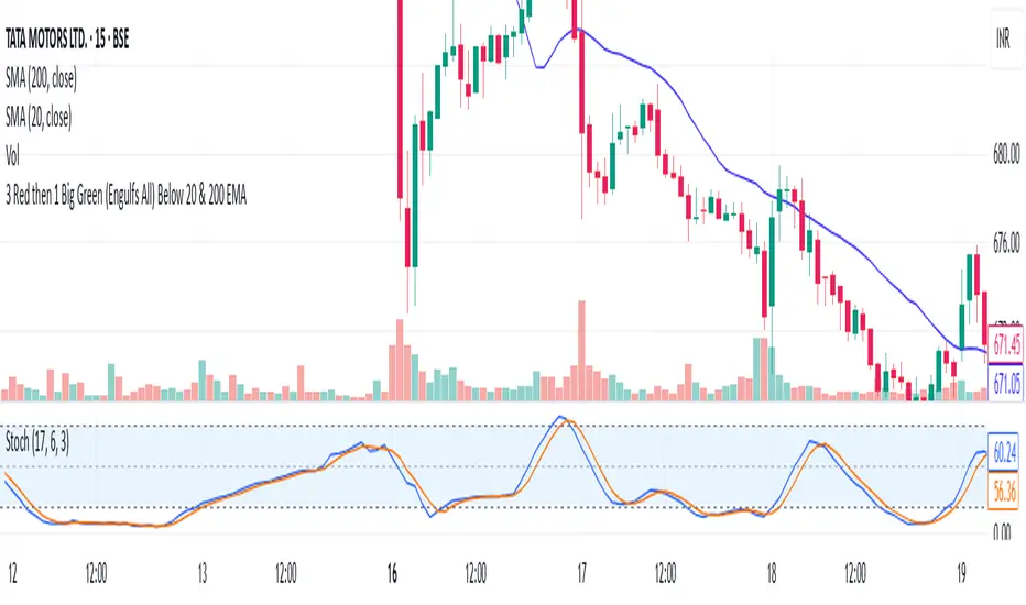
3 Red then 1 Big Green (Engulfs All) Below 20 & 200 EMAIt will tell if green canlde is big enough to engulf 3 red
EMA Cross Approach ScreenerWorks best on D/4H. Signals when the price of a stock is below the 200ema and the 9 and 20 are sloping up approaching the 200 while being 5% or less than from the 200. Helps the trader find a good buying point while keeping risk minimum.

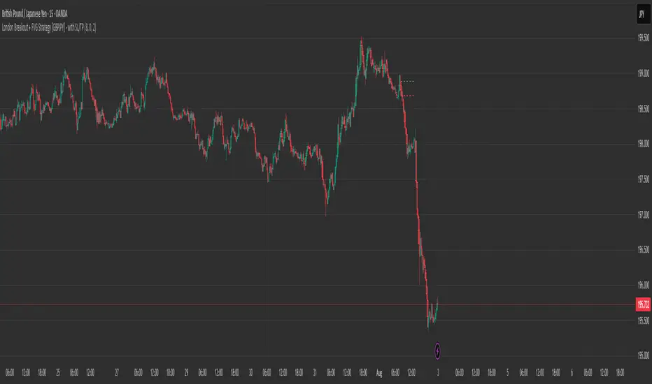
London Breakout + FVG Strategy [GBPJPY] - with SL/TPMarks the London open high and low on 15 min time frame, ads fvg on 5 min for orders
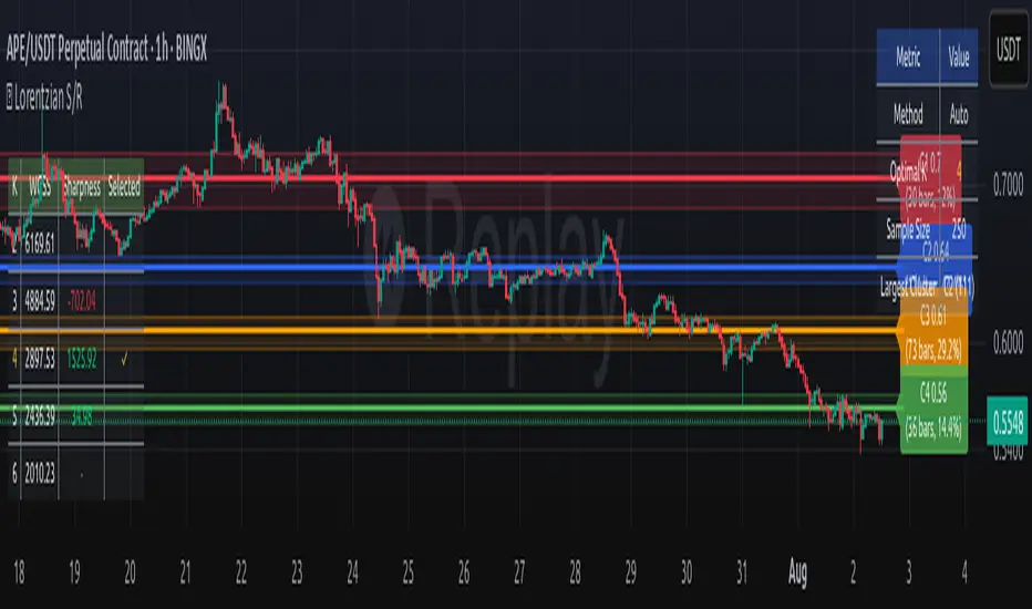
Lorentzian Key Support and Resistance Level Detector [mishy]🧮 Lorentzian Key S/R Levels Detector
Advanced Support & Resistance Detection Using Mathematical Clustering
The Problem
Traditional S/R indicators fail because they're either subjective (manual lines), rigid (fixed pivots), or break when price spikes occur. Most importantly, they don't tell you where prices actually spend time, just where they touched briefly.
The Solution: Lorentzian Distance Clustering
This indicator introduces a novel approach by using Lorentzian distance instead of traditional Euclidean distance for clustering. This is groundbreaking for financial data analysis.
Data Points Clustering:
🔬 Why Euclidean Distance Fails in Trading
Traditional K-means uses Euclidean distance:
• Formula: distance = (price_A - price_B)²
• Problem: Squaring amplifies differences exponentially
• Real impact: One 5% price spike has 25x more influence than a 1% move
• Result: Clusters get pulled toward outliers, missing real support/resistance zones
Example scenario:
Prices: ← flash spike
Euclidean: Centroid gets dragged toward 150
Actual S/R zone: Around 100 (where prices actually trade)
⚡ Lorentzian Distance: The Game Changer
Our approach uses Lorentzian distance:
• Formula: distance = log(1 + (price_difference)² / σ²)
• Breakthrough: Logarithmic compression keeps outliers in check
• Real impact: Large moves still matter, but don't dominate
• Result: Clusters focus on where prices actually spend time
Same example with Lorentzian:
Prices: ← flash spike
Lorentzian: Centroid stays near 100 (real trading zone)
Outlier (150): Acknowledged but not dominant
🧠 Adaptive Intelligence
The σ parameter isn't fixed,it's calculated from market disturbance/entropy:
• High volatility: σ increases, making algorithm more tolerant of large moves
• Low volatility: σ decreases, making algorithm more sensitive to small changes
• Self-calibrating: Adapts to any instrument or market condition automatically
Why this matters: Traditional methods treat a 2% move the same whether it's in a calm or volatile market. Lorentzian adapts the sensitivity based on current market behavior.
🎯 Automatic K-Selection (Elbow Method)
Instead of guessing how many S/R levels to draw, the indicator:
• Tests 2-6 clusters and calculates WCSS (tightness measure)
• Finds the "elbow" - where adding more clusters stops helping much
• Uses sharpness calculation to pick the optimal number automatically
Result: Perfect balance between detail and clarity.
How It Works
1. Collect recent closing prices
2. Calculate entropy to adapt to current market volatility
3. Cluster prices using Lorentzian K-means algorithm
4. Auto-select optimal cluster count via statistical analysis
5. Draw levels at cluster centers with deviation bands
📊 Manual K-Selection Guide (Using WCSS & Sharpness Analysis)
When you disable auto-selection, use both WCSS and Sharpness metrics from the analysis table to choose manually:
What WCSS tells you:
• Lower WCSS = tighter clusters = better S/R levels
• Higher WCSS = scattered clusters = weaker levels
What Sharpness tells you:
• Higher positive values = optimal elbow point = best K choice
• Lower/negative values = poor elbow definition = avoid this K
• Measures the "sharpness" of the WCSS curve drop-off
Decision strategy using both metrics:
K=2: WCSS = 150.42 | Sharpness = - | Selected =
K=3: WCSS = 89.15 | Sharpness = 22.04 | Selected = ✓ ← Best choice
K=4: WCSS = 76.23 | Sharpness = 1.89 | Selected =
K=5: WCSS = 73.91 | Sharpness = 1.43 | Selected =
Quick decision rules:
• Pick K with highest positive Sharpness (indicates optimal elbow)
• Confirm with significant WCSS drop (30%+ reduction is good)
• Avoid K values with negative or very low Sharpness (<1.0)
• K=3 above shows: Big WCSS drop (41%) + High Sharpness (22.04) = Perfect choice
Why this works:
The algorithm finds the "elbow" where adding more clusters stops being useful. High Sharpness pinpoints this elbow mathematically, while WCSS confirms the clustering quality.
Elbow Method Visualization:
Traditional clustering problems:
❌ Price spikes distort results
❌ Fixed parameters don't adapt
❌ Manual tuning is subjective
❌ No way to validate choices
Lorentzian solution:
☑️ Outlier-resistant distance metric
☑️ Entropy-based adaptation to volatility
☑️ Automatic optimal K selection
☑️ Statistical validation via WCSS & Sharpness
Features
Visual:
• Color-coded levels (red=highest resistance, green=lowest support)
• Optional deviation bands showing cluster spread
• Strength scores on labels: Each cluster shows a reliability score.
• Higher scores (0.8+) = very strong S/R levels with tight price clustering
• Lower scores (0.6-0.7) = weaker levels, use with caution
• Based on cluster tightness and data point density
• Clean line extensions and labels
Analytics:
• WCSS analysis table showing why K was chosen
• Cluster metrics and statistics
• Real-time entropy monitoring
Control:
• Auto/manual K selection toggle
• Customizable sample size (20-500 bars)
• Show/hide bands and metrics tables
The Result
You get mathematically validated S/R levels that focus on where prices actually cluster, not where they randomly spiked. The algorithm adapts to market conditions and removes guesswork from level selection.
Best for: Traders who want objective, data-driven S/R levels without manual chart analysis.
Credits: This script is for educational purposes and is inspired by the work of @ThinkLogicAI and an amazing mentor @DskyzInvestments . It demonstrates how Lorentzian geometrical concepts can be applied not only in ML classification but also quite elegantly in clustering.
EMA 10/20/60/120// This script plots four Exponential Moving Averages (10, 20, 60, 120)
// for trend-following analysis. Crossovers and the order of the EMAs can
// help identify the strength and direction of the trend.

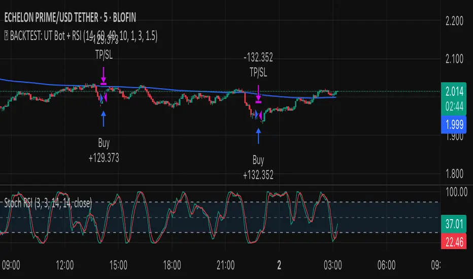
✅ BACKTEST: UT Bot + RSIRSI levels widened (60/40) — more signals.
Removed ATR volatility filter (to let trades fire).
Added inputs for TP and SL using ATR — fully dynamic.
Cleaned up conditions to ensure alignment with market structure.
Lucas Scalia Maximums and minimums of the day, week, and month. Basically, it automatically marks and labels the highs and lows of the previous daily , weekly, and monthly candles. The labels can be added or removed at your discretion, leaving only the dotted lines.

Buy & Sell Signals - EMA + MACDBuy & Sell Signals - EMA + MACD is clean and practical Pine Script for buy and sell signals using a popular combination of EMA crossover and MACD confirmation, designed for stocks, crypto, or forex swing/intraday trading.

ercometiUzun Vadeli SMA'lar354 708 1062 1414 diaries for friends who want to make money in the long term

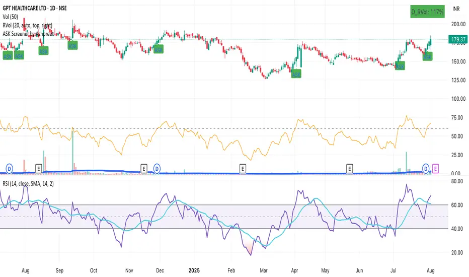
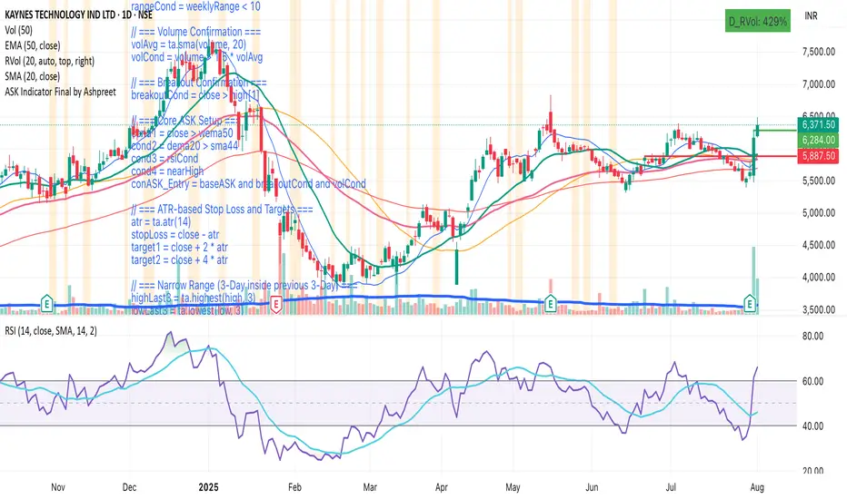
ASK Screener by AshpreetThe ASK Indicator is a custom-built breakout and trend continuation system designed for swing traders seeking high-probability entries with strong risk-reward ratios. Built using a combination of moving averages, momentum filters, volume confirmation, and price structure, this indicator helps identify stocks poised for explosive moves.
It uses three key moving averages: the 44-period SMA (medium trend), 20-period DEMA (short-term strength, custom-coded), and 50-period WEMA (institutional trendline). Trades are only triggered when the price is above 50 WEMA, and the 20 DEMA is above the 44 SMA.
Momentum is confirmed using RSI(14) within a healthy zone of 40–60, ensuring the stock is not overbought or oversold. To focus on breakout candidates, the stock must be trading within 10% of its 52-week high, and the weekly candle range must be under 10%, signaling compression before expansion.
A valid ASK Signal occurs when these conditions are met along with a breakout above the previous day’s high and volume exceeding 1.5× the 20-day average. Once triggered, the indicator auto-plots the stop-loss (1× ATR) and two profit targets: 1:2 (TP1) and 1:4 (TP2).
Additionally, the system detects a narrow range setup, where the last 3 daily candles are inside the previous 3-day range — a powerful consolidation signal. Alerts for both ASK entries and narrow ranges are included.
This system is ideal for positional and short-term swing traders who want to combine structure, momentum, and volume in one powerful tool.
ASK Indicator by AshpreetThe ASK Indicator is a custom-built breakout and trend continuation system designed for swing traders seeking high-probability entries with strong risk-reward ratios. Built using a combination of moving averages, momentum filters, volume confirmation, and price structure, this indicator helps identify stocks poised for explosive moves.
It uses three key moving averages: the 44-period SMA (medium trend), 20-period DEMA (short-term strength, custom-coded), and 50-period WEMA (institutional trendline). Trades are only triggered when the price is above 50 WEMA, and the 20 DEMA is above the 44 SMA.
Momentum is confirmed using RSI(14) within a healthy zone of 40–60, ensuring the stock is not overbought or oversold. To focus on breakout candidates, the stock must be trading within 10% of its 52-week high, and the weekly candle range must be under 10%, signaling compression before expansion.
A valid ASK Signal occurs when these conditions are met along with a breakout above the previous day’s high and volume exceeding 1.5× the 20-day average. Once triggered, the indicator auto-plots the stop-loss (1× ATR) and two profit targets: 1:2 (TP1) and 1:4 (TP2).
Additionally, the system detects a narrow range setup, where the last 3 daily candles are inside the previous 3-day range — a powerful consolidation signal. Alerts for both ASK entries and narrow ranges are included.
This system is ideal for positional and short-term swing traders who want to combine structure, momentum, and volume in one powerful tool.


Patrón Mecha ProfundaThis pattern must be combined with a 20-period moving average. It is used to know the direction of the price. When the pattern appears and the price is above the 20-period moving average, it is a bullish signal and vice versa.
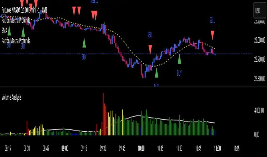
Patrón Mecha Profunda
This pattern must be combined with a 20-period moving average. It is used to know the direction of the price. When the pattern appears and the price is above the 20-period moving average, it is a bullish signal and vice versa.

Midnight OpenMidnight Opening Price because there wasn't a single indicator that was specifically marking this.
