minchang volume tradingCondition
Point color
Volume ≥ 3× MA(24)
Violet
Volume ≥ 1.5× MA(24)
Red
Volume < 1.5× MA(24) & bullish
White
Volume < 1.5× MA(24) & bearish
Black
Cycles

Nến Tô Màu Theo Volume / MA(21)Condition
Point color
Volume ≥ 3× MA(24)
Violet
Volume ≥ 1.5× MA(24)
Red
Volume < 1.5× MA(24) & bullish
White
Volume < 1.5× MA(24) & bearish
Black

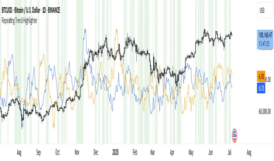
Repeating Trend HighlighterThis custom indicator helps you see when the current price trend is similar to a past trend over the same number of candles. Think of it like checking whether the market is repeating itself.
You choose three settings:
• Lookback Period: This is how many candles you want to measure. For example, if you set it to 10, it looks at the price change over the last 10 bars.
• Offset Bars Ago: This tells the indicator how far back in time to look for a similar move. If you set it to 50, it compares the current move to what happened 50 bars earlier.
• Tolerance (%): This is how closely the moves must match to be considered similar. A smaller number means you only get a signal if the moves are almost the same, while a larger number allows more flexibility.
When the current price move is close enough to the past move you picked, the background of your chart turns light green. This makes it easy to spot repeating trends without studying numbers manually.
You’ll also see two lines under your chart if you enable them: a blue line showing the percentage change of the current move and an orange line showing the change in the past move. These help you compare visually.
This tool is useful in several ways. You can use it to confirm your trading setups, for example if you suspect that a strong rally or pullback is happening again. You can also use it to filter trades by combining it with other indicators, so you only enter when trends repeat. Many traders use it as a learning tool, experimenting with different lookback periods and offsets to understand how often similar moves happen.
If you are a scalper working on short timeframes, you can set the lookback to a small number like 3–5 bars. Swing traders who prefer daily or weekly charts might use longer lookbacks like 20–30 bars.
Keep in mind that this indicator doesn’t guarantee price will move the same way again—it only shows similarity in how price changed over time. It works best when you use it together with other signals or market context.
In short, it’s like having a simple spotlight that tells you: “This move looks a lot like what happened before.” You can then decide if you want to act on that information.
If you’d like, I can help you tweak the settings or combine it with alerts so it notifies you when these patterns appear.
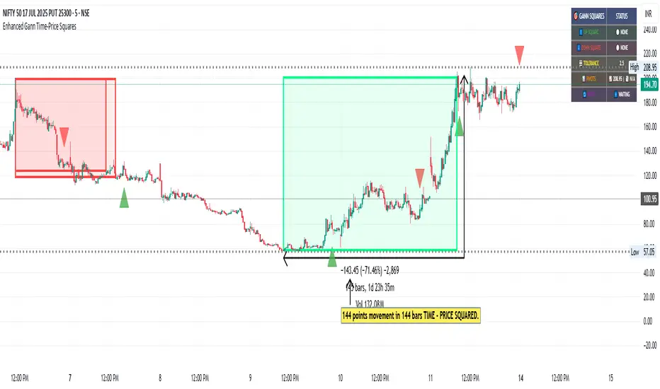
Enhanced Gann Time-Price SquaresEnhanced Gann Time-Price Squares Indicator
A comprehensive Pine Script indicator that identifies and visualizes W.D. Gann's time-price square formations on your charts. This tool helps traders spot potential market turning points where time and price movements align according to Gann's legendary market theories.
Key Features:
Automatic Square Detection - Identifies completed squares where price movement equals time movement
Future Projections - Shows forming squares with projected completion points
Pivot Integration - Automatically detects pivot highs/lows as square starting points
Visual Clarity - Clean box outlines with customizable colors and styles
Smart Filtering - Prevents overlapping squares and includes minimum move thresholds
Real-time Status - Information table showing current square formations
How to Use:
The indicator draws boxes when price moves from pivot points equal the time elapsed (number of bars). Green squares indicate upward movements, red squares show downward movements. Dashed lines show forming squares, while dotted lines project where they might complete.
Settings:
Adjust pivot sensitivity and minimum price moves
Customize tolerance for time-price matching
Toggle projections, labels, and visual elements
Fine-tune colors and line styles
Perfect for Gann theory practitioners and traders looking for time-based market analysis. The squares often coincide with significant support/resistance levels and potential reversal points.
Compatible with all timeframes and instruments.
More updates to follow
RSI For LoopTitle: RSI For Loop
SurgeQuant’s RSI with Threshold Colors and Bar Coloring indicator is a sophisticated tool designed to identify overbought and oversold conditions using a customizable Relative Strength Index (RSI). By averaging RSI over a user-defined lookback period, this indicator provides clear visual signals for bullish and bearish market conditions. The RSI line and price bars are dynamically colored to highlight momentum, making it easier for traders to spot potential trading opportunities.
How It Works
RSI Calculation:
Computes RSI based on a user-selected price source (Close, High, Low, or Open) with a configurable length (default: 5). Optional moving average smoothing refines the RSI signal for smoother analysis.
Lookback Averaging:
Averages the RSI over a user-defined lookback period (default: 5) to generate a stable momentum indicator, reducing noise and enhancing signal reliability.
Threshold-Based Signals:
Long Signal: Triggered when the averaged RSI exceeds the upper threshold (default: 52), indicating overbought conditions.
Short Signal: Triggered when the averaged RSI falls below the lower threshold (default: 48), indicating oversold conditions.
Visual Representation
The indicator provides a clear and customizable visual interface: Green RSI Line and Bars: Indicate overbought conditions when the averaged RSI surpasses the upper threshold, signaling potential long opportunities.
Red RSI Line and Bars: Indicate oversold conditions when the averaged RSI drops below the lower threshold, signaling potential short opportunities.
Neutral Gray RSI Line: Represents RSI values between thresholds for neutral market conditions.
Threshold Lines: Dashed gray lines mark the upper and lower thresholds on the RSI panel for easy reference.
Customization & Parameters
The RSI with Threshold Colors and Bar Coloring indicator offers flexible parameters to suit
various trading styles: Source: Select the input price (default: Close; options: Close, High, Low, Open).
RSI Length: Adjust the RSI calculation period (default: 5).
Smoothing: Enable/disable moving average smoothing (default: enabled) and set the smoothing length (default: 10).
Moving Average Type: Choose from multiple types (SMA, EMA, DEMA, TEMA, WMA, VWMA, SMMA, HMA, LSMA, ALMA; default: ALMA).
ALMA Sigma: Configure the ALMA smoothing parameter (default: 5).
Lookback Period: Set the period for averaging RSI (default: 5).
Thresholds: Customize the upper (default: 52) and lower (default: 48) thresholds for signal generation.
Color Settings: Transparent green and red colors (70% transparency) for bullish and bearish signals, with gray for neutral states.
Trading Applications
This indicator is versatile and can be applied across various markets and strategies: Momentum Trading: Highlights strong overbought or oversold conditions for potential entry or exit points.
Trend Confirmation: Use bar coloring to confirm RSI-based signals with price action on the main chart.
Reversal Detection: Identify potential reversals when RSI crosses the customizable thresholds.
Scalping and Swing Trading: Adjust parameters (e.g., RSI length, lookback) to suit short-term or longer-term strategies.
Final Note
SurgeQuant’s RSI with Threshold Colors and Bar Coloring indicator is a powerful tool for traders seeking to leverage RSI for momentum and reversal opportunities. Its combination of lookback-averaged RSI, dynamic threshold signals, and synchronized RSI and bar coloring offers a robust framework for informed trading decisions. As with all indicators, backtest thoroughly and integrate into a comprehensive trading strategy for optimal results.

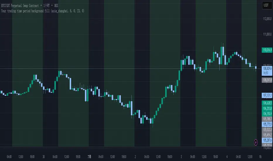
Your trading time period background fillThis script allows you to add background highlights to charts during any regional trading session, customize your own trading time, and is precise and customizable yet simple and easy to use, making it more convenient to review transactions.
Support global mainstream time zones: The drop-down list includes 30 commonly used IANA time zones (default is Asia/Shanghai) (such as Asia/Shanghai, America/New_York, Europe/London, etc.), one-click switching, no need to manually calculate the time difference.
Fully localized time input: "Start hour/minute" and "End hour/minute" are filled in with the local time of the selected time zone. The end hour defaults to 23:00 and can be adjusted to 0-23 at will.
Accurate time difference splitting: The script internally splits the time zone offset into whole hours and remainder minutes (supports half-hour zones, such as UTC+5:30), and ensures that all parameters are integers when calling timestamp to avoid errors.
Dynamic background rendering: Each K-line is judged according to the UTC timestamp whether it falls within the set range. If it meets the time period, it will be marked with a semi-transparent green background, and it will return to its original state after crossing the time period, helping you to identify the opening, closing or active period of any market at a glance.
Wide range of scenarios: It can be used for time-sharing highlighting of all-weather varieties of foreign exchange and cryptocurrency, and can also be used in conjunction with backtesting and timing strategies to only send signals during the active period of the target market, greatly improving trading efficiency and strategy accuracy.
Just select the region and set the time, and the script will automatically complete all complex time zone conversions and drawing, allowing you to focus on the transaction itself.
Bearish Fibonacci Extension Distance Table
### 📉 **Bearish Fibonacci Extension Distance Table – Pine Script Indicator**
This TradingView indicator calculates and displays **bearish Fibonacci extension targets** based on recent price swings, specifically designed for traders looking to **analyze downside potential** in a trending market. Unlike traditional Fibonacci retracement tools that help identify pullbacks, this version projects likely **price targets below current levels** using Fibonacci ratios commonly followed by institutional and retail traders alike.
#### 🔧 **How It Works:**
* **Swing Calculation**:
The script looks back over a user-defined period (`swingLen`, default 20 bars) to find:
* `B`: The **highest high** in the lookback (start of bearish move)
* `A`: The **lowest low** in the same period (end of bearish swing)
* `C`: The **current high**, serving as the base for projecting future downside levels.
* **Bearish Extensions**:
It then calculates Fibonacci extension levels **below** the current high using standard ratios:
* **100%**, **127.2%**, **161.8%**, **200%**, and **261.8%**
* **Distance Calculation**:
For each level, the indicator computes:
* The **target price**
* The **distance (in %)** between the current close and each Fibonacci level
* **Visual Output**:
A live, auto-updating **data table** is shown in the **top-right corner** of the chart. This provides at-a-glance insight into how far current price is from each bearish target, with color-coded levels for clarity.
#### 📊 **Use Cases**:
* Identify **bearish continuation targets** in downtrending or correcting markets.
* Help manage **take-profit** zones for short trades.
* Assess **risk-reward** scenarios when entering bearish positions.
* Combine with indicators like RSI, OBV, or MACD for **confluence-based setups**.
#### ⚙️ **Inputs**:
* `Swing Lookback`: Number of bars to consider for calculating the swing high and swing low.
* `Show Table`: Toggle to display or hide the Fibonacci level table.
---
### 🧠 Example Interpretation:
Suppose the stock is trading at ₹180 and the 161.8% Fibonacci extension level is ₹165 with a -8.3% distance — this suggests the price may continue down to ₹165, offering a potential 8% short opportunity if confirmed by other indicators.


NEXGEN ADXNEXGEN ADX
NEXGEN ADX – Advanced Trend Strength & Directional Indicator
Purpose:
The NEXGEN ADX is a powerful trend analysis tool developed by NexGen Trading Academy to help traders identify the strength and direction of market trends with precision. Based on the Average Directional Index (ADX) along with +DI (Positive Directional Indicator) and –DI (Negative Directional Indicator), this custom indicator provides a reliable foundation for both trend-following strategies and trend reversal setups.


Wyckoff Smart Signals (Long + Short)- Wycoff Smart signals made by Melik
Using Wycoff fundamentals and volume confirmation to form a bias


Holy GrailThis is a long-only educational strategy that simulates what happens if you keep adding to a position during pullbacks and only exit when the asset hits a new All-Time High (ATH). It is intended for learning purposes only — not for live trading.
🧠 How it works:
The strategy identifies pullbacks using a simple moving average (MA).
When price dips below the MA, it begins monitoring for the first green candle (close > open).
That green candle signals a potential bottom, so it adds to the position.
If price goes lower, it waits for the next green candle and adds again.
The exit happens after ATH — it sells on each red candle (close < open) once a new ATH is reached.
You can adjust:
MA length (defines what’s considered a pullback)
Initial buy % (how much to pre-fill before signals start)
Buy % per signal (after pullback green candle)
Exit % per red candle after ATH
📊 Intended assets & timeframes:
This strategy is designed for broad market indices and long-term appreciating assets, such as:
SPY, NASDAQ, DAX, FTSE
Use it only on 1D or higher timeframes — it’s not meant for scalping or short-term trading.
⚠️ Important Limitations:
Long-only: The script does not short. It assumes the asset will eventually recover to a new ATH.
Not for all assets: It won't work on assets that may never recover (e.g., single stocks or speculative tokens).
Slow capital deployment: Entries happen gradually and may take a long time to close.
Not optimized for returns: Buy & hold can outperform this strategy.
No slippage, fees, or funding costs included.
This is not a performance strategy. It’s a teaching tool to show that:
High win rate ≠ high profitability
Patience can be deceiving
Many signals = long capital lock-in
🎓 Why it exists:
The purpose of this strategy is to demonstrate market psychology and risk overconfidence. Traders often chase strategies with high win rates without considering holding time, drawdowns, or opportunity cost.
This script helps visualize that phenomenon.

👽 TIME PERIODS👽 TIME PERIODS v1.15
Visualize key time divisions and session levels on any chart:
• Timezone‐aware session shading
– Highlight active NY session (configurable HHMM–HHMM and days)
– Adjustable background opacity
• Weekly & Monthly Separators
– Toggle on/off
– Custom color, style (solid/dashed/dotted) & width
• Day-of-Week Labels
– Diamonds at session start for M–S
– Toggle on/off
• Session Open Line
– Horizontal line at each session’s open
– Configurable color, width & “distanceRight” in bars
– Always shows current session
• Midpoint Vertical Line
– Plots halfway between session open & close
– Custom color, style & width
– Toggle on/off
▶ All elements grouped for easy parameter tweaking
▶ Fully timezone-configurable (default America/New_York)
▶ Version 1.15 — added distanceRight feature & current session support
Use this to see exactly where your chosen session, weekly/monthly boundaries, and intraday pivot points fall—across any timeframe.

Week days colorsThe “Week Days Colors” indicator highlights each day of the week with a custom background color on the chart. You can assign a different color to each weekday (Monday to Sunday) using the input settings. This makes it easy to visually distinguish days on the chart, helping with pattern recognition, trading strategy timing, or simply improving chart readability.
Features:
• Custom background color for each day of the week
• Fully customizable through color inputs
• Works on any timeframe
• Helps visualize weekly patterns and cycles

VEP - Volume Explosion Predictor💥 VEP - Volume Explosion Predictor
General Overview
The Volume Explosion Predictor (VEP) is an advanced indicator that analyzes volume peaks to predict when the next volume explosion might occur. Using statistical analysis on historical patterns, it provides accurate probabilities on moments of greater trading activity.
MAIN FEATURES
🎯 Intelligent volume peak detection
Automatically identifies significant volume peaks
Anti-consecutive filter to avoid redundant signals
Customizable threshold for detection sensitivity
📊 Advanced statistical analysis
Calculates the average distance between volume peaks
Monitors the number of sessions without peaks
Tracks the maximum historical range without activity
🔮 Predictive system
Dynamic probability: Calculates the probability of an imminent peak
Visual indicators: Background colors that change based on probability
Time forecasts: Estimates remaining sessions to the next peak
📈 Visual signals
Colored arrows: Green for bullish peaks, red for bearish peaks
Statistics table: Complete real-time overview
ALERT SYSTEM
🚨 Three Alert Levels
New Valid Volume Peak: New peak detected
Approaching Prediction: Increasing probability
High Peak Probability: High probability of explosion
HOW TO USE IT
📋 Recommended setup
Timeframe : Works on all timeframes but daily, weekly or monthly timeframe usage is recommended. In any case, it should always be used consistently with your time horizon
Markets : Stocks, crypto, forex, commodities
Threshold for volume peak realization : It's recommended to start with 2.0x (i.e., twice the volume average) for normal markets, 1.5x for more volatile markets. This parameter can be set in the settings as desired
🎨 Visual interpretation
Green Arrows : Peak during bullish candle
Red Arrows : Peak during bearish candle
Red Background : High probability (>90%) of new peak
Yellow Background : Medium probability (50-70%)
📊 STATISTICS TABLE
The table shows:
Total peaks analyzed
Average distance between peaks
Current sessions without peaks
Forecast remaining sessions
Percentage probability
Volume threshold needed for peak realization
STRATEGIC ADVANTAGES
🎯 For Day Traders
Anticipates moments of greater volatility for analysis, supporting the evaluation of trading setups and providing context on low volume periods
📈 For Swing Traders
Identifies high-probability volume patterns, supporting breakout analysis with volume and improving understanding of market timing
🔍 For Technical Analysts
Understands the stock's volume patterns.
Helps evaluate the historical market interest and supports quantitative research and analysis
OTHER THINGS TO KNOW...
A) Anti-Consecutive Algorithm : allows to avoid multiple and consecutive volume signals and peaks at close range
B) Statistical Validation : Uses standard deviation for accuracy
C) Memory Management : Limits historical data for optimal performance
D) Compatibility : Works with all TradingView chart types
⚠️ IMPORTANT DISCLAIMER
This indicator is exclusively a technical analysis tool for studying volume patterns. It does not provide investment advice, trading signals or entry/exit points. All trading decisions are at the complete discretion and responsibility of the user. Always use in combination with other technical and fundamental analysis and proper risk management.
DESCRIZIONE IN ITALIANO
💥 VEP - Volume Explosion Predictor
Panoramica Generale
Il Volume Explosion Predictor (VEP) è un indicatore avanzato che analizza i picchi di volume per prevedere quando potrebbe verificarsi la prossima esplosione di volume. Utilizzando analisi statistiche sui pattern storici, fornisce probabilità accurate sui momenti di maggiore attività di trading.
CARATTERISTICHE PRINCIPALI
🎯 Rilevamento intelligente dei picchi di volume
- Identifica automaticamente i picchi di volume significativi
- Filtro anti-consecutivo per evitare segnali ridondanti
- Soglia personalizzabile per la sensibilità del rilevamento
📊 Analisi statistica avanzata
Calcola la distanza media tra i picchi di volume
Monitora il numero di sessioni senza picchi
Traccia il range massimo storico senza attività
🔮 Sistema predittivo
Probabilità dinamica: Calcola la probabilità di un imminente picco
Indicatori visivi: Colori di sfondo che cambiano in base alla probabilità
Previsioni temporali: Stima delle sessioni rimanenti al prossimo picco
📈 Segnali visivi
1) Frecce colorate: Verdi per picchi rialzisti, rosse per ribassisti
2) Tabella statistiche: Panoramica completa in tempo reale
SISTEMA DI ALERT
🚨 Tre Livelli di Alert
1) New Valid Volume Peak: Nuovo picco rilevato
2) Approaching Prediction: Probabilità in aumento
3) High Peak Probability: Alta probabilità di esplosione
COME UTILIZZARLO
📋 Setup consigliato
- Timeframe : Funziona su tutti i timeframe ma è consigliabile un utilizzo su timeframe giornaliero, settimanale o mensile. In ogni caso va sempre utilizzato coerentemente con il proprio orizzonte temporale
- Mercati : Azioni, crypto, forex, commodities
- Limite affinché si realizzi il picco di volumi : Si consiglia di iniziare con 2.0x (ovvero due volte la media dei volumi) per mercati normali, 1.5x per mercati più volatili. Questo parametro può essere settato nelle impostazioni a proprio piacimento
🎨 Interpretazione visuale
Frecce Verdi : Picco durante candela rialzista
Frecce Rosse : Picco durante candela ribassista
Sfondo Rosso : Alta probabilità (>90%) di nuovo picco
Sfondo Giallo : Probabilità media (50-70%)
📊 TABELLA STATISTICHE
La tabella mostra:
1. Totale picchi analizzati
2. Distanza media tra picchi
3. Sessioni attuali senza picchi
4. Previsione sessioni rimanenti
5. Probabilità percentuale
6. Soglia volume necessaria affinché si realizzi il picco di volumi
VANTAGGI STRATEGICI
🎯 Per Day Traders
Anticipa i momenti di maggiore volatilità per analisi, supportando la valutazione dei setup di trading e fornendo al contempo un contesto sui periodi di basso volume
📈 Per Swing Traders
1. Identifica pattern di volume ad alta probabilità, supportando l'analisi dei breakout con volume e migliorando la comprensione dei tempi di mercato
🔍 Per Analisti Tecnici
Comprende i pattern di volume del titolo.
Aiuta a fare una valutazione dell'interesse storico del mercato ed è di supporto alla ricerca e analisi quantitativa
ALTRE COSE DA SAPERE...
A) Algoritmo Anti-Consecutivo : permette di evitare segnali e picchi di volume multipli e consecutivi multipli a distanza ravvicinata
B) Validazione Statistica : Utilizza deviazione standard per l'accuratezza
C) Gestione Memoria : Limita i dati storici per performance ottimali
D) Compatibilità : Funziona con tutti i tipi di grafico TradingView
⚠️ DISCLAIMER IMPORTANTE
Questo indicatore è esclusivamente uno strumento di analisi tecnica per lo studio dei pattern di volume. Non fornisce consigli di investimento, segnali di trading o punti di ingresso/uscita. Tutte le decisioni di trading sono a completa discrezione e responsabilità dell'utente. Utilizzare sempre in combinazione con altre analisi tecniche, fondamentali e una adeguata gestione del rischio.

Omori Law Recovery PhasesWhat is the Omori Law?
Originally a seismological model, the Omori Law describes how earthquake aftershocks decay over time. It follows a power law relationship: the frequency of aftershocks decreases roughly proportionally to 1/(t+c)^p, where:
t = time since the main shock
c = time offset constant
p = power law exponent (typically around 1.0)
Application to the markets
Financial markets experience "aftershocks" similar to earthquakes:
Market Crashes as Main Shocks: Major market declines (crashes) represent the initial shock event.
Volatility Decay: After a crash, market volatility typically declines following a power law pattern rather than a linear or exponential one.
Behavioral Components: The decay pattern reflects collective market psychology - initial panic gives way to uncertainty, then stabilization, and finally normalization.
The Four Recovery Phases
The Omori decay pattern in markets can be divided into distinct phases:
Acute Phase: Immediately after the crash, characterized by extreme volatility, panic selling, and sharp reversals. Trading is hazardous.
Reaction Phase: Volatility begins decreasing, but markets test previous levels. False rallies and retests of lows are common.
Repair Phase: Structure returns to the market. Volatility approaches normal levels, and traditional technical analysis becomes more reliable.
Recovery Phase: The final stage where market behavior normalizes completely. The impact of the original shock has fully decayed.
Why It Matters for Traders
Understanding where the market stands in this recovery cycle provides valuable context:
Risk Management: Adjust position sizing based on the current phase
Strategy Selection: Different strategies work in different phases
Psychological Preparation: Know what to expect based on the phase
Time Horizon Guidance: Each phase suggests appropriate time frames for trading

RSP / VOO 比值指標The RSP/VOO ratio compares the performance of the S&P 500 Equal Weight ETF (RSP) to the S&P 500 Market Cap Weighted ETF (VOO). When the ratio is falling, it indicates that large-cap stocks—especially mega-cap tech names—are outperforming the broader market. In contrast, a rising ratio suggests that smaller and mid-sized companies are catching up or leading, which may signal a healthy broadening of market participation. Investors often use this ratio to identify shifts in market leadership and assess the strength or fragility of a rally.

EMA 21, 55, 200 with Small LabelsThis is a combination of ema21/50/200. Helps to identify market trends. It comes with small labels so it won't confuse which line is which. I hope it helps and good luck with your trading!


Multi-timeframe Spot ETH ETF flowsDescription of Multi-timeframe Spot ETH ETF Flows Pine Script
This Pine Script™ (version 6) creates a Multi-timeframe Spot ETH ETF Flows indicator to track and visualize net and cumulative capital flows for various Ethereum (ETH) Spot Exchange-Traded Funds (ETFs) listed on AMEX and NASDAQ. The script calculates up and down volume based on price movements in a lower timeframe, multiplies these by the average price (HLC3) for accuracy, and aggregates the data to display net and cumulative flows.
Key Features:
ETF List : Tracks nine ETH Spot ETFs (e.g., AMEX:ETHE, NASDAQ:ETHA, etc.).
Custom Timeframe Input : Allows users to override the default lower timeframe (automatically selected based on the chart’s timeframe) with a custom timeframe (default: 720 minutes). Higher timeframes provide more historical data but less precision.
Volume Analysis : Calculates positive (up) and negative (down) volume based on price movements (close vs. open or close vs. previous close) in the lower timeframe, weighted by the average price.
Net and Cumulative Flows :
Net flow is the sum of up and down volumes across all ETFs, displayed as colored columns (green for positive, red for negative, with transparency based on trend direction).
Cumulative flow is the running total of net flows since the ETFs' launch, plotted as a line. Visualization : Uses dynamic colors for net flow columns to indicate direction and strength, with a black line for cumulative flow.
Technical Details:
Data Retrieval : Uses request.security and request.security_lower_tf to fetch price and volume data from lower timeframes.
Array Processing : Sums up and down volume arrays to compute net flows for each ETF.
Auto Timeframe Switching : Selects an appropriate lower timeframe (e.g., 1-second for seconds-based charts, 5-minute for daily charts) unless a custom timeframe is specified.
Styling : Net flow is plotted as columns, with color intensity reflecting flow direction and trend continuity.
Purpose:
The indicator helps traders and investors monitor capital inflows and outflows for ETH Spot ETFs, providing insights into market sentiment and fund activity across multiple timeframes.
License : Mozilla Public License 2.0.

SantiHOURchange
Indicator to mark changes in the next hours; once an hour passes, the following one will be marked automatically. It's ideal for those who do not want to wait for the indicator to mark it upon arrival, but rather see it beforehand.

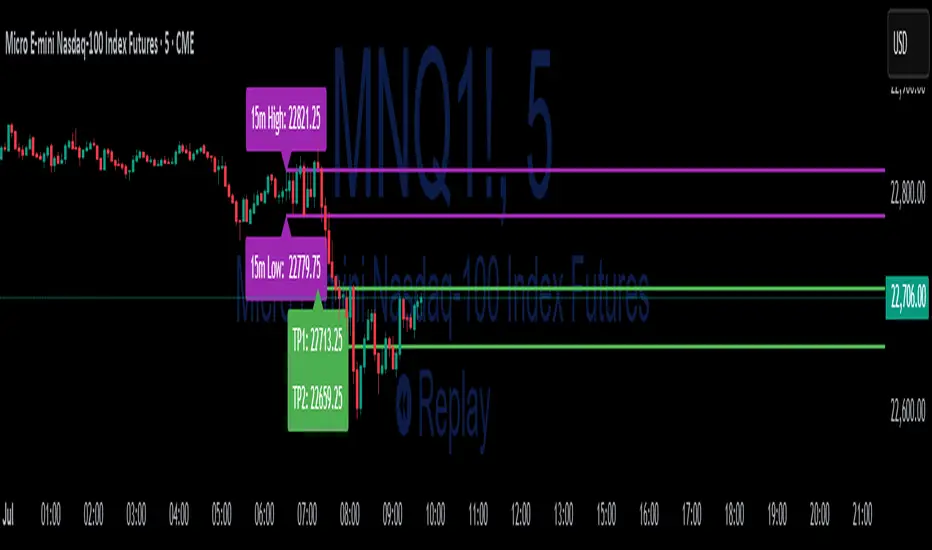
15-Min ORB Indicator with Breakout Targets **What this indicator does:**
The 15-Min ORB (Opening Range Breakout) Indicator helps traders spot breakout trades by automatically detecting the high and low of the first 15 minutes after a session opens. It then monitors for breakouts above or below this range and plots dynamic take-profit levels based on your chosen multipliers.
**How it works:**
You set the start time for your session (hour and minute) in the settings.
The indicator marks the high and low during the first 15 minutes after your chosen open time, drawing lines on the chart and, if enabled, labels for these levels.
If price breaks above the 15-min high, a potential long breakout is identified; if it breaks below the low, a potential short breakout is detected.
Upon a breakout, the script calculates the distance from the entry (breakout) to the opposite side of the 15-min range and uses your input multipliers to project two take-profit levels (TP1/TP2).
All lines and labels (for the range and targets) can be individually toggled on or off in the settings.
Both the 15-min range and the targets can be styled (color, line style, label position).
**How to use it:**
Add the indicator to your chart.
Set the session start hour and minute to match your instrument’s open (e.g., 9:30 for US stocks or futures).
Use the settings to customize which levels and labels are shown, their appearance, and the target expansion multiples.
When price breaks out above or below the opening range, the script will plot TP1 and TP2 lines at your chosen risk/reward multiples, and label them if desired.
You can use the visual levels for trade entries, profit taking, or alerts.
**What makes it unique and useful:** >
Unlike many basic ORB indicators, this script not only marks the opening range but also tracks breakouts, auto-plots your profit targets based on range expansion, and gives you full control over display (styles, toggles, and label positions).
The TP targets are dynamic and can be set to any multiples, adapting to your risk/reward plan and breakout style.
Everything is customizable for your own session times, instrument, or trading approach.
**Typical uses:**
Intraday traders looking for clear breakout setups around the session open.
Automated R-multiple target planning for both long and short trades.
Visualizing volatility and measuring early price expansion.