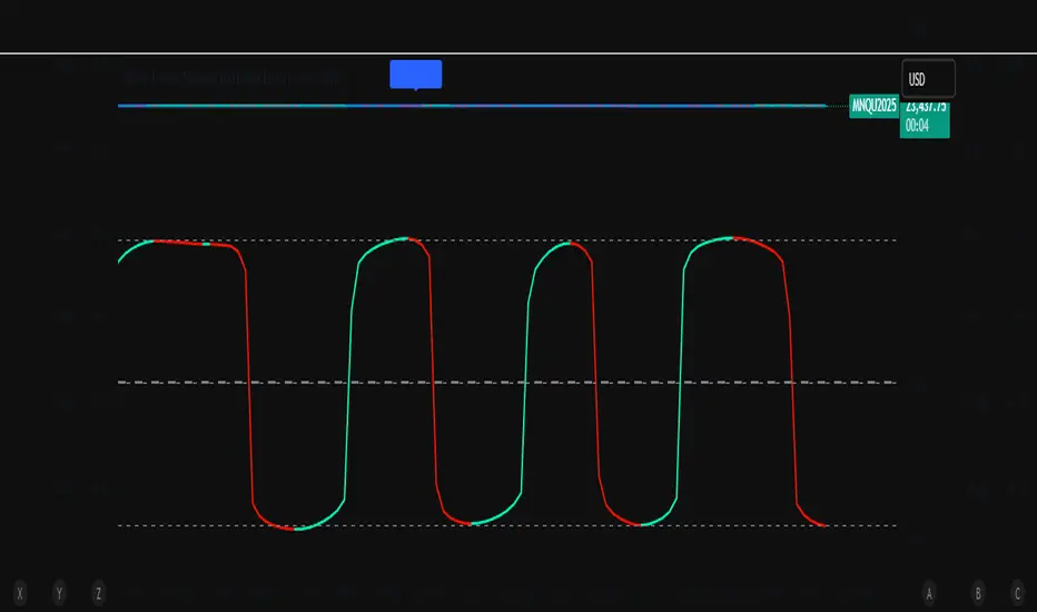
ZoneShift+StochZ+LRO + AI Breakout Bands [Combined]This composite Pine Script brings together four powerful trend and momentum tools into a single, easy-to-read overlay:
ZoneShift
Computes a dynamic “zone” around price via an EMA/HMA midpoint ± average high-low range.
Flags flips when price closes convincingly above or below that zone, coloring candles and drawing the zone lines in bullish or bearish hues.
Stochastic Z-Score
Converts your chosen price series into a statistical Z-score, then runs a Stochastic oscillator on it and HMA-smooths the result.
Marks momentum flips in extreme over-sold (below –2) or over-bought (above +2) territory.
Linear Regression Oscillator (LRO)
Builds a bar-indexed linear regression, normalizes it to standard deviations, and shows area-style up/down coloring.
Highlights local reversals when the oscillator crosses its own look-back values, and optionally plots LRO-colored candles on price.
AI Breakout Bands (Kalman + KNN)
Applies a Kalman filter to price, smooths it further with a KNN-weighted average, then measures mean-absolute-error bands around that smoothed line.
Colors the Kalman trend line and bands for bullish/bearish breaks, giving you a data-driven channel to trade.
Composite Signals & Alerts
Whenever the ZoneShift flip, Stoch Z-Score flip, and LRO reversal all agree and price breaks the AI bands in the same direction, the script plots a clear ▲ (bull) or ▼ (bear) on the chart and fires an alert. This triple-confirmation approach helps you zero in on high-probability reversal points, filtering out noise and combining trend, momentum, and statistical breakout criteria into one unified signal.
Forecasting
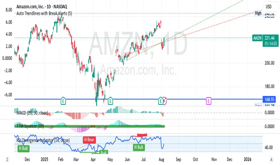
RSI ⇄ Price Divergence on Graphic//@version=5
indicator("RSI ⇄ Price Divergence with Emphasis", overlay=true, max_lines_count=500)
// === Inputs ===
rsiLength = input.int(14, "RSI Length")
pivotLR = input.int(5, "Pivot Left/Right", minval=1)
rescaleLook = input.int(100, "Bars to rescale RSI→Price", minval=10)
minLabelSize = input.string("small", "Label size", options= )
// === Calculate RSI & price pivots ===
rsi = ta.rsi(close, rsiLength)
isPh = ta.pivothigh(high, pivotLR, pivotLR)
isPl = ta.pivotlow(low, pivotLR, pivotLR)
// === Helpers to map RSI into price range ===
priceHigh = ta.highest(high, rescaleLook)
priceLow = ta.lowest(low, rescaleLook)
priceRange = priceHigh - priceLow
scaleRsi(x) => priceLow + (x / 100.0) * priceRange
// Utility to measure divergence strength
getStrength(p0, p1, r0, r1) =>
math.abs((p1 - p0) / p0) + math.abs((r1 - r0) / 100)
// === State storage ===
var int lastPhBar = na
var float lastPhPrice = na
var float lastPhRsi = na
var float lastPhStrength = 0.0
var int lastPlBar = na
var float lastPlPrice = na
var float lastPlRsi = na
var float lastPlStrength = 0.0
// === Containers for drawings ===
var line divLines = array.new_line()
var label divLabels = array.new_label()
// Function to clear old drawings ===
clearAll() =>
if array.size(divLines) > 0
for i = 0 to array.size(divLines) - 1
line.delete(array.get(divLines, i))
array.clear(divLines)
if array.size(divLabels) > 0
for i = 0 to array.size(divLabels) - 1
label.delete(array.get(divLabels, i))
array.clear(divLabels)
// === Bearish divergence ===
if isPh
curBar = bar_index - pivotLR
curPrice = high
curRsi = rsi
if not na(lastPhBar)
if (curPrice > lastPhPrice) and (curRsi < lastPhRsi)
strength = getStrength(lastPhPrice, curPrice, lastPhRsi, curRsi)
if strength >= lastPlStrength
clearAll()
l1 = line.new(lastPhBar, lastPhPrice, curBar, curPrice, color=color.red, width=2)
l2 = line.new(lastPhBar, scaleRsi(lastPhRsi), curBar, scaleRsi(curRsi), color=color.red, style=line.style_dashed, width=1)
lbl = label.new(curBar, curPrice, "Bear Div", xloc=xloc.bar_index, yloc=yloc.price, color=color.red, style=label.style_label_down, textcolor=color.white, size=size.small)
array.push(divLines, l1)
array.push(divLines, l2)
array.push(divLabels, lbl)
lastPhStrength := strength
lastPhBar := curBar
lastPhPrice := curPrice
lastPhRsi := curRsi
// === Bullish divergence ===
if isPl
curBar = bar_index - pivotLR
curPrice = low
curRsi = rsi
if not na(lastPlBar)
if (curPrice < lastPlPrice) and (curRsi > lastPlRsi)
strength = getStrength(lastPlPrice, curPrice, lastPlRsi, curRsi)
if strength > lastPhStrength
clearAll()
l1 = line.new(lastPlBar, lastPlPrice, curBar, curPrice, color=color.green, width=2)
l2 = line.new(lastPlBar, scaleRsi(lastPlRsi), curBar, scaleRsi(curRsi), color=color.green, style=line.style_dashed, width=1)
lbl = label.new(curBar, curPrice, "Bull Div", xloc=xloc.bar_index, yloc=yloc.price, color=color.green, style=label.style_label_up, textcolor=color.white, size=size.small)
array.push(divLines, l1)
array.push(divLines, l2)
array.push(divLabels, lbl)
lastPlStrength := strength
lastPlBar := curBar
lastPlPrice := curPrice
lastPlRsi := curRsi
// Plot RSI pane for context ===
plot(rsi, title="RSI", color=color.blue)
hline(70, "Overbought", color=color.gray, linestyle=hline.style_dotted)
hline(30, "Oversold", color=color.gray, linestyle=hline.style_dotted)
/*
HOW TO USE (for TradingView Publishing)
1. Apply to Chart
- Copy and paste the full Pine v5 script into the TradingView Pine Editor.
- Save the script and click “Add to Chart”.
2. Configure Inputs
• RSI Length: Number of bars for the RSI calculation (default 14).
• Pivot Left/Right: Bars on each side to define a pivot high/low (default 5).
• Bars to Rescale RSI→Price: Lookback window for mapping RSI to price scale for on-chart lines (default 100).
3. Interpret Signals
- **Bearish Divergence** (Red): Price makes higher highs, RSI makes lower highs. The stronger signal replaces any existing bullish divergence.
- **Bullish Divergence** (Green): Price makes lower lows, RSI makes higher lows. The stronger signal replaces any existing bearish divergence.
- A dashed line connects RSI pivots in the price pane to highlight the divergence visually.
4. Alerts
- (Optional) Create custom alerts based on label text or line drawings using the `plotshape` or alertcondition functions if desired.
5. Best Practices
- Check divergences on higher timeframes (4H, Daily) for reliability.
- Use in conjunction with support/resistance zones and volume confirmation.
- Adjust inputs to match the volatility profile of the instrument and timeframe.
*/

ActivTrades US Market Pulse – Ion JaureguiWhat the ActivTrades US Market Pulse Indicator Does
This indicator measures US market risk sentiment by combining:
The relative position of cyclical and defensive sectors versus their 50-day moving averages.
The level of the VIX volatility index.
The yield spread between 10-year and 2-year US Treasury bonds.
It assigns points based on these conditions to create an index that oscillates between Risk-Off (fear) and Risk-On (risk appetite).
The result is shown as a colored histogram with labels indicating:
Extreme Risk-On (bullish market)
Extreme Risk-Off (fearful market)
Neutral zone
It helps anticipate shifts in market sentiment and supports investment or trading decisions.
*******************************************************************************************
The information provided does not constitute investment research. The material has not been prepared in accordance with the legal requirements designed to promote the independence of investment research and such should be considered a marketing communication.
All information has been prepared by ActivTrades ("AT"). The information does not contain a record of AT's prices, or an offer of or solicitation for a transaction in any financial instrument. No representation or warranty is given as to the accuracy or completeness of this information.
Any material provided does not have regard to the specific investment objective and financial situation of any person who may receive it. Past performance and forecasting are not a synonym of a reliable indicator of future performance. AT provides an execution-only service. Consequently, any person acting on the information provided does so at their own risk. Political risk is unpredictable. Central bank actions can vary. Platform tools do not guarantee success.
INDICATOR RISK ADVICE: The information and publications are not meant to be, and do not constitute, financial, investment, trading, or other types of advice or recommendations supplied or endorsed by ActivTrades. This script intends to help follow the trend and filter out market noise. This script is meant for the use of international users. This script is not meant for the use of Spain users.

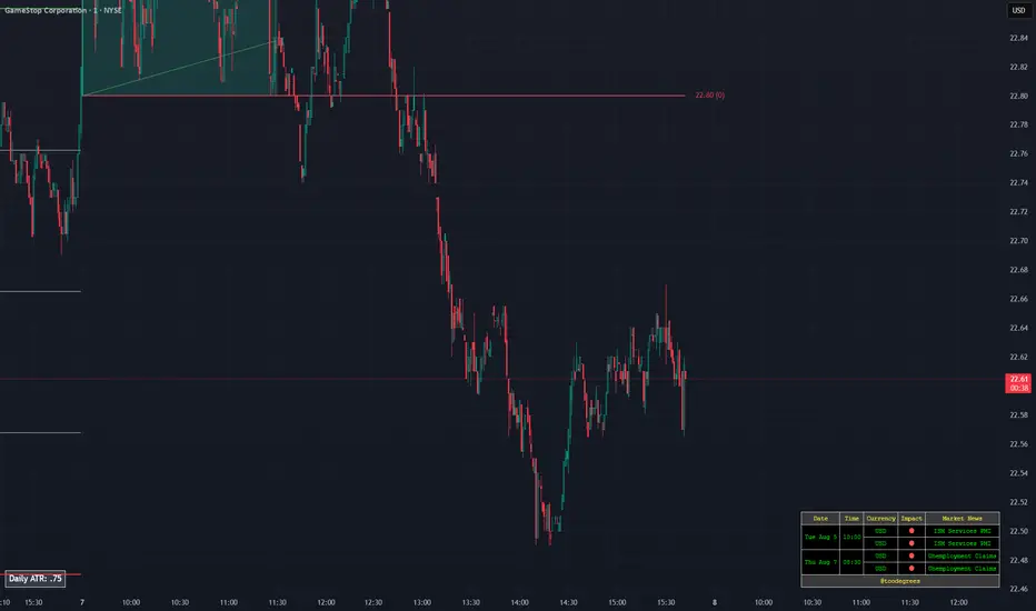
Thors Economic NewsThe Live Economic Calendar indicator seamlessly integrates with external news sources to provide real-Time, upcoming, and past financial news directly on your Tradingview chart.
By having a clear understanding of when news are planned to be released, as well as their respective impact, analysts can prepare their weeks and days in advance. These injections of volatility can be harnessed by analysts to support their thesis, or may want to be avoided to ensure higher probability market conditions. Fundamentals and news releases transcend the boundaries of technical analysis, as their effects are difficult to predict or estimate.
Designed for both novice and experienced traders, the Live Economic Calendar indicator enhances your analysis by keeping you informed of the latest and upcoming market-moving news.
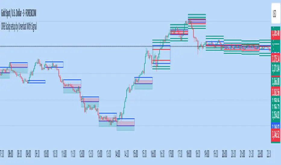
ORB Scalp setup by Unenbat With Signal**ORB Scalp Setup by Unenbat with Signal**
This indicator visualizes a custom Opening Range Breakout (ORB) strategy using a 6-minute range split across the end of one hour and the start of the next. It identifies two key trade setups using 1-hour candles:
* **Reverse Signals:** Triggered when the second 1H candle breaks the previous high/low but closes back inside, signaling a reversal.
* **Continuation Signals:** Triggered when the second 1H candle breaks and closes beyond the previous candle’s range, confirming trend continuation.
SL/TP zones are plotted accordingly, with optional fill coloring. No trades are displayed during "inside bars" or "manipulation" candles.
JOSITOThis indicator marks equal points that XAU will go to reach; it doesn’t work on other pairs, but on XAU it is quite accurate.
Preguntar a ChatGPT

Filtro Antirumore Ottimizzato by G.I.N.e TradingNoise Filter – Adaptive Version for Bund & DAX by G.I.N.e Trading
The Noise Filter is a market condition tool designed to help traders avoid false signals by identifying sideways or low-quality trading phases. This version has been specifically optimized to work effectively with both Bund and DAX price action behaviors.
⚙️ How It Works
The indicator analyzes four key components to determine if the market is in a "noise zone" (sideways, low volatility, or weak trend):
Bollinger Band Width – Detects price compression.
ADX – Measures the strength of the trend.
ATR – Captures recent volatility.
HMA Slope – Evaluates directional movement (trend or no trend).
A noise zone is triggered if at least two out of three core conditions are met:
Narrow Bollinger Bands
ADX below threshold
ATR below threshold
And it is confirmed only if there is no clear directional slope in price.
A strong directional slope overrides the noise signal, allowing valid trends with low volatility (common in instruments like the Bund).
🎯 Visual Output
Gray column → Noise zone: avoid signals in this phase (low quality environment).
Yellow column → Operational zone: conditions are more favorable for trend-following systems.
🛠️ Fully Customizable
You can adjust:
Bollinger Band period & width threshold
ADX length & threshold
ATR period & threshold
HMA slope sensitivity
💡 Best For
Filtering false signals in automated or manual trading strategies
Enhancing trend-following accuracy
Adapting behavior to both high-volatility instruments (DAX) and low-volatility instruments (Bund)

🧠 Crypto Predictor v8125 (CleveAlgo)## 🧠 Crypto Predictor v8125 (CleveAlgo) – Auto Trade Signal Parser + R\:R Zones + Emojis
**Visualize your crypto trade signals like a pro.**
The Crypto Predictor v8125 by **CleveAlgo** is a powerful Pine Script indicator that transforms plain-text trade setups into fully visual trading zones, risk/reward tables, and animated labels – ideal for traders using Telegram, Discord, AI-generated signals, or bot-driven automation.
---
### 🚀 Key Features:
* 🔄 **Multi-Signal Support** – Parse and visualize up to **5 trade setups** simultaneously
* 🟦 **Entry Zones** – Highlights your entry range with precision
* 🟥 **Stop Loss Zones** – Visual risk overlay from entry to SL
* 🟩 **Take Profit Zones** – TP1 and TP2 drawn with dynamic boxes
* 📊 **R\:R Ratio Calculator** – Auto-calculates and displays risk/reward in a floating table
* 🧠 **Hit Detection Emojis** – Alerts with animated labels when TP1, TP2, SL, or Entry is triggered
* 🎛️ **Customizable Labels & Styles** – Toggle display of labels, emojis, and adjust label sizes
---
### 📋 Signal Input Format:
Paste signals into the input fields in this format:
```
📌 Contract: ETH/USDT
📉 Current Price: 3450
📈 Direction: Buy
🎯 Entry: 3390 - 3420
⛔ Stop-Loss: 3360
💰 Take-Profit: TP1: 3500, TP2: 3550
⚡ Confidence: Medium
📝 Reason: Retest of broken trendline on the 1H chart.
```
The script automatically extracts:
* ✅ Contract Pair
* ✅ Entry Range
* ✅ Stop-Loss
* ✅ Take-Profit Targets
* ✅ Confidence Level
* ✅ Trade Rationale (shown as tooltip in table)
---
### 📈 Best Used With:
* 🤖 **AI Crypto Predictor Bot** – Automated signal generation and execution
* 💹 **Crypto Futures or Spot Trading** – Visualize entries, exits, and zones across pairs
* 📊 **Visual Backtesting & Risk Management** – Instantly see R\:R and trade logic on the chart
---
### ⚙️ Technical Specs:
* Pine Script v5
* Supports up to 5 simultaneous trades
* Max draw capacity: 500 boxes, 500 labels
* Optimized for intraday and swing traders (1H–4H recommended)
* Clean layout with dynamic table stacking
---
💼 Developed by **CleveAlgo**
🔗 Follow for more advanced Pine Scripts, AI trading tools, and automation integrations.

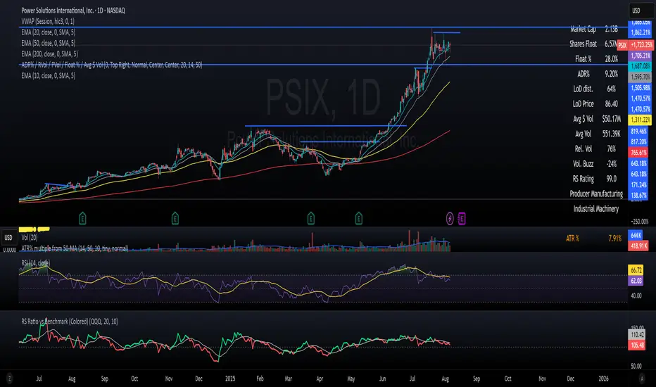
RS Ratio vs Benchmark (Colored)📈 RS Ratio vs Benchmark (with Color Change)
A simple but powerful tool to track relative strength against a benchmark like QQQ, SPY, or any other ETF.
🔍 What it Shows
RS Ratio (orange line): Measures how strong a stock is relative to a benchmark.
Moving Average (teal line): Smooths out RS to show trend direction.
Color-coded RS Line:
🟢 Green = RS is above its moving average → strength is increasing.
🔴 Red = RS is below its moving average → strength is fading.
📊 How to Read It
Above 100 = Stock is outperforming the benchmark.
Below 100 = Underperforming.
Rising & Green = Strongest signal — accelerating outperformance.
Above 100 but Red = Consolidating or losing momentum — potential rest period.
Crosses below 100 = Warning sign — underperformance.
✅ Best Uses
Spot leading stocks with strong momentum vs QQQ/SPY.
Identify rotation — when strength shifts between sectors.
Time entries and exits based on RS trends and crossovers.
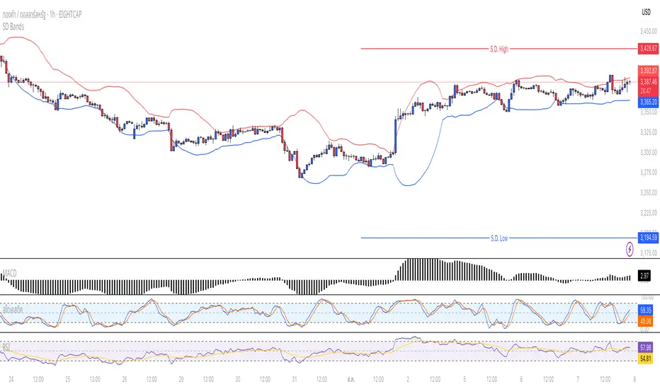
Standard Deviation BandsStandard Deviation Bands
คำอธิบายอินดิเคเตอร์:
อินดิเคเตอร์ SD Bands (Standard Deviation Bands) เป็นเครื่องมือวิเคราะห์ทางเทคนิคที่ออกแบบมาเพื่อวัดความผันผวนของราคาและระบุโอกาสในการเทรดที่อาจเกิดขึ้น อินดิเคเตอร์นี้จะแสดงผลเป็นเส้นขอบ 2 เส้นบนกราฟราคาโดยตรง โดยอ้างอิงจากค่าเฉลี่ยเคลื่อนที่ (Moving Average) และค่าส่วนเบี่ยงเบนมาตรฐาน (Standard Deviation)
* เส้นบน (Upper Band): แสดงระดับที่ราคาเคลื่อนไหวสูงกว่าค่าเฉลี่ย
* เส้นล่าง (Lower Band): แสดงระดับที่ราคาเคลื่อนไหวต่ำกว่าค่าเฉลี่ย
ความกว้างของช่องระหว่างเส้นทั้งสองบ่งบอกถึงระดับความผันผวนของตลาดในปัจจุบัน
วิธีการใช้งานอย่างละเอียด:
คุณสามารถนำอินดิเคเตอร์ SD Bands ไปประยุกต์ใช้ได้หลายวิธีเพื่อประกอบการตัดสินใจ ดังนี้:
1. การใช้เป็นแนวรับ-แนวต้านแบบไดนามิก (Dynamic Support & Resistance)
* แนวรับ: เมื่อราคาวิ่งลงมาแตะหรือเข้าใกล้เส้นล่าง (เส้นสีน้ำเงิน) เส้นนี้อาจทำหน้าที่เป็นแนวรับชั่วคราวและมีโอกาสที่ราคาจะเด้งกลับขึ้นไปหาเส้นกลาง
* แนวต้าน: เมื่อราคาวิ่งขึ้นไปแตะหรือเข้าใกล้เส้นบน (เส้นสีแดง) เส้นนี้อาจทำหน้าที่เป็นแนวต้านชั่วคราวและมีโอกาสที่ราคาจะย่อตัวลงมา
2. การวัดความผันผวนและสัญญาณ Breakout
* ช่วงตลาดสงบ (Low Volatility): เมื่อเส้น SD ทั้งสองเส้นบีบตัวเข้าหากันเป็นช่องที่แคบมาก (คล้ายกับ Bollinger Squeeze) แสดงว่าตลาดมีความผันผวนต่ำมาก ซึ่งมักจะเป็นสัญญาณว่ากำลังจะเกิดการเคลื่อนไหวครั้งใหญ่ (Breakout)
* ช่วงตลาดเป็นเทรนด์ (High Volatility): เมื่อเส้น SD ขยายตัวกว้างออกอย่างรวดเร็ว พร้อมกับที่ราคาวิ่งอยู่นอกขอบ แสดงว่าตลาดเข้าสู่ช่วงเทรนด์ที่แข็งแกร่งและมีโมเมนตัมสูง
3. สัญญาณการกลับตัว (Reversal Signals)
* เมื่อราคาปิดแท่งเทียน นอกเส้น SD Bands อย่างชัดเจน (โดยเฉพาะหลังจากที่เทรนด์นั้นดำเนินมานาน) อาจเป็นสัญญาณว่าแรงซื้อ/แรงขายเริ่มอ่อนกำลังลง และมีโอกาสที่จะเกิดการกลับตัวของราคาในไม่ช้า
การตั้งค่าอินพุต (Input Parameters):
* ระยะเวลา (Length): กำหนดจำนวนแท่งเทียนที่ใช้ในการคำนวณค่าเฉลี่ยและ SD
* 20: สำหรับการวิเคราะห์ระยะสั้นถึงกลาง
* 50 หรือ 100: สำหรับการวิเคราะห์ระยะยาว
* ตัวคูณ (Multiplier): กำหนดระยะห่างของเส้น SD จากค่าเฉลี่ย
* 1.0 - 2.0: เส้นจะอยู่ใกล้ราคามากขึ้น ทำให้เกิดสัญญาณบ่อยขึ้น
* 2.0 - 3.0: เส้นจะอยู่ห่างจากราคามากขึ้น ทำให้เกิดสัญญาณที่น่าเชื่อถือมากขึ้น แต่จะเกิดไม่บ่อย
ข้อควรระวังและคำเตือน:
* อินดิเคเตอร์นี้เป็นเพียง เครื่องมือวิเคราะห์ เพื่อช่วยในการตัดสินใจ ไม่ใช่สัญญาณการซื้อขายที่ถูกต้อง 100%
* ควรใช้ร่วมกับเครื่องมืออื่นๆ เช่น RSI, MACD, หรือ Volume เพื่อยืนยันสัญญาณ
* การเทรดมีความเสี่ยงสูง ควรบริหารจัดการความเสี่ยงและตั้งจุด Stop Loss ทุกครั้ง
คุณสามารถใช้โครงสร้างนี้ในการเขียนโพสต์บน TradingView ได้เลยนะครับ ขอให้ประสบความสำเร็จกับการโพสต์อินดิเคเตอร์ของคุณครับ!
English
Standard Deviation Bands
Indicator Description:
The SD Bands (Standard Deviation Bands) indicator is a powerful technical analysis tool designed to measure price volatility and identify potential trading opportunities. The indicator displays two dynamic bands directly on the price chart, based on a moving average and a customizable standard deviation multiplier.
* Upper Band: Indicates price levels above the moving average.
* Lower Band: Indicates price levels below the moving average.
The width of the channel between these two bands provides a clear picture of current market volatility.
Detailed User Guide:
You can use SD Bands in several ways to enhance your trading decisions:
1. Dynamic Support and Resistance:
These bands can act as dynamic support and resistance levels.
* Support: When the price moves down and touches or approaches the lower band, it can act as support, offering the possibility of a rebound to the average.
* Resistance: When the price moves up and touches or approaches the upper band, it can act as resistance, offering the possibility of a rebound.
2. Volatility Measurement and Breakout Signals:
* Low Volatility (Squeeze): When the two bands converge and form a narrow channel. Indicates very low market volatility. This condition often occurs before significant price movements or breakouts.
* High Volatility (Expansion): When the bands expand and widen rapidly, it indicates that the market is entering a period of strong trending momentum with high momentum.
3. Reversal Signals:
* When the price closes significantly outside the SD Bands (especially after a long-term trend), it may signal that the current momentum has expired and a reversal may be imminent.
Input Parameters:
The indicator's parameters are fully customizable to suit your trading style:
* Length: Defines the number of bars used to calculate the moving average and standard deviation.
* 20: Suitable for short- to medium-term analysis.
* 50 or 100: Suitable for long-term trend analysis.
* Multiplier: Adjusts the sensitivity of the signal bars.
* 1.0 - 2.0: Creates narrower signal bars, leading to more frequent signals.
* 2.0 - 3.0: Creates wider signal bars, providing fewer but potentially more significant signals.
Important Warning:
* This indicator is an analytical tool only. It does not provide guaranteed buy or sell signals.
* Always use it in conjunction with other indicators (such as RSI, MACD, and Volume) for confirmation.
* Trading involves high risk. Proper risk management, including the use of stop-loss orders, is recommended.
You can use this structure for your posts on TradingView. Good luck with your indicators!
ACR(Average Candle Range) With TargetsWhat is ACR?
The Average Candle Range (ACR) is a custom volatility metric that calculates the mean distance between the high and low of a set number of past candles. ACR focuses only on the actual candle range (high - low) of specific past candles on a chosen timeframe.
This script calculates and visualizes the Average Candle Range (ACR) over a user-defined number of candles on a custom timeframe. It displays a table of recent range values, plots dynamic bullish and bearish target levels, and marks the start of each new candle with a vertical line. All calculations update in real time as price action develops. This script was inspired by the “ICT ADR Levels - Judas x Daily Range Meter°” by toodegrees.
Key Features
Custom Timeframe Selection: Choose any timeframe (e.g., 1D, 4H, 15m) for analysis.
User-Defined Lookback: Calculate the average range across 1 to 10 previous candles.
Dynamic Targets:
Bullish Target: Current candle low + ACR.
Bearish Target: Current candle high – ACR.
Live Updates: Targets adjust intrabar as highs or lows change during the current candle.
Candle Start Markers: Vertical lines denote the open of each new candle on the selected timeframe.
Floating Range Table:
Displays the current ACR value.
Lists individual ranges for the previous five candles.
Extend Target Lines: Choose to extend bullish and bearish target levels fully across the screen.
Global Visibility Controls: Toggle on/off all visual elements (targets, vertical lines, and table) for a cleaner view.
How It Works
At each new candle on the user-selected timeframe, the script:
Draws a vertical line at the candle’s open.
Recalculates the ACR based on the inputted previous number of candles.
Plots target levels using the current candle's developing high and low values.
Limitation
Once the price has already moved a full ACR in the opposite direction from your intended trade, the associated target loses its practical value. For example, if you intended to trade long but the bearish ACR target is hit first, the bullish target is no longer a reliable reference for that session.
Use Case
This tool is designed for traders who:
Want to visualize the average movement range of candles over time.
Use higher or lower timeframe candles as structural anchors.
Require real-time range-based price levels for intraday or swing decision-making.
This script does not generate entry or exit signals. Instead, it supports range awareness and target projection based on historical candle behavior.
Key Difference from Similar Tools
While this script was inspired by “ICT ADR Levels - Judas x Daily Range Meter°” by toodegrees, it introduces a major enhancement: the ability to customize the timeframe used for calculating the range. Most ADR or candle-range tools are locked to a single timeframe (e.g., daily), but this version gives traders full control over the analysis window. This makes it adaptable to a wide range of strategies, including intraday and swing trading, across any market or asset.

Auto Trendlines with Break AlertsIdentify the two most recent significant swing highs and swing lows based on a customizable pivot length.
Draw trendlines extending from these points.
Provide an optional visual signal (a small diamond on the chart) and a alertcondition for sound/push notifications when a trendline is broken.
Configure: Once the indicator is on your chart, you can click on the gear icon (⚙️) next to its name to adjust the settings. You will see a checkbox to enable/disable alerts and a slider to change the pivot length.
Configuring Alerts in TradingView
The alertcondition lines in the code allow you to set up official TradingView alerts for sound and push notifications.
Create an Alert: Click the clock icon (⏰) on the right-side toolbar of your TradingView chart.
Set the Condition: In the "Condition" field, select the name of the indicator: "Auto Trendlines with Break Alerts".
Choose the Alert Type: A second dropdown will appear. Select either "High Trendline Broken" or "Low Trendline Broken" to specify which break you want to be alerted for.
Select Notification Options: In the "Notifications" section, you can check the boxes for "Play sound," "Send email," "Send push notification," etc.
Create the Alert: Click "Create" to save your alert.
Trend Magic - Modulo Antirumore by G.I.N.e TradingTrend Magic – Description and Optimization
Trend Magic is a trend-following indicator designed to filter out noise and avoid trades during sideways or choppy market conditions. It combines two elements:
CCI (Commodity Channel Index) – used to determine market momentum and direction.
ATR (Average True Range) – used to adjust sensitivity to volatility.
The indicator plots a dynamic line (often color-coded) that changes based on the CCI value:
If CCI is above 0, the line is set to Lower Band (suggesting a bullish environment).
If CCI is below 0, the line is set to Upper Band (suggesting a bearish environment).
This line acts as a trend confirmation filter, helping to ignore signals in non-trending or uncertain conditions.

Daily Manipulation Probability Dashboard📜 Summary
Tired of getting stopped out on a "Judas Swing" just before the price moves in your intended direction? This indicator is designed to give you a statistical edge by quantifying the daily manipulation move.
The Daily Manipulation Probability Dashboard analyzes thousands of historical trading days to reveal the probability of the initial "stop-hunt" or "fakeout" move reaching certain percentage levels. It presents this data in a clean, intuitive dashboard right on your chart, helping you make more data-driven decisions about stop-loss placement and entry timing.
🧠 The Core Concept
The logic is simple but powerful. For every trading day, we measure two things:
Amplitude Above Open (AAO): The distance price travels up from the daily open (High - Open).
Amplitude Below Open (ABO): The distance price travels down from the daily open (Open - Low).
The indicator defines the "Manipulation" as the smaller of these two moves. The idea is that this smaller move often acts as a liquidity grab to trap traders before the day's primary, larger move ("Distribution") begins.
This tool focuses exclusively on providing deep statistical insight into this crucial manipulation phase.
🛠️ How to Use This Tool
This dashboard is designed to be a practical part of your daily analysis and trade planning.
1. Smarter Stop-Loss Placement
This is the primary use case. The "Prob. (%)" column tells you the historical chance of the manipulation move being at least a certain size.
Example: If the table shows that for EURUSD, the ≥ 0.25% level has a probability of 30%, you can flip this information: there is a 70% probability that the daily manipulation move will be less than 0.25%.
Action: Placing your stop-loss just beyond a level with a low probability gives you a statistically sound buffer against typical stop-hunts.
2. Entry Timing and Patience
The live arrow (→) shows you where the current day's manipulation falls.
Example: If the arrow is pointing at ≥ 0.10% and you know there is a high probability (e.g., 60%) of the manipulation reaching ≥ 0.20%, you might wait for a deeper pullback before entering, anticipating that the "Judas Swing" hasn't completed yet.
3. Assessing Daily Character
Quickly see if the current day's action is unusual. If the manipulation move is already in a very low probability zone (e.g., > 1.00%), it might indicate that your Bias is wrong, or signal a high-volatility day or a potential trend reversal.
📊 Understanding the Dashboard
Ticker: The top-right shows the current symbol you are analyzing.
→ (Arrow): Points to the row that corresponds to the current, live day's manipulation amplitude.
Manip. Level: The percentage threshold being analyzed (e.g., ≥ 0.20%).
Days Analyzed: The raw count of historical days where the manipulation move met or exceeded this level.
Prob. (%): The key statistic. The cumulative probability of the manipulation move being at least the size of the level.
⚙️ Settings
Position: Choose where you want the dashboard to appear on your chart.
Text Size: Adjust the font size for readability.
Max Historical Days to Analyze: Set the number of past daily candles to include in the statistical analysis. A larger number provides a more robust sample size.
I believe this tool provides a unique, data-driven edge for intraday traders across all markets (Forex, Crypto, Stocks, Indices). Your feedback and suggestions are highly welcome!
- @traderprimez

Confidence Score – Antirumore DAX H1How it works
Calculates 5 signal validity conditions
Assigns 1 point for each condition met
Displays a colored bar in the lower panel:
🟥 Red (0–1): noise, avoid
🟧 Orange (2–3): to be evaluated
🟩 Green (4–5): strong signal

Antirumore by G.I.N.e TradingCode Functions
Checks 5 conditions:
1. ADX > threshold
2. RSI outside the 45–55 neutral zone
3. Wide price range
4. Candle with a strong body
5. Consistent volume
Displays a colored bar in a lower panel:
🟩 Green = possible long entry

Daily Volatility/Amplitude Probability DashboardSummary
This indicator provides a powerful statistical deep-dive into an asset's daily volatility. It moves beyond simple range indicators by calculating the historical probability of a trading day reaching certain amplitude levels.
The results are presented in a clean, interactive dashboard that highlights the current day's performance in real-time, allowing traders to instantly gauge if the current volatility is normal, unusually high, or unusually low compared to history.
This tool is designed to help traders answer a critical question: "Based on past behavior, what is the likelihood that today's range will be at least X%?"
Key Concepts Explained
1. Daily Amplitude (%)
The indicator first calculates the amplitude (or range) of every historical daily candle and expresses it as a percentage of that day's opening price.
Formula: (Daily High - Daily Low) / Daily Open * 100
This normalization allows for a consistent volatility comparison across different price levels and time periods.
2. Cumulative Probability Distribution
Instead of showing the probability of a day's final range falling into a small, exclusive bin (e.g., "exactly between 1.0% and 1.5%"), this indicator uses a cumulative model. It answers the question, "What is the probability that the daily range will be at least a certain value?"
For example, if the row for "≥ 2%" shows a probability of 12.22%, it means that historically, 12.22% of all trading days have had a total range of 2% or more. This is incredibly useful for risk management and setting realistic expectations.
Core Features
Statistical Dashboard: Presents all data in a clear, easy-to-read table on your chart.
Cumulative Probability Model: Instantly see the historical probability of the daily range reaching or exceeding key percentage levels.
Real-Time Highlight & Arrow (→): The dashboard isn't just historical. It actively tracks the current, unfinished day's amplitude and highlights the corresponding row with a color and an arrow (→). This provides immediate context for the current session's price action.
Timeframe Independent: You can use this indicator on any chart timeframe (e.g., 5-minute, 1-hour, 4-hour), and it will always fetch and calculate using the correct daily data.
Clean & Professional UI: Features a monospace font for perfect alignment and a simple, readable design.
Fully Customizable: Easily adjust the dashboard's position, text size, and the amount of historical data used for the analysis.
How to Use & Interpret the Data
This indicator is not a trading signal but a powerful tool for statistical context and decision-making.
Risk Management: If you see that an asset has only a 5% historical probability of moving more than 3% in a day, you can set stop-losses more intelligently and avoid being overly aggressive with your targets on a typical day.
Setting Profit Targets: Gauge realistic intra-day profit targets. If a stock is already up 2.5% and has historically only moved more than 3% on rare occasions, you might consider taking profits.
Options Trading: Volatility is paramount for options. This tool helps you visualize the expected range of movement, which can inform decisions on strike selection for strategies like iron condors or straddles.
Identifying Volatility Regimes: Quickly see if the current day is a "normal" low-volatility day or an "abnormal" high-volatility day that could signal a major market event or trend initiation.
Dashboard Breakdown
→ (Arrow): Points to the bin corresponding to the current, live day's amplitude.
Amplitude Level: The minimum amplitude threshold. The format "≥ 1.5%" means "greater than or equal to 1.5%".
Days Reaching Level: The raw number of historical days that had an amplitude equal to or greater than the level in the first column.
Prob. of Reaching Level (%): The percentage of total days that reached that amplitude level (Days Reaching Level / Total Days Analyzed).
Settings
Position: Choose where the dashboard appears on your chart.
Text Size: Adjust the font size for better readability on your screen resolution.
Max Historical Days to Analyze: Set the lookback period for the statistical analysis. A larger number provides a more robust statistical sample but may take slightly longer to load initially.
Enjoy this tool and use it to add a new layer of statistical depth to your trading analysis.

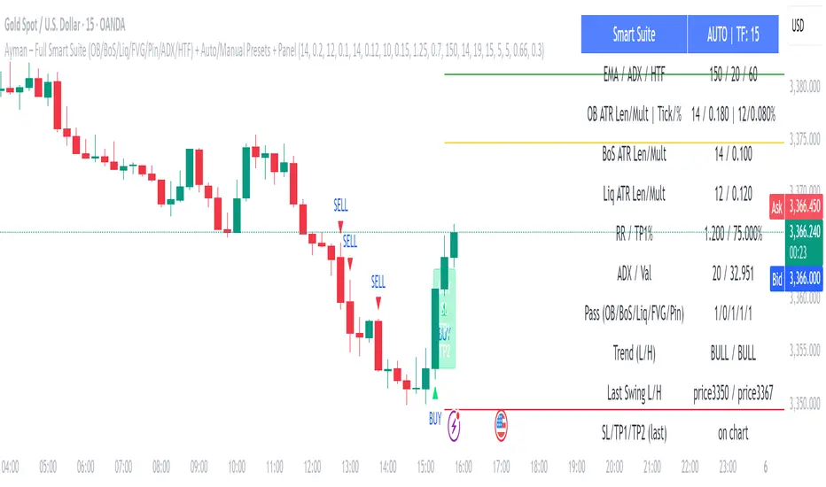
Ayman – Full Smart Suite Auto/Manual Presets + PanelIndicator Name
Ayman – Full Smart Suite (OB/BoS/Liq/FVG/Pin/ADX/HTF) + Auto/Manual Presets + Panel
This is a multi-condition trading tool for TradingView that combines advanced Smart Money Concepts (SMC) with classic technical filters.
It generates BUY/SELL signals, draws Stop Loss (SL) and Take Profit (TP1, TP2) levels, and displays a control panel with all active settings and conditions.
1. Main Features
Smart Money Concepts Filters:
Order Block (OB) Zones
Break of Structure (BoS)
Liquidity Sweeps
Fair Value Gaps (FVG)
Pin Bar patterns
ADX filter
Higher Timeframe EMA filter (HTF EMA)
Two Operating Modes:
Auto Presets: Automatically adjusts all settings (buffers, ATR multipliers, RR, etc.) based on your chart timeframe (M1/M5/M15).
Manual Mode: Fully customize all parameters yourself.
Trade Management Levels:
Stop Loss (SL)
TP1 – partial profit
TP2 – full profit
Visual Panel showing:
Current settings
Filter status
Trend direction
Last swing levels
SL/TP status
Alerts for BUY/SELL conditions
2. Entry Conditions
A BUY signal is generated when all these are true:
Trend: Price above EMA (bullish)
HTF EMA: Higher timeframe trend also bullish
ADX: Trend strength above threshold
OB: Price in a valid bullish Order Block zone
BoS: Structure break to the upside
Liquidity Sweep: Sweep of recent lows in bullish context
FVG: A bullish Fair Value Gap is present
Pin Bar: Bullish Pin Bar pattern detected (if enabled)
A SELL signal is generated when the opposite conditions are met.
3. Stop Loss & Take Profits
SL: Placed just beyond the last swing low (BUY) or swing high (SELL), with a small ATR buffer.
TP1: Partial profit target, defined as a ratio of the SL distance.
TP2: Full profit target, based on Reward:Risk ratio.
4. How to Use
Step 1 – Apply Indicator
Open TradingView
Go to your chart (recommended: XAUUSD, M1/M5 for scalping)
Add the indicator script
Step 2 – Choose Mode
AUTO Mode: Leave “Use Auto Presets” ON – parameters adapt to your timeframe.
MANUAL Mode: Turn Auto OFF and adjust all lengths, buffers, RR, and filters.
Step 3 – Filters
In the Filters On/Off section, enable/disable specific conditions (OB, BoS, Liq, FVG, Pin Bar, ADX, HTF EMA).
Step 4 – Trading the Signals
Wait for a BUY or SELL arrow to appear.
SL and TP levels will be plotted automatically.
TP1 can be used for partial close and TP2 for full exit.
Step 5 – Alerts
Set alerts via BUY Signal or SELL Signal to receive notifications.
5. Best Practices
Scalping: Use M1 or M5 with AUTO mode for gold or forex pairs.
Swing Trading: Use M15+ and adjust buffers/ATR manually.
Combine with price action confirmation before entering trades.
For higher accuracy, wait for multiple filter confirmations rather than acting on the first arrow.
6. Summary Table
Feature Purpose Can Disable?
Order Block Finds key supply/demand zones ✅
Break of Structure Detects trend continuation ✅
Liquidity Sweep Finds stop-hunt moves ✅
Fair Value Gap Confirms imbalance entries ✅
Pin Bar Price action reversal filter ✅
ADX Trend strength filter ✅
HTF EMA Higher timeframe confirmation ✅
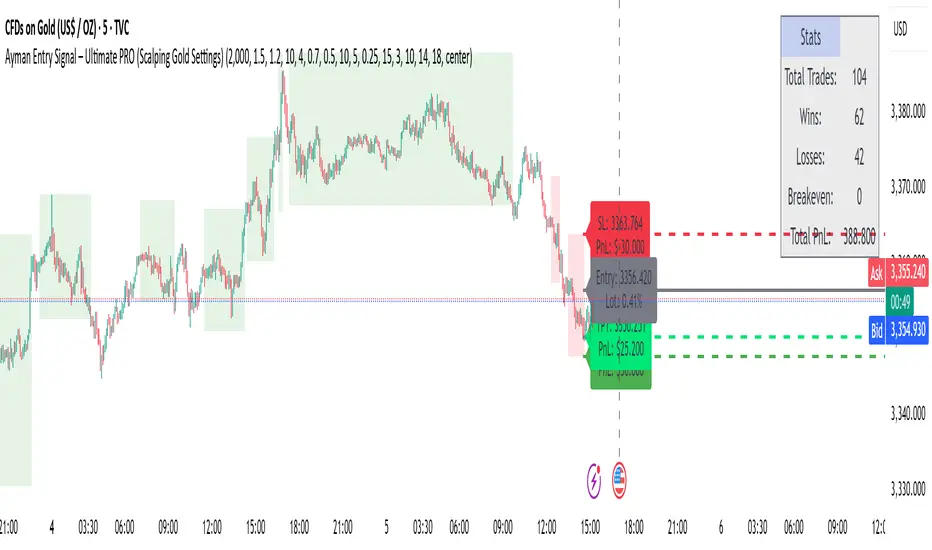
Ayman Entry Signal – Ultimate PRO (Scalping Gold Settings)1. Overview
This indicator is a professional gold scalping tool built for TradingView using Pine Script v6.
It combines multiple price action and technical filters to generate high-probability Buy/Sell signals with built-in trade management features (TP1, TP2, SL, Break Even, Partial Close, Stats tracking).
It is optimized for XAUUSD but can be applied to other assets with proper setting adjustments.
2. Key Features
Multi-Condition Trade Signals – EMA trend, Break of Structure, Order Blocks, FVG, Liquidity Sweeps, Pin Bars, Higher Timeframe confirmation, Trend Cloud, SMA Cross, and ADX.
Full Trade Management – Auto-calculates lot size, SL, TP1, TP2, Break Even, Partial Close.
Dynamic Chart Drawing – Entry lines, SL/TP lines, trade boxes, and real-time PnL.
Statistics Panel – Tracks wins, losses, breakeven trades, and total PnL over selected dates.
Customizable Filters – All filters can be turned ON/OFF to match your strategy.
3. Main Inputs & Settings
Account Settings
Capital ($) – Total trading capital.
Risk Percentage (%) – Risk per trade.
TP to SL Ratio – Risk-to-reward ratio.
Value Per Point ($) – Value per pip/point for lot size calculation.
SL Buffer – Extra points added to SL to avoid stop hunts.
Take Profit Settings
TP1 % of Full Target – Fraction of TP1 compared to TP2.
Move SL to Entry after TP1? – Activates Break Even after TP1.
Break Even Buffer – Extra points when moving SL to BE.
Take Partial Close at TP1 – Option to close half at TP1.
Signal Filters
ATR Period – For SL/TP calculation buffer.
EMA Trend – Uses EMA 9/21 crossover for trend.
Break of Structure (BoS) – Requires structure break confirmation.
Order Block (OB) – Validates trades within OB zones.
Fair Value Gap (FVG) – Confirms trades inside FVGs.
Liquidity Sweep – Checks if liquidity zones are swept.
Pin Bar Confirmation – Uses candlestick patterns for extra confirmation.
Pin Bar Body Ratio – Controls strictness of Pin Bar filter.
Higher Timeframe Filters (HTF)
HTF EMA Confirmation – Confirms lower timeframe trades with higher timeframe trend.
HTF BoS – Confirms with higher timeframe structure break.
HTF Timeframe – Selects higher timeframe.
Advanced Filters
SuperTrend Filter – Confirms trades based on SuperTrend.
ADX Filter – Filters out low volatility periods.
SMA Cross Filter – Uses SMA 8/9 cross as filter.
Trend Cloud Filter – Uses EMA 50/200 as a cloud trend filter.
4. How It Works
Buy Signal Conditions
EMA 9 > EMA 21 (trend bullish)
Optional filters (BoS, OB, FVG, Liquidity Sweep, Pin Bar, HTF confirmations, ADX, SMA Cross, Trend Cloud) must pass if enabled.
When all active filters pass → Buy signal triggers.
Sell Signal Conditions
EMA 9 < EMA 21 (trend bearish)
Same filtering process but for bearish conditions.
When all active filters pass → Sell signal triggers.
5. Trade Execution & Management
When a signal triggers:
Lot size is auto-calculated based on risk % and SL distance.
SL is placed beyond recent swing high/low + ATR buffer.
TP1 and TP2 are calculated from the SL using the reward-to-risk ratio.
Break Even: If enabled, SL moves to entry price after TP1 is hit.
Partial Close: If enabled, half of the position closes at TP1.
Trade Exit: Full exit at TP2, SL hit, or partial close at TP1.
6. Chart Display
Entry Line – Shows entry price.
SL Line – Red dashed line at stop loss level.
TP1 Line – Lime dashed line for TP1.
TP2 Line – Green dashed line for TP2.
PnL Labels – Displays real-time profit/loss in $.
Trade Box – Visual area showing trade range.
Pin Bar Shapes – Optional, marks Pin Bars.
7. Statistics Panel
Stats Header – Shows “Stats”.
Total Trades
Wins
Losses
Breakeven Trades
Total PnL
Can be reset or filtered by date.
8. How to Use
Load the Indicator in TradingView.
Select Gold (XAUUSD) on your preferred scalping timeframe (1m, 5m, 15m).
Adjust settings:
Use default gold scalping settings for quick start.
Enable/disable filters according to your style.
Wait for a Buy/Sell alert.
Confirm visually that all desired conditions align.
Place trade with calculated lot size, SL, and TP levels shown on chart.
Let trade run – the indicator manages Break Even & Partial Close if enabled.
9. Recommended Timeframes
Scalping: 1m, 5m, 15m
Day Trading: 15m, 30m, 1H
Swing: 4H, Daily (adjust settings accordingly)
Crypto Options Greeks & Volatility Analyzer [BackQuant]Crypto Options Greeks & Volatility Analyzer
Overview
The Crypto Options Greeks & Volatility Analyzer is a comprehensive analytical tool that calculates Black-Scholes option Greeks up to the third order for Bitcoin and Ethereum options. It integrates implied volatility data from VOLMEX indices and provides multiple visualization layers for options risk analysis.
Quick Introduction to Options Trading
Options are financial derivatives that give the holder the right, but not the obligation, to buy or sell an underlying asset at a predetermined price (strike price) within a specific time period (expiration date). Understanding options requires grasping two fundamental concepts:
Call Options : Give the right to buy the underlying asset at the strike price. Calls increase in value when the underlying price rises above the strike price.
Put Options : Give the right to sell the underlying asset at the strike price. Puts increase in value when the underlying price falls below the strike price.
The Language of Options: Greeks
Options traders use "Greeks" - mathematical measures that describe how an option's price changes in response to various factors:
Delta : How much the option price moves for each $1 change in the underlying
Gamma : How fast delta changes as the underlying moves
Theta : Daily time decay - how much value erodes each day
Vega : Sensitivity to implied volatility changes
Rho : Sensitivity to interest rate changes
These Greeks are essential for understanding risk. Just as a pilot needs instruments to fly safely, options traders need Greeks to navigate market conditions and manage positions effectively.
Why Volatility Matters
Implied volatility (IV) represents the market's expectation of future price movement. High IV means:
Options are more expensive (higher premiums)
Market expects larger price swings
Better for option sellers
Low IV means:
Options are cheaper
Market expects smaller moves
Better for option buyers
This indicator helps you visualize and quantify these critical concepts in real-time.
Back to the Indicator
Key Features & Components
1. Complete Greeks Calculations
The indicator computes all standard Greeks using the Black-Scholes-Merton model adapted for cryptocurrency markets:
First Order Greeks:
Delta (Δ) : Measures the rate of change of option price with respect to underlying price movement. Ranges from 0 to 1 for calls and -1 to 0 for puts.
Vega (ν) : Sensitivity to implied volatility changes, expressed as price change per 1% change in IV.
Theta (Θ) : Time decay measured in dollars per day, showing how much value erodes with each passing day.
Rho (ρ) : Interest rate sensitivity, measuring price change per 1% change in risk-free rate.
Second Order Greeks:
Gamma (Γ) : Rate of change of delta with respect to underlying price, indicating how quickly delta will change.
Vanna : Cross-derivative measuring delta's sensitivity to volatility changes and vega's sensitivity to price changes.
Charm : Delta decay over time, showing how delta changes as expiration approaches.
Vomma (Volga) : Vega's sensitivity to volatility changes, important for volatility trading strategies.
Third Order Greeks:
Speed : Rate of change of gamma with respect to underlying price (∂Γ/∂S).
Zomma : Gamma's sensitivity to volatility changes (∂Γ/∂σ).
Color : Gamma decay over time (∂Γ/∂T).
Ultima : Third-order volatility sensitivity (∂²ν/∂σ²).
2. Implied Volatility Analysis
The indicator includes a sophisticated IV ranking system that analyzes current implied volatility relative to its recent history:
IV Rank : Percentile ranking of current IV within its 30-day range (0-100%)
IV Percentile : Percentage of days in the lookback period where IV was lower than current
IV Regime Classification : Very Low, Low, High, or Very High
Color-Coded Headers : Visual indication of volatility regime in the Greeks table
Trading regime suggestions based on IV rank:
IV Rank > 75%: "Favor selling options" (high premium environment)
IV Rank 50-75%: "Neutral / Sell spreads"
IV Rank 25-50%: "Neutral / Buy spreads"
IV Rank < 25%: "Favor buying options" (low premium environment)
3. Gamma Zones Visualization
Gamma zones display horizontal price levels where gamma exposure is highest:
Purple horizontal lines indicate gamma concentration areas
Opacity scaling : Darker shading represents higher gamma values
Percentage labels : Shows gamma intensity relative to ATM gamma
Customizable zones : 3-10 price levels can be analyzed
These zones are critical for understanding:
Pin risk around expiration
Potential for explosive price movements
Optimal strike selection for gamma trading
Market maker hedging flows
4. Probability Cones (Expected Move)
The probability cones project expected price ranges based on current implied volatility:
1 Standard Deviation (68% probability) : Shown with dashed green/red lines
2 Standard Deviations (95% probability) : Shown with dotted green/red lines
Time-scaled projection : Cones widen as expiration approaches
Lognormal distribution : Accounts for positive skew in asset prices
Applications:
Strike selection for credit spreads
Identifying high-probability profit zones
Setting realistic price targets
Risk management for undefined risk strategies
5. Breakeven Analysis
The indicator plots key price levels for options positions:
White line : Strike price
Green line : Call breakeven (Strike + Premium)
Red line : Put breakeven (Strike - Premium)
These levels update dynamically as option premiums change with market conditions.
6. Payoff Structure Visualization
Optional P&L labels display profit/loss at expiration for various price levels:
Shows P&L at -2 sigma, -1 sigma, ATM, +1 sigma, and +2 sigma price levels
Separate calculations for calls and puts
Helps visualize option payoff diagrams directly on the chart
Updates based on current option premiums
Configuration Options
Calculation Parameters
Asset Selection : BTC or ETH (limited by VOLMEX IV data availability)
Expiry Options : 1D, 7D, 14D, 30D, 60D, 90D, 180D
Strike Mode : ATM (uses current spot) or Custom (manual strike input)
Risk-Free Rate : Adjustable annual rate for discounting calculations
Display Settings
Greeks Display : Toggle first, second, and third-order Greeks independently
Visual Elements : Enable/disable probability cones, gamma zones, P&L labels
Table Customization : Position (6 options) and text size (4 sizes)
Price Levels : Show/hide strike and breakeven lines
Technical Implementation
Data Sources
Spot Prices : INDEX:BTCUSD and INDEX:ETHUSD for underlying prices
Implied Volatility : VOLMEX:BVIV (Bitcoin) and VOLMEX:EVIV (Ethereum) indices
Real-Time Updates : All calculations update with each price tick
Mathematical Framework
The indicator implements the full Black-Scholes-Merton model:
Standard normal distribution approximations using Abramowitz and Stegun method
Proper annualization factors (365-day year)
Continuous compounding for interest rate calculations
Lognormal price distribution assumptions
Alert Conditions
Four categories of automated alerts:
Price-Based : Underlying crossing strike price
Gamma-Based : 50% surge detection for explosive moves
Moneyness : Deep ITM alerts when |delta| > 0.9
Time/Volatility : Near expiration and vega spike warnings
Practical Applications
For Options Traders
Monitor all Greeks in real-time for active positions
Identify optimal entry/exit points using IV rank
Visualize risk through probability cones and gamma zones
Track time decay and plan rolls
For Volatility Traders
Compare IV across different expiries
Identify mean reversion opportunities
Monitor vega exposure across strikes
Track higher-order volatility sensitivities
Conclusion
The Crypto Options Greeks & Volatility Analyzer transforms complex mathematical models into actionable visual insights. By combining institutional-grade Greeks calculations with intuitive overlays like probability cones and gamma zones, it bridges the gap between theoretical options knowledge and practical trading application.
Whether you're:
A directional trader using options for leverage
A volatility trader capturing IV mean reversion
A hedger managing portfolio risk
Or simply learning about options mechanics
This tool provides the quantitative foundation needed for informed decision-making in cryptocurrency options markets.
Remember that options trading involves substantial risk and complexity. The Greeks and visualizations provided by this indicator are tools for analysis - they should be combined with proper risk management, position sizing, and a thorough understanding of options strategies.
As crypto options markets continue to mature and grow, having professional-grade analytics becomes increasingly important. This indicator ensures you're equipped with the same analytical capabilities used by institutional traders, adapted specifically for the unique characteristics of 24/7 cryptocurrency markets.

BSC XTrender Signal Engine📈 BSC XTrender Signal Engine
The BSC XTrender Signal Engine is a precision-built momentum and trend confirmation tool that generates high-probability long/short alerts based on three key components:
🔹 BSC XTrender Engine – A dual-timeframe oscillator that visualizes both short- and long-term trend pressure in a unified color-coded ribbon.
🔹 EMA Trend Filter – Confirms price structure alignment using fast and slow exponential moving averages.
🔹 MACD Directional Bias – Validates momentum direction by checking for histogram agreement with price.
🚨 Trade Signals:
Long Trigger: BSC XTrender turns green, price above EMAs, MACD rising
Short Trigger: BSC XTrender turns red, price below EMAs, MACD falling
All conditions must align for a confirmed signal.
🧠 Designed for:
Futures, crypto, and equities traders who want clear entry signals backed by multi-layered logic. Perfect for both intraday scalping and swing trading strategies.

DeltaTrace ForecastDeltaTrace Forecast is a forward-looking projection tool that visualizes the probable directional path of price using a multi-timeframe momentum model rooted in volatility-adjusted nonlinear dynamics. Rather than relying on traditional indicators that react to price after the fact, DeltaTrace estimates future price motion by tracing the progression of momentum changes across expanding timeframes—then scaling those deltas using adaptive volatility to forecast a plausible path forward.
At its core, DeltaTrace constructs a momentum vector from a series of smoothed z-scores derived from increasing multiples of the current chart's timeframe. These z-scores are normalized using a hyperbolic tangent function (tanh), which compresses extreme values and emphasizes meaningful deviations without being overly sensitive to outliers. This nonlinear normalization ensures that explosive moves are weighted with less distortion, while still preserving the shape and direction of the underlying trend.
Once the z-scores are calculated for a range of 12 timeframes (from 1× the current timeframe up to 12×), the indicator computes the first difference between each adjacent pair. These differences—or deltas—represent the change in momentum from one timeframe to the next. In this structure, a strong positive delta implies momentum is strengthening as we look into higher timeframes, while a negative delta reflects waning or reversing strength.
However, not all deltas are treated equally. To make the projection adaptive to market volatility and temporally meaningful, each delta is scaled by the square root of its corresponding timeframe multiple, weighted by the ATR (Average True Range) of the base timeframe. This square-root volatility scaling mirrors the behavior of Brownian motion and reflects the natural geometric diffusion of price over time. By applying this scaling, the model tempers its forecast according to recent volatility while maintaining proportional distance over longer time horizons.
The result is a chain of projected price steps—11 in total—starting from the current closing price. These steps are cumulative, meaning each one builds upon the previous, forming a continuously adjusted polyline that represents the most recent forecast path of price. Each point in the forecast line is directional: if the next projected point is above the last, the segment is colored green (upward momentum); if below, it is colored red (downward momentum). This color coding gives immediate visual feedback on the nature of the projected path and allows for intuitive at-a-glance interpretation.
What makes DeltaTrace unique is its combination of ideas from signal processing, time-series momentum analysis, and volatility theory. Instead of relying on static support/resistance levels or lagging moving averages, it dynamically adapts to both momentum curvature and volatility structure. This allows it to be used not just for trend confirmation, but also for top-down bias fading, reversal anticipation, and path-following strategies.
Traders can use DeltaTrace in a variety of ways depending on their style:
For trend traders, a consistent upward or downward curve in the forecast suggests directional continuation and can be used for position sizing or confirmation of bias.
For mean-reversion traders, exaggerated divergence between the current price and the first few forecast points may indicate temporary exhaustion or overextension.
For scalpers or intraday traders, the short-term bend or flattening of the initial segments can reveal early signs of weakening momentum or build-up before breakout.
For swing traders, the full shape of the polyline gives an evolving map of market rhythm across time compression, allowing for context-aware decision-making.
It’s important to understand that this is a path projection tool, not a precise price target predictor. The forecast does not attempt to predict exact price levels at exact bars, but rather illustrates how the market might evolve if the current multi-timeframe momentum structure persists. Like all models, it should be interpreted probabilistically and used in conjunction with other confirmation signals, risk management tools, or strategy frameworks.
Inputs allow customization of the z-score calculation length and ATR window to tune the sensitivity of the model. The color scheme for up/down forecast segments can also be adjusted for personal preference. Additionally, users can toggle the polyline forecast on or off, which may be useful for pairing this indicator with others in a crowded chart layout.
Because the forecast path is calculated only on the last bar, it does not repaint or shift once the candle closes—preserving historical accuracy for visual inspection and backtesting reference. However, it is also sensitive to changes in volatility and momentum structure, meaning it updates each bar as conditions evolve, making it most effective in real-time decision support.
DeltaTrace Forecast is particularly well-suited for traders who want a deeper understanding of hidden momentum shifts across timeframes without relying on traditional trend-following tools. It reveals the shape of future possibility based on present dynamics, offering a compact yet powerful visualization of directional bias, transition risk, and path strength.
To maximize its utility, consider pairing DeltaTrace with volume profiles, order flow tools, higher timeframe zones, or market structure indicators. Used in context, it becomes a powerful companion to both systematic and discretionary trading styles—especially for those who appreciate a blend of mathematics and intuition in their market analysis.
This indicator is not based on magic or black-box logic; every component—from the z-score standardization to the volatility-adjusted deltas—is fully transparent and grounded in simple, interpretable mechanics. If you're looking for a reliable way to visualize multi-timeframe bias and momentum diffusion, DeltaTrace provides a unique lens through which to interpret future potential in an ever-shifting market landscape.
