TRI - Smart Zones============================================================================
# TRI - SMART ZONES v2.0
## Professional Smart Money Concepts Indicator for Pine Script v6
============================================================================
## 📊 OVERVIEW
**TRI - Smart Zones** is a comprehensive Smart Money Concepts indicator that
combines multiple institutional trading concepts into a single, powerful tool.
Built with Pine Script v6 for optimal performance and reliability.
## 🎯 CORE FEATURES
### **Fair Value Gaps (FVG)**
- **Detection**: Automatic identification of price imbalances
- **Types**: Bullish and Bearish Fair Value Gaps
- **Threshold**: Customizable gap size requirements (0.1% default)
- **Extension**: Configurable zone projection length
- **Mitigation**: Real-time tracking of gap fills
### **Order Blocks (OB)**
- **Detection**: Volume-based institutional footprint identification
- **Types**: Bullish and Bearish Order Blocks
- **Method**: Pivot-based volume analysis with configurable lookback
- **Validation**: Market structure confirmation required
- **Extension**: Adjustable zone projection
### **BSL/SSL Liquidity Levels**
- **Multi-Timeframe**: Automatic higher timeframe reference
- **Dynamic**: Real-time level updates and extensions
- **Visual**: Clear line markings with timeframe labels
- **Smart**: Adaptive timeframe selection based on current chart
### **Fibonacci Extensions**
- **ZigZag Integration**: Advanced pivot point detection
- **Levels**: Customizable Fibonacci ratios (38.2%, 61.8%, 100%, 161.8%)
- **Projection**: Dynamic extension from swing points
- **Visual**: Subtle dashed lines with level/price labels
### **Smart Dashboard**
- **Zone Statistics**: Real-time FVG and OB counts
- **Success Rates**: Mitigation percentages for each zone type
- **Market Bias**: Intelligent bullish/bearish/neutral assessment
- **Positioning**: Customizable location and size
### **Zone Analysis Engine**
- **Technical Confluence**: RSI, ADX, ATR, Volume analysis
- **VWAP Integration**: Institutional price reference
- **Confidence Scoring**: High/Mid/Low signal classification
- **Signal Arrows**: Visual trade direction indicators
## 🔔 ALERT SYSTEM
### **Market Structure Alerts**
- `Market Bias Changed` - Shift in overall market sentiment
- `BSL Touched` - Buy Side Liquidity level reached
- `SSL Touched` - Sell Side Liquidity level reached
### **Zone Touch Alerts**
- `OB Touched` - Any Order Block interaction
- `Bullish OB Touched` - Bullish Order Block touch
- `Bearish OB Touched` - Bearish Order Block touch
- `FVG Touched` - Any Fair Value Gap interaction
- `Bullish FVG Touched` - Bullish FVG touch
- `Bearish FVG Touched` - Bearish FVG touch
- `Zone Touched` - Any Smart Zone interaction
- `Bullish Zone Touched` - Any bullish zone touch
- `Bearish Zone Touched` - Any bearish zone touch
## ⚙️ CONFIGURATION
### **Zone Detection**
- Enable/disable FVG and OB detection independently
- Maximum zones per type (3-15, default: 8)
- Zone-specific threshold and extension settings
### **Visual Customization**
- Individual color schemes for each zone type
- Adjustable transparency levels
- Configurable line styles and widths
- Dashboard positioning and sizing options
### **Technical Analysis**
- RSI, ADX, ATR period customization
- Volume threshold multipliers
- Confidence level color coding
- Signal display toggle
## 🚀 PINE SCRIPT v6 OPTIMIZATIONS
- **User-Defined Types**: Structured data for zones and statistics
- **Methods**: Type-specific operations for better code organization
- **Enhanced Arrays**: Optimized memory management
- **Switch Statements**: Improved performance for zone classification
- **Error Handling**: Robust input validation and edge case management
- **Performance**: Efficient algorithms for real-time analysis
## 📈 TRADING APPLICATIONS
### **Entry Strategies**
- Zone confluence for high-probability setups
- Multi-timeframe confirmation via BSL/SSL
- Fibonacci extension targets
- Signal arrows for directional bias
### **Risk Management**
- Zone mitigation for stop-loss placement
- Market bias for position sizing
- Dashboard statistics for strategy validation
### **Market Analysis**
- Institutional footprint identification
- Liquidity level mapping
- Market structure assessment
- Trend continuation vs reversal analysis
## 🔧 TECHNICAL SPECIFICATIONS
- **Version**: Pine Script v6
- **Overlay**: True (draws on price chart)
- **Max Objects**: 100 boxes, 100 lines, 50 labels
- **Performance**: Optimized for real-time analysis
- **Compatibility**: All TradingView chart types and timeframes
Fundamental Analysis

IB LRS & CISD - LEMAZZEthe "IB LRS & CISD - LEMAZZE" TradingView indicator script. This is a comprehensive tool that combines three key technical analysis components:
Initial Balance (IB):
Tracks the high/low range during a user-defined session (default 9:30-10:30)
Offers customization for visualization (colors, labels, line styles)
Can display only current levels or all historical levels
Linear Regression Slope (LRS):
Plots a linear regression line based on user-defined length (default 14)
Shows slope direction with coloring
Includes optional alerts for zero-line crosses
Change in Supply/Demand (CISD):
Identifies trend changes using two methods (Classic or Liquidity Sweep)
Marks CISD events with labels and trend lines
Customizable colors and detection parameters
The script also includes an information table at the bottom right that displays:
Current Initial Balance levels
LRS slope direction (Bullish/Bearish/Neutral)
CISD trend state
Key features worth noting:
The Initial Balance can be extended left/right/both/none
Multiple style options for lines and labels
The CISD component has sophisticated logic for detecting trend changes
The script manages historical data efficiently with max_bars_back settings
The code is well-structured with clear sections for each component and uses Pine Script's newer features like typed variables (bin, swing) and object-oriented approaches for drawing tools.

Real-Time FTFC Dashboard (Styled)Full Time Frame Continuity dashboard that monitors real-time market direction across multiple timeframes for any stock, ETF, or index. Uses green, red, and pause emojis to visually indicate bullish, bearish, or inactive periods, helping traders quickly assess overall market alignment.

VRD-5: Volume Reversal Detector (5 Bars)Overview
This Pine Script indicator detects potential trend reversals based on volume patterns over a 5-bar period. It identifies accumulation (bullish) and distribution (bearish) patterns using volume analysis combined with price action.
Key Features
Volume Analysis:
Compares current volume to a 34-period SMA
Identifies strong/weak volume using configurable thresholds
Calculates volume "energy" as a 5-bar average ratio
Pattern Detection:
Bearish Signal: Looks for decreasing volume after a strong volume bar
Bullish Signal: Looks for increasing volume after weak volume bars
Visualization:
Colored volume histogram (bullish/bearish/neutral)
SMA volume line
Labels for detected signals
Customization Options:
Adjustable lookback period (3-10 bars)
Configurable thresholds for volume strength
Strict mode requiring confirming price action
Suggested Improvements
Performance Optimization:
Reduce the max_labels_count (currently 500) to improve performance
Consider using barstate.isconfirmed for more efficient calculations
Enhanced Visualization:
Add arrows on price chart for better visibility
Include a background color highlight for signal periods
Add option to display the energy level as a separate line
Additional Features:
Incorporate RSI or MACD for confirmation
Add multi-timeframe analysis capability
Include a strategy version for backtesting
Code Structure:
Separate the logic into distinct functions for better readability
Add more detailed comments for complex calculations
Consider using varip for real-time updates if needed
User Experience:
Add input options for label text size/position
Include sound options for alerts
Add a toggle for the information table
This indicator provides a solid foundation for volume-based reversal detection that could be further enhanced with these improvements while maintaining its core functionality.

Volume Analysis with Averages- LEMAZZEThis is a Pine Script indicator that analyzes trading volume with two moving averages. Here's what it does:
Features:
Plots raw volume as a histogram colored by price movement (green=up, red=down, gray=neutral)
Adds two Simple Moving Averages (SMA) of volume:
Blue line: 21-period SMA (default)
Orange line: 34-period SMA (default)
Creates alert conditions for:
High volume (when volume exceeds both MAs)
Low volume (when volume is below both MAs)
Displays the last values in a label on the right side of the chart
Customization Options:
Adjustable lengths for both moving averages (with reasonable min/max limits)
Transparency settings for the colors (currently at 70% opacity)
Usage:
The indicator helps identify periods of unusually high or low volume compared to recent averages, which can signal potential trend changes or confirm existing trends.

EPS QoQ % ChangeThis indicator calculates and displays the quarter-over-quarter (QoQ) percentage change in earnings per share (EPS) directly on your chart, aligned with each earnings event.
It is designed to quickly highlight EPS growth or decline without the need to open an earnings report, providing traders and investors with instant, visual performance context.
Features :
- Automatic Earnings Detection: Identifies earnings bars and calculates QoQ % change.
- Color-Coded Text: Positive changes are shown in your chosen “up” color, declines in your “down” color, and flat results in a neutral color.
- Customizable Appearance: Choose text size and colors to match your chart style.
- Tooltip Support: Optional detailed tooltip showing reported EPS, previous EPS, and calculated QoQ change.
- Compact Layout: Displays in its own pane to avoid cluttering price action.
Use Cases :
- Quickly assess EPS growth trends over time.
- Spot significant earnings beats or misses without reading earnings transcripts.
- Use alongside other technical or fundamental tools for better decision-making.
ASIAN UTC=2/UTC-4It looks like you're working on a Pine Script indicator to highlight the Asian trading session on your chart. Here's a breakdown of what your code does and some potential improvements:
Current functionality:
Creates customizable Asian session highlighting
Allows user to select their timezone (UTC+2 or UTC-4)
Shows session times in both local and UTC times
Draws a semi-transparent rectangle during the Asian session

RSI + Stochastique FusionRSI + Stochastique Fusion Indicator Analysis
This indicator combines RSI and Stochastic oscillators into a single powerful tool for technical analysis. Here's what it offers:
Key Features
Dual Oscillator System:
Traditional RSI (14-period default)
Stochastic oscillator applied to the RSI values (rather than price)
Customizable Parameters:
Adjustable lengths for both RSI (14) and Stochastic (14)
Smoothing periods for %K (3) and %D (3) lines
Customizable overbought/oversold levels for both indicators
Visual Elements:
RSI line in purple (#7E57C2)
Stochastic %K in blue (#2962FF)
Stochastic %D in orange (#FF6D00)
Clear overbought/oversold zones for both indicators
Gradient fills for extreme RSI zones
Trading Signals:
Triangle markers for Stochastic crossovers
Green triangles for bullish %K crossing above %D
Red triangles for bearish %K crossing below %D
Built-in alert conditions for both crossover types
Interpretation
This unique fusion creates a "Stochastic RSI" that provides:
The mean-reversion properties of RSI
The momentum sensitivity of Stochastic
Earlier signals than traditional RSI alone
The indicator is particularly useful for identifying:
Overbought/oversold conditions
Potential trend reversals
Momentum shifts in ranging markets
The gradient fills provide visual emphasis on extreme conditions, while the crossover signals help identify potential entry/exit points.

Market Profile with Sessions - LEMAZZEThis script is a comprehensive TradingView indicator called " Market Profile with Sessions, POC, VWAP, EMA50 & HeatMap." It combines multiple advanced technical analysis tools into one powerful visualization. Here's a breakdown of its key features:
Market Profile Visualization:
Volume-based price levels (23 by default)
Color-coded bullish/bearish volume
Heatmap display option
Configurable placement (left/right)
Key Reference Lines:
Point of Control (POC) - highest volume level
VWAP (Volume Weighted Average Price)
EMA 50
Session Analysis:
Customizable session boxes (Asia, London, NY, Close, Day)
Initial Balance (IB) periods for each session
Extended session visualization options
Additional Indicators:
ATR/Volume statistics table
VIX/VVIX indicators
BTC reference price
Gold-BTC correlation study
Advanced Features:
Single print detection (daily/weekly/monthly/yearly)
Volume forecasting zones
Customizable colors and styles
The script provides traders with a complete market structure analysis tool, showing volume distribution, key reference levels, and session-based price action all in one view. The extensive customization options allow users to tailor the display to their specific trading style and preferences.
Note that this is a complex indicator that may require significant system resources, especially when viewing large timeframes or many bars of history. The script includes parameters to help manage performance by limiting the number of drawn elements.

Ai buy and sell fundamental the Gk fundamental is a precision built market analysis tool designed yto help traders identify high probability
it uses a combination of market structure analysis, volatility tracking, and multi time frame confirmation to highlight possible trade opportunities
HOW IT WORKS
analyses momentum shift and structure breaks on the 2h chart for clearer direction
confirms potential entries by filtering market noise and using volatility directional filters
HOW TO USE apply 2h chart for primary direction
when signal appears allow 1 candle to close for confirmation
drop to lower time frame to lower time frame to refine entry if desired
always use proper risk management - no tool guarantees results

Advanced Swing Labels Prohe "Advanced Swing Labels Pro" indicator is a comprehensive tool for identifying and visualizing swing highs and lows on your TradingView chart. Here's a breakdown of its features:
Key Features:
Swing Detection:
Detects swing highs and lows based on user-defined pivot bars (default 5 candles on each side)
Can highlight intermediate swings between major swings
Customization Options:
Color customization for both swing highs and lows
Choice of label styles (triangle, circle, or square)
Adjustable label sizes for intermediate swings
Line style options (solid, dashed, dotted)
Visualization Tools:
Option to connect swings with trend lines
Ability to extend lines to the right
Price display on swing points
Toggle for showing/hiding short-term swings
Advanced Logic:
Identifies higher highs and lower lows
Marks intermediate swings when price makes a lower high or higher low
Manages memory by limiting the number of stored swings
Usage Tips:
Increase the pivot bars setting for longer-term swings
Use different colors for intermediate swings to better visualize price structure
Enable lines to see the overall trend direction
The indicator works best on higher timeframes (1H+)
Technical Notes:
Maximum of 500 labels/lines allowed (adjustable in indicator settings)
Cleans up short-term swings automatically when disabled
Optimized for performance with array management
This indicator is particularly useful for traders who want to quickly identify market structure, potential reversal points, and trend directions. The intermediate swing highlighting helps visualize the development of trends and potential weakening of momentum.

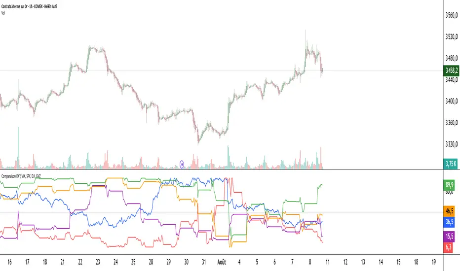
Comparaison DXY, VIX, SPX, DJI, GVZPine Script indicator compares the normalized values of DXY, VIX, SPX, DJI, and GVZ indices on a single scale from 0 to 100. Here's a breakdown of what it does:
Data Requests: Gets closing prices for:
US Dollar Index (DXY)
VIX Volatility Index
S&P 500 (SPX)
Dow Jones Industrial Average (DJI)
Gold Volatility Index (GVZ)
Normalization: Each index is normalized using a 500-period lookback to scale values between 0-100, making them comparable despite different price scales.
Visualization:
Plots each normalized index with distinct colors
Adds a dotted midline at 50 for reference
Uses thicker linewidth (2) for better visibility
Timeframe Flexibility: Works on any chart timeframe since it uses timeframe.period
This is useful for:
Comparing relative strength/weakness between these key market indicators
Identifying divergences or convergences in their movements
Seeing how different asset classes (currencies, equities, volatility) relate
You could enhance this by:
Adding correlation calculations between pairs
Including options to adjust the normalization period
Adding alerts when instruments diverge beyond certain thresholds
Including volume or other metrics alongside price
Master Trend & Reversal Indicator [UTC-4 LEMAZZE]It looks like you've shared a Pine Script code for a comprehensive trading indicator called "Master Trend & Reversal Indicator ". This is a sophisticated indicator that combines multiple technical analysis tools and trading concepts. Let me break down what this script does:
Key Features:
Trading Session Hours:
Allows configuration of trading hours (UTC-4 timezone by default)
Includes killzones for Asian, London, and pre-market sessions
Technical Indicators:
VWAP (Volume Weighted Average Price) with standard deviation bands
RSI (Relative Strength Index) with divergence detection
ATR (Average True Range) for volatility filtering
Trading Signals:
Swing point detection (highs/lows)
Breakout signals with retest confirmation option
Divergence signals (bullish/bearish)
Visual Elements:
Plots VWAP and its bands
Marks divergence and breakout signals
Colors background for significant ATR movements
Shows pre-market levels
Statistics Table:
Displays current filter statuses
Shows daily PnL (Profit and Loss)
Tracks daily loss limit
Indicates trading session status
Risk Management:
Includes a daily loss limit feature
Multiple filter options (trend, volume, ATR)
Customization Options:
The script provides numerous user inputs to customize:
Trading hours
Indicator parameters (VWAP period, RSI settings, ATR values)
Which killzones to display
Various filter toggles
Breakout confirmation settings
Timezone Note:
The indicator is set up for UTC-4 timezone (as noted in the title), which is likely Eastern Time (ET) with daylight savings. The comments suggest it also accommodates UTC+2 timezone users.
This appears to be a professional-grade trading tool that combines multiple technical indicators with trading session awareness and risk management features. The creator (JM81) has designed it to work specifically during certain market hours and includes features to help identify significant moves and potential reversals.

Supertrend + Range Detector- LEMAZZEIt looks like you're sharing a Pine Script code for a TradingView indicator called "Supertrend + Range Detector JM81". This indicator combines two popular trading tools:
Supertrend - A trend-following indicator that shows potential buy/sell signals based on price crossing above/below a dynamic line calculated using ATR (Average True Range).
Range Detector - Identifies consolidation ranges in the market by detecting when price stays within a certain distance (based on ATR) from a moving average for a specified period.
Key features I notice:
Customizable parameters for both components
Visual alerts for trend changes (buy/sell signals)
Color-coded range boxes that change when broken
Option to show/hide background trend colors
Clean visual presentation with adjustable transparency
The script appears well-structured with clear sections for each component and style customization options.

Range Detector- LEMAZZEIt looks like you've shared a Pine Script code for a "Range Detector" indicator. This indicator identifies price ranges on a chart and visually represents them with boxes and lines. Here's a breakdown of what it does:
Key Features:
Range Detection:
Uses a moving average (SMA) and ATR (Average True Range) to define price ranges
A range is identified when price stays within ± (ATR × multiplier) of the SMA for a specified length of bars
Visual Elements:
Draws boxes around the detected ranges
Plots a dotted midline within the range
Changes color when the range is broken (up/down)
User Inputs:
Adjustable minimum range length
Range width multiplier
ATR length for volatility calculation
Color customization for different states (broken upward, broken downward, unbroken)
Dynamic Behavior:
Extends ranges if new price action continues within bounds
Changes color when price breaks out of the range
Can merge adjacent ranges if they overlap
How to Use:
When price consolidates within a range, you'll see a box with a dotted midline
If price breaks above, the box turns green (upward break)
If price breaks below, the box turns red (downward break)
The unbroken range remains blue
This indicator could be useful for identifying consolidation periods and potential breakout opportunities in price action trading. The ATR-based range width makes it adaptive to current market volatility.

Swing Breakouts & Liquidity Sweeps - LEMAZZEIt looks like you've shared a Pine Script code for a TradingView indicator called "Swing Breakouts & Liquidity Sweeps - LEMAZZE." This indicator combines two trading concepts:
Swing Breakouts - Identifies potential breakout areas from swing highs/lows with test/retest labels.
Liquidity Sweeps - Detects when price sweeps liquidity (wick breaks) beyond swing points.
Key Features:
Swing Breakouts:
Customizable display options (bullish/bearish/both)
Adjustable width using ATR multiplier
Maximum bars without signal setting
Test/retest label display options
Color customization for bullish/bearish areas
Liquidity Sweeps:
Detects wick breaks and proper breaks of swing points
Three display modes (only wicks, only breakouts, or both)
Color customization for bull/bear sweeps
Extended area display option
How It Works:
It identifies swing highs/lows using pivot points
Creates zones around these swings where breakouts might occur
Tracks liquidity sweeps (wick breaks beyond swing points)
Marks test/retest scenarios with different label styles
Usage Tips:
The indicator works best on higher timeframes (1H+)
Combine with other confirmation signals for better accuracy
The liquidity sweeps can help identify potential stop runs
The breakout areas show zones where price might react

Fractal/Imbal/Fvg with RSI Dashboard - LEMAZZEIt looks like you've shared a Pine Script code for a TradingView indicator called "Fractal/Imbal/Fvg with RSI Dashboard - LEMAZZE". This indicator combines several technical analysis concepts:
RSI Dashboard: Shows the RSI (Relative Strength Index) value in a table at the top right, colored green when between 30-70 and red otherwise.
Fractals: Identifies fractal patterns (high and low points) with customizable settings for:
Showing fractals
Showing market structure breakouts
Break type (Wick+Body or Body only)
Periods (default 4)
Line styles and colors
Imbalances/Fair Value Gaps (FVG): Detects price imbalances with options to:
Show breakout imbalances
Show other imbalances
Hide filled gaps
Customize colors
Order Blocks: Shows order blocks with customization options for colors and visibility.

Market Structures BOS/CHoCH Major- LEMAZZEHere's a breakdown of what the indicator does:
Input Parameters:
Allows customization of pivot period for order block detection
Provides style and color options for Bullish/Bearish BoS and ChoCh lines
Core Functionality:
Uses zigzag pattern detection to identify pivot highs and lows
Classifies pivots into different types (HH, LH, HL, LL) and tracks major/minor pivots
Detects Break of Structure (BoS) when price breaks a major level in the direction of the current trend
Detects Change of Character (ChoCh) when price breaks a major level against the current trend
Visualization:
Draws lines and labels for major BoS and ChoCh events
Differentiates between bullish (blue/green) and bearish (orange/red) structures
Allows customization of line styles (solid, dashed, dotted)
Trend Tracking:
Maintains an internal state of the market trend (Up, Down, or No Trend)
Updates trend based on BoS and ChoCh events
The indicator is designed to help traders identify significant market structure changes that often precede trend continuations (BoS) or reversals (ChoCh). The "Major" designation means it focuses only on the most significant structural levels.
The code is quite complex with extensive array manipulation to track pivot points and their classifications. It uses multiple arrays to store different types of pivots (major/minor) and their properties.

AI BUY AND SELL BGThe Gk fundamental is a next gen level ai powered BUY and SELL system engineered for big market moves, it runs an embedded algorithm within a algorithm to detect breakout points before they happen giving traders insane results
works best and only 2h and 4h

Minimal S/R Zones with Volume StrengthHow it works
Pivot Detection
A pivot high is a candle whose high is greater than the highs of a certain number of candles before and after it.
A pivot low is a candle whose low is lower than the lows of a certain number of candles before and after it.
Parameters like Pivot Left Bars and Pivot Right Bars control how sensitive the pivots are.
Zone Creation
Pivot High → creates a Resistance zone.
Pivot Low → creates a Support zone.
Each zone is defined as a price range (top and bottom) and drawn horizontally for a given lookback length.
Volume Strength Filter
Volume Strength (%) = (Volume at Pivot / Volume SMA) × 100.
If the strength is below the minimum threshold (Min Strength %), the zone is ignored.
This ensures only pivots with significant trading activity create zones.
Zone Management
The indicator stores zones in arrays.
Max Zones per side prevents too many zones from being displayed at once.
Older zones are removed when new ones are added beyond the limit.
Visuals
Support zones → green label with Volume Strength %.
Resistance zones → red label with Volume Strength %.
Zones have semi-transparent boxes so price action remains visible.

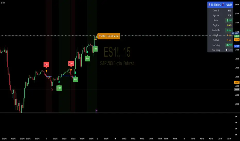
TSI Indicator with Trailing StopAuthor: ProfitGang
Type: Indicator (visual + alerts). No orders are executed.
What it does
This tool combines the True Strength Index (TSI) with a simple tick-based trailing stop visualizer.
It plots buy/sell markers from a TSI cross with momentum confirmation and, if enabled, draws a trailing stop line that “ratchets” in your favor. It also shows a compact info table (position state, entry price, trailing status, and unrealized ticks).
Signal logic (summary)
TSI is computed with double EMA smoothing (user lengths).
Signals:
Buy when TSI crosses above its signal line and momentum (TSI–Signal histogram) improves, with TSI above your Buy Threshold.
Sell when TSI crosses below its signal line and momentum weakens, with TSI below your Sell Threshold.
Confirmation: Optional “Confirm on bar close” setting evaluates signals on closed bars to reduce repaint risk.
Trailing stop (visual only)
Units are ticks (uses the symbol’s min tick).
Start Trailing After (ticks): activates the trail only once price has moved in your favor by the set amount.
Trailing Stop (ticks): distance from price once active.
For longs: stop = close - trail; it never moves down.
For shorts: stop = close + trail; it never moves up.
Exits shown on chart when the trailing line is touched or an opposite signal occurs.
Note: This is a simulation for visualization and does not place, manage, or guarantee broker orders.
Inputs you can tune
TSI Settings: Long Length, Short Length, Signal Length, Buy/Sell thresholds, Confirm on Close.
Trailing Stop: Start Trailing After (ticks), Trailing Stop (ticks), Show/Hide trailing lines.
Display: Toggle chart signals, info table, and (optionally) TSI plots on the price chart.
Alerts included
TSI Buy / TSI Sell
Long/Short Trailing Activated
Long/Short Trail Exit
Tips for use
Timeframes/markets: Works on any symbol/timeframe that reports a valid min tick. If your market has large ticks, adjust the tick inputs accordingly.
TSI view: By default, TSI lines are hidden to avoid rescaling the price chart. Enable “Show TSI plots on price chart” if you want to see the oscillator inline.
Non-repainting note: With Confirm on bar close enabled, signals are evaluated on closed bars. Intrabar previews can change until the bar closes—this is expected behavior in TradingView.
Limitations
This is an indicator for education/research. It does not execute trades, and visuals may differ from actual broker fills.
Performance varies by market conditions; thresholds and trail settings should be tested by the user.
Disclaimer
Nothing here is financial advice. Markets involve risk, including possible loss of capital. Always do your own research and test on a demo before using any tool in live trading.
— ProfitGang