Bitcoin: Mayer MultipleMayer Multiple Indicator
The Mayer Multiple is a powerful tool designed to help traders assess market conditions and identify optimal buying or selling opportunities. It calculates the ratio between the current price and its 200-day simple moving average (SMA), visualizing key thresholds that indicate value zones, caution areas, and overheated markets.
Key Features:
Dynamic Market Zones: Clearly marked levels like "Smash Buy," "Boost DCA," and "Extreme Euphoria" to guide your trading decisions.
Customizable Input: Adjust the SMA length to fit your strategy.
Color-Coded Signals: Intuitive visualization of market sentiment for quick analysis.
Comprehensive Thresholds: Historical insights into price behavior with plotted reference levels based on probabilities.
This indicator is ideal for traders aiming to enhance their long-term strategies and improve decision-making in volatile markets. Use it to gain an edge in identifying potential turning points and managing risk effectively.
MAYERMULTIPLE
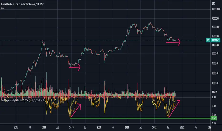
Tri-MayerMultiple by USCG_VetThe Mayer Multiple was created by Trace Mayer as a way to analyze the price of an asset in a historical context.
The Mayer Multiple is the multiple of the current price over some x-day moving average.
I preferred to display multiple average lines as they can help with identifying divergences.
Mikolaj Zakrzowski - Adjusted Mayer MultipleAuthor - Publication: Mikołaj Zakrzowski, Marek Zatwarnicki
Author - Algorithm: Mikołaj Zakrzowski
Author - Code: Marek Zatwarnicki, Derek Gruening
Inspired by: Mayer Multiple by Trace Mayer
Category: Technical Analysis
Type: Indicator
Timeframe: 1D Only
Index: INDEX:BTCUSD Only
About:
According to Willy Woo Mayer Multiple is "A way to gauge the current price of Bitcoin against its long range historical price movements (200 day moving average), the Mayer Multiple highlights when Bitcoin is overbought or oversold in the context of longer time frames".
My friend, Mikolaj Zakrzowski, decided to modify and adjust this indicator so that it could be normalized. This procedure allows for easier interpretation, and clear signals of the end of the ups and downs of a given Bitcoin cycle.
How to use:
BUY - Buy some Bitcoin , when label on last candle shows "Buy".
SELL- Sell some Bitcoin , when label on last candle shows "Sell".
Formula:
- Mayer Multiple - Close / ta. sma (close, 200)
- Formula for normalization is an intellectual property of Mikolaj Zakrzowski.
Overfitting: The presented algorithm is characterized by log regresion determined as of 01/01/2022. Tests with historical data show that the algorithm is very likely to work equally well the following years.
Disclaimer: Past good results do not guarantee future trading success. Please use the algorithm with caution and support it with your knowledge. Published algorithm decisions are not financial advice.

Mayer Multiple Bands [TXMC]This Bitcoin indicator provides level bands using price distance from the 200 day moving average, also known as the Mayer Multiple.
The percentage levels are based on historical distribution of the Mayer Multiple since Bitcoin's inception, and are meant to inform the user of price action probabilities.
Usage examples:
The 25% line means that 25% of Bitcoin's price history has traded below that distance away from the 200 day moving average.
A value of 95% means that only 5% of Bitcoin's price history has extended that far above the 200 day moving average.
Levels displayed:
5% (5% chance of trading below)
10% (10% chance of trading below)
20%
75%
90% (10% chance of trading above)
95% (5% chance of trading above)
This indicator is for information purposes only . Use at your own discretion.

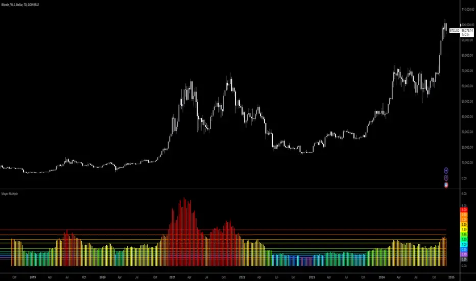
Mayer Multiple RainbowUses a more recent sampling (since 2013) to generated Mayer Multiple distribution.

Mayer Multiple Dynamic Histogram [arviman]Plots dynamic levels of the standard mayer multiple based on percentile of recent history. This allows you to view color coded information in a more dynamic fashion.
Hope this helps give you an overview of the current market.
This can be used for crypto but also for quick analysis of the current trend for any other instruments like stocks.
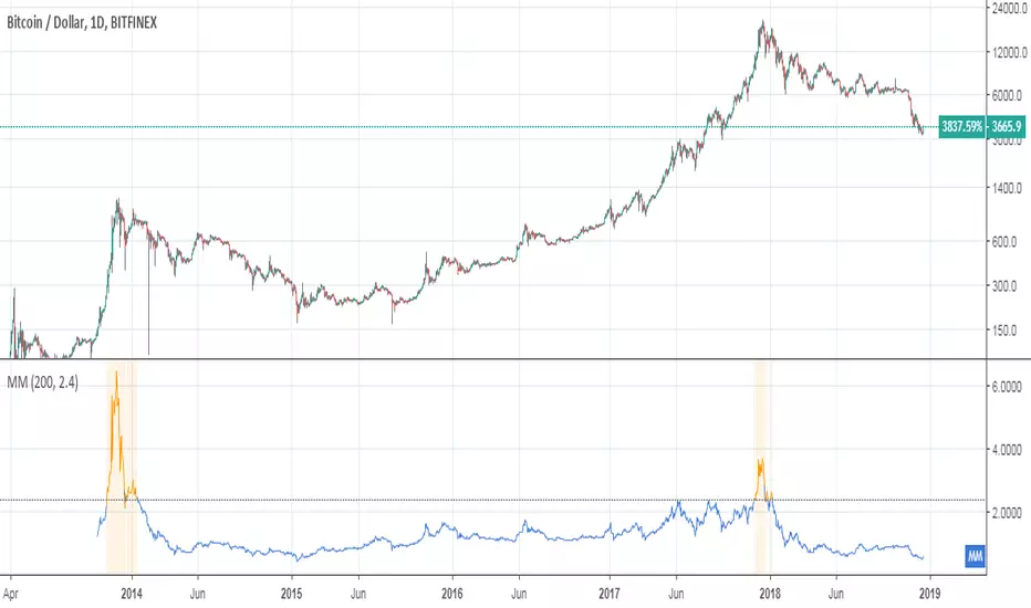
Mayer MultipleThe script implements a custom version of the Mayer multiple and it may be useful for analyzing the price of Bitcoin in a historical context.
Note n.1: Mayer multiple does not tell whether to buy, sell or hold, but highlights the best long-term area when the bitcoin price is below a threshold value (2.4).
Note n.2: the threshold value (2.4) has been determined in the past by simulations performed.
The script user may decide whether to use the shown graph or another graph for the calculation of the Mayer multiple.
The script is very easy to use and it is possible to change the following parameters:
the period of SMA (default value is 200)
the threshold (default value 2.4)
Show or not the sell area
Use or not the shown graph to calculate the Mayer multiple (default value is true)
name of exchange to use for calculation of the Mayer multiple (default value is BNC)
name of chart to use for calculation of the Mayer multiple (default value is BLX)
Indicator: Weight Of Middle [xQT5]This is my original indicator that was inspired by "Mayer Multiple" and "Chande Forecast Oscillator" (CFO).
I decided to search truth of trend power with SMA and LinReg and found it in a somewhere of the middle. Also, I added a limit area, where you need to keep a more attention, because it can show a potential reversal.
You can change parametrs with a your own look.
One more signal for indicator:
- If "WOM" is above "1" - it's a bullish direction;
- If "WOM" is below "1" - it's a bearish direction.
Enjoy it!

BTC Mayer Multiple BandsIntroduced by Trace Mayer as a way to gauge the current price of Bitcoin against its long range historical price movements (200 day moving average), the Mayer Multiple highlights when Bitcoin is overbought or oversold in the context of longer time frames.
It's worth noting that as the market becomes larger and less volatile, the peaks are becoming less exaggerated. This is because a 200 day moving average baseline is a static yardstick against an ever growing, more stable, Bitcoin market. We should recalibrate what constitutes the overbought/oversold extremes on this chart accordingly.
Idea by CryptoKea. Original author:

MACD & Mayer multpile Crypto-EmbassyThis is a combination of two indicators MACD & The Mayer Multiple.
MACD = Short for moving average convergence/divergence. It is designed to reveal changes in the strength, direction, momentum, and duration of a trend in a stock's price.
You will find the normal histogram and also a generated trend line (green = bullish , red = bearish )
The Mayer Multiple = The Mayer Multiple was created by Trace Mayer as a way to analyse the price of Bitcoin in a historical context. The Mayer Multiple is the multiple of the current price over the 200-days moving average.
"It does NOT tell whether to buy, sell or hold" but it gives you a pretty good idea of where we are at.
Basically
🔵Blue = Please buy🙏
🟢Light green = Looking for good entries 👀
🟢Green = Buy if you wish
🟡Yellow = This is starting to take off
🟠Orange = Looking for good exit 👀
🔴Red = You should get out of this
🔴Dark Red = You have balls, now please sell🙏

BEST Mayer MultipleHello traders
I'm not a HODLer by any means. I know when to sell (or I think I know....) when an asset starts going against me too much.
Even if it's a "long-term" investment.
My mentor used to telling me this: "If a short-term trade becomes a long-term investment, then you're in for a hell of a ride".
I have no clue if Bitcoin/BTC will go back up or not - I don't even care because I'm an intraday trader.
What if BTC was actually a way to accumulate more fiat? Satoshi fooled us
I coded this Mayer Multiple according to the specifications below. By the way, I'm a big fan of Willy Woo. I've been monitoring all his work since I learned about crypto (10 minutes ago.... it's a joke come on)
charts.woobull.com
Scaling
To respect the Mayer's multiple model, I recommend to select the Logarithmic scaling as shown below
imgur.com
What Mayer's model says
Using the reference below, the model says we're in the oversold zone. But, we can be in that zone for months/years...
When a model says an asset could bounce in a 1000-7000 USD range... well... I don't know how I would be able to perform optimally with that insight. This is very subjective and not a recommendation.
Mayer's Multiple model reference
All the BEST
Dave

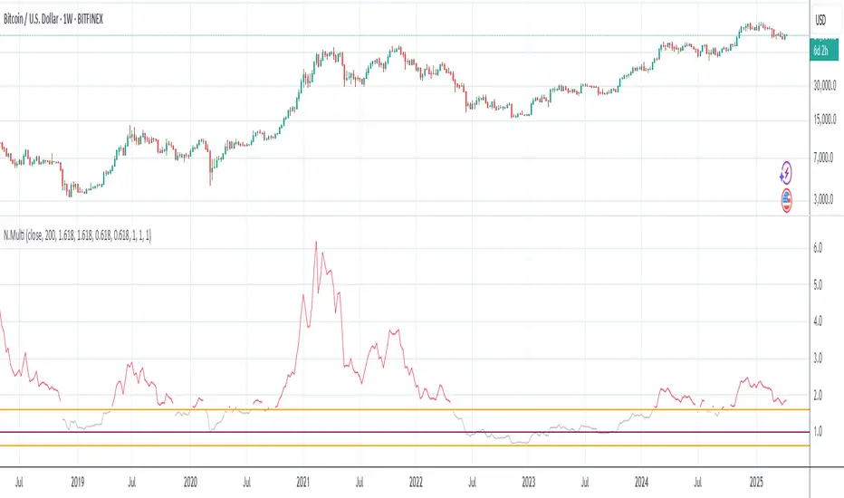
Al Po Multiples [ADV]Al Po Multiples - is the logical evolving of a very well known to every bitcoiner Mayer Multiples formula. Instead of fixed constants (like 200MA, current price and below or above the 1, etc.), I use a variable values which helps in general to set the very best values for separate timeframes.
You can set Buy and Sell borders to separate green/red/yellow fields for better visual integrity.
Mayer Multiple [ChuckBanger]The Mayer Multiple is calculated by dividing the current price by 200-day moving average so you have to use daily charts fort it to work properly. This script is design to be a help for deciding when to buy Bitcoin and when it is time to sell your HODL position. This script uses moving average for optimal sell and buy points. In time of writing the average Mayer Multiple is 1.47 for the history of Bitcoin.

Mayer Multiple Optimal Multi-Color Histogram [aamonkey]Mayer Multiple developed by Trace Mayer gives the ratio of price to 200 daily moving average.
Buy when it's white sell when it's orange.
Is intended for use on day chart only.
This is an extension of the Mayer Multiple developed by Trace Mayer.
Normally you only have 2 thresholds signaling buying or selling (blue and yellow).
However, I added 2 more thresholds signaling optimized buys and sells (white and orange).

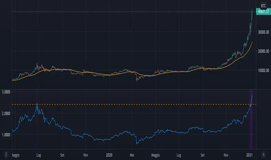
Mayer MultiplerThe ‘Mayer Multiple’ is one of the most popular metrics and derives from the current price divided by the 200-day moving average (200-MA). The average value is 1.39, and historically, when it becomes equal to or greater than 2.4 it will retrace to under 1.5.
Simulations performed by Trace Mayer determined that in the past, the best long-term results were achieved by accumulating Bitcoin whenever the Mayer Multiple was below 2.4.
Since the simulations were based on historical data, they are purely educational and should not be the basis of any financial decision.
Credit:
bitcoinist.com
mayermultiple.info

Mayer Multiple | SMA Line Indicator [AJ]Inspired by Trace Mayer's 200 Day SMA cryptocurrency valuation method
I take no credit for the formula used to calculate the Mayer Multiple or the Mayer Multiple itself
For use with the Mayer Multiple Histogram Indicator which gives a visual of this line indicator
This line indicator should be used for setting alerts.
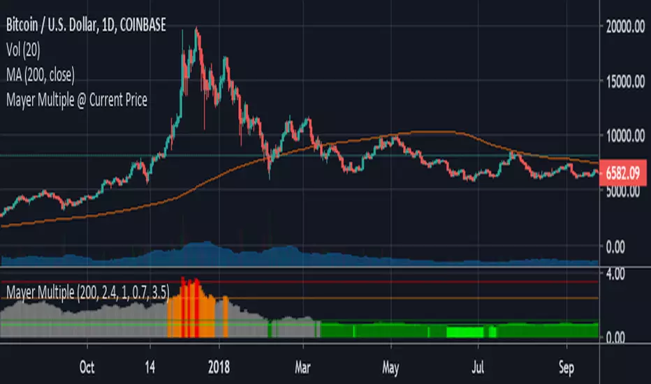
Mayer Multiple Histogram [AJ]Mayer Multiple Histogram Indicator | Customized by AJ Robertson
@Version=2
I take no credit for the actual formula used to calculate the Mayer Multiple or the Mayer Multiple itself.
For use with Mayer Multiple Line Indicator
The histogram helps give a visual representation while the line indicator is used to set alerts
I've set an additional optimal buy color which is the Mayer Multiple at or below 0.7 as this is optimal accumulation threshold
Also set an optimal sell color (red) which is the Mayer Multiple at or above 3.5
Color Coding
Red (Hist) = Optimal Sell
Red (Line) = Backtesting threshold
Orange = Overvalued
Gray = Hold
Green (dark) = Undervalued
Lime (light green) = Optimal Accumulation Zone

Bitcoin Stock To Flow Model Value (fixed)This indicator shows the Bitcoin value based on the Stock To Flow Model by planB
Fixed version of the original script by yomofoV:
Split up into 2 seperate indicators so you can put it into two seperate panes. This is the S2F Model Value.
You can find the S2F Multiple indicator here:
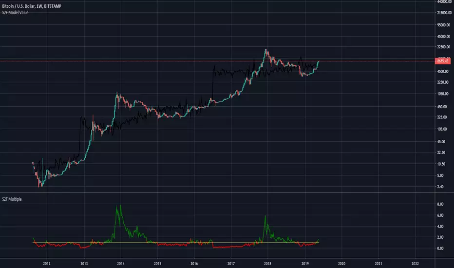
Bitcoin Stock to Flow Multiple (fixed)This is a fixed version of the original script by yomofoV:
I fixed the variable assignments and added switching of timeframes over indicator inputs.
To switch timeframes click on the indicator, open its settings and switch the timeframe to either monthly, weekly or daily.

Bitcoin Stock to Flow Multiplethis study plots the price of btc over the Stock to Flow Model value
idea credited to: 100trillionUSD
my data is a bit off compared to the original source but overall it seems correct

Major Mayer MultipleAdjusted version of the BTC Mayer Multiple developed by Trace Mayer www.theinvestorspodcast.com
This version includes two novelties. The first one replaces BTC with Total Market Cap from 2016/2017 (depending on your moving averages) to present and the second is that we consider two Moving Averages to produce more detailed lows.

🔗 Blockchain Rhythms by Cryptorhythms🎼 Blockchain Rhythms v1.0 by Cryptorhythms
This indicator and data plot suite is for bitcoin BTCUSD analysis over longer periods and higher time frames. 🚨For this to plot anything you must use on Daily or higher timeframe🚨 .
You want to have an alternative to the typical technical indicators you see everywhere? This is it. Seen crypto twitter talking about/using all sorts of indicators you have never seen before on tradingview? Here you go. Are you a long term investor and not a short term speculator?... I think you get the picture...
With the wealth of data here, I cannot go into a fully detailed analysis for every indicator. Please make liberal use of google and as always DYOR before trading on a system you have never used.
These indicators are best observed versus a logarithmic price scale. If I have missed any indicators you think should be in here let me know! Let me preempt that by saying MVRV and UTXO Age Distribution are not possible to create on Tradingview at this time.
🚧Error Screen:
If you see this you need to choose a data-point or indicator to plot!
⌚If you are loading this indicator with alot of chart history shown (as in the example screenshots) it may take up to a minute to load.
Please note: some of the screenshots below show chart title plots which I subsequently had to remove due to limitations. If you would like a title for all the plot, simple use the Indicator Labels checkbox option located in the scales tab of chart settings.
[b📊 Fundamental Blockchain Indicators
NVT Signal & Ratio
Both are related. NVT / NVT Signal can be interpreted as the strength of market confidence in the means of payment / settlement layer narrative. A “measure of the chain’s strength as a payment network compared to its market value — a low NVT may suggest that a network is undervalued compared to the service it is providing as a settlement layer” (Matteo Leibowitz).
💰NVT Ratio:
NVT Ratio (Network Value to Transactions Ratio) is similar to the PE Ratio used in equity markets.
When Bitcoin`s NVT is high, it indicates that its network valuation is outstripping the value being transmitted on its payment network, this can happen when the network is in high growth and investors are valuing it as a high return investment, or alternatively when the price is in an unsustainable bubble.
🚦NVT Signal:
NVT Signal (NVTS) is a derivative of NVT Ratio created by Dimitry Kalichkin. This indicator provides more emphasis on predictive signaling ahead of price peaks.
🚀Bitcoin Velocity
Velocity is a measure of how quickly money is circulating in the economy. Is bitcoin trending towards savings or payments? This can help you decide. It is similar to Bitcoin Network Momentum, except this takes into account bitcoins increasing supply.
🏃Bitcoin Network Momentum
Network Momentum is a view created by PositiveCrypto which looks into the value transmitted through the Bitcoin blockchain denominated in BTC value plotted against Bitcoin's price. It serves as a leading indicator to bitcoin price, in that we need high levels of value throughput to drive the bull market. This indicator is experimental.
Both daily transaction values and price exhibit cyclical patterns, but not in sync with each other. A hypothesis to explain the mismatch is that short-term mindset traders (using exchanges) heavily influence price; but long-term mindset investments (more likely to be directly recorded on-chain) have a greater contribution to the daily transaction value recorded in the ledger.
An alternative to the NVT / NVT Signal - tracks the relationship between Bitcoin’s price and BTC volume flowing through the blockchain network.
Ⓜ Mayer Multiple
Introduced by Trace Mayer as a way to gauge the current price of Bitcoin against its long range historical price movements (200 day SMA by default), the Mayer Multiple highlights when Bitcoin is overbought or oversold in the context of longer time frames.
It`s worth noting as the market becomes larger and less volatile, the peaks are becoming less exaggerated. This is because a 200 day moving average baseline is a static yardstick against an ever growing, more stable, Bitcoin market. We should eventually re-calibrate what constitutes the overbought/oversold extremes on this chart accordingly.
A more fully featured Mayer Multiple version available here:
💲 BTC Marketcap and Thermocap
We are all familiar with marketcap, but it does come with its disadvantages.
A more appropriate measure of network value was recently put forth by Nic Carter. Remember capital flows in crypto generally do not come in via exchanges (miners notably like to sell OTC). Every buy in an exchange is matched by a sell. Money that comes in = money that goes out.
True inflows (in Bitcoin, at least) are the aggregate of resources spent by miners¹. And a good proxy for that is the amount these folks are earning back from networks they support in return for their investments. That’s aggregate security spend (or Thermocap): what was actually paid out to miners (transactions * their price in USD at the time they were mined).
There is an option to deduct lost coins, genesis (Satoshi's) coins, and dead HODL'ers coins from the marketcap. This information was taken from ChainAnalysis' 2017 report
This shows both plots for comparison on a logrithmic scale:
⛏Mining Indicators & Data
⛏ Petahash Dollar Ratio
Bitcoin’s Hashrate (Daily PetaHashes) to Daily Mining Earnings (PetaHashDollar) is a robust metric to asses the day to day mining profitability. In addition, when plotted over the past five years, its overall trend represents a good way to quantify and visualize the relative progress in efficiency of ASICs (more specifically the inverse of that metric: 1/relative mining efficiency).
⛏Unmined Coins Marketcap
A simple statistic I created to plot the value of the unmined BTC still waiting to be extracted. If you find any interesting value for analysis please message me and let me know.
⛏Percentage of Total BTC Mined
I hope this one doesnt need an explanation. 😅
#️⃣ Network Hash Rate
A network's hashrate is the most important data point in blockchain tech. It indicates to the world how secure its network is. The hashrate is the "bridge" between the analog world, and the digital world. Essentially, the hashrate describes how much computing power (called hashing power in blockchain speak) is being thrown at the network, by users all across the world. These "miners" are running servers with dedicated processing chips to solve random, cryptographic math problems. The reason miners do this constant computing is that it betters their chances to reap a "block reward." The block reward entitles them to:
1.)Newly "mined" coins, and
2.)Transaction fees
Both of these are typically paid out with each new block. This rewards miners for their “proof-of-work.” It signals to the world that real "work" and resources, like electricity, have been spent on the Bitcoin network.
As more and more miners compete for the block reward, the hashrate, mining calculations and block difficulty will increase. This increase in the network's hashrate over time means an increase in the network’s security. Much better detail on this is available elsewhere, but primarily, this process solves digital money's vulnerability to attacks and the "double spend" problem.
I like to plot it directly on the price chart (click on the indicator and drag it up)
⛏ Revenue Per Transaction
A chart showing miners revenue divided by the number of transactions.
Fee Per Block Kilobyte
A measure of how much it costs per kilobyte of blockchain block size.
⛏Return Per TeraHash (TH)
Revenue per TH of mining hash power.
Can also be plotted on price chart and looks nice:
Cost Per TX (CPT) and Cost % Per TX Volume
CPT - A chart showing miners revenue divided by the number of transactions
C%PRV - A chart showing miners revenue as percentage of the transaction volume
Blockchain Statistics & Data Plots
🏋Network Difficulty
A relative measure of how difficult it is to find a new block. The difficulty is adjusted periodically as a function of how much hashing power has been deployed by the network of miners.
I like plotting this one on price chart as well:
Daily Output Value
The total value of all transaction outputs per day (includes coins returned to the sender as change).
🔢Number of Unique Addresses Used
Addresses are kind of like bank accounts.
Unlike bank accounts, addresses on the blockchain can be generated by anyone, anywhere and one single person could have thousands.
The plot shows bitcoins growth of addresses which are both unique and active per day, smoothed out over 14 days for clarity (using a zero lag ema). As you can see bull runs typically lead to more unique addresses the assumption being that more new money is drawn into the market due to the news cycle.
This is another one I prefer to plot on the price chart.
🔢Number of Transactions (NoTX) and NoTX - Exchange Wallets
Number of TX's on the chain (green line) and NoTX minus (-) Exchange Wallets (blue line).
⏳ Median Confirmation Time
The median time for a transaction to be accepted into a mined block and added to the public ledger (note: only includes transactions with miner fees). Displayed in minutes.
🔊Volume Dominance (Liquidity to Transaction Volume Ratio)
Volume Dominance is another metric I invented simply to show the ratio between spot exchange TXs (liquidity/speculation) and blockchain TXs (utility/HODLing). Its shows percent of volume attributed to blockchain TXs.
🙃 We REALLY hope you enjoy and find this indicator useful. I certainly enjoyed creating it and learned quite a bit myself manipulating the data! I welcome any suggestions or ideas you may have to further extend, or create new indicators.
👍 Enjoying this indicator or find it useful? Please give me a like and follow! I post crypto analysis, price action strategies and free indicators regularly.
💬 Questions? Comments? Want to get access to an entire suite of proven trading indicators? Come visit us on telegram and chat, or just soak up some knowledge. We make timely posts about the market, news, and strategy everyday. Our community isn't open only to subscribers - everyone is welcome to join.

Mayer MultipleThis indicator was created by Trace Mayer as a way to analyze the price of Bitcoin in a historical context. Consider it as a kind of Volatility Ratio that was created by Jack Schwager for the securities.
To learn more about Mayer Multiple see:
charts.woobull.com
mayermultiple.info
www.theinvestorspodcast.com
Good luck!