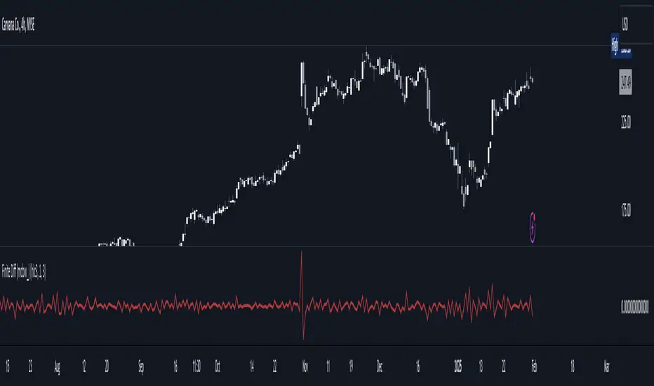
Finite Difference - Backward (mcbw_)In calculus there exists a 'derivative', which simply just measures the difference between two points on a curve. For well behaved mathematical functions there are infinitely many points and so there exists a derivative at every point. Where there are infinitely many points in a curve that curve is called 'continuous'. Continuous curves are very nice to deal with since each point on it exists almost exactly where its neighbors are. However, if the curve does not have infinitely many points on it, but instead has a finite number of points on it, that curve is called 'discrete' instead of continuous. Taking the derivative of discrete curves is much trickier business since there are none of the mathematical conveniences that a continuous offers. In the real world everything we measure is a discrete curve, including Price (since we measure it a finite number of times, aka each candlestick)!
The branch of Discrete Mathematics has found an approach to measure the derivative along a discrete curve, that approach is aptly called " Finite Difference ". To get a more accurate approximation of a discrete derivative, the finite difference approach uses weighted combinations of neighboring points. The most common type of finite difference is a 'central' difference, this uses a combination of points before and after the point of interest to approximate the discrete derivative. This is great for historical analysis but is not of much use for trading algorithms since it technically means using future prices to calculate the derivative of the current point. Instead we can use a less common variant called a ' Backwards Difference ' that only uses a combination of points before the current one to help approximate the current derivative.
In this script you can choose the " Order " of your derivative and the " Accuracy " of its approximation. This script is for educational purposes for folks building trading algorithms. Many trading algorithms often have an element of seeing how much Price has changed from the previous candle to the current candle. This approach is the lowest accuracy derivative possible, and using the backwards finite differences, made available for the first time on TradingView (!!), algorithms that use derivatives can now have higher orders of accuracy!
Happy Trading/Developing!
Mcbw
Accurate Bollinger Bands mcbw_ [True Volatility Distribution]The Bollinger Bands have become a very important technical tool for discretionary and algorithmic traders alike over the last decades. It was designed to give traders an edge on the markets by setting probabilistic values to different levels of volatility. However, some of the assumptions that go into its calculations make it unusable for traders who want to get a correct understanding of the volatility that the bands are trying to be used for. Let's go through what the Bollinger Bands are said to show, how their calculations work, the problems in the calculations, and how the current indicator I am presenting today fixes these.
--> If you just want to know how the settings work then skip straight to the end or click on the little (i) symbol next to the values in the indicator settings window when its on your chart <--
--------------------------- What Are Bollinger Bands ---------------------------
The Bollinger Bands were formed in the 1980's, a time when many retail traders interacted with their symbols via physically printed charts and computer memory for personal computer memory was measured in Kb (about a factor of 1 million smaller than today). Bollinger Bands are designed to help a trader or algorithm see the likelihood of price expanding outside of its typical range, the further the lines are from the current price implies the less often they will get hit. With a hands on understanding many strategies use these levels for designated levels of breakout trades or to assist in defining price ranges.
--------------------------- How Bollinger Bands Work ---------------------------
The calculations that go into Bollinger Bands are rather simple. There is a moving average that centers the indicator and an equidistant top band and bottom band are drawn at a fixed width away. The moving average is just a typical moving average (or common variant) that tracks the price action, while the distance to the top and bottom bands is a direct function of recent price volatility. The way that the distance to the bands is calculated is inspired by formulas from statistics. The standard deviation is taken from the candles that go into the moving average and then this is multiplied by a user defined value to set the bands position, I will call this value 'the multiple'. When discussing Bollinger Bands, that trading community at large normally discusses 'the multiple' as a multiplier of the standard deviation as it applies to a normal distribution (gaußian probability). On a normal distribution the number of standard deviations away (which trades directly use as 'the multiple') you are directly corresponds to how likely/unlikely something is to happen:
1 standard deviation equals 68.3%, meaning that the price should stay inside the 1 standard deviation 68.3% of the time and be outside of it 31.7% of the time;
2 standard deviation equals 95.5%, meaning that the price should stay inside the 2 standard deviation 95.5% of the time and be outside of it 4.5% of the time;
3 standard deviation equals 99.7%, meaning that the price should stay inside the 3 standard deviation 99.7% of the time and be outside of it 0.3% of the time.
Therefore when traders set 'the multiple' to 2, they interpret this as meaning that price will not reach there 95.5% of the time.
---------------- The Problem With The Math of Bollinger Bands ----------------
In and of themselves the Bollinger Bands are a great tool, but they have become misconstrued with some incorrect sense of statistical meaning, when they should really just be taken at face value without any further interpretation or implication.
In order to explain this it is going to get a bit technical so I will give a little math background and try to simplify things. First let's review some statistics topics (distributions, percentiles, standard deviations) and then with that understanding explore the incorrect logic of how Bollinger Bands have been interpreted/employed.
---------------- Quick Stats Review ----------------
.
(If you are comfortable with statistics feel free to skip ahead to the next section)
.
-------- I: Probability distributions --------
When you have a lot of data it is helpful to see how many times different results appear in your dataset. To visualize this people use "histograms", which just shows how many times each element appears in the dataset by stacking each of the same elements on top of each other to form a graph. You may be familiar with the bell curve (also called the "normal distribution", which we will be calling it by). The normal distribution histogram looks like a big hump around zero and then drops off super quickly the further you get from it. This shape (the bell curve) is very nice because it has a lot of very nifty mathematical properties and seems to show up in nature all the time. Since it pops up in so many places, society has developed many different shortcuts related to it that speed up all kinds of calculations, including the shortcut that 1 standard deviation = 68.3%, 2 standard deviations = 95.5%, and 3 standard deviations = 99.7% (these only apply to the normal distribution). Despite how handy the normal distribution is and all the shortcuts we have for it are, and how much it shows up in the natural world, there is nothing that forces your specific dataset to look like it. In fact, your data can actually have any possible shape. As we will explore later, economic and financial datasets *rarely* follow the normal distribution.
-------- II: Percentiles --------
After you have made the histogram of your dataset you have built the "probability distribution" of your own dataset that is specific to all the data you have collected. There is a whole complicated framework for how to accurately calculate percentiles but we will dramatically simplify it for our use. The 'percentile' in our case is just the number of data points we are away from the "middle" of the data set (normally just 0). Lets say I took the difference of the daily close of a symbol for the last two weeks, green candles would be positive and red would be negative. In this example my dataset of day by day closing price difference is:
week 1:
week 2:
sorting all of these value into a single dataset I have:
I can separate the positive and negative returns and explore their distributions separately:
negative return distribution =
positive return distribution =
Taking the 25th% percentile of these would just be taking the value that is 25% towards the end of the end of these returns. Or akin the 100%th percentile would just be taking the vale that is 100% at the end of those:
negative return distribution (50%) = -5
positive return distribution (50%) = +4
negative return distribution (100%) = -10
positive return distribution (100%) = +20
Or instead of separating the positive and negative returns we can also look at all of the differences in the daily close as just pure price movement and not account for the direction, in this case we would pool all of the data together by ignoring the negative signs of the negative reruns
combined return distribution =
In this case the 50%th and 100%th percentile of the combined return distribution would be:
combined return distribution (50%) = 4
combined return distribution (100%) = 10
Sometimes taking the positive and negative distributions separately is better than pooling them into a combined distribution for some purposes. Other times the combined distribution is better.
Most financial data has very different distributions for negative returns and positive returns. This is encapsulated in sayings like "Price takes the stairs up and the elevator down".
-------- III: Standard Deviation --------
The formula for the standard deviation (refereed to here by its shorthand 'STDEV') can be intimidating, but going through each of its elements will illuminate what it does. The formula for STDEV is equal to:
square root ( (sum ) / N )
Going back the the dataset that you might have, the variables in the formula above are:
'mean' is the average of your entire dataset
'x' is just representative of a single point in your dataset (one point at a time)
'N' is the total number of things in your dataset.
Going back to the STDEV formula above we can see how each part of it works. Starting with the '(x - mean)' part. What this does is it takes every single point of the dataset and measure how far away it is from the mean of the entire dataset. Taking this value to the power of two: '(x - mean) ^ 2', means that points that are very far away from the dataset mean get 'penalized' twice as much. Points that are very close to the dataset mean are not impacted as much. In practice, this would mean that if your dataset had a bunch of values that were in a wide range but always stayed in that range, this value ('(x - mean) ^ 2') would end up being small. On the other hand, if your dataset was full of the exact same number, but had a couple outliers very far away, this would have a much larger value since the square par of '(x - mean) ^ 2' make them grow massive. Now including the sum part of 'sum ', this just adds up all the of the squared distanced from the dataset mean. Then this is divided by the number of values in the dataset ('N'), and then the square root of that value is taken.
There is nothing inherently special or definitive about the STDEV formula, it is just a tool with extremely widespread use and adoption. As we saw here, all the STDEV formula is really doing is measuring the intensity of the outliers.
--------------------------- Flaws of Bollinger Bands ---------------------------
The largest problem with Bollinger Bands is the assumption that price has a normal distribution. This is assumption is massively incorrect for many reasons that I will try to encapsulate into two points:
Price return do not follow a normal distribution, every single symbol on every single timeframe has is own unique distribution that is specific to only itself. Therefore all the tools, shortcuts, and ideas that we use for normal distributions do not apply to price returns, and since they do not apply here they should not be used. A more general approach is needed that allows each specific symbol on every specific timeframe to be treated uniquely.
The distributions of price returns on the positive and negative side are almost never the same. A more general approach is needed that allows positive and negative returns to be calculated separately.
In addition to the issues of the normal distribution assumption, the standard deviation formula (as shown above in the quick stats review) is essentially just a tame measurement of outliers (a more aggressive form of outlier measurement might be taking the differences to the power of 3 rather than 2). Despite this being a bit of a philosophical question, does the measurement of outlier intensity as defined by the STDEV formula really measure what we want to know as traders when we're experiencing volatility? Or would adjustments to that formula better reflect what we *experience* as volatility when we are actively trading? This is an open ended question that I will leave here, but I wanted to pose this question because it is a key part of what how the Bollinger Bands work that we all assume as a given.
Circling back on the normal distribution assumption, the standard deviation formula used in the calculation of the bands only encompasses the deviation of the candles that go into the moving average and have no knowledge of the historical price action. Therefore the level of the bands may not really reflect how the price action behaves over a longer period of time.
------------ Delivering Factually Accurate Data That Traders Need------------
In light of the problems identified above, this indicator fixes all of these issue and delivers statistically correct information that discretionary and algorithmic traders can use, with truly accurate probabilities. It takes the price action of the last 2,000 candles and builds a huge dataset of distributions that you can directly select your percentiles from. It also allows you to have the positive and negative distributions calculated separately, or if you would like, you can pool all of them together in a combined distribution. In addition to this, there is a wide selection of moving averages directly available in the indicator to choose from.
Hedge funds, quant shops, algo prop firms, and advanced mechanical groups all employ the true return distributions in their work. Now you have access to the same type of data with this indicator, wherein it's doing all the lifting for you.
------------------------------ Indicator Settings ------------------------------
.
---- Moving average ----
Select the type of moving average you would like and its length
---- Bands ----
The percentiles that you enter here will be pulled directly from the return distribution of the last 2,000 candles. With the typical Bollinger Bands, traders would select 2 standard deviations and incorrectly think that the levels it highlights are the 95.5% levels. Now, if you want the true 95.5% level, you can just enter 95.5 into the percentile value here. Each of the three available bands takes the true percentile you enter here.
---- Separate Positive & Negative Distributions----
If this box is checked the positive and negative distributions are treated indecently, completely separate from each other. You will see that the width of the top and bottom bands will be different for each of the percentiles you enter.
If this box is unchecked then all the negative and positive distributions are pooled together. You will notice that the width of the top and bottom bands will be the exact same.
---- Distribution Size ----
This is the number of candles that the price return is calculated over. EG: to collect the price return over the last 33 candles, the difference of price from now to 33 candles ago is calculated for the last 2,000 candles, to build a return distribution of 2000 points of price differences over 33 candles.
NEGATIVE NUMBERS(<0) == exact number of candles to include;
EG: setting this value to -20 will always collect volatility distributions of 20 candles
POSITIVE NUMBERS(>0) == number of candles to include as a multiple of the Moving Average Length value set above;
EG: if the Moving Average Length value is set to 22, setting this value to 2 will use the last 22*2 = 44 candles for the collection of volatility distributions
MORE candles being include will generally make the bands WIDER and their size will change SLOWER over time.
I wish you focus, dedication, and earnest success on your journey.
Happy trading :)

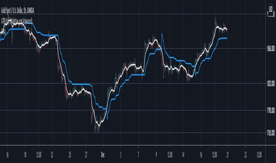
ATR Stop (Adaptive and Advanced)Hi everyone I am excited to share with you all a tool that has been in a lot of my research lately I and think would greatly benefit everyone.
In the last years I have fallen in love with ATR stoplosses/ stop and reverses. However all the ones offered in the community lacked the features that I wanted to have, so I built them all myself and want to share them with you all today!!!
Assuming that you are already familiar with ATR stops, here is what is new and improved with this version:
1. This script takes anything as an input! As you can see in the chart above I have used an EMA as an input into this script and this greatly smoothed out the results while still allowing for phenomenal entries with minimal whiplash. You can use this tool on anything now, from moving averages to oscillators.
2. Previous scripts were not adaptive, you can now choose how adaptive this script is! Increasing this number allows this ATR stop to follow price when it is running away so you don't have to give back much profit. Likewise it makes sure that the ATR stop slows down when the market is ranging so you wont get randomly stopped out.
3. You can now get it to start at the exact moment you enter your trade! Previous scripts had the ATR stop running forever which wasn't helpful if you only needed it for your own trades. You can now set it to start at the exact time of your trade if that is the only time you need it!
4. Now you can easily get alerts when the ATR stop gets hit.
Hope this helps you all!
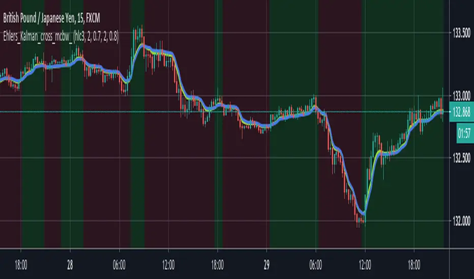
powerful moving average crossoverThis script is a simplified version of John Ehlers's adaption of Dr. Kalman's optimum estimator as applied to price action (More can be found on this here: www.dimensionetrading.com). Here I have adapted two of these optimum estimators to work together to provide crossover signals. The user can choose the input of this filter in the 'input source'. The 'Ratio of Uncertainties' controls how adaptive the moving averages are, increasing this number will increase adaptivity and vice versa for decreasing. The 'Kalman Gain' allows the user to choose how much error to let into the calculation. The smaller this number is the quicker the moving average will approach price action.
In practice this indicator is much smoother than most other moving averages and has significantly less whiplash while still getting very early entries. If anyone wants to adapt this script for their own uses please feel free. Message me what you make with it, I am very curious what this can do when in the right hands!
Happy trading!
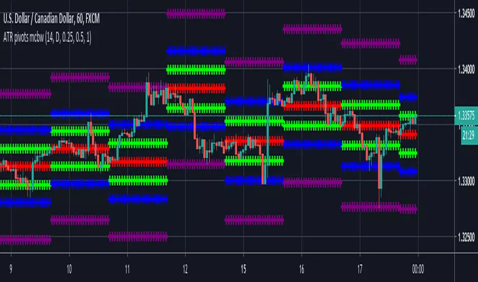
ATR based Pivots mcbwHey everyone this is an exciting new script I have prepared for you.
I was reading an old forex bulletin article some time ago when I came across this: solar.murty.net (or you can download the full bulletin with lots of other good articles here: www.forexfactory.com).
You can already buy this for metatrader (www.mql5.com) so I figured to make it for free for tradingview.
This bulletin suggested that you can reasonably predict daily volatility by adding or subtracting multiples of the daily ATR to the daily opening. Using this you can choose multiples to use as price targets and alternatively as stop losses. For example, if you already have a sense of market direction you can buy at market open place a stop loss at - 1 daily ATR and a profit target at + 3 ATRs for a risk to reward ratio of 3. If you are looking for smaller/quicker moves with a ratio of 3 you can have a stop loss at -0.25 ATR and a take profit at +0.75 ATR.
Alternatively this article also suggests to use this method to catch volatility breakouts. If price is higher than the + 1 ATR area then you can safely assume it will be going to the +2 ATR area so you can put a buy stop at + 1 ATR with a profit target at + 2 ATR with a stop loss at +0.5 ATR to catch a volatility breakout with a risk to reward ratio of 2!
Even further there are methods that you can use with ATRs of multiple window sizes, for example by opening two copies of this indicator and measuring recent volatility with a 1 week window and long term volatility within a 1 month window. If the short term volatility is crossing the long term volatility then there is a high probability chance that even more price movement will occur.
However I have found that this method is good for more than daily volatility , it can also be used to measure weekly volatility , and monthly volatility and use these multiples as good long term price targets.
To select if you want daily, weekly, or monthly values of the ATR of volatility you're using go to the settings and click on the options in the "Opening period". The default window of the ATR here is 14 periods, but you can change this if you want to in "ATR period". Most importantly you are able to select which multiples of the ATR you would like to use in the settings in "ATR multiple 1" which is the green line, "ATR multiple 2" which is the blue line, and "ATR multiple 3" which is the purple line. You can select any values you want to put in these, the choice of 0.25, 0.5, and 1 is not special, some people use fibonacci numbers here or simply 0.33, 0.66, and 0.99.
Repainting issue: This script uses the daily value of the Average True Range (ATR), which measures the volatility that is happening today. If price becomes more volatile then the value of the ATR can increase throughout the day, but it can never decrease. What this means is that the ATR based pivots are able to expand away from the opening price, which should not affect the trades that you take based on these areas. If you base your take profit on one of these ATR multiples and the daily volatility increase this means that your take profit area will be closer to your entry than the ATR multiple. Meaning that your trades will be more conservative.
While this all may sound very technical it is super intuitive, throw this on your chart and play around with it :)
Happy trading!
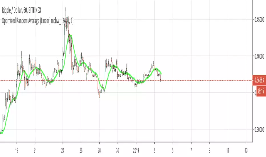
Optimized Random Average (Linear) mcbw_This is a moving average with a customizable random kernel. You can shape your kernel by selecting your parameters in the settings window. This is not something that is immediately ready to mess with by just applying it on the chart, it is very useful for people who are researching indicators and developing new tools. To see the shape of your kernel you can plug it into google or wolfram. This indicator and the related ones are rather technical in nature, so feel free to comment any questions you may have and to see if anyone has asked your question.
Read more here:
Happy studying and enjoy your life!
2019 will be absolutely insane!
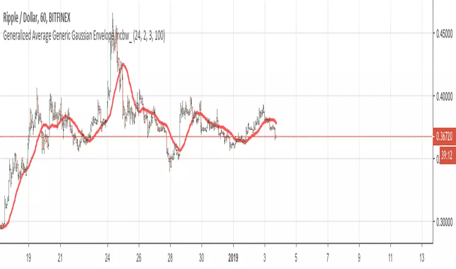
Generalized Average Generic Gaussian Envelope mcbw_This is a moving average with a customizable gaussian kernel. You can shape your kernel by selecting your parameters in the settings window. This is not something that is immediately ready to mess with by just applying it on the chart, it is very useful for people who are researching indicators and developing new tools. To see the shape of your kernel you can plug it into google or wolfram. This indicator and the related ones are rather technical in nature, so feel free to comment any questions you may have and to see if anyone has asked your question.
Read more here:
Happy studying and enjoy your life!
2019 will be absolutely insane!
Generalized Average Polynomial Envelope mcbw_This is a moving average with a customizable polynomial kernel. You can shape your kernel by selecting your parameters in the settings window. This is not something that is immediately ready to mess with by just applying it on the chart, it is very useful for people who are researching indicators and developing new tools. To see the shape of your kernel you can plug it into google or wolfram. This indicator and the related ones are rather technical in nature, so feel free to comment any questions you may have and to see if anyone has asked your question.
Read more here:
Happy studying and enjoy your life!
2019 will be absolutely insane!

Gap finder (gold minds)This tool highlights where gaps happens and outlines in the chart where the gap zones are. If there is a gap up there is a green line, a gap down it is red. The gap zone is highlighted in blue. You can choose the size of your gap with the input menu to the desired size. Feel free to ask comment below. Made for the Gold Minds group

mcbw_RSI_candlesAn RSI can have any input, but most commonly used is the closing price. I thought it would be interesting to see if feeding the open high low and close information into the RSI to make RSI candles, if there are candlestick formations that can be recognized or possible patters in wicks.
To make it smoother there also is the option to turn the RSI candles into Heiken Ashi form, just check the box labeled HA. The result is an RSI that is easier on the eyes.
Happy trading!
Remember to not take everything too seriously

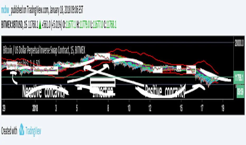
Stream Influxes and ReversalsI have a really interesting script for you guys today. While walking home I had an interesting idea that I wanted to visualize, but had no clue how it would turn out. This script is the result and it seems to provide some larger information.
For anyone who doesn't know the definition of concavity here is a super quick calculus lesson: Concavity is a fancy word for the sign of the second derivative of something. This is the SLOPE OF A SLOPE; how fast is the rate of change changing? An example is position, if you are in a place and want to go to another place the first derivative how you move there is the velocity, if you are measuring the derivative of velocity that is called acceleration. If you are speeding up then you have positive concavity. If you are slowing down you have negative concavity. On a graph positive concavity looks like a cup, negative concavity looks like an upside down bowl. Infection is just a fancy word for when it is zero, which means - to + or + to - So...
If we look at the concavity of the edges it seems to provide us clues about how the price is moving and where it wants to reverse. I made boxes around points of inflection (pos --> neg or neg --> pos concavity)
The purple lines are just moving averages of the green dots. The green dots are where the edges are at each time step, just the average of all of them at once. If price is wiggling a lot then it creates lots of edges, the green dots get plotted close to the price line, which moves up the purple lines.
The red line is a highlight of the last line, helps guide the eye.
The other smooth red lines are a shout out to bollinger bands, set the band width smaller to find break outs or squeezes.
There really isn't a defined strategy for how to use this, but with all the messages I am getting about these scripts everyone is always surprising me with what they see. So I hope some of you can make some good calls with this!
Theres lots of calculations here and it takes a long time to load, if it won't load, just toggle something back and forth till it does.
Happy trading everyone! I hope these scripts give some of you financial freedom. If you're making really good profits then share some of it with those who are less fortunate. Cheers
Best Holy Grail Indicator V3Thanks to everyone that has been contacting me about the holy grail project, your comments and feedback have made this project much more rewarding. I'm excited for your further feedback. Here is Version 3.
How to use:
At the heart of this projects is a new kind of moving average that I have been developing. As such it is reasonable to think of these lines as highly enhanced and finely tuned moving averages. Their slopes, crossovers, spreads, and behaviors are all meaningful, just as in other moving averages. What is special about these is that if you trade their price crossovers, it almost never generates a real loss, just consistent profits. In trending markets these lines can give you all you need to know about trend entry/exit and details inbetween, effectively letting you get in/out at the top/bottom. In a ranging market they will show you ideal lines of mean reversion, and how to play them.
Description (Upgrades from V2), there are 3 huge improvements from V2:
1) It follows the price better: In the inputs window there is now a box called “Responsiveness”, it can have values from 0 to 5. At 0 Version 3 looks a lot like V2. When you turn up the responsiveness the lines follow closer when they should, and repel themselves when they should be distant. Unfortunately the lines are no longer as smooth, but it isn’t much of a problem. When you turn this up the lines can generate losses if you blindly use the crossover, this is because the slopes of these lines now have more meaning as they focus on the trend, and not how price moves right around it. This can also give very powerful signals if all 5 lines crossover in the same place. Mess with it.
2) There are too many neutral entries: Now every trade can be closed profitably! I posted an idea a few weeks back about “smart execution traces”, it is an intelligently suggested stop loss. The way you set it is in the inputs window at “Smart Execution Baseline”. If you are using crossover signals from Line 4, then set this to 4, if you use line 3 then set it to 3, ect… Unfortunately the lines are also not so smooth, but this can be a very helpful tool. If you play with it you can easily get a feeling for it.
3) Flipping between timeframes is now easier: Here you can bring a line in from another time frame. In the input window there is a box “Line from other timeframe?”. Here you can select the line you are interested in. Next you have to choose which timeframe you are interested it, you can choose this in the “timeframe multiplier” box. This multiplies you current time frame to get the desired one. If you are on the hourly charts and are interest in line 4 on the 6 hour charts, you first choose line 4, then in the timeframe multiplier you enter 6 to see the 6 hour red line in the 1 hour time frame. Likewise if you are still in the 1 hour and want to see the 15 minute red line, simply multiply by 0.25 (which is 1/4). Due to the limitations of pinescript it is easier to see smaller timeframes, getting a higher timeframe line requires more data. If you don’t want to consult another timeframe leave both of these at 0 to cut down on computational time.
After enough inquiries, the source code is now for sale.
If you are making money with this system and want to share it, here are my addresses. If you donated and want to see some of the indicators I am currently working on just message me so I can privately tag you in.
ETH: 0xcf1ca127d9cefb5efbe9557fa09a05cf4daea6c1
ZEC: t1dSFhH9jkG1z9AdGA27e2UqCMLdA2Y1or1
LTC: LQ1cssjU3dhqSa9K85ErqZYuRAPLfGKivA
BCH: 15zwnh2t2nM2bufnuPv12hJvJhFrU8iSFk
Please feel free to write in further questions in the comments below. Hope this makes some of you rich, happy trading!

Bitcoin momentum correlation This is a pretty simple indicator, it measures the momentum of bitcoin as compared to usd,eur,eth,dash, and ltc, which you can see in all of the blue lines. If the red line is above zero then it means the overall value of btc is going up, opposite for down. The Ema_window controls how smooth the signal is. If you shorten the Ema_window parameter and open this on higher timeframe btc charts then the zero crossing gives pretty solid signals, despite being pretty choppy. A good way to interpret this is that if all the blue lines are moving in the same direction at once without disagreement, then the value of bitcoin has good momentum.
Mildly more technically:
Momentum is measured in the first derivative of an EMA for each ticker. To normalize the different values against each other they are all divided by their local maximums, which can be chosen in the parameter window, but shouldn't make a huge difference. All the checked values are then summed, as shown in the red line. To include a value into the red line simply keep it checked. Take a look at the script, it's kind of easy on the eyes.
It's pretty handy to look at, but doesn't seem too worthwhile to pursue much further. If someone wants much more out of the script then feel free to message me.
Remember rules #1 & #2
Don't lose money.
Happy trading
Fibonacci ClustersI was reading about Fibonacci Clusters on investopedia (www.investopedia.com) and couldn't find a script for it on tradingveiw. Apparently some people use it successfully but I found it a little chaotic. This script will mark the retracements in a window's length, and you can set this for six windows. This script isn't very pretty because it doesn't seem obviously useful and pinescript has far too many deficiencies to fully flesh this idea out. I was able to make more sense out of larger windowing times (500-4000 periods), than shorter ones (25-333). Try it out, see what it shows you. Happy trading

Multiple Ichimoku CloudsFor anyone that uses the Ichimoku Cloud there is a consistent need to flip between timeframes to get information about this at all levels. However, that trouble is now over. In this script there are 4 Ichimoku Clouds that operate in 4 different time frames. To change the timeframe simply change the multiplication factor to the desired levels. How this script works is that it takes your current timeframe as an input then it applies multiplication factors to it to achieve larger timescales. In the example here we are looking at the XBTJPY pair on the 1 hour. Our first cloud is 1x scaling, meaning that it is the 1 hour cloud. The second and third are 2x and 4x respectively meaning that we are looking at the 2 hour cloud and the 4 hour cloud. Lastly the largest cloud is the 24x cloud, aka the daily cloud. Now you only really need one look at the clouds for all the essential information.
As always feel free to message me about anything regarding this script.
Be happy :)
Blair Momentum IndicatorThis is a very interesting momentum indicator for everyone to take a look at. To understand the concept behind it please see my previous idea "Adaptive Derivative Analysis", and the short Bitcoin prediction that was concurrent.
At its core this indicator takes the derivative of a custom adaptive moving average and adaptively weights the results. This is what the big black line is, the "Blair Line". When it is above 0 there is upward momentum, and downward when it is below 0. However, simply watching the movement of the Blair line doesn't seem especially helpful, so to aid the eye there are clouds around it. 2 fast clouds, 1 medium cloud, and 1 slow cloud. When the Blair line goes under a cloud it is a good time to sell, when it goes above a cloud it is a good time to buy. The red and orange clouds provide the quickest signals about the behavior of the momentum. The yellow cloud provides more certainty. When all three of these clouds align on the same side of the Blair line, it is a very good indication about the current momentum in the market. The Blue cloud is the slowest cloud, and provides the greatest confluence. Since the market can be in varying degrees of volatility there is a button to adjust the sensitivity of the indicator, called the "Roughness". When the roughness is at its maximum of 6 the indicator takes lots of weight for the most recent price movement, when the roughness is at a minimum of 1 it only looks at really long term behavior. The indicator seems to be the best at a roughness between 2 to 4. Since this is a momentum indicator it will not tell you what is the best time to buy at the lowest and sell at the highest, but it will give you a very good idea about the momentum in the markets, and much more importantly when the momentum will reverse.
It is recommended to use this indicator at a timeframe or two higher than where you are trading for a good overview. If you are trading on the 5 minute charts, look at the Blair momentum indicator of the 1 hour to 2 hour charts. If you trade on the daily charts then look at the weekly Blair momentum.
The power of this tool is in its ability to show where the momentum is changing, a long time before the price action changes. Please apply this indicator to the charts you are working with and see its predictive behavior around breakouts and sideways action.
Happy trading! Always feel free to message me with questions.
