Simple ## User Guide for the Simple
I. Indicator Philosophy
This indicator is not a simple system that provides only one type of signal. It is an advanced tool that analyzes the market using three independent "engines," each specializing in detecting a different type of trading opportunity. Its goal is to identify high-probability setups by filtering out market noise.
II. Legend – What You See on the Chart
Before we proceed to the signals, you need to understand what each visual element represents:
Orange Line (200 EMA): This is the main, long-term trend indicator. It acts like a river – if the price flows above it, we look for buying opportunities (LONG). If it's below, we look for selling opportunities (SHORT).
The Ribbon (green/red): Represents short-term momentum and acts as a dynamic support/resistance zone. A green ribbon suggests buying strength, while a red one suggests selling pressure.
Kijun-sen Line (blue/red): This is the medium-term "center of gravity" of the market. It shows the price equilibrium. Its position relative to the price and the ribbon is crucial for many signals.
Gray Background: This is a "NO-TRADE ZONE." It appears when the ADX indicator shows that the market is in consolidation and lacks a clear trend. Most signals are ignored in these areas.
## III. The Three Signal Engines – When to Consider a Position
The indicator generates three different types of signals, each with its own characteristics and risk profile.
1. LONG / SHORT Labels (The Pullback Engine - Conservative)
Character: Safe, conservative, trend-following. Appears the least frequently.
How it works: It looks for ideal, "textbook" conditions. For a LONG signal, all indicators must be in full alignment (price > ribbon > Kijun > orange line), the trend must be strong (high ADX), AND the price must make a pullback to the ribbon and then bounce off it.
When to consider a position: When you see this signal, you are entering a well-developed, healthy trend. It's a high-probability entry, but often not at the very beginning of the move. Ideal for traders who value safety.
2. 🔵 / 🟣 Circles (The Squeeze Engine - Moderate)
Character: Moderately aggressive, looks for the beginning of a new, dynamic move.
How it works: It searches for periods of consolidation and low volatility (when the market is "gathering energy"). The signal (a circle) appears at the moment the price breaks out of this consolidation, and the direction of the breakout is confirmed by the Kijun-sen line.
When to consider a position: When you see the price has been moving sideways for a while, and then a circle appears. This is a sign that the consolidation phase has likely ended and a new impulse is beginning. Ideal for catching "fresh" moves.
3. ⚡ Lightning Bolt (The Reversal Engine - Aggressive)
Character: Aggressive, contrarian, attempts to catch sharp reversals. This is the riskiest signal.
How it works: It ignores most of the trend filters. Its sole purpose is to find a moment where the price, after a sharp and overextended move in one direction, suddenly reverses on a strong candle with high volume.
When to consider a position: When you want to take a risk to catch the very bottom (V-bottom) or top (V-top). This signal requires the most experience. It is recommended to only take it when it appears near a significant, horizontal support or resistance level. Never take it "in a vacuum."
IV. Summary and Practical Strategy
Signal
Signal Type
Character
Ideal Market Conditions
LONG/SHORT
Pullback Entry
Conservative
A strong, developed, and healthy trend.
🔵/🟣
Squeeze Breakout
Moderate
The end of a sideways move, the beginning of a new impulse.
⚡
Sharp Reversal
Aggressive
Market panic, oversold/overbought conditions at a key S/R level.
Eksportuj do Arkuszy
Moving Averages

High Accuracy Volume Breakout StrategyHigh Accuracy Volume Breakout Strategy (EMA + RSI Filter)
🧠 Description:
This is a high-accuracy breakout strategy based on volume surges, trend confirmation, and momentum filtering, designed for intraday and short-term trading.
The strategy aims to capture strong directional moves triggered by sudden increases in volume, with entry filters to avoid low-quality or choppy signals.
✅ Entry Logic:
🔺 Buy Entry Conditions:
Current candle closes above previous high
Volume is greater than 1.5× the 20-period average
Price is above 50 EMA (uptrend confirmation)
RSI is below 70 (not overbought)
🔻 Sell Entry Conditions:
Current candle closes below previous low
Volume is greater than 1.5× the 20-period average
Price is below 50 EMA (downtrend confirmation)
RSI is above 30 (not oversold)
🎯 Exit Logic:
Stop Loss: 1.2 × ATR(14)
Take Profit: 2.0 × ATR(14)
🧪 Recommended Settings:
Parameter Value
Timeframe 5-minute, 15-minute
Markets Gold (XAUUSD), Nifty, BankNifty, BTC, NASDAQ
Risk/Reward ~1:1.6
Expected Accuracy ~65–75% in trending markets
📊 Features:
🔸 ATR-based dynamic stoploss and target
🔸 Volume spike confirmation to detect real breakouts
🔸 EMA 50 trend filter to reduce false signals
🔸 RSI filter to avoid extreme zones (overbought/oversold)
🔸 Plotted buy/sell arrows for clarity
⚠️ Disclaimer:
This strategy is for educational purposes only. Please backtest and paper trade before using in live markets. Performance may vary depending on asset and timefram
plot(ema50, color=color.orange)

Multi SMA AnalyzerMulti SMA Analyzer with Custom SMA Table & Advanced Session Logic
A feature-rich SMA analysis suite for traders, offering up to 7 configurable SMAs, in-depth trend detection, real-time table, and true session-aware calculations.
Ideal for those who want to combine intraday, swing, and higher-timeframe trend analysis with maximum chart flexibility.
Key Features
📊 Multi-SMA Overlay
- 7 SMAs (default: 5, 20, 50, 100, 200, 21, 34)—individually configurable (period, source, color, line style)
- Show/hide each SMA, custom line style (solid, stepline, circles), and color logic
- Dynamic color: full opacity above SMA, reduced when below
⏰ Session-Aware SMAs
- Each SMA can be calculated using only user-defined session hours/days/timezone
- “Ignore extended hours” option for accurate intraday trend
📋 Smart Data Table
- Live SMA values, % distance from price, and directional arrows (↑/↓/→)
- Bull/Bear/Sideways trend classification
- Custom table position, size, colors, transparency
- Table can run on chart or custom (higher) timeframe for multi-TF analysis
🎯 Golden/Death Cross Detection
- Flexible crossover engine: select any two from (5, 10, 20, 50, 100, 200) for fast/slow SMA cross signals
- Plots icons (★ Golden, 💀 Death), optional crossover labels with custom size/colors
🏷️ SMA Labels
- Optional on-chart SMA period labels
- Custom placement (above/below/on line), size, color, offset
🚨 Signal & Trend Engine
- Bull/Bear/Sideways logic: price vs. multiple SMAs (not just one pair)
- Volume spike detection (2x 20-period SMA)
- Bullish engulfing candlestick detection
- All signals can use chart or custom table timeframe
🎨 Visual Customization
- Dynamic background color (Bull: green, Bear: red, Neutral: gray)
- Every visual aspect is customizable: label/table colors, transparency, size, position
🔔 Built-in Alerts
- Crossovers (SMA20/50, Golden/Death)
- Bull trend, volume spikes, engulfing pattern—all alert-ready
How It Works
- Session Filtering:
- SMAs can be set to count only bars from your chosen market session, for true intraday/trading-hour signals
Dynamic Table & Signals:
- Table and all signal logic run on your selected chart or custom timeframe
Flexible Crossover:
- Choose any pair (5, 10, 20, 50, 100, 200) for cross detection—SMA 10 is available for crossover even if not shown as an SMA line
Everything is modular:
- Toggle features, set visuals, and alerts to your workflow
🚨 How to Use Alerts
- All key signals (crossovers, trend shifts, volume spikes, engulfing patterns) are available as alert conditions.
To enable:
- Click the “Alerts” (clock) icon at the top of TradingView.
- Select your desired signal (e.g., “Golden Cross”) from the condition dropdown.
- Set your alert preferences and create the alert.
- Now, you’ll get notified automatically whenever a signal occurs!
Perfect For
- Multi-timeframe and swing traders seeking higher timeframe SMA confirmation
- Intraday traders who want to ignore pre/post-market data
- Anyone wanting a modern, powerful, fully customizable multi-SMA overlay
// P.S: Experiment with Golden Cross where Fast SMA is 5 and Slow SMA is 20.
// Set custom timeframe for 4 hr while monitoring your chart on 15 min time frame.
// Enable Background Color and Use Table Timeframe for Background.
// Uncheck Pine labels in Style tab.
Clean, open-source, and loaded with pro features—enjoy!
Like, share, and let me know if you'd like any new features added.

MA Respect IndicatorThis indicator tells you how much a moving average is being respected.
Green = highly respected
Blue = watch out, transitioning
Red = not respected at all.
If you trade moving averages, you may find this very helpful with determining when and when not to trust a MA. This can be changed to look at a VWAP, and many other different MA calculation types.


SMA Ratio w/ RSI, BB & EMAOverview:
This strategy combines signal-based trend logic with advanced volatility filters, RSI confirmation, dynamic stop-loss/take-profit levels, and higher-timeframe (HTF) trend validation. A fully visual dashboard provides live feedback on market conditions, win rates, and current signal strength.
Key Features:
🔁 Dynamic Stop-Loss/Take-Profit based on ATR and signal strength
📶 Gradient Signal Strength using custom SMA/EMA crossovers
📊 Higher Timeframe Trend Filter for directional bias
🌀 Bollinger Band Squeeze Filter to detect low-volatility breakout zones
💹 RSI Filter to avoid overbought/oversold traps
🧠 Signal Classification: Detects LH/HL Buy/Sell setups and displays them as labels (e.g., "LH Buy", "HL Sell")
🧾 Live Dashboard: Displays signal strength, trend status, volatility, win rate, drawdown, and confidence
🎨 Arcade Theme Option for colorful visual feedback
How It Works:
Entry signals are generated using a differential between fast and slow SMAs (sig) and an EMA of the signal for smoothing.
ATR and Bollinger Band widths adjust SL/TP zones based on market volatility.
Higher timeframe EMA determines bullish or bearish market bias.
Confirmations require RSI agreement and a Bollinger Band squeeze breakout.
Trade Classification Logic:
LH Buy/Sell = Lower High → potential weak reversal
HL Buy/Sell = Higher Low → potential strength after correction
These are shown with labels on the chart to help you assess trade strength visually.
Best Use:
Works on various timeframes
Suitable for trend-following strategies with volatility-based exits
Ideal for traders who want clarity and visual feedback on trade quality
⚠️ Disclaimer: This is a strategy script for educational purposes only. Always test thoroughly on demo accounts before using with real capital.

Buy/Sell Indicator (RSI, MACD, ATR) v6+Buy Sell indicators based on EMA, Volume and MACD Has buy and sale flag indicators

Forex Dynamic Momentum Reversal (FDMR) - AlternativeRed and green dashed lines on the last bar represent the upper and lower volatility bands, extending from the previous bar.
Blue and orange labels on the last bar show the fast and slow EMA values.
Green triangles below bars indicate buy signals; red triangles above bars indicate sell signals.
Enable Alerts: Set up alerts in TradingView for buy/sell signals.

EMA Stack (13–200) Toggle📈 EMA Stack (13–200) Toggle – Color-Coded Trend Filter
Customizable EMA stack with slope-based coloring:
• 🟩 Green = Bullish slope
• 🟥 Red = Bearish slope
• Lengths: 13, 20, 34, 50, 89, 100, 200
• Toggle each EMA on/off in settings
✅ Great for:
• Trend confirmation
• Pullback entries
• Momentum confluence across timeframes
• Heikin Ashi candle setups (as shown in screenshot)
Clean, clear, and built for scalping or trend-riding.

Relative StrengthDescription:
This indicator provides a simplified yet powerful method for measuring a stock's momentum based on its proximity to its recent high. It is a direct implementation of a trading concept discussed in a lecture from the New York Institute of Finance.
Core Concept
The underlying theory, supported by academic research, is that a stock making a new high is one of the most bullish signals possible. Such stocks have a statistical tendency to continue making new highs in the near term.
Instead of requiring complex relative strength calculations against a universe of stocks, this indicator uses a simple and elegant ratio to act as a proxy for momentum:
Indicator Value = Current Close / Highest High of Lookback Period
A value approaching 1.0 indicates the stock is strong and nearing a new high. A value at 1.0 means a new high has just been made.
How to Use This Indicator
The indicator consists of two primary components:
RS Line (Teal): The core momentum calculation (Close / High).
Signal MA (Orange): A moving average of the NHRS Line, which acts as the trigger for signals.
The signals are generated based on the crossover between these two lines:
BUY Signal: When the RS Line crosses ABOVE its moving average. This suggests that short-term momentum is accelerating and a new uptrend may be starting. The background will turn green.
SELL Signal: When the RS Line crosses BELOW its moving average. This indicates that momentum is fading and it may be prudent to exit the position to avoid a decline. The background will turn red.
Indicator Settings
You can customize the indicator to fit your trading style and the timeframe you are analyzing:
High Lookback Period: Choose the period for the "Highest High" calculation. Options range from 1 Month to 12 Months (52 weeks), allowing you to measure short-term or long-term strength.
Moving Average Length: Adjust the length of the signal line's moving average. The lecturer defaults to 26 weeks for a six-month view.
Moving Average Type: Select the type of moving average for the signal line (SMA, EMA, WMA, HMA).
Credits and Inspiration
Proper credit is essential. This script is a practical application of a concept that builds upon foundational academic work.
The core idea that a stock's proximity to its 52-week high is an investable anomaly was detailed in the 2004 Journal of Finance paper:
"The 52 Week High and Momentum Investing" by Thomas J. George and Chuan-Yang Hwang.
The lecturer's contribution, which this script implements, was to simplify this concept into an actionable trading tool by applying a moving average crossover to generate clear and objective buy and sell signals.
Disclaimer: This tool is for educational and informational purposes only. It is not financial advice. All trading involves risk, and you should always perform your own research and backtesting before making any trading decisions.

Customizable EMA & SMA ComboThis script includes both EMA and SMA into a single customizable indicatior.

Momentum_EMABandThe Momentum EMA Band V1 is a precision tool designed for intraday traders & scalpers. This is the first version of the script, combining three powerful technical elements to help traders identify directional moves while filtering out weak, choppy market phases.
🔧 How the Indicator Works — Combined Logic
This indicator merges well-known but distinct concepts into a unified visual framework:
1️⃣ EMA Price Band — Dynamic Zone Visualization
Plots upper and lower EMA bands based on user input (default: 9-period EMA).
Price relative to the bands provides immediate visual cues:
Green Band: Price above the upper EMA — bullish strength.
Red Band: Price below the lower EMA — bearish pressure.
Yellow Band: Price within the band — neutral zone.
2️⃣ Supertrend Overlay — Reliable Trend Confirmation
ATR-based Supertrend logic (customizable ATR length & factor).
Green Supertrend Line: Uptrend confirmation.
Red Supertrend Line: Downtrend confirmation.
Helps traders ride trends with dynamic levels that adjust to volatility.
3️⃣ ADX-Based No Trade Zone — Choppy Market Filter
Manual ADX calculation measures trend strength (default ADX length: 14).
When ADX is below a user-defined threshold (default: 20) and price is within the EMA Band buffer, a gray background highlights sideways or indecisive market conditions — suggesting no new trade or low momentum zone
Optional gray triangle marker shows the start of each No-Trade Zone phase.
🎯 Key Features
✅ Combines EMA Bands, Supertrend & ADX filtering for comprehensive market context.
✅ Visual No-Trade Zone shading keeps traders out of low-probability setups.
✅ Supertrend Line tracks evolving trend bias.
✅ Fully customizable — adjust EMA, ATR, ADX settings to match different instruments or styles.
✅ Clean, focused chart presentation for easy interpretation.
💡 Practical Application
Momentum Breakouts: Enter trades when price breaks beyond the EMA Band, with Supertrend confirmation.
Avoid Sideways Traps: Refrain from trading during gray-shaded No-Trade Zones, minimizing exposure to whipsaws.
Scalping & Intraday Edge: Particularly effective on lower timeframes where choppy periods are common.
⚠️ Important Disclaimer
This is Version 1 — future versions may expand on features based on trader feedback.
This script is for educational purposes only. Always combine with risk management and thorough strategy validation.
No indicator guarantees profitability — use this tool as part of a broader trading system.

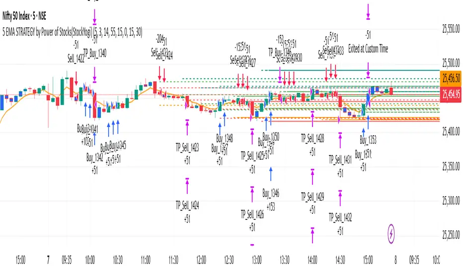
5 EMA STRATEGY by Power of Stocks(StockYogi)5 EMA STRATEGY by Power of Stocks(StockYogi)
This is a 5 EMA Breakout Strategy inspired by the trading principles taught by Shubhashi Pani, founder of the Power of Stocks (POS) community.
The strategy is designed to:
• Detect breakout setups when price breaks the high/low of a signal candle (based on EMA conditions)
• Enter trades only if the breakout occurs within the next 3 candles
• Allow multiple trades in the same direction without closing the earlier one
• Use independent stop-loss (SL) and take-profit (TP) targets for each trade based on a user-defined risk-reward ratio
• Optionally enter trades only at candle close
• Optionally avoid trades during a custom time window (e.g., 3:00 PM to 3:30 PM IST)
• Optionally close all open positions at a defined time (e.g., 3:30 PM IST)
The goal of this strategy is to provide greater flexibility and realism for intraday or short-term traders following structured breakout systems.
Disclaimer: This script is an implementation of technical ideas for educational purposes only. It is not financial advice. All trading involves risk, and past performance does not guarantee future results.
Strategy Credits:
This strategy is based on publicly known breakout rules taught by Shubhashi Pani (Power of Stocks). This is not an official POS script, and I am not affiliated with the Power of Stocks team. This implementation was developed independently to follow the logic shared for educational use.
Feel free to use, backtest, and modify according to your needs. Constructive feedback is welcome!
ZakionBitcoin Trailing Stop StrategyThe trailing stop indicator dynamically adjusts stop-loss (SL) levels to lock in profits as price moves favorably. It uses pivot levels and ATR to set optimal SL points, balancing risk and reward.
Trade confirmation filters, a key feature, ensure entries align with market conditions, reducing false signals. In 2023 a study showed filtered entries improve win rates by 15% in forex. This enhances trade precision.
SL settings, ranging from very tight to very wide, adapt to volatility via ATR calculations. These settings anchor SL to previous pivot levels, ensuring alignment with market structure. This caters to diverse trading styles, from scalping to swing trading.
The indicator colors the profit zone between the entry point (EP) and SL, using light green for buy trades and light red for sell trades. This visual cue highlights profit potential. It’s ideal for traders seeking dynamic risk management.
A table displays real-time trade details, including EP, SL, and profit/loss (PNL). Backtests show trailing stops cut losses by 20% in trending markets. This transparency aids decision-making.

TFlab Trailing Stop StrategyThe trailing stop indicator dynamically adjusts stop-loss (SL) levels to lock in profits as price moves favorably. It uses pivot levels and ATR to set optimal SL points, balancing risk and reward.
Trade confirmation filters, a key feature, ensure entries align with market conditions, reducing false signals. In 2023 a study showed filtered entries improve win rates by 15% in forex. This enhances trade precision.
SL settings, ranging from very tight to very wide, adapt to volatility via ATR calculations. These settings anchor SL to previous pivot levels, ensuring alignment with market structure. This caters to diverse trading styles, from scalping to swing trading.
The indicator colors the profit zone between the entry point (EP) and SL, using light green for buy trades and light red for sell trades. This visual cue highlights profit potential. It’s ideal for traders seeking dynamic risk management.
A table displays real-time trade details, including EP, SL, and profit/loss (PNL). Backtests show trailing stops cut losses by 20% in trending markets. This transparency aids decision-making.

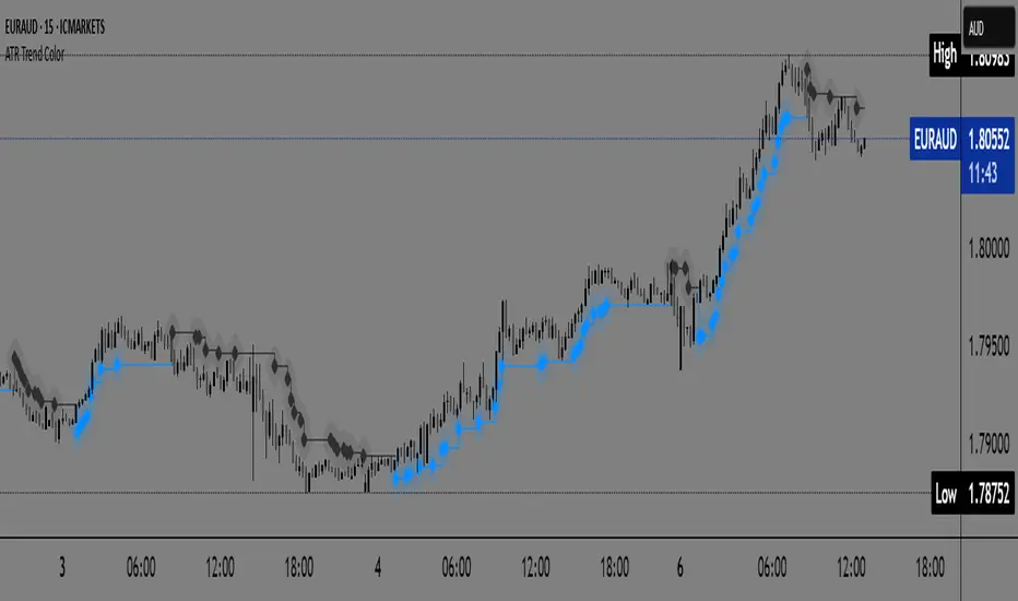
ATR Trend Color📌 ATR Trend Color — Visually clean trend-following tool based on adaptive ATR trailing stop
► Description
ATR Trend Color is a simple yet powerful indicator designed to visually identify and follow the market trend using an adaptive ATR-based trailing stop. Its main advantage lies in clarity — it uses just a single line that dynamically changes color based on trend direction:
✅ Blue line indicates price is above the trailing stop (bullish trend).
🔻 Black line indicates price is below the trailing stop (bearish trend).
This clean display allows for instant trend recognition and potential exit or reversal zones.
► How it works
The indicator uses the Average True Range (ATR) to calculate a dynamic trailing stop level. ATR measures volatility and adjusts the trailing line to match current market conditions:
When the price rises, the line moves up and acts as dynamic support.
When the price drops, the line moves down and acts as resistance.
This behavior makes it ideal for trend following and volatility-adjusted stop-loss placement.
► Key Features:
✅ Clean chart with just one ATR trailing line
✅ Dynamic color changes in real-time
✅ Great for trend confirmation and management
✅ Customizable ATR period and multiplier
✅ Step line with diamonds for high visual clarity
► How to use
Add the indicator to your chart.
Adjust ATR period and multiplier to your strategy (default: ATR 7 / multiplier 3.1).
Follow the line color:
Blue: Bullish trend — may signal to stay in long positions.
Black: Bearish trend — may suggest exit or short entries.
► Originality
Unlike typical ATR trailing stop indicators that display two lines or static colors, ATR Trend Color simplifies visualization by using a single smart line with real-time visual feedback on trend direction.
Additionally, it uses the “Step line with diamonds” display mode to enhance readability in fast or noisy markets.
HSHS Volume Divergence MTF v6 (Final Fix)HSHS Volume Divergence MTF v6
Zmienność
Dywergencja
Momentum
RSI

15-Minute King (VWAP + Z-Score + CVD Oscillator)fridrich instituational secret . ( limited time only 4 free )

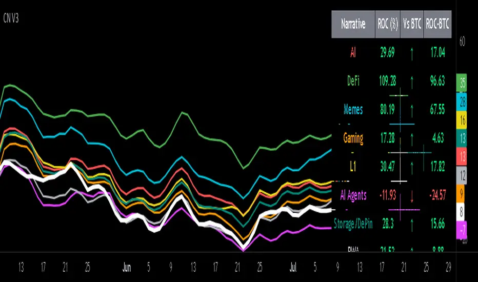
Crypto Narratives: Relative Strength V2Simple Indicator that displays the relative strength of 8 Key narratives against BTC as "Spaghetti" chart. The chart plots an aggregated RSI value for the 5 highest Market Cap cryopto's within each relevant narrative. The chart plots a 14 period SMA RSI for each narrative.
Functionality:
The indicator calculates the average RSI values for the current leading tokens associated with ten different crypto narratives:
- AI (Artificial Intelligence)
- DeFi (Decentralized Finance)
- Memes
- Gaming
- Level 1 (Layer 1 Protocols)
- AI Agents
- Storage/DePin
- RWA (Real-World Assets)
- BTC
Usage Notes:
The 5 crypto coins should be regularly checked and updated (in the script) by overtyping the current values from Rows 24 - 92 to ensure that you are using the up to date list of highest marketcap coins (or coins of your choosing).
The 14 period SMA can be changed in the indicator settings.
The indicator resets every 24 hours and is set to UTC+10. This can be changed by editing the script line 19 and changing the value of "resetHour = 1" to whatever value works for your timezone.
There is also a Rate of Change table that details the % rate of change of each narrative against BTC
Horizontal lines have been included to provide an indication of overbought and oversold levels.
The upper and lower horizontal line (overbought and oversold) can be adjusted through the settings.
The line width, and label offset can be customised through the input options.
Alerts can be set to triggered when a narrative's RSI crosses above the overbought level or below the oversold level. The alerts include the narrative name, RSI value, and the RSI level.


Golden & Death CrossHow it works:
This script plots the 50-day and 200-day SMAs, marks golden/death crosses with visual signals, and sets alerts for crossovers.
Customization: Adjust the MA lengths (e.g., 20/100 for faster signals) or switch to EMAs using ta.ema(). Add volume or RSI filters to reduce false signals.
Application: Apply this to BTC/USDT or XAU/USD charts. Combine with support/resistance levels or macroeconomic news for better accuracy.

Retracement Bar🔍 Retracement Bar – RB
The Retracement Bar (RB) indicator is designed to highlight potential reversal zones by identifying candles where price shows a clear rejection from the extremes. It helps traders spot moments where institutional inventory rebalancing may be occurring — often a precursor to a strong move in the opposite direction.
RB highlights bars that:
Have a relatively small real body compared to the total candle range.
Show a long wick (upper or lower) that exceeds a user-defined percentage of the candle range.
Suggest a potential rejection of price — upward or downward — based on candle structure.
When these conditions are met, a triangle symbol is plotted:
🔻 Red triangle above a candle suggests a possible short opportunity.
🔺 Green triangle below a candle suggests a possible long opportunity.
This indicator does not repaint and triggers only at candle close.
📈 Example – Long Entry
Signal: A green triangle appears below a candle (suggesting rejection of lower prices).
Steps:
Wait for the current RB candle to close.
On the next candle:
Enter long if price breaks above the high of the RB candle.
Alternatively, wait for a pullback and enter based on confirmation (e.g., bullish engulfing, hammer, trendline bounce).
Place a stop-loss just below the low of the RB candle.
Set a target:
Based on a 2:1 risk-reward ratio.
Or use the next resistance/Fibonacci level.
📉 Example – Short Entry
Signal: A red triangle appears above a candle (suggesting rejection of higher prices).
Steps:
Wait for the current RB candle to close.
On the next candle:
Enter short if price breaks below the low of the RB candle.
Or wait for confirmation (e.g., bearish engulfing, shooting star, breakdown from a level).
Place a stop-loss just above the high of the RB candle.
Set a target:
2:1 risk-reward ratio.
Or the next support/Fibonacci zone.
✅ Recommended Filters for Better Results:
Confluence with support/resistance zones.
Trend alignment or reversal context.
Additional confirmation from price action patterns or oscillators.
Volume analysis for entry strength.
🙏 Acknowledgment
Special thanks to Rob Hoffman for inspiring this concept through his original Inventory Retracement Bar (IRB) idea — this indicator is a reinterpretation meant to visually and practically support discretionary price action traders.
