Customizable EMA & SMA ComboThis script includes both EMA and SMA into a single customizable indicatior.
Moving Averages

Momentum_EMABandThe Momentum EMA Band V1 is a precision tool designed for intraday traders & scalpers. This is the first version of the script, combining three powerful technical elements to help traders identify directional moves while filtering out weak, choppy market phases.
🔧 How the Indicator Works — Combined Logic
This indicator merges well-known but distinct concepts into a unified visual framework:
1️⃣ EMA Price Band — Dynamic Zone Visualization
Plots upper and lower EMA bands based on user input (default: 9-period EMA).
Price relative to the bands provides immediate visual cues:
Green Band: Price above the upper EMA — bullish strength.
Red Band: Price below the lower EMA — bearish pressure.
Yellow Band: Price within the band — neutral zone.
2️⃣ Supertrend Overlay — Reliable Trend Confirmation
ATR-based Supertrend logic (customizable ATR length & factor).
Green Supertrend Line: Uptrend confirmation.
Red Supertrend Line: Downtrend confirmation.
Helps traders ride trends with dynamic levels that adjust to volatility.
3️⃣ ADX-Based No Trade Zone — Choppy Market Filter
Manual ADX calculation measures trend strength (default ADX length: 14).
When ADX is below a user-defined threshold (default: 20) and price is within the EMA Band buffer, a gray background highlights sideways or indecisive market conditions — suggesting no new trade or low momentum zone
Optional gray triangle marker shows the start of each No-Trade Zone phase.
🎯 Key Features
✅ Combines EMA Bands, Supertrend & ADX filtering for comprehensive market context.
✅ Visual No-Trade Zone shading keeps traders out of low-probability setups.
✅ Supertrend Line tracks evolving trend bias.
✅ Fully customizable — adjust EMA, ATR, ADX settings to match different instruments or styles.
✅ Clean, focused chart presentation for easy interpretation.
💡 Practical Application
Momentum Breakouts: Enter trades when price breaks beyond the EMA Band, with Supertrend confirmation.
Avoid Sideways Traps: Refrain from trading during gray-shaded No-Trade Zones, minimizing exposure to whipsaws.
Scalping & Intraday Edge: Particularly effective on lower timeframes where choppy periods are common.
⚠️ Important Disclaimer
This is Version 1 — future versions may expand on features based on trader feedback.
This script is for educational purposes only. Always combine with risk management and thorough strategy validation.
No indicator guarantees profitability — use this tool as part of a broader trading system.

[CRTT] Dragon TrendModified Sonic R system based on Wyckoff logic to indicate current trend phase and strength based on the Dragon (EMA34) color.
1. Red : downtrend but the trend strength is weak and can be consider as phase |B| or |D|. Open positions in this color is risk, we should wait more.
2. Green : uptrend but the trend strength is weak and can be consider as phase |B| or |D|. Open positions in this color is risk, we should wait more.
3. Purple : uptrend and the strength of trend is strongly bullish that can be considered as phase |D| or |E| in accumulation phase. This is where we place our Long positions because the trend is strongly bullish and price could continue to run upward.
4. Blue : downtrend and the strength of trend is strongly bearish that can be considered as phase |D| or |E| in distribution phase. This is where we place our Short positions because the trend is strongly bearish and price could continue to run downward.

MCDX with MAs📌 MCDX with MAs – Market Participant Flow Analyzer
🔍 Overview
This invite-only indicator is a powerful evolution of the MCDX concept, designed to analyze market behavior by profiling three key trader types—Bankers (Smart Money), Hot Money, and Retail Traders—using a proprietary RSI-based model and group-specific Moving Averages (MAs). It provides a real-time visualization of market participant dominance, momentum, and potential reversals to support strategic decision-making.
⚙️ How It Works
Each participant group is independently analyzed through:
✅ Custom RSI Calculations – Each group's RSI is computed using a proprietary method that adjusts sensitivity, smoothing, and thresholds to capture group-specific momentum. The logic goes beyond standard RSI, incorporating dynamic level zones (L1/L2/L3) and smoothing tailored to institutional or retail behavior.
✅ Group-Specific MAs – Users can assign unique MA types (EMA, SMA, WMA, RMA, SMMA) and lengths for each group, which are applied to the group’s custom RSI output rather than price.
✅ Histogram Visuals – Each group is displayed using capped histograms to normalize scale, making participant dominance and trend strength easier to interpret visually.
✅ Multi-Timeframe Support – RSI and MA values can be sourced from higher timeframes, allowing for alignment with broader market context.
🟢 Bullish Bias Conditions
Banker RSI is rising and crosses above one or more of its MAs.
Hot Money RSI is rising and above its MA.
Retail RSI is falling (indicating retail exit).
Setup is stronger if Banker or Hot Money RSI recovers from oversold zones.
🔴 Bearish Bias Conditions
Banker RSI is falling and below all of its MAs.
Hot Money RSI is falling.
Retail RSI is rising (indicating retail entering into weakness).
Setup is stronger if RSI values are near overbought levels.
📊 Visual Representation
Bankers (Smart Money): Green histogram (strong or light based on RSI-MA alignment)
Hot Money: Yellow histogram (bright or soft)
Retail Traders: Red histogram (bright or soft)
Histogram bars reflect real-time momentum and dominance shifts based on the relationship between each group’s RSI and its MAs.
🔔 Alert Logic (User-Configurable in Code)
RSI crossing above/below any group-specific MA
Entry or exit from dynamic RSI threshold zones (L1, L2, L3)
Divergence between Bankers and Retail behavior
Full alignment or trend shifts across all three groups
🛠️ Key Features
Custom RSI sensitivity control
Per-group MA type and length inputs
Multi-timeframe sourcing for trend confirmation
User-defined RSI thresholds for extreme zone detection
Scaled histogram visualization for intuitive analysis
✅ Why Invite-Only?
This script uses a proprietary model combining custom RSI logic, group-segmented MA filtering, and behavioral divergence detection between trader types. The closed-source format is used to protect the intellectual property of these unique implementations, while this transparent explanation ensures traders fully understand how to use and benefit from the tool.
⚠️ Important Notes
This tool is intended for strategic support and educational use only.
Always use in combination with price action, volume analysis, and support/resistance levels.
It is not financial advice.
📈 Best For
Swing traders seeking accumulation/distribution insights
Traders identifying trend strength via institutional behavior
Those analyzing divergence between Smart Money and Retail activity

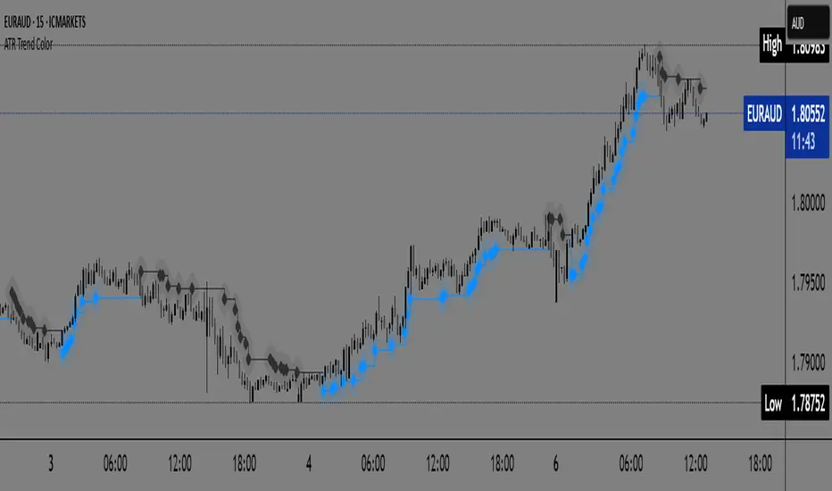
ATR Trend Color📌 ATR Trend Color — Visually clean trend-following tool based on adaptive ATR trailing stop
► Description
ATR Trend Color is a simple yet powerful indicator designed to visually identify and follow the market trend using an adaptive ATR-based trailing stop. Its main advantage lies in clarity — it uses just a single line that dynamically changes color based on trend direction:
✅ Blue line indicates price is above the trailing stop (bullish trend).
🔻 Black line indicates price is below the trailing stop (bearish trend).
This clean display allows for instant trend recognition and potential exit or reversal zones.
► How it works
The indicator uses the Average True Range (ATR) to calculate a dynamic trailing stop level. ATR measures volatility and adjusts the trailing line to match current market conditions:
When the price rises, the line moves up and acts as dynamic support.
When the price drops, the line moves down and acts as resistance.
This behavior makes it ideal for trend following and volatility-adjusted stop-loss placement.
► Key Features:
✅ Clean chart with just one ATR trailing line
✅ Dynamic color changes in real-time
✅ Great for trend confirmation and management
✅ Customizable ATR period and multiplier
✅ Step line with diamonds for high visual clarity
► How to use
Add the indicator to your chart.
Adjust ATR period and multiplier to your strategy (default: ATR 7 / multiplier 3.1).
Follow the line color:
Blue: Bullish trend — may signal to stay in long positions.
Black: Bearish trend — may suggest exit or short entries.
► Originality
Unlike typical ATR trailing stop indicators that display two lines or static colors, ATR Trend Color simplifies visualization by using a single smart line with real-time visual feedback on trend direction.
Additionally, it uses the “Step line with diamonds” display mode to enhance readability in fast or noisy markets.
HSHS Volume Divergence MTF v6 (Final Fix)HSHS Volume Divergence MTF v6
Zmienność
Dywergencja
Momentum
RSI

Dynamic Momentum Oscillator ProThis indicator is called "Dynamic Momentum Oscillator Pro" (DMO PrO) and is a modified oscillator that analyzes the difference between two moving averages (fast and slow) across different timeframes. Its primary purpose is to identify trend strength and direction, as well as potential reversal points.
This indicator detects early momentum shifts in assets approaching key reversal zones by tracking:
- Convergence of the smoothed moving average (SMMA)
- Trend confirmation across multiple timeframes
- Visual assessment of momentum intensity
### Key Features:
1. Dual Smoothed Moving Averages (SMMA)
- Uses two modified moving averages (SMMA — Smoothed Moving Average) with different periods:
- `fast_length` (default: 4) — fast MA.
- `slow_length` (default: 12) — slow MA.
- The difference between them (`ma_diff = fast_ma - slow_ma`) generates the primary signal.
2. Higher Timeframe Analysis
- The indicator automatically calculates the moving average difference (`ma_diff`) on a higher timeframe (`res_multi` times larger than the current one) to determine the global trend.
- Example: If the current timeframe is 1H and `res_multi = 3`, the higher timeframe will be 3H.
3. Visualization:
- Histogram (bars) — displays the current `ma_diff` value. Color depends on the direction and position relative to zero.
- Lines — duplicates the histogram as a line.
- Background — shaded red/green based on the higher timeframe trend direction.
4. Color Scheme:
- Above zero and rising: Light green (`#81C784`).
- Below zero and rising: Deep green (`#26A69A`).
- Above zero and falling: Bright red (`#EF5350`).
- Below zero and falling: Light pink (`#FFCDD2`).
Signal Interpretation:
- Green bars: Increasing bullish momentum.
- Red bars: Growing bearish pressure.
- Background color: Trend bias on the higher timeframe (red = bearish, green = bullish).
### Logic:
- A rising `ma_diff` indicates strengthening momentum.
- Zero-line crossovers may signal a trend reversal.
- Divergence between current and higher timeframes (e.g., uptrend on lower TF vs. downtrend on higher TF) can warn of trend weakness.
### Applications:
- Trend strategies: Buy when the histogram rises above zero; sell when it falls below.
- Trend filter: Alignment of directions across timeframes strengthens signals.
- Divergences: Discrepancies between price and indicator may hint at reversals.
This indicator combines features of MACD (MA difference) and Momentum.

Crypto Narratives: Relative Strength V2Simple Indicator that displays the relative strength of 8 Key narratives against BTC as "Spaghetti" chart. The chart plots an aggregated RSI value for the 5 highest Market Cap cryopto's within each relevant narrative. The chart plots a 14 period SMA RSI for each narrative.
Functionality:
The indicator calculates the average RSI values for the current leading tokens associated with ten different crypto narratives:
- AI (Artificial Intelligence)
- DeFi (Decentralized Finance)
- Memes
- Gaming
- Level 1 (Layer 1 Protocols)
- AI Agents
- Storage/DePin
- RWA (Real-World Assets)
- BTC
Usage Notes:
The 5 crypto coins should be regularly checked and updated (in the script) by overtyping the current values from Rows 24 - 92 to ensure that you are using the up to date list of highest marketcap coins (or coins of your choosing).
The 14 period SMA can be changed in the indicator settings.
The indicator resets every 24 hours and is set to UTC+10. This can be changed by editing the script line 19 and changing the value of "resetHour = 1" to whatever value works for your timezone.
There is also a Rate of Change table that details the % rate of change of each narrative against BTC
Horizontal lines have been included to provide an indication of overbought and oversold levels.
The upper and lower horizontal line (overbought and oversold) can be adjusted through the settings.
The line width, and label offset can be customised through the input options.
Alerts can be set to triggered when a narrative's RSI crosses above the overbought level or below the oversold level. The alerts include the narrative name, RSI value, and the RSI level.


Golden & Death CrossHow it works:
This script plots the 50-day and 200-day SMAs, marks golden/death crosses with visual signals, and sets alerts for crossovers.
Customization: Adjust the MA lengths (e.g., 20/100 for faster signals) or switch to EMAs using ta.ema(). Add volume or RSI filters to reduce false signals.
Application: Apply this to BTC/USDT or XAU/USD charts. Combine with support/resistance levels or macroeconomic news for better accuracy.

Retracement Bar🔍 Retracement Bar – RB
The Retracement Bar (RB) indicator is designed to highlight potential reversal zones by identifying candles where price shows a clear rejection from the extremes. It helps traders spot moments where institutional inventory rebalancing may be occurring — often a precursor to a strong move in the opposite direction.
RB highlights bars that:
Have a relatively small real body compared to the total candle range.
Show a long wick (upper or lower) that exceeds a user-defined percentage of the candle range.
Suggest a potential rejection of price — upward or downward — based on candle structure.
When these conditions are met, a triangle symbol is plotted:
🔻 Red triangle above a candle suggests a possible short opportunity.
🔺 Green triangle below a candle suggests a possible long opportunity.
This indicator does not repaint and triggers only at candle close.
📈 Example – Long Entry
Signal: A green triangle appears below a candle (suggesting rejection of lower prices).
Steps:
Wait for the current RB candle to close.
On the next candle:
Enter long if price breaks above the high of the RB candle.
Alternatively, wait for a pullback and enter based on confirmation (e.g., bullish engulfing, hammer, trendline bounce).
Place a stop-loss just below the low of the RB candle.
Set a target:
Based on a 2:1 risk-reward ratio.
Or use the next resistance/Fibonacci level.
📉 Example – Short Entry
Signal: A red triangle appears above a candle (suggesting rejection of higher prices).
Steps:
Wait for the current RB candle to close.
On the next candle:
Enter short if price breaks below the low of the RB candle.
Or wait for confirmation (e.g., bearish engulfing, shooting star, breakdown from a level).
Place a stop-loss just above the high of the RB candle.
Set a target:
2:1 risk-reward ratio.
Or the next support/Fibonacci zone.
✅ Recommended Filters for Better Results:
Confluence with support/resistance zones.
Trend alignment or reversal context.
Additional confirmation from price action patterns or oscillators.
Volume analysis for entry strength.
🙏 Acknowledgment
Special thanks to Rob Hoffman for inspiring this concept through his original Inventory Retracement Bar (IRB) idea — this indicator is a reinterpretation meant to visually and practically support discretionary price action traders.

Single EMA Buy/Sell + Touch + Alerts + Signal Candle Colorsthis is pure buy sell indicator based on ema
you'll use this with the help of volume
risk reward ratio 1:1.5

Accurate Scalper A.I🔑 CORE FEATURES 🔑
✅ AUTOMATED SUPPORT/RESISTANCE & TREND LINE
Dynamic levels plotted in real-time
Multi-timeframe confirmation Only for Scalping
✅ A.I Powered Accurate Buy & Sell signal
✅ Accurate to Identify Sideways Market
✅ A.I-POWERED FIBONACCI TOOL
Instant retracement/extension zones
Fibonacci Time Zones + Price Levels

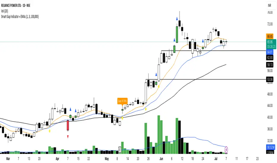
Smart Gap Indicator + EMAs📈 Smart Gap Indicator + EMAs
Spot high-impact gaps with precision and confidence.
🔍 What it does:
This tool identifies and highlights strategic price gaps that often precede strong directional moves. It filters out noise by combining advanced logic with volume activity and trend bias, helping you focus on the most relevant setups.
📊 Key Features:
Smart Gap Detection – Automatically detects meaningful gap up/down events based on dynamic thresholds.
EMA Trend Filter – Optional multi-EMA filter (10, 21, 50) to help align trades with the prevailing market trend.
Volume Spike Signal – Highlights volume surges that may indicate institutional involvement.
Clean Visuals – Configurable labels, shapes, and optional gap fill lines to aid quick interpretation.
Gap Performance Table – Summarizes recent gap activity to assess directional bias.
⚠️ Built-in Alerts:
Gap Up
Gap Down
Gap + Volume Spike
💡 Made by a trader, for traders.
Whether you're a swing trader, gap hunter, or momentum follower—this tool was crafted to give you an edge where it matters most: timing.

Open Drive 7M DetectorAn Opening Drive play or Open Drive play is a strategy for just right when the market is open. This strategy lets you take advantage of the momentum that happens just when the market opens. At the beginning of my trading career i made a lot of money using this strategy.
This indicator attempts to use my personal logic to decide wether one of the 7 Magnificents is a candidate for this strategy. So what the script does is to look for premarket behavior of the price around the VWAP with particular focus on interactions between 8 AM and 9:30 AM. If the price is found to cross VWAP or EMA 200 is a possible candidate. If the price retest either VWAP or EMA 200 then it's a candidate.
To play an Open Drive make sure your price is as close to the VWAP or EMA 200 as possible and then risk just a little below of them on an uprend and conversely up of them if on a downtrend.
Contact me if you have questions.

Multi-Moving Average Rainbow | InvrsROBINHOODThe Dynamic Multi-Moving Average Rainbow | InvrsROBINHOOD is a comprehensive technical analysis indicator designed to provide traders with a dynamic visual representation of multiple moving averages and their relationship to the current price. It's built to offer insights into market momentum, trend strength, and potential areas of support and resistance.
How it Works (Conceptually):
At its core, this indicator plots a "rainbow" of several different moving averages on your chart simultaneously. Each line in the rainbow represents a moving average calculated over a different period, allowing you to observe how price interacts with various short-term, medium-term, and long-term trends all at once. The specific type of moving average used (e.g., Simple, Exponential, Weighted, Hull, Volume Weighted and Rolling) is selectable by the user, providing flexibility to adapt to different trading styles and market conditions.
A key feature of this indicator is the visual "fills" between adjacent moving average lines. These colored bands highlight the convergence or divergence of the averages, offering a quick visual cue about the strength and direction of the trend. When the moving averages are fanning out and ordered sequentially (e.g., shorter MAs above longer MAs in an uptrend), it typically suggests strong momentum. Conversely, when they are converging or intertwined, it might indicate consolidation or a weakening trend.
Beyond the visual plots, the indicator includes a convenient on-chart table. This table provides precise, real-time data on the percentage distance of the current price from each individual moving average. It also calculates the average, highest, and lowest absolute percentage distances over user-defined lookback periods. This numerical data complements the visual aspect by offering objective metrics on how extended or compressed the price is relative to its moving averages.
How Traders Can Use It:
Traders can leverage the Dynamic Multi-Moving Average Rainbow in several ways:
Trend Identification and Confirmation:
Strong Uptrend: Look for the rainbow to fan out upwards, with shorter-period MAs consistently above longer-period MAs. The price should ideally stay above all or most of the MAs.
Strong Downtrend: Conversely, a fanning out downwards, with shorter-period MAs consistently below longer-period MAs, suggests a strong downtrend. The price should remain below the MAs.
Trend Weakening/Consolidation: When the moving average lines start to converge, cross frequently, or become flat, it often signals a loss of trend momentum, potential consolidation, or a pending trend reversal.
Support and Resistance Levels:
Individual moving average lines, especially the longer-period ones, can act as dynamic support (in an uptrend) or resistance (in a downtrend) levels. Price often bounces off these lines.
The "rainbow" as a whole can also represent a dynamic zone of support or resistance.
Entry and Exit Signals:
Trend Following Entries: In a strong trend, a pullback to and bounce off one of the moving average lines can be a potential entry point for continuing with the trend.
Crosses: While not explicitly coded as signals, the crossing of shorter-period MAs above or below longer-period MAs can indicate shifts in short-term momentum within the broader trend.
Exhaustion/Reversal Signs: If price becomes excessively far from its moving averages (indicated by high percentage distance in the table), especially after a prolonged trend, it might suggest an overbought or oversold condition and potential for a correction or reversal. The "Highest % Dist" in the table can help identify historical extremes.
Volatility and Price Extension Analysis (using the Table):
The "% Dist" column shows how far the current price is, in percentage terms, from each MA. A large positive percentage indicates price is significantly above the MA, while a large negative percentage means it's significantly below.
The "Avg % Dist" provides a sense of the typical price deviation from each MA over a recent period.
The "High % Dist" and "Low % Dist" can be used to gauge historical extremes of how far price tends to deviate from a given MA. If the current "% Dist" approaches these historical highs or lows, it might suggest price is stretched and due for a reversion to the mean.
By combining the visual insights of the moving average rainbow with the precise numerical data from the table, traders can gain a more nuanced understanding of market dynamics and make more informed trading decisions.

Smooth MTF CloudsThe smoothness of the "clouds" in the script you provided comes from the combination of plotting moving averages (typically EMA or SMA) and using the fill() function to visually create smooth, overlapping areas between two lines. Additionally, EMAs naturally create smoother curves as they respond to price changes in a lagged, less abrupt way compared to traditional plots.

AI - EMA Trend-ColorThis is a simple indicator for EMA that changes color. Green = Uptrend and Red=downtrend.

Finance Nirvana Buy/Sell Signals Generator V1.0Finance Nirvana Buy Sell Indicator combines multiple layers of analysis into a single, streamlined overlay. It plots key trend and volatility structures—EMAs and Bollinger Bands—while computing a fast, zero-lag EMA (ZLEMA20) for more responsive trend detection. Extreme RSI and volume events are flagged directly on the chart, and classic two-bar price-action (Buy / Sell) signals are only triggered when confirmed by ATR-based volatility breakouts, ADX trend strength, dynamic RSI momentum filters, and volume confirmations. A multi-timeframe alignment table shows both “bullish vs. bearish” status and live RSI readings across 5m, 15m, 60m, 240m, and daily frames, and intraday pivot, support, and resistance levels are drawn for easy reference.

ITRADEPRO SMART VOLUMEvisit www.itradepro.academy get full free membership to get full strategies , scanners , educational secrets, courses

Khahana Spine with DCA + PnLKhahana Spine is a momentum-driven trend-following indicator designed for clean charting and strategic execution.
It identifies high-confidence trend continuation setups using a smoothed EMA spine and momentum slope, providing timely Buy and Sell signals.
Once a trade begins, the indicator manages it with a built-in DCA (Safety Order) mechanism — averaging down/up to improve entry price up to 2 times — with real-time PnL tracking, risk management (TP/SL), and live alerts.
📊 A compact performance dashboard tracks total trades, win rate, and cumulative PnL, allowing quick review of effectiveness.
💡 Ideal for intraday or swing traders who want clear directional signals, dynamic risk control, and automated alerts.
🔒 This is a closed-source indicator published by @khahana.
Contact for access or integration
