Scalper Pro Pattern Recognition & Price Action👑Scalper Pro®👑Pattern Recognition & Price Action
i.postimg.cc
Introducing the ultimate trading robot designed for serious investors! Our advanced bot analyzes market cycles, tracks targets, sets stop losses, and expertly manages your capital. With powerful algorithms and real-time insights, it identifies opportunities and delivers accurate signals, ensuring you never miss a market move. Take control of your trading strategy and maximize your profits with our cutting-edge technology. Join the future of trading today—your expert assistant is ready to help you succeed!
💡 This is not just another indicator — it's a complete trading assistant that identifies structure, signals strength, and simplifies decision-making.
🚀 Plug it into your TradingView chart today and start seeing the market in a whole new way.
💬 Need help with access, backtesting, or have any questions about our indicators?
Our support team is available 24/7 on Telegram.
Just reach out through the link below: 👉 t.me
Multitimeframe

GOD Scalper TURBO Pattern Recognition & Price Action🚀 Introducing: 👑Scalper TURBO👑 – Your Ultimate TradingView Companion for High-Speed Scalping & Auto-Trading!
Trade Smarter. Trade Faster. Trade Automated.
The world's fastest scalper robot with the ability to analyze and trade in second-by-second time frames with an incredible 900% monthly profitability.
🔥 What is 👑Scalper TURBO👑?
Scalper TURBO is a high-performance Pine Script 5 strategy designed for aggressive and intelligent scalping on TradingView. It combines breakout detection, multi-indicator confirmation, time-based filtering, and full PineConnector integration for automated live trading with MetaTrader 5 (MT5). Whether you want to backtest, trade manually, or connect with MT5 via PineConnector – this tool is your edge.
⚙️ Key Features
✅ Fast Execution Logic — Uses real-time tick data with calc_on_every_tick=true
✅ EMA, SMA, RSI & ATR Filters — Combines trend, momentum, and volatility in one strategy
✅ Breakout Strategy — Trades breakouts above resistance or below support
✅ Multi-Time Filter Zones — 4 customizable intraday trading windows to avoid choppy hours
✅ PineConnector-Ready — Seamless alerts for auto-trading with MT5, customizable lot sizes
✅ Dynamic Stop Loss / Take Profit — Based on ATR multipliers for adaptable risk
✅ Trail Stop Support — Optional trailing stop-loss system
✅ Built-in Risk Labels — Live performance and signal info right on the chart
✅ Minimal Resource Usage — Pre-computed constants and cached indicators for speed
✅ Recommended Use Cases:
XAUUSD / Gold scalping (default)
1m to 5m charts (for high-frequency setups)
Live auto-trading via PineConnector
Backtesting and optimization with historical data
🧠 Pro Tips
For best results, run it during high-volume market hours (enable time filters like London/NY session).
Use trailing stop in volatile assets for maximizing gains.
Integrate with PineConnector Pro for seamless MT5 execution.
Combine with your own overlays or confirmation tools.
📣 Join the Movement
💬 Created by @DrFXAi – follow on TradingView for updates, improvements, and more elite scripts.
🚀 Ready to Automate Your Edge?
📌 Add 👑Scalper TURBO👑 to your chart today and take control of your scalping game with automation, speed, and intelligence!
💬 Need help with access, backtesting, or have any questions about our indicators?
Our support team is available 24/7 on Telegram.
Just reach out through the link below: 👉 t.me

4-Bar Fractal ReversalTitle: 4-Bar Fractal Reversal
Description:
The "4-Bar Fractal Reversal" is a clean and effective tool for identifying potential market reversals based on pure price action logic.
📈 How It Works:
This indicator scans for a 4-bar fractal pattern where the current candle (bar 0) acts as the confirmation bar. A reversal signal is generated when:
Bullish Reversal (Buy): The current close is higher than both the high of 1 bar back and the high of 3 bars back.
Bearish Reversal (Sell): The current close is lower than both the low of 1 bar back and the low of 3 bars back.
⚙️ Features:
Works on any timeframe.
Customizable display: choose to show or hide symbols and/or labels.
Includes alerts for both bullish and bearish setups.
This tool allows traders to react only after confirmation, reducing false signals and providing a more disciplined approach to reversal trading.
Indicator born following the viewing of the following video.
www.youtube.com

Market Energy – Trend vs Retest (with Saturation %)Market Energy – Trend vs Retest Indicator
This indicator measures the bullish and bearish energy in the market based on volume-weighted price changes.
It calculates two smoothed energy waves — bullish energy and bearish energy — using exponential moving averages of volume-adjusted price movements.
The indicator detects trend changes and retests by comparing the relative strength of these waves.
A saturation percentage quantifies the intensity of the current dominant side (bulls or bears) relative to recent highs.
- High saturation (>70%) indicates strong momentum and dominance by bulls or bears.
- Low saturation (<30%) suggests weak momentum and possible market indecision or consolidation.
The background color highlights the current control: green for bulls, red for bears, with transparency indicating the saturation level.
A label shows which side is currently in control along with the saturation percentage for quick interpretation.
Use this tool to identify strong trends, possible retests, and momentum strength to support your trading decisions.

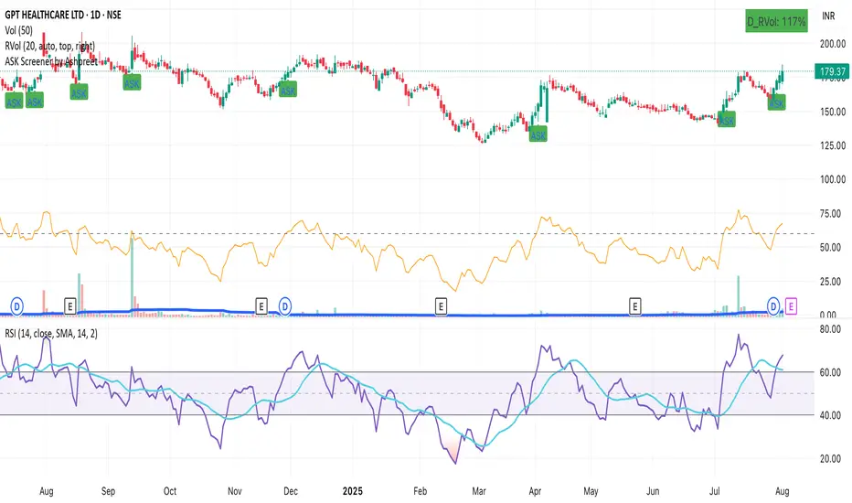
ASK Screener by AshpreetThe ASK Indicator is a custom-built breakout and trend continuation system designed for swing traders seeking high-probability entries with strong risk-reward ratios. Built using a combination of moving averages, momentum filters, volume confirmation, and price structure, this indicator helps identify stocks poised for explosive moves.
It uses three key moving averages: the 44-period SMA (medium trend), 20-period DEMA (short-term strength, custom-coded), and 50-period WEMA (institutional trendline). Trades are only triggered when the price is above 50 WEMA, and the 20 DEMA is above the 44 SMA.
Momentum is confirmed using RSI(14) within a healthy zone of 40–60, ensuring the stock is not overbought or oversold. To focus on breakout candidates, the stock must be trading within 10% of its 52-week high, and the weekly candle range must be under 10%, signaling compression before expansion.
A valid ASK Signal occurs when these conditions are met along with a breakout above the previous day’s high and volume exceeding 1.5× the 20-day average. Once triggered, the indicator auto-plots the stop-loss (1× ATR) and two profit targets: 1:2 (TP1) and 1:4 (TP2).
Additionally, the system detects a narrow range setup, where the last 3 daily candles are inside the previous 3-day range — a powerful consolidation signal. Alerts for both ASK entries and narrow ranges are included.
This system is ideal for positional and short-term swing traders who want to combine structure, momentum, and volume in one powerful tool.
Manual 1H Trend BackgroundThis TradingView Pine Script v6 indicator allows you to manually set the trend direction (based on your analysis of the 1-hour timeframe), and it will change the background color of your chart based on that input:
"Buy" → chart background turns green
"Sell" → chart background turns red
"Neutral" → no background color (transparent)

Ghost Month HighlighterThe term "Ghost Month" refers to the seventh lunar month in the Chinese calendar, a period considered inauspicious for major activities like trading or investing in some cultures, due to superstitions about spirits influencing events

Intra Bullish Strategy - Profit Ping v4.0ProfitPing 4.0 is a high-precision intraday swing trading strategy designed for global equity markets, including the US, South Africa, and Australia. The system identifies high-probability BUY and EXIT signals using a confluence of technical indicators and real-time volume dynamics.
🧠 Key Features:
Dual EMA Crossover (7 & 14) for short-term trend confirmation
Volume Spike Detection based on 20-period moving average
RSI Momentum Filter (ideal zone: 55–65) to avoid overbought entries
MACD Histogram & Signal Line Sync for trend momentum validation
Candlestick Pattern Filtering (e.g. bullish engulfing, flags, breakout candles)
Multi-Timeframe Confirmation (optional) for intraday trend alignment
Dynamic Risk-to-Reward Logic built into alert framework
Webhook-compatible JSON alerts for automation to Google Sheets, Power BI, and IBKR
🛠️ Alert System:
BUY alert triggers when all bullish conditions align
EXIT alert triggers only if a previous BUY exists for that ticker
Trade status is updated live in Google Sheets and integrated with Power BI dashboards
Orphaned EXITs (no matched BUY) are tracked separately for accuracy review
🔄 Ideal For:
Traders seeking 1:2 to 1:5 risk/reward setups
Automation-focused workflows (via TradingView → Google Sheets → Power BI)
Swing traders wanting clean visual logs, automated P&L tracking, and optional IBKR execution


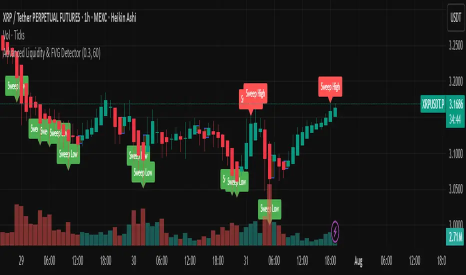
Advanced Liquidity & FVG Detector With Entry/Exit SignalsThe Advanced Liquidity & FVG Detector is more than just an indicator—it's a complete trading system that brings institutional-grade market analysis to individual traders. By combining liquidity detection, fair value gap analysis, sweep/grab pattern recognition, and intelligent risk management, this indicator provides everything needed for sophisticated market analysis and high-probability trading opportunities.
Whether you're a day trader, swing trader, or position trader, this indicator adapts to your style and timeframe, providing the insights needed to make informed trading decisions with confidence. The Pine Script v6 compatibility ensures future-proof performance and seamless integration with the latest TradingView features.
Transform your trading experience with professional-grade market structure analysis—tradable insights delivered in real-time, right on your chart.
High Probability Buy/Sell with SL & TP High-accuracy Buy/Sell signals with dynamic SL & Target—perfect for scalpers and swing traders,Smart trading signals with built-in risk management. Never miss a move.Auto Buy/Sell entries with real-time SL & TP levels—trade with confidence.Turn signals into strategy. Precision entries, clear exits.Your all-in-one trading assistant: entry, stop loss, and take profit—automated.Built for serious traders: Clean signals, sharp exits, and solid risk-reward.

TSD Quantum | mrmoeinudinThis indicator, **TSD Quantum**, has been developed by **Moeinudin Montazerfaraj**, exclusively for the students of the **TSD Intraday Trading Course**.
TSD Quantum is an intelligent and proprietary tool designed to accurately identify **valid supply and demand zones** and distinguish them from weak or linear bases. The algorithm is fully customized to align with the advanced concepts taught in the TSD methodology, empowering traders to make more confident and data-driven decisions.
### Key Features:
- Smart zone detection tailored to TSD methodology
- Floating risk management panel
- Integrated checklist for trade validation
- Real-time display of ATR, spread, and other essential metrics
- Optimized for intraday traders who follow price action and zone-based decision making strategies.
To join our exclusive educational programs, visit our official website:
🌐 (mrmoeinudin.com)
Stay connected and follow us for insights, updates, and free educational content:
📌 Telegram: (t.me)
📌 YouTube:
📌 Instagram:
Wishing all Persian-speaking traders around the world continued success and growth in their trading journey. 🚀📈

MACD + EMA Zone Filter (with EMAs)How it works:
It plots 4 EMAs (Exponential Moving Averages):
EMA 20 (orange)
EMA 50 (yellow)
EMA 100 (blue)
EMA 200 (red)
A Buy signal is triggered when:
All three EMAs (20, 50, 100) are above EMA 200 (indicating an uptrend)
The MACD line crosses above the Signal line (bullish momentum)
A Sell signal is triggered when:
All three EMAs (20, 50, 100) are below EMA 200 (indicating a downtrend)
The MACD line crosses below the Signal line (bearish momentum)
📊 Visual Features:
Buy/Sell arrows directly on the chart
Background turns green in strong uptrends and red in strong downtrends
Built-in alerts for automation or notifications
🕒 Works on any timeframe, using the current chart's data.
use with fractals indicator for SL, aim for 1:2 RR

MTF EMA Pane with Diagnostics30 sec chart, 1 min EMA goes flat, I buy, 1 min EMA stays inside the group, I stay in the trade.
Not financial advice. I am working on an Algo killer, stay tuned. I am dedicating the rest of my life, as short as it my be, to beating the Men behind the Algo's. Buy me some coffee.
Send USDT thru ETH or Base to BYDFi 0x20391e32afd61dc9e1ec027651391b56ceade4e0
Join BYDFi
Referral Link: Spin for a possible $100
partner.bydfi.com
Deposit: USDT via;
ETH (ERC20) 0x20391e32afd61dc9e1ec027651391b56ceade4e0
Tron (TRC20)
TUs5u2YxtQrQfRwYK2CsMmSDGvND6Uopdj
BNB/Base (BEP20)
0x20391e32afd61dc9e1ec027651391b56ceade4e0
Solana
696LAngiQBbdk4m6k1ZBiKZrFtjTJo6dxCnVXMEePQea

VIX Filter/RSI/EMA Bias/Cum-TICK w/ Exhaustion Zone DashboardThis all-in-one dashboard gives intraday traders a real-time visual read of market conditions, combining volatility regime, trend bias, momentum exhaustion, and internal strength — all in a fully customizable overlay that won’t clutter your chart.
📉 VIX Market Regime Detector
Identifies "Weak", "Normal", "Volatile", or "Danger" market states based on customizable VIX ranges and symbol (e.g., VXN or VIX).
📊 RSI Momentum Readout
Displays real-time RSI from any selected timeframe or symbol, with adjustable length, OB/OS thresholds, and color-coded exhaustion alerts.
📈 EMA Trend Bias Scanner
Compares fast and slow EMAs to define bullish or bearish bias, using your preferred timeframe, symbol, and EMA lengths — ideal for multi-timeframe setups.
🧠 Cumulative TICK Pressure & Exhaustion Engine
Analyzes internal market strength using cumulative TICK data to classify conditions as:
-Strong / Mild Bullish or Bearish Pressure
-Choppy / No Edge
-⚠️ Exhaustion Zones — when raw TICK values hit extreme highs/lows, a separate highlight box appears in the dashboard, warning of potential turning points
All logic is customizable, including TICK symbol, timeframes, thresholds, and lookback periods.
Scalpers and day traders who want fast, visual insight into market internals, exhaustion, and trend bias.

Previous Close LabelSee the previous close price label. Combine it with Multi Timeframe Bar Replay Fix indicator in the Bar Replay mode.

Internal Pivot Pattern [LuxAlgo]The Internal Pivot Pattern indicator is a novel method allowing traders to detect pivots without excessive delay on the chart timeframe, by using the lower timeframe data from a candle.
It features custom colors for candles and zigzag lines to help identify trends. A dashboard showing the accuracy of the pattern is also included.
🔶 USAGE
We define a pivot as the occurrence where the middle candle over a specific interval (for example, the most recent 21 bars) is the highest (pivot high) or the lowest (pivot low). This method commonly allows for identifying swing highs/lows on a trader's chart; however, this pattern can only be identified after a specific number of bars has been formed, rendering this pattern useless for real-time detection of swing highs/lows.
This indicator uses a different approach, removing the need to wait for candles to form on the user chart; instead, we check the lower timeframe data of the current candle and evaluate for the presence of a pivot given the internal data, effectively providing pivot confirmation at the candle close.
An internal pivot low pattern is indicative of a potential uptrend, while an internal pivot high is indicative of a potential downtrend.
Candles are colored based on the last internal pivot detected, with blue candle colors indicating that the most recent internal pivot is a pivot low, indicating an uptrend, while an orange candle color indicates that the most recent internal pivot is a pivot high, indicating a downtrend.
🔹 Timeframes
The timeframe setting allows controlling the amount of lower timeframe data to consider for the internal pivot detection. This setting must be lower than the user's chart timeframe.
Using a timeframe significantly lower than the user chart timeframe will evaluate a larger amount of data for the pivot detection, making it less frequent, while using a timeframe closer to the chart timeframe can make the internal pivot detection more frequent, and more prone to false positives.
🔹 Accuracy Dashboard
The Accuracy Dashboard allows evaluating how accurate the detected patterns are as a percentage, with a pattern being judged accurate if subsequent patterns are detected higher or lower than a previous one.
For example, an internal pivot low is judged accurate if the following internal pivot is higher than it, indicating that higher highs have been made.
This dashboard can be useful to determine the timeframe setting to maximize the respective internal pivot accuracy.
🔶 SETTINGS
Timeframe: Timeframe for detecting internal swings
Accuracy Dashboard: Enable or disable the Accuracy Dashboard.
🔹 Style
Internal Pivot High: Color of the dot displayed upon the detection of an internal pivot high
Internal Pivot Low: Color of the dot displayed upon the detection of an internal pivot low
Zig-Zag: Color of the zig-zag segments connecting each internal pivot
Candles: Enable candle coloring, with control over the color of the candles highlighting the detected trend

STOCK SCHOOL | SWING TRACKER Swing Tracker is a powerful tool that automatically identifies Higher Highs (HH), Higher Lows (HL), Lower Highs (LH), and Lower Lows (LL) directly on the chart, helping traders clearly understand market structure and trend direction. Designed for price action traders, it works seamlessly across all timeframes and instruments, offering clean visual labels for swing points to spot trend continuations or potential reversals. Whether you're following the trend or looking for structure shifts, Swing Tracker keeps you aligned with price action for smarter, more confident trading decisions.

Swing Strategy MTF with Auto SL/TP + Weekly Pivotsested and Working Notes:
Works on any intraday chart (like 1H or 4H)
Uses Daily trend for confirmation by default
Adjust trend EMAs or pivot TF if needed
Wait for a signal label after candle close
Targets and SL are drawn automatically
—

Session Highs and Lows Indicator (DST + Editable Times)Previous session highs and lows labeled for NY, Asia, and London. Key component in swing strategies are finding levels for price to respect and to chase and a very strong level is the previous session's high or low. Adjustable settings to view specific time windows and customizable color settings for your own preference.

🔫 10:00 AM Candle Range – Bhavishya Sniper ScriptMarks the 10:00 AM candle high and low for intraday breakout trading. Designed for Bhavishya’s sniper entry system during Trading Reset 3.0."

VWAP MultiCombined IntradayIncluded all VWAP in One for intraday purpose.
User will get S W M Q Y Decade Century Vwap at Single Combined.
This will helps to find levels who uses vwap on routine basis.
Breakout Range Signal with Quality Analysis [Dova Lazarus]📌 Breakout Range Signal with Quality Analysis
🎓 Training-focused indicator for breakout logic, SL & TP behavior and signal quality assessment
🔷 PURPOSE
This tool identifies breakout candles from a calculated channel range and visually simulates entries, stop losses, and take profits, providing live and historical performance metrics.
⚙️ MAIN SETTINGS
1️⃣ Channel Setup
channel_length = 10 → how many candles are averaged to form channel boundaries
channel_multiplier = 0.0 → adds expansion above/below the base channel
channel_smoothing_type = SMA → smoothing method for high/low averaging
📊 The channel consists of two moving averages: one from highs, the other from lows. When expanded (via multiplier), it creates a buffer range for breakout validation.
2️⃣ Signal Detection
Body > Channel % = 50 → a breakout candle's body must exceed 150% of the channel width
Signal Mode:
• Weak → every valid breakout candle is highlighted
• Strong → only the first signal in a sequence is shown (helps reduce noise)
🟦 Bullish signals (blue):
• Candle opens inside the channel
• Closes above the channel
• Body is large enough
• Optional: confirms with trend (if enabled)
🟨 Bearish signals (yellow):
• Candle opens inside the channel
• Closes below the channel
• Body is large enough
• Optional: confirms with trend
3️⃣ Trend Filter (optional)
Enabled via checkbox
Uses a higher timeframe MA to filter signals
Bullish signals are allowed only if price is below the trend MA
Bearish signals only if price is above it
⏱️ trend_timeframe = 1D (typically set higher than the chart's timeframe)
🟢 Trend line is plotted if enabled
🎯 ENTRY, STOP LOSS & TAKE PROFIT LOGIC
SL and TP are based on channel width, not fixed pip/tick size:
📍 Entry Price = close of the breakout candle
🛑 Stop Loss:
• Bullish → below the lower channel border (minus offset)
• Bearish → above the upper channel border (plus offset)
🎯 Take Profit:
• Bullish → entry + channel width × profit multiplier
• Bearish → entry − channel width × profit multiplier
You can control:
Profit Target Multiplier (e.g., 1.0 → TP = 1×channel width)
Stop Loss Target Multiplier (e.g., 0.5 → SL = 0.5×channel width)
Signals to Show = how many historical SL/TP setups to display
📈 Lines and labels ("TP", "SL") are drawn on the chart for clarity.
🧪 QUALITY ANALYSIS MODULE
If enabled, the indicator will:
Track each new signal (entry, SL, TP)
Analyze outcomes:
• Win = TP hit before SL
• Loss = SL hit before TP
• Expired = signal unresolved after N bars
Display statistics in a table (top-right corner):
📋 Table fields:
✅ Overall win rate
📈 Bullish win rate
📉 Bearish win rate
🔢 Total signals
🕓 Pending (still active trades)
Maximum bars to wait for outcome is customizable (max_bars_to_analyze).
📐 VISUALIZATION TOOLS
TP / SL lines per signal
Labels “TP” and “SL”
Optional channel lines and trendline for better context
Colored bars for valid signals (blue/yellow)
📌 BEST USE CASES
Understand how breakout signals are formed
Learn SL/TP logic based on dynamic range
Test how volatility affects trade outcomes
Use as a visual simulation of trade behavior over time
