Anticipated Profit Targets (APT)Anticipated Profit Targets (APT)
Purpose:
The Anticipated Profit Targets script is a specialized tool designed to assist traders in visualizing potential exit points for their trades. This is achieved by leveraging the Average True Range (ATR), a renowned measure of market volatility.
How It Works:
ATR Computations: At its core, the script calculates the ATR based on a user-defined number of periods. The ATR captures the range between the high and low prices of an asset over a specific duration, providing a snapshot of its volatility.
Multiplier Application: To fine-tune the profit targets, the ATR is multiplied by a user-defined multiplier. This step adjusts the ATR value, setting the profit targets at a distance from the current price, thus accounting for potential price movements.
Adaptable Timeframes: One of the standout features of this script is its adaptability. Users can select their desired timeframe for the profit target calculations. This flexibility means that a trader can be on a 15-minute chart but visualize profit targets based on the volatility of a 1-hour chart.
Visual Representation: The calculated profit targets are then overlaid onto the current chart. This visual aid provides traders with a clear perspective of potential exit points in relation to ongoing price movements.
Originality and Usefulness:
While the concept of using ATR for setting profit targets isn't new, this script's adaptability across timeframes and its user-centric customization options make it a unique offering. The combination of ATR with dynamic multipliers and timeframe adaptability ensures that traders get a tool tailored to their specific needs, rather than a one-size-fits-all solution.
Usage Guidelines:
After adding the script to the chart, traders can adjust the input parameters to their preferences. The anticipated profit targets will then be displayed, offering potential exit points. It's recommended to use these targets in conjunction with other technical indicators and chart patterns for a holistic trading strategy.
Features:
ATR Periods: The ATR is calculated using a user-defined number of periods. By default, it's set to 14 periods, a standard setting. The ATR gauges the asset's volatility, and adjusting the periods can increase or decrease its sensitivity to recent price fluctuations.
ATR Multiplier: The ATR is multiplied by a user-defined factor to determine the profit targets. With a default multiplier of 1.5, the profit target will be positioned 1.5 times the ATR above (for bullish trades) or below (for bearish trades) the current price.
Target Timeframe: Traders can choose the timeframe for which the profit targets are calculated. This feature enables viewing of profit targets from higher timeframes on the current chart. For instance, while observing a 15-minute chart, one can see the 1-hour profit targets.
Visual Indicators:
1. Two lines are plotted: the bullish target (in green) and the bearish target (in red).
2. At the onset of each new candle in the selected higher timeframe, labels indicating the precise profit target values are displayed.
3. Price scale labels also showcase the profit targets, offering a quick reference for potential exit points.
Customization:
Traders can modify the following parameters:
1. ATR Periods: Adjusting the number of periods can refine the ATR's sensitivity to price changes.
2. Multiplier for ATR: Tweaking this value alters the distance between the profit targets and the current price.
3. Timeframe for Profit Targets: A variety of timeframes are available, granting flexibility in viewing profit targets.
How to Use:
After integrating the script into their chart, traders can modify the input parameters as desired. The anticipated profit targets will then be overlaid on the chart, offering potential exit points. When used alongside other technical indicators and chart patterns, this tool can enhance trading decision-making.
Note: This script is designed for educational purposes and should not be considered as financial advice. Always conduct your own research and consult with a financial advisor before making any trading decisions.
Multitimeframe

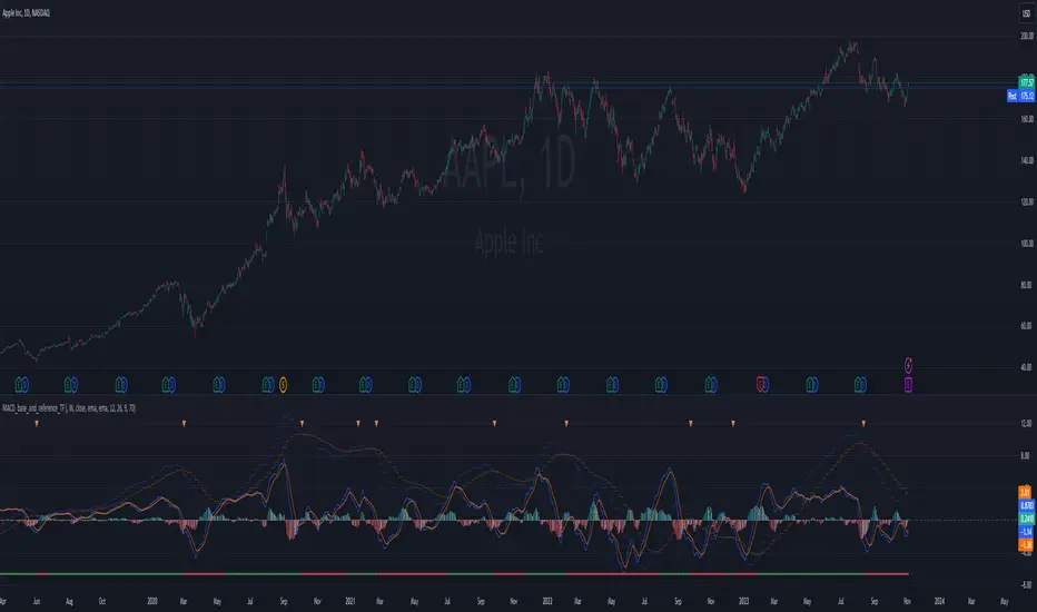
MACD_base_and_reference_TF//====================================================================================================================
The "MACD_with_reference" indicator aims to illustrate the MACD (Moving Average Convergence Divergence) on two distinct timeframes: the base timeframe (typically the chart's timeframe, e.g., 1D) and the reference timeframe (defaulted to 1W). This tool provides a means to determine momentum shifts within the stock, potentially guiding traders in adjusting or trimming positions.
// ================================================== INFO ==================================================
Key Features of the Indicator:
- Dual Timeframe MACD: Displays MACD on both the primary (base) and higher (reference) timeframes - transparent.
- Momentum Analysis: indication of MACD crossdown of the signal line on the refenence TF to indicate momentum loss on the higher timeframe, guiding decisions to manage positions.
- MACD Line Status: Beneath the chart, a red/green bar line signifies the MACD line's position relative to the signal line on the higher timeframe.
- Alert Creation: Allows for alerts on the MACD and signal line crossdown on the higher timeframe, aiding in planning stop-loss settings for owned stocks.
// ================================================== NOTES ==================================================
The "MACD_with_reference" indicator finds optimal usage in several scenarios:
- Chart Analysis: Replacing the MACD indicator during chart reviews.
- Alert Setup: Setting alerts for owned stocks to plan ahead for stop-loss placements or position closures.
// ================================================== TODO ==================================================
//#endregion ========================================================================================================
// Continue the script code...
New York Sessions Morning, Lunch and afternoon. AMKDescription
The script is designed to highlight the New York Stock Exchange's trading day, broken down into three specific sub-sessions: morning, lunchtime, and afternoon. Each sub-session is color-coded to provide an immediate visual cue about which portion of the trading day is currently active. Additionally, this script allows the user to adjust the time zone offset, making it adaptable for traders in different time zones around the world.
Originality
While there are scripts that highlight the entire trading day or specific market hours, this script adds granularity by breaking down the New York trading session into its typical behavioral parts: the morning rush, the lunchtime lull, and the afternoon action. The addition of an adjustable time zone offset is a unique feature that makes the tool more versatile and accommodating to a global user base.
Usefulness
The ability to visualize these different trading sessions can be valuable for various types of traders:
Day Traders: The script helps to immediately identify which session they are in, aiding in their trading strategy as market behavior can vary between these periods.
Swing Traders: They may use these sub-sessions to time their entries or exits, especially if they're based in different time zones.
Market Analysts: The color-coded sessions provide a quick way to analyze the historical performance and volatility of an asset during different trading periods.
Global Traders: The time zone adjustment feature makes it easy for traders outside of the Eastern Time Zone to customize the script according to their local time, increasing its utility across different markets.
Educational Purpose: For new traders, this could serve as an educational tool to understand the typical behavior of the stock market at different times of the day.
So, whether you're timing an intraday entry or looking for patterns tied to specific market sessions, this script offers a straightforward, visual way to keep track of where you are in the trading day.
MA + MACD alert TrendsThis is a strategy/combination of warning indicators using 6MA+MACD.
The strategy details are as follows: This is a simple warning strategy created so that we don't have to monitor the candlestick chart too often.
Note: This isn't an entry strategy; it's a signaling strategy for upcoming trends. For maximum efficiency, we should incorporate more formulas into the command. In the case below, I use Fibonacci to enter the command.
This strategy setting works for a 15-minute time frame, but it can still work for different time frames.
It has been working well with Gold and USOIL for the last two years, as well as with currency pairs like EURUSD and many others.
Components:
EMA100 + EMA200 + MA400 + MA800
MACD (timeframe greater than 1 timeframe)
Fibonacci retreat.
Uptrend alert:
Candles on both EMAs (100-200) + 2 SMAs (400-800)
In the previous 80 candles:
EMA100 cross up to EMA200
At the same time, the MACD cross up 0.
The uptrend warning will trigger when EMA6 cuts down to MA10. That's when the price creates the top and we'll wait for the market to go back to the Fibonacci threshold of 0.618 and start buying (or wait for markets to break up the trendline to buy).
Downtrend alert:
Candles are below both EMAs ( 100-200 ) + 2 SMAs ( 400-800 )
In the previous 80 candles:
EMA100 cross down to EMA200
At the same time, the MACD cross down zero.
The downtrend warning will trigger when EMA6 cuts to MA10. That's when the price creates a bottom and we'll wait for the market to go back to the Fibonacci threshold of 0.618 and start selling (or wait for the market to break down the trendline to sell).
Recommended RR: 1:1
If you have any questions please let me know!

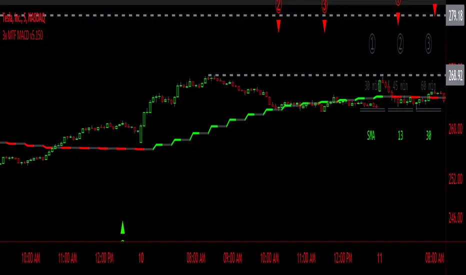
3x MTF MACD v3.0MACD's on 3 different Time Frames
Indicator Information
- Each Time Frame shows start of Trend and end of trend of the MACD vs the Signal Cross
- They are labled 1,2,3 with respective up or down triangle for possible direction.
User Inputs
- configure the indicator by specifying various inputs. These inputs include colors for bullish
and bearish conditions, the time frame to use, whether to show a Simple Moving Average
(SMA) line, and other parameters.
- Users can choose time frames for analysis (like 30 minutes, 1 hour, etc.)
but they must be in mintues.
- The code also allows users to customize how the indicator looks on the chart by providing
options for position and color.
Main Calculations
- The script calculates the Simple Moving Average (SMA) based on the user-defined time
frame.
- It then determines the color of the plot (line) based on certain conditions, such as whether
the SMA is rising or falling. These conditions help users quickly identify market trends.
Label Creation
- The code creates labels that can be displayed on the chart.
These labels indicate whether there's a bullish or bearish signal.
Level Detection
- The script determines and labels key levels or points of interest in the chart based on
certain conditions.
- It can show labels like "①" and "▲" for bullish conditions and "▼" for bearish conditions.
Table Display
- There's an option to show a table on the chart that displays information about the MACD
indicator Chosen and the NUmber Bubble assocated with that time frame
- The table can include information like which time frame is being analyzed, whether the SMA
line is shown, and other relevant data.
Plotting on the Chart
- The script plots the Simple Moving Average (SMA) on the chart. The color of this line
changes based on the calculated trend conditions.
ATR (Average True Range)
- The script also plots the Average True Range (ATR) on the chart. ATR is used to measure
market volatility.
"In essence, this script is a highly customizable MACD and SMA indicator for traders. It assists traders in comprehending market trends, offering insights into different MACD cycles concerning various timeframes.
Users can configure it to match their trading strategies, and it presents information in a user-friendly manner with colors, labels, and tables.
This simplifies market analysis, allowing traders to make more informed decisions without the distraction of multiple indicators."
RSI Radar Multi Time FrameHello All!
First of all many Thanks to Tradingview and Pine Team for developing Pine Language all the time! Now we have a new feature and it's called Polylines and I developed RSI Radar Multi Time Frame . This script is an example and experimental work, you can use it as you wish.
The scripts gets RSI values from 6 different time frames, it doesn't matter the time frame you choose is higher/lower or chart time frame. it means that the script can get RSI values from higher or lower time frames than chart time frame.
It's designed to show RSI Radar all the time on the chart even if you zoom in/out or scroll left/right.
You can set OB/OS or RSI line colors. Also RSI polyline is shown as Curved/Hexagon optionally.
Some screenshots here:
Doesn't matter if you zoom out, it can show RSI radar in the visible area:
Another example:
You can change the colors, or see the RSI as Hexagon:
Time frames from seconds to 1Day in this example while chart time frame is any ( 30mins here )
Enjoy!

Watchlist Heatmap PlusIntroducing 'Watchlist Heatmap Plus,' an advanced indicator designed to supercharge your trading experience. With this tool, you can easily track up to 40 symbols in your watchlist and gain valuable insights into their performance. Here's what it does:
1. Data Visualization: Watchlist Heatmap Plus displays essential data for each symbol, including open, high, low, close, close percent, volume, and volume percent.
2. Dynamic Color Coding: The indicator leverages a dynamic color-coding system to make data interpretation a breeze. By default, red indicates a decrease or a lower value compared to the immediate previous candle, while green represents an increase or a higher value. This color scheme is consistently applied to open, high, low, close, and volume data, making it easy to spot trends at a glance. Close percent and volume percent are color-coded according to their actual values.
3. Customization Options: Users have the power to customize the displayed data to align with their trading strategy. They can choose from several data display options:
- Regular: Display the original data as is.
- Change: Show the difference between the current value and the previous candle.
- Change Percent: Display the percentage change between the current and previous values.
- Equal To, Less Than, Less Than or Equal To, Greater Than, Greater Than or Equal To: Perform comparison operations between the current and previous value, producing a boolean output.
4. Consistent Color Coding: Regardless of the data display option chosen, the color-coding functionality remains the same, based on the percentage change, allowing traders to quickly assess the health of each symbol.
Performance Considerations:
Please be aware that due to the complexity of this indicator and the substantial volume of data requests it handles, users may experience occasional data lag and performance slowdown, particularly when applied to certain timeframes. In some cases, there may be a risk of memory exhaustion, especially on smaller timeframes.
To optimize your experience and ensure smooth functionality, I recommend using this indicator on higher timeframes where data processing is less resource-intensive. Additionally, when using the indicator with the chart's replay feature, be cautious as it may encounter memory limits, affecting its performance.

New Tradability by hajiIntroduction:
The New Tradability Indicator is a state-of-the-art, meticulously coded tool designed for traders on TradingView. Crafted with precision and an in-depth understanding of market dynamics, this indicator offers a comprehensive insight into market tradability across various time frames. By leveraging the core metrics of Trend Area and Quality, it aims to empower traders with the right information to make informed decisions, mitigate FOMO, and maximize profitability.
Core Features:
Three-tiered Time Frame Analysis:
Macro Time Frame: This captures the overarching market movement by analyzing long-term trends. It gives a bird's-eye view of the market's direction and momentum, ideal for position and swing traders.
Normal Time Frame: This is aligned with the current chart time frame. It offers real-time insights for those who trade more frequently, such as day traders or those who base their decisions on hourly or daily charts.
Micro Time Frame: Tailored for scalpers and short-term traders, this captures the minutiae of market fluctuations by focusing on smaller time frames.
Dual-metric Analysis:
Trend Area: This metric delves deep into the market's current trend strength. Whether bullish or bearish, it provides a quantified representation of the trend's vigor and possible continuation. A higher percentage indicates a more pronounced trend, offering traders clarity on potential breakout or reversal scenarios.
Quality: Designed to combat one of the trader's arch-nemeses, FOMO (Fear of Missing Out), this metric evaluates the aptness of entering a trade. A high-quality score signifies a ripe opportunity, suggesting that it's an optimal time to enter the market. Conversely, a low-quality score can act as a warning sign, indicating that the prime entry point might have passed, thus cautioning traders against making hasty decisions.
Tradability Bar: The culmination of the indicator's insights is reflected in the Tradability Bar. This holistic bar synthesizes data from all metrics and time frames to present traders with a singular, easy-to-read percentage. The higher the percentage, the more favorable the market conditions are deemed for trading.
Usage Guidelines:
For optimal results, traders are advised to:
Use the Tradability Bar as an initial reference point. A high percentage suggests promising trading conditions.
Dive deeper by analyzing individual metrics (Trend Area & Quality) and respective time frames to validate or refine their trading strategies.
Always consider external market news, events, and other technical analysis tools in conjunction with this indicator for a more rounded decision-making process.
Conclusion:
The New Tradability Indicator for TradingView stands as a beacon for traders navigating the tumultuous seas of the financial markets. By distilling complex market dynamics into actionable insights, it seeks to be an indispensable ally in a trader's journey towards consistent profitability. Whether you're a seasoned trader or just starting out, this tool is tailored to provide clarity, confidence, and a competitive edge in the trading arena. Welcome to the future of informed trading.

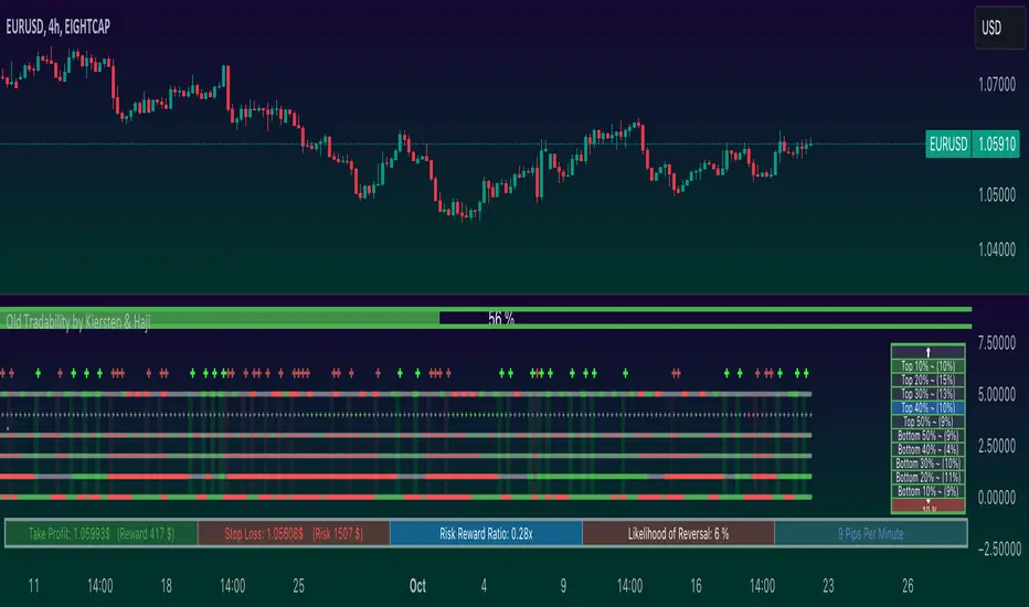
Old Tradability by Kiersten & HajiIntroduction:
The "Old Tradability" is a meticulously crafted indicator designed exclusively for TradingView users. It brings together the power of various well-respected indicators, offering traders a comprehensive tool to gauge market conditions and make informed decisions. Whether you're a novice trader looking for a reliable indicator or a seasoned professional seeking to add another layer to your analytical toolbox, Old Tradability is tailored to provide actionable insights.
Core Features:
Dual Level Analysis:
Long-Term Trend Analysis: At its core, Old Tradability emphasizes the identification of prevailing long-term market trends. To achieve this, it leverages the capabilities of some of the most recognized indicators in the trading world, such as:
MACD (Moving Average Convergence Divergence): Known for its reliability in spotting trend changes and momentum.
MFI (Money Flow Index): A valuable tool to evaluate the flow of money into and out of an asset, often used to predict overbought or oversold conditions.
Heikin Ashi: A unique form of candlestick charting that filters market noise, helping traders understand the market sentiment and trend direction more clearly.
Short-Term Analysis Using MinMax Normalization: The indicator doesn't stop at just identifying the long-term trend. Recognizing the importance of short-term price movements, Old Tradability applies MinMax Normalization on shorter time frames. This technique adjusts the scale of data, making it easier to spot potential reversals or continuation patterns.
Strategic Trading Recommendations:
The principle is simple yet effective. When the long-term trend is bullish and the short-term analysis places the asset in the bottom 20%, it presents a potential buying opportunity. Conversely, if the long-term trend is bearish and the short-term places the asset in the top 20%, traders might consider it as a selling signal.
Integrated Risk Management Alerts:
One of the standout features of Old Tradability is its built-in risk management system. This feature ensures that traders are not only informed about potential trade setups but also about the inherent risks associated.
The system sends out timely alerts for what it deems as "perfect setups," allowing traders to act swiftly and decisively. This minimizes the chance of missing out on lucrative trades while also providing an extra layer of security by notifying users about unfavorable conditions.
Conclusion:
The Old Tradability Indicator is more than just a tool; it's a comprehensive trading companion. Its dual-level analysis ensures that traders have a holistic view of the market, while its integrated risk management alerts keep them one step ahead. If you're looking for a dependable, detailed, and actionable indicator on TradingView, Old Tradability might just be the perfect addition to your trading strategy. Happy trading!
Pivot Support & Resistance [DeltaAlgo]Pivot Support & Resistance Indicator - DeltaAlgo
Concept:
The "Pivot Support & Resistance" indicator is designed to help traders identify and visualize key support and resistance levels based on pivot points. It calculates and plots lines representing these levels on a price chart. This indicator's concept is rooted in the idea that pivot points can act as significant price reference points, which can be instrumental in making trading decisions.
Settings:
Pivot Period: Users can customize the period for calculating pivot points. This period determines how many bars are considered when calculating support and resistance levels.
Maximum Lines: The indicator allows traders to set a maximum number of support and resistance lines that will be displayed. When the maximum is reached, older lines are removed to keep the chart uncluttered.
Line Colors and Width: Users can choose the colors and width for both the support and resistance lines to tailor the indicator's appearance to their preferences.
Use Case:
The "Pivot Support & Resistance" indicator is beneficial for traders who employ pivot points in their technical analysis and trading strategies. It aids in identifying potential reversal and breakout levels, which can inform trading decisions. Traders can use this indicator to:
Identify key price levels: The indicator highlights significant support and resistance levels based on pivot points.
Plan entries and exits: Traders can incorporate these levels into their trading strategies to make more informed decisions about when to enter or exit trades.
Manage risk: Knowing where support and resistance levels are can help traders set stop-loss and take-profit orders more effectively.
This indicator simplifies the process of identifying and visualizing pivot-based support and resistance levels, making it a valuable tool for traders who rely on these levels in their technical analysis. It helps streamline the decision-making process and enhances overall trading effectiveness.

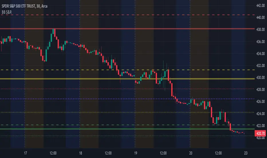
BB Support & ResistanceChoosing support and resistance can be time consuming and subjective. Personally, I don't want to spend too much time manually marking up charts. Credit to video I saw, forget the producer, that demonstrated how multi-time frame Bollinger Bands can act as support and resistance. I suggest reading up on Bollinger Bands (en.wikipedia.org) and how to trade them. This indicator draws support and resistance lines based on Bollinger Bands on three time frames. You can select 1 or all three time frames to display on your chart. Enjoy.
Multi Timeframe Supply & Demand ZonesIntroduction
Hello fellow traders and coders, I’d like to introduce the multi time-frame supply and demand indicator that you’ve been looking for, its a dynamic script encompassing a lot of features however it is merely a tool to be used in conjunction with your own market analysis.
Features
A maximum of 2 time-frames that can be customized independently.
The ability to change individual swing lengths that create the supply and demand boxes, all time-frames will come set at 7, you can however set this to whatever you are comfortable with.
Supply and demand functionality for both time-frames.
The ability to either use (highs and lows) or closes for mitigation of supply and demand zones, meaning that if set to close the zones will be mitigated if a close is above the top for supply and bottom from demand, the same will apply when the high and low flag is used.
The ability to customize box colors, border type, border width and text size.
The ability to prevent lower time frame structure from showing on higher time frames which I don’t advice as it will provide you with an inaccurate perception of the lower time frame structure hence I’ve made the feature available but set it to false.
The script also has a section called general settings that will allow you to hide all the supply and demand zones on the chart.
The ability to choose the number of supply or demand zones to display per time-frame.
General Settings Functionality.
Input 1 allows you to hide all the demand zones on the chart.
Input 2 allows you to hide all the supply zones on the chart.
Input 3 if false will show lower time frame structure on a higher time frame. Default is true to prevent inaccurate results on higher time-frames.

Multiple Vertical LinesThis script allows you to have multiple vertical lines on your chart (for seeing how price action performs around certain times of interest to you.
You can adjust the code to add new lines or colours as you wish (or comment out any that are there if they don't suit you.
There is also a shaded area, so you can use that for delineating an amount of time.
The indicator is currently set to New York time, but you can adjust this to suit you.

Moving averages & clouds
Hi all!
This is a script that lets you have 3 moving averages (of a user defined type) and maybe have an alternative cloud (fill) between them. The cloud can be customized and turned on/off in the "style" tab for the indicator.
Alerts can be configured to fire on up/down/all crosses and are activated when the whole candle has crossed the morning average.
A higher time frame can be configured for the moving averages.
You can hide the moving average, but show the cloud:
You can have multiple clouds:
You can have moving averages from a higher time frame (here from weekly time frame on a daily chart):
Best of trading luck!

Golden Level Predictions v1.0Golden Level Predictions (GLP) Trading Indicator
This script introduces a custom trading indicator named "GLP" tailored for the TradingView platform. It offers various price levels derived from Fibonacci calculations and other mathematical models, assisting traders in pinpointing potential overpriced and discounted price levels.
Key Features:
User Inputs : Users have the flexibility to select their desired timeframe, with options ranging from Weekly, Daily, Monthly, and more. Additionally, they can opt to showcase Fibonacci lines and the associated prices within these levels.
Price Level Calculations :
- Employs constants such as the Golden Ratio (PHI) and Pi (PI) to extract various multipliers and factors.
- Assesses if the current asset is a cryptocurrency and tweaks calculations accordingly.
- Determines overpriced and discounted price levels, drawing from the current open price and past data.
Fibonacci Levels :
- For each overpriced and discounted level, the script computes intermediary Fibonacci levels, including 23.6%, 38.2%, 50%, 61.8%, and 78.6% (the 3rd level is excluded due to plot limitations).
- These levels are illustrated on the chart, granting traders a more detailed view of price targets.
Visual Elements :
- Projects horizontal lines to the subsequent selected indicator interval for every calculated price level.
- Exhibits potential percentage gains or losses at each tier, indicating the prospective price alteration upon reaching that level.
- Differentiates overpriced (green) and discounted (red) levels using color codes. A neutral price is depicted in yellow.
Anticipated Close Calculation : Offers a projected closing price for the current timeframe, based on a myriad of factors.
This indicator is particularly effective with cryptocurrencies due to their inherent volatility. It's also compatible with stocks and is most efficient with tickers that provide volume data.
9-20 sma multi timeframe indicatorThis is an indicator to help visualizing the 9 and the 20 sma on 3 different timeframes.
When they cross, you will see a cross on the band representing the timeframe.
When a trade is favorable the band will color in green for up trend and in red for downtrend:
- Conditions in uptrend: Start after the first green candle closed above the 9 sma, Stop after the first red candle closed under the 9 sma
- Conditions in downtrend: Start after the first red candle closed below the 9 sma, Stop after the first green candle closed above the 9 sma
